
Search results for "Sympathetic" in Home Design Ideas
 Thomas J. Pearson, Inc.
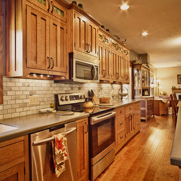
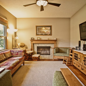
In this project, the client wanted to make an arts and crafts themed first floor. First, walls were torn down to open up the space. To carry the arts and crafts theme throughout the first floor quarter sawn cabinets and a hand-scraped wood floors were installed in the kitchen, new arts and crafts columns were added between the kitchen and family room, and doors and trim sympathetic to the rest of the theme were replaced in each room. The staircase was also completely redone with new null posts, balusters, skirt boards, and risers.
Thomas J. Pearson, Inc.
Bird & Branch Photography
 Laidlaw Schultz architects
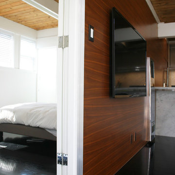
The project’s starting point was to understand the building’s original post and beam structure and to use that internal logic to formulate a sympathetic remodel. With an emphasis on the upper back unit, the owner’s private residence within this recently purchased Edward Killingsworth triplex, the first order of business was to strip the excess out and to return the complex to something that resembled the original. With a limited budget, the tact was to restore where possible, and to insert where needed, but always with a sympathetic eye. The kitchen quickly became the primary focus and it was soon realized that by removing the division between the existing galley and family room that the essence of the structural system could be revealed. Once opened the datum of the layered beams was adhered to with the kitchen reinforcing this overhead water line. The primary internal wall was then highlighted with a new wood veneer with the refrigerator recessed (borrowing a bit of space from the master closet) and the existing heater chromed.
 Thomas J. Pearson, Inc.
This 24’ by 22’ addition opens up the kitchen space with an additional room which the kitchen connects to. The newly constructed space serves as a living room/sunroom.
To do this, we tore down the kitchen wall and built a temporary plywood wall to keep the space closed off from the new construction. The new structure was framed and the roof was shingled. To allow for the roof line, new window openings were built and new windows were purchased to meet current egress requirements. The double door that initially went to the exterior was transformed into an 8’ tall opening. The kitchen window at the sink was taken out and now has a wood jamb opening with a granite countertop for a bar where people can sit and watch the cooks at work.
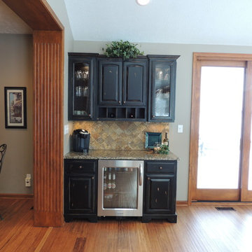
Inside the addition we created some additional cabinet space for another serving area. The cabinetry was framed to fit a beverage cooler. The floor in the addition matches the existing hand scraped wood floor in the kitchen. One particular challenge we faced in the addition was ensuring that the floor elevation for the new addition lined perfectly so that it was seamless.
On the exterior we installed a new cultured ledge stone and a real limestone sill with actual rock face to provide a natural appearance. The stone steps on each of the entryways into the addition have a similar look. The radius steps contain the rock face feature as well. Large windows were installed which match the pitch of the existing roof. The siding on the new structure is sympathetic to the siding on the home. We also installed new state of the art skylights that shut themselves when it rains.
Find the right local pro for your project
 Katie Hutchison Studio
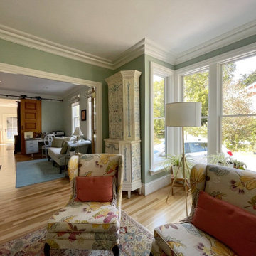
This project for a builder husband and interior-designer wife involved adding onto and restoring the luster of a c. 1883 Carpenter Gothic cottage in Barrington that they had occupied for years while raising their two sons. They were ready to ditch their small tacked-on kitchen that was mostly isolated from the rest of the house, views/daylight, as well as the yard, and replace it with something more generous, brighter, and more open that would improve flow inside and out. They were also eager for a better mudroom, new first-floor 3/4 bath, new basement stair, and a new second-floor master suite above.
The design challenge was to conceive of an addition and renovations that would be in balanced conversation with the original house without dwarfing or competing with it. The new cross-gable addition echoes the original house form, at a somewhat smaller scale and with a simplified more contemporary exterior treatment that is sympathetic to the old house but clearly differentiated from it.
Renovations included the removal of replacement vinyl windows by others and the installation of new Pella black clad windows in the original house, a new dormer in one of the son’s bedrooms, and in the addition. At the first-floor interior intersection between the existing house and the addition, two new large openings enhance flow and access to daylight/view and are outfitted with pairs of salvaged oversized clear-finished wooden barn-slider doors that lend character and visual warmth.
A new exterior deck off the kitchen addition leads to a new enlarged backyard patio that is also accessible from the new full basement directly below the addition.
(Interior fit-out and interior finishes/fixtures by the Owners)
 Thomas J. Pearson, Inc.
In this project, the client wanted to make an arts and crafts themed first floor. First, walls were torn down to open up the space. To carry the arts and crafts theme throughout the first floor quarter sawn cabinets and a hand-scraped wood floors were installed in the kitchen, new arts and crafts columns were added between the kitchen and family room, and doors and trim sympathetic to the rest of the theme were replaced in each room. The staircase was also completely redone with new null posts, balusters, skirt boards, and risers.
Thomas J. Pearson, Inc.
Bird & Branch Photography
 Katie Hutchison Studio
This project for a builder husband and interior-designer wife involved adding onto and restoring the luster of a c. 1883 Carpenter Gothic cottage in Barrington that they had occupied for years while raising their two sons. They were ready to ditch their small tacked-on kitchen that was mostly isolated from the rest of the house, views/daylight, as well as the yard, and replace it with something more generous, brighter, and more open that would improve flow inside and out. They were also eager for a better mudroom, new first-floor 3/4 bath, new basement stair, and a new second-floor master suite above.
The design challenge was to conceive of an addition and renovations that would be in balanced conversation with the original house without dwarfing or competing with it. The new cross-gable addition echoes the original house form, at a somewhat smaller scale and with a simplified more contemporary exterior treatment that is sympathetic to the old house but clearly differentiated from it.
Renovations included the removal of replacement vinyl windows by others and the installation of new Pella black clad windows in the original house, a new dormer in one of the son’s bedrooms, and in the addition. At the first-floor interior intersection between the existing house and the addition, two new large openings enhance flow and access to daylight/view and are outfitted with pairs of salvaged oversized clear-finished wooden barn-slider doors that lend character and visual warmth.
A new exterior deck off the kitchen addition leads to a new enlarged backyard patio that is also accessible from the new full basement directly below the addition.
(Interior fit-out and interior finishes/fixtures by the Owners)
 Laidlaw Schultz architects
The project’s starting point was to understand the building’s original post and beam structure and to use that internal logic to formulate a sympathetic remodel. With an emphasis on the upper back unit, the owner’s private residence within this recently purchased Edward Killingsworth triplex, the first order of business was to strip the excess out and to return the complex to something that resembled the original. With a limited budget, the tact was to restore where possible, and to insert where needed, but always with a sympathetic eye. The kitchen quickly became the primary focus and it was soon realized that by removing the division between the existing galley and family room that the essence of the structural system could be revealed. Once opened the datum of the layered beams was adhered to with the kitchen reinforcing this overhead water line. The primary internal wall was then highlighted with a new wood veneer with the refrigerator recessed (borrowing a bit of space from the master closet) and the existing heater chromed.
 Gertler & Wente Architects
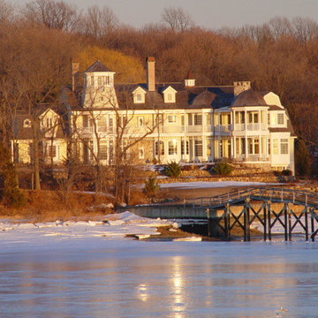
Gertler & Wente Architects was hired to design this 12,000 s.f. residence for a family of five. It is situated, facing west, on Oyster Bay with views of Long Island Sound, Oyster Bay Harbor and Oyster Bay beach. The house was designed to be sympathetic to its context and the history of north shore residences. A range of outdoor terraces, porches, and structures extends the living area of the house into the landscape. The building is mostly steel frame construction.
Photography by Edberg Marketing and Tony Calarco
 D. A. Dunlevy
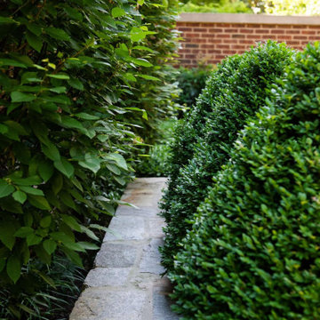
Innovative design and smart planning create a lush, private outdoor space.
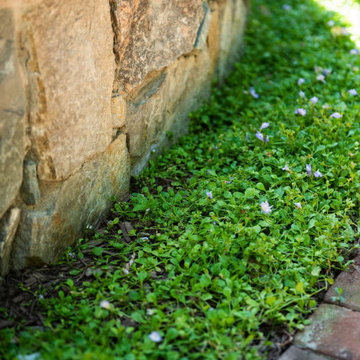
This client’s outdoor courtyard came with a number of interesting challenges—including limited access, structural hurdles, and existing landscape design. The D. A. Dunlevy team built a custom ramp to create ingress from the street, allowing us to bring in all of the materials and plantings.The courtyard has been transformed into a private, tucked-away place for the owners to relax with morning coffee, escape with a good book, or provide an overflow area for visiting guests. The design remained sympathetic to existing architecture and landscaping, utilizing black granite stepping stones and other elements to create cohesion. Clean lines were established with a modern custom bench and stone planter wall. The greenery was chosen to create a simple and structured feel, using narrow European Hornbeam trees for an aerial hedge and adding in boxwoods, nandina, hellebores, and creeping Jenny to round out the verdant, calming effect.
 D. A. Dunlevy
Innovative design and smart planning create a lush, private outdoor space.
This client’s outdoor courtyard came with a number of interesting challenges—including limited access, structural hurdles, and existing landscape design. The D. A. Dunlevy team built a custom ramp to create ingress from the street, allowing us to bring in all of the materials and plantings.The courtyard has been transformed into a private, tucked-away place for the owners to relax with morning coffee, escape with a good book, or provide an overflow area for visiting guests. The design remained sympathetic to existing architecture and landscaping, utilizing black granite stepping stones and other elements to create cohesion. Clean lines were established with a modern custom bench and stone planter wall. The greenery was chosen to create a simple and structured feel, using narrow European Hornbeam trees for an aerial hedge and adding in boxwoods, nandina, hellebores, and creeping Jenny to round out the verdant, calming effect.
 Thomas J. Pearson, Inc.
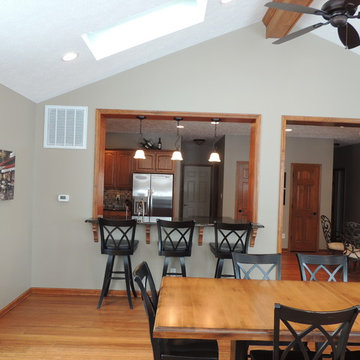
This 24’ by 22’ addition opens up the kitchen space with an additional room which the kitchen connects to. The newly constructed space serves as a living room/sunroom.
To do this, we tore down the kitchen wall and built a temporary plywood wall to keep the space closed off from the new construction. The new structure was framed and the roof was shingled. To allow for the roof line, new window openings were built and new windows were purchased to meet current egress requirements. The double door that initially went to the exterior was transformed into an 8’ tall opening. The kitchen window at the sink was taken out and now has a wood jamb opening with a granite countertop for a bar where people can sit and watch the cooks at work.
Inside the addition we created some additional cabinet space for another serving area. The cabinetry was framed to fit a beverage cooler. The floor in the addition matches the existing hand scraped wood floor in the kitchen. One particular challenge we faced in the addition was ensuring that the floor elevation for the new addition lined perfectly so that it was seamless.
On the exterior we installed a new cultured ledge stone and a real limestone sill with actual rock face to provide a natural appearance. The stone steps on each of the entryways into the addition have a similar look. The radius steps contain the rock face feature as well. Large windows were installed which match the pitch of the existing roof. The siding on the new structure is sympathetic to the siding on the home. We also installed new state of the art skylights that shut themselves when it rains.
 Laidlaw Schultz architects
The project’s starting point was to understand the building’s original post and beam structure and to use that internal logic to formulate a sympathetic remodel. With an emphasis on the upper back unit, the owner’s private residence within this recently purchased Edward Killingsworth triplex, the first order of business was to strip the excess out and to return the complex to something that resembled the original. With a limited budget, the tact was to restore where possible, and to insert where needed, but always with a sympathetic eye. The kitchen quickly became the primary focus and it was soon realized that by removing the division between the existing galley and family room that the essence of the structural system could be revealed. Once opened the datum of the layered beams was adhered to with the kitchen reinforcing this overhead water line. The primary internal wall was then highlighted with a new wood veneer with the refrigerator recessed (borrowing a bit of space from the master closet) and the existing heater chromed.
 Laidlaw Schultz architects
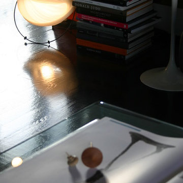
The project’s starting point was to understand the building’s original post and beam structure and to use that internal logic to formulate a sympathetic remodel. With an emphasis on the upper back unit, the owner’s private residence within this recently purchased Edward Killingsworth triplex, the first order of business was to strip the excess out and to return the complex to something that resembled the original. With a limited budget, the tact was to restore where possible, and to insert where needed, but always with a sympathetic eye. The kitchen quickly became the primary focus and it was soon realized that by removing the division between the existing galley and family room that the essence of the structural system could be revealed. Once opened the datum of the layered beams was adhered to with the kitchen reinforcing this overhead water line. The primary internal wall was then highlighted with a new wood veneer with the refrigerator recessed (borrowing a bit of space from the master closet) and the existing heater chromed.
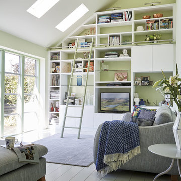
 Neville Johnson Ltd
Painted in ‘sorrel’ this superb example of a large bespoke bookcase complements this spacious lounge perfectly.
This is a stunning fitted bookcase that not only looks great but fits the client’s initial vision by incorporating a small study area that can be neatly hidden away when not in use. Storage for books, pictures, trinkets and keepsakes has been carefully considered and designed sympathetically to the interior decor.
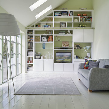 Neville Johnson Ltd
Painted in ‘sorrel’ this superb example of a large bespoke bookcase complements this spacious lounge perfectly.
This is a stunning fitted bookcase that not only looks great but fits the client’s initial vision by incorporating a small study area that can be neatly hidden away when not in use. Storage for books, pictures, trinkets and keepsakes has been carefully considered and designed sympathetically to the interior decor.
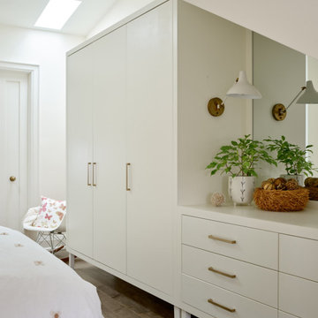
 Emily Griffin Design
This sweet master bedroom ended up with tons of angles once we were done with it. We followed the lines of the roof rafters above when renovating the space and opening it up, so we wanted the custom millwork design to be sympathetic to those beautiful new angles - a dresser was perched under the angled roof with a custom inset triangular mirror placed above the dresser portion. The whole thing sits on legs to give it an airy feeling in the room. Designed by: Stephanie Houghton, principal partner at Emily Griffin Design.
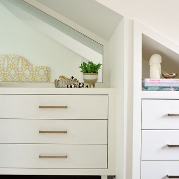 Emily Griffin Design
This sweet master bedroom ended up with tons of angles once we were done with it. We followed the natural lines of the roof rafters above when renovating the space and opening it up, so we wanted the custom millwork design to be sympathetic to those beautiful new angles - a dresser perches under the angled roof with a custom inset triangular mirror placed above the dresser portion. The whole thing built-in sits on legs to give it an airy feeling in the room. Designed by: Stephanie Houghton, principal partner at Emily Griffin Design.
 Smith & Sons Vernon South
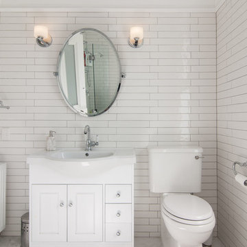
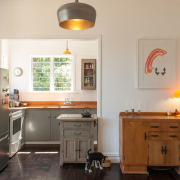
This beautiful residence was in need of repairs and a 2 bedroom extension to accommodate the family of five who love the home and wished to restore and extend sympathetically in keeping with the feel and character charm of the property. They worked with Smith & Sons to create a stunning home which would meet their needs for years to come.
 Smith & Sons Vernon South
This beautiful residence was in need of repairs and a 2 bedroom extension to accommodate the family of five who love the home and wished to restore and extend sympathetically in keeping with the feel and character charm of the property. They worked with Smith & Sons to create a stunning home which would meet their needs for years to come.
 Neville Johnson Ltd
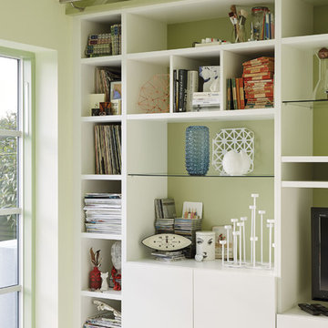
Painted in ‘sorrel’ this superb example of a large bespoke bookcase complements this spacious lounge perfectly.
This is a stunning fitted bookcase that not only looks great but fits the client’s initial vision by incorporating a small study area that can be neatly hidden away when not in use. Storage for books, pictures, trinkets and keepsakes has been carefully considered and designed sympathetically to the interior decor.
8