
Search results for "Tall most" in Home Design Ideas
 Design Works Architecture
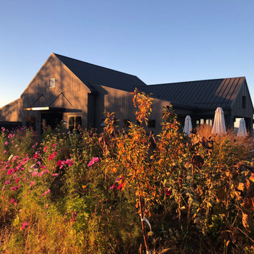
A fateful meeting in Australia led a young couple to starting a successful tasting room in Rochester, NY. The rapid growth of their business model led to the necessity to produce their own wine locally. Once an ideal site was found the dream of building their production facility and tasting room began to take form. The vaulted public space is perched on top of a 20 foot tall foundation wall allowing for tanks, pallet storage, as well as the ability to bottle wine on site. The use of natural materials was an important part of acknowledging the local vernacular and helping the building integrate into the landscape. A trip to Hammondsport would not be complete without a visit to this modern vineyard. Enjoy some wine tasting and take in one of the most spectacular views of Keuka Lake.
 User
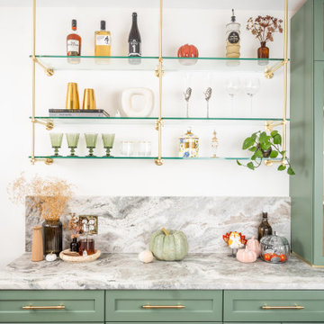
The Origin 2 Bay Standard Shelving Unit is our most asked for configuration for this shelving style. Skip the design and lead time of customizing a unit by purchasing this prefabricated shelf.
This unit measures 42" tall, and fits a 12" deep shelf. We do not suggest spanning shelves more than 48" between the ladder rungs. Our Wooden Shelving Planks measure 3/4" thick, and our Glass Shelves measure 3/8" thick. If you need shelving plank dimensions that you don't see listed here, please checkout with "none" and contact us so we can work with you to add the right size material to your shelving order.
 User
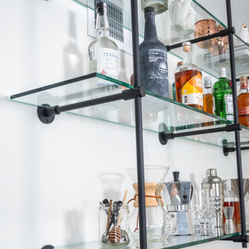
The Origin 2 Bay Standard Shelving Unit is our most asked for configuration for this shelving style. Skip the design and lead time of customizing a unit by purchasing this prefabricated shelf.
This unit measures 42" tall, and fits a 12" deep shelf. We do not suggest spanning shelves more than 48" between the ladder rungs. Our Wooden Shelving Planks measure 3/4" thick, and our Glass Shelves measure 3/8" thick. If you need shelving plank dimensions that you don't see listed here, please checkout with "none" and contact us so we can work with you to add the right size material to your shelving order.
Find the right local pro for your project
 Sloan Polish Design
Working in small or awkward spaces is often the most rewarding because the problem solving required calls on one’s creativity. The slanted ceiling nook in this tween bedroom is a great example of how to turn a demerit into an asset. Instead of trying to ignore it, the feature is played up here with the bold stripe treatment. The nook’s utility is maximized by using a corner desk and creating custom wood shelves affixed to the wall using plumbing piping.
Storage space remained a challenge in the room, and if we added a tall storage unit to the wall where one could fit, we would be blocking the light and views of the windows. The solution was to create a long, built-in bench with drawer storage below and two long wooden shelves, higher up the wall, for books and personal items. To bring in an industrial vibe and complement the iron bed, we distressed the wood and used plumbing pipes and fixtures for shelf support.
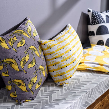
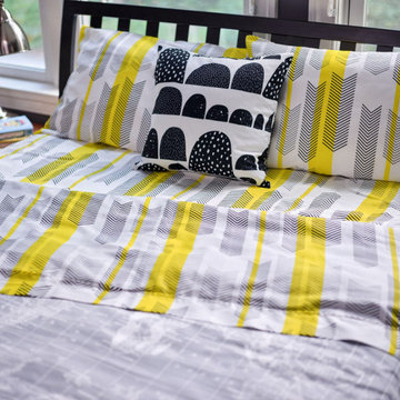
Pops of yellow as a repeating element bring energy and personality to the space. Custom bedding, pillows, and window seat fabric from Spoonflower.
Images ©Spoonflower and ©Sloan Polish Design.
 Sloan Polish Design
Working in small or awkward spaces is often the most rewarding because the problem solving required calls on one’s creativity. The slanted ceiling nook in this tween bedroom is a great example of how to turn a demerit into an asset. Instead of trying to ignore it, the feature is played up here with the bold stripe treatment. The nook’s utility is maximized by using a corner desk and creating custom wood shelves affixed to the wall using plumbing piping.
Storage space remained a challenge in the room, and if we added a tall storage unit to the wall where one could fit, we would be blocking the light and views of the windows. The solution was to create a long, built-in bench with drawer storage below and two long wooden shelves, higher up the wall, for books and personal items. To bring in an industrial vibe and complement the iron bed, we distressed the wood and used plumbing pipes and fixtures for shelf support.
Pops of yellow as a repeating element bring energy and personality to the space. Custom bedding, pillows, and window seat fabric from Spoonflower.
Images ©Spoonflower and ©Sloan Polish Design.

 Outdoor Lighting Design by Preferred Properties
This Georgian Colonial anchoring the culdesac is just a beauty. It is so apparent that light defines space and more so enables us to see what we see. Strategic landscaping by our crew allowed tall slender trees to anchor the road presentation and support the landscape in the front yard. Ofcourse all the landscape design had great lighting right behind it as well. Various strategies such as cross lighting, front lighting, silhouetting, down lighting and low level lighting allowed accent lighting to shine it's thing on what I thought was some of the most interesting and striking Focal specimens in the Landscape. The levels of brightness play a dominant role in direction of the welcoming of the house to others as there are several options for entry and light brightness helps direct the guests to the door. As most homeowners drive into the garage to enter the home they don't think about the approach in the dark as much as we do. Outdoor lighting on the house and fixtures secured to the home have to be at times toned down or aligned with light intensity to match the landscape lighting. Finish pointing at night and night time photography which we do as part of our landscape lighting installation approach shows these details best.
It gives us an opportunity to adjust beam sprays, add lens covers and readjust the landscape lighting fixtures for more optimal results.
 Drury Design
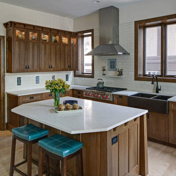
The 100-year old home’s kitchen was old and just didn’t function well. A peninsula in the middle of the main part of the kitchen blocked the path from the back door. This forced the homeowners to mostly use an odd, U-shaped corner of the kitchen.
Design objectives:
-Add an island
-Wow-factor design
-Incorporate arts and crafts with a touch of Mid-century modern style
-Allow for a better work triangle when cooking
-Create a seamless path coming into the home from the backdoor
-Make all the countertops in the space 36” high (the old kitchen had different base cabinet heights)
Design challenges to be solved:
-Island design
-Where to place the sink and dishwasher
-The family’s main entrance into the home is a back door located within the kitchen space. Samantha needed to find a way to make an unobstructed path through the kitchen to the outside
-A large eating area connected to the kitchen felt slightly misplaced – Samantha wanted to bring the kitchen and materials more into this area
-The client does not like appliance garages/cabinets to the counter. The more countertop space, the better!
Design solutions:
-Adding the right island made all the difference! Now the family has a couple of seats within the kitchen space. -Multiple walkways facilitate traffic flow.
-Multiple pantry cabinets (both shallow and deep) are placed throughout the space. A couple of pantry cabinets were even added to the back door wall and wrap around into the breakfast nook to give the kitchen a feel of extending into the adjoining eating area.
-Upper wall cabinets with clear glass offer extra lighting and the opportunity for the client to display her beautiful vases and plates. They add and an airy feel to the space.
-The kitchen had two large existing windows that were ideal for a sink placement. The window closest to the back door made the most sense due to the fact that the other window was in the corner. Now that the sink had a place, we needed to worry about the dishwasher. Samantha didn’t want the dishwasher to be in the way of people coming in the back door – it’s now in the island right across from the sink.
-The homeowners love Motawi Tile. Some fantastic pieces are placed within the backsplash throughout the kitchen. -Larger tiles with borders make for nice accent pieces over the rangetop and by the bar/beverage area.
-The adjacent area for eating is a gorgeous nook with massive windows. We added a built-in furniture-style banquette with additional lower storage cabinets in the same finish. It’s a great way to connect and blend the two areas into what now feels like one big space!

 Brendan McHugh, Architect, Manasquan, NJ
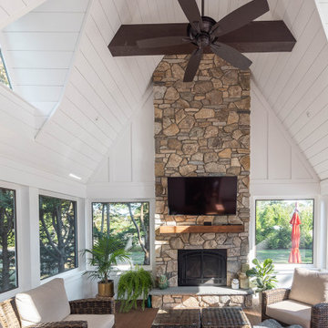
Easy entry to screened-in room from deck. McHugh Architecture designed a unique 3-Seasons Room addition for a family in Brielle, NJ. The home is an old English Style Tudor home. Most old English Style homes tend to have darker elements, where the space can typically feel heavy and may also lack natural light. We wanted to keep the architectural integrity of the Tudor style while giving the space a light and airy feel that invoked a sense of calmness and peacefulness. The space provides 3 seasons of indoor-outdoor entertainment.
 Outdoor Lighting Design by Preferred Properties
This Georgian Colonial anchoring the culdesac is just a beauty. It is so apparent that light defines space and more so enables us to see what we see. Strategic landscaping by our crew allowed tall slender trees to anchor the road presentation and support the landscape in the front yard. Ofcourse all the landscape design had great lighting right behind it as well. Various strategies such as cross lighting, front lighting, silhouetting, down lighting and low level lighting allowed accent lighting to shine it's thing on what I thought was some of the most interesting and striking Focal specimens in the Landscape. The levels of brightness play a dominant role in direction of the welcoming of the house to others as there are several options for entry and light brightness helps direct the guests to the door. As most homeowners drive into the garage to enter the home they don't think about the approach in the dark as much as we do. Outdoor lighting on the house and fixtures secured to the home have to be at times toned down or aligned with light intensity to match the landscape lighting. Finish pointing at night and night time photography which we do as part of our landscape lighting installation approach shows these details best.
It gives us an opportunity to adjust beam sprays, add lens covers and readjust the landscape lighting fixtures for more optimal results.
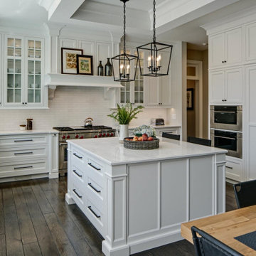 Drury Design
Design Challenges:
-Offer sufficient storage despite a very large window and many appliances
-Include an island without crowding the existing breakfast table
-Create a feeling of warmth in an all-white kitchen
Design Solutions:
-Take wall cabinets up to the 10′ ceiling – this facilitates plenty of storage for everyday items and items that are used less frequently
-Scale the island’s potential back a bit and add furniture details so that it fits into the space beautifully
-Add glass doors to the cabinets surrounding the hood – displaying carefully curated items and keepsakes is a great way to add color to a mostly white space
-Matte black hardware and lighting adds contrast and keeps things fresh
THE RENEWED SPACE
The family loves their new kitchen. As a focal point for meals and activities, it is the hub of their day-to-day lives. The bright, light-filled space is great for cooking, enjoying meals and spending time with family and friends.
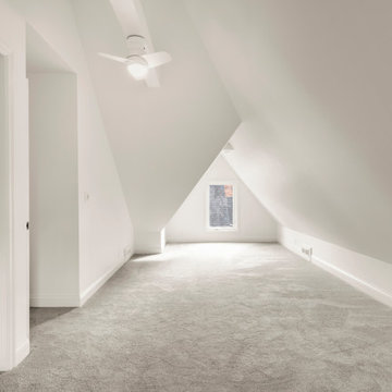
 Prima Construction
Project Goal: Utilize an unfinished story and a half-space to give each daughter a bedroom on the second floor along with a new full bath.
Challenge 1: The sloped ceilings in the area presented a challenge to how we could most cost-effectively add a bathroom within building code limits.
Solution 1: We’ve come across this challenge often when trying to fit a bathroom in sloped ceiling spaces and the budget or roof doesn't support adding a dormer. In these cases, we built out what we call a "vanity soffit", a tall soffit spanning from higher on the angled portion down to a comfortable height above the faucet bringing the upper portion of the flat wall forward. Its width typically depends on lighting needs and other considerations in the space. The vanity soffit allows the vanity to drop back to the original wall maintaining floor space and clearances while also providing just enough additional height for a practical mirror. For further flexibility, we typically recommend a pivoting mirror.
Challenge 2: Homeowners were told the floor structure was sound to finish for living space. Due to the spans, the first-floor ceiling joists did not meet the requirements to be second-floor floor joists.
Solution 2: In order to provide a solid base for the new living space, we consulted our engineer. The existing 2x6 members spanned beyond the distance they could while still structurally supporting the new living space floor. We determined throughout most of the space we needed to add in (“sister”) 2 additional 2x6 joists between the existing joists.
This additional work also took place during an unseasonably warm spell in June yet we persevered. So proud of our hard-working team.
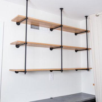 User
The Origin 2 Bay Standard Shelving Unit is our most asked for configuration for this shelving style. Skip the design and lead time of customizing a unit by purchasing this prefabricated shelf.
This unit measures 42" tall, and fits a 12" deep shelf. We do not suggest spanning shelves more than 48" between the ladder rungs. Our Wooden Shelving Planks measure 3/4" thick, and our Glass Shelves measure 3/8" thick. If you need shelving plank dimensions that you don't see listed here, please checkout with "none" and contact us so we can work with you to add the right size material to your shelving order.

 Alair Homes Plano
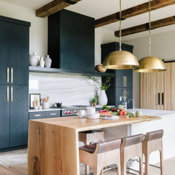
These clients spend most of their time between their kitchen and living room where they enjoy their fireplace. The original kitchen was not only cut off from the living room but was tight and not functional for clients that enjoy cooking and entertaining. They wanted to open the floor plan and update the finishes throughout; starting with the front door! The fireplace in the living room was the first thing you saw when you walked into the house. The old fireplace had a tall curved brick hearth with a simple boring wood mantel. We modernized the fireplace by surrounding it with tile and removing the tall hearth. The same Uliano Gray Vicostone Quartz from the kitchen island now topped the lowered hearth. There were three different ceiling heights in the kitchen, to include some decorative wood ceiling panels and two pop ups that were removed and leveled out when the wall was removed between the kitchen and living room. The new large spacious island with a sink now sits where that wall once was. The original pantry was in the hallway adjacent to the kitchen, so it was not convenient at all. Space was taken from what used to be the formal dining for a new conveniently located pantry. The original formal dining was transformed into an office, which is more functional space for these clients. The coat closet that was once accessible from the entry way was closed off becoming a closet for the guest bedroom. We removed the chair rail and picture frame molding from the entry way and once the new front door was hung, the entry way was now completely transformed, to match the new kitchen and living area! Design/Remodel by Hatfield Builders & Remodelers | Photography by Versatile Imaging #hbdallas #kitchenremodel #livingarearemodel


 Traci Connell Interiors
Perfectly embedded on an acre of land overlooking a pond, in the heart of Willow Bend of Plano, this dated, traditional home got more than a complete facelift. The wife is a “farmer’s daughter” and could have never imagined having a home like this to call her own one day. Finding a 15’ dining table was a tall task… especially for a family of four. Using a local craftsman, the most gorgeous white oak table was created to host everyone in the neighborhood! The clients told a lot of stories about their past and children. The designer realized that the stories were actually treasures as she incorporated their memories and symbols in every room. She brought these memories to life in a custom artwork collage above the family room mantel. From a tractor representing the grandfather, to the Russian alphabet portraying the roots of their adopted sons and some Cambodian script, there were meanings behind each piece. In order to bring nature indoors, the designer decided to demo the exterior wall to the patio to add a large folding door and blew out the wall dividing the formal dining room and breakfast room so there would be a clear sight through to the outdoors. Throughout the home, each family member was thought of. The fabrics and finishes had to withstand small boys, who were extremely active. The use of outdoor fabrics and beautiful scratch proof finishes were incorporated in every space – bring on the hotwheels.

 Cynthia B. Wilson Interior Design
I began working with the owners of this house in 2013. We started with the living and dining rooms. No new furniture was purchased, but the rooms transformed when we changed the wall and ceiling colors, added lighting and light fixtures, rearranged artwork, rugs and furniture. We softened the windows and added privacy with very simple linen Roman blinds. We used the same linen to slipcover the sofa.
Early in 2015, we tackled the most difficult room. The relatively small family room has disproportionately high ceilings. We worked to minimize the "elevator shaft" feeling of the room by replacing the previously "wimpy" mantel, surround and hearth with a design and combination of materials that stand up to the height of the room. In addition to treating the two sets of windows stacked at ground level and again at 8' as one tall window, we painted the ceiling chocolate brown which is reflected at floor level by the new rug (Dash and Albert - Nigel) and hearth stone. The chocolate brown ceiling extends into the foyer where we hung
Circa Lighting's phenomenal "Kate" lantern.
Victoria Mc Hugh Photography
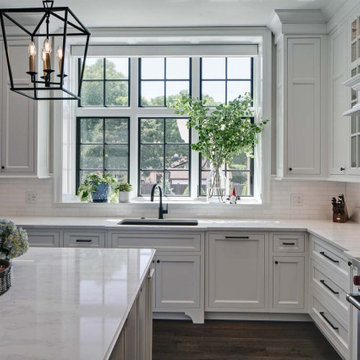 Drury Design
Design Challenges:
-Offer sufficient storage despite a very large window and many appliances
-Include an island without crowding the existing breakfast table
-Create a feeling of warmth in an all-white kitchen
Design Solutions:
-Take wall cabinets up to the 10′ ceiling – this facilitates plenty of storage for everyday items and items that are used less frequently
-Scale the island’s potential back a bit and add furniture details so that it fits into the space beautifully
-Add glass doors to the cabinets surrounding the hood – displaying carefully curated items and keepsakes is a great way to add color to a mostly white space
-Matte black hardware and lighting adds contrast and keeps things fresh
THE RENEWED SPACE
The family loves their new kitchen. As a focal point for meals and activities, it is the hub of their day-to-day lives. The bright, light-filled space is great for cooking, enjoying meals and spending time with family and friends.
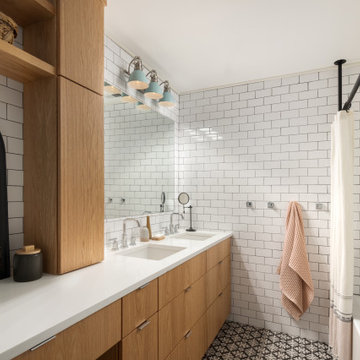
 Amanda Ganginis Architect
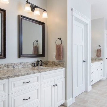
The simple, neutral palette of this Master Bathroom creates a serene atmosphere. The custom vanity allows for additional storage while bringing added warmth to the space. Iron pipes and pipe fittings were used to create the custom shower rod.
Sponsored
Columbus, OH

Hope Restoration & General Contracting
Columbus Design-Build, Kitchen & Bath Remodeling, Historic Renovations
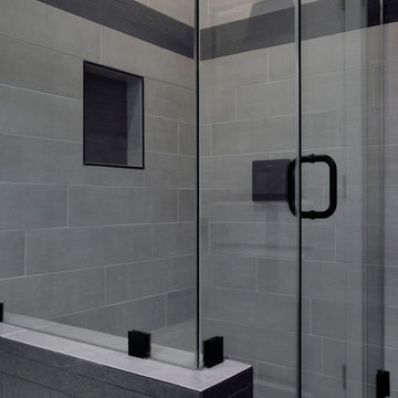
 Metropolis Drafting and Construction Inc
This hallway bathroom is mostly used by the son of the family so you can see the clean lines and monochromatic colors selected for the job.
the once enclosed shower has been opened and enclosed with glass and the new wall mounted vanity is 60" wide but is only 18" deep to allow a bigger passage way to the end of the bathroom where the alcove tub and the toilet is located.
A once useless door to the outside at the end of the bathroom became a huge tall frosted glass window to allow a much needed natural light to penetrate the space but still allow privacy.
 Brendan McHugh, Architect, Manasquan, NJ
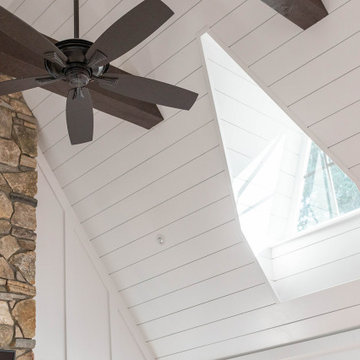
McHugh Architecture designed a unique 3-Seasons Room addition for a family in Brielle, NJ. The home is an old English Style Tudor home. Most old English Style homes tend to have darker elements, where the space can typically feel heavy and may also lack natural light. We wanted to keep the architectural integrity of the Tudor style while giving the space a light and airy feel that invoked a sense of calmness and peacefulness. The space provides 3 seasons of indoor-outdoor entertainment.
 Brendan McHugh, Architect, Manasquan, NJ
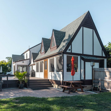
Easy entry to screened-in room from deck. McHugh Architecture designed a unique 3-Seasons Room addition for a family in Brielle, NJ. The home is an old English Style Tudor home. Most old English Style homes tend to have darker elements, where the space can typically feel heavy and may also lack natural light. We wanted to keep the architectural integrity of the Tudor style while giving the space a light and airy feel that invoked a sense of calmness and peacefulness. The space provides 3 seasons of indoor-outdoor entertainment.
170