
Search results for "Techniques mentioned" in Home Design Ideas
 Kansas City Stained Glass
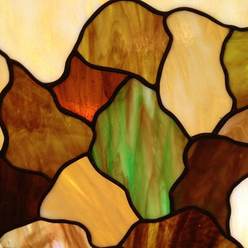
We used similar techniques as the Greene brothers to create these entryway stained glass panels. As you can see in this close up image, through a combination of copper foiling and glass layering, we were able to create a shimmering, iridescent appearance for this design. A combination of earth tones were selected for the colors of the glass. The pattern was made to mock the appearance of the famous stained glass window in the previously mentioned Gamble House. The sort of “mock art” stained glass window serves as a striking focal point for the entryway of this Kansas City home.
Greene & Greene style stained glass is perfect for lovers of nature, art, or both. The vibrant green and copper tones of these windows can bring an incredible amount of warmth and color to your home’s interior. Kansas City Stained Glass can create beautiful Greene & Greene inspired stained glass installations. Our artists are very skilled in the techniques used for creating these types of designs.
If you’re a fan of Greene & Greene architecture and are interesting in getting a stained glass panel for your Kansas City home that is inspired by or looks similar to their work, please contact our office. We’d love to work with you on creating a unique work of art for your home.
 Almesedoors
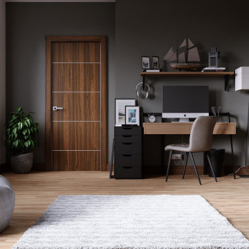
THE DOOR NAME ORIGIN - "ALLUMINIO ELIVIA VERTICAL WOOD GRAIN 4HS"
Of all the interior door models in the Elivia collection, this one is perhaps the most unapologetically elegant. Why? Hmm … That which is self-evident can be the most difficult to explain. Is it because it is built using the latest breakthroughs in interior door making technology? Look at the finish: the process of applying it utilizes something called “stretching” by professionals, which is to say that instead of simply slapping the finish on top of the interior door’s surface, our company fuses (for lack of a better word) the materials (on molecular level, no less), the result being that the finished product is more warp-resistant, scratch-resistant, and fade-proof than any interior door put together in the past. This is especially important in climates known for their high humidity levels. Yes, but this has more to do with engineering than aesthetics, right? Okay, so, is this interior door super-elegant because ... Show more!
FINISH: WALNUT
When it comes to interior door finishes, walnut may not be king per se, since “different folk have different views,” as the poet said, and it behooves a proper collection of finishes to be thoroughly democratic; but, but … you could view walnut as an important majority leader descended from royalty – like, say, Louis Napoleon back when he was still an elected official and not, as he eventually came to style himself, Napoleon III.
Strictly speaking, a walnut is the seed of a drupaceous nut, and not a true nut in the botanical sense. It is native to Persia (walnut oil is a staple in Iranian cuisine to this day) and North America, even though approximately one half of the world’s production today is done in China.
That said, one of its more historically curious uses would be the production of ink and dyes. Those are made, or used to be made, at least, from the husk surrounding the nut. The ink could be used to produce drawings – or darken paper to make it look older. It has (as it turned out by the by) excellent archival properties. It was used liberally by many capable and honest artists in the past.
A keen observer of the human condition, a Florentine named Leonardo da Vinci never left his house (which featured some pretty interesting interior doors, but that’s a story for another day) … never left it without a vial – and a sketch book.
As he took leisurely strolls around the streets and piazzas, he observed folks – socializing, arguing, fighting, striking bargains, and gossiping. Let us mention in passing – and this is merely an opinion, mind you – that his sketches seem to be a great deal livelier than his portraits, which for the most part adhere to the epoch’s somewhat mawkish standards and the algebraic, rather than harmonious, approach to depicting humans. The perpetual beguiling mystery of Mona Lisa’s smile is undoubtedly magnificent, but it is the Tuscan polymath’s quick yet amazingly insightful drawings that give us an idea – oftentimes a very comprehensive one – of what everyday life was truly like in Florence in the Sixteenth Century. An old man gloating at someone’s misfortune, two passionate merchants arguing over the price of some highly important delivery, a young woman lamenting the lack of decent men whom a reasonable person could view as husband material, and on and on – it’s all there in Leonardo’s sketches characterized by masterful lines and elegant shading despite the obvious – and necessary – impetuosity of each sketch. So precious and brilliant are those casual masterpieces that, had the scientifically inclined fellow eliminated the need for outdoor sketching by inventing photography, it would have been an historian’s immeasurable gain, certainly, but also an art lover’s great loss.
The idea behind our Walnut Finish is to invoke in the interior door owner a feeling of timeless historicity. Some things change, but others are forever. Stability is an important quality in an interior door, is it not?
Rembrandt van Rijn, who also used walnut ink extensively, was a studio artist, with only a few outdoor paintings in his legacy. Truth be told, he was a better draftsman than Leonardo, at least as far as technique goes (don’t let this get around). Well. He lived a century later and had the benefit of all the development art had undergone since the great Italian master. Just like these interior doors – your interior doors – are a huge improvement on anything that was available only twenty years ago, never mind a hundred years ago.
The “oscillation” of Rembrandt’s line, the delightful shift from the descriptive to the aesthetic stroke, makes his production in that category quite unique. Upon reaching artistic maturity, the stubborn Dutch master began to shun the unbroken contour line, which caused a lot of trouble for his drawings a century later, when dealers and collectors who wished to “update” his sketches to fit the current fashion had the audacity to “complete” Rembrandt’s pen-and-inks. Fortunately, some of the sketches escaped this sorry fate and have been preserved in their original glorious state to this day. Rembrandt’s mastery is yet another thing this interior door finish might remind you of each time you look at your doors.
 Almesedoors
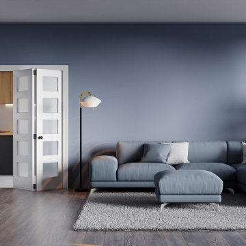
FINISH: PRIMED
The advantages of this approach – of this type of interior door finish – are fairly obvious. Pick a color, any color that suits your projects best. Mix and apply. Re- coat whenever you feel it is necessary to do so. Touch it up. It gives you, the proud owner of these interior doors, complete freedom of choice, and the significant savings, especially where it comes to bulk orders, can be a true source of joy.
As Kurt Vonnegut mentions in one of his novels (Bluebeard, unless I’m mistaken … check it out when you get a chance), the thrill of laying on colors is a large part of the artist’s professional satisfaction. In other words, a keen pleasure.
When back in the remote past visual arts became a field dominated by professionals rather than hobbyists, the main problem of “just laying on paint” became obvious: you can’t.
The medium of choice back then was egg tempera, a permanent, fast-drying substance consisting of colored pigments mixed with a water-soluble binder medium, usually glutinous material such as egg yolk. Portraits and ornaments were executed in this medium, and the wood panel was the surface of choice. One of tempera’s interesting features is that it is not as easily absorbed by wood as other mediums. Some sort of primer was necessary, of course, but pretty much any substance that dried evenly could be used.
The drawbacks of tempera, or pintura al temple, as the Spanish call it, only became obvious with the advent of the Renaissance, when the leading representatives of the trade turned to oil (and interior doors suddenly became a great deal less crude, but that’s a story for another day).
Oil painting is the process of “painting with pigments with a medium of drying oil as the binder.” Commonly used types include linseed (highly preferable in art, though not necessarily in interior doors, mind you), poppy seed, walnut, and safflower.
Today, five hundred years later, it is safe to say that oil is more versatile than pintura al temple – by orders of magnitude. Specifically, the contrasts achieved through the former are much greater, the darks are far deeper, and three- dimensional, highly realistic images are much easier to achieve. Next time you visit a museum, take a closer look at pintura al temple portraits. All of them, without exception, come off as a bit “flat” as opposed to their latter-day counterparts.
Also, where glazing is concerned …
Glazing: a painting technique in which a transparent layer, with just a touch of pigment, is laid over a previously painted surface, allowing light to travel through the glaze and be reflected back off of the opaque layer below. Gentle shadows, subtle changes of color, smooth transitions – all these can be achieved through glazing, which was used by all artists up until the middle of the Nineteenth Century, when artist tubes were invented, revolutionizing the field, and other techniques began to be explored.
Tempera enthusiasts (it takes all kinds to make a world) will assure you that glazing is not just possible in pintura al temple but is actually the basis of the whole enterprise. Well, what are you going to do? They’re enthusiasts.
Anyway, la peinture à l'huile, as the French call it, re-introduced the ancient problem of most surface’s propensity to absorb dipingere, as the Italians call the stuff. Wood or canvas, it is all the same: you’re not going to get very far without a good primer.
Experiments were conducted, and soon rabbit skin glue emerged as the least expensive and most effective solution. It was easy to apply. It dried evenly. It made the application of the l’huile stuff on top of it a walk in the park.
There were drawbacks. Today, rabbit skin glue is considered to be a major cause of cracking by most modern conservators. (Remember, when you visited the Metropolitan Museum of Art – and did you see those interior doors? … some of them are quite something … - most “old masters” pictures are completely covered with a cobweb of cracks? There you go). Because the glue is hygroscopic, it continually absorbs moisture from the atmosphere, causing the glue to swell and shrink as ambient humidity levels change. Over many humidity cycles, this repeated flexing causes the brittle oily layers to crack.
To combat this problem, modern primers are made of acrylic materials which are guaranteed not to cause any damage to the dipingere. No bubbling, no cracks. Your interior doors are safe.
Find the right local pro for your project
 User
UserDesigner homes in big cities seek the best in home renovation in San Diego, as performed by experts like UpUp Remodeling that specializes in custom upgrades & improvements. It can be in the area of kitchen & bath remodels, ADU design & construction, room addition or backyard services, to mention a few.
General Contractors for Home Remodeling in San Diego, CA - https://www.upupremodeling.com/
 Performance Kitchens & Home
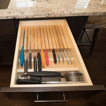
The cost of kitchen cabinets is a major consideration when designing a new kitchen. There are so many things that need to be evaluated including the materials, the color and finish. What most kitchen designers don't mention are all of the issues relating to the fit and use of your new cabinets. At Performance Kitchens & Home, our roots come from fine craftspeople like George Nakashima and George Brauntrager, who pioneered many of the techniques that we integrate into our kitchen cabinets.
We believe that every kitchen deserves cabinets that are beautiful, well-built, functional and that are designed to stand up to the test of time. We hope that some of these finely crafted kitchen cabinets will spark some ideas for you!
 Performance Kitchens & Home
The cost of kitchen cabinets is a major consideration when designing a new kitchen. There are so many things that need to be evaluated including the materials, the color and finish. What most kitchen designers don't mention are all of the issues relating to the fit and use of your new cabinets. At Performance Kitchens & Home, our roots come from fine craftspeople like George Nakashima and George Brauntrager, who pioneered many of the techniques that we integrate into our kitchen cabinets.
We believe that every kitchen deserves cabinets that are beautiful, well-built, functional and that are designed to stand up to the test of time. We hope that some of these finely crafted kitchen cabinets will spark some ideas for you!
 safe ZOnea
Ask a kitchen designer in Chicago which countertop question comes up most and you will hear the same answer: white or off-white quartz, and which shade. Homeowners walk into showrooms with a photo saved on their phone, usually a bright, veined slab from a magazine spread, and leave an hour later realizing there are a dozen versions of that same look. The confusion is not about taste. It is about the fact that "white quartz" covers a huge range of patterns, undertones, and price points, and nobody explains the differences before the sale.
Older bungalows and newer builds alike are getting stripped of their dated laminate and butcher block in favor of quartz, and the reasons are practical rather than trendy. Quartz does not need sealing, resists the kind of staining that granite can suffer over decades, and holds up to the freeze-thaw humidity swings that Chicago basements and kitchens go through every year. Once a homeowner commits to quartz, though, the real decision starts: which white, and does the pattern justify the difference in cost.
This piece walks through three specific slabs that keep showing up in Chicago renovation projects, why designers reach for them in different rooms, and what actually separates a flat white surface from one with real depth. None of this requires a design background to follow. It is mostly about paying attention to how a slab behaves under kitchen lighting, how busy the vending gets, and how it photographs versus how it looks in person.
Why White Quartz Took Over Chicago Kitchens
Ten years ago, granite dominated Chicago kitchen remodels almost by default. It was durable, it looked expensive, and every fabricator in the metro area carried a wide range of colors. Quartz has since taken over that position, and the shift happened faster than most contractors expected. Engineered stone gave homeowners a more predictable surface, since natural granite varies slab to slab while quartz is manufactured to a consistent pattern batch after batch.
The other driver is light. Chicago winters are long and gray, and a lot of kitchens, especially in older two-flats and courtyard buildings, do not get much direct sun. A dark granite countertop in a dim kitchen can make the whole room feel smaller. White and light-toned quartz reflects what little natural light comes through the windows, and it makes a galley kitchen or a north-facing space feel noticeably brighter without touching the cabinetry or the layout.
There is also a resale argument that local real estate agents bring up constantly. White quartz photographs well for listings, reads as updated and low-maintenance to buyers touring in person, and does not compete visually with whatever cabinet color the next owner might prefer. It is a safer bet than a bold veined marble look or a colored quartz that might feel dated in five years.
Arctic White and the Cost Question
Among the flatter, more uniform whites, arctic white quartz price comes up constantly in budget conversations because the slab sits at a more approachable point than the heavily veined Italian-marble-inspired patterns. It reads as clean and bright without the busy movement that some homeowners find overwhelming in a small kitchen. Fabricators in the Chicago area tend to keep it in stock precisely because demand stays steady across both new construction and remodel projects.
Part of what keeps this slab affordable relative to its heavily patterned cousins comes down to manufacturing complexity. A quartz surface with minimal veining and a consistent white base is simpler to produce at scale than one that mimics the irregular, high-contrast movement of natural Calacatta marble. That production difference shows up directly in what a homeowner pays per square foot, and it is worth asking a fabricator to walk through that pricing before assuming every white quartz costs the same.
Homeowners planning a full kitchen, including an island, backsplash, and perimeter counters, often use a flatter white like this specifically because it lets other elements carry the visual interest. A patterned tile backsplash or a bold cabinet color reads more clearly against a calm countertop than against one already fighting for attention with heavy veining. Designers frequently pair simpler whites with statement lighting fixtures for exactly this reason.
What Makes Calacatta Patterns Different
Calacatta refers to a family of marble originally quarried in Italy, known for a bright white background broken up by bold, often gold-toned veining that moves in thick, dramatic streaks rather than thin gray lines. Natural Calacatta marble is soft, porous, and expensive to maintain, which is exactly why quartz manufacturers spent years developing engineered versions that replicate the look without the upkeep headaches.
The challenge with any Calacatta-style quartz is getting the veining to look organic instead of printed. Early generations of engineered stone struggled with repetitive patterns that gave away the fact the slab was manufactured rather than cut from actual marble. Modern digital printing and layering techniques have closed that gap considerably, and the better Calacatta-inspired quartz lines now vary the veining across each slab batch so two counters in the same kitchen do not look identical.
Chicago designers gravitate toward Calacatta patterns for kitchens that function as the visual centerpiece of an open floor plan, which describes a large share of the gut renovations happening in neighborhoods like Lincoln Park, Roscoe Village, and the North Shore suburbs. When the kitchen island is visible from the living room and dining area, a dramatic veined surface becomes part of the home's overall design language rather than a purely functional work surface.
Calacatta Arno Under Kitchen Lighting
One of the more popular options in this category, calacatta arno quartz, balances a warm white base with soft gray and gold veining that avoids looking too stark under the cooler LED lighting common in newer Chicago builds. Homeowners touring showrooms sometimes make the mistake of judging a slab entirely under warm incandescent lighting, then get surprised when the same surface looks slightly different once installed under their kitchen's actual fixtures.
What separates this particular pattern from flatter competitors is how the veining clusters rather than spreading evenly across the slab. That clustering mimics the way real quarried marble forms, with denser mineral deposits in some sections and cleaner stretches in others. Fabricators cutting a large island slab from a single piece will often orient the pattern intentionally so the busiest veining lands somewhere visually interesting rather than getting cut off at an edge.
Because the background reads warmer than a stark white, this pattern tends to pair well with brass or matte gold hardware, a combination that has been showing up repeatedly in Chicago kitchen remodels over the past few renovation seasons. Cabinet painters report a similar trend, with more clients requesting warm white or greige cabinet colors specifically because they complement this kind of veined quartz better than a cooler, blue-toned white would.
Silestone's Version of the Calacatta Look
Manufacturers compete directly in this Calacatta-inspired category, and silestone eternal calacatta gold represents one brand's specific take on the pattern, distinguished by richer gold veining set against a brighter white base than some competing slabs in the same family. Silestone has built a reputation around anti-bacterial surface treatments in addition to the standard quartz durability, a detail some homeowners specifically ask about for kitchens used heavily by families with young children.
The veining in this particular slab tends to run in longer, more continuous lines compared to the clustered pattern found in some other Calacatta-style options, which gives large island surfaces a sense of visual flow from one end to the other. Fabricators working with bigger islands, the kind increasingly common in open-concept Chicago remodels, often favor patterns like this because there is less need to worry about seams interrupting a busy, disconnected pattern.
Price positioning for this slab tends to sit toward the upper end of the engineered quartz category, reflecting both the brand's manufacturing process and the complexity of replicating that continuous gold veining consistently across production batches. Homeowners weighing this option against other Calacatta-style quartz should ask their fabricator directly about batch availability, since premium patterns sometimes have longer lead times than standard stock colors.
Living With Quartz Day to Day
Beyond how a slab looks in a showroom or a listing photo, the daily experience of owning quartz countertops matters more once the renovation dust settles. Quartz resists scratching far better than laminate and holds up to the acidic spills, hot pans, and general abuse of an active kitchen without the sealing maintenance that natural stone requires every year or two. That low-maintenance reputation is a large part of why quartz overtook granite in the first place.
Heat resistance is a detail that gets less attention than it should. While quartz handles moderate heat well, manufacturers generally recommend using a trivet or pad for very hot pots straight off the stove, since sudden temperature shock can occasionally cause stress marks in the resin binder that holds the engineered stone together. This is a minor precaution rather than a major limitation, but it is worth mentioning to anyone assuming quartz is entirely indestructible.
Cleaning routines stay simple across almost every pattern in this category. A damp cloth and mild soap handle daily messes, and the nonporous surface means wine, coffee, and tomato-based sauces do not soak in the way they can with unsealed granite or marble. Homeowners moving from an older stone counter often mention how much less they worry about everyday spills once quartz is installed, which is a quality-of-life change that rarely makes it into the initial design conversation.
Choosing Between the Three
There is no single correct answer among these three slabs, and that is exactly why they keep coming up together in the same design conversations across Chicago renovation projects. A flatter white with minimal veining suits kitchens where other elements need to carry the visual interest, while a bolder Calacatta-inspired pattern makes sense when the countertop itself is meant to be the centerpiece of an open floor plan.
Budget matters too, and it is worth having a direct conversation with a fabricator about where each option lands before falling in love with a specific slab in a showroom. Lighting, cabinet color, and how the kitchen connects to the rest of the home all play into which pattern will actually look right once installation is finished rather than just in a photo.
Whatever direction a homeowner leans, seeing a full slab in person under actual kitchen lighting remains the single most useful step before signing off. Photos only go so far once the countertop is sitting in the room it will live in for years.
Sponsored
Columbus, OH

Trish Takacs Design
Award Winning & Highly Skilled Kitchen & Bath Designer in Columbus
 Tile Doctor Ltd
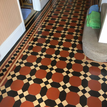
This Victorian floor in Twickenham, Middlesex was in good physical condition for its age but needed a good deep clean. Our customer had informed us that they had never cleaned or sealed the floor in the sixteen years that they had lived there so it was well overdue.
I went over to survey the floor and completed a test clean on a small section of tiling to see which products/techniques would work best. I like to do this as it demonstrates to the client what can be done, and it allows me to come up with an accurate price for doing the work.
As you can see from the pictures, there was quite a difference in the test patch compared to the rest of the floor. Years of foot traffic from the street had taken its’ toll and the floor was very dirty. Luckily, the floor was in very good condition and had not worn too badly.
Once they had seen the test patch, they were confident that it would be worth go ahead with my quote. It would ensure that the period feature was retained for many years to come. The colours on the floor were quite faded so it would be nice to get it restored.
I started the cleaning process by first taping up the surrounding skirting boards and doors to ensure they were protected from potential splashing. Cleaning involved spraying the Victorian tiles with a strong dilution of Tile Doctor Pro-Clean which is a dedicated Tile and Grout cleaning product. This was left to soak in for about ten minutes and then scrubbed in using a black pad fitted to a heavy-duty rotary scrubber.
This gives the floor a good mechanical scrub and works wonders releasing the ground-in dirt and soil from the tiles. The strong dilution of Pro-Clean will also remove any remaining sealers from the tile, however after sixteen years I doubted there would much trace of sealer left. Once done the floor was rinsed with water and all the soils removed with a wet vacuum.
Following the initial clean the colours were already much stronger. Next step however was to improve on that by giving the floor an acid rinse using Tile Doctor Grout Clean-Up. This removes mineral deposits and generally brightens up the appearance of the tile. After another round of scrubbing the floor was rinsed with our high-pressure washer and then vacuumed, extracting all of the dirty water and dirt away in one go. The floor was looking a lot better and was left to dry overnight.
After allowing the floor to dry overnight, we returned the next day to seal the floor. First, checking the floor was dry using the damp meter. Floors of this age can take a little longer to dry as there is no damp-proof membrane so it’s always worth checking as applying a sealer to damp tiles is not a good idea.
Once I was satisfied it was dry eight coats of Tile Doctor Seal and Go sheen finish sealer were applied. This takes a while to do as each coat needs to dry before applying the next. The sealer will protect the Victorian tiles for dirt and stains, it also enhanced the colours in the tile and will make it easier to keep the floor clean going forward.
My client was very pleased with the floor and mentioned that they should have called me in sooner! For aftercare cleaning I recommended Tile Doctor Neutral Clean which is an effective cleaner with a neutral pH, its designed for cleaning tiles without degrading the sealer.
Jonathan Oldham
South Middlesex Tile Doctor
 Tile Doctor Ltd
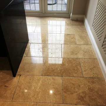
This Tumbled Travertine tiled floor at a beautiful house in Horley had been poorly maintained through the years using the wrong type of sealer which quickly wore down allowing dirt to become ingrained in the stone. The owner had become concerned about the state of the tiles and decided it was time to call in an expert that could restore the tiles to a condition that complimented the environment in which it was situated.
Travertine is known for being very distinctive in character and very durable, making it a very popular choice for tiled flooring in properties worldwide. However, the stone does require regular professional maintenance and polishing to keep it looking it top shape and home owners rarely realise this when they decide to have it installed. Fortunately, in the UK at least you can rely on your local tile doctor to maintain it for you.
The first part of the job involved giving the floor a thorough clean to remove what was left of old sealers and any polishing compounds that remained on the floor. Before beginning that however I brought in all my equipment and products into the house and then prepped the area by taping up the woodwork to protect it during the renovation process.
To remove what was left of the old sealers and other coatings still present on the floor a strong solution of Tile Doctor Remove and Go was applied to the floor and left to soak in for about ten minutes before being actively worked in with a rotary machine fitted with a black scrubbing pad. The solution turned black with the soil as it was lifted out of the pores of the stone and it was then rinsed off with water and extracted with a wet vacuum.
Following this, we moved on to a process we know as burnishing that hones the stone and brings up the polished appearance. Working in sections due to the size of the floor It involves the application of a series of diamond encrusted burnishing pads from coarse through to very fine.
The coarse 400-grit pad fitted to the rotary floor buffer and run over the floor using only water for lubrication. The water turns into a slurry as the pad does its job removing dirt and this has to be rinsed off the floor and extracted with the wet vacuum before applying the next pad. The process was then repeated with medium 800 grit pad for an initial polish followed by the Fine 1500 grit pad for the second polish using water for lubrication and rinsing and extracting in between each pad.
The last pad is a very fine 3000 grit pad for the final polish and is applied with only a little water sprayed onto the floor using a technique we call a Spray Burnish. This last pad really brings up the polished appearance of the stone.
To bring up the appearance of the stone even further and add a really durable polish Tile Doctor Shine Powder was applied. This is a crystallising powder sealer that ensures a very high shine and a tough, durable finish. This powder is applied directly to the tiles in combination with approximately ½ a litre of water and a soft white buffing pad.
Last step was to add to the protection provided by the Shine Powder with two coats of Tile Doctor Ultra-Seal which is a natural look sealer that doesn’t change the look of the stone and is applied to the stone and grout. This sealer works by seeping into the stone, occupying the pores and preventing dirt from becoming ingrained.
The customer was ecstatic with the results, being particularly pleased that she got the floor looking the way she originally wanted without significant expense, not to mention stress.
Michael Conlon
East Surrey Tile Doctor
 Tile Doctor Ltd
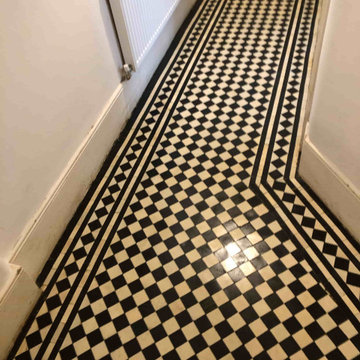
This property was in theLadbroke Grove area of West London near Kensington. The client had found an old and probably original black and white checkered pattern Victorian tiled floor under their cork tiled flooring. They also reported that it was badly damaged so I thought it would be best if I paid them a visit first to see how extensive the damage was and whether it was repairable. The floor was in a quite a state, the tiles were covered in glue from the cork and had several areas had been back filled with cement.
I reassured them that the damage could be rectified, and that it would be possible to completely restore the floor back to a good standard. I would have to remove the glue, remove the cement that had been used to level the floor and replace with reclaimed tiles to match. They were relieved to find out it could be done and happy with my quote I was instructed to go ahead with the work.
We started by taping up the skirting boards to protect the woodwork. With this done attention was turned to the glue which was softened using a strong dilution of Tile Doctor Remove and Go so it could be carefully scraped off. Multiple techniques and tools were needed to remove the glue including hand-held scrappers and a black pad fitted to a buffing machine. For the stubborn areas steam was applied to help lift the adhesive out the tile.
Once all the glue was removed the floor was rinsed and the alkaline cleaner neutralised with Tile Doctor Grout Clean Up which further cleaned the tiles and removed old traces of grout from the floor. Old floors like this generally don’t have a damp proof membrane underneath so the acids in the Grout Clean-up also counter any efflorescent salts trapped in the tile.
Once this was completed the slurry was removed with a wet vacuum and left to fully dry out overnight.
The following day focus turned to repairing the areas of the floor where the tiles were missing or broken. The main issue being the cemented areas, we see this a lot with Victorian Hallways and generally what happens is a heating engineer digs out the floor to install pipework. Not being tilers, your average plumber then repairs the floor with a self-levelling cement that brings the level up to the surface of the tile so it can be covered with lino, carpet of in this case cork.
The sub floor was then rebuilt with rapid setting self-levelling compound but this time to below the level of the tile.
Once the new base was dry it was a just a question of re-tiling with the replacement tiles to match the original checkered pattern. The replacement reproduction tiles were sourced from Original Features in Crouch End North London. After grouting we left the floor to dry out over the weekend.
When we returned to seal the floor our first step was to check the floor was dry using a moisture meter. This is critical as the sealant will not cure correctly if there is too much moisture in the floor. In this case the extra two days we had allowed had done its job and the test had confirmed it was ready to accept a sealer.
The client wanted the floor finish not to be too shiny once sealed so we opted to seal with two coats of Tile Doctor Seal and Go Extra. This is good choice for old Victorian floors such as this example as it’s special acrylic-based formula allows for moisture vapour transmission which as mentioned previously is a concern where no damp proof membrane has been installed.
I’m please to confirm my clients were delighted with the result, as you can see from the pictures the black and white floor restoration makes for a dramatic entrance well in keeping with the style of the property. For aftercare I recommended the use of Tile Doctor Neutral Tile Cleaner which will keep the tiles in good condition going forward without damaging the new sealer.
Jackson Davis
Central London Tile Doctor

 Mindy Khan
Let's face it: times are changing. We're living in an era where technology advances at a fast pace and its developments have a significant impact on the surroundings. The need for environmental solutions has become more urgent with each passing day.
While we live and adapt to our immediate environment, it doesn't mean that we have to settle with what's present, especially when our surrounding conditions are becoming detrimental to our wellbeing. This is the reason Singapore architects are looking into eco-friendly approaches when designing residential spaces.
Singapore architects are becoming more proactive in integrating eco-friendly principles in their residential projects. Below are some of the standout reasons why:
1. You get to practice energy efficiency.
In typical homes, electricity is powered by non-renewable sources. The continuous use of non-renewable energy increases carbon footprint and worsens air pollution, both of which negatively affect the environment.
However, there are alternative sources of energy that can be included in your home's architectural design. These include solar panels and wind turbines that produce electricity that can keep the house powered. These methods do not produce toxic compounds or carbon emissions; they are also renewable and do not incur recurring expenses.
2. Eco-friendly architecture brings you closer to a more "natural environment."
The emergence of urban landscapes has deprived today's generation of the opportunity to be one with nature. Individuals these days have to travel to the countryside to enjoy nature's beauty and all the amazing benefits it has to offer.
Fortunately, eco-friendly architecture provides a route where you can better appreciate many of the benefits nature offers. As a homeowner, you must enjoy a calm, clean, and fresh indoor environment.
Eco-friendly approaches to homes aim to provide this kind of atmosphere through the use of local materials, renewable energy sources, and incorporating nature's elements (such as sunlight and air ventilation) on the structural design.
3. You save money for maintenance and upkeep.
Eco-friendly architecture is known for its low maintenance costs. At first glance, you may find it expensive to build a "green home." However, since it makes use of renewable energy sources and local resources for upkeep, operational costs become much cheaper compared to living in a conventional home.
Also, green homes promote material efficiency. Apart from using local resources, eco-friendly construction involves building processes that generate as little waste as possible.
Recycled and reusable materials are preferred in building the home, while the architectural design follows construction techniques that use less energy, water, and raw materials.
4. You enjoy better health.
Living in a green home offers a lot of health benefits. For instance, eco-friendly architecture supports the use of natural materials and it discourages having plastic by-products in the building process.
At the same time, eco-friendly architectural designs look into utilising vertical space to boost freedom of movement and air circulation. These spatial strategies allow you to breathe better even while indoors and move around the house without feeling cramped.
Lastly, utilising vertical space offers more natural light to enter the home. Natural light is essential not just because it illuminates the house during the day, it also regulates the circadian rhythm, which dictates our body's waking and sleeping hours.
In a nutshell
Eco-friendly homes can help you save money and time, not to mention improve your health dramatically. Moreover, it can also help reduce your environmental footprint significantly. From improving air quality to helping regulate the effects of climate change, eco-friendly homes allow you to live a more sustainable lifestyle.
 Performance Kitchens & Home
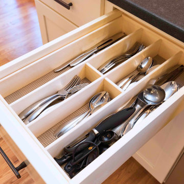
The cost of kitchen cabinets is a major consideration when designing a new kitchen. There are so many things that need to be evaluated including the materials, the color and finish. What most kitchen designers don't mention are all of the issues relating to the fit and use of your new cabinets. At Performance Kitchens & Home, our roots come from fine craftspeople like George Nakashima and George Brauntrager, who pioneered many of the techniques that we integrate into our kitchen cabinets.
We believe that every kitchen deserves cabinets that are beautiful, well-built, functional and that are designed to stand up to the test of time. We hope that some of these finely crafted kitchen cabinets will spark some ideas for you!
 Mari Kushino Design
Leanna Rathkelly
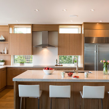
Cabinets: Rift Cut White Oak - Crystal Stain by Thetis Cove Joinery, Victoria, BC
Countertop: Caesarstone "Bianco Drift" by StoneAge Marble and Granite
Backsplash: Neolith by Thesize Gama Colorfeel - Nieve
Paint: Benjamin Moore - Strand of Pearls- CSP - 395
 Performance Kitchens & Home
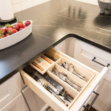
The cost of kitchen cabinets is a major consideration when designing a new kitchen. There are so many things that need to be evaluated including the materials, the color and finish. What most kitchen designers don't mention are all of the issues relating to the fit and use of your new cabinets. At Performance Kitchens & Home, our roots come from fine craftspeople like George Nakashima and George Brauntrager, who pioneered many of the techniques that we integrate into our kitchen cabinets.
We believe that every kitchen deserves cabinets that are beautiful, well-built, functional and that are designed to stand up to the test of time. We hope that some of these finely crafted kitchen cabinets will spark some ideas for you!
2