
Search results for "Templates" in Home Design Ideas
 Rocky Tops Granite & Marble LLC
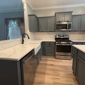
This kitchen with full height backsplash in Gaston came together in Calacatta Lilly, an engineered quartz from AG Stones that gives you that bright white background with soft gray and gold veining moving through it.
We used the same stone into the bathroom vanities too, so the whole house reads consistent without repeating the same room twice. Quartz like this is manufactured under controlled conditions, so the veining pattern is engineered to look natural while staying more predictable slab to slab than a lot of natural stone.
That consistency matters most in a kitchen, where the counters are doing the real work every day. Calacatta Lilly holds up to knives, hot pans, and the general chaos of cooking without needing much babying. It's non-porous, so there's no sealing schedule to keep track of, no worrying about a glass of wine sitting too long or lemon juice etching a ring into the surface. You wipe it down and move on with your life.
Getting the look right across a kitchen this size takes some care at the template stage. We're matching veining direction across the island, the perimeter, and working out where the seams fall so they land somewhere quiet, not right in your line of sight. With a manufactured stone like this, the pattern repeats in a way that actually helps us keep that continuity, but it still takes a careful eye to lay it out so the kitchen looks like one continuous piece rather than a handful of slabs pieced together.
In the bathroom, that same white and gray palette does something different. Vanities don't take the abuse a kitchen counter does, so the quartz there is more about keeping a clean, bright look day after day with almost zero maintenance. We finished both spaces with an eased edge, simple and clean, letting the stone itself carry the room instead of the edge detail.
Gaston sits right in that stretch of the Midlands where we do a lot of our work, and it's always good to get out there and put a stone like this into a house. Calacatta Lilly gives this kitchen and bath a bright, cohesive look that's going to hold up fine to daily life for a long time to come.
 Rocky Tops Granite & Marble LLC
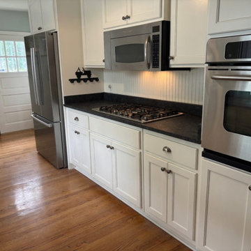
This kitchen in Forest Acres came together around a solid granite countertop, and it's the kind of stone that does the quiet work of holding a whole room together. Granite's been the go-to for kitchen counters for decades because it earns it. It's igneous rock, formed under heat and pressure, and that history is why it laughs off the stuff a real kitchen throws at it. Hot pans, knife work, everyday spills, granite takes it and keeps looking good.
We went with an eased edge on this one, which is the clean, simple line that a lot of Midlands homeowners want. It's not flashy, but that's the point. An eased edge softens the sharp corner just enough to be comfortable to lean against and easy to wipe down, and it lets the granite itself, the movement, the flecks, the depth in the stone, do the talking instead of a fussy edge profile competing for attention.
Getting a countertop like this right starts before the stone ever gets cut. We template the kitchen precisely, accounting for the cabinets, the appliances, and any out-of-square walls that always show up in real houses. Then it's cut, the edges are worked by hand to get that eased profile even and consistent around every corner, and the seams, if there are any, get lined up so the pattern reads as close to continuous as we can get it. Granite doesn't forgive sloppy fabrication. Every joint and cutout has to be tight because the stone's not going anywhere once it's set.
Day to day, this is a countertop that's built for actual cooking and actual life, not just for photos. Granite resists scratching, it handles heat better than almost anything else you'd put in a kitchen, and with a good sealer it shrugs off staining from wine, oil, or lemon juice. It's low maintenance once it's in, just a wipe down and, depending on the specific granite, a reseal every year or two to keep it performing at its best.
Forest Acres has a good mix of older homes getting updated and newer builds going in, and granite fits both. It's a material that's stood the test of time in kitchens across the Midlands, and this one's a solid, honest example of why. Clean lines, real stone, and a countertop that's going to outlast most everything else in that kitchen.
 Rocky Tops Granite & Marble LLC
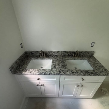
This kitchen in Bamberg came together in Dallas White granite, a stone that reads clean and bright without going stark. The background carries soft grays with subtle movement through it, enough character to keep the eye interested but calm enough to work with just about any cabinet color a builder picks for a spec house like this one. That's part of why it gets used so often in kitchens meant to show well and live well at the same time.
Granite's still one of the best choices you can make for a kitchen countertop, and Dallas White in particular holds up the way granite's supposed to. It's dense, it resists heat, and you can set a hot pan on it without worrying about scorching. Scratches aren't a concern with normal use, and the surface takes a polish that lasts for years. We seal it going in and that's about all the maintenance it ever needs.
Getting a granite slab like this into a kitchen right takes more than just cutting to size. We template the space first to make sure the seams land where they won't draw attention, usually tucked near the sink or stove, and any countertop longer than about 8 to 9 feet is going to need one. Matching the pattern across a seam so it reads as one continuous piece is where the work actually happens. The edge here is eased, a clean, simple line that lets the stone itself do the talking instead of competing with it.
Day to day, this is the kind of countertop that just works. Wipe it down, don't worry about it, and it'll look the same ten years from now as it does today. That durability is exactly what a spec house kitchen needs, something that shows well to a buyer walking through and keeps performing long after they've moved in.
We do a lot of work through the Midlands, and Bamberg jobs like this one are a good example of what granite still does better than almost anything else on the market. It's a straightforward material that never stops earning its keep in a kitchen, and this one turned out exactly the way it should.
Find the right local pro for your project
 Milgard Windows & Doors
The Kiguchi family moved into their Austin, Texas home in 1994. Built in the 1980’s as part of a neighborhood development, they happily raised their family here but longed for something more contemporary. Once they became empty nesters, they decided it was time for a major remodel. After spending many years visiting Austin AIA Home Tours that highlight contemporary residential architecture, they had a lot of ideas and in 2013 were ready to interview architects and get their renovation underway.
The project turned into a major remodel due to an unstable foundation. Architects Ben Arbib and Ed Hughey, of Arbib Hughey Design were hired to solve the structural issue and look for inspiration in the bones of the house, which sat on top of a hillside and was surrounded by great views.
Unfortunately, with the old floor plan, the beautiful views were hidden by small windows that were poorly placed. In order to bring more natural light into the house the window sizes and configurations had to be addressed, all while keeping in mind the homeowners desire for a modern look and feel.
To achieve a more contemporary and sophisticated front of house, a new entry was designed that included removing a two-story bay window and porch. The entrance of the home also became more integrated with the landscape creating a template for new foliage to be planted. Older exterior materials were updated to incorporate a more muted palette of colors with a metal roof, dark grey siding in the back and white stucco in the front. Deep eaves were added over many of the new large windows for clean lines and sun protection.
“Inside it was about opening up the floor plan, expanding the views throughout the house, and updating the material palette to get a modern look that was also warm and inviting,” said Ben from Arbib Hughey Design. “Prior to the remodel, the house had the typical separation of rooms. We removed the walls between them and changed all of the windows to Milgard Thermally Improved Aluminum to connect the inside with the outside. No matter where you are you get nice views and natural light.”
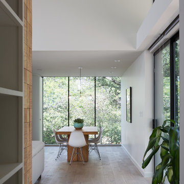
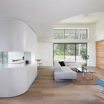
The architects wanted to create some drama, which they accomplished with the window placement and opening up the interior floor plan to an open concept approach. Cabinetry was used to help delineate intimate spaces. To add warmth to an all-white living room, white-washed oak wood floors were installed and pine planks were used around the fireplace. The large windows served as artwork bringing the color of nature into the space.
An octagon shaped, elevated dining room, (named “the turret”), had a big impact on the design of the house. They architects rounded the corners and added larger window openings overlooking a new sunken garden. The great room was also softened by rounding out the corners and that circular theme continued throughout the house, being picked up in skylight wells and kitchen cabinetry. A staircase leading to a catwalk was added and the result was a two-story window wall that flooded the home with natural light.
When asked why Milgard® Thermally Improved Aluminum windows were selected, the architectural team listed many reasons:
1) Aesthetics: “We liked the slim profiles and narrow sightlines. The window frames never get in the way of the view and that was important to us. They also have a very contemporary look that went well with our design.”
2) Options: “We liked that we could get large sliding doors that matched the windows, giving us a very cohesive look and feel throughout the project.”
3) Cost Effective: “Milgard windows are affordable. You get a good product at a good price.”
4) Custom Sizes: “Milgard windows are customizable, which allowed us to get the right window for each location.”
Ready to take on your own traditional to modern home remodeling project? Arbib Hughey Design advises, “Work with a good architect. That means picking a team that is creative, communicative, listens well and is responsive. We think it’s important for an architect to listen to their clients and give them something they want, not something the architect thinks they should have. At the same time you want an architect who is willing and able to think outside the box and offer up design options that you may not have considered. Design is about a lot of back and forth, trying out ideas, getting feedback and trying again.”
The home was completely transformed into a unique, contemporary house perfectly integrated with its site. Internally the home has a natural flow for the occupants and externally it is integrated with the surroundings taking advantage of great natural light. As a side note, it was highly praised as part of the Austin AIA homes tour.
 Milgard Windows & Doors
The Kiguchi family moved into their Austin, Texas home in 1994. Built in the 1980’s as part of a neighborhood development, they happily raised their family here but longed for something more contemporary. Once they became empty nesters, they decided it was time for a major remodel. After spending many years visiting Austin AIA Home Tours that highlight contemporary residential architecture, they had a lot of ideas and in 2013 were ready to interview architects and get their renovation underway.
The project turned into a major remodel due to an unstable foundation. Architects Ben Arbib and Ed Hughey, of Arbib Hughey Design were hired to solve the structural issue and look for inspiration in the bones of the house, which sat on top of a hillside and was surrounded by great views.
Unfortunately, with the old floor plan, the beautiful views were hidden by small windows that were poorly placed. In order to bring more natural light into the house the window sizes and configurations had to be addressed, all while keeping in mind the homeowners desire for a modern look and feel.
To achieve a more contemporary and sophisticated front of house, a new entry was designed that included removing a two-story bay window and porch. The entrance of the home also became more integrated with the landscape creating a template for new foliage to be planted. Older exterior materials were updated to incorporate a more muted palette of colors with a metal roof, dark grey siding in the back and white stucco in the front. Deep eaves were added over many of the new large windows for clean lines and sun protection.
“Inside it was about opening up the floor plan, expanding the views throughout the house, and updating the material palette to get a modern look that was also warm and inviting,” said Ben from Arbib Hughey Design. “Prior to the remodel, the house had the typical separation of rooms. We removed the walls between them and changed all of the windows to Milgard Thermally Improved Aluminum to connect the inside with the outside. No matter where you are you get nice views and natural light.”
The architects wanted to create some drama, which they accomplished with the window placement and opening up the interior floor plan to an open concept approach. Cabinetry was used to help delineate intimate spaces. To add warmth to an all-white living room, white-washed oak wood floors were installed and pine planks were used around the fireplace. The large windows served as artwork bringing the color of nature into the space.
An octagon shaped, elevated dining room, (named “the turret”), had a big impact on the design of the house. They architects rounded the corners and added larger window openings overlooking a new sunken garden. The great room was also softened by rounding out the corners and that circular theme continued throughout the house, being picked up in skylight wells and kitchen cabinetry. A staircase leading to a catwalk was added and the result was a two-story window wall that flooded the home with natural light.
When asked why Milgard® Thermally Improved Aluminum windows were selected, the architectural team listed many reasons:
1) Aesthetics: “We liked the slim profiles and narrow sightlines. The window frames never get in the way of the view and that was important to us. They also have a very contemporary look that went well with our design.”
2) Options: “We liked that we could get large sliding doors that matched the windows, giving us a very cohesive look and feel throughout the project.”
3) Cost Effective: “Milgard windows are affordable. You get a good product at a good price.”
4) Custom Sizes: “Milgard windows are customizable, which allowed us to get the right window for each location.”
Ready to take on your own traditional to modern home remodeling project? Arbib Hughey Design advises, “Work with a good architect. That means picking a team that is creative, communicative, listens well and is responsive. We think it’s important for an architect to listen to their clients and give them something they want, not something the architect thinks they should have. At the same time you want an architect who is willing and able to think outside the box and offer up design options that you may not have considered. Design is about a lot of back and forth, trying out ideas, getting feedback and trying again.”
The home was completely transformed into a unique, contemporary house perfectly integrated with its site. Internally the home has a natural flow for the occupants and externally it is integrated with the surroundings taking advantage of great natural light. As a side note, it was highly praised as part of the Austin AIA homes tour.
 Stylish
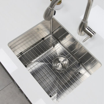
This 23” x 18” single bowl undermount stainless steel kitchen sink is perfect for your kitchen. The sink will give your space a luxurious look thanks to its modern style and rectangular shape. Handmade of surgical grade SUS 304 16G stainless steel, this sleek and luxurious kitchen sink with a brushed satin finish will look amazing in your kitchen! Even after years of constant use, the patina finish of the kitchen sink will never oxidize. The X-pattern drain grooves in this undermount kitchen sink’s basin allow for optimal drainage. the undermount sink will drain and dry quickly and effortlessly. Also, the 10mm radius sink corners are smooth and easy to clean, so that your sink will always be shiny and free of bacteria and unpleasant smells. The stainless steel undermount kitchen sink will not only give your space a luxurious look, it will make your life easier. Keep your cabinets intact. Water condensation in kitchen sinks often causes your cabinets to get ruined. This won’t be a problem if you install the STYLISH undermount sink in your kitchen. The stone guard coating of our stainless steel sinks prevents condensations and keeps your sink quiet. With the sink is included a luxury basket drain strainer, which is deeper than regular strainers and will help trap food and debris easier. Also included with the sink is a cutting template, mounting brackets and a perfect fit stainless steel bottom grid to protect your sink from dents and scratches. Our kitchen sinks are Canadian designed and meet the highest plumbing standards for North America. This functional undermount singe bowl kitchen sink will not make loud noises when the water is on. Thanks to the 2mm and 3mm extra thick pads, this is a very quiet sink. The undermount kitchen sink is equipped with a soundproofing system that will keep your kitchen sink very quiet. The extra deep basins of this double undermount kitchen sink can fit large pots and pans easily. The 10-inch depth is also great because it can hide the dirty dishes under the countertop line until you have the time to wash them. Trusted by architects and builders for upscale projects and modern makeovers, this undermount single bowl stainless steel kitchen sink is what you have been looking for.
 Stylish
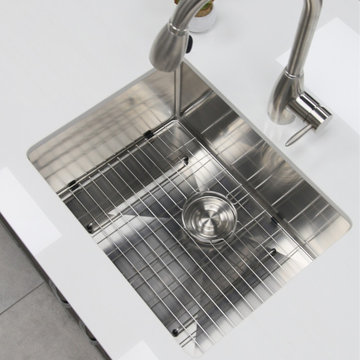
This 23” x 18” single bowl undermount stainless steel kitchen sink is perfect for your kitchen. The sink will give your space a luxurious look thanks to its modern style and rectangular shape. Handmade of surgical grade SUS 304 16G stainless steel, this sleek and luxurious kitchen sink with a brushed satin finish will look amazing in your kitchen! Even after years of constant use, the patina finish of the kitchen sink will never oxidize. The X-pattern drain grooves in this undermount kitchen sink’s basin allow for optimal drainage. the undermount sink will drain and dry quickly and effortlessly. Also, the 10mm radius sink corners are smooth and easy to clean, so that your sink will always be shiny and free of bacteria and unpleasant smells. The stainless steel undermount kitchen sink will not only give your space a luxurious look, it will make your life easier. Keep your cabinets intact. Water condensation in kitchen sinks often causes your cabinets to get ruined. This won’t be a problem if you install the STYLISH undermount sink in your kitchen. The stone guard coating of our stainless steel sinks prevents condensations and keeps your sink quiet. With the sink is included a luxury basket drain strainer, which is deeper than regular strainers and will help trap food and debris easier. Also included with the sink is a cutting template, mounting brackets and a perfect fit stainless steel bottom grid to protect your sink from dents and scratches. Our kitchen sinks are Canadian designed and meet the highest plumbing standards for North America. This functional undermount singe bowl kitchen sink will not make loud noises when the water is on. Thanks to the 2mm and 3mm extra thick pads, this is a very quiet sink. The undermount kitchen sink is equipped with a soundproofing system that will keep your kitchen sink very quiet. The extra deep basins of this double undermount kitchen sink can fit large pots and pans easily. The 10-inch depth is also great because it can hide the dirty dishes under the countertop line until you have the time to wash them. Trusted by architects and builders for upscale projects and modern makeovers, this undermount single bowl stainless steel kitchen sink is what you have been looking for.
 Rocky Tops Granite & Marble LLC
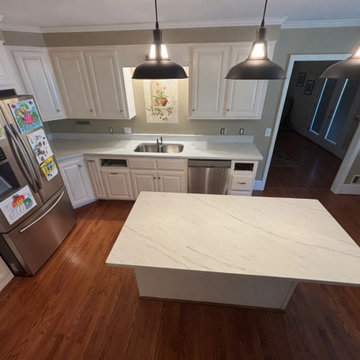
Spectrum Quartz Splendid went into this kitchen in West Columbia, and it's the kind of stone that does a lot of the work in a room without shouting about it. It's an engineered quartz, so what you're looking at is a mix of ground quartz and resin, pressed and cured until it's hard, dense, and consistent from one end of the slab to the other. The background reads soft and light, with a scatter of movement through it that keeps the surface from looking flat under kitchen lighting.
We templated the counters the way we do every job, laser measuring the base cabinets so the slabs come back from the shop cut to the exact lines of that kitchen. With quartz, that precision matters a lot, because the pattern repeats in a controlled way and you can plan your layout and your seams instead of chasing anything. That's part of why quartz suits a working kitchen so well. What you see in the showroom is what you get on the counter, corner to corner, with the pattern lining up the way it should.
Day to day, this material is about as forgiving as it gets. It doesn't need sealing, ever, because it's non-porous straight out of the fabrication shop. Wine, coffee, tomato sauce, none of it soaks in if you wipe it up in a reasonable time. It stands up to knives and daily wear better than most kitchen surfaces, though we still tell folks to use a trivet, since quartz doesn't love direct heat from a hot pan sitting right on it. Scratches aren't something you have to worry about with normal use in a busy kitchen.
We set the counters with an eased edge, clean and simple, which is what most of our customers land on once they see it doesn't take anything away from the stone itself.
Jobs like this one are what keep us busy across the Midlands. West Columbia kitchens see a lot of quartz these days, and Spectrum Quartz Splendid is a slab that holds up to real cooking and real family life while still looking sharp enough to notice the first time you walk into the room.
 Rocky Tops Granite & Marble LLC
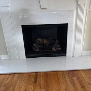
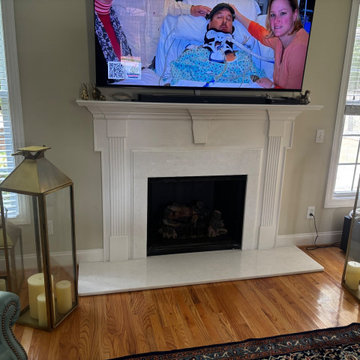
Hanoi White marble makes a fireplace surround the centerpiece of a room instead of just a backdrop for the TV. This one went into a home in Blythewood, and it's the kind of stone that earns that spot. White marble with soft gray veining has been the go-to for fireplaces for a reason: it catches light off to either side of the mantel and gives the whole wall a calm, finished look that paint or tile just can't match.
Marble takes a mellower polish than a lot of other stones, and the veining moves in loose, natural patterns that give it a warmer feel to the eye even though the stone itself stays cool to the touch. For a surround, we're not dealing with knife cuts or hot pans, so the wear concerns people sometimes bring up with marble in a kitchen don't really apply here. It's decorative and structural at the same time, built to frame a firebox and take the heat that comes off it without any trouble.
Fabricating a surround like this means getting the slab selection right before anything else. You want the veining to read well across the face and up the legs, not fight itself at the seams. We templated this one to the fireplace opening and cut it so the pattern carries through cleanly, then set it with an eased edge, simple and out of the way so the stone itself stays the focus. That's really the right call on a piece like this. Anything fussier on the edge would just compete with what the marble's already doing.
Day to day, a surround like this asks for very little. It's not a work surface, so scratching isn't a real concern, and a light sealing keeps it looking the way it did on install day for years. It'll take the ambient heat from the firebox fine, it wipes clean, and it holds up as the kind of feature you don't think about, you just enjoy.
Jobs like this are why we like doing this kind of work around Blythewood and the rest of the Midlands. A fireplace wall is one of the first things people see walking into a room, and Hanoi White marble with an eased edge gives this one a quiet, finished presence that's going to hold up for a long time.
 Rocky Tops Granite & Marble LLC
This kitchen in Forest Acres came together around a solid granite countertop, and it's the kind of stone that does the quiet work of holding a whole room together. Granite's been the go-to for kitchen counters for decades because it earns it. It's igneous rock, formed under heat and pressure, and that history is why it laughs off the stuff a real kitchen throws at it. Hot pans, knife work, everyday spills, granite takes it and keeps looking good.
We went with an eased edge on this one, which is the clean, simple line that a lot of Midlands homeowners want. It's not flashy, but that's the point. An eased edge softens the sharp corner just enough to be comfortable to lean against and easy to wipe down, and it lets the granite itself, the movement, the flecks, the depth in the stone, do the talking instead of a fussy edge profile competing for attention.
Getting a countertop like this right starts before the stone ever gets cut. We template the kitchen precisely, accounting for the cabinets, the appliances, and any out-of-square walls that always show up in real houses. Then it's cut, the edges are worked by hand to get that eased profile even and consistent around every corner, and the seams, if there are any, get lined up so the pattern reads as close to continuous as we can get it. Granite doesn't forgive sloppy fabrication. Every joint and cutout has to be tight because the stone's not going anywhere once it's set.
Day to day, this is a countertop that's built for actual cooking and actual life, not just for photos. Granite resists scratching, it handles heat better than almost anything else you'd put in a kitchen, and with a good sealer it shrugs off staining from wine, oil, or lemon juice. It's low maintenance once it's in, just a wipe down and, depending on the specific granite, a reseal every year or two to keep it performing at its best.
Forest Acres has a good mix of older homes getting updated and newer builds going in, and granite fits both. It's a material that's stood the test of time in kitchens across the Midlands, and this one's a solid, honest example of why. Clean lines, real stone, and a countertop that's going to outlast most everything else in that kitchen.
 Rocky Tops Granite & Marble LLC
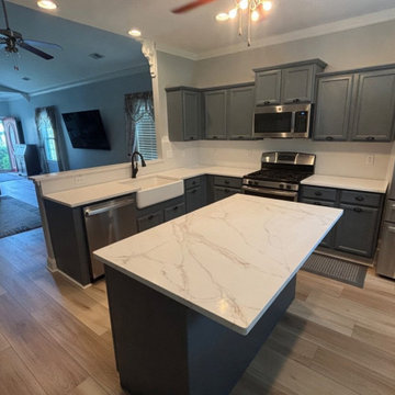
This kitchen with full height backsplash in Gaston came together in Calacatta Lilly, an engineered quartz from AG Stones that gives you that bright white background with soft gray and gold veining moving through it.
We used the same stone into the bathroom vanities too, so the whole house reads consistent without repeating the same room twice. Quartz like this is manufactured under controlled conditions, so the veining pattern is engineered to look natural while staying more predictable slab to slab than a lot of natural stone.
That consistency matters most in a kitchen, where the counters are doing the real work every day. Calacatta Lilly holds up to knives, hot pans, and the general chaos of cooking without needing much babying. It's non-porous, so there's no sealing schedule to keep track of, no worrying about a glass of wine sitting too long or lemon juice etching a ring into the surface. You wipe it down and move on with your life.
Getting the look right across a kitchen this size takes some care at the template stage. We're matching veining direction across the island, the perimeter, and working out where the seams fall so they land somewhere quiet, not right in your line of sight. With a manufactured stone like this, the pattern repeats in a way that actually helps us keep that continuity, but it still takes a careful eye to lay it out so the kitchen looks like one continuous piece rather than a handful of slabs pieced together.
In the bathroom, that same white and gray palette does something different. Vanities don't take the abuse a kitchen counter does, so the quartz there is more about keeping a clean, bright look day after day with almost zero maintenance. We finished both spaces with an eased edge, simple and clean, letting the stone itself carry the room instead of the edge detail.
Gaston sits right in that stretch of the Midlands where we do a lot of our work, and it's always good to get out there and put a stone like this into a house. Calacatta Lilly gives this kitchen and bath a bright, cohesive look that's going to hold up fine to daily life for a long time to come.
 Rocky Tops Granite & Marble LLC
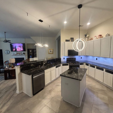
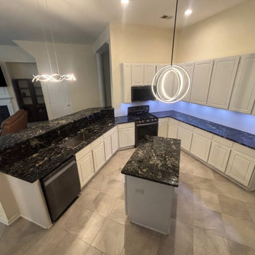
Blue Fantasy granite is one of those stones that stops people in the kitchen doorway. It's got that deep blue-gray base with soft movement running through it, flecks of white and darker gray scattered across the surface, and enough depth to it that it reads different depending on the light hitting it. In this Irmo kitchen it works as the anchor for the whole room, the kind of stone that doesn't need anything else dressing it up.
Granite like this comes out of the ground with real mineral variation, and that's part of why we like working with it. Every slab has its own character, so when we template a kitchen like this one we're not just measuring cabinets, we're looking at how the pattern will fall across the counters and figuring out where the seams need to land so the movement in the stone keeps flowing instead of getting chopped up at a corner. That's the part of the job that takes patience more than anything else.
Blue Fantasy is a hard, dense granite, and that's exactly what you want in a kitchen that gets used every day. It shrugs off heat, it resists scratching better than most surfaces you'll put a knife near, and it holds up to the kind of daily abuse a real kitchen dishes out. We sealed it before we left so it stays easy to wipe down and keeps its color from picking up any staining, and that's about the only maintenance it'll ever ask for. We kept the edge eased on this one, simple and clean, which lets the stone itself do the talking instead of competing with it.
Jobs like this are why we like working around Irmo and the rest of the Midlands. Every kitchen brings its own layout, its own light, its own slab pulled off the yard, and getting it right means paying attention to the details that don't show up in a photo, tight seams, a level install, an edge that doesn't fight the stone. This one came together the way we like to see them, a granite with real presence doing exactly what a kitchen counter should do for years to come.
 Rocky Tops Granite & Marble LLC
Hanoi White marble makes a fireplace surround the centerpiece of a room instead of just a backdrop for the TV. This one went into a home in Blythewood, and it's the kind of stone that earns that spot. White marble with soft gray veining has been the go-to for fireplaces for a reason: it catches light off to either side of the mantel and gives the whole wall a calm, finished look that paint or tile just can't match.
Marble takes a mellower polish than a lot of other stones, and the veining moves in loose, natural patterns that give it a warmer feel to the eye even though the stone itself stays cool to the touch. For a surround, we're not dealing with knife cuts or hot pans, so the wear concerns people sometimes bring up with marble in a kitchen don't really apply here. It's decorative and structural at the same time, built to frame a firebox and take the heat that comes off it without any trouble.
Fabricating a surround like this means getting the slab selection right before anything else. You want the veining to read well across the face and up the legs, not fight itself at the seams. We templated this one to the fireplace opening and cut it so the pattern carries through cleanly, then set it with an eased edge, simple and out of the way so the stone itself stays the focus. That's really the right call on a piece like this. Anything fussier on the edge would just compete with what the marble's already doing.
Day to day, a surround like this asks for very little. It's not a work surface, so scratching isn't a real concern, and a light sealing keeps it looking the way it did on install day for years. It'll take the ambient heat from the firebox fine, it wipes clean, and it holds up as the kind of feature you don't think about, you just enjoy.
Jobs like this are why we like doing this kind of work around Blythewood and the rest of the Midlands. A fireplace wall is one of the first things people see walking into a room, and Hanoi White marble with an eased edge gives this one a quiet, finished presence that's going to hold up for a long time.
 Rocky Tops Granite & Marble LLC
Blue Fantasy granite is one of those stones that stops people in the kitchen doorway. It's got that deep blue-gray base with soft movement running through it, flecks of white and darker gray scattered across the surface, and enough depth to it that it reads different depending on the light hitting it. In this Irmo kitchen it works as the anchor for the whole room, the kind of stone that doesn't need anything else dressing it up.
Granite like this comes out of the ground with real mineral variation, and that's part of why we like working with it. Every slab has its own character, so when we template a kitchen like this one we're not just measuring cabinets, we're looking at how the pattern will fall across the counters and figuring out where the seams need to land so the movement in the stone keeps flowing instead of getting chopped up at a corner. That's the part of the job that takes patience more than anything else.
Blue Fantasy is a hard, dense granite, and that's exactly what you want in a kitchen that gets used every day. It shrugs off heat, it resists scratching better than most surfaces you'll put a knife near, and it holds up to the kind of daily abuse a real kitchen dishes out. We sealed it before we left so it stays easy to wipe down and keeps its color from picking up any staining, and that's about the only maintenance it'll ever ask for. We kept the edge eased on this one, simple and clean, which lets the stone itself do the talking instead of competing with it.
Jobs like this are why we like working around Irmo and the rest of the Midlands. Every kitchen brings its own layout, its own light, its own slab pulled off the yard, and getting it right means paying attention to the details that don't show up in a photo, tight seams, a level install, an edge that doesn't fight the stone. This one came together the way we like to see them, a granite with real presence doing exactly what a kitchen counter should do for years to come.
 L & L Home Restoration, LLC
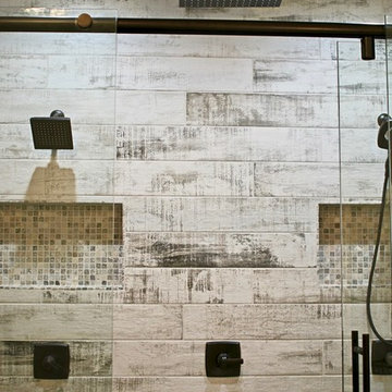
Complete luxury with this large walk-in shower. Overhead rainfall panel and two separate shower heads keep you warm and relaxed. The tile is a rustic barnwood look with small travertine squares for the inset.
 Rocky Tops Granite & Marble LLC
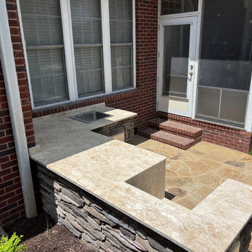
This outdoor kitchen in Lexington is built around 3cm unfilled travertine, and that's a material choice that says a lot about what this space is meant to do. Unfilled travertine keeps its natural pits and texture instead of having them smoothed over with resin, which means the surface reads as raw and organic rather than polished. Out here, under open sky and full sun, that texture works in the stone's favor. It doesn't glare back at you at midday and it doesn't get slick when a hose or a rain shower hits it.
The layout is an L-shaped countertop set over a stacked stone veneer base, with stainless steel drawers and cabinets tucked underneath and a built-in grill anchoring one leg of the L. There's a cutout in the counter for a sink or a cooler, which is the kind of detail that takes real planning at the template stage. You can't cut that opening freehand on site and expect clean lines. We measure twice, dry-fit the appliance or basin, and cut the stone to match before it ever leaves the shop.
Travertine outdoors is a practical call as much as a good-looking one. It handles heat well, which matters right next to a grill, and it won't crack or discolor the way some engineered materials can when they take direct sun for years. Unfilled travertine in particular breathes a little more than the filled version, so it doesn't trap moisture the way a sealed slab might. We finished the edges eased, which keeps the whole thing feeling soft and unfussy, no sharp lines to bang a hip on when you're moving between the grill and the prep space.
Outdoor kitchens take a beating that indoor ones never see: pollen, humidity, the occasional hard freeze here in the Midlands, direct sun for months at a stretch. Travertine's been used outdoors for centuries for exactly that reason, it ages instead of failing. Sealing it now and then keeps water from sitting in the pits, but even bare it holds up. This one in Lexington is set up to be used hard, grilled on, gathered around, and to look better for the wear rather than worse.
 Karp Associates Inc.
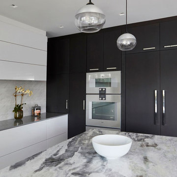
The Kitchen in this residence had to be outstanding for the owner’s ego and provide a template of future styles. We scoured kitchen showrooms from New York to Los Angeles to see cutting edge design, gadgets and layouts. After much consideration and given our long-standing relationship, we worked with New England Custom Cabinets, our go to contractor for custom millwork. We worked tirelessly with them to create the dream kitchen. The limited amount of space available in this waterfront home challenged us to not only make the best use of the available space, but also to make each space highly functional.
In order to create the desired aesthetic and still provide storage, we created a floor to ceiling Wegne bank of cabinetry concealing the refrigerator and freezer and incorporating a pantry with a hidden pocket door and an appliance cabinet that has a one of a kind folding mechanism that allows it to sit flat against the adjacent wall. The Wenge cabinetry has a matte finish and is replicated in the cabinet paneling under the Princess White marble double waterfall island.
To contrast the dark wood finish, the rest of the kitchen is completed in a high gloss polyester hand buffed white finish with walnut interiors. The upper cabinets appear to float on the three dimensional tile backsplash purchased directly from a vendor in Spain. The special touch latch magic hydraulic openers lift the cabinets vertically and are closed by the touch of a button as well. This is a feature that is years ahead on the design curve. All drawers and drawer fronts are installed using Blum’s Servo-Drive electronic opening system. Hafele LED interior cabinet lighting is applied throughout.
Wow – State of the Art, High Tech Appliances that the owner and his friends are still figuring out. The kitchen is fitted out with Gagganeu appliances incorporating an induction cooktop and a state of the art electronic drop down exhaust hood. The microwave, special high-tech oven and warming drawer will keep the owner and his friends reading manuals for years to come. The perimeter counter tops are finished in the innovative Dekton indestructible man-made stone. All base cabinets have electronic openers and automatically light up upon opening. The square flush mounted recessed lights by Tech Lighting accentuate the clean lines of the kitchen. Two hand blown glass and brushed aluminum pendants from California illuminate the beautiful marble waterfall island. Unique toe kick lighting is also incorporated to illuminate the base as a nightlight and accent feature. In order to keep the ceiling “uncluttered” seamless speakers by SpeakerCraft was utilized. The audio, television and lighting are all controlled by Control4 Smart System, which is incorporated throughout the house. The select rift white oak planks in long lengths are finished in a special brushed patina with a gray stain to give the floors a natural driftwood finish.
The kitchen exceeds the owner, his friends and family’s expectations for design, function and format.
Photograpy - Kelly Marshall
 Milgard Windows & Doors
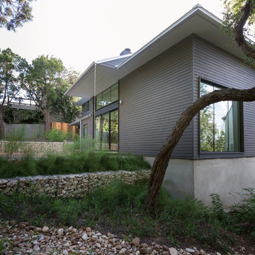
The Kiguchi family moved into their Austin, Texas home in 1994. Built in the 1980’s as part of a neighborhood development, they happily raised their family here but longed for something more contemporary. Once they became empty nesters, they decided it was time for a major remodel. After spending many years visiting Austin AIA Home Tours that highlight contemporary residential architecture, they had a lot of ideas and in 2013 were ready to interview architects and get their renovation underway.
The project turned into a major remodel due to an unstable foundation. Architects Ben Arbib and Ed Hughey, of Arbib Hughey Design were hired to solve the structural issue and look for inspiration in the bones of the house, which sat on top of a hillside and was surrounded by great views.
Unfortunately, with the old floor plan, the beautiful views were hidden by small windows that were poorly placed. In order to bring more natural light into the house the window sizes and configurations had to be addressed, all while keeping in mind the homeowners desire for a modern look and feel.
To achieve a more contemporary and sophisticated front of house, a new entry was designed that included removing a two-story bay window and porch. The entrance of the home also became more integrated with the landscape creating a template for new foliage to be planted. Older exterior materials were updated to incorporate a more muted palette of colors with a metal roof, dark grey siding in the back and white stucco in the front. Deep eaves were added over many of the new large windows for clean lines and sun protection.
“Inside it was about opening up the floor plan, expanding the views throughout the house, and updating the material palette to get a modern look that was also warm and inviting,” said Ben from Arbib Hughey Design. “Prior to the remodel, the house had the typical separation of rooms. We removed the walls between them and changed all of the windows to Milgard Thermally Improved Aluminum to connect the inside with the outside. No matter where you are you get nice views and natural light.”
The architects wanted to create some drama, which they accomplished with the window placement and opening up the interior floor plan to an open concept approach. Cabinetry was used to help delineate intimate spaces. To add warmth to an all-white living room, white-washed oak wood floors were installed and pine planks were used around the fireplace. The large windows served as artwork bringing the color of nature into the space.
An octagon shaped, elevated dining room, (named “the turret”), had a big impact on the design of the house. They architects rounded the corners and added larger window openings overlooking a new sunken garden. The great room was also softened by rounding out the corners and that circular theme continued throughout the house, being picked up in skylight wells and kitchen cabinetry. A staircase leading to a catwalk was added and the result was a two-story window wall that flooded the home with natural light.
When asked why Milgard® Thermally Improved Aluminum windows were selected, the architectural team listed many reasons:
1) Aesthetics: “We liked the slim profiles and narrow sightlines. The window frames never get in the way of the view and that was important to us. They also have a very contemporary look that went well with our design.”
2) Options: “We liked that we could get large sliding doors that matched the windows, giving us a very cohesive look and feel throughout the project.”
3) Cost Effective: “Milgard windows are affordable. You get a good product at a good price.”
4) Custom Sizes: “Milgard windows are customizable, which allowed us to get the right window for each location.”
Ready to take on your own traditional to modern home remodeling project? Arbib Hughey Design advises, “Work with a good architect. That means picking a team that is creative, communicative, listens well and is responsive. We think it’s important for an architect to listen to their clients and give them something they want, not something the architect thinks they should have. At the same time you want an architect who is willing and able to think outside the box and offer up design options that you may not have considered. Design is about a lot of back and forth, trying out ideas, getting feedback and trying again.”
The home was completely transformed into a unique, contemporary house perfectly integrated with its site. Internally the home has a natural flow for the occupants and externally it is integrated with the surroundings taking advantage of great natural light. As a side note, it was highly praised as part of the Austin AIA homes tour.
 Rocky Tops Granite & Marble LLC
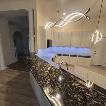
Blue Fantasy granite is one of those stones that stops people in the kitchen doorway. It's got that deep blue-gray base with soft movement running through it, flecks of white and darker gray scattered across the surface, and enough depth to it that it reads different depending on the light hitting it. In this Irmo kitchen it works as the anchor for the whole room, the kind of stone that doesn't need anything else dressing it up.
Granite like this comes out of the ground with real mineral variation, and that's part of why we like working with it. Every slab has its own character, so when we template a kitchen like this one we're not just measuring cabinets, we're looking at how the pattern will fall across the counters and figuring out where the seams need to land so the movement in the stone keeps flowing instead of getting chopped up at a corner. That's the part of the job that takes patience more than anything else.
Blue Fantasy is a hard, dense granite, and that's exactly what you want in a kitchen that gets used every day. It shrugs off heat, it resists scratching better than most surfaces you'll put a knife near, and it holds up to the kind of daily abuse a real kitchen dishes out. We sealed it before we left so it stays easy to wipe down and keeps its color from picking up any staining, and that's about the only maintenance it'll ever ask for. We kept the edge eased on this one, simple and clean, which lets the stone itself do the talking instead of competing with it.
Jobs like this are why we like working around Irmo and the rest of the Midlands. Every kitchen brings its own layout, its own light, its own slab pulled off the yard, and getting it right means paying attention to the details that don't show up in a photo, tight seams, a level install, an edge that doesn't fight the stone. This one came together the way we like to see them, a granite with real presence doing exactly what a kitchen counter should do for years to come.
 Rocky Tops Granite & Marble LLC
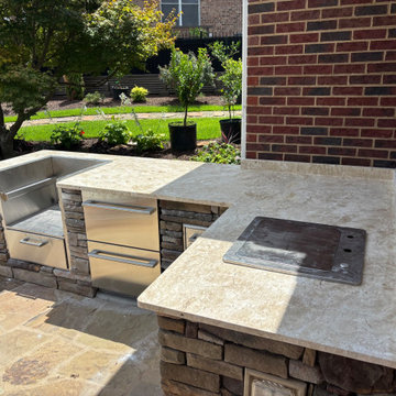
This outdoor kitchen in Lexington is built around 3cm unfilled travertine, and that's a material choice that says a lot about what this space is meant to do. Unfilled travertine keeps its natural pits and texture instead of having them smoothed over with resin, which means the surface reads as raw and organic rather than polished. Out here, under open sky and full sun, that texture works in the stone's favor. It doesn't glare back at you at midday and it doesn't get slick when a hose or a rain shower hits it.
The layout is an L-shaped countertop set over a stacked stone veneer base, with stainless steel drawers and cabinets tucked underneath and a built-in grill anchoring one leg of the L. There's a cutout in the counter for a sink or a cooler, which is the kind of detail that takes real planning at the template stage. You can't cut that opening freehand on site and expect clean lines. We measure twice, dry-fit the appliance or basin, and cut the stone to match before it ever leaves the shop.
Travertine outdoors is a practical call as much as a good-looking one. It handles heat well, which matters right next to a grill, and it won't crack or discolor the way some engineered materials can when they take direct sun for years. Unfilled travertine in particular breathes a little more than the filled version, so it doesn't trap moisture the way a sealed slab might. We finished the edges eased, which keeps the whole thing feeling soft and unfussy, no sharp lines to bang a hip on when you're moving between the grill and the prep space.
Outdoor kitchens take a beating that indoor ones never see: pollen, humidity, the occasional hard freeze here in the Midlands, direct sun for months at a stretch. Travertine's been used outdoors for centuries for exactly that reason, it ages instead of failing. Sealing it now and then keeps water from sitting in the pits, but even bare it holds up. This one in Lexington is set up to be used hard, grilled on, gathered around, and to look better for the wear rather than worse.
61