
Search results for "Templates" in Home Design Ideas
 T. Duffy
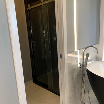
The bathroom of my dreams has finally come true!
Thanks to B.A.C Construction Inc., they have helped turn my 90's bathroom into far better bathroom space. With monochromatic colour tones, we feel that this bathroom will have the timeless style that will last throughout the years and decades to come.
 Lori Jolin Design, LLC.
Sutter Photographers
The Hardware Studio - hardware
Martinwood Cabinetry - millwork
Studio GlassWorks - glass countertop
Window Design Center - awning window
Nonn's Showplace - quartz, granite countertops
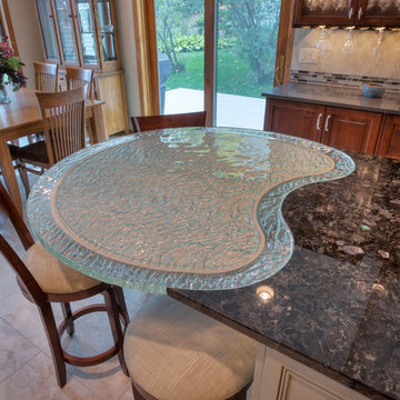
• The most difficult part of the project was figuring out all the technical details to install the glass counter-top, which would weigh about 300 pounds!
• One goal was to avoid seeing the cabinet supports through the glass. The glass itself proposed problems because it had a wavy texture and separate confetti glass that could be added to the bottom. Therefore, we needed to add something below it.
• A custom steel base was designed to carry the weight yet float the glass so you are able to see the beauty of the glass itself. A small 1/2 inch trim piece on the steel was added to accomplish this task.
• Once the steel was made, we took it to the glass distributor. We turned the very heavy base upside down, traced the 1/2 inch trim piece on a full size piece of paper, and sent it to the glass manufacturer.
• After this, the base was sent to a powder coater and the raw steel was transformed into a beautiful champagne color.
• In the meantime, the glass manufacturer molded a channel for the glass to rest that would suspend the glass 1/2 inch higher than the powder coated steel base.
• The glass manufacturer was instructed to make the top of the glass smooth so it would hold a plate without rocking; they added an extra layer of 1/4 inch glass after it was fired the first time to accomplish this.
• When the base was brought to the job site, the carpenter installed a thick 6 inch block of wood through the tile and into the floor joists. The hollow 6 inch square base of the steel table was glued and screwed into the wood. The base was leveled and ready for the top to arrive several days later.
• The glass installers put it over the base, and it fit PERFECTLY! (whew)
• The steel base is 3 inches smaller than the glass, creating a see-through effect around the entire perimeter of the kidney bean shape.
• The granite was then templated by using a
specialized camera that measured the curve of the glass. However, upon arrival, the fit was less than perfect. Thanks to a patient and skilled granite installer from Nonn's Showroom who spent several hours hand grinding and polishing the curve on site until it fit perfectly.
• A small bead of silicone between the granite and the glass was all that was needed to complete the perfect installation.
• With a few shims under the end of the granite, the top is perfectly level!
• Our client was extremely excited and very patient with the process because they trusted our abilities so that the end result would be spectacular.
 Rocky Tops Granite & Marble LLC
This project in Northeast Columbia brought together three different stones across the house, and that's not something we get to do every day. Marble in one space, quartzite in another, dolomite doing its own quiet work somewhere else. It's the kind of job that makes you slow down and think about where each material actually belongs instead of just picking one slab and running it everywhere.
The kitchen called for something that could handle the daily grind while still looking like a piece of natural stone should look, full of movement and depth. Quartzite earns its keep here. It reads like marble with all that soft veining and cool background color, but it's far harder and more resistant to etching from citrus, wine, or vinegar splashing around a busy counter. We templated it carefully to keep the veining moving in a way that feels natural across the runs, not chopped up or mismatched at the seams. That takes patience on the slab yard picking the right book match before it ever hits a saw.
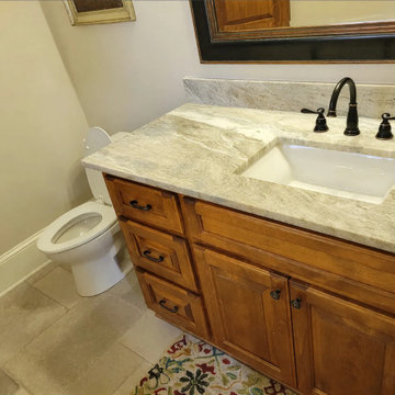
The bathroom vanity is where the marble gets to shine. Marble on a vanity top makes sense in a way it doesn't always in a kitchen. Less traffic, less acid exposure, and it gets to just look good day after day with the veining catching the light over the sink. We kept the edge eased throughout the project, a simple softened line that doesn't compete with the stone itself. An eased edge is subtle, it just takes the sharp corner off the top so it feels comfortable under your hand and doesn't chip as easy as a square edge would over the years.
Dolomite showed up in the other space, and it's one of our favorite stones to work with because it splits the difference. It looks a lot like marble, softer tones, that same classic veining, but it's a good bit tougher and more stain resistant, which makes it a smart call anywhere you want that marble look without babying it constantly. Sealing still matters with all three of these stones. A good penetrating sealer keeps them looking right for years and makes cleanup simple, no special stuff needed, just soap and water day to day.
Jobs like this are why we like working across the Midlands. Northeast Columbia homes run the gamut from new builds to older houses getting a real refresh, and getting to move between marble, quartzite, and dolomite in one project keeps the work honest. Every stone got fabricated and set the way it should be, tight seams, clean eased edges, and a finish that'll hold up to real life in that kitchen and that bath for a long time to come.
Find the right local pro for your project

 Gallery KBNY
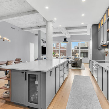
A classic West Side loft in Hell’s Kitchen, Gallery’s main task was to renovate the large kitchen. The clients like to entertain, so in addition to remodeling the aesthetic, we expanded the footprint of the island and built an entirely new bar at the opposite end of the kitchen. Some design choices are a natural fit for the space. In this case, that meant leaning into the industrial vibe of the exposed concrete while bringing in some character with the material choices.
INDUSTRIAL CHIC
With an industrial aesthetic in mind, gray was a natural color choice for the fully custom Miralis cabinets. The backsplash was designed in a subway brick pattern, but rather than the typical porcelain or marble, a clay tile in a white matte tone resembling cement was chosen to further coordinate with the exposed concrete.
Stacked cabinets were installed to accommodate the tall loft ceilings. For contrast, we incorporated glass front cabinetry with lighting in some areas. The resulting marriage of concrete, glass, and wood is well-matched for an industrial chic loft kitchen.
Further highlighting the homeowners’ love of entertaining, we also built an entirely custom bar at one end of the space, featuring open shelving in contrasting wood tones with underlighting and a custom mirrored backsplash for an authentic bar feel.
ADVENTURES IN APPROACHING COLUMNS
Loft renovations tend to come with two common needs: how to fill all that space tastefully and how to work with those ever present columns. In the case of this loft kitchen renovation, it suited the industrial aesthetic not to wrap the concrete column as one typically would, but rather to leave it exposed, accentuating the raw character of the space. Partially as a result, the island expanded too, creating more room for functional additions such as a built-in microwave, wine fridge, and more open shelving to match the bar, outlined with a countertop overhang to optimize counter space and chair storage.
ANCHORED IN SYMMETRY
With a loft space as unusually large as this one, an ideal design strategy, especially when high ceilings are involved, is to anchor the kitchen on opposing sides. Here, one side is anchored by a large floor-to-ceiling pantry, while the other is anchored by the counter-depth fridge with cabinetry above. The connecting element is the counter space in the middle, resulting in the visual impact of a long kitchen run within the open floor plan of a loft.
SOME HIGHLIGHTS
- Entirely custom-built bar with custom mirrored backsplash templated specifically for this project
- Large, oversized island with seating all around, open shelving, and built-in microwave
- Subway backsplash tiles in clay rather than porcelain or marble
- Olympian white marble countertops
Considering a kitchen loft renovation in New York? Our expertise is in renovating all kinds of New York Spaces, from gut renovations of historic landmark buildings like brownstones and townhomes to kitchens and bathrooms in lofts and other apartments in managed buildings. Contact us to find out if our full-scale design-and-build approach is right for your project.
 Nathan Allan Glass Studios Inc.
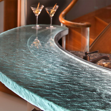
What surprises people most when entering and walking on the glowing white surface in this particular Private Residence (Williamsburg, VA) is when they find out they are walking on a sea of glass! Yes, GLASS! Not marble, not granite, but GLASS! Nathan Allan has created a very fresh, unique flooring surface, which is smooth to touch on the majority of the glass surface, yet has an almost invisible safety finish permanently embedded in the glass surface.
THE GLASS
Nathan Allan’s Glass Flooring incorporates features which are visually stunning, while also providing a safety finish which provides comfort to everyone walking on the glass. Our Sandstone texture is forged into the bottom surface of the glass, while our exclusive Glass Sandpaper safety finish is fused onto the walking surface. To enhance all features, we added a bright, sparkling, White Metallic color finish throughout each flooring panel.
SPECIFICATIONS
Each Glass Flooring panel is produced in 1/2″ (12mm) thick, Low Iron, tempered safety glass. Tempered glass provides added strength, insuring that the Glass Flooring can accept a heavy load. Panels vary in size and dimension, with most panels measured at a block size of 5’0 x 6’0 (1500mm x 1800mm). Perimeter Edge panels were carved and shaped to fit tightly against the curved walls. Glass Sandpaper, ASTM tested in labs with the highest slip-coefficient safety ratings, is fused onto the walking surface, to provide a very comfortable and effective safety feature.
Flooring Glass Details:
1/2″ (12mm) thick, Low iron tempered safety glass
Flat Polished Edges
Glass Sandpaper on walking surface
Sandstone texture on bottom surface
White Metallic color finish on bottom surface
Panels sizes up to 5’0 x 6’0
Approximately 800 square feet of glass flooring
Perimeter panels shape cut to fit
Almost overshadowed by the spectacular flooring is a 1.5” thick, Heavy Glasstop, Crescent shaped, with Nathan Allan’s Rocky Mountain texture.
DESIGN
A White Sea of Glass flooring is the finished result of combining a light Sandstone texture on the bottom glass surface, with the added touch of a sparkling White Metallic color finish. Combined with our Glass Sandpaper safety finish, and the natural and artificial light sources, our Glass Flooring shimmers within the entire entrance space.
INSTALLATION
Using very important installation techniques, Nathan Allan worked hand in hand with great team of professionals: Vicki Bristow, designer, W. M. Jordan Company, GC, and Pompei Inc, glass flooring installer. Templates were produced for all perimeter edge panels, and every shaped panel. All flooring panels are secured to the substrate with special adhesives, and joints are filled with matching color sealants.
“A beautiful project is always enhanced when working with quality, prestigious builders, and talented trade’s people. The tight organization and open communication by all the team members contributed greatly to a project proceeding seamlessly, with the incredible visual results to prove it.” Barry Allan – Director
Photo credit: Morgan Howarth
 CRC Builders Inc.
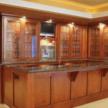
The homeowner wanted something different, out of the ordinary, as an entertainment center and bar combination that would add an unusual dimension to watching TV. It had to be in character with the rest of the residence, tastefully designed and executed to deliver the maximum effect.
A two-piece combination bar and seating, coupled with a fireplace and large screen TV was designed. A system was designed and custom built cabinet consisting of a radius front entertainment center houses a large flat screen TV and enclosed stereo speakers on the top level, and a gas log fireplace below.
A custom built see-through bar sports a matching radius front, plenty of storage, and room for three to eat, drink, and enjoy the warmth of the fireplace without missing any of the action on the TV. For even greater functionality, the TV is also viewable through the large opening in the bar while meals or snacks are prepared from the kitchen. Traffic flow is unique: access and egress between the bar front and TV can happen with ease around both sides of the bar, and the opening in the back of the bar provides for service both from and to the kitchen area. Because of the free and easy movement about the space, adequate lighting, and lack of combustibles at or on the fireplace, safety, as well as an ample use of space, are both achieved. Both pieces are custom fabricated from start to finish, and match each other identically in all respects. Both are constructed of clear cherry finish with a clear satin lacquer. Both enjoy chrome accents strips and custom crafted, glass cabinet doors with matching radii, and both are tastefully lit with accenting puck lights. The design and fabrication for both units shared issues in common as well as individually.
The entertainment center was fabricated in the shop in three units and then assembled onsite. The opening for the flat screen TV had to be carefully considered as it too had a radius and therefore had to be designed so that the TV would fit.
The entire bar system, except the countertop, had to be fabricated onsite due to the structural columns on either side between which the curved lower cabinets would rest. Then the countertop template was prepared, fabricated elsewhere, returned and installed. After the countertop was in place, the cabinetmaker had to wrap the two columns on either side as well as the overhead beam while making sure the joints at the columns and header maintained alignment. A complement of matching radii cabinet doors had to be constructed for both units. Radius glass inserts had to be ordered with precise dimensions to assure a perfect fit to openings with tight tolerances. Any mistake would have been expensive to correct. Because of the abundance of natural light into the space, the finishes had to be dead-on, otherwise every flaw would show. The custom walnut inlays were fabricated out of square stock, which protruded above the radius in each door. A jig matching the radius had to be designed and fabricated, then a router used to trim excess material and then sanded and finished.
Solving the multitude of challenges associated with the project was one of the parts that made the project fun and interesting. The homeowners now can entertain every night.

 Gallery KBNY
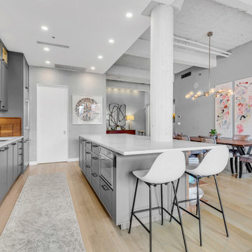
A classic West Side loft in Hell’s Kitchen, Gallery’s main task was to renovate the large kitchen. The clients like to entertain, so in addition to remodeling the aesthetic, we expanded the footprint of the island and built an entirely new bar at the opposite end of the kitchen. Some design choices are a natural fit for the space. In this case, that meant leaning into the industrial vibe of the exposed concrete while bringing in some character with the material choices.
INDUSTRIAL CHIC
With an industrial aesthetic in mind, gray was a natural color choice for the fully custom Miralis cabinets. The backsplash was designed in a subway brick pattern, but rather than the typical porcelain or marble, a clay tile in a white matte tone resembling cement was chosen to further coordinate with the exposed concrete.
Stacked cabinets were installed to accommodate the tall loft ceilings. For contrast, we incorporated glass front cabinetry with lighting in some areas. The resulting marriage of concrete, glass, and wood is well-matched for an industrial chic loft kitchen.
Further highlighting the homeowners’ love of entertaining, we also built an entirely custom bar at one end of the space, featuring open shelving in contrasting wood tones with underlighting and a custom mirrored backsplash for an authentic bar feel.
ADVENTURES IN APPROACHING COLUMNS
Loft renovations tend to come with two common needs: how to fill all that space tastefully and how to work with those ever present columns. In the case of this loft kitchen renovation, it suited the industrial aesthetic not to wrap the concrete column as one typically would, but rather to leave it exposed, accentuating the raw character of the space. Partially as a result, the island expanded too, creating more room for functional additions such as a built-in microwave, wine fridge, and more open shelving to match the bar, outlined with a countertop overhang to optimize counter space and chair storage.
ANCHORED IN SYMMETRY
With a loft space as unusually large as this one, an ideal design strategy, especially when high ceilings are involved, is to anchor the kitchen on opposing sides. Here, one side is anchored by a large floor-to-ceiling pantry, while the other is anchored by the counter-depth fridge with cabinetry above. The connecting element is the counter space in the middle, resulting in the visual impact of a long kitchen run within the open floor plan of a loft.
SOME HIGHLIGHTS
- Entirely custom-built bar with custom mirrored backsplash templated specifically for this project
- Large, oversized island with seating all around, open shelving, and built-in microwave
- Subway backsplash tiles in clay rather than porcelain or marble
- Olympian white marble countertops
Considering a kitchen loft renovation in New York? Our expertise is in renovating all kinds of New York Spaces, from gut renovations of historic landmark buildings like brownstones and townhomes to kitchens and bathrooms in lofts and other apartments in managed buildings. Contact us to find out if our full-scale design-and-build approach is right for your project.
 Nathan Allan Glass Studios Inc.
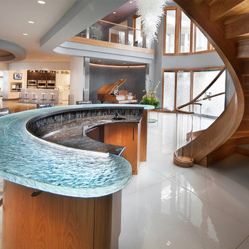
What surprises people most when entering and walking on the glowing white surface in this particular Private Residence (Williamsburg, VA) is when they find out they are walking on a sea of glass! Yes, GLASS! Not marble, not granite, but GLASS! Nathan Allan has created a very fresh, unique flooring surface, which is smooth to touch on the majority of the glass surface, yet has an almost invisible safety finish permanently embedded in the glass surface.
THE GLASS
Nathan Allan’s Glass Flooring incorporates features which are visually stunning, while also providing a safety finish which provides comfort to everyone walking on the glass. Our Sandstone texture is forged into the bottom surface of the glass, while our exclusive Glass Sandpaper safety finish is fused onto the walking surface. To enhance all features, we added a bright, sparkling, White Metallic color finish throughout each flooring panel.
SPECIFICATIONS
Each Glass Flooring panel is produced in 1/2″ (12mm) thick, Low Iron, tempered safety glass. Tempered glass provides added strength, insuring that the Glass Flooring can accept a heavy load. Panels vary in size and dimension, with most panels measured at a block size of 5’0 x 6’0 (1500mm x 1800mm). Perimeter Edge panels were carved and shaped to fit tightly against the curved walls. Glass Sandpaper, ASTM tested in labs with the highest slip-coefficient safety ratings, is fused onto the walking surface, to provide a very comfortable and effective safety feature.
Flooring Glass Details:
1/2″ (12mm) thick, Low iron tempered safety glass
Flat Polished Edges
Glass Sandpaper on walking surface
Sandstone texture on bottom surface
White Metallic color finish on bottom surface
Panels sizes up to 5’0 x 6’0
Approximately 800 square feet of glass flooring
Perimeter panels shape cut to fit
Almost overshadowed by the spectacular flooring is a 1.5” thick, Heavy Glasstop, Crescent shaped, with Nathan Allan’s Rocky Mountain texture.
DESIGN
A White Sea of Glass flooring is the finished result of combining a light Sandstone texture on the bottom glass surface, with the added touch of a sparkling White Metallic color finish. Combined with our Glass Sandpaper safety finish, and the natural and artificial light sources, our Glass Flooring shimmers within the entire entrance space.
INSTALLATION
Using very important installation techniques, Nathan Allan worked hand in hand with great team of professionals: Vicki Bristow, designer, W. M. Jordan Company, GC, and Pompei Inc, glass flooring installer. Templates were produced for all perimeter edge panels, and every shaped panel. All flooring panels are secured to the substrate with special adhesives, and joints are filled with matching color sealants.
“A beautiful project is always enhanced when working with quality, prestigious builders, and talented trade’s people. The tight organization and open communication by all the team members contributed greatly to a project proceeding seamlessly, with the incredible visual results to prove it.” Barry Allan – Director
Photo credit: Morgan Howarth
 Milgard Windows & Doors
The Kiguchi family moved into their Austin, Texas home in 1994. Built in the 1980’s as part of a neighborhood development, they happily raised their family here but longed for something more contemporary. Once they became empty nesters, they decided it was time for a major remodel. After spending many years visiting Austin AIA Home Tours that highlight contemporary residential architecture, they had a lot of ideas and in 2013 were ready to interview architects and get their renovation underway.
The project turned into a major remodel due to an unstable foundation. Architects Ben Arbib and Ed Hughey, of Arbib Hughey Design were hired to solve the structural issue and look for inspiration in the bones of the house, which sat on top of a hillside and was surrounded by great views.
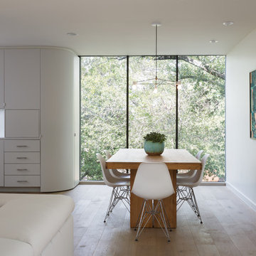
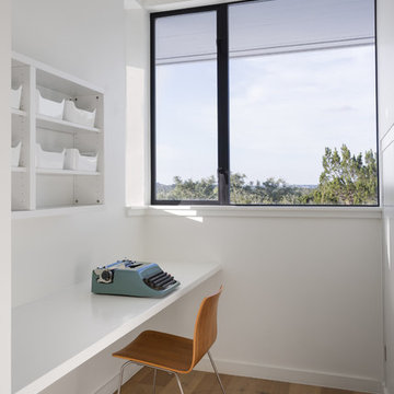
Unfortunately, with the old floor plan, the beautiful views were hidden by small windows that were poorly placed. In order to bring more natural light into the house the window sizes and configurations had to be addressed, all while keeping in mind the homeowners desire for a modern look and feel.
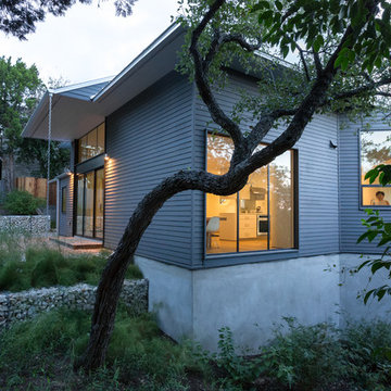
To achieve a more contemporary and sophisticated front of house, a new entry was designed that included removing a two-story bay window and porch. The entrance of the home also became more integrated with the landscape creating a template for new foliage to be planted. Older exterior materials were updated to incorporate a more muted palette of colors with a metal roof, dark grey siding in the back and white stucco in the front. Deep eaves were added over many of the new large windows for clean lines and sun protection.
“Inside it was about opening up the floor plan, expanding the views throughout the house, and updating the material palette to get a modern look that was also warm and inviting,” said Ben from Arbib Hughey Design. “Prior to the remodel, the house had the typical separation of rooms. We removed the walls between them and changed all of the windows to Milgard Thermally Improved Aluminum to connect the inside with the outside. No matter where you are you get nice views and natural light.”
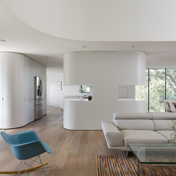
The architects wanted to create some drama, which they accomplished with the window placement and opening up the interior floor plan to an open concept approach. Cabinetry was used to help delineate intimate spaces. To add warmth to an all-white living room, white-washed oak wood floors were installed and pine planks were used around the fireplace. The large windows served as artwork bringing the color of nature into the space.
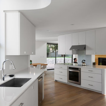
An octagon shaped, elevated dining room, (named “the turret”), had a big impact on the design of the house. They architects rounded the corners and added larger window openings overlooking a new sunken garden. The great room was also softened by rounding out the corners and that circular theme continued throughout the house, being picked up in skylight wells and kitchen cabinetry. A staircase leading to a catwalk was added and the result was a two-story window wall that flooded the home with natural light.
When asked why Milgard® Thermally Improved Aluminum windows were selected, the architectural team listed many reasons:
1) Aesthetics: “We liked the slim profiles and narrow sightlines. The window frames never get in the way of the view and that was important to us. They also have a very contemporary look that went well with our design.”
2) Options: “We liked that we could get large sliding doors that matched the windows, giving us a very cohesive look and feel throughout the project.”
3) Cost Effective: “Milgard windows are affordable. You get a good product at a good price.”
4) Custom Sizes: “Milgard windows are customizable, which allowed us to get the right window for each location.”
Ready to take on your own traditional to modern home remodeling project? Arbib Hughey Design advises, “Work with a good architect. That means picking a team that is creative, communicative, listens well and is responsive. We think it’s important for an architect to listen to their clients and give them something they want, not something the architect thinks they should have. At the same time you want an architect who is willing and able to think outside the box and offer up design options that you may not have considered. Design is about a lot of back and forth, trying out ideas, getting feedback and trying again.”
The home was completely transformed into a unique, contemporary house perfectly integrated with its site. Internally the home has a natural flow for the occupants and externally it is integrated with the surroundings taking advantage of great natural light. As a side note, it was highly praised as part of the Austin AIA homes tour.
 CRC Builders Inc.
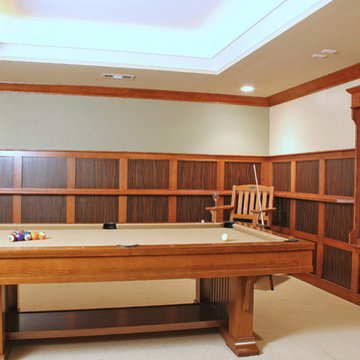
The homeowner wanted something different, out of the ordinary, as an entertainment center and bar combination that would add an unusual dimension to watching TV. It had to be in character with the rest of the residence, tastefully designed and executed to deliver the maximum effect.
A two-piece combination bar and seating, coupled with a fireplace and large screen TV was designed. A system was designed and custom built cabinet consisting of a radius front entertainment center houses a large flat screen TV and enclosed stereo speakers on the top level, and a gas log fireplace below.
A custom built see-through bar sports a matching radius front, plenty of storage, and room for three to eat, drink, and enjoy the warmth of the fireplace without missing any of the action on the TV. For even greater functionality, the TV is also viewable through the large opening in the bar while meals or snacks are prepared from the kitchen. Traffic flow is unique: access and egress between the bar front and TV can happen with ease around both sides of the bar, and the opening in the back of the bar provides for service both from and to the kitchen area. Because of the free and easy movement about the space, adequate lighting, and lack of combustibles at or on the fireplace, safety, as well as an ample use of space, are both achieved. Both pieces are custom fabricated from start to finish, and match each other identically in all respects. Both are constructed of clear cherry finish with a clear satin lacquer. Both enjoy chrome accents strips and custom crafted, glass cabinet doors with matching radii, and both are tastefully lit with accenting puck lights. The design and fabrication for both units shared issues in common as well as individually.
The entertainment center was fabricated in the shop in three units and then assembled onsite. The opening for the flat screen TV had to be carefully considered as it too had a radius and therefore had to be designed so that the TV would fit.
The entire bar system, except the countertop, had to be fabricated onsite due to the structural columns on either side between which the curved lower cabinets would rest. Then the countertop template was prepared, fabricated elsewhere, returned and installed. After the countertop was in place, the cabinetmaker had to wrap the two columns on either side as well as the overhead beam while making sure the joints at the columns and header maintained alignment. A complement of matching radii cabinet doors had to be constructed for both units. Radius glass inserts had to be ordered with precise dimensions to assure a perfect fit to openings with tight tolerances. Any mistake would have been expensive to correct. Because of the abundance of natural light into the space, the finishes had to be dead-on, otherwise every flaw would show. The custom walnut inlays were fabricated out of square stock, which protruded above the radius in each door. A jig matching the radius had to be designed and fabricated, then a router used to trim excess material and then sanded and finished.
Solving the multitude of challenges associated with the project was one of the parts that made the project fun and interesting. The homeowners now can entertain every night.
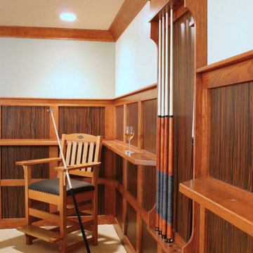 CRC Builders Inc.
The homeowner wanted something different, out of the ordinary, as an entertainment center and bar combination that would add an unusual dimension to watching TV. It had to be in character with the rest of the residence, tastefully designed and executed to deliver the maximum effect.
A two-piece combination bar and seating, coupled with a fireplace and large screen TV was designed. A system was designed and custom built cabinet consisting of a radius front entertainment center houses a large flat screen TV and enclosed stereo speakers on the top level, and a gas log fireplace below.
A custom built see-through bar sports a matching radius front, plenty of storage, and room for three to eat, drink, and enjoy the warmth of the fireplace without missing any of the action on the TV. For even greater functionality, the TV is also viewable through the large opening in the bar while meals or snacks are prepared from the kitchen. Traffic flow is unique: access and egress between the bar front and TV can happen with ease around both sides of the bar, and the opening in the back of the bar provides for service both from and to the kitchen area. Because of the free and easy movement about the space, adequate lighting, and lack of combustibles at or on the fireplace, safety, as well as an ample use of space, are both achieved. Both pieces are custom fabricated from start to finish, and match each other identically in all respects. Both are constructed of clear cherry finish with a clear satin lacquer. Both enjoy chrome accents strips and custom crafted, glass cabinet doors with matching radii, and both are tastefully lit with accenting puck lights. The design and fabrication for both units shared issues in common as well as individually.
The entertainment center was fabricated in the shop in three units and then assembled onsite. The opening for the flat screen TV had to be carefully considered as it too had a radius and therefore had to be designed so that the TV would fit.
The entire bar system, except the countertop, had to be fabricated onsite due to the structural columns on either side between which the curved lower cabinets would rest. Then the countertop template was prepared, fabricated elsewhere, returned and installed. After the countertop was in place, the cabinetmaker had to wrap the two columns on either side as well as the overhead beam while making sure the joints at the columns and header maintained alignment. A complement of matching radii cabinet doors had to be constructed for both units. Radius glass inserts had to be ordered with precise dimensions to assure a perfect fit to openings with tight tolerances. Any mistake would have been expensive to correct. Because of the abundance of natural light into the space, the finishes had to be dead-on, otherwise every flaw would show. The custom walnut inlays were fabricated out of square stock, which protruded above the radius in each door. A jig matching the radius had to be designed and fabricated, then a router used to trim excess material and then sanded and finished.
Solving the multitude of challenges associated with the project was one of the parts that made the project fun and interesting. The homeowners now can entertain every night.
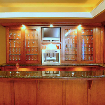 CRC Builders Inc.
The homeowner wanted something different, out of the ordinary, as an entertainment center and bar combination that would add an unusual dimension to watching TV. It had to be in character with the rest of the residence, tastefully designed and executed to deliver the maximum effect.
A two-piece combination bar and seating, coupled with a fireplace and large screen TV was designed. A system was designed and custom built cabinet consisting of a radius front entertainment center houses a large flat screen TV and enclosed stereo speakers on the top level, and a gas log fireplace below.
A custom built see-through bar sports a matching radius front, plenty of storage, and room for three to eat, drink, and enjoy the warmth of the fireplace without missing any of the action on the TV. For even greater functionality, the TV is also viewable through the large opening in the bar while meals or snacks are prepared from the kitchen. Traffic flow is unique: access and egress between the bar front and TV can happen with ease around both sides of the bar, and the opening in the back of the bar provides for service both from and to the kitchen area. Because of the free and easy movement about the space, adequate lighting, and lack of combustibles at or on the fireplace, safety, as well as an ample use of space, are both achieved. Both pieces are custom fabricated from start to finish, and match each other identically in all respects. Both are constructed of clear cherry finish with a clear satin lacquer. Both enjoy chrome accents strips and custom crafted, glass cabinet doors with matching radii, and both are tastefully lit with accenting puck lights. The design and fabrication for both units shared issues in common as well as individually.
The entertainment center was fabricated in the shop in three units and then assembled onsite. The opening for the flat screen TV had to be carefully considered as it too had a radius and therefore had to be designed so that the TV would fit.
The entire bar system, except the countertop, had to be fabricated onsite due to the structural columns on either side between which the curved lower cabinets would rest. Then the countertop template was prepared, fabricated elsewhere, returned and installed. After the countertop was in place, the cabinetmaker had to wrap the two columns on either side as well as the overhead beam while making sure the joints at the columns and header maintained alignment. A complement of matching radii cabinet doors had to be constructed for both units. Radius glass inserts had to be ordered with precise dimensions to assure a perfect fit to openings with tight tolerances. Any mistake would have been expensive to correct. Because of the abundance of natural light into the space, the finishes had to be dead-on, otherwise every flaw would show. The custom walnut inlays were fabricated out of square stock, which protruded above the radius in each door. A jig matching the radius had to be designed and fabricated, then a router used to trim excess material and then sanded and finished.
Solving the multitude of challenges associated with the project was one of the parts that made the project fun and interesting. The homeowners now can entertain every night.
 Goehring & Morgan Construction
Example of a large transitional master beige tile and porcelain tile limestone floor and beige floor alcove shower design in Orlando with raised-panel cabinets, dark wood cabinets, beige walls, an undermount sink and a hinged shower door
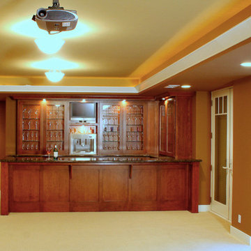 CRC Builders Inc.
The homeowner wanted something different, out of the ordinary, as an entertainment center and bar combination that would add an unusual dimension to watching TV. It had to be in character with the rest of the residence, tastefully designed and executed to deliver the maximum effect.
A two-piece combination bar and seating, coupled with a fireplace and large screen TV was designed. A system was designed and custom built cabinet consisting of a radius front entertainment center houses a large flat screen TV and enclosed stereo speakers on the top level, and a gas log fireplace below.
A custom built see-through bar sports a matching radius front, plenty of storage, and room for three to eat, drink, and enjoy the warmth of the fireplace without missing any of the action on the TV. For even greater functionality, the TV is also viewable through the large opening in the bar while meals or snacks are prepared from the kitchen. Traffic flow is unique: access and egress between the bar front and TV can happen with ease around both sides of the bar, and the opening in the back of the bar provides for service both from and to the kitchen area. Because of the free and easy movement about the space, adequate lighting, and lack of combustibles at or on the fireplace, safety, as well as an ample use of space, are both achieved. Both pieces are custom fabricated from start to finish, and match each other identically in all respects. Both are constructed of clear cherry finish with a clear satin lacquer. Both enjoy chrome accents strips and custom crafted, glass cabinet doors with matching radii, and both are tastefully lit with accenting puck lights. The design and fabrication for both units shared issues in common as well as individually.
The entertainment center was fabricated in the shop in three units and then assembled onsite. The opening for the flat screen TV had to be carefully considered as it too had a radius and therefore had to be designed so that the TV would fit.
The entire bar system, except the countertop, had to be fabricated onsite due to the structural columns on either side between which the curved lower cabinets would rest. Then the countertop template was prepared, fabricated elsewhere, returned and installed. After the countertop was in place, the cabinetmaker had to wrap the two columns on either side as well as the overhead beam while making sure the joints at the columns and header maintained alignment. A complement of matching radii cabinet doors had to be constructed for both units. Radius glass inserts had to be ordered with precise dimensions to assure a perfect fit to openings with tight tolerances. Any mistake would have been expensive to correct. Because of the abundance of natural light into the space, the finishes had to be dead-on, otherwise every flaw would show. The custom walnut inlays were fabricated out of square stock, which protruded above the radius in each door. A jig matching the radius had to be designed and fabricated, then a router used to trim excess material and then sanded and finished.
Solving the multitude of challenges associated with the project was one of the parts that made the project fun and interesting. The homeowners now can entertain every night.
 Milgard Windows & Doors
The Kiguchi family moved into their Austin, Texas home in 1994. Built in the 1980’s as part of a neighborhood development, they happily raised their family here but longed for something more contemporary. Once they became empty nesters, they decided it was time for a major remodel. After spending many years visiting Austin AIA Home Tours that highlight contemporary residential architecture, they had a lot of ideas and in 2013 were ready to interview architects and get their renovation underway.
The project turned into a major remodel due to an unstable foundation. Architects Ben Arbib and Ed Hughey, of Arbib Hughey Design were hired to solve the structural issue and look for inspiration in the bones of the house, which sat on top of a hillside and was surrounded by great views.
Unfortunately, with the old floor plan, the beautiful views were hidden by small windows that were poorly placed. In order to bring more natural light into the house the window sizes and configurations had to be addressed, all while keeping in mind the homeowners desire for a modern look and feel.
To achieve a more contemporary and sophisticated front of house, a new entry was designed that included removing a two-story bay window and porch. The entrance of the home also became more integrated with the landscape creating a template for new foliage to be planted. Older exterior materials were updated to incorporate a more muted palette of colors with a metal roof, dark grey siding in the back and white stucco in the front. Deep eaves were added over many of the new large windows for clean lines and sun protection.
“Inside it was about opening up the floor plan, expanding the views throughout the house, and updating the material palette to get a modern look that was also warm and inviting,” said Ben from Arbib Hughey Design. “Prior to the remodel, the house had the typical separation of rooms. We removed the walls between them and changed all of the windows to Milgard Thermally Improved Aluminum to connect the inside with the outside. No matter where you are you get nice views and natural light.”
The architects wanted to create some drama, which they accomplished with the window placement and opening up the interior floor plan to an open concept approach. Cabinetry was used to help delineate intimate spaces. To add warmth to an all-white living room, white-washed oak wood floors were installed and pine planks were used around the fireplace. The large windows served as artwork bringing the color of nature into the space.
An octagon shaped, elevated dining room, (named “the turret”), had a big impact on the design of the house. They architects rounded the corners and added larger window openings overlooking a new sunken garden. The great room was also softened by rounding out the corners and that circular theme continued throughout the house, being picked up in skylight wells and kitchen cabinetry. A staircase leading to a catwalk was added and the result was a two-story window wall that flooded the home with natural light.
When asked why Milgard® Thermally Improved Aluminum windows were selected, the architectural team listed many reasons:
1) Aesthetics: “We liked the slim profiles and narrow sightlines. The window frames never get in the way of the view and that was important to us. They also have a very contemporary look that went well with our design.”
2) Options: “We liked that we could get large sliding doors that matched the windows, giving us a very cohesive look and feel throughout the project.”
3) Cost Effective: “Milgard windows are affordable. You get a good product at a good price.”
4) Custom Sizes: “Milgard windows are customizable, which allowed us to get the right window for each location.”
Ready to take on your own traditional to modern home remodeling project? Arbib Hughey Design advises, “Work with a good architect. That means picking a team that is creative, communicative, listens well and is responsive. We think it’s important for an architect to listen to their clients and give them something they want, not something the architect thinks they should have. At the same time you want an architect who is willing and able to think outside the box and offer up design options that you may not have considered. Design is about a lot of back and forth, trying out ideas, getting feedback and trying again.”
The home was completely transformed into a unique, contemporary house perfectly integrated with its site. Internally the home has a natural flow for the occupants and externally it is integrated with the surroundings taking advantage of great natural light. As a side note, it was highly praised as part of the Austin AIA homes tour.
 Milgard Windows & Doors
The Kiguchi family moved into their Austin, Texas home in 1994. Built in the 1980’s as part of a neighborhood development, they happily raised their family here but longed for something more contemporary. Once they became empty nesters, they decided it was time for a major remodel. After spending many years visiting Austin AIA Home Tours that highlight contemporary residential architecture, they had a lot of ideas and in 2013 were ready to interview architects and get their renovation underway.
The project turned into a major remodel due to an unstable foundation. Architects Ben Arbib and Ed Hughey, of Arbib Hughey Design were hired to solve the structural issue and look for inspiration in the bones of the house, which sat on top of a hillside and was surrounded by great views.
Unfortunately, with the old floor plan, the beautiful views were hidden by small windows that were poorly placed. In order to bring more natural light into the house the window sizes and configurations had to be addressed, all while keeping in mind the homeowners desire for a modern look and feel.
To achieve a more contemporary and sophisticated front of house, a new entry was designed that included removing a two-story bay window and porch. The entrance of the home also became more integrated with the landscape creating a template for new foliage to be planted. Older exterior materials were updated to incorporate a more muted palette of colors with a metal roof, dark grey siding in the back and white stucco in the front. Deep eaves were added over many of the new large windows for clean lines and sun protection.
“Inside it was about opening up the floor plan, expanding the views throughout the house, and updating the material palette to get a modern look that was also warm and inviting,” said Ben from Arbib Hughey Design. “Prior to the remodel, the house had the typical separation of rooms. We removed the walls between them and changed all of the windows to Milgard Thermally Improved Aluminum to connect the inside with the outside. No matter where you are you get nice views and natural light.”
The architects wanted to create some drama, which they accomplished with the window placement and opening up the interior floor plan to an open concept approach. Cabinetry was used to help delineate intimate spaces. To add warmth to an all-white living room, white-washed oak wood floors were installed and pine planks were used around the fireplace. The large windows served as artwork bringing the color of nature into the space.
An octagon shaped, elevated dining room, (named “the turret”), had a big impact on the design of the house. They architects rounded the corners and added larger window openings overlooking a new sunken garden. The great room was also softened by rounding out the corners and that circular theme continued throughout the house, being picked up in skylight wells and kitchen cabinetry. A staircase leading to a catwalk was added and the result was a two-story window wall that flooded the home with natural light.
When asked why Milgard® Thermally Improved Aluminum windows were selected, the architectural team listed many reasons:
1) Aesthetics: “We liked the slim profiles and narrow sightlines. The window frames never get in the way of the view and that was important to us. They also have a very contemporary look that went well with our design.”
2) Options: “We liked that we could get large sliding doors that matched the windows, giving us a very cohesive look and feel throughout the project.”
3) Cost Effective: “Milgard windows are affordable. You get a good product at a good price.”
4) Custom Sizes: “Milgard windows are customizable, which allowed us to get the right window for each location.”
Ready to take on your own traditional to modern home remodeling project? Arbib Hughey Design advises, “Work with a good architect. That means picking a team that is creative, communicative, listens well and is responsive. We think it’s important for an architect to listen to their clients and give them something they want, not something the architect thinks they should have. At the same time you want an architect who is willing and able to think outside the box and offer up design options that you may not have considered. Design is about a lot of back and forth, trying out ideas, getting feedback and trying again.”
The home was completely transformed into a unique, contemporary house perfectly integrated with its site. Internally the home has a natural flow for the occupants and externally it is integrated with the surroundings taking advantage of great natural light. As a side note, it was highly praised as part of the Austin AIA homes tour.
 Milgard Windows & Doors
The Kiguchi family moved into their Austin, Texas home in 1994. Built in the 1980’s as part of a neighborhood development, they happily raised their family here but longed for something more contemporary. Once they became empty nesters, they decided it was time for a major remodel. After spending many years visiting Austin AIA Home Tours that highlight contemporary residential architecture, they had a lot of ideas and in 2013 were ready to interview architects and get their renovation underway.
The project turned into a major remodel due to an unstable foundation. Architects Ben Arbib and Ed Hughey, of Arbib Hughey Design were hired to solve the structural issue and look for inspiration in the bones of the house, which sat on top of a hillside and was surrounded by great views.
Unfortunately, with the old floor plan, the beautiful views were hidden by small windows that were poorly placed. In order to bring more natural light into the house the window sizes and configurations had to be addressed, all while keeping in mind the homeowners desire for a modern look and feel.
To achieve a more contemporary and sophisticated front of house, a new entry was designed that included removing a two-story bay window and porch. The entrance of the home also became more integrated with the landscape creating a template for new foliage to be planted. Older exterior materials were updated to incorporate a more muted palette of colors with a metal roof, dark grey siding in the back and white stucco in the front. Deep eaves were added over many of the new large windows for clean lines and sun protection.
“Inside it was about opening up the floor plan, expanding the views throughout the house, and updating the material palette to get a modern look that was also warm and inviting,” said Ben from Arbib Hughey Design. “Prior to the remodel, the house had the typical separation of rooms. We removed the walls between them and changed all of the windows to Milgard Thermally Improved Aluminum to connect the inside with the outside. No matter where you are you get nice views and natural light.”
The architects wanted to create some drama, which they accomplished with the window placement and opening up the interior floor plan to an open concept approach. Cabinetry was used to help delineate intimate spaces. To add warmth to an all-white living room, white-washed oak wood floors were installed and pine planks were used around the fireplace. The large windows served as artwork bringing the color of nature into the space.
An octagon shaped, elevated dining room, (named “the turret”), had a big impact on the design of the house. They architects rounded the corners and added larger window openings overlooking a new sunken garden. The great room was also softened by rounding out the corners and that circular theme continued throughout the house, being picked up in skylight wells and kitchen cabinetry. A staircase leading to a catwalk was added and the result was a two-story window wall that flooded the home with natural light.
When asked why Milgard® Thermally Improved Aluminum windows were selected, the architectural team listed many reasons:
1) Aesthetics: “We liked the slim profiles and narrow sightlines. The window frames never get in the way of the view and that was important to us. They also have a very contemporary look that went well with our design.”
2) Options: “We liked that we could get large sliding doors that matched the windows, giving us a very cohesive look and feel throughout the project.”
3) Cost Effective: “Milgard windows are affordable. You get a good product at a good price.”
4) Custom Sizes: “Milgard windows are customizable, which allowed us to get the right window for each location.”
Ready to take on your own traditional to modern home remodeling project? Arbib Hughey Design advises, “Work with a good architect. That means picking a team that is creative, communicative, listens well and is responsive. We think it’s important for an architect to listen to their clients and give them something they want, not something the architect thinks they should have. At the same time you want an architect who is willing and able to think outside the box and offer up design options that you may not have considered. Design is about a lot of back and forth, trying out ideas, getting feedback and trying again.”
The home was completely transformed into a unique, contemporary house perfectly integrated with its site. Internally the home has a natural flow for the occupants and externally it is integrated with the surroundings taking advantage of great natural light. As a side note, it was highly praised as part of the Austin AIA homes tour.
 Milgard Windows & Doors
The Kiguchi family moved into their Austin, Texas home in 1994. Built in the 1980’s as part of a neighborhood development, they happily raised their family here but longed for something more contemporary. Once they became empty nesters, they decided it was time for a major remodel. After spending many years visiting Austin AIA Home Tours that highlight contemporary residential architecture, they had a lot of ideas and in 2013 were ready to interview architects and get their renovation underway.
The project turned into a major remodel due to an unstable foundation. Architects Ben Arbib and Ed Hughey, of Arbib Hughey Design were hired to solve the structural issue and look for inspiration in the bones of the house, which sat on top of a hillside and was surrounded by great views.
Unfortunately, with the old floor plan, the beautiful views were hidden by small windows that were poorly placed. In order to bring more natural light into the house the window sizes and configurations had to be addressed, all while keeping in mind the homeowners desire for a modern look and feel.
To achieve a more contemporary and sophisticated front of house, a new entry was designed that included removing a two-story bay window and porch. The entrance of the home also became more integrated with the landscape creating a template for new foliage to be planted. Older exterior materials were updated to incorporate a more muted palette of colors with a metal roof, dark grey siding in the back and white stucco in the front. Deep eaves were added over many of the new large windows for clean lines and sun protection.
“Inside it was about opening up the floor plan, expanding the views throughout the house, and updating the material palette to get a modern look that was also warm and inviting,” said Ben from Arbib Hughey Design. “Prior to the remodel, the house had the typical separation of rooms. We removed the walls between them and changed all of the windows to Milgard Thermally Improved Aluminum to connect the inside with the outside. No matter where you are you get nice views and natural light.”
The architects wanted to create some drama, which they accomplished with the window placement and opening up the interior floor plan to an open concept approach. Cabinetry was used to help delineate intimate spaces. To add warmth to an all-white living room, white-washed oak wood floors were installed and pine planks were used around the fireplace. The large windows served as artwork bringing the color of nature into the space.
An octagon shaped, elevated dining room, (named “the turret”), had a big impact on the design of the house. They architects rounded the corners and added larger window openings overlooking a new sunken garden. The great room was also softened by rounding out the corners and that circular theme continued throughout the house, being picked up in skylight wells and kitchen cabinetry. A staircase leading to a catwalk was added and the result was a two-story window wall that flooded the home with natural light.
When asked why Milgard® Thermally Improved Aluminum windows were selected, the architectural team listed many reasons:
1) Aesthetics: “We liked the slim profiles and narrow sightlines. The window frames never get in the way of the view and that was important to us. They also have a very contemporary look that went well with our design.”
2) Options: “We liked that we could get large sliding doors that matched the windows, giving us a very cohesive look and feel throughout the project.”
3) Cost Effective: “Milgard windows are affordable. You get a good product at a good price.”
4) Custom Sizes: “Milgard windows are customizable, which allowed us to get the right window for each location.”
Ready to take on your own traditional to modern home remodeling project? Arbib Hughey Design advises, “Work with a good architect. That means picking a team that is creative, communicative, listens well and is responsive. We think it’s important for an architect to listen to their clients and give them something they want, not something the architect thinks they should have. At the same time you want an architect who is willing and able to think outside the box and offer up design options that you may not have considered. Design is about a lot of back and forth, trying out ideas, getting feedback and trying again.”
The home was completely transformed into a unique, contemporary house perfectly integrated with its site. Internally the home has a natural flow for the occupants and externally it is integrated with the surroundings taking advantage of great natural light. As a side note, it was highly praised as part of the Austin AIA homes tour.
63