
Search results for "Third party specifications" in Home Design Ideas
 Gayler Design Build
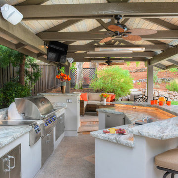
With a sizeable backyard and a love for entertaining, these clients wanted to build a covered outdoor kitchen/bar and seating area. They had one specific area by the side of their pool, with limited space, to build the outdoor kitchen.
There were immediate concerns about how to incorporate the two steps in the middle of the patio area; and they really wanted a bar that could seat at least eight people (to include an additional seating area with couches and chairs). This couple also wanted to use their outdoor living space year round. The kitchen needed ample storage and had to be easy to maintain. And last, but not least, they wanted it to look beautiful!
This 16 x 26 ft clear span pavilion was a great fit for the area we had to work with. By using wrapped steel columns in the corners in 6-foot piers, carpenter-built trusses, and no ridge beams, we created good space usage underneath the pavilion. The steps were incorporated into the space to make the transition between the kitchen area and seating area, which looked like they were meant to be there. With a little additional flagstone work, we brought the curve of the step to meet the back island, which also created more floor space in the seating area.
Two separate islands were created for the outdoor kitchen/bar area, built with galvanized metal studs to allow for more room inside the islands (for appliances and cabinets). We also used backer board and covered the islands with smooth finish stucco.
The back island housed the BBQ, a 2-burner cooktop and sink, along with four cabinets, one of which was a pantry style cabinet with pull out shelves (air tight, dust proof and spider proof—also very important to the client).
The front island housed the refrigerator, ice maker, and counter top cooler, with another set of pantry style, air tight cabinets. By curving the outside edge of the countertop we maximized the bar area and created seating for eight. In addition, we filled in the curve on the inside of the island with counter top and created two additional seats. In total, there was seating for ten people.
Infrared heaters, ceiling fans and shades were added for climate control, so the outdoor living space could be used year round. A TV for sporting events and SONOS for music, were added for entertaining enjoyment. Track lighting, as well as LED tape lights under the backsplash, provided ideal lighting for after dark usage.
The clients selected honed, Fantasy Brown Satin Quartzite, with a chipped edge detail for their countertop. This beautiful, linear design marble is very easy to maintain. The base of the islands were completed in stucco and painted satin gray to complement their house color. The posts were painted with Monterey Cliffs, which matched the color of the house shutter trim. The pavilion ceiling consisted of 2 x 6-T & G pine and was stained platinum gray.
In the few months since the outdoor living space was built, the clients said they have used it for more than eight parties and can’t wait to use it for the holidays! They also made sure to tell us that the look, feel and maintenance of the area all are perfect!
 Kitchen Design Concepts
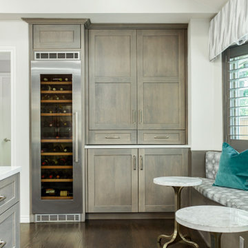
The built-ins on the opposite side of the breakfast area were mainly used for overflow storage and the client was in need of space specifically for wine and entertaining. The breakfast table was rarely used and we wanted to create a banquette space for casual seating and wine tasting.
The new wine column provides plenty of storage for this client’s collection, and floor to ceiling cabinetry store drinking glasses, extra place settings, and holiday/party décor. The banquette is perfectly placed under the windows for resting while cooking, reading, or a few additional guests.
 Klopf Architecture
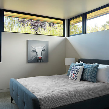
Klopf Architecture, Arterra Landscape Architects and Henry Calvert of Calvert Ventures Designed and built a new warm, modern, Eichler-inspired, open, indoor-outdoor home on a deeper-than-usual San Mateo Highlands property where an original Eichler house had burned to the ground.
The owners wanted multi-generational living and larger spaces than the original home offered, but all parties agreed that the house should respect the neighborhood and blend in stylistically with the other Eichlers. At first the Klopf team considered re-using what little was left of the original home and expanding on it. But after discussions with the owner and builder, all parties agreed that the last few remaining elements of the house were not practical to re-use, so Klopf Architecture designed a new home that pushes the Eichler approach in new directions.
One disadvantage of Eichler production homes is that the house designs were not optimized for each specific lot. A new custom home offered the team a chance to start over. In this case, a longer house that opens up sideways to the south fit the lot better than the original square-ish house that used to open to the rear (west). Accordingly, the Klopf team designed an L-shaped “bar” house with a large glass wall with large sliding glass doors that faces sideways instead of to the rear like a typical Eichler. This glass wall opens to a pool and landscaped yard designed by Arterra Landscape Architects.
Driving by the house, one might assume at first glance it is an Eichler because of the horizontality, the overhanging flat roof eaves, the dark gray vertical siding, and orange solid panel front door, but the house is designed for the 21st Century and is not meant to be a “Likeler.” You won't see any posts and beams in this home. Instead, the ceiling decking is a western red cedar that covers over all the beams. Like Eichlers, this cedar runs continuously from inside to out, enhancing the indoor / outdoor feeling of the house, but unlike Eichlers it conceals a cavity for lighting, wiring, and insulation. Ceilings are higher, rooms are larger and more open, the master bathroom is light-filled and more generous, with a separate tub and shower and a separate toilet compartment, and there is plenty of storage. The garage even easily fits two of today's vehicles with room to spare.
A massive 49-foot by 12-foot wall of glass and the continuity of materials from inside to outside enhance the inside-outside living concept, so the owners and their guests can flow freely from house to pool deck to BBQ to pool and back.
During construction in the rough framing stage, Klopf thought the front of the house appeared too tall even though the house had looked right in the design renderings (probably because the house is uphill from the street). So Klopf Architecture paid the framer to change the roofline from how we had designed it to be lower along the front, allowing the home to blend in better with the neighborhood. One project goal was for people driving up the street to pass the home without immediately noticing there is an "imposter" on this lot, and making that change was essential to achieve that goal.
This 2,606 square foot, 3 bedroom, 3 bathroom Eichler-inspired new house is located in San Mateo in the heart of the Silicon Valley.
Klopf Architecture Project Team: John Klopf, AIA, Klara Kevane
Landscape Architect: Arterra Landscape Architects
Contractor: Henry Calvert of Calvert Ventures
Photography ©2016 Mariko Reed
Location: San Mateo, CA
Year completed: 2016
Find the right local pro for your project

 Edgewater Design Group
As written in Northern Home & Cottage by Elizabeth Edwards
In general, Bryan and Connie Rellinger loved the charm of the old cottage they purchased on a Crooked Lake peninsula, north of Petoskey. Specifically, however, the presence of a live-well in the kitchen (a huge cement basin with running water for keeping fish alive was right in the kitchen entryway, seriously), rickety staircase and green shag carpet, not so much. An extreme renovation was the only solution. The downside? The rebuild would have to fit into the smallish nonconforming footprint. The upside? That footprint was built when folks could place a building close enough to the water to feel like they could dive in from the house. Ahhh...
Stephanie Baldwin of Edgewater Design helped the Rellingers come up with a timeless cottage design that breathes efficiency into every nook and cranny. It also expresses the synergy of Bryan, Connie and Stephanie, who emailed each other links to products they liked throughout the building process. That teamwork resulted in an interior that sports a young take on classic cottage. Highlights include a brass sink and light fixtures, coffered ceilings with wide beadboard planks, leathered granite kitchen counters and a way-cool floor made of American chestnut planks from an old barn.
Thanks to an abundant use of windows that deliver a grand view of Crooked Lake, the home feels airy and much larger than it is. Bryan and Connie also love how well the layout functions for their family - especially when they are entertaining. The kids' bedrooms are off a large landing at the top of the stairs - roomy enough to double as an entertainment room. When the adults are enjoying cocktail hour or a dinner party downstairs, they can pull a sliding door across the kitchen/great room area to seal it off from the kids' ruckus upstairs (or vice versa!).
From its gray-shingled dormers to its sweet white window boxes, this charmer on Crooked Lake is packed with ideas!
- Jacqueline Southby Photography
 MMI Design
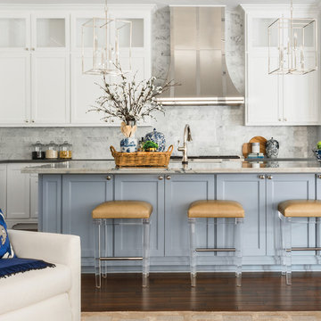
This existing client reached out to MMI Design for help shortly after the flood waters of Harvey subsided. Her home was ravaged by 5 feet of water throughout the first floor. What had been this client's long-term dream renovation became a reality, turning the nightmare of Harvey's wrath into one of the loveliest homes designed to date by MMI. We led the team to transform this home into a showplace. Our work included a complete redesign of her kitchen and family room, master bathroom, two powders, butler's pantry, and a large living room. MMI designed all millwork and cabinetry, adjusted the floor plans in various rooms, and assisted the client with all material specifications and furnishings selections. Returning these clients to their beautiful '"new" home is one of MMI's proudest moments!
 Kowalske Kitchen & Bath
Creating a space to entertain was the top priority in this Mukwonago kitchen remodel. The homeowners wanted seating and counter space for hosting parties and watching sports. By opening the dining room wall, we extended the kitchen area. We added an island and custom designed furniture-style bar cabinet with retractable pocket doors. A new awning window overlooks the backyard and brings in natural light. Many in-cabinet storage features keep this kitchen neat and organized.
Bar Cabinet
The furniture-style bar cabinet has retractable pocket doors and a drop-in quartz counter. The homeowners can entertain in style, leaving the doors open during parties. Guests can grab a glass of wine or make a cocktail right in the cabinet.
Outlet Strips
Outlet strips on the island and peninsula keeps the end panels of the island and peninsula clean. The outlet strips also gives them options for plugging in appliances during parties.
Modern Farmhouse Design
The design of this kitchen is modern farmhouse. The materials, patterns, color and texture define this space. We used shades of golds and grays in the cabinetry, backsplash and hardware. The chevron backsplash and shiplap island adds visual interest.
Custom Cabinetry
This kitchen features frameless custom cabinets with light rail molding. It’s designed to hide the under cabinet lighting and angled plug molding. Putting the outlets under the cabinets keeps the backsplash uninterrupted.
Storage Features
Efficient storage and organization was important to these homeowners.
We opted for deep drawers to allow for easy access to stacks of dishes and bowls.
Under the cooktop, we used custom drawer heights to meet the homeowners’ storage needs.
A third drawer was added next to the spice drawer rollout.
Narrow pullout cabinets on either side of the cooktop for spices and oils.
The pantry rollout by the double oven rotates 90 degrees.
Other Updates
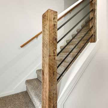
Staircase – We updated the staircase with a barn wood newel post and matte black balusters
Fireplace – We whitewashed the fireplace and added a barn wood mantel and pilasters.
 Wiedemann Architects LLC
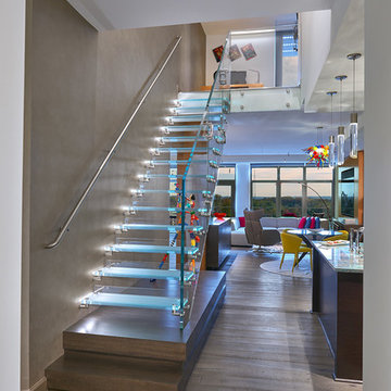
To create a more open plan, our solution was to replace the current enclosed stair with an open, glass stair and to create a proper dining space where the third bedroom used to be. This allows the light from the large living room windows to cascade down the length of the apartment brightening the front entry. The Venetian plaster wall anchors the new stair case and LED lights illuminate each glass tread.
Photography: Anice Hoachlander, Hopachlander Davis Photography
 Kowalske Kitchen & Bath
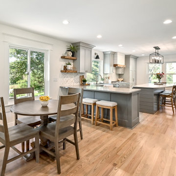
Creating a space to entertain was the top priority in this Mukwonago kitchen remodel. The homeowners wanted seating and counter space for hosting parties and watching sports. By opening the dining room wall, we extended the kitchen area. We added an island and custom designed furniture-style bar cabinet with retractable pocket doors. A new awning window overlooks the backyard and brings in natural light. Many in-cabinet storage features keep this kitchen neat and organized.
Bar Cabinet
The furniture-style bar cabinet has retractable pocket doors and a drop-in quartz counter. The homeowners can entertain in style, leaving the doors open during parties. Guests can grab a glass of wine or make a cocktail right in the cabinet.
Outlet Strips
Outlet strips on the island and peninsula keeps the end panels of the island and peninsula clean. The outlet strips also gives them options for plugging in appliances during parties.
Modern Farmhouse Design
The design of this kitchen is modern farmhouse. The materials, patterns, color and texture define this space. We used shades of golds and grays in the cabinetry, backsplash and hardware. The chevron backsplash and shiplap island adds visual interest.
Custom Cabinetry
This kitchen features frameless custom cabinets with light rail molding. It’s designed to hide the under cabinet lighting and angled plug molding. Putting the outlets under the cabinets keeps the backsplash uninterrupted.
Storage Features
Efficient storage and organization was important to these homeowners.
We opted for deep drawers to allow for easy access to stacks of dishes and bowls.
Under the cooktop, we used custom drawer heights to meet the homeowners’ storage needs.
A third drawer was added next to the spice drawer rollout.
Narrow pullout cabinets on either side of the cooktop for spices and oils.
The pantry rollout by the double oven rotates 90 degrees.
Other Updates
Staircase – We updated the staircase with a barn wood newel post and matte black balusters
Fireplace – We whitewashed the fireplace and added a barn wood mantel and pilasters.
 Edgewater Design Group
As written in Northern Home & Cottage by Elizabeth Edwards
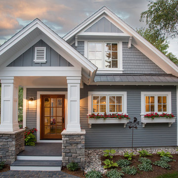
In general, Bryan and Connie Rellinger loved the charm of the old cottage they purchased on a Crooked Lake peninsula, north of Petoskey. Specifically, however, the presence of a live-well in the kitchen (a huge cement basin with running water for keeping fish alive was right in the kitchen entryway, seriously), rickety staircase and green shag carpet, not so much. An extreme renovation was the only solution. The downside? The rebuild would have to fit into the smallish nonconforming footprint. The upside? That footprint was built when folks could place a building close enough to the water to feel like they could dive in from the house. Ahhh...
Stephanie Baldwin of Edgewater Design helped the Rellingers come up with a timeless cottage design that breathes efficiency into every nook and cranny. It also expresses the synergy of Bryan, Connie and Stephanie, who emailed each other links to products they liked throughout the building process. That teamwork resulted in an interior that sports a young take on classic cottage. Highlights include a brass sink and light fixtures, coffered ceilings with wide beadboard planks, leathered granite kitchen counters and a way-cool floor made of American chestnut planks from an old barn.
Thanks to an abundant use of windows that deliver a grand view of Crooked Lake, the home feels airy and much larger than it is. Bryan and Connie also love how well the layout functions for their family - especially when they are entertaining. The kids' bedrooms are off a large landing at the top of the stairs - roomy enough to double as an entertainment room. When the adults are enjoying cocktail hour or a dinner party downstairs, they can pull a sliding door across the kitchen/great room area to seal it off from the kids' ruckus upstairs (or vice versa!).
From its gray-shingled dormers to its sweet white window boxes, this charmer on Crooked Lake is packed with ideas!
- Jacqueline Southby Photography
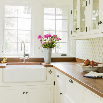
 Albert, Righter & Tittmann Architects, Inc.
Harbor View is a modern-day interpretation of the shingled vacation houses of its seaside community. The gambrel roof, horizontal, ground-hugging emphasis, and feeling of simplicity, are all part of the character of the place.
While fitting in with local traditions, Harbor View is meant for modern living. The kitchen is a central gathering spot, open to the main combined living/dining room and to the waterside porch. One easily moves between indoors and outdoors.
The house is designed for an active family, a couple with three grown children and a growing number of grandchildren. It is zoned so that the whole family can be there together but retain privacy. Living, dining, kitchen, library, and porch occupy the center of the main floor. One-story wings on each side house two bedrooms and bathrooms apiece, and two more bedrooms and bathrooms and a study occupy the second floor of the central block. The house is mostly one room deep, allowing cross breezes and light from both sides.
The porch, a third of which is screened, is a main dining and living space, with a stone fireplace offering a cozy place to gather on summer evenings.
A barn with a loft provides storage for a car or boat off-season and serves as a big space for projects or parties in summer.
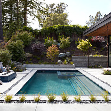 Klopf Architecture
Klopf Architecture, Arterra Landscape Architects and Henry Calvert of Calvert Ventures Designed and built a new warm, modern, Eichler-inspired, open, indoor-outdoor home on a deeper-than-usual San Mateo Highlands property where an original Eichler house had burned to the ground.
The owners wanted multi-generational living and larger spaces than the original home offered, but all parties agreed that the house should respect the neighborhood and blend in stylistically with the other Eichlers. At first the Klopf team considered re-using what little was left of the original home and expanding on it. But after discussions with the owner and builder, all parties agreed that the last few remaining elements of the house were not practical to re-use, so Klopf Architecture designed a new home that pushes the Eichler approach in new directions.
One disadvantage of Eichler production homes is that the house designs were not optimized for each specific lot. A new custom home offered the team a chance to start over. In this case, a longer house that opens up sideways to the south fit the lot better than the original square-ish house that used to open to the rear (west). Accordingly, the Klopf team designed an L-shaped “bar” house with a large glass wall with large sliding glass doors that faces sideways instead of to the rear like a typical Eichler. This glass wall opens to a pool and landscaped yard designed by Arterra Landscape Architects.
Driving by the house, one might assume at first glance it is an Eichler because of the horizontality, the overhanging flat roof eaves, the dark gray vertical siding, and orange solid panel front door, but the house is designed for the 21st Century and is not meant to be a “Likeler.” You won't see any posts and beams in this home. Instead, the ceiling decking is a western red cedar that covers over all the beams. Like Eichlers, this cedar runs continuously from inside to out, enhancing the indoor / outdoor feeling of the house, but unlike Eichlers it conceals a cavity for lighting, wiring, and insulation. Ceilings are higher, rooms are larger and more open, the master bathroom is light-filled and more generous, with a separate tub and shower and a separate toilet compartment, and there is plenty of storage. The garage even easily fits two of today's vehicles with room to spare.
A massive 49-foot by 12-foot wall of glass and the continuity of materials from inside to outside enhance the inside-outside living concept, so the owners and their guests can flow freely from house to pool deck to BBQ to pool and back.
During construction in the rough framing stage, Klopf thought the front of the house appeared too tall even though the house had looked right in the design renderings (probably because the house is uphill from the street). So Klopf Architecture paid the framer to change the roofline from how we had designed it to be lower along the front, allowing the home to blend in better with the neighborhood. One project goal was for people driving up the street to pass the home without immediately noticing there is an "imposter" on this lot, and making that change was essential to achieve that goal.
This 2,606 square foot, 3 bedroom, 3 bathroom Eichler-inspired new house is located in San Mateo in the heart of the Silicon Valley.
Klopf Architecture Project Team: John Klopf, AIA, Klara Kevane
Landscape Architect: Arterra Landscape Architects
Contractor: Henry Calvert of Calvert Ventures
Photography ©2016 Mariko Reed
Location: San Mateo, CA
Year completed: 2016
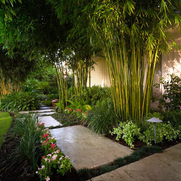
 Landscape Images Ltd
the bamboo is a clumping variety called Bambusa eutuldoides viridi-vittata , Asian lemon bamboo. This variety is a clumper and you do not need to contain it, however, do allow an 8'by 10' area for its ultimate growth. Bamboo does require constant maintenance and you will need to do some research for the specific variety you choose. Once planted, it will become a beautiful focal point and add a stunning tropical accent. Photo Credit: Sherwood Cox

 Thyme & Place Design LLC
When my client had to move from her company office to work at home, she set up in the dining room. Despite her best efforts, this was not the long-term solution she was looking for. My client realized she needed a dedicated space not on the main floor of the home. On one hand, having your office space right next to the kitchen is handy. On the other hand, it made separating work and home life was not that easy.
The house was a ranch. In essence, the basement would run entire length of the home. As we came down the steps, we entered a time capsule. The house was built in the 1950’s. The walls were covered with original knotty pine paneling. There was a wood burning fireplace and considering this was a basement, high ceilings. In addition, there was everything her family could not store at their own homes. As we wound though the space, I though “wow this has potential”, Eventually, after walking through the laundry room we came to a small nicely lit room. This would be the office.
My client looked at me and asked what I thought. Undoubtedly, I said, this can be a great workspace, but do you really want to walk through this basement and laundry to get here? Without reservation, my client said where do we start?
Once the design was in place, we started the renovation. The knotty pine paneling had to go. Specifically, to add some insulation and control the dampness and humidity. The laundry room wall was relocated to create a hallway to the office.
At the far end of the room, we designated a workout zone. Weights, mats, exercise bike and television are at the ready for morning or afternoon workouts. The space can be concealed by a folding screen for party time. Doors to an old closet under the stairs were relocated to the workout area for hidden storage. Now we had nice wall for a beautiful console and mirror for storage and serving during parties.
In order to add architectural details, we covered the old ugly support columns with simple recessed millwork panels. This detail created a visual division between the bar area and the seating area in front of the fireplace. The old red brick on the fireplace surround was replaced with stack stone. A mantle was made from reclaimed wood. Additional reclaimed wood floating shelves left and right of the fireplace provides decorative display while maintaining a rustic element balancing the copper end table and leather swivel rocker.
We found an amazing rug which tied all of the colors together further defining the gathering space. Russet and burnt orange became the accent color unifying each space. With a bit of whimsy, a rather unusual light fixture which looks like roots from a tree growing through the ceiling is a conversation piece.
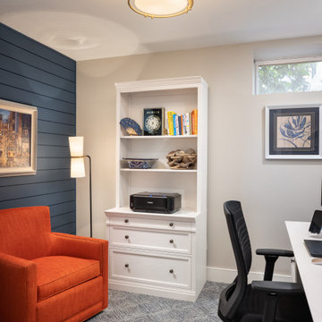
The office space is quite and removed from the main part of the basement. There is a desk large enough for multiple screens, a small bookcase holding office supplies and a comfortable chair for conference calls. Because working from home requires many online meetings, we added a shiplap wall painted in Hale Navy to contrast with the orange fabric on the chair. We finished the décor with a painting from my client’s father. This is the background online visitors will see.
The last and best part of the renovation is the beautiful bar. My client is an avid collector of wine. She already had the EuroCave refrigerator, so I incorporated it into the design. The cabinets are painted Temptation Grey from Benjamin Moore. The counter tops are my favorite hard working quartzite Brown Fantasy. The backsplash is a combination of rustic wood and old tin ceiling like porcelain tiles. Together with the textures of the reclaimed wood and hide poofs balanced against the smooth finish of the cabinets, we created a comfortable luxury for relaxing.
There is ample storage for bottles, cans, glasses, and anything else you can think of for a great party. In addition to the wine storage, we incorporated a beverage refrigerator, an ice maker, and a sink. Floating shelves with integrated lighting illuminate the back bar. The raised height of the front bar provides the perfect wine tasting and paring spot. I especially love the pendant lights which look like wine glasses.
Finally, I selected carpet for the stairs and office. It is perfect for noise reduction. Meanwhile for the overall flooring, I specifically selected a high-performance vinyl plank floor. We often use this product as it is perfect to install on a concrete floor. It is soft to walk on, easy to clean and does not reduce the overall height of the space.
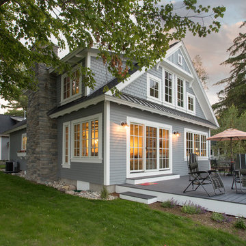 Edgewater Design Group
As written in Northern Home & Cottage by Elizabeth Edwards
In general, Bryan and Connie Rellinger loved the charm of the old cottage they purchased on a Crooked Lake peninsula, north of Petoskey. Specifically, however, the presence of a live-well in the kitchen (a huge cement basin with running water for keeping fish alive was right in the kitchen entryway, seriously), rickety staircase and green shag carpet, not so much. An extreme renovation was the only solution. The downside? The rebuild would have to fit into the smallish nonconforming footprint. The upside? That footprint was built when folks could place a building close enough to the water to feel like they could dive in from the house. Ahhh...
Stephanie Baldwin of Edgewater Design helped the Rellingers come up with a timeless cottage design that breathes efficiency into every nook and cranny. It also expresses the synergy of Bryan, Connie and Stephanie, who emailed each other links to products they liked throughout the building process. That teamwork resulted in an interior that sports a young take on classic cottage. Highlights include a brass sink and light fixtures, coffered ceilings with wide beadboard planks, leathered granite kitchen counters and a way-cool floor made of American chestnut planks from an old barn.
Thanks to an abundant use of windows that deliver a grand view of Crooked Lake, the home feels airy and much larger than it is. Bryan and Connie also love how well the layout functions for their family - especially when they are entertaining. The kids' bedrooms are off a large landing at the top of the stairs - roomy enough to double as an entertainment room. When the adults are enjoying cocktail hour or a dinner party downstairs, they can pull a sliding door across the kitchen/great room area to seal it off from the kids' ruckus upstairs (or vice versa!).
From its gray-shingled dormers to its sweet white window boxes, this charmer on Crooked Lake is packed with ideas!
- Jacqueline Southby Photography
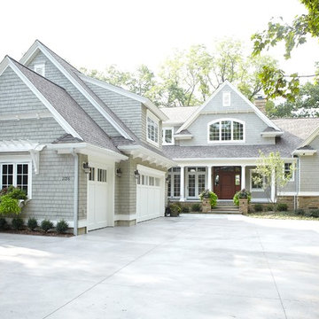
 Sears Architects
Photographer: Ashley Avila
For building specifications, please see description on main project page.
For interior images and specifications, please visit: http://www.houzz.com/projects/332182/lake-house.
 Thyme & Place Design LLC
When my client had to move from her company office to work at home, she set up in the dining room. Despite her best efforts, this was not the long-term solution she was looking for. My client realized she needed a dedicated space not on the main floor of the home. On one hand, having your office space right next to the kitchen is handy. On the other hand, it made separating work and home life was not that easy.
The house was a ranch. In essence, the basement would run entire length of the home. As we came down the steps, we entered a time capsule. The house was built in the 1950’s. The walls were covered with original knotty pine paneling. There was a wood burning fireplace and considering this was a basement, high ceilings. In addition, there was everything her family could not store at their own homes. As we wound though the space, I though “wow this has potential”, Eventually, after walking through the laundry room we came to a small nicely lit room. This would be the office.
My client looked at me and asked what I thought. Undoubtedly, I said, this can be a great workspace, but do you really want to walk through this basement and laundry to get here? Without reservation, my client said where do we start?
Once the design was in place, we started the renovation. The knotty pine paneling had to go. Specifically, to add some insulation and control the dampness and humidity. The laundry room wall was relocated to create a hallway to the office.
At the far end of the room, we designated a workout zone. Weights, mats, exercise bike and television are at the ready for morning or afternoon workouts. The space can be concealed by a folding screen for party time. Doors to an old closet under the stairs were relocated to the workout area for hidden storage. Now we had nice wall for a beautiful console and mirror for storage and serving during parties.
In order to add architectural details, we covered the old ugly support columns with simple recessed millwork panels. This detail created a visual division between the bar area and the seating area in front of the fireplace. The old red brick on the fireplace surround was replaced with stack stone. A mantle was made from reclaimed wood. Additional reclaimed wood floating shelves left and right of the fireplace provides decorative display while maintaining a rustic element balancing the copper end table and leather swivel rocker.
We found an amazing rug which tied all of the colors together further defining the gathering space. Russet and burnt orange became the accent color unifying each space. With a bit of whimsy, a rather unusual light fixture which looks like roots from a tree growing through the ceiling is a conversation piece.
The office space is quite and removed from the main part of the basement. There is a desk large enough for multiple screens, a small bookcase holding office supplies and a comfortable chair for conference calls. Because working from home requires many online meetings, we added a shiplap wall painted in Hale Navy to contrast with the orange fabric on the chair. We finished the décor with a painting from my client’s father. This is the background online visitors will see.
The last and best part of the renovation is the beautiful bar. My client is an avid collector of wine. She already had the EuroCave refrigerator, so I incorporated it into the design. The cabinets are painted Temptation Grey from Benjamin Moore. The counter tops are my favorite hard working quartzite Brown Fantasy. The backsplash is a combination of rustic wood and old tin ceiling like porcelain tiles. Together with the textures of the reclaimed wood and hide poofs balanced against the smooth finish of the cabinets, we created a comfortable luxury for relaxing.
There is ample storage for bottles, cans, glasses, and anything else you can think of for a great party. In addition to the wine storage, we incorporated a beverage refrigerator, an ice maker, and a sink. Floating shelves with integrated lighting illuminate the back bar. The raised height of the front bar provides the perfect wine tasting and paring spot. I especially love the pendant lights which look like wine glasses.
Finally, I selected carpet for the stairs and office. It is perfect for noise reduction. Meanwhile for the overall flooring, I specifically selected a high-performance vinyl plank floor. We often use this product as it is perfect to install on a concrete floor. It is soft to walk on, easy to clean and does not reduce the overall height of the space.
 Cantoni Irvine
Designed By: Richard Bustos Photos By: Jeri Koegel
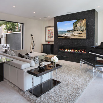
Ron and Kathy Chaisson have lived in many homes throughout Orange County, including three homes on the Balboa Peninsula and one at Pelican Crest. But when the “kind of retired” couple, as they describe their current status, decided to finally build their ultimate dream house in the flower streets of Corona del Mar, they opted not to skimp on the amenities. “We wanted this house to have the features of a resort,” says Ron. “So we designed it to have a pool on the roof, five patios, a spa, a gym, water walls in the courtyard, fire-pits and steam showers.”
To bring that five-star level of luxury to their newly constructed home, the couple enlisted Orange County’s top talent, including our very own rock star design consultant Richard Bustos, who worked alongside interior designer Trish Steel and Patterson Custom Homes as well as Brandon Architects. Together the team created a 4,500 square-foot, five-bedroom, seven-and-a-half-bathroom contemporary house where R&R get top billing in almost every room. Two stories tall and with lots of open spaces, it manages to feel spacious despite its narrow location. And from its third floor patio, it boasts panoramic ocean views.
“Overall we wanted this to be contemporary, but we also wanted it to feel warm,” says Ron. Key to creating that look was Richard, who selected the primary pieces from our extensive portfolio of top-quality furnishings. Richard also focused on clean lines and neutral colors to achieve the couple’s modern aesthetic, while allowing both the home’s gorgeous views and Kathy’s art to take center stage.
As for that mahogany-lined elevator? “It’s a requirement,” states Ron. “With three levels, and lots of entertaining, we need that elevator for keeping the bar stocked up at the cabana, and for our big barbecue parties.” He adds, “my wife wears high heels a lot of the time, so riding the elevator instead of taking the stairs makes life that much better for her.”
 Klopf Architecture
Klopf Architecture, Arterra Landscape Architects and Henry Calvert of Calvert Ventures Designed and built a new warm, modern, Eichler-inspired, open, indoor-outdoor home on a deeper-than-usual San Mateo Highlands property where an original Eichler house had burned to the ground.
The owners wanted multi-generational living and larger spaces than the original home offered, but all parties agreed that the house should respect the neighborhood and blend in stylistically with the other Eichlers. At first the Klopf team considered re-using what little was left of the original home and expanding on it. But after discussions with the owner and builder, all parties agreed that the last few remaining elements of the house were not practical to re-use, so Klopf Architecture designed a new home that pushes the Eichler approach in new directions.
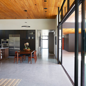
One disadvantage of Eichler production homes is that the house designs were not optimized for each specific lot. A new custom home offered the team a chance to start over. In this case, a longer house that opens up sideways to the south fit the lot better than the original square-ish house that used to open to the rear (west). Accordingly, the Klopf team designed an L-shaped “bar” house with a large glass wall with large sliding glass doors that faces sideways instead of to the rear like a typical Eichler. This glass wall opens to a pool and landscaped yard designed by Arterra Landscape Architects.
Driving by the house, one might assume at first glance it is an Eichler because of the horizontality, the overhanging flat roof eaves, the dark gray vertical siding, and orange solid panel front door, but the house is designed for the 21st Century and is not meant to be a “Likeler.” You won't see any posts and beams in this home. Instead, the ceiling decking is a western red cedar that covers over all the beams. Like Eichlers, this cedar runs continuously from inside to out, enhancing the indoor / outdoor feeling of the house, but unlike Eichlers it conceals a cavity for lighting, wiring, and insulation. Ceilings are higher, rooms are larger and more open, the master bathroom is light-filled and more generous, with a separate tub and shower and a separate toilet compartment, and there is plenty of storage. The garage even easily fits two of today's vehicles with room to spare.
A massive 49-foot by 12-foot wall of glass and the continuity of materials from inside to outside enhance the inside-outside living concept, so the owners and their guests can flow freely from house to pool deck to BBQ to pool and back.
During construction in the rough framing stage, Klopf thought the front of the house appeared too tall even though the house had looked right in the design renderings (probably because the house is uphill from the street). So Klopf Architecture paid the framer to change the roofline from how we had designed it to be lower along the front, allowing the home to blend in better with the neighborhood. One project goal was for people driving up the street to pass the home without immediately noticing there is an "imposter" on this lot, and making that change was essential to achieve that goal.
This 2,606 square foot, 3 bedroom, 3 bathroom Eichler-inspired new house is located in San Mateo in the heart of the Silicon Valley.
Klopf Architecture Project Team: John Klopf, AIA, Klara Kevane
Landscape Architect: Arterra Landscape Architects
Contractor: Henry Calvert of Calvert Ventures
Photography ©2016 Mariko Reed
Location: San Mateo, CA
Year completed: 2016
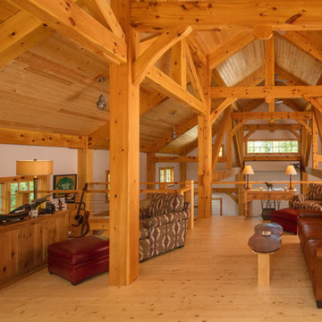
 Custom Timber Frames
View from loft / office over looking the great room.
Example of a country light wood floor and beige floor family room design in Other with white walls
Example of a country light wood floor and beige floor family room design in Other with white walls
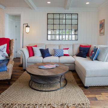 Edgewater Design Group
As written in Northern Home & Cottage by Elizabeth Edwards
In general, Bryan and Connie Rellinger loved the charm of the old cottage they purchased on a Crooked Lake peninsula, north of Petoskey. Specifically, however, the presence of a live-well in the kitchen (a huge cement basin with running water for keeping fish alive was right in the kitchen entryway, seriously), rickety staircase and green shag carpet, not so much. An extreme renovation was the only solution. The downside? The rebuild would have to fit into the smallish nonconforming footprint. The upside? That footprint was built when folks could place a building close enough to the water to feel like they could dive in from the house. Ahhh...
Stephanie Baldwin of Edgewater Design helped the Rellingers come up with a timeless cottage design that breathes efficiency into every nook and cranny. It also expresses the synergy of Bryan, Connie and Stephanie, who emailed each other links to products they liked throughout the building process. That teamwork resulted in an interior that sports a young take on classic cottage. Highlights include a brass sink and light fixtures, coffered ceilings with wide beadboard planks, leathered granite kitchen counters and a way-cool floor made of American chestnut planks from an old barn.
Thanks to an abundant use of windows that deliver a grand view of Crooked Lake, the home feels airy and much larger than it is. Bryan and Connie also love how well the layout functions for their family - especially when they are entertaining. The kids' bedrooms are off a large landing at the top of the stairs - roomy enough to double as an entertainment room. When the adults are enjoying cocktail hour or a dinner party downstairs, they can pull a sliding door across the kitchen/great room area to seal it off from the kids' ruckus upstairs (or vice versa!).
From its gray-shingled dormers to its sweet white window boxes, this charmer on Crooked Lake is packed with ideas!
- Jacqueline Southby Photography
3