
Search results for "Time s" in Home Design Ideas

 down2earth Interior Design, LLC.
The bathroom in this home features a double wide shower. The original inspiration for the shower walls was a herringbone wall tile design in which each tile is a parallelogram.
The master bathroom in this home features a double wide shower. The original inspiration for the shower walls was a herringbone wall tile design in which each tile is a parallelogram.
But one of the things we pride ourselves on at d2e is being able to capture the look for less. It turns out that parallelogram tile was a little pricey. Our substitution: similarly proportioned black rectangular tiles installed in a herringbone pattern to elevate the look of a budget-friendly material. These 3x12 tiles Costa Alegra tiles from Bedrosians Tile & Stone did the trick.
Shower sprayer is from the Brizo Litze line in luxe gold.
photo credit: Rebecca McAlpin
 One Room at a Time, Inc.
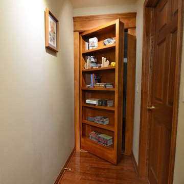
The attic space was transformed from a cold storage area of 700 SF to usable space with closed mechanical room and 'stage' area for kids. Structural collar ties were wrapped and stained to match the rustic hand-scraped hardwood floors. LED uplighting on beams adds great daylight effects. Short hallways lead to the dormer windows, required to meet the daylight code for the space. An additional steel metal 'hatch' ships ladder in the floor as a second code-required egress is a fun alternate exit for the kids, dropping into a closet below. The main staircase entrance is concealed with a secret bookcase door. The door hardware is a concealed pivoting hinge that can withstand 700 pounds, and opens weightlessly.
One Room at a Time, Inc.

 TKS Design Group
Download our free ebook, Creating the Ideal Kitchen. DOWNLOAD NOW
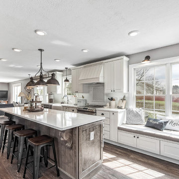
The homeowners came to us looking to update the kitchen in their historic 1897 home. The home had gone through an extensive renovation several years earlier that added a master bedroom suite and updates to the front façade. The kitchen however was not part of that update and a prior 1990’s update had left much to be desired. The client is an avid cook, and it was just not very functional for the family.
The original kitchen was very choppy and included a large eat in area that took up more than its fair share of the space. On the wish list was a place where the family could comfortably congregate, that was easy and to cook in, that feels lived in and in check with the rest of the home’s décor. They also wanted a space that was not cluttered and dark – a happy, light and airy room. A small powder room off the space also needed some attention so we set out to include that in the remodel as well.
See that arch in the neighboring dining room? The homeowner really wanted to make the opening to the dining room an arch to match, so we incorporated that into the design.
Another unfortunate eyesore was the state of the ceiling and soffits. Turns out it was just a series of shortcuts from the prior renovation, and we were surprised and delighted that we were easily able to flatten out almost the entire ceiling with a couple of little reworks.
Other changes we made were to add new windows that were appropriate to the new design, which included moving the sink window over slightly to give the work zone more breathing room. We also adjusted the height of the windows in what was previously the eat-in area that were too low for a countertop to work. We tried to keep an old island in the plan since it was a well-loved vintage find, but the tradeoff for the function of the new island was not worth it in the end. We hope the old found a new home, perhaps as a potting table.
Designed by: Susan Klimala, CKD, CBD
Photography by: Michael Kaskel
For more information on kitchen and bath design ideas go to: www.kitchenstudio-ge.com
Find the right local pro for your project


 Cook Designs
Large tuscan laminate floor and beige floor mudroom photo in Austin with beige walls and a white front door
 TKS Design Group
Free ebook, Creating the Ideal Kitchen. DOWNLOAD NOW
Our clients had been in their home since the early 1980’s and decided it was time for some updates. We took on the kitchen, two bathrooms and a powder room.
The layout in the kitchen was functional for them, so we kept that pretty much as is. Our client wanted a contemporary-leaning transitional look — nice clean lines with a gray and white palette. Light gray cabinets with a slightly darker gray subway tile keep the northern exposure light and airy. They also purchased some new furniture for their breakfast room and adjoining family room, so the whole space looks completely styled and new. The light fixtures are staggered and give a nice rhythm to the otherwise serene feel.
The homeowners were not 100% sold on the flooring choice for little powder room off the kitchen when I first showed it, but now they think it is one of the most interesting features of the design. I always try to “push” my clients a little bit because that’s when things can get really fun and this is what you are paying for after all, ideas that you may not come up with on your own.
We also worked on the two upstairs bathrooms. We started first on the hall bath which was basically just in need of a face lift. The floor is porcelain tile made to look like carrera marble. The vanity is white Shaker doors fitted with a white quartz top. We re-glazed the cast iron tub.
The master bath was a tub to shower conversion. We used a wood look porcelain plank on the main floor along with a Kohler Tailored vanity. The custom shower has a barn door shower door, and vinyl wallpaper in the sink area gives a rich textured look to the space. Overall, it’s a pretty sophisticated look for its smaller fooprint.
Designed by: Susan Klimala, CKD, CBD
Photography by: Michael Alan Kaskel
For more information on kitchen and bath design ideas go to: www.kitchenstudio-ge.com


Sponsored
Sunbury, OH

J.Holderby - Renovations
Franklin County's Leading General Contractors - 2X Best of Houzz!


 Ruben S. Ojeda Architects
Shawn Bishop
Example of a mid-sized tuscan backyard deck design in Los Angeles with decking and a pergola
Example of a mid-sized tuscan backyard deck design in Los Angeles with decking and a pergola

 catlin stothers design
Well situated in Mont Royal, this split-level home had many positives apart from its dated interior, and layout of many small and inefficient rooms. This was all at odds with the owners’ lifestyle and aesthetic.
The client had architectural plans designed for a third floor addition that were to include a master bedroom and ensuite bathroom. The desired look for the entire house influenced all aspects of construction. Apart from the removal most walls on the main floor, everything was stripped back to the most simple and pure of finishing materials.
The existing floors were refinished in a smoked grey matte palette and offset the rich warm walnut accents in the kitchen and soft white walls.
With an abundance of white walls throughout, feature walls were essential in both the master bedroom and ensuite. The deep charcoal wall in the bedroom provides dramatic contrast to the teak headboard and hammered silver light fixture. The ensuite’s feature wall is made of pewter ceramic tiles that add texture and elegance to this simple space.
Materials and furnishings throughout were selected for their simplicity and form.
Photo : Drew Hadley

 Edgewater Design Group
As written in Northern Home & Cottage by Elizabeth Edwards
For years, Jeff and Ellen Miller spent their vacations sailing in Northern Michigan—so they had plenty of time to check out which small harbor town they might like to retire to someday. When that time arrived several years ago, they looked at properties up and down the coast and along inland lakes. When they discovered a sweet piece on the outskirts of Boyne City that included waterfront and a buildable lot, with a garage on it, across the street, they knew they’d found home. The couple figured they could find plans for their dream lake cottage online. After all, they weren’t looking to build anything grandiose. Just a small-to-medium sized contemporary Craftsman. But after an unfruitful online search they gave up, frustrated. Every plan they found had the back of the house facing the water—they needed a blueprint for a home that fronted on the water. The Millers first met the woman, Stephanie Baldwin, Owner & President of Edgewater Design Group, who solved that issue and a number of others on the 2015
Northern Home & Cottage Petoskey Area Home Tour. Baldwin’s home that year was a smart, 2000-square cottage on Crooked Lake with simple lines and a Craftsman sensibility. That home proved to the couple that Edgewater Design Group is as proficient at small homes as the larger ones they are often known for. Edgewater Design Group did indeed come up with the perfect plan for the Millers. At 2400 square feet, the simple Craftsman with its 3 bedrooms, vaulted ceiling in the great room and upstairs deck is everything the Millers wanted—including the fact that construction stayed within their budget. An extra courtesy of working with the talented design team is a screened in porch facing the lake (“She told us, of course you have to have a screened in porch,” Ellen says. “And we love it!’) Edgewater’s other touches are more subtle. The Millers wanted to keep the garage, but the home needed to be sited on a small knoll some feet away in order to capture the views of Lake Charlevoix across the street. The solution is a covered walkway and steps that are so artful they enhance the home. Another favor Baldwin did for them was to connect them with Legacy Construction, a firm known for its craftsmanship and attention to detail. The Miller home, outfitted with touches including custom molding, cherry cabinetry, a stunning custom range hood, built in shelving and custom vanities. A warm hickory floor and lovely earth-toned Craftsman-style color palette pull it all together, while a fireplace mantel hewn from a tree taken on the property rounds out this gracious lake cottage.

 urbangreen furniture
Bedroom and mid-sized elegant boy medium tone wood floor and brown floor kids' bedroom photo in New York with beige walls

Sponsored
Sunbury, OH
J.Holderby - Renovations
Franklin County's Leading General Contractors - 2X Best of Houzz!

 Alair Homes Plano
Our clients came to us because they were tired of looking at the side of their neighbor’s house from their master bedroom window! Their 1959 Dallas home had worked great for them for years, but it was time for an update and reconfiguration to make it more functional for their family.
They were looking to open up their dark and choppy space to bring in as much natural light as possible in both the bedroom and bathroom. They knew they would need to reconfigure the master bathroom and bedroom to make this happen. They were thinking the current bedroom would become the bathroom, but they weren’t sure where everything else would go.
This is where we came in! Our designers were able to create their new floorplan and show them a 3D rendering of exactly what the new spaces would look like.
The space that used to be the master bedroom now consists of the hallway into their new master suite, which includes a new large walk-in closet where the washer and dryer are now located.
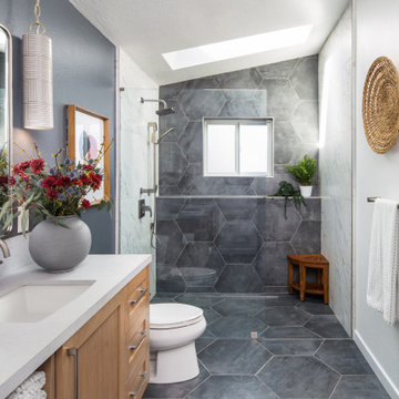
From there, the space flows into their new beautiful, contemporary bathroom. They decided that a bathtub wasn’t important to them but a large double shower was! So, the new shower became the focal point of the bathroom. The new shower has contemporary Marine Bone Electra cement hexagon tiles and brushed bronze hardware. A large bench, hidden storage, and a rain shower head were must-have features. Pure Snow glass tile was installed on the two side walls while Carrara Marble Bianco hexagon mosaic tile was installed for the shower floor.
For the main bathroom floor, we installed a simple Yosemite tile in matte silver. The new Bellmont cabinets, painted naval, are complemented by the Greylac marble countertop and the Brainerd champagne bronze arched cabinet pulls. The rest of the hardware, including the faucet, towel rods, towel rings, and robe hooks, are Delta Faucet Trinsic, in a classic champagne bronze finish. To finish it off, three 14” Classic Possini Euro Ludlow wall sconces in burnished brass were installed between each sheet mirror above the vanity.
In the space that used to be the master bathroom, all of the furr downs were removed. We replaced the existing window with three large windows, opening up the view to the backyard. We also added a new door opening up into the main living room, which was totally closed off before.
Our clients absolutely love their cool, bright, contemporary bathroom, as well as the new wall of windows in their master bedroom, where they are now able to enjoy their beautiful backyard!

 MossCreek
High in the Blue Ridge Mountains of North Carolina, this majestic lodge was custom designed by MossCreek to provide rustic elegant living for the extended family of our clients. Featuring four spacious master suites, a massive great room with floor-to-ceiling windows, expansive porches, and a large family room with built-in bar, the home incorporates numerous spaces for sharing good times.
Unique to this design is a large wrap-around porch on the main level, and four large distinct and private balconies on the upper level. This provides outdoor living for each of the four master suites.
We hope you enjoy viewing the photos of this beautiful home custom designed by MossCreek.
Photo by Todd Bush



Sponsored
Columbus, OH

Snider & Metcalf Interior Design, LTD
Leading Interior Designers in Columbus, Ohio & Ponte Vedra, Florida


 M Home Style
The attic from a circa 1790's farmhouse was transformed into a teenage girls bedroom retreat
Inspiration for a large timeless loft-style carpeted bedroom remodel in New York with gray walls
Inspiration for a large timeless loft-style carpeted bedroom remodel in New York with gray walls


145