
Search results for "Towards material" in Home Design Ideas
 ashleyelizabeth649
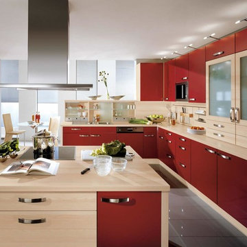
Kitchen is the heart of every house. It is the place where we cook food items and store them inside our house. In the past, the idea of a kitchen was simple. People used it only for preparing foods. But, things have changed a lot in this modern era. Now, a kitchen is arranged according to modular designs and it will be equipped with variety of electric appliances. Apart from cooking food, a kitchen can also be used for dining, food storage, dish washing etc. People who are keen on keeping their home clean and beautiful have to be conscious of innovating their kitchen. Many people consult interior designers and other experts who can help them for that. This will be a costly effort which will not be affordable for all kind of people. Creative kitchen renovations will make your kitchen look better. If you are looking for the finest ways to modify your kitchen, this article will be helpful for you. Please find below some of the world's best ideas for renovating your kitchen.
Be conscious of the quality: You should always purchase only high quality materials for your kitchen as it has to do a lot. Top quality appliances will last for many years and will perform better. It is recommended to use wood veneer for cabinet interiors as it is more durable than melamine, laminate or MDF.
Paint elegantly: If you want to make your kitchen attractive and colorful, then you can opt painting. Find suitable colors for kitchen materials and give a unique outlook. Brush- painting will help you to maintain your kitchen beautiful and it will also enhance the freshness.
Do not forget ceiling: Most of the people who are trying to renovate their kitchen, do not give proper attention towards ceiling. Beautification of ceiling is an inevitable part of renovating kitchen. Use antique tiles or attractive colours for the ceiling. If you have no idea of it, you can ask for the help of an expert.
Find proper place and height: Placing appliances in the right place and height will help you to make your kitchen more beautiful. It will also help you to manage the use of space. If you placed all materials properly, it will be easier for you to use them.
Give large space for storage: It is known to all that the main function of a kitchen is to prepare food. But nowadays, storage of food has become as important as cooking. While renovating kitchen, try to give large space for storing food items. If your kitchen lacks enough space for storage, you will tend to store things here and there and it will ruin all its beauty. So, try to find enough space and keep things neatly.
It is important to maintain the sanity and beauty of your kitchen as it is considered to be the heart of a house. Try to follow the ideas mentioned above for renovating your kitchen. Creative kitchen renovations will provide a unique style for your kitchen.
 USI Design & Remodeling
This master bathroom renovation in Frisco was completed for a repeat USI Design & Remodeling client as part of a larger first-floor transformation of the home. The original bathroom reflected a very typical North Texas layout of its era — dark stained cabinetry, granite countertops, compartmentalized vanities, a built-in tub adjoining a framed shower, and separated spaces that no longer aligned with how the homeowners wanted to live. As their aesthetic evolved toward a more transitional and contemporary direction, the goal became less about replacing finishes and more about redefining the experience of the room itself. The project needed to feel calmer, more architectural, and far more intentional in how the space functioned visually and emotionally.
One of the most important changes was removing the original shower curb and pony wall in favor of a fully open curbless shower with ultra-clear ½-inch heavy glass. Achieving that look required recessing the slab, re-floating the shower floor toward a linear drain, and engineering the space so the room would read as visually uninterrupted from end to end. Throughout the project, many of the design decisions were rooted in restraint rather than excess. The oversized 24x48 Porcelanosa flooring carries very little shade variation, creating a quieter visual field, while the cabinetry was executed in rift-sawn white oak specifically because it produces a far more controlled and consistent finish outcome than more common cuts of wood. In luxury projects, consistency itself becomes part of the refinement.
The floating vanity was designed more like custom furniture than traditional cabinetry, utilizing waterfall mitered edges and fully reworked plumbing locations so both homeowners could share in having generous functional countertop space. The original makeup station was repurposed into integrated storage with powered drawers and concealed organization for everyday items such as blow dryers and flat irons. Along the vanity wall, wall-mounted plumbing fixtures were paired with ribbed natural marble surfaces — a detail that required intentional planning long before construction began. Rather than allowing the ribbed material to terminate awkwardly behind the fixtures, the backsplash and stone transitions were specifically designed to resolve those conditions cleanly. Those are the types of details that distinguish highly coordinated design-build work from projects that simply assemble materials together.
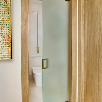
While the room contains a significant amount of luxury detailing — from the freestanding tub and geoprism marble focal wall to the custom rift-sawn white oak closet doors and elongated mirrors that leverage the 11-foot ceiling heights — the project was always guided by quiet luxury rather than visual competition. Even the water closet enclosure was handled with restraint through the use of a satin-etched glass door rather than another heavy solid opening. The intent throughout was to create a bathroom that feels restorative and serene rather than overdesigned. In our view, the best luxury spaces are the ones that feel composed long after the initial impression wears off.
 Go Home Builders
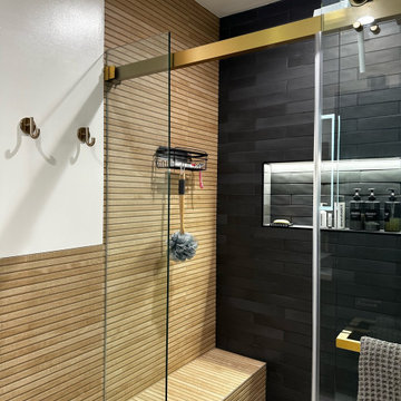
Upon stepping into this stylish japandi modern fusion bathroom nestled in the heart of Pasadena, you are instantly greeted by the unique visual journey of maple ribbon tiles These tiles create an inviting path that extends from the entrance of the bathroom, leading you all the way to the shower. They artistically cover half the wall, adding warmth and texture to the space. Indeed, creating a japandi modern fusion style that combines the best of both worlds. You might just even say japandi bathroom with a modern twist.
Elegance and Boldness
Above the tiles, the walls are bathed in fresh white paint. Particularly, he crisp whiteness of the paint complements the earthy tones of the maple tiles, resulting in a harmonious blend of simplicity and elegance.
Moving forward, you encounter the vanity area, featuring dual sinks. Each sink is enhanced by flattering vanity mirror lighting. This creates a well-lit space, perfect for grooming routines.
Balanced Contrast
Adding a contemporary touch, custom black cabinets sit beneath and in between the sinks. Obviously, they offer ample storage while providing each sink its private space. Even so, bronze handles adorn these cabinets, adding a sophisticated touch that echoes the bathroom’s understated luxury.
The journey continues towards the shower area, where your eye is drawn to the striking charcoal subway tiles. Clearly, these tiles add a modern edge to the shower’s back wall. Alongside, a built-in ledge subtly integrates lighting, adding both functionality and a touch of ambiance.
The shower’s side walls continue the narrative of the maple ribbon tiles from the main bathroom area. Definitely, their warm hues against the cool charcoal subway tiles create a visual contrast that’s both appealing and invigorating.
Beautiful Details
Adding to the seamless design is a sleek glass sliding shower door. Apart from this, this transparent element allows light to flow freely, enhancing the overall brightness of the space. In addition, a bronze handheld shower head complements the other bronze elements in the room, tying the design together beautifully.
Underfoot, you’ll find luxurious tile flooring. Furthermore, this material not only adds to the room’s opulence but also provides a durable, easy-to-maintain surface.
Finally, the entire japandi modern fusion bathroom basks in the soft glow of recessed LED lighting. Without a doubt, this lighting solution adds depth and dimension to the space, accentuating the unique features of the bathroom design. Unquestionably, making this bathroom have a japandi bathroom with a modern twist.
Find the right local pro for your project
 Lincoln Lighthill Architect
 employed several discrete updates that collectively transform this existing row house.
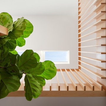
At the heart of the home, a section of floor was removed at the top level to open up the existing stair and allow light from a new skylight to penetrate deep into the home. The stair itself received a new maple guardrail and planter, with a Fiddle-leaf fig tree growing up through the opening towards the skylight.
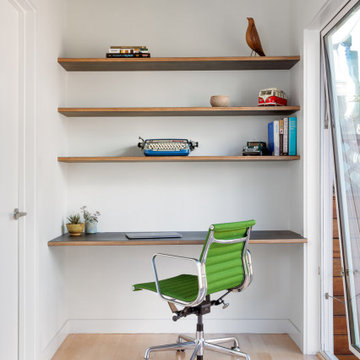
On the top living level, an awkwardly located entrance to a full bathroom directly off the main stair was moved around the corner and out of the way by removing a little used tub from the bathroom, as well as an outdated heater in the back corner. This created a more discrete entrance to the existing, now half-bath, and opened up a space for a wall of pantry cabinets with built-in refrigerator, and an office nook at the rear of the house with a huge new awning window to let in light and air.
Downstairs, the two existing bathrooms were reconfigured and recreated as dedicated master and kids baths. The kids bath uses yellow and white hexagonal Heath tile to create a pixelated celebration of color. The master bath, hidden behind a flush wall of walnut cabinetry, utilizes another Heath tile color to create a calming retreat.
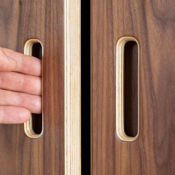
Throughout the home, walnut thin-ply cabinetry creates a strong contrast to the existing maple flooring, while the exposed blond edges of the material tie the two together. Rounded edges on integral pulls and door edges create pinstripe detailing that adds richness and a sense of playfulness to the design.
This project was featured by Houzz: https://tinyurl.com/stn2hcze
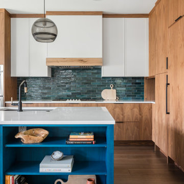
 Designs by KS
Project: Kitsilano House
Builder: Grenor Homes
About this Project
When our clients asked us to design their new house in the heart of Kitsilano, they wanted a space that showcased their personalities, travels, and experiences. Naturally, our team was instantly excited and eager to make this house a home.
Layout:
Prior to the renovation, the family room was adjacent to the kitchen and the formal living room at the other end of the space; in the middle was the dinning area. We looked at the main floor as an entire space and decided to combine the two living spaces into one and move the dining area towards the kitchen.
The Kitchen:
had always been an L shape with an island; previously there was a kitchen table by the windows. In the space planning period, we decided to eliminate the kitchen table to increase the overall size of the kitchen, giving us a bigger island for casual eating.
The perimeter of the kitchen has many great features; a coffee nook, a freezer column, double ovens, a cooktop with drawers below, an appliance garage in the awkward corner, a pantry with ample storage and free-standing fridge.
The Island also has many key features; a built-in unit for garbage/recycling/compost, a slide out tray underneath the sink for easy access to cleaning products, a dishwasher, and a bank of four drawer. On the outside of the island is an open shelf for cookbooks and display items. Below the countertop overhang is additional hidden storage for the items not accessed frequently.
Dinning Area:
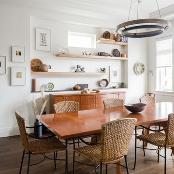
we utilized the pre-existing niche by incorporating floating shelves in an asymmetrical design, which became the perfect area for the clients to display the art collected during their travels.
Bar Area:
The space between the kitchen and powder room became the perfect place to add a bar. Storage, counter space, and 2 bar fridges brought this little entertaining area to life.
Fireplace:
Using existing fireplace unit we cladded the surround with Dekton material, paneled the wall above with Walnut and a mantel made from Quarkus. These materials repeat them selves through the entire space.

 InnovationLand
Among our Houston outdoor kitchens, this one is unique because of its concrete countertops, pergola with stucco wrapping and custom storage.
"It's not one of our biggest covered outdoor kitchens in Houston," says Outdoor Homescapes of Houston owner Wayne Franks. "But it's unique, and it looks really nice, too!"
The client, a young family, wanted an outdoor kitchen with a more minimalistic, modern look, explains Outdoor Homescapes senior designer Lisha Maxey.
"They're both doctors and very much attuned to detail," she says. "Their primary goal was to create a space where they could lounge while the children played as well as an area to entertain family and friends while cooking and dining outside."
Like a growing number of people wanting small outdoor kitchens in Houston, this client expressed interest in using concrete as a surface material: "The look is contemporary and is easily paired with any type of outdoor furniture," says Maxey, "from wicker to teak to iron."
Here's a closeup of the concrete countertops. You'll notice that they're glossy and smooth like glass, thanks to special sealers and a topcoat of UV-resistant resin that prevents the countertop from yellowing.
Since these particular clients lean toward the minimalistic side of contemporary design, she continues, "the standard granite countertop of many Houston outdoor kitchens would not work, since it typically has a lot of movement and can be busy."
Lisha sees the use of concrete as a growing outdoor design trend for Houston outdoor kitchens: "It's easy to maintain and again, leans towards a more modern look for outdoor."
All the furniture and lighting is from Restoration Hardware, says Lisha, who's offering $500 in free outdoor furniture consultation services as a special promotion. (Interested? Just contact us!)
The dining and lounge chairs are from the Antibes collection in cast aluminum with a bronze finish. The table is a Belgian Trestle made of weathered concrete and teak. Simple track lighting was used on the pergola in keeping with the minimalist look of the space.
The pergola is a treated pine, stained a Minwax Jacobean, which appears almost black. "This client chose a pergola over a roof extension off the house because they wanted it to still seem light and airy in their outdoor space for their young children," explains Lisha. "They wanted a certain degree of sun and shade protection, which a pergola does provide, but they wanted it to seem a bit like a park for the kids to play in."
"The seating/storage bin was not a part of the original design," says Lisha. "As the project progressed, the client expressed interest in some sort of chest for the new outdoor furniture cushions to be stored in."
The design for the storage bin was developed to accommodate this request: "It eventually evolved into a seating area as well. And to keep the look consistent with the new kitchen, it was agreed that the stone be carried through the design. The wood top was necessary so we could design a hinged access for storage."
 Kuche+Cucina
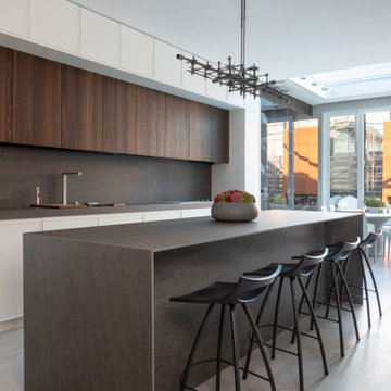
A complete gut renovation of a Borough Park, Brooklyn kosher kitchen, with am addition of a breakfast room.
DOCA cabinets, in textured dark oak, thin shaker white matte lacquer, porcelain fronts, counters and backsplashes, as well as metallic lacquer cabinets.
Sponsored
Columbus, OH

Hope Restoration & General Contracting
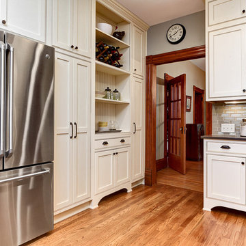
Columbus Design-Build, Kitchen & Bath Remodeling, Historic Renovations
 Interior Concepts By Amy
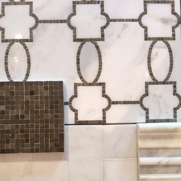
I give you a recent kitchen project complete. The kitchen back splash is a place of impact. It is a place where you can say, "welcome to my kitchen and this is how I would like you to feel in it". What does this design say to you? It tells me that the homeowner appreciates fine things, they are traditional and lean a bit toward formal.
Trending now are very plain back splashes without a lot of detail so I have to confess, it was nice giving a nod to tradition in this lower Fairfield County delight. After many iterations and decisions, I finally came up with the winning combination that spoke to the homeowner! This was not a simple design. Quite intricate with the dueling mosaics between the area over the range and the area over the sink in the Butler Pantry. I also wanted to connect the two spaces with coordinating frames and complimentary stone in the field area of the perimeter. Here I added random touches of the mosaic frame work creating little slats of the dark brown limestone material.
Used in this scheme were products from three different vendors and all resourced at Karen Berkemeyer Home Ltd. It is how things combine that make it work so well.
The Butler Pantry and Bar Area is given focus. Here the expert installer was asked to surround the herringbone 3x6 stone tile with limestone 3/8ths inch square mosaic pieces. This job was not for an amateur. I used a round pencil to transition and frame. Here is what the client said, "Thanks again. Everything looks amazing! Mike did a fantastic job....the crew were neat, get and efficient. Thanks also for referring Mike to us."
Here is where I started: I posted this earlier knowing it was the one that would make it all come together:
So many looks, so many choices and one is just right for you. Whether you are refreshing your kitchen or starting over new, the back splash is the place of impact. It is where it all comes together and is a very important aspect of the kitchen. Ideally it should be considered in concert with all the other materials in order to get it just right.
 Lincoln Lighthill Architect
 employed several discrete updates that collectively transform this existing row house.
At the heart of the home, a section of floor was removed at the top level to open up the existing stair and allow light from a new skylight to penetrate deep into the home. The stair itself received a new maple guardrail and planter, with a Fiddle-leaf fig tree growing up through the opening towards the skylight.
On the top living level, an awkwardly located entrance to a full bathroom directly off the main stair was moved around the corner and out of the way by removing a little used tub from the bathroom, as well as an outdated heater in the back corner. This created a more discrete entrance to the existing, now half-bath, and opened up a space for a wall of pantry cabinets with built-in refrigerator, and an office nook at the rear of the house with a huge new awning window to let in light and air.
Downstairs, the two existing bathrooms were reconfigured and recreated as dedicated master and kids baths. The kids bath uses yellow and white hexagonal Heath tile to create a pixelated celebration of color. The master bath, hidden behind a flush wall of walnut cabinetry, utilizes another Heath tile color to create a calming retreat.
Throughout the home, walnut thin-ply cabinetry creates a strong contrast to the existing maple flooring, while the exposed blond edges of the material tie the two together. Rounded edges on integral pulls and door edges create pinstripe detailing that adds richness and a sense of playfulness to the design.
This project was featured by Houzz: https://tinyurl.com/stn2hcze
 Designs by KS
Project: Kitsilano House
Builder: Grenor Homes
About this Project
When our clients asked us to design their new house in the heart of Kitsilano, they wanted a space that showcased their personalities, travels, and experiences. Naturally, our team was instantly excited and eager to make this house a home.
Layout:
Prior to the renovation, the family room was adjacent to the kitchen and the formal living room at the other end of the space; in the middle was the dinning area. We looked at the main floor as an entire space and decided to combine the two living spaces into one and move the dining area towards the kitchen.
The Kitchen:
had always been an L shape with an island; previously there was a kitchen table by the windows. In the space planning period, we decided to eliminate the kitchen table to increase the overall size of the kitchen, giving us a bigger island for casual eating.
The perimeter of the kitchen has many great features; a coffee nook, a freezer column, double ovens, a cooktop with drawers below, an appliance garage in the awkward corner, a pantry with ample storage and free-standing fridge.
The Island also has many key features; a built-in unit for garbage/recycling/compost, a slide out tray underneath the sink for easy access to cleaning products, a dishwasher, and a bank of four drawer. On the outside of the island is an open shelf for cookbooks and display items. Below the countertop overhang is additional hidden storage for the items not accessed frequently.
Dinning Area:
we utilized the pre-existing niche by incorporating floating shelves in an asymmetrical design, which became the perfect area for the clients to display the art collected during their travels.
Bar Area:
The space between the kitchen and powder room became the perfect place to add a bar. Storage, counter space, and 2 bar fridges brought this little entertaining area to life.
Fireplace:
Using existing fireplace unit we cladded the surround with Dekton material, paneled the wall above with Walnut and a mantel made from Quarkus. These materials repeat them selves through the entire space.
 Lincoln Lighthill Architect
 employed several discrete updates that collectively transform this existing row house.
At the heart of the home, a section of floor was removed at the top level to open up the existing stair and allow light from a new skylight to penetrate deep into the home. The stair itself received a new maple guardrail and planter, with a Fiddle-leaf fig tree growing up through the opening towards the skylight.
On the top living level, an awkwardly located entrance to a full bathroom directly off the main stair was moved around the corner and out of the way by removing a little used tub from the bathroom, as well as an outdated heater in the back corner. This created a more discrete entrance to the existing, now half-bath, and opened up a space for a wall of pantry cabinets with built-in refrigerator, and an office nook at the rear of the house with a huge new awning window to let in light and air.
Downstairs, the two existing bathrooms were reconfigured and recreated as dedicated master and kids baths. The kids bath uses yellow and white hexagonal Heath tile to create a pixelated celebration of color. The master bath, hidden behind a flush wall of walnut cabinetry, utilizes another Heath tile color to create a calming retreat.
Throughout the home, walnut thin-ply cabinetry creates a strong contrast to the existing maple flooring, while the exposed blond edges of the material tie the two together. Rounded edges on integral pulls and door edges create pinstripe detailing that adds richness and a sense of playfulness to the design.
This project was featured by Houzz: https://tinyurl.com/stn2hcze

 Haifa Architects
Duplex Y is located in a multi apartment building, typical to the Carmel mountain neighborhoods. The building has several entrances due to the slope it sits on.
Duplex Y has its own separate entrance and a beautiful view towards Haifa bay and the Golan Heights that can be seen on a clear weather day.
The client - a computer high-tech couple, with their two small daughters asked us for a simple and functional design that could remind them of their frequent visits to central and northern Europe. Their request has been accepted.
Our planning approach was simple indeed, maybe even simple in a radical way:
We followed the principle of clean and ultra minimal spaces, that serve their direct mission only.
Complicated geometry of the rooms has been simplified by implementing built-in wood furniture into numerous niches.
The most 'complicated' room (due to its broken geometry, narrow proportions and sloped ceiling) has been turned into a kid's room shaped as a clean 'wood box' for fun, games and 'edutainment'.
The storage room has been refurbished to maximize it's purpose by creating enough space to store 90% of the entire family's demand.
We've tried to avoid unnecessary decoration. 97% of the design has its functional use in addition to its atmospheric qualities.
Several elements like the structural cylindrical column were exposed to show their original material - concrete.
Photos: Julia Berezina

 RoomService 360
Winner of the 2012 Good Design Award and the 2013 Red Dot Award, Still Designer Dining Table is an exclusive, daring, and unexpected composition that brings to life a whole world of new ideas and inspiring settings. Manufactured in Italy by Bonaldo, Still Dining collection combines complex materials and modern forms into an exquisite solution that boasts with originality.
Still Dining Table features conical cement legs that support a matte white lacquered or solid walnut top. Still is available in two round sizes, one square and three rectangular versions.
Sponsored
Plain City, OH

Kuhns Contracting, Inc.
Central Ohio's Trusted Home Remodeler Specializing in Kitchens & Baths
 Designs by KS
Project: Kitsilano House
Builder: Grenor Homes
About this Project
When our clients asked us to design their new house in the heart of Kitsilano, they wanted a space that showcased their personalities, travels, and experiences. Naturally, our team was instantly excited and eager to make this house a home.
Layout:
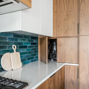
Prior to the renovation, the family room was adjacent to the kitchen and the formal living room at the other end of the space; in the middle was the dinning area. We looked at the main floor as an entire space and decided to combine the two living spaces into one and move the dining area towards the kitchen.
The Kitchen:
had always been an L shape with an island; previously there was a kitchen table by the windows. In the space planning period, we decided to eliminate the kitchen table to increase the overall size of the kitchen, giving us a bigger island for casual eating.
The perimeter of the kitchen has many great features; a coffee nook, a freezer column, double ovens, a cooktop with drawers below, an appliance garage in the awkward corner, a pantry with ample storage and free-standing fridge.
The Island also has many key features; a built-in unit for garbage/recycling/compost, a slide out tray underneath the sink for easy access to cleaning products, a dishwasher, and a bank of four drawer. On the outside of the island is an open shelf for cookbooks and display items. Below the countertop overhang is additional hidden storage for the items not accessed frequently.
Dinning Area:
we utilized the pre-existing niche by incorporating floating shelves in an asymmetrical design, which became the perfect area for the clients to display the art collected during their travels.
Bar Area:
The space between the kitchen and powder room became the perfect place to add a bar. Storage, counter space, and 2 bar fridges brought this little entertaining area to life.
Fireplace:
Using existing fireplace unit we cladded the surround with Dekton material, paneled the wall above with Walnut and a mantel made from Quarkus. These materials repeat them selves through the entire space.

 Shuler Architecture
Completed in 2015, this 4 BR, 2 1/2 bath was designed for a developer with a intolerably tight budget. Our simple solution employs a straightforward mix of flowing spaces borrowed from California great room houses with design elements found in more traditional residential design.
The house is entered through a generous entry hall flanked by a formal Dining Room on one side and a Home Office/Den on the other. The far end of this Entry Hall deposits into a large Great Room and open kitchen that is this home's gathering and entertainment hub. A small alcove at the end of the kitchen allows for everyday meals while the island functions as this entire space's focal point. Completing the entertainment concept of this level is a covered porch accessed through a sliding door in the Family Room.
The upper level is accessed via a stair at one end of the plan and is organized around a wide hallway that terminates in a tech space for kids. 3 generous children's bedrooms and an ample Master Suite with a view toward the Olympic Mountains complete this level. Finish selections throughout the house were purposely kept clean, light and simple. The exterior form of the house, while simple, allows for a variety of roof schemes that appeal to different price points in the marketplace. We also designed a bonus room option that can be accessed via the stair and resides over the garage.
 Lincoln Lighthill Architect
 employed several discrete updates that collectively transform this existing row house.
At the heart of the home, a section of floor was removed at the top level to open up the existing stair and allow light from a new skylight to penetrate deep into the home. The stair itself received a new maple guardrail and planter, with a Fiddle-leaf fig tree growing up through the opening towards the skylight.
On the top living level, an awkwardly located entrance to a full bathroom directly off the main stair was moved around the corner and out of the way by removing a little used tub from the bathroom, as well as an outdated heater in the back corner. This created a more discrete entrance to the existing, now half-bath, and opened up a space for a wall of pantry cabinets with built-in refrigerator, and an office nook at the rear of the house with a huge new awning window to let in light and air.
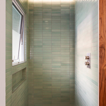
Downstairs, the two existing bathrooms were reconfigured and recreated as dedicated master and kids baths. The kids bath uses yellow and white hexagonal Heath tile to create a pixelated celebration of color. The master bath, hidden behind a flush wall of walnut cabinetry, utilizes another Heath tile color to create a calming retreat.
Throughout the home, walnut thin-ply cabinetry creates a strong contrast to the existing maple flooring, while the exposed blond edges of the material tie the two together. Rounded edges on integral pulls and door edges create pinstripe detailing that adds richness and a sense of playfulness to the design.
This project was featured by Houzz: https://tinyurl.com/stn2hcze
 InnovationLand
We are so excited about this stylish Houston patio addition!
It's one of our most recent outdoor living space design projects - and one of our new favorites!
We particularly love the rustic corner fireplace, the beautiful, vaulted pine ceiling and the Restoration Hardware furniture and accessories.
"Even though this space has an outdoor kitchen - often the highlight of our projects - the focus here is beautiful, comfortable outdoor living," says Outdoor Homescapes of Houston owner Wayne Franks. "And I have to say, I think this is one of the most gorgeous spaces we've created for doing that - in style."
"This project was special from the start, as we were creating this space for a friend of Wayne’s who had been a long time mentor to his boys growing up," adds Lisha Maxey, owner of LGH Designs in Houston (she coordinated furniture and finishes for the project). "This client was the principal of their high school and knew all of them very well and Wayne, too. This made it very personal, indeed, and we wanted everything to be perfect!"
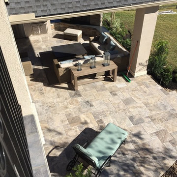
The 23- by 16-foot addition, located at the back of the house in Cypress, looks out onto a manmade lake in the homeowners' subdivision. The focal point? A 9-foot-8-inch-high-by-7-foot-wide corner fireplace in Earth Grey rustic ledgestone from Colorstone in Houston. The fireplace features a custom wooden mantel, stone bench seating and a 52-inch Sunbrite outdoor TV.
Another highlight is the flooring - silver travertine tile laid out in a Versailles pattern. "We chose silver travertine in a 'Tumbled' color palette with variations of cream and brown," says Lisha. "So we had those two colors, plus grey, to pull from."
The 7-foot-long, stucco outdoor kitchen island's countertops are also noteworthy - Absolute Black granite in a leathered finish offering a modern look and a dark grey hue that works perfectly with the color palette. The kitchen island also houses an RCS 30-inch grill and fridge.
The seating area includes a sectional couch, coffee table, two swivel chairs and two ottomans - all from Restoration Hardware.
"We used Restoration Hardware's Biscayne sectional, swivel chairs and ottomans in gray, with textured linen weave in Sand and cushions and peacock accent pillows in gray," says Lisha. The coffee table is made of solid teak with a concrete top - as is the matching side table.
"We added a console table, also in teak, behind the sofa. And for accents, we added three Amalfi lanterns from Restoration Hardware in weathered zinc."
A Sunbrella® Heathered area rug (in Gray) was added to anchor the space and visually tie it together.
"The space as a whole leans towards a transitional style, in that it has many traditional cozy comforts and colors, but the furniture gives it a more contemporary look," says Lisha. "The idea from the beginning was to marry these two styles, as our clients wanted a look that would not age and be in vogue for years to come."
On the exterior, you can see how we worked to make the addition blend with the existing home - matching the shingles and stucco and continuing the landscaping.
3D graphic renderings and a virtual video tour allowed the clients to know exactly what the space would look like beforehand.
"It takes a lot of the guesswork out of the process," says Outdoor Homescapes' graphic designer, Kristy Buell Franks. "Floor plans and elevation drawings are good for giving an idea of the overall scope of the project, but it's the 3D renderings that really show what the space is going to look like."
The 3D graphics and video tours also help immensely when choosing finishing materials and furniture, she says: "The clients' choices can be put into the design to allow the clients to see how the materials will work with the existing materials on the house and how the furniture will look in the space."
What do you like about this space? Post a comment and let us know!
Sponsored
Columbus, OH
Hope Restoration & General Contracting
Columbus Design-Build, Kitchen & Bath Remodeling, Historic Renovations
 down2earth Interior Design, LLC.
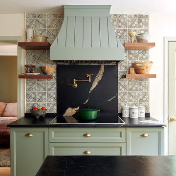
It is not uncommon for down2earth interior design to be tasked with the challenge of combining an existing kitchen and dining room into one open space that is great for communal cooking and entertaining. But what happens when that request is only the beginning? In this kitchen, our clients had big dreams for their space that went well beyond opening up the plan and included flow, organization, a timeless aesthetic, and partnering with local vendors.
Although the family wanted all the modern conveniences afforded them by a total kitchen renovation, they also wanted it to look timeless and fit in with the aesthetic of their 100 year old home. So all design decisions were made with an eye towards timelessness, from the profile of the cabinet doors, to the handmade backsplash tiles, to the choice of soapstone for countertops, which is a beautiful material that is naturally heat resistant. The soapstone was strategically positioned so that the most stunning veins would be on display across the island top and on the wall behind the cooktop. Even the green color of the cabinet, and the subtle green-greys of the trim were specifically chosen for their softness so they will not look stark or trendy in this classic home.
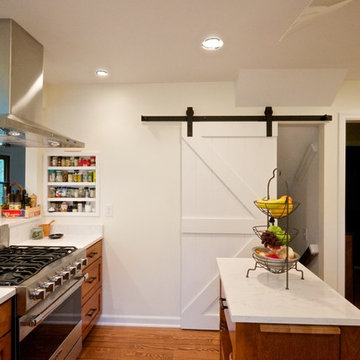
To address issues of flow, the clients really analyzed how they cook, entertain, and eat. We went well beyond the typical “kitchen triangle” to make sure all the hot spots of the kitchen were in the most functional locations within the space. Once we located the “big moves” we really dug down into the details. Some noteworthy ones include a whole wall of deep pantries with pull outs so all food storage is in one place, knives stored in a drawer right over the cutting boards, trash located right behind the sink, and pots, pans, cookie sheets located right by the oven, and a pullout for the Kitchenaid mixer. There are also pullouts that serve as dedicated storage next to the oven for oils, spices, and utensils, and a microwave located in the island which will facilitate aging in place if that becomes an objective in the future. A broom and cleaning supply storage closet at the top of the basement stairs coordinates with the kitchen cabinets so it will look nice if on view, or it can be hidden behind barn doors that tuck just a bit behind the oven. Storage for platters and a bar are located near the dining room so they will be on hand for entertaining.
As a couple deeply invested in their local community, it was important to the homeowners to work with as many local vendors as possible. From flooring to woodwork to tile to countertops, choosing the right materials to make this project come together was a real collaborative effort. Their close community connections also inspired these empty nesters to stay in their home and update it to their needs, rather than relocating. The space can now accommodate their growing family that might consist of children’s spouses, grandkids, and furry friends alike.
 Designs by KS
Project: Kitsilano House
Builder: Grenor Homes
About this Project
When our clients asked us to design their new house in the heart of Kitsilano, they wanted a space that showcased their personalities, travels, and experiences. Naturally, our team was instantly excited and eager to make this house a home.
Layout:
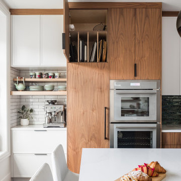
Prior to the renovation, the family room was adjacent to the kitchen and the formal living room at the other end of the space; in the middle was the dinning area. We looked at the main floor as an entire space and decided to combine the two living spaces into one and move the dining area towards the kitchen.
The Kitchen:
had always been an L shape with an island; previously there was a kitchen table by the windows. In the space planning period, we decided to eliminate the kitchen table to increase the overall size of the kitchen, giving us a bigger island for casual eating.
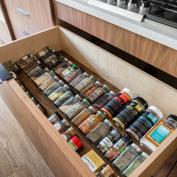
The perimeter of the kitchen has many great features; a coffee nook, a freezer column, double ovens, a cooktop with drawers below, an appliance garage in the awkward corner, a pantry with ample storage and free-standing fridge.
The Island also has many key features; a built-in unit for garbage/recycling/compost, a slide out tray underneath the sink for easy access to cleaning products, a dishwasher, and a bank of four drawer. On the outside of the island is an open shelf for cookbooks and display items. Below the countertop overhang is additional hidden storage for the items not accessed frequently.
Dinning Area:
we utilized the pre-existing niche by incorporating floating shelves in an asymmetrical design, which became the perfect area for the clients to display the art collected during their travels.
Bar Area:
The space between the kitchen and powder room became the perfect place to add a bar. Storage, counter space, and 2 bar fridges brought this little entertaining area to life.
Fireplace:
Using existing fireplace unit we cladded the surround with Dekton material, paneled the wall above with Walnut and a mantel made from Quarkus. These materials repeat them selves through the entire space.
 Designs by KS
Project: Kitsilano House
Builder: Grenor Homes
About this Project
When our clients asked us to design their new house in the heart of Kitsilano, they wanted a space that showcased their personalities, travels, and experiences. Naturally, our team was instantly excited and eager to make this house a home.
Layout:
Prior to the renovation, the family room was adjacent to the kitchen and the formal living room at the other end of the space; in the middle was the dinning area. We looked at the main floor as an entire space and decided to combine the two living spaces into one and move the dining area towards the kitchen.
The Kitchen:
had always been an L shape with an island; previously there was a kitchen table by the windows. In the space planning period, we decided to eliminate the kitchen table to increase the overall size of the kitchen, giving us a bigger island for casual eating.
The perimeter of the kitchen has many great features; a coffee nook, a freezer column, double ovens, a cooktop with drawers below, an appliance garage in the awkward corner, a pantry with ample storage and free-standing fridge.
The Island also has many key features; a built-in unit for garbage/recycling/compost, a slide out tray underneath the sink for easy access to cleaning products, a dishwasher, and a bank of four drawer. On the outside of the island is an open shelf for cookbooks and display items. Below the countertop overhang is additional hidden storage for the items not accessed frequently.
Dinning Area:
we utilized the pre-existing niche by incorporating floating shelves in an asymmetrical design, which became the perfect area for the clients to display the art collected during their travels.
Bar Area:
The space between the kitchen and powder room became the perfect place to add a bar. Storage, counter space, and 2 bar fridges brought this little entertaining area to life.
Fireplace:
Using existing fireplace unit we cladded the surround with Dekton material, paneled the wall above with Walnut and a mantel made from Quarkus. These materials repeat them selves through the entire space.
157