
Search results for "Towards material" in Home Design Ideas
 SM Design
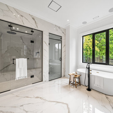
St. Andrews Project — Primary Bathroom & Spa Retreat
This St. Andrews primary bathroom is conceived as a private spa retreat, where material continuity, sculptural forms, and architectural restraint create a sense of understated luxury. The design intentionally avoids visual clutter, allowing the quality of the materials and precision of the detailing to define the space.
The room is anchored by a dramatic marble-look stone that extends continuously across the shower enclosure and floor, creating a seamless visual envelope. The expressive veining introduces movement and natural variation, transforming what could otherwise be a minimal white bathroom into a richly layered composition. Carrying the stone through multiple surfaces also gives the room a sense of scale and architectural cohesion.
The freestanding bathtub is treated as a sculptural object rather than simply a functional fixture. Its softly curved silhouette and vertically fluted exterior introduce an organic counterpoint to the linear geometry of the surrounding architecture. Positioned directly beneath the large black-framed window, the tub becomes a quiet focal point while taking advantage of abundant natural light and views toward the greenery beyond.
Black-framed glass creates another important layer of contrast. The expansive shower enclosure and adjacent glazed opening establish a crisp graphic framework against the pale stone, while black plumbing fixtures and hardware reinforce the same architectural language. This repeated use of black creates visual continuity without overwhelming the light palette.
The oversized window is particularly important to the atmosphere of the room. Instead of treating the bathroom as an enclosed, highly private environment, the design establishes a connection to nature, allowing daylight and greenery to become part of the experience. The result is a space that feels bright, open, and restorative.
A restrained wooden stool introduces warmth and an organic material note against the stone and glass. Its natural finish prevents the monochromatic palette from feeling overly clinical, while the simple form complements the sculptural bathtub.
The overall design is based on material continuity, contrast, and calm geometry. Veined stone provides movement, fluted surfaces provide texture, black metal provides definition, and natural wood introduces warmth. The result is a contemporary luxury bathroom that feels architectural, serene, and highly considered, more like a private wellness retreat than a conventional ensuite.

 Harth Builders
Even with the use of clear glass, the knee wall still adds privacy and the opportunity for a wall niche. The materials used for the threshold and top of the knee wall is the same as the vanity countertop. This helps pull the whole room together.
Photo Credit: Mike Irby

 Klopf Architecture
 and Jesse Ososki Art remodeled an existing Eichler atrium home into a brighter, more open, and more functional version of its original self.
The goals were to preserve the Eichler look and feel without the need to strictly adhere to it. The scope of work included re-configuring the master bedroom/bath, the kitchen, and the hall bath/laundry area, as well as updating interior finishes throughout to be more sophisticated.
The owners are detail-oriented and were very involved in the design process, down to the selection of lighting controls and stainless steel faceplates.Their design aesthetic leans toward the Scandinavian — light and bright, with simple straight lines and pure geometric shapes.
The finish flooring is large porcelain tile (24” x 24”) in a neutral grey tone, providing a uniform backdrop against which other materials can stand out. The same tile continues into the shower floor (with a different finish texture for slip-resistance) and up the shower/tub walls (in a smaller size). Heath Classic Field ceramic tile in Modern Blue was used sparingly, to add color at the hall bath vanity backsplash and at the shampoo niches in both bathrooms. Back-painted soda glass in pale blue to match the Heath tile was used at the kitchen backsplash. This same accent color was also used at the front entry atrium door. Kitchen cabinetry, countertops, appliances, and light fixtures are all white, making the kitchen feel more airy and light. Countertops are Caesarstone Blizzard.
The owners chose to keep some of the original Eichler elements: the concrete masonry fireplace; the stained tongue-and-groove redwood ceiling decking; and the luan wall paneling. The luan paneling was lightly sanded, cleaned, and re-stained. The owners also kept an added element that was installed by a previous owner: sliding shoji panels at all bedroom windows and sliding glass doors, for both privacy and sun control. Grooves were cut into the new tile flooring for the shoji panels to slide in, creating a more integrated look. Walnut was used to add warmth and contrast at the kitchen bar top and niche, the bathroom vanities, and the window sill/ledge under the kitchen window.
This Burlingame Eichler Remodel is a 2,121 sf, 4 bedroom/2 bath home located in the heart of Silicon Valley.
Klopf Architecture Project Team: John Klopf, Klara Kevane and Yegvenia Torres Zavala
Contractor: Jesse Ososki Art
Structural Engineer: Emmanuel Pun
Photography ©2018 Mariko Reed
Location: Burlingame, CA
Year completed: 2017
Find the right local pro for your project

 K. Dakin Design Inc.
Dakin has been working with the owners of this site realize their dream of cultivating a rich and meaningful landscape around their home. Because of their deep engagement with their land and garden, the landscape has guided the entire design process, from architecture to civil engineering to landscape design.
All architecture on site is oriented toward the garden, a park-like, multi-use environment that includes a walking labyrinth, restored prairie, a Japanese garden, an orchard, vegetable beds, berry brambles, a croquet lawn and a charred wood outdoor shower. Dakin pays special attention to materials at every turn, selecting an antique sugar bowl for the outdoor fire pit, antique Japanese roof tiles to create blue edging, and stepping stones imported from India. In addition to its diversity of garden types, this permacultural paradise is home to chickens, ducks, and bees. A complex irrigation system was designed to draw alternately from wells and cisterns.
3x5lion.png
Dakin has also had the privilege of creating an arboretum of diverse and rare trees that she based on Olmsted’s design for Central Park. Trees were selected to display a variety of seasonally shifting delights: spring blooms, fall berries, winter branch structure. Mature trees onsite were preserved and sometimes moved to new locations.

 User
This Greek Revival row house in Boerum Hill was previously owned by a local architect who renovated it several times, including the addition of a two-story steel and glass extension at the rear. The new owners came to us seeking to restore the house and its original formality, while adapting it to the modern needs of a family of five. The detailing of the 25 x 36 foot structure had been lost and required some sleuthing into the history of Greek Revival style in historic Brooklyn neighborhoods.
In addition to completely re-framing the interior, the house also required a new south-facing brick façade due to significant deterioration. The modern extension was replaced with a more traditionally detailed wood and copper- clad bay, still open to natural light and the garden view without sacrificing comfort. The kitchen was relocated from the first floor to the garden level with an adjacent formal dining room. Both rooms were enlarged from their previous iterations to accommodate weekly dinners with extended family. The kitchen includes a home office and breakfast nook that doubles as a homework station. The cellar level was further excavated to accommodate finished storage space and a playroom where activity can be monitored from the kitchen workspaces.
The parlor floor is now reserved for entertaining. New pocket doors can be closed to separate the formal front parlor from the more relaxed back portion, where the family plays games or watches TV together. At the end of the hall, a powder room with brass details, and a luxe bar with antique mirrored backsplash and stone tile flooring, leads to the deck and direct garden access. Because of the property width, the house is able to provide ample space for the interior program within a shorter footprint. This allows the garden to remain expansive, with a small lawn for play, an outdoor food preparation area with a cast-in-place concrete bench, and a place for entertaining towards the rear. The newly designed landscaping will continue to develop, further enhancing the yard’s feeling of escape, and filling-in the views from the kitchen and back parlor above. A less visible, but equally as conscious, addition is a rooftop PV solar array that provides nearly 100% of the daily electrical usage, with the exception of the AC system on hot summer days.
The well-appointed interiors connect the traditional backdrop of the home to a youthful take on classic design and functionality. The materials are elegant without being precious, accommodating a young, growing family. Unique colors and patterns provide a feeling of luxury while inviting inhabitants and guests to relax and enjoy this classic Brooklyn brownstone.
This project won runner-up in the architecture category for the 2017 NYC&G Innovation in Design Awards and was featured in The American House: 100 Contemporary Homes.
Photography by Francis Dzikowski / OTTO
 Klopf Architecture
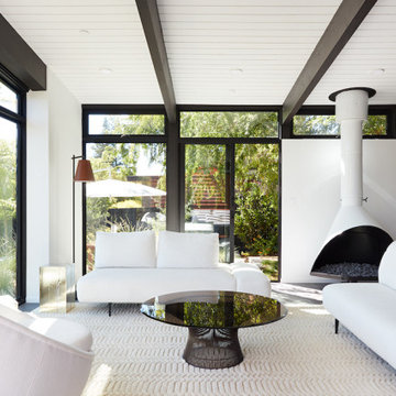
The Roger Lee designed house from 1962 was purchased by the current homeowners in almost original condition, as the previous owners elected to defer most maintenance projects over the years. The clients were able to see beyond the dated materials and finishes, single-paned glass and uninsulated walls and they approached Klopf Architecture to help them expand and update the entire home, one the family could settle into and enjoy for years to come. It was important that the new designs were aligned with Lee's original intent not only because of the client's appreciation for mid-century modern architecture, but also because the house was deemed historical. The Stanford Real Estate Office requires a stringent design review which safeguards the integrity of the community, which Klopf Architecture was happy to oblige going into their updated designs.
As with many original mid-century modern homes, the house was scaled to the 1960s lifestyle where rooms were smaller and openings to views were limited and tightly framed. The original conditions defined the direction the family of four would take in updating the house and making it comfortable for their modern lifestyle. Klopf designed a full gut remodel and major addition to bring the house into the 21st century and provide the living area needed for the client's family. The newly expanded house added just about 1,100 sf to create an airy, comfortable and family friendly house, taking full advantage of the beautiful southwestern views that extend out to the hills beyond. The enclosed garage created an additional 240 sf of covered space for long-term storage.
A cracked swimming pool created an eyesore taking up a majority of the backyard landscape, so it was one of the first elements to go during the transformation. Working with Outer Space Landscape Architects, the family asked for a mix of relaxing outdoor patio spaces that eventually blend into the native landscaping, extending their views outward toward the natural greenery of the trees beyond their property. Filling in the old pool was a smart way to expand the living spaces outward. The orientation of the house was designed to enjoy the views, but the original architecture provided the first homeowners with mere glimpses of the landscape outside.
Klopf was able to broaden those views, continuing and extending on the original architecture to take full advantage of the unobstructed natural views across the rear facade of the house. Small horizontal openings in the primary bedroom and office were replaced with much taller windows that now follow the angled roof line upward, extending across almost all of the facade. We worked with Western Windows, whose designs included an oblique-shaped, operable casement that allowed our design to rise with the slope. A new corner office added to the primary suite, offers a bright and functional work-from-home solution that looks out at the distant views and added natural light from the expanded window configuration that now wraps around the corner.
The existing lower level was designed by Lee as a utilitarian space, serving as a wet pool room with a drain in the center of the floor, bathroom, laundry and storage areas. Without the need for a pool room, Klopf was able to convert the area into a much more comfortable and functional living space with a new family room and guest suite. The new spaces enjoy easy access to a new outdoor patio through floor to ceiling, full-width glass sliders.
Continuing along the rear facade, a previously exposed deck extending from the living room and hallway provided access to the backyard through a single set of stairs leading toward the side of the house which made sense when the pool was in place. The new deck was re-envisioned as an extension of the main living room and now serves as a second outdoor living room. A new slatted pergola above provides the homeowners welcome relief from the hot afternoon sun. A second set of stairs now creates a better connection to the redesigned lower level. Klopf was able to reconfigure the spaces, extending the living room outward toward the views, where the family now claims it as the heart of the home, spending a large majority of their time outdoors.
Back inside, the original wood-burning Malm fireplace was beautifully restored and a gas burner installed to comply with California's strict air standards. It now rests in front of a wall of Heath accent tiles where a dated red brick wall used to stand. A new taller window brings more light and views into the refreshed interior living room. The original glass doors opposite the fireplace were replaced by larger sliders that when fully opened, create a seamless transition to the new outdoor living area so the two spaces feel like one connected space. The original utilitarian kitchen was needlessly tucked into the far back corner and closed-off, out of sight from the living room, so the clients asked Klopf to open it up and expand the kitchen forward so it felt more connected. Today the much larger kitchen is connected to the living area where a short wall with a cutout offers a visual glimpse into the kitchen and a handy pass-through counter for serving guests. A new breakfast nook was also added to create another spot where the family can gather for casual meals. Just outside, a new built-in outdoor grill and prep area extends the kitchen outside and connects to a new outdoor dining spot nestled amongst the trees, taking advantage of the views out back.
Klopf was able to expand the other two bedrooms, add a new laundry room and half-bath and convert the carport to an enclosed garage to add more storage areas which was lost when the pool house was converted to the family and guest room.
To maintain a historical connection to the original designs, the exterior siding was repeated on all exterior walls, a full-height stained glass window at the front entryway restored, and an interior slatted screen element repeated outside at the exterior entry courtyard and over the new outdoor living room to create a shade trellis. The new house stands proudly and shines against it's new landscaping features, while respecting and expanding on the original intent of Roger Lee's designs epitomizing the comforts of indoor-outdoor living in Northern California.
Completion year: 2020
Klopf Architecture project team: John Klopf, Klara Kevane, Noel Andrade
Contractor: ORB Construction, Brendan O'Reilly
Structural engineer: Sezen and Moon
Landscape architect: Outer space
Furnishings and decoration: Urbanism Designs
Photographer: Mariko Reed
 Madley Fine Cabinetry
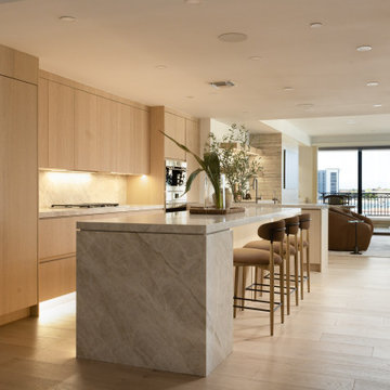
This custom cabinetry project sits at the top of a luxury penthouse condominium in Scottsdale, Arizona, and the design reflects exactly that.
Floor-to-ceiling white oak cabinetry runs the full length of the kitchen wall, integrated and seamless from base to ceiling with no visual interruption. The waterfall island anchors the space in natural stone, its veining continuous from surface to base, positioned to draw the eye toward the panoramic city views beyond.
Every detail was considered in the context of the larger space. Integrated appliances disappear into the cabinetry. Under-cabinet lighting warms the stone backsplash without competing with the natural light flooding in from the floor-to-ceiling windows. The open plan connects kitchen to living without a single element out of place.
This is cabinetry designed to match the scale and standard of the property it lives in.
Scope: Full kitchen cabinetry, custom island
Material: White oak, natural stone, integrated lighting
Style: Contemporary luxury, warm modern
Location: Scottsdale, AZ
luxury kitchen cabinetry Scottsdale, white oak kitchen cabinets, custom penthouse cabinetry, floor to ceiling cabinets, waterfall island Scottsdale AZ, contemporary kitchen design Phoenix, custom cabinet maker Scottsdale, integrated appliance cabinetry, luxury condo kitchen remodel, frameless cabinetry Phoenix metro

 Kaplan Thompson Architects
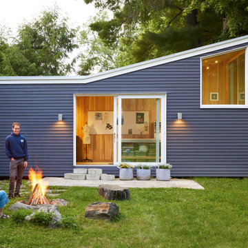
Designed to maximize function with minimal impact, the studio serves up adaptable square footage in a wrapping almost healthy enough to eat.
The open interior space organically transitions from personal to communal with the guidance of an angled roof plane. Beneath the tallest elevation, a sunny workspace awaits creative endeavors. The high ceiling provides room for big ideas in a small space, while a cluster of windows offers a glimpse of the structure’s soaring eave. Solid walls hugging the workspace add both privacy and anchors for wall-mounted storage. Towards the studio’s southern end, the ceiling plane slopes downward into a more intimate gathering space with playfully angled lines.
The building is as sustainable as it is versatile. Its all-wood construction includes interior paneling sourced locally from the Wood Mill of Maine. Lengths of eastern white pine span up to 16 feet to reach from floor to ceiling, creating visual warmth from a material that doubles as a natural insulator. Non-toxic wood fiber insulation, made from sawdust and wax, partners with triple-glazed windows to further insulate against extreme weather. During the winter, the interior temperature is able to reach 70 degrees without any heat on.
As it neared completion, the studio became a family project with Jesse, Betsy, and their kids working together to add the finishing touches. “Our whole life is a bit of an architectural experiment”, says Jesse, “but this has become an incredibly useful space.”

 Allison Landers
Trendy medium tone wood floor kitchen photo in Minneapolis with an undermount sink, glass-front cabinets, medium tone wood cabinets, white backsplash, subway tile backsplash and stainless steel appliances
 Pennsylvania Landscape & Nursery Association
Plantique, INC http://www.plantique.com
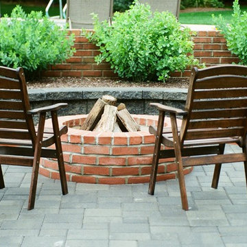
Entry Name: Classic Fireside Getaway
2014 PLNA Awards for Landscape Excellence Winner
Category: Hardscaping-Residential $30,000-$60,000
Award Level: Bronze
Photo Description:
The initial call from these homeowners was about a drainage issue. After having installed new roofing, siding, and a new porch enclosure, it was discovered that the original piping for the downspouts had failed. A few recent rainstorms had left a large pool of water behind the house. The new gutters and downspouts were now properly channeling water into a sub-surface piping system that no longer functioned. Obviously this had to be fixed, but after some further discussions, it was suggested that if a cost-effective solution could be found, perhaps a patio could be created along with the drainage solution. This would make the space between the porch and the pool more useful. The surfaces would have to be as kid-friendly as possible, as the homeowners foresaw frequent visits by their grandchildren. The flow of the spaces would have to be such that small bikes would be able to easily maneuver around chairs and tables.
After a site study was conducted, several issues were discovered. Pertaining to the drainage issue, it was determined that the grade sloped directly toward the porch from the pool. This not only channeled water toward the house and porch, but created a dam in an already shallow drainage swale that trapped water off to the side of the porch. Since the soil in this area is predominantly clay, water could sit in that area for days until it drained away. On the aesthetic side, a good part of the house’s façade was brick, the porch floor was brick, the small patio and walkways were brick, and the seating wall next to the pool was brick; there was a lot of brick. The challenge would be to find a cost-effective material that would contrast will with the brick, while creating a functional patio space that also facilitated water drainage.
The solution involved a significant re-grading of the area between the pool and the house, along with the installation of a completely new drain system to channel roof water away from the area. Working with the fixed points of the porch and foundation levels of the home, the slope that pitched toward the house was cut into to create a positive pitch away from the house. This created 20 in. high cut at the furthest point from the porch. To retain this, a segmental retaining wall block was used to form a curved seating wall around a mortared brick fire ring, perfect for evening campfires and marshmallow roasting with the grandchildren. Prior to the patio construction, new subsurface PVC piping was installed to channel water away from the house, under the patio, and to daylight about 100 ft. further into the side yard where it could properly drain. To construct the patio, the existing dry laid brick walks and patio were recycled as a border around a gray colored concrete paver that mimics the look of more expensive PA Bluestone, an often used companion to brick. The smooth surface texture and tight joint provide a barefoot friendly walking surface that stays cooler in the hot summer sun. The patio itself is also pitched so as to drain runoff to the lower end of the yard in case of a failure in the drain piping.
Along with providing several clear pathways between the porch, pool, and driveway the new patio includes an open air dining area, a fire pit area, and a seating/lounging area (not yet furnished at the time of the photo) for larger family gatherings or more intimate dinners and fire-side relaxation.
Photo Credit: Plantique, Mike Wimmer
 K. Dakin Design Inc.
Dakin has been working with the owners of this site realize their dream of cultivating a rich and meaningful landscape around their home. Because of their deep engagement with their land and garden, the landscape has guided the entire design process, from architecture to civil engineering to landscape design.
All architecture on site is oriented toward the garden, a park-like, multi-use environment that includes a walking labyrinth, restored prairie, a Japanese garden, an orchard, vegetable beds, berry brambles, a croquet lawn and a charred wood outdoor shower. Dakin pays special attention to materials at every turn, selecting an antique sugar bowl for the outdoor fire pit, antique Japanese roof tiles to create blue edging, and stepping stones imported from India. In addition to its diversity of garden types, this permacultural paradise is home to chickens, ducks, and bees. A complex irrigation system was designed to draw alternately from wells and cisterns.
3x5lion.png
Dakin has also had the privilege of creating an arboretum of diverse and rare trees that she based on Olmsted’s design for Central Park. Trees were selected to display a variety of seasonally shifting delights: spring blooms, fall berries, winter branch structure. Mature trees onsite were preserved and sometimes moved to new locations.
 Kaplan Thompson Architects
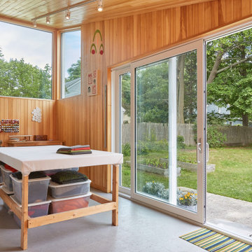
Designed to maximize function with minimal impact, the studio serves up adaptable square footage in a wrapping almost healthy enough to eat.
The open interior space organically transitions from personal to communal with the guidance of an angled roof plane. Beneath the tallest elevation, a sunny workspace awaits creative endeavors. The high ceiling provides room for big ideas in a small space, while a cluster of windows offers a glimpse of the structure’s soaring eave. Solid walls hugging the workspace add both privacy and anchors for wall-mounted storage. Towards the studio’s southern end, the ceiling plane slopes downward into a more intimate gathering space with playfully angled lines.
The building is as sustainable as it is versatile. Its all-wood construction includes interior paneling sourced locally from the Wood Mill of Maine. Lengths of eastern white pine span up to 16 feet to reach from floor to ceiling, creating visual warmth from a material that doubles as a natural insulator. Non-toxic wood fiber insulation, made from sawdust and wax, partners with triple-glazed windows to further insulate against extreme weather. During the winter, the interior temperature is able to reach 70 degrees without any heat on.
As it neared completion, the studio became a family project with Jesse, Betsy, and their kids working together to add the finishing touches. “Our whole life is a bit of an architectural experiment”, says Jesse, “but this has become an incredibly useful space.”

 Harwood Design Builders Ltd.
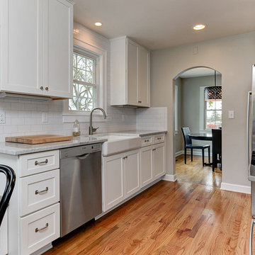
The original home, built in the early 1940’s had an historical charm the home owners wanted to preserve in this full kitchen renovation.
White shaker cabinets, a foolproof solution when dealing with the narrow space of a galley kitchen, were softened with an inset cove moulding and complemented with crown moulding.
Reclaimed bricks were hand-picked, sliced and veneered to mimic the existing fireplace surround and exterior of the home.
The patina of the hardware, cinnamon stained hardwoods, traditional champagne faucet and cast iron sink infused warmth and character in this kitchen. Layering natural materials along with aged finishes results in a classic European aesthetic perfectly suited for this home.
Sponsored
Delaware, OH

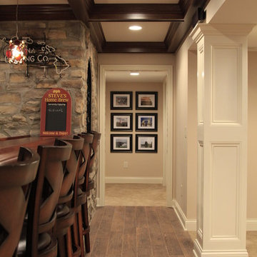
Buckeye Basements, Inc.
Central Ohio's Basement Finishing ExpertsBest Of Houzz '13-'21

 Made To Last Custom Homes Ltd.
The Made to Last team kept much of the existing footprint and original feel of the cabin while implementing the new elements these clients wanted. To expand the outdoor space, they installed a composite wrap-around deck with picture frame installation, built to last a lifetime. Inside, no opportunity was lost to add additional storage space, including a pantry and hidden shelving throughout.
Finally, by adding a two-story addition on the back of the existing A-frame, they were able to create a better kitchen layout, a welcoming entranceway with a proper porch, and larger windows to provide plenty of natural light and views of the ocean and rugged Thetis Island scenery. There is a guest room and bathroom towards the back of the A-frame. The master suite of this home is located in the upper loft and includes an ensuite and additional upstairs living space.

 Don Foote Contracting
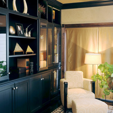
Throughway view from living room into large dining room and kitchen area. Mahogany shelves flank entryway with matching bookshelves. Farside of countertops are desk and computer stations with two drawers banks on each side.

 Cape Associates, Inc.
Overthinking a situation isn’t always a bad thing, particularly when the home in question is one in which the past is suddenly meeting the present. Originally designed by Finnish architect Olav Hammarstrom in 1952 for fellow architect Eero Saarinen, this unique home recently received its first transformation in decades. Still in its 1950s skin, it was completely gutted, inside and out. It was a serious undertaking, as the homeowner wanted modern upgrades, while keeping an eye toward retaining the home’s 1950s charm. She had a vision for her home, and she stuck to it from beginning to end.
Perched on a rise of land and overlooking the tranquil Wellfleet Herring Pond, the home initially appears split, with the guest house on the left, and the main house of the right, but both ends are connected with a breezeway. The original home’s bones were in good shape, but many upgrades and replacements were necessary to bring the house up to date.
New siding, roofing, gutters, insulation and mechanical systems were all replaced. Doors and windows with metal frames were custom made by a company in Long Island that fabricates doors for office buildings. Modern heating and cooling systems were added, and the three bathrooms were all updated. The footprint of the home remained unchanged. Inside, the only expansion was more closet space.
The attention to detail in retaining the 50s-style look took a lot of online searching, from handles and knobs to lighting fixtures, with bits and pieces arriving from all over the world, including a doorstop from New Zealand. The homeowner selected many of the fixtures herself, while a very detail-oriented foreman exhaustively researched as well, looking for just the right piece for each and every location.
High-end appliances were purchased to modernize the kitchen and all of the old cabinetry was removed, replaced and refaced with NUVACOR, a versatile surfacing material that not only provided a sleek, modern look, but added convenience and ease of use.
Bare, wood-beamed ceilings throughout give a nod to the home’s natural surroundings, while the main living area (formerly a fisherman’s cabin), with a brick fireplace, was completely trimmed in walnut, while multiple windows of varying sizes welcome sunlight to brighten the home. Here, the sheetrock ceiling with faux rafters provides an interesting and room-brightening feature.
Behind the house sits the serene pond, which can now be enjoyed from the stunning new deck. Here, decking material was not laid out side by side, as it typically is but, instead, meticulously laid out on edge, creating an unusual and eye-catching effect. A railing of tempered glass panels allows unobstructed views of the surrounding natural beauty, and keeps consistent with the open, airy feel of the place. A new outdoor shower is accessible via the deck and left open to the wilderness and the pond below, completing the bold yet sophisticated feeling of this retro-modern home.

 DesignARC
SANTA BARBARA, CA / DUPLEX RESIDENTIAL
This urban infill, artist loft duplex was located in an overlooked, but well-located, light-commercial zone. It was also the first new residential construction built in the area for decades, the project is located within a 10-square-block area zoned for light-commercial and affectionately dubbed the “Funk Zone” by resident artists and city planners.
Only two blocks walking distance to the beach, and a similar distance to the downtown commercial district, this pedestrian-oriented project ideally suits the lifestyles of the owners. Although the two units share equal footprints, the southerly unit features a double-height, north-facing living space. The northerly unit supplants this volume with additional living space. The siting also allows for secure private courtyard entries, maximization of natural light and view-swept, rooftop living space.
The design incorporates a raised plinth required by flood zone restrictions to create a peaceful, intimate environment within the somewhat chaotic surrounding context. The disciplined and restrained approach towards the building’s image was intended to make reference to the much-loved Meridian Studios by George Washington Smith. Two roof-decks with outdoor fireplaces and shade trellises extend outdoor living space, contribute ocean and mountain views and provide both refuge and release.
Cost-effective materials were selected in order to adhere to the strict budget and to relate to the industrial surroundings. Over-sized pivot doors, “industrial” staircases and cabinetry were constructed on-site by the owners to conserve design integrity within the extremely limited budget.
2000 AIA Santa Barbara Chapter Honor Award
Sponsored
Columbus, OH

Hope Restoration & General Contracting
Columbus Design-Build, Kitchen & Bath Remodeling, Historic Renovations
 Klopf Architecture
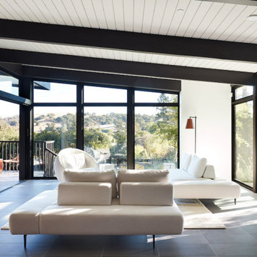
The Roger Lee designed house from 1962 was purchased by the current homeowners in almost original condition, as the previous owners elected to defer most maintenance projects over the years. The clients were able to see beyond the dated materials and finishes, single-paned glass and uninsulated walls and they approached Klopf Architecture to help them expand and update the entire home, one the family could settle into and enjoy for years to come. It was important that the new designs were aligned with Lee's original intent not only because of the client's appreciation for mid-century modern architecture, but also because the house was deemed historical. The Stanford Real Estate Office requires a stringent design review which safeguards the integrity of the community, which Klopf Architecture was happy to oblige going into their updated designs.
As with many original mid-century modern homes, the house was scaled to the 1960s lifestyle where rooms were smaller and openings to views were limited and tightly framed. The original conditions defined the direction the family of four would take in updating the house and making it comfortable for their modern lifestyle. Klopf designed a full gut remodel and major addition to bring the house into the 21st century and provide the living area needed for the client's family. The newly expanded house added just about 1,100 sf to create an airy, comfortable and family friendly house, taking full advantage of the beautiful southwestern views that extend out to the hills beyond. The enclosed garage created an additional 240 sf of covered space for long-term storage.
A cracked swimming pool created an eyesore taking up a majority of the backyard landscape, so it was one of the first elements to go during the transformation. Working with Outer Space Landscape Architects, the family asked for a mix of relaxing outdoor patio spaces that eventually blend into the native landscaping, extending their views outward toward the natural greenery of the trees beyond their property. Filling in the old pool was a smart way to expand the living spaces outward. The orientation of the house was designed to enjoy the views, but the original architecture provided the first homeowners with mere glimpses of the landscape outside.
Klopf was able to broaden those views, continuing and extending on the original architecture to take full advantage of the unobstructed natural views across the rear facade of the house. Small horizontal openings in the primary bedroom and office were replaced with much taller windows that now follow the angled roof line upward, extending across almost all of the facade. We worked with Western Windows, whose designs included an oblique-shaped, operable casement that allowed our design to rise with the slope. A new corner office added to the primary suite, offers a bright and functional work-from-home solution that looks out at the distant views and added natural light from the expanded window configuration that now wraps around the corner.
The existing lower level was designed by Lee as a utilitarian space, serving as a wet pool room with a drain in the center of the floor, bathroom, laundry and storage areas. Without the need for a pool room, Klopf was able to convert the area into a much more comfortable and functional living space with a new family room and guest suite. The new spaces enjoy easy access to a new outdoor patio through floor to ceiling, full-width glass sliders.
Continuing along the rear facade, a previously exposed deck extending from the living room and hallway provided access to the backyard through a single set of stairs leading toward the side of the house which made sense when the pool was in place. The new deck was re-envisioned as an extension of the main living room and now serves as a second outdoor living room. A new slatted pergola above provides the homeowners welcome relief from the hot afternoon sun. A second set of stairs now creates a better connection to the redesigned lower level. Klopf was able to reconfigure the spaces, extending the living room outward toward the views, where the family now claims it as the heart of the home, spending a large majority of their time outdoors.
Back inside, the original wood-burning Malm fireplace was beautifully restored and a gas burner installed to comply with California's strict air standards. It now rests in front of a wall of Heath accent tiles where a dated red brick wall used to stand. A new taller window brings more light and views into the refreshed interior living room. The original glass doors opposite the fireplace were replaced by larger sliders that when fully opened, create a seamless transition to the new outdoor living area so the two spaces feel like one connected space. The original utilitarian kitchen was needlessly tucked into the far back corner and closed-off, out of sight from the living room, so the clients asked Klopf to open it up and expand the kitchen forward so it felt more connected. Today the much larger kitchen is connected to the living area where a short wall with a cutout offers a visual glimpse into the kitchen and a handy pass-through counter for serving guests. A new breakfast nook was also added to create another spot where the family can gather for casual meals. Just outside, a new built-in outdoor grill and prep area extends the kitchen outside and connects to a new outdoor dining spot nestled amongst the trees, taking advantage of the views out back.
Klopf was able to expand the other two bedrooms, add a new laundry room and half-bath and convert the carport to an enclosed garage to add more storage areas which was lost when the pool house was converted to the family and guest room.
To maintain a historical connection to the original designs, the exterior siding was repeated on all exterior walls, a full-height stained glass window at the front entryway restored, and an interior slatted screen element repeated outside at the exterior entry courtyard and over the new outdoor living room to create a shade trellis. The new house stands proudly and shines against it's new landscaping features, while respecting and expanding on the original intent of Roger Lee's designs epitomizing the comforts of indoor-outdoor living in Northern California.
Completion year: 2020
Klopf Architecture project team: John Klopf, Klara Kevane, Noel Andrade
Contractor: ORB Construction, Brendan O'Reilly
Structural engineer: Sezen and Moon
Landscape architect: Outer space
Furnishings and decoration: Urbanism Designs
Photographer: Mariko Reed

 Z Double B Inc
. is family owned and offers local construction solutions you can count on. We believe in providing quality products, at fair prices, with exceptional service. We provide the best replacement windows, sidings and doors for residential and commercial clients.
Z Double B Inc. has been serving customers in the Denver Metro area since 2013, offering local construction solutions that clients can count on. The company believes in providing quality products, at fair prices, with exceptional service. The mission of the company is “To provide superior customer service, while keeping prices reasonable with a quality that you cannot beat.”
Not only are eco-minded construction solutions offered, but customers can expect quality craftsmanship and diligence on every installation. Z Double B Inc. strives towards leading an eco-friendly job process by recycling materials they bring during the job such as glass, aluminum, previous windows, and doors. Z Double B Inc. provide complete building and construction services, including design, product acquisition, and technical installation.
Services Provided
Bifold Windows, Custom Windows, Egress Windows, Exterior Shutters, Trim Work, Weather Stripping, Window Installation, Window Replacement, Window Sales, Window Screen Installation, Siding, Doors, Door Sales, Garage Doors, Interior Glass, Moving Glass wall systems, Patio Doors
 DesignARC
SANTA BARBARA, CA / DUPLEX RESIDENTIAL
This urban infill, artist loft duplex was located in an overlooked, but well-located, light-commercial zone. It was also the first new residential construction built in the area for decades, the project is located within a 10-square-block area zoned for light-commercial and affectionately dubbed the “Funk Zone” by resident artists and city planners.
Only two blocks walking distance to the beach, and a similar distance to the downtown commercial district, this pedestrian-oriented project ideally suits the lifestyles of the owners. Although the two units share equal footprints, the southerly unit features a double-height, north-facing living space. The northerly unit supplants this volume with additional living space. The siting also allows for secure private courtyard entries, maximization of natural light and view-swept, rooftop living space.
The design incorporates a raised plinth required by flood zone restrictions to create a peaceful, intimate environment within the somewhat chaotic surrounding context. The disciplined and restrained approach towards the building’s image was intended to make reference to the much-loved Meridian Studios by George Washington Smith. Two roof-decks with outdoor fireplaces and shade trellises extend outdoor living space, contribute ocean and mountain views and provide both refuge and release.
Cost-effective materials were selected in order to adhere to the strict budget and to relate to the industrial surroundings. Over-sized pivot doors, “industrial” staircases and cabinetry were constructed on-site by the owners to conserve design integrity within the extremely limited budget.
2000 AIA Santa Barbara Chapter Honor Award
153