
Search results for "Towards material" in Home Design Ideas
 Zepboo
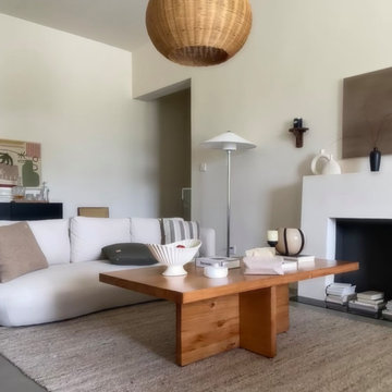
This project is a case study of a client living in Warsaw, Poland. The client's home is a 95 square meter, three-bedroom apartment. With a preference for a serene, minimalist aesthetic, the overall style of the home embraces the Scandinavian Wabi-Sabi concept. Black, white, and gray serve as the primary color palette, with touches of brown to add warmth. The furniture is kept minimal, emphasizing an open and spacious visual effect.
The client desired lighting fixtures that would complement the black, white, and gray color scheme while leaning towards a rustic countryside style, steering clear of modern fixtures made of materials like metal, glass, or crystal. It was for this reason that the client reached out to us, seeking lighting options that would align with her preference for a more natural look. Ultimately, we selected this handwoven rattan pendant light in a rustic, country-inspired design. Upon receiving the product, the client expressed utmost satisfaction, stating that the chosen light fixture perfectly met her needs.
We are sharing this case study with you, hoping to provide inspiration and ideas for your own home decor. Let this serve as a testament to how carefully selected lighting can effortlessly blend with your desired style, creating a harmonious and satisfying ambiance.
 Brooks + Scarpa Architects
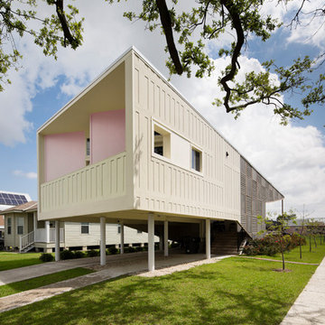
As part of the initiative to rebuild New Orleans' Lower Ninth Ward in the wake of Hurricane Katrina, Brooks + Scarpa’s Make it Right (MIR) home seeks to redefine the concept of a home into a flexible, multifunctional and adaptable space addressing the needs of today’s modern family, on a limited budget. Offering shelter and comfort, the MIR home breaks the prescriptive mold of the traditional home by creating public and private “zones” in which private space is deemphasized in favor of large public living areas. The organization of the space is intended to transform the way people live—away from a reclusive, isolating layout, towards a family-oriented, interactive space.
The inspiration for the exterior’s design came from American patchwork quilting traditions, particularly the distinctive Gee’s Bend quilt-makers of southwest Alabama. Recycled wooden pallets are repositioned here as a patchworked shade screen wrapping the building, an innovative alternative to expensive façade materials. The visually expressive pallets impart an imperfect, rough-hewn individuality, adding depth and texture. Brooks + Scarpa is working with local manufacturers to ensure the viability of this cost-effective and sustainable off-the-shelf product, easily obtainable and readily replaceable. The pallet wrapping is joined by decoratively perforated cement board on the east and west façades, providing both shade and privacy, while allowing views out and dappled, indirect daylight and breezes to enter. All the exterior elements will combine and interweave, emerging as a distinctive pattern-making aesthetic.
 Michael Shannon Designs
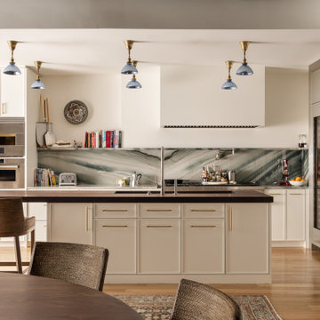
Our client’s foremost design priority was to create a space that is both glamorous and highly functional—equally suited to everyday living and to serve as a true stage for entertainment. At the core of the project was the restoration of the loft’s authentic character, thoughtfully reimagined to complement a refined industrial-chic aesthetic. The apartment’s previous incarnation leaned toward traditional design, with wainscoting, dropped ceilings, crown moldings, and concealed structural elements. In contrast, the new vision embraces the building’s industrial roots. Ceilings were opened to reveal the original structure, steel columns were exposed, and historic brick walls were uncovered, reintroducing a sense of honesty and architectural depth to the space. From the outset, the project involved close collaboration with a lighting specialist to transform what had been notably dark interiors: a layered lighting strategy was implemented, combining concealed architectural illumination with focused overhead accents. In the kitchen, salvaged industrial “X-Ray Shade” mercury-glass fixtures—originally designed for maximum reflectivity—introduce both character and warmth. Artist Cimone Berman was commissioned to create a series of bespoke mirrors for the space to further enhance the play of light. Each one-of-a-kind piece blends historical influences (reminiscent of aged material,) with contemporary artistic expression futher enhancing the sense of openness and luminosity throughout the loft while reinforcing the project’s balance between industrial authenticity and refined sophistication. Whole House Renovation: Society Hill - Philadelphia, Pennsylvania. 2026. Philadelphia Interior Design, Philadelphia Kitchen and Bath Design, Lighting Design, Space Planning, Loft Design, Custom Window Treatment, Custom Millwork
Find the right local pro for your project

 Shuler Architecture
Completed in 2015, this 4 BR, 2 1/2 bath was designed for a developer with a intolerably tight budget. Our simple solution employs a straightforward mix of flowing spaces borrowed from California great room houses with design elements found in more traditional residential design.
The house is entered through a generous entry hall flanked by a formal Dining Room on one side and a Home Office/Den on the other. The far end of this Entry Hall deposits into a large Great Room and open kitchen that is this home's gathering and entertainment hub. A small alcove at the end of the kitchen allows for everyday meals while the island functions as this entire space's focal point. Completing the entertainment concept of this level is a covered porch accessed through a sliding door in the Family Room.
The upper level is accessed via a stair at one end of the plan and is organized around a wide hallway that terminates in a tech space for kids. 3 generous children's bedrooms and an ample Master Suite with a view toward the Olympic Mountains complete this level. Finish selections throughout the house were purposely kept clean, light and simple. The exterior form of the house, while simple, allows for a variety of roof schemes that appeal to different price points in the marketplace. We also designed a bonus room option that can be accessed via the stair and resides over the garage.

 SURROUNDS Landscape Architecture + Construction
Our client desired a diversely landscaped environment with natural stone and an expansive deck across the rear of the home. The existing landscape consisted of randomized plantings and the client desired to transplant all of the plant material throughout the rear of the property. The current plant palate reflects the client's love for having a diversity of plants. Extensive landscape lighting was used for accenting both hardscape and soft scape features. We created increased privacy from the adjacent neighbor and fenced the rear of the property. Simplistic water features were also desired by the client. The client drove many of the "wants".
The client did not want to use masonry retaining walls, so strictly boulders were used to hold back soil and create different spaces in the rear landscape. The deck steps were a challenge due to the HOA not allowing them to protrude from the side of the home. Part of the property was an RPA (Resource Protected Area).
Photography: Morgan Howarth. Landscape Architect: Howard Cohen, Surrounds Inc.

 Matt Fajkus Architecture
The site descends from the street and is privileged with dynamic natural views toward a creek below and beyond. To incorporate the existing landscape into the daily life of the residents, the house steps down to the natural topography. A continuous and jogging retaining wall from outside to inside embeds the structure below natural grade at the front with flush transitions at its rear facade. All indoor spaces open up to a central courtyard which terraces down to the tree canopy, creating a readily visible and occupiable transitional space between man-made and nature.
The courtyard scheme is simplified by two wings representing common and private zones - connected by a glass dining “bridge." This transparent volume also visually connects the front yard to the courtyard, clearing for the prospect view, while maintaining a subdued street presence. The staircase acts as a vertical “knuckle,” mediating shifting wing angles while contrasting the predominant horizontality of the house.
Crips materiality and detailing, deep roof overhangs, and the one-and-half story wall at the rear further enhance the connection between outdoors and indoors, providing nuanced natural lighting throughout and a meaningful framed procession through the property.
Photography
Charles Davis Smith
 In Detail Interiors
Collaboration of nature and modern home design
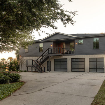
Often when motivations point to a more modern interior space, the direction of materials and furnishings leans to hard lines, harsh juxtaposition of cold finishes and a level of simplicity that can feel sterile. When broad horizons, airy space and modern inclinations was on this client’s wish list, we dug in on nailing the right overall schematic flow, affording opportunity for natural textures and selections in a warmer, neutral palette to collaborate in order to develop harmonious ambiance and depth. Notable project highlights were efforts to open up and carve out a chef’s kitchen with modern appliances, bold wooden & quartz-clad bar for gatherings, an extra guest bedroom off the entry that could double as a hide-away video game room, and a master suite with a more suitable layout for work at home office setup, optimized waterfront view potential, and fresh bathroom aesthetics.
Maximizing the architectural potential
Broad glass sliders, floor-to-ceiling fixed pane windows in a dark bronze metal finish and a magnificent custom mahogany front door added great architectural features to this formerly mostly characterless home. Appointing the right wall coverings and solid surface materials furthered the goals of flow, serenity and balance. Achieving a beautiful symbiosis of rich darks and soft lights, coastal-inspired textures in the furnishings – everything from the bleached wood-look tile floors to the thin bamboo burnout-pattern window treatments – work towards a multi-layered, coastal contemporary vibe inspired by the home’s natural surroundings that the client loved.
This client trusted the process; let us run with our vision for something completely unique and landed with an amazing turn-key project that exceeded all expectations, particularly with COVID and a hurricane taking out bridge access to the property. A primary residence sure – but we definitely also created a getaway in it’s own right. We love the transformation and know this home’s value increased substantially by the time we were done!

 Pennsylvania Landscape & Nursery Association
Plantique, INC http://www.plantique.com
Entry Name: Classic Fireside Getaway
2014 PLNA Awards for Landscape Excellence Winner
Category: Hardscaping-Residential $30,000-$60,000
Award Level: Bronze
Photo Description:
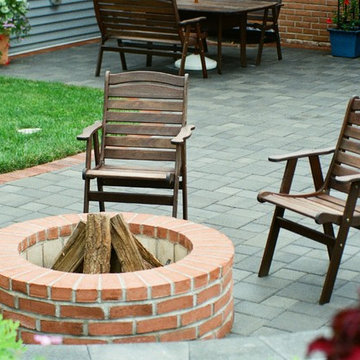
The initial call from these homeowners was about a drainage issue. After having installed new roofing, siding, and a new porch enclosure, it was discovered that the original piping for the downspouts had failed. A few recent rainstorms had left a large pool of water behind the house. The new gutters and downspouts were now properly channeling water into a sub-surface piping system that no longer functioned. Obviously this had to be fixed, but after some further discussions, it was suggested that if a cost-effective solution could be found, perhaps a patio could be created along with the drainage solution. This would make the space between the porch and the pool more useful. The surfaces would have to be as kid-friendly as possible, as the homeowners foresaw frequent visits by their grandchildren. The flow of the spaces would have to be such that small bikes would be able to easily maneuver around chairs and tables.
After a site study was conducted, several issues were discovered. Pertaining to the drainage issue, it was determined that the grade sloped directly toward the porch from the pool. This not only channeled water toward the house and porch, but created a dam in an already shallow drainage swale that trapped water off to the side of the porch. Since the soil in this area is predominantly clay, water could sit in that area for days until it drained away. On the aesthetic side, a good part of the house’s façade was brick, the porch floor was brick, the small patio and walkways were brick, and the seating wall next to the pool was brick; there was a lot of brick. The challenge would be to find a cost-effective material that would contrast will with the brick, while creating a functional patio space that also facilitated water drainage.
The solution involved a significant re-grading of the area between the pool and the house, along with the installation of a completely new drain system to channel roof water away from the area. Working with the fixed points of the porch and foundation levels of the home, the slope that pitched toward the house was cut into to create a positive pitch away from the house. This created 20 in. high cut at the furthest point from the porch. To retain this, a segmental retaining wall block was used to form a curved seating wall around a mortared brick fire ring, perfect for evening campfires and marshmallow roasting with the grandchildren. Prior to the patio construction, new subsurface PVC piping was installed to channel water away from the house, under the patio, and to daylight about 100 ft. further into the side yard where it could properly drain. To construct the patio, the existing dry laid brick walks and patio were recycled as a border around a gray colored concrete paver that mimics the look of more expensive PA Bluestone, an often used companion to brick. The smooth surface texture and tight joint provide a barefoot friendly walking surface that stays cooler in the hot summer sun. The patio itself is also pitched so as to drain runoff to the lower end of the yard in case of a failure in the drain piping.
Along with providing several clear pathways between the porch, pool, and driveway the new patio includes an open air dining area, a fire pit area, and a seating/lounging area (not yet furnished at the time of the photo) for larger family gatherings or more intimate dinners and fire-side relaxation.
Photo Credit: Plantique, Mike Wimmer

 Cassoni Furniture & Accessories
- N.C. LANDSCAPE 2016 WALL UNIT. The forms, colors and materials evolve towards a new warmth, a cozy, comfortable mood, which transforms the elegance of the linear shapes into soft, sensory emotions: N.C. Landscape shows new horizons. The large doors made with thin solid wood slats, together with glass that is reflective and transparent at the same time, create an intriguing play of light and shadow, reflection and transparency. The freely sliding doors reveals surprising contrasts of material with the inside of the compartments and the backs of the paneling, emphasizing each time the different functions: concealing and integrating audio-video equipment, displaying books and favorite objects on the shelves or containing them within the spacious closed compartments.
189"W x 20"7/8D x 63"H.
https://cassoni.com/NC_Landscape_2016_02
- HYPER SOFA. A sofa with a special bridge structure, slender and linear, that reveals and enhances the decisive forms and the pronounced volumes of the weight-bearing arms, giving an unusual shape to comfort, strictly in leather. The low back creates an unusual contrast between the height and the depth of the seat, while the cushions create a harmony with the severity of the structural lines, liberating a feeling of comfort and relaxation. Its unusual suspended effect creates a dreamy, relaxed atmosphere, soft and at the same time exquisitely squared, with shapes that give a personal character to the living space.
2 or 3-seaters.
https://cassoni.com/Hyper_Sofa
- POND COFFEE TABLE. Family of cocktail tables, side tables, occasional tables with different heights and width. While the conical base tends to disappears in the shadow, the top is raised from the ground and lives of intriguing reflections and shades of colors. The reflections of the glass top, whose perfectly glossy surface mirrors everything around, recreating the mystic reflection effect of perfectly still water, or those of the marble top, for the rich grains and mosaic of minerals it is made of. Base made from molded polyurethane BAYDUR®60, lacquered with glossy finishes. Top in back-lacquered glass or in stone. 47"1/4 version on wheels, hidden inside the base.
Ø35''3/8 x 15''H.
Ø47''1/4 x 11''7/8H.
https://cassoni.com/Pond_Coffee_Table

 Bilotta Kitchen & Home
This kitchen was designed by Daniel Popescu from Bilotta’s NYC showroom. With a picturesque view of the ocean the kitchen is the ideal room in which to escape from the hustle and bustle of Manhattan. Featuring Bilotta Collection Cabinetry in a mix of natural walnut and white paint, the kitchen’s two main workspaces – the sink and the cooktop – look out towards the beach, making any meal enjoyable to prep and clean up from. The walnut island curves on one end and features a custom-made walnut and maple butcher block, perfect for serving a cheese board to guests or chopping up vegetables. The creative marble and walnut table off of the island creates a “his & hers” dining area when the rest of the family is out at the beach. The beautiful walnut hutch area, with diagonal graining, is perfect for serving coffee or using as a bar for gatherings. Designer: Daniel Popescu, Bilotta Kitchens Photo Credit: Peter Rymwid
 USI Design & Remodeling
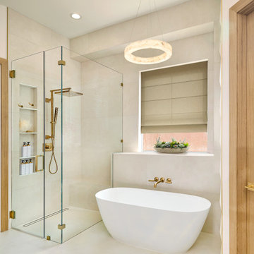
This master bathroom renovation in Frisco was completed for a repeat USI Design & Remodeling client as part of a larger first-floor transformation of the home. The original bathroom reflected a very typical North Texas layout of its era — dark stained cabinetry, granite countertops, compartmentalized vanities, a built-in tub adjoining a framed shower, and separated spaces that no longer aligned with how the homeowners wanted to live. As their aesthetic evolved toward a more transitional and contemporary direction, the goal became less about replacing finishes and more about redefining the experience of the room itself. The project needed to feel calmer, more architectural, and far more intentional in how the space functioned visually and emotionally.
One of the most important changes was removing the original shower curb and pony wall in favor of a fully open curbless shower with ultra-clear ½-inch heavy glass. Achieving that look required recessing the slab, re-floating the shower floor toward a linear drain, and engineering the space so the room would read as visually uninterrupted from end to end. Throughout the project, many of the design decisions were rooted in restraint rather than excess. The oversized 24x48 Porcelanosa flooring carries very little shade variation, creating a quieter visual field, while the cabinetry was executed in rift-sawn white oak specifically because it produces a far more controlled and consistent finish outcome than more common cuts of wood. In luxury projects, consistency itself becomes part of the refinement.
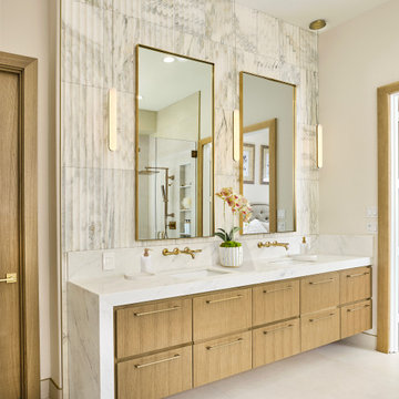
The floating vanity was designed more like custom furniture than traditional cabinetry, utilizing waterfall mitered edges and fully reworked plumbing locations so both homeowners could share in having generous functional countertop space. The original makeup station was repurposed into integrated storage with powered drawers and concealed organization for everyday items such as blow dryers and flat irons. Along the vanity wall, wall-mounted plumbing fixtures were paired with ribbed natural marble surfaces — a detail that required intentional planning long before construction began. Rather than allowing the ribbed material to terminate awkwardly behind the fixtures, the backsplash and stone transitions were specifically designed to resolve those conditions cleanly. Those are the types of details that distinguish highly coordinated design-build work from projects that simply assemble materials together.
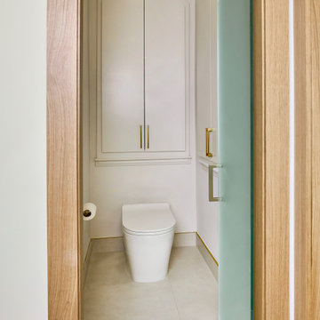
While the room contains a significant amount of luxury detailing — from the freestanding tub and geoprism marble focal wall to the custom rift-sawn white oak closet doors and elongated mirrors that leverage the 11-foot ceiling heights — the project was always guided by quiet luxury rather than visual competition. Even the water closet enclosure was handled with restraint through the use of a satin-etched glass door rather than another heavy solid opening. The intent throughout was to create a bathroom that feels restorative and serene rather than overdesigned. In our view, the best luxury spaces are the ones that feel composed long after the initial impression wears off.
 USI Design & Remodeling
This master bathroom renovation in Frisco was completed for a repeat USI Design & Remodeling client as part of a larger first-floor transformation of the home. The original bathroom reflected a very typical North Texas layout of its era — dark stained cabinetry, granite countertops, compartmentalized vanities, a built-in tub adjoining a framed shower, and separated spaces that no longer aligned with how the homeowners wanted to live. As their aesthetic evolved toward a more transitional and contemporary direction, the goal became less about replacing finishes and more about redefining the experience of the room itself. The project needed to feel calmer, more architectural, and far more intentional in how the space functioned visually and emotionally.
One of the most important changes was removing the original shower curb and pony wall in favor of a fully open curbless shower with ultra-clear ½-inch heavy glass. Achieving that look required recessing the slab, re-floating the shower floor toward a linear drain, and engineering the space so the room would read as visually uninterrupted from end to end. Throughout the project, many of the design decisions were rooted in restraint rather than excess. The oversized 24x48 Porcelanosa flooring carries very little shade variation, creating a quieter visual field, while the cabinetry was executed in rift-sawn white oak specifically because it produces a far more controlled and consistent finish outcome than more common cuts of wood. In luxury projects, consistency itself becomes part of the refinement.
The floating vanity was designed more like custom furniture than traditional cabinetry, utilizing waterfall mitered edges and fully reworked plumbing locations so both homeowners could share in having generous functional countertop space. The original makeup station was repurposed into integrated storage with powered drawers and concealed organization for everyday items such as blow dryers and flat irons. Along the vanity wall, wall-mounted plumbing fixtures were paired with ribbed natural marble surfaces — a detail that required intentional planning long before construction began. Rather than allowing the ribbed material to terminate awkwardly behind the fixtures, the backsplash and stone transitions were specifically designed to resolve those conditions cleanly. Those are the types of details that distinguish highly coordinated design-build work from projects that simply assemble materials together.
While the room contains a significant amount of luxury detailing — from the freestanding tub and geoprism marble focal wall to the custom rift-sawn white oak closet doors and elongated mirrors that leverage the 11-foot ceiling heights — the project was always guided by quiet luxury rather than visual competition. Even the water closet enclosure was handled with restraint through the use of a satin-etched glass door rather than another heavy solid opening. The intent throughout was to create a bathroom that feels restorative and serene rather than overdesigned. In our view, the best luxury spaces are the ones that feel composed long after the initial impression wears off.
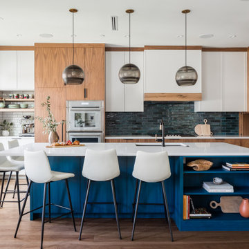
 Designs by KS
Project: Kitsilano House
Builder: Grenor Homes
About this Project
When our clients asked us to design their new house in the heart of Kitsilano, they wanted a space that showcased their personalities, travels, and experiences. Naturally, our team was instantly excited and eager to make this house a home.
Layout:
Prior to the renovation, the family room was adjacent to the kitchen and the formal living room at the other end of the space; in the middle was the dinning area. We looked at the main floor as an entire space and decided to combine the two living spaces into one and move the dining area towards the kitchen.
The Kitchen:
had always been an L shape with an island; previously there was a kitchen table by the windows. In the space planning period, we decided to eliminate the kitchen table to increase the overall size of the kitchen, giving us a bigger island for casual eating.
The perimeter of the kitchen has many great features; a coffee nook, a freezer column, double ovens, a cooktop with drawers below, an appliance garage in the awkward corner, a pantry with ample storage and free-standing fridge.
The Island also has many key features; a built-in unit for garbage/recycling/compost, a slide out tray underneath the sink for easy access to cleaning products, a dishwasher, and a bank of four drawer. On the outside of the island is an open shelf for cookbooks and display items. Below the countertop overhang is additional hidden storage for the items not accessed frequently.
Dinning Area:
we utilized the pre-existing niche by incorporating floating shelves in an asymmetrical design, which became the perfect area for the clients to display the art collected during their travels.
Bar Area:
The space between the kitchen and powder room became the perfect place to add a bar. Storage, counter space, and 2 bar fridges brought this little entertaining area to life.
Fireplace:
Using existing fireplace unit we cladded the surround with Dekton material, paneled the wall above with Walnut and a mantel made from Quarkus. These materials repeat them selves through the entire space.
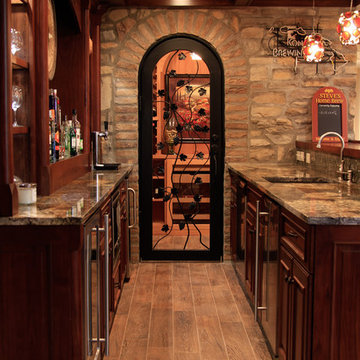
Sponsored
Delaware, OH

Buckeye Basements, Inc.
Central Ohio's Basement Finishing ExpertsBest Of Houzz '13-'21
 Shuler Architecture
Completed in 2019, this is a home we completed for client who initially engaged us to remodeled their 100 year old classic craftsman bungalow on Seattle’s Queen Anne Hill. During our initial conversation, it became readily apparent that their program was much larger than a remodel could accomplish and the conversation quickly turned toward the design of a new structure that could accommodate a growing family, a live-in Nanny, a variety of entertainment options and an enclosed garage – all squeezed onto a compact urban corner lot.
Project entitlement took almost a year as the house size dictated that we take advantage of several exceptions in Seattle’s complex zoning code. After several meetings with city planning officials, we finally prevailed in our arguments and ultimately designed a 4 story, 3800 sf house on a 2700 sf lot. The finished product is light and airy with a large, open plan and exposed beams on the main level, 5 bedrooms, 4 full bathrooms, 2 powder rooms, 2 fireplaces, 4 climate zones, a huge basement with a home theatre, guest suite, climbing gym, and an underground tavern/wine cellar/man cave. The kitchen has a large island, a walk-in pantry, a small breakfast area and access to a large deck. All of this program is capped by a rooftop deck with expansive views of Seattle’s urban landscape and Lake Union.
Unfortunately for our clients, a job relocation to Southern California forced a sale of their dream home a little more than a year after they settled in after a year project. The good news is that in Seattle’s tight housing market, in less than a week they received several full price offers with escalator clauses which allowed them to turn a nice profit on the deal.
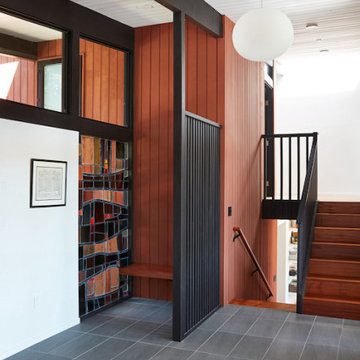
 Klopf Architecture
The Roger Lee designed house from 1962 was purchased by the current homeowners in almost original condition, as the previous owners elected to defer most maintenance projects over the years. The clients were able to see beyond the dated materials and finishes, single-paned glass and uninsulated walls and they approached Klopf Architecture to help them expand and update the entire home, one the family could settle into and enjoy for years to come. It was important that the new designs were aligned with Lee's original intent not only because of the client's appreciation for mid-century modern architecture, but also because the house was deemed historical. The Stanford Real Estate Office requires a stringent design review which safeguards the integrity of the community, which Klopf Architecture was happy to oblige going into their updated designs.
As with many original mid-century modern homes, the house was scaled to the 1960s lifestyle where rooms were smaller and openings to views were limited and tightly framed. The original conditions defined the direction the family of four would take in updating the house and making it comfortable for their modern lifestyle. Klopf designed a full gut remodel and major addition to bring the house into the 21st century and provide the living area needed for the client's family. The newly expanded house added just about 1,100 sf to create an airy, comfortable and family friendly house, taking full advantage of the beautiful southwestern views that extend out to the hills beyond. The enclosed garage created an additional 240 sf of covered space for long-term storage.
A cracked swimming pool created an eyesore taking up a majority of the backyard landscape, so it was one of the first elements to go during the transformation. Working with Outer Space Landscape Architects, the family asked for a mix of relaxing outdoor patio spaces that eventually blend into the native landscaping, extending their views outward toward the natural greenery of the trees beyond their property. Filling in the old pool was a smart way to expand the living spaces outward. The orientation of the house was designed to enjoy the views, but the original architecture provided the first homeowners with mere glimpses of the landscape outside.
Klopf was able to broaden those views, continuing and extending on the original architecture to take full advantage of the unobstructed natural views across the rear facade of the house. Small horizontal openings in the primary bedroom and office were replaced with much taller windows that now follow the angled roof line upward, extending across almost all of the facade. We worked with Western Windows, whose designs included an oblique-shaped, operable casement that allowed our design to rise with the slope. A new corner office added to the primary suite, offers a bright and functional work-from-home solution that looks out at the distant views and added natural light from the expanded window configuration that now wraps around the corner.
The existing lower level was designed by Lee as a utilitarian space, serving as a wet pool room with a drain in the center of the floor, bathroom, laundry and storage areas. Without the need for a pool room, Klopf was able to convert the area into a much more comfortable and functional living space with a new family room and guest suite. The new spaces enjoy easy access to a new outdoor patio through floor to ceiling, full-width glass sliders.
Continuing along the rear facade, a previously exposed deck extending from the living room and hallway provided access to the backyard through a single set of stairs leading toward the side of the house which made sense when the pool was in place. The new deck was re-envisioned as an extension of the main living room and now serves as a second outdoor living room. A new slatted pergola above provides the homeowners welcome relief from the hot afternoon sun. A second set of stairs now creates a better connection to the redesigned lower level. Klopf was able to reconfigure the spaces, extending the living room outward toward the views, where the family now claims it as the heart of the home, spending a large majority of their time outdoors.
Back inside, the original wood-burning Malm fireplace was beautifully restored and a gas burner installed to comply with California's strict air standards. It now rests in front of a wall of Heath accent tiles where a dated red brick wall used to stand. A new taller window brings more light and views into the refreshed interior living room. The original glass doors opposite the fireplace were replaced by larger sliders that when fully opened, create a seamless transition to the new outdoor living area so the two spaces feel like one connected space. The original utilitarian kitchen was needlessly tucked into the far back corner and closed-off, out of sight from the living room, so the clients asked Klopf to open it up and expand the kitchen forward so it felt more connected. Today the much larger kitchen is connected to the living area where a short wall with a cutout offers a visual glimpse into the kitchen and a handy pass-through counter for serving guests. A new breakfast nook was also added to create another spot where the family can gather for casual meals. Just outside, a new built-in outdoor grill and prep area extends the kitchen outside and connects to a new outdoor dining spot nestled amongst the trees, taking advantage of the views out back.
Klopf was able to expand the other two bedrooms, add a new laundry room and half-bath and convert the carport to an enclosed garage to add more storage areas which was lost when the pool house was converted to the family and guest room.
To maintain a historical connection to the original designs, the exterior siding was repeated on all exterior walls, a full-height stained glass window at the front entryway restored, and an interior slatted screen element repeated outside at the exterior entry courtyard and over the new outdoor living room to create a shade trellis. The new house stands proudly and shines against it's new landscaping features, while respecting and expanding on the original intent of Roger Lee's designs epitomizing the comforts of indoor-outdoor living in Northern California.
Completion year: 2020
Klopf Architecture project team: John Klopf, Klara Kevane, Noel Andrade
Contractor: ORB Construction, Brendan O'Reilly
Structural engineer: Sezen and Moon
Landscape architect: Outer space
Furnishings and decoration: Urbanism Designs
Photographer: Mariko Reed

 Thomas Development
Designed and Remodeled by Stewart Thomas Design Build. Ceiling beams are Helmholtz resonators, a sound absorbing/canceling device custom designed by an audio engineer. Rift Cut Quarter Sawn Walnut slab cabinets with white quartz counters. Cabinet handles made by EPCO. Frosted glass upper cabinet doors. Barstools made by Room and Board.
Photography by Scott Basile

 Scandinavian Home Designs
Renovation of a 1952 Midcentury Modern Eichler home in San Jose, CA.
Full remodel of kitchen, main living areas and central atrium incl flooring and new windows in the entire home - all to bring the home in line with its mid-century modern roots, while adding a modern style and a touch of Scandinavia.
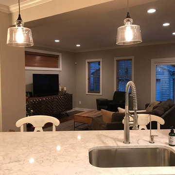

 USI Design & Remodeling
This master bathroom renovation in Frisco was completed for a repeat USI Design & Remodeling client as part of a larger first-floor transformation of the home. The original bathroom reflected a very typical North Texas layout of its era — dark stained cabinetry, granite countertops, compartmentalized vanities, a built-in tub adjoining a framed shower, and separated spaces that no longer aligned with how the homeowners wanted to live. As their aesthetic evolved toward a more transitional and contemporary direction, the goal became less about replacing finishes and more about redefining the experience of the room itself. The project needed to feel calmer, more architectural, and far more intentional in how the space functioned visually and emotionally.
One of the most important changes was removing the original shower curb and pony wall in favor of a fully open curbless shower with ultra-clear ½-inch heavy glass. Achieving that look required recessing the slab, re-floating the shower floor toward a linear drain, and engineering the space so the room would read as visually uninterrupted from end to end. Throughout the project, many of the design decisions were rooted in restraint rather than excess. The oversized 24x48 Porcelanosa flooring carries very little shade variation, creating a quieter visual field, while the cabinetry was executed in rift-sawn white oak specifically because it produces a far more controlled and consistent finish outcome than more common cuts of wood. In luxury projects, consistency itself becomes part of the refinement.
The floating vanity was designed more like custom furniture than traditional cabinetry, utilizing waterfall mitered edges and fully reworked plumbing locations so both homeowners could share in having generous functional countertop space. The original makeup station was repurposed into integrated storage with powered drawers and concealed organization for everyday items such as blow dryers and flat irons. Along the vanity wall, wall-mounted plumbing fixtures were paired with ribbed natural marble surfaces — a detail that required intentional planning long before construction began. Rather than allowing the ribbed material to terminate awkwardly behind the fixtures, the backsplash and stone transitions were specifically designed to resolve those conditions cleanly. Those are the types of details that distinguish highly coordinated design-build work from projects that simply assemble materials together.
While the room contains a significant amount of luxury detailing — from the freestanding tub and geoprism marble focal wall to the custom rift-sawn white oak closet doors and elongated mirrors that leverage the 11-foot ceiling heights — the project was always guided by quiet luxury rather than visual competition. Even the water closet enclosure was handled with restraint through the use of a satin-etched glass door rather than another heavy solid opening. The intent throughout was to create a bathroom that feels restorative and serene rather than overdesigned. In our view, the best luxury spaces are the ones that feel composed long after the initial impression wears off.

 Habanero Architecture, PLLC
The project’s goal is to introduce more affordable contemporary homes for Triangle Area housing. This 1,800 SF modern ranch-style residence takes its shape from the archetypal gable form and helps to integrate itself into the neighborhood. Although the house presents a modern intervention, the project’s scale and proportional parameters integrate into its context.
Natural light and ventilation are passive goals for the project. A strong indoor-outdoor connection was sought by establishing views toward the wooded landscape and having a deck structure weave into the public area. North Carolina’s natural textures are represented in the simple black and tan palette of the facade.

156