
Search results for "Towards material" in Home Design Ideas

 Ground One Landscape Design + Build
Ground One designed and built a deck off the back of the house for casual sitting, mirroring the house’s front porch. This deck and the screened porch steps descend to a patio terrace. To expand the entertaining space and accommodate the setback restrictions for a permitted gas firepit, we excavated the lot’s back slope to gain bonus space and create a rustic campfire spot. Large boulders found on the site during house construction are incorporated into a retaining wall. Colonial bluestone fills the gaps between these large accent stones and surrounds the firepit. Additional boulders hold up the patio and a slab of bluestone bridges the terrace and patio, preserving the overall drainage pattern. Bluestone is the common thread throughout the project, but it is used in different forms; clean lines closer to the house transition to a more weathered look as you move toward the natural area. The swale is a variety of boulder sizes and river rock to create a more visually-compelling creekbed.
The firepit patio is comfortable for just two people, but can also accommodate a larger group. It is close to the dining space, but physical separation allows for entertaining in different configurations: pre-dinner cocktails around the fire, a roaring flame as backdrop during dinner, kids roasting marshmallows while the adults linger within sight at the dining table, or the gang huddled around a bonfire.

 New Energy Works Timberframers
Phil and Rocio, little did you know how perfect your timing was when you came to us and asked for a “small but perfect home”. Fertile ground indeed as we thought about working on something like a precious gem, or what we’re calling a NEW Jewel.
So many of our clients now are building smaller homes because they simply don’t need a bigger one. Seems smart for many reasons: less vacuuming, less heating and cooling, less taxes. And for many, less strain on the finances as we get to the point where retirement shines bright and hopeful.
For the jewel of a home we wanted to start with 1,000 square feet. Enough room for a pleasant common area, a couple of away rooms for bed and work, a couple of bathrooms and yes to a mudroom and pantry. (For Phil and Rocio’s, we ended up with 1,140 square feet.)
The Jewel would not compromise on design intent, envelope or craft intensity. This is the big benefit of the smaller footprint, of course. By using a pure and simple form for the house volume, a true jewel would have enough money in the budget for the highest quality materials, net-zero levels of insulation, triple pane windows, and a high-efficiency heat pump. Additionally, the doors would be handcrafted, the cabinets solid wood, the finishes exquisite, and craftsmanship shudderingly excellent.
Our many thanks to Phil and Rocio for including us in their dream home project. It is truly a Jewel!
From the homeowners (read their full note here):
“It is quite difficult to express the deep sense of gratitude we feel towards everyone that contributed to the Jewel…many of which I don’t have the ability to send this to, or even be able to name. The artistic, creative flair combined with real-life practicality is a major component of our place we will love for many years to come.
Please pass on our thanks to everyone that was involved. We look forward to visits from any and all as time goes by."
–Phil and Rocio
Read more about the first steps for this Jewel on our blog.
Reclaimed Wood, Kitchen Cabinetry, Bedroom Door: Pioneer Millworks
Entry door: NEWwoodworks
Professional Photos: Loren Nelson Photography
 Klopf Architecture
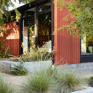
The Roger Lee designed house from 1962 was purchased by the current homeowners in almost original condition, as the previous owners elected to defer most maintenance projects over the years. The clients were able to see beyond the dated materials and finishes, single-paned glass and uninsulated walls and they approached Klopf Architecture to help them expand and update the entire home, one the family could settle into and enjoy for years to come. It was important that the new designs were aligned with Lee's original intent not only because of the client's appreciation for mid-century modern architecture, but also because the house was deemed historical. The Stanford Real Estate Office requires a stringent design review which safeguards the integrity of the community, which Klopf Architecture was happy to oblige going into their updated designs.
As with many original mid-century modern homes, the house was scaled to the 1960s lifestyle where rooms were smaller and openings to views were limited and tightly framed. The original conditions defined the direction the family of four would take in updating the house and making it comfortable for their modern lifestyle. Klopf designed a full gut remodel and major addition to bring the house into the 21st century and provide the living area needed for the client's family. The newly expanded house added just about 1,100 sf to create an airy, comfortable and family friendly house, taking full advantage of the beautiful southwestern views that extend out to the hills beyond. The enclosed garage created an additional 240 sf of covered space for long-term storage.
A cracked swimming pool created an eyesore taking up a majority of the backyard landscape, so it was one of the first elements to go during the transformation. Working with Outer Space Landscape Architects, the family asked for a mix of relaxing outdoor patio spaces that eventually blend into the native landscaping, extending their views outward toward the natural greenery of the trees beyond their property. Filling in the old pool was a smart way to expand the living spaces outward. The orientation of the house was designed to enjoy the views, but the original architecture provided the first homeowners with mere glimpses of the landscape outside.
Klopf was able to broaden those views, continuing and extending on the original architecture to take full advantage of the unobstructed natural views across the rear facade of the house. Small horizontal openings in the primary bedroom and office were replaced with much taller windows that now follow the angled roof line upward, extending across almost all of the facade. We worked with Western Windows, whose designs included an oblique-shaped, operable casement that allowed our design to rise with the slope. A new corner office added to the primary suite, offers a bright and functional work-from-home solution that looks out at the distant views and added natural light from the expanded window configuration that now wraps around the corner.
The existing lower level was designed by Lee as a utilitarian space, serving as a wet pool room with a drain in the center of the floor, bathroom, laundry and storage areas. Without the need for a pool room, Klopf was able to convert the area into a much more comfortable and functional living space with a new family room and guest suite. The new spaces enjoy easy access to a new outdoor patio through floor to ceiling, full-width glass sliders.
Continuing along the rear facade, a previously exposed deck extending from the living room and hallway provided access to the backyard through a single set of stairs leading toward the side of the house which made sense when the pool was in place. The new deck was re-envisioned as an extension of the main living room and now serves as a second outdoor living room. A new slatted pergola above provides the homeowners welcome relief from the hot afternoon sun. A second set of stairs now creates a better connection to the redesigned lower level. Klopf was able to reconfigure the spaces, extending the living room outward toward the views, where the family now claims it as the heart of the home, spending a large majority of their time outdoors.
Back inside, the original wood-burning Malm fireplace was beautifully restored and a gas burner installed to comply with California's strict air standards. It now rests in front of a wall of Heath accent tiles where a dated red brick wall used to stand. A new taller window brings more light and views into the refreshed interior living room. The original glass doors opposite the fireplace were replaced by larger sliders that when fully opened, create a seamless transition to the new outdoor living area so the two spaces feel like one connected space. The original utilitarian kitchen was needlessly tucked into the far back corner and closed-off, out of sight from the living room, so the clients asked Klopf to open it up and expand the kitchen forward so it felt more connected. Today the much larger kitchen is connected to the living area where a short wall with a cutout offers a visual glimpse into the kitchen and a handy pass-through counter for serving guests. A new breakfast nook was also added to create another spot where the family can gather for casual meals. Just outside, a new built-in outdoor grill and prep area extends the kitchen outside and connects to a new outdoor dining spot nestled amongst the trees, taking advantage of the views out back.
Klopf was able to expand the other two bedrooms, add a new laundry room and half-bath and convert the carport to an enclosed garage to add more storage areas which was lost when the pool house was converted to the family and guest room.
To maintain a historical connection to the original designs, the exterior siding was repeated on all exterior walls, a full-height stained glass window at the front entryway restored, and an interior slatted screen element repeated outside at the exterior entry courtyard and over the new outdoor living room to create a shade trellis. The new house stands proudly and shines against it's new landscaping features, while respecting and expanding on the original intent of Roger Lee's designs epitomizing the comforts of indoor-outdoor living in Northern California.
Completion year: 2020
Klopf Architecture project team: John Klopf, Klara Kevane, Noel Andrade
Contractor: ORB Construction, Brendan O'Reilly
Structural engineer: Sezen and Moon
Landscape architect: Outer space
Furnishings and decoration: Urbanism Designs
Photographer: Mariko Reed
Find the right local pro for your project

 Decorpro
AQUA FLAME CARTRIDGE (Black)
Aqua Flame
Product Dimensions (IN): L9” X W16” X H7.5”
Product Weight (LB): 11.5
Product Dimensions (CM): L23 X W41 X H19
Product Weight (KG): 5.21
Ember Bed: Rocks
Finish/Colour: Black
Volts: 120
Wattage: 200
BTUs: 682
Amps: 1.67
Remote control included: Yes
Limited Warranty: 1-year
Aqua Flame Cartridge is a mesmerizing addition to a whole new level of fire features. Bold and brilliant, this smart, contemporary mess-free, worry-free faux fire will create the illusion of flames in any indoor space.
Producing 90% less CO2 than the average direct vent gas fireplace, Aqua Flame has the qualities of an actual fire, without the fire. Rising vapours and the semblance of sepia-toned flames are all features of Aqua Flame. The key difference being that, unlike all those other fireplaces, Aqua Flame is the fire that you can touch, without getting burned.
Working its magic in a room, Aqua Flame effectively combines coloured halogen lights and water to produce the resulting appearance of majestic flames.
Easy to operate, Aqua Flame can be activated at the flip of a switch, after performing these three simple steps towards watching your space transform before your eyes. Enjoy up to 14 hours of a fabulous faux fire on one full cartridge of water:
Fill the cartridge with water
Plug in the lights
Flip the switch to turn on
By Decorpro Home + Garden.
Each sold separately.
100% toxic-free.
100% fuel-free.
0% ventilation required.
Each Aqua Flame unit contains:
1 L. water cartridge (x2).
Materials:
Solid steel
Black epoxy powder paint
Water cartridge (plastic)
Made in Canada
 InnovationLand
We are so excited about this stylish Houston patio addition!
It's one of our most recent outdoor living space design projects - and one of our new favorites!
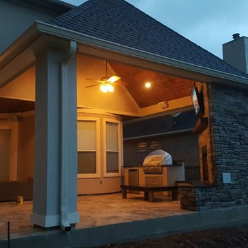
We particularly love the rustic corner fireplace, the beautiful, vaulted pine ceiling and the Restoration Hardware furniture and accessories.
"Even though this space has an outdoor kitchen - often the highlight of our projects - the focus here is beautiful, comfortable outdoor living," says Outdoor Homescapes of Houston owner Wayne Franks. "And I have to say, I think this is one of the most gorgeous spaces we've created for doing that - in style."
"This project was special from the start, as we were creating this space for a friend of Wayne’s who had been a long time mentor to his boys growing up," adds Lisha Maxey, owner of LGH Designs in Houston (she coordinated furniture and finishes for the project). "This client was the principal of their high school and knew all of them very well and Wayne, too. This made it very personal, indeed, and we wanted everything to be perfect!"
The 23- by 16-foot addition, located at the back of the house in Cypress, looks out onto a manmade lake in the homeowners' subdivision. The focal point? A 9-foot-8-inch-high-by-7-foot-wide corner fireplace in Earth Grey rustic ledgestone from Colorstone in Houston. The fireplace features a custom wooden mantel, stone bench seating and a 52-inch Sunbrite outdoor TV.
Another highlight is the flooring - silver travertine tile laid out in a Versailles pattern. "We chose silver travertine in a 'Tumbled' color palette with variations of cream and brown," says Lisha. "So we had those two colors, plus grey, to pull from."
The 7-foot-long, stucco outdoor kitchen island's countertops are also noteworthy - Absolute Black granite in a leathered finish offering a modern look and a dark grey hue that works perfectly with the color palette. The kitchen island also houses an RCS 30-inch grill and fridge.
The seating area includes a sectional couch, coffee table, two swivel chairs and two ottomans - all from Restoration Hardware.
"We used Restoration Hardware's Biscayne sectional, swivel chairs and ottomans in gray, with textured linen weave in Sand and cushions and peacock accent pillows in gray," says Lisha. The coffee table is made of solid teak with a concrete top - as is the matching side table.
"We added a console table, also in teak, behind the sofa. And for accents, we added three Amalfi lanterns from Restoration Hardware in weathered zinc."
A Sunbrella® Heathered area rug (in Gray) was added to anchor the space and visually tie it together.
"The space as a whole leans towards a transitional style, in that it has many traditional cozy comforts and colors, but the furniture gives it a more contemporary look," says Lisha. "The idea from the beginning was to marry these two styles, as our clients wanted a look that would not age and be in vogue for years to come."
On the exterior, you can see how we worked to make the addition blend with the existing home - matching the shingles and stucco and continuing the landscaping.
3D graphic renderings and a virtual video tour allowed the clients to know exactly what the space would look like beforehand.
"It takes a lot of the guesswork out of the process," says Outdoor Homescapes' graphic designer, Kristy Buell Franks. "Floor plans and elevation drawings are good for giving an idea of the overall scope of the project, but it's the 3D renderings that really show what the space is going to look like."
The 3D graphics and video tours also help immensely when choosing finishing materials and furniture, she says: "The clients' choices can be put into the design to allow the clients to see how the materials will work with the existing materials on the house and how the furniture will look in the space."
What do you like about this space? Post a comment and let us know!
 Marcus Gleysteen Architects
Cove House is a contemporary shoreline sanctuary in the lake region of New Hampshire. The wooded property, which includes several accessory outbuildings and an existing guest cottage, makes up a private micro-cove. The new modern house and existing traditional cottage turn both toward the lake and to each other. Thoughtful siting and landscape architecture establish a connective flow between the two residences, with a notched stone courtyard in the house inviting visitors to go back and forth.
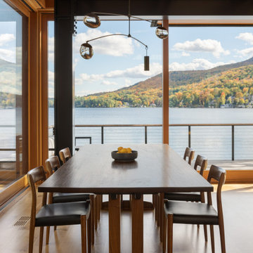
Inspired by the craftsmanship of an antique mahogany powerboat, Cove House pursues architectural quality and beauty at the highest level. The design uses materiality, texture, and daylight to balance livability and artistry. The main entrance leads through a slot-canyon-like hall where a sequence of monumental granite walls reveals a glorious, light-filled living room. A steel moment frame spanning two levels imparts unobstructed panoramic views of the lake.
The magnetism of the New Hampshire waterfront is equalized by a coordinated series of openings, which attune daylight throughout the interior. Large sliding glass doors and windows draw light through the courtyard and into the home’s core – a bright and lofty kitchen. Below the kitchen, a walkout patio illuminates a refined wine-tasting room.
Near the front entry, a gracious granite and steel stair delivers daylight to each level though open risers and glass balustrades. Skylights draw light from above and cast grazing shadows against the textured tile walls of the upper bathrooms.
“We aimed to create a “beautiful reward” and an environment that our clients will enjoy for the rest of their lives.”
– Marcus Gleysteen
 Go Home Builders
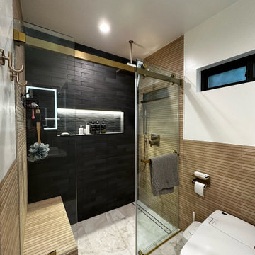
Upon stepping into this stylish japandi modern fusion bathroom nestled in the heart of Pasadena, you are instantly greeted by the unique visual journey of maple ribbon tiles These tiles create an inviting path that extends from the entrance of the bathroom, leading you all the way to the shower. They artistically cover half the wall, adding warmth and texture to the space. Indeed, creating a japandi modern fusion style that combines the best of both worlds. You might just even say japandi bathroom with a modern twist.
Elegance and Boldness
Above the tiles, the walls are bathed in fresh white paint. Particularly, he crisp whiteness of the paint complements the earthy tones of the maple tiles, resulting in a harmonious blend of simplicity and elegance.
Moving forward, you encounter the vanity area, featuring dual sinks. Each sink is enhanced by flattering vanity mirror lighting. This creates a well-lit space, perfect for grooming routines.
Balanced Contrast
Adding a contemporary touch, custom black cabinets sit beneath and in between the sinks. Obviously, they offer ample storage while providing each sink its private space. Even so, bronze handles adorn these cabinets, adding a sophisticated touch that echoes the bathroom’s understated luxury.
The journey continues towards the shower area, where your eye is drawn to the striking charcoal subway tiles. Clearly, these tiles add a modern edge to the shower’s back wall. Alongside, a built-in ledge subtly integrates lighting, adding both functionality and a touch of ambiance.
The shower’s side walls continue the narrative of the maple ribbon tiles from the main bathroom area. Definitely, their warm hues against the cool charcoal subway tiles create a visual contrast that’s both appealing and invigorating.
Beautiful Details
Adding to the seamless design is a sleek glass sliding shower door. Apart from this, this transparent element allows light to flow freely, enhancing the overall brightness of the space. In addition, a bronze handheld shower head complements the other bronze elements in the room, tying the design together beautifully.
Underfoot, you’ll find luxurious tile flooring. Furthermore, this material not only adds to the room’s opulence but also provides a durable, easy-to-maintain surface.
Finally, the entire japandi modern fusion bathroom basks in the soft glow of recessed LED lighting. Without a doubt, this lighting solution adds depth and dimension to the space, accentuating the unique features of the bathroom design. Unquestionably, making this bathroom have a japandi bathroom with a modern twist.

Sponsored
Plain City, OH

The Creative Kitchen Company
Columbus Area Kitchen Remodeling and Refacing Professional

 Shuler Architecture
Completed in 2019, this is a home we completed for client who initially engaged us to remodeled their 100 year old classic craftsman bungalow on Seattle’s Queen Anne Hill. During our initial conversation, it became readily apparent that their program was much larger than a remodel could accomplish and the conversation quickly turned toward the design of a new structure that could accommodate a growing family, a live-in Nanny, a variety of entertainment options and an enclosed garage – all squeezed onto a compact urban corner lot.
Project entitlement took almost a year as the house size dictated that we take advantage of several exceptions in Seattle’s complex zoning code. After several meetings with city planning officials, we finally prevailed in our arguments and ultimately designed a 4 story, 3800 sf house on a 2700 sf lot. The finished product is light and airy with a large, open plan and exposed beams on the main level, 5 bedrooms, 4 full bathrooms, 2 powder rooms, 2 fireplaces, 4 climate zones, a huge basement with a home theatre, guest suite, climbing gym, and an underground tavern/wine cellar/man cave. The kitchen has a large island, a walk-in pantry, a small breakfast area and access to a large deck. All of this program is capped by a rooftop deck with expansive views of Seattle’s urban landscape and Lake Union.
Unfortunately for our clients, a job relocation to Southern California forced a sale of their dream home a little more than a year after they settled in after a year project. The good news is that in Seattle’s tight housing market, in less than a week they received several full price offers with escalator clauses which allowed them to turn a nice profit on the deal.

 River Valley Landscapes
This project was the result of the owner’s desire to install a swimming pool and outdoor living space inspired by tropical resorts they had visited on family vacations. The one element asked for specifically was a large waterfall spilling into the pool. The challenge for the designers was how to achieve the look the owner’s wished without the use of clichéd items such as thatched huts and tiki torches. The designers decided lush full plantings using plants found in the northeast region that met certain design criteria would be the primary way of giving the tropical feel. Boulder outcroppings, irregular stone paving and fire bowls along the back of the pool would complete the look.
The property is located in a newer subdivision with homes on both sides and a school to the rear. A walkway connects the neighborhood and the school along one side. The desired privacy would be addressed by the placement of plants and trees around the perimeter in mounded beds. Placing the waterfall to the rear of the pool helped block the view of the school beyond. The township had restrictions on the amount of impervious material allowable on site. The patio was designed to the maximum allowable size with square footage going to where it would be most usable. Planting beds were cut into the patio to decrease unnecessary square footage, divide spaces, and allow for more places to add plants and trees.
A rectangular swimming pool was chosen to make it easier to install an automatic pool cover. The pool was designed, with input from the landscape designers, and contracted separately by the owner. The landscape designers chose the location of pool and waterfall so that it was prominently placed to be the focal point of the backyard. The pool includes a curving sunbathing shelf running from end to end, finished in a lighter color to make it more visible, with removable umbrellas for shade and to add to the resort feel. To tie into the boulders used throughout the design, a large boulder was used as a substitute for a diving board. The yard sloped down towards the back of the property which required a large amount of soil to be added and large boulder retaining wall along the back.
For the planting design, the designers choose to focus on plants with larger leaves, various leaf colors and textures, and plants with large flowers in bold colors. These plants were then arranged into a loose lush planting scheme mixed with more traditional northeast plants such as pines, grasses, and roses. Unique plants such as hardy bananas were added for their tropical and exotic look. The full planting beds help to nestle in and enclose the living space.
Broken flagstone was chosen for the patio and intentionally left irregular at the edges. PA flagstone was avoided and a stone with gold and brown tones was chosen. Boulder outcroppings added to the natural and tropical theme. The fire pit was designed with a large built-in bench to increase the amount of seating. The designers chose a rounded smooth shape and incorporated the same stone as the pool coping for the caps and bench. For entertaining guests the outdoor kitchen was outfitted with a large gas grill, beverage taps, refrigerator, sink and a dedicated lobster cooker. The kitchen was finished with granite countertops and stainless steel cabinets. Two strategically placed fire bowls, along with the low voltage lighting, add additional interest to the space at night.
While the designers were faced with many challenges the resulting design incorporated enough elements to achieve the desired look and feel. Using plants appropriate to the northeast that fit the design criteria and carefully choosing hardscaping materials was essential. The owner’s feel they now have their own tropical theme resort right in their Pennsylvania backyard.
 New Energy Works Timberframers
Phil and Rocio, little did you know how perfect your timing was when you came to us and asked for a “small but perfect home”. Fertile ground indeed as we thought about working on something like a precious gem, or what we’re calling a NEW Jewel.
So many of our clients now are building smaller homes because they simply don’t need a bigger one. Seems smart for many reasons: less vacuuming, less heating and cooling, less taxes. And for many, less strain on the finances as we get to the point where retirement shines bright and hopeful.
For the jewel of a home we wanted to start with 1,000 square feet. Enough room for a pleasant common area, a couple of away rooms for bed and work, a couple of bathrooms and yes to a mudroom and pantry. (For Phil and Rocio’s, we ended up with 1,140 square feet.)
The Jewel would not compromise on design intent, envelope or craft intensity. This is the big benefit of the smaller footprint, of course. By using a pure and simple form for the house volume, a true jewel would have enough money in the budget for the highest quality materials, net-zero levels of insulation, triple pane windows, and a high-efficiency heat pump. Additionally, the doors would be handcrafted, the cabinets solid wood, the finishes exquisite, and craftsmanship shudderingly excellent.
Our many thanks to Phil and Rocio for including us in their dream home project. It is truly a Jewel!
From the homeowners (read their full note here):
“It is quite difficult to express the deep sense of gratitude we feel towards everyone that contributed to the Jewel…many of which I don’t have the ability to send this to, or even be able to name. The artistic, creative flair combined with real-life practicality is a major component of our place we will love for many years to come.
Please pass on our thanks to everyone that was involved. We look forward to visits from any and all as time goes by."
–Phil and Rocio
Read more about the first steps for this Jewel on our blog.
Reclaimed Wood, Kitchen Cabinetry, Bedroom Door: Pioneer Millworks
Entry door: NEWwoodworks
Professional Photos: Loren Nelson Photography
 New Energy Works Timberframers
Phil and Rocio, little did you know how perfect your timing was when you came to us and asked for a “small but perfect home”. Fertile ground indeed as we thought about working on something like a precious gem, or what we’re calling a NEW Jewel.
So many of our clients now are building smaller homes because they simply don’t need a bigger one. Seems smart for many reasons: less vacuuming, less heating and cooling, less taxes. And for many, less strain on the finances as we get to the point where retirement shines bright and hopeful.
For the jewel of a home we wanted to start with 1,000 square feet. Enough room for a pleasant common area, a couple of away rooms for bed and work, a couple of bathrooms and yes to a mudroom and pantry. (For Phil and Rocio’s, we ended up with 1,140 square feet.)
The Jewel would not compromise on design intent, envelope or craft intensity. This is the big benefit of the smaller footprint, of course. By using a pure and simple form for the house volume, a true jewel would have enough money in the budget for the highest quality materials, net-zero levels of insulation, triple pane windows, and a high-efficiency heat pump. Additionally, the doors would be handcrafted, the cabinets solid wood, the finishes exquisite, and craftsmanship shudderingly excellent.
Our many thanks to Phil and Rocio for including us in their dream home project. It is truly a Jewel!
From the homeowners (read their full note here):
“It is quite difficult to express the deep sense of gratitude we feel towards everyone that contributed to the Jewel…many of which I don’t have the ability to send this to, or even be able to name. The artistic, creative flair combined with real-life practicality is a major component of our place we will love for many years to come.
Please pass on our thanks to everyone that was involved. We look forward to visits from any and all as time goes by."
–Phil and Rocio
Read more about the first steps for this Jewel on our blog.
Reclaimed Wood, Kitchen Cabinetry, Bedroom Door: Pioneer Millworks
Entry door: NEWwoodworks
Professional Photos: Loren Nelson Photography
 Shuler Architecture
This classic 1970's rambler was purchased by our clients as their 'forever' retirement home and as a gathering place for their large, extended family. Situated on a large, verdant lot, the house was burdened with extremely dated finishes and poorly conceived spaces. These flaws were more than offset by the overwhelming advantages of a single level plan and spectacular sunset views. Weighing their options, our clients executed their purchase fully intending to hire us to immediately remodel this structure for them.
Our first task was to open up this plan and give the house a fresh, contemporary look that emphasizes views toward Lake Washington and the Olympic Mountains in the distance. Our initial response was to recreate our favorite Great Room plan. This started with the elimination of a large, masonry fireplace awkwardly located in the middle of the plan and to then tear out all the walls. We then flipped the Kitchen and Dining Room and inserted a walk-in pantry between the Garage and new Kitchen location.
While our clients' initial intention was to execute a simple Kitchen remodel, the project scope grew during the design phase. We convinced them that the original ill-conceived entry needed a make-over as well as both bathrooms on the main level. Now, instead of an entry sequence that looks like an afterthought, there is a formal court on axis with an entry art wall that arrests views before moving into the heart of the plan. The master suite was updated by sliding the wall between the bedroom and Great Room into the family area and then placing closets along this wall - in essence, using these closets as an acoustical buffer between the Master Suite and the Great Room. Moving these closets then freed up space for a 5-piece master bath, a more efficient hall bath and a stacking washer/dryer in a closet at the top of the stairs.

 Nakamoto Forestry
Project Overview:
The project was a highly designed energy efficient residential new build in Colchester, Vermont by Red HouseBuilding and architect Elizabeth Herrmann using our Shou Sugi Ban – Gendai that was oiled with a Light Gray prefinish.
“Nestled into a steep Vermont hillside, this home was carefully designed and positioned to efficiently and thoughtfully take advantage of the challenging terrain and stunning mountain views. The house is characterized by a series of connected wedge-shaped volumes. Roof lines lift toward views and sunlight and provide airy, varied-height spaces within. Designed to make single-floor living possible, the home has all major living spaces including a bedroom suite and garage on the main level, with a dual-purpose guest room/office, bathroom, and dual-purpose art studio/exercise room below. Totaling just 2,200 square feet of finished area (with additional mechanical space and an unfinished garage), the house is small, though expansive in feel. A dramatically angled porch juts out over the hillside, expanding the living space by over 200 square feet in the warmer months.
This home is also a high-performance, energy-efficient home that takes advantage of solar exposure. Solar panels located just above the house generate power. The home is heated and cooled by just two air source heat pumps.
A natural, low-maintenance palette extends from interior to exterior including Shou Sugi Ban siding charred and stained a light gray, local maple wood flooring and cabinetry, and stone accents.”
Product: Gendai 1×6 select grade shiplap
Prefinish: Light Gray
Application: Residential – Exterior
SF: 2400SF
Designer: Elizabeth Herrmann Architecture + Design
Builder: Red House Building
Date: November 2018
Location: Colchester, VT

 Neumann & Rudy Architecture
**I. Spatial Composition & Architectural Volume**
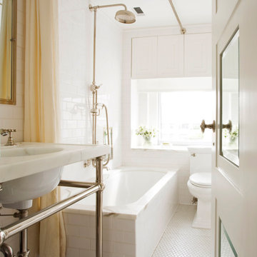
This is an exercise in the disciplined choreography of a constrained footprint — a narrow, rectilinear bathroom whose length is exploited rather than disguised. The composition unfolds along a single axis, the viewer's eye drawn from the foreground console lavatory, past the drop-in tub, to the terminal glazed aperture that anchors the far wall and releases the volume outward. The photograph's vantage, taken through a partially opened multi-paneled door with its cushioned rail-and-stile profile and beveled glazing, establishes a layered threshold condition: the room is framed, glimpsed, and entered simultaneously. Ceiling height is generous relative to plan dimension, and the architect has resisted the temptation to lower it; instead, a slender crown profile and a delicate picture-rail cornice terminate the field tile at a consistent datum, reinforcing the vertical proportion. Above the tub, a bank of recessed-panel cabinetry is set flush into the reveal of a soffit, borrowing the depth of the wall assembly to gain storage without protrusion — a deft piece of joinery logic. The window is treated as an architectural niche, its deep jambs and marble sill establishing a plinth that reads as inhabited rather than merely functional. Overhead, an exposed nickel-plated curtain rod traverses the ceiling plane in a single diagonal gesture, its cantilevered support rendering the drapery a movable spatial partition rather than a fixed enclosure.
**II. Materiality, Color & Texture**
The palette is a study in monochromatic gradation, calibrated almost entirely within the white spectrum yet richly differentiated by surface behavior. Hand-glazed subway tile in a running-bond pattern clads the wet walls, its subtle undulation and pooled glaze catching light unevenly to produce a soft, ceramic luminosity that no machine-pressed tile could replicate. Underfoot, a penny-round mosaic in matte porcelain introduces fine-grain granularity and a faintly warm grout line, its curvilinear tessellation providing tactile counterpoint to the orthogonal wall coursing. Marble — likely a Calacatta or lightly veined Carrara — appears strategically at the lavatory deck, the tub apron cap, and the window sill, its ochre-gold and cool grey veining supplying the room's only true figuration and its principal chromatic warmth. Polished nickel is the unifying metal, deployed with unusual generosity: the exposed console legs and cross-braced towel bar, the exposed riser and telephone-style handshower, the cross-handle fittings, and the rose-mounted door knob with its knurled backplate. Its cool, silvery reflectivity absorbs and redistributes ambient light, dissolving the hardware into the field. The single yielding material is the shower curtain — an unlined linen or cotton voile in pale butter-yellow — whose slubby weave, gravity-drawn folds, and warm undertone break the room's cool register and introduce the necessary note of domestic softness.
**III. Lighting, Atmosphere & Style Profile**
Illumination is overwhelmingly diurnal and unapologetically singular in source: the window at the terminus floods the space with diffuse, high-key daylight that blows toward pure white at the aperture and falls off gradually along the tile, modeling the wall's minute irregularities into a low-relief texture. The absence of visible decorative fixtures — save a discreet ceiling-recessed vent or downlight above the shower — is deliberate; artificial lighting is subordinated so that the material palette performs under natural light. The resulting atmosphere is serene, hygienic without sterility, and quietly luxurious: light behaves as a material in its own right, and the white-on-white scheme functions as a reflector rather than a void. Stylistically, the room synthesizes early-twentieth-century Anglo-American sanitary vernacular — the exposed-plumbing console lavatory, the exposed-riser shower, the metro tile and penny mosaic — with a contemporary editorial restraint that strips out ornament and pattern in favor of proportion and craft. It might be characterized as Refined Classicism, or more precisely, a Transitional Pre-War Revival: historically literate in its detailing, resolutely modern in its spatial economy and tonal discipline. The single pale-yellow textile is the design's signature move, a calibrated warm accent that prevents the achromatic scheme from tipping into clinical austerity and confirms the project's essential thesis — that restraint, correctly executed, reads as generosity.
 Shuler Architecture
Completed in 2019, this is a home we completed for client who initially engaged us to remodeled their 100 year old classic craftsman bungalow on Seattle’s Queen Anne Hill. During our initial conversation, it became readily apparent that their program was much larger than a remodel could accomplish and the conversation quickly turned toward the design of a new structure that could accommodate a growing family, a live-in Nanny, a variety of entertainment options and an enclosed garage – all squeezed onto a compact urban corner lot.
Project entitlement took almost a year as the house size dictated that we take advantage of several exceptions in Seattle’s complex zoning code. After several meetings with city planning officials, we finally prevailed in our arguments and ultimately designed a 4 story, 3800 sf house on a 2700 sf lot. The finished product is light and airy with a large, open plan and exposed beams on the main level, 5 bedrooms, 4 full bathrooms, 2 powder rooms, 2 fireplaces, 4 climate zones, a huge basement with a home theatre, guest suite, climbing gym, and an underground tavern/wine cellar/man cave. The kitchen has a large island, a walk-in pantry, a small breakfast area and access to a large deck. All of this program is capped by a rooftop deck with expansive views of Seattle’s urban landscape and Lake Union.
Unfortunately for our clients, a job relocation to Southern California forced a sale of their dream home a little more than a year after they settled in after a year project. The good news is that in Seattle’s tight housing market, in less than a week they received several full price offers with escalator clauses which allowed them to turn a nice profit on the deal.

 Living Green Designs
In this backyard space, the design challenge was to bring the essence of the California Mountains to Redondo Beach. As this client is an avid outdoorsman, he wanted to bring the a feel of the Sierra Nevada mountains, his happy place, home to create his very own backyard mountain retreat. Our team sourced materials that one would find in the mountains of California whilst keeping a lounge feel in mind for the secondary design criteria, a retreat. In this retreat, we created four distinct areas: the lounging area with covered pergola, fire pit area with built-in seating bench and overhead trellis complete with carnival lighting, central waterfall, and barbeque area with picnic table and overhead carnival lighting. We built a 10” x 10” rugged pergola was built out of sustainably sourced pine. The massive posts feel as though large pine trees were harvested right out of the California Mountains and crafted right on-site. The pergola was built with a retractable shade cloth so the sun can be let in for warmth in open during the colder months. The pergola and the other hard-scaped areas in the backyard were covered with a mix of gray granite and charcoal pavers. This color selection is reminiscent of the colors in California granite. Walking north from the pergola toward the fire pit area there is a mass planting of deer grasses, assortment of ferns and California coffee berries planted to mimic California Chaparral. At the other edge of this chaparral garden, sits the Cresta Boulder fire pit. Boulders were used to create this fire pit to harness the feeling of being outdoors in the wilderness. The boulders were locally sourced out of the Sierra Nevada mountain range for authenticity. In order to frame the space we installed a trellis and off the trellis runs carnival lights for night time parties. Just beyond the fire pit sits a granite boulder water fall. The waterfall is placed so that wherever you are in the yard you can see and hear the tranquil sounds of the babbling water as it circulates and recycles. The barbeque area is nestled against the backdrop of a dark green fernleaf podocarpus hedge. During the day, birds and butterflies traverse the native foliage and at night the sounds of the fire pit dance in harmony with the gentle sounds of water falling down granite pebbles making this backyard a true retreat from the chaotic noise of the city.

 ZEPHYR
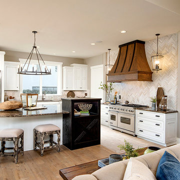
Titan Wall Hood
Design by Katrina Stumbos https://www.houzz.com/pro/katrina-stumbos/katrina-stumbos-interior-design
Sponsored
Columbus, OH

Wannemacher Interiors
Customized Award-Winning Interior Design Solutions in Franklin Cnty OH

 William Hoffman Architect
Entrance Transition Spaces
The outdoor space between the street and the front door is the start of the entrance to your home. This sequence of spaces differentiates between public and private areas. The street is the start of an intimacy gradient that extends to your front door and into your home. This transition from the street to the inside of your home should be a tranquil experience, slowing you down after experiencing automobile traffic on the interstate highway and the challenges of the day. Creating an entrance transition from the street to the front door and inside your house can create a space with a feeling of calm. Having your front door open directly to the street, you overlook the opportunity to create a graceful arrival to your home. The experience of entering your home and passing through an outdoor room between the street and the front door influences the way you feel once inside. If the transition is too abrupt, there is no feeling of arrival and once inside the quality of an intimate privacy doesn’t exist. The important thing is that an actual physical outdoor space exists between the street and the front door. The essential quality of creating this place is defining the space and to create a sense of enclosure, with a change in surroundings and view, while emphasizing a variation in the light, sound, path direction and surface texture. Below are some considerations you may want to think about in the design phase of the project:
• Define a space or path extending from the street to the front door. Think about the transition as an actual space or outdoor room rather than just going from point “A” to “B”. Create a sense of enclosure with a gate or garden wall.
• As this space is shaped, think about changes in level and direction in the walking surface at points of significance.
• Activate all the senses as you pass through this outdoor entrance room. Create calming sounds with chimes or water. Introduce smells with fragrant flowers and bushes. Provide a Zen view at a change in direction or stopping point on the path. Vary the amount of light with a trellis. Change the texture and size of the paths surface material.
• Change the scale of the path. Create a space at the street and just outside the front door for greeting or saying goodbye to guests. Create a space in the middle of the path as a point of reflection while looking towards a Zen view.
If done well, the outdoor entrance room you created between the front door and the street will feel comfortable arriving and leaving. This will be a remarkable addition to your home.
Photo credit: Bill Sanders
 Shuler Architecture
This classic 1970's rambler was purchased by our clients as their 'forever' retirement home and as a gathering place for their large, extended family. Situated on a large, verdant lot, the house was burdened with extremely dated finishes and poorly conceived spaces. These flaws were more than offset by the overwhelming advantages of a single level plan and spectacular sunset views. Weighing their options, our clients executed their purchase fully intending to hire us to immediately remodel this structure for them.
Our first task was to open up this plan and give the house a fresh, contemporary look that emphasizes views toward Lake Washington and the Olympic Mountains in the distance. Our initial response was to recreate our favorite Great Room plan. This started with the elimination of a large, masonry fireplace awkwardly located in the middle of the plan and to then tear out all the walls. We then flipped the Kitchen and Dining Room and inserted a walk-in pantry between the Garage and new Kitchen location.
While our clients' initial intention was to execute a simple Kitchen remodel, the project scope grew during the design phase. We convinced them that the original ill-conceived entry needed a make-over as well as both bathrooms on the main level. Now, instead of an entry sequence that looks like an afterthought, there is a formal court on axis with an entry art wall that arrests views before moving into the heart of the plan. The master suite was updated by sliding the wall between the bedroom and Great Room into the family area and then placing closets along this wall - in essence, using these closets as an acoustical buffer between the Master Suite and the Great Room. Moving these closets then freed up space for a 5-piece master bath, a more efficient hall bath and a stacking washer/dryer in a closet at the top of the stairs.

 The Cultural Landscape Foundation
Saturday, August 8, 9:00 to 10:30am | Aspen | DBX3 by Sheri Sanzone and Christine Shine of Bluegreen
A modern residential community with a storied past, the Double Bar X Ranch is steeped in the rich history of Colorado’s mining and agrarian roots. Today the site of a contemporary, ranch-inspired community, this rustic landscape was once part of the largest silver-producing mining district in the U.S. It later supported an array of intensive, agricultural activities. From the gentle rise of tilled-rubble walls and the patterning of open meadow, to the remnants of sculpted earthworks, evidence of the site’s prior use abounds. Winding foot trails allow visitors to experience panoramic views of the timbered landscape and structural features reminiscent of the historic ranch, including the large, wooden water trough that serves as a central focal point of the property. The design of the current landscape celebrates this juxtaposition of past and present; it revels in its contemporary context while embracing a historically minded design intent and honoring its latent history through selected materials and textures. The result of this mindful effort is an expression of thoughtful transition from the bygone, ranch of yesterday to a modern-day interpretation of the agrarian homestead.
Photo by Jason Dewey Photography, courtesy Bluegreen
176