
Search results for "Towards material" in Home Design Ideas

 Dan Nelson, Designs Northwest Architects
View towards out door coking area from the dining room, with the sliding wall system open. Photography by Lucas Henning.
Kitchen/dining room combo - large contemporary medium tone wood floor and brown floor kitchen/dining room combo idea in Seattle with white walls
Kitchen/dining room combo - large contemporary medium tone wood floor and brown floor kitchen/dining room combo idea in Seattle with white walls

 Angela Dechard Design
Example of a mid-sized mid-century modern beige one-story stucco exterior home design in Portland with a hip roof

 Fox Custom Woodworks
Looking through the kitchen toward the dining room — the black buffet and oak millwork carry the same material language from one space to the next, creating a cohesive open-plan composition.
Designed by: EKR Designs
Featuring Hanstone Quartz countertops and backsplashes.
Find the right local pro for your project

 Jessica Koltun Home
Coastal contemporary finishes and furniture designed by Interior Designer and Realtor Jessica Koltun in Dallas, TX. #designingdreams
Example of a mid-sized beach style l-shaped light wood floor and beige floor kitchen/dining room combo design in Dallas with a single-bowl sink, shaker cabinets, light wood cabinets, quartz countertops, gray backsplash, porcelain backsplash, stainless steel appliances, an island, white countertops and white walls
Example of a mid-sized beach style l-shaped light wood floor and beige floor kitchen/dining room combo design in Dallas with a single-bowl sink, shaker cabinets, light wood cabinets, quartz countertops, gray backsplash, porcelain backsplash, stainless steel appliances, an island, white countertops and white walls

 User
Photocredits (c) Olivia Wimmer
View towards the walk-in closet, on the right you see the built in sauna.
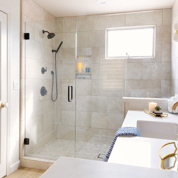
Example of a mid-sized minimalist gray tile and ceramic tile ceramic tile doorless shower design with recessed-panel cabinets, beige cabinets, white walls, a console sink and laminate countertops
Example of a mid-sized minimalist gray tile and ceramic tile ceramic tile doorless shower design with recessed-panel cabinets, beige cabinets, white walls, a console sink and laminate countertops
 NEXUS 21
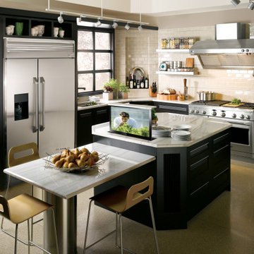
Want to watch TV in the kitchen, but keep all of your counter space available? A pop-up TV lift is the perfect solution.
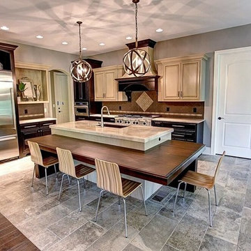
Example of a kitchen design in Phoenix with stainless steel appliances and an island
Example of a kitchen design in Phoenix with stainless steel appliances and an island

 CITYDESKSTUDIO, Inc.
Built in 1949, this Edina home had a strong horizontal presence on the site, but through subsequent renovations the overall massing was lacking clarity and refinement and the entry was diminutive and uninviting. The roof and siding materials were aging, and important interior spaces were cramped and closed in. The house needed better light, better connection internally and out, and exterior updates to clarify and enhance the strengths of the home.
The primary design evolved out of a celebration of the existing horizontality of the home and a recognition that a bigger home was not needed. By layering materiality and color, a new identity was created. A new cedar entry canopy slips out from under the previous roof line, extending further towards the street. This added warmth at the entry is echoed along the facade, creating a graceful rhythm and texture. The previous additions were re-clad with a darker material palette in order to anchor and unify the ends of the home. As the grade slopes down towards the back yard, horizontal bands are exposed, revealing the layering top to bottom. Combined, these few shifts in color and materiality allowed for a complete transformation of the home.
The interior is reflective of the material and color palette used outside. The main living spaces are opened up and connected while strengthening the original symmetry of the more formal linear alignment of rooms. A whole new kitchen relocates the center of the home and makes more fluid the daily life of this young family. The house is fully transformed inside and out, all without adding more square feet.
Project Team:
Ben Awes, AIA, Principal-in-Charge
Nate Dodge
Sponsored
Columbus, OH

Hope Restoration & General Contracting
Columbus Design-Build, Kitchen & Bath Remodeling, Historic Renovations
 Wendy O'Brien Interior Planning & Design
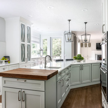
We breathed new life into this Hampton’s inspired kitchen with beautiful fresh materials in soft white and airy blue hues. We also redesigned the layout for optimal food prep, cooking and entertaining while keeping them separate from each other. By incorporating the nook area and removing the desk, we were able to give our client everything she ever wanted in a kitchen (see BEFORE pics). The lines and details of the custom hood and soft curved fretwork in the cabinetry create a sense of understated luxury and elegance. Oil rubbed bronze accents on the island legs, traditional lanterns and sconces, along with brushed nickel cabinet hardware complete the space. We also redesigned the fireplace and added built-ins to both sides for additional storage and unified, fresh new look.
For more photos of this project visit our website: https://wendyobrienid.com.
Photography by Valve Interactive: https://valveinteractive.com/

 Turnbull Griffin Haesloop
Architects: Turnbull Griffin Haesloop
Photography: Matthew Millman
Trendy u-shaped concrete floor and gray floor kitchen photo in San Francisco with glass-front cabinets, an island and medium tone wood cabinets
Trendy u-shaped concrete floor and gray floor kitchen photo in San Francisco with glass-front cabinets, an island and medium tone wood cabinets

 Main Street Kitchens at Botellos
This modern farmhouse kitchen was created to match the style and feel of the rest of the historic house built in the 1700s. Reclaimed flooring and counters, white fully custom Grabill cabinets, a farmhouse sink, and marble counters complete this lovely kitchen. Design and Installation by Main Street at Botellos. Photography by Eric Roth.
 CITYDESKSTUDIO, Inc.
Built in 1949, this Edina home had a strong horizontal presence on the site, but through subsequent renovations the overall massing was lacking clarity and refinement and the entry was diminutive and uninviting. The roof and siding materials were aging, and important interior spaces were cramped and closed in. The house needed better light, better connection internally and out, and exterior updates to clarify and enhance the strengths of the home.
The primary design evolved out of a celebration of the existing horizontality of the home and a recognition that a bigger home was not needed. By layering materiality and color, a new identity was created. A new cedar entry canopy slips out from under the previous roof line, extending further towards the street. This added warmth at the entry is echoed along the facade, creating a graceful rhythm and texture. The previous additions were re-clad with a darker material palette in order to anchor and unify the ends of the home. As the grade slopes down towards the back yard, horizontal bands are exposed, revealing the layering top to bottom. Combined, these few shifts in color and materiality allowed for a complete transformation of the home.
The interior is reflective of the material and color palette used outside. The main living spaces are opened up and connected while strengthening the original symmetry of the more formal linear alignment of rooms. A whole new kitchen relocates the center of the home and makes more fluid the daily life of this young family. The house is fully transformed inside and out, all without adding more square feet.
Project Team:
Ben Awes, AIA, Principal-in-Charge
Nate Dodge
 CITYDESKSTUDIO, Inc.
Built in 1949, this Edina home had a strong horizontal presence on the site, but through subsequent renovations the overall massing was lacking clarity and refinement and the entry was diminutive and uninviting. The roof and siding materials were aging, and important interior spaces were cramped and closed in. The house needed better light, better connection internally and out, and exterior updates to clarify and enhance the strengths of the home.
The primary design evolved out of a celebration of the existing horizontality of the home and a recognition that a bigger home was not needed. By layering materiality and color, a new identity was created. A new cedar entry canopy slips out from under the previous roof line, extending further towards the street. This added warmth at the entry is echoed along the facade, creating a graceful rhythm and texture. The previous additions were re-clad with a darker material palette in order to anchor and unify the ends of the home. As the grade slopes down towards the back yard, horizontal bands are exposed, revealing the layering top to bottom. Combined, these few shifts in color and materiality allowed for a complete transformation of the home.
The interior is reflective of the material and color palette used outside. The main living spaces are opened up and connected while strengthening the original symmetry of the more formal linear alignment of rooms. A whole new kitchen relocates the center of the home and makes more fluid the daily life of this young family. The house is fully transformed inside and out, all without adding more square feet.
Project Team:
Ben Awes, AIA, Principal-in-Charge
Nate Dodge

 Randy Trainor
This three-story vacation home for a family of ski enthusiasts features 5 bedrooms and a six-bed bunk room, 5 1/2 bathrooms, kitchen, dining room, great room, 2 wet bars, great room, exercise room, basement game room, office, mud room, ski work room, decks, stone patio with sunken hot tub, garage, and elevator.
The home sits into an extremely steep, half-acre lot that shares a property line with a ski resort and allows for ski-in, ski-out access to the mountain’s 61 trails. This unique location and challenging terrain informed the home’s siting, footprint, program, design, interior design, finishes, and custom made furniture.
Credit: Samyn-D'Elia Architects
Sponsored
Sunbury, OH

J.Holderby - Renovations
Franklin County's Leading General Contractors - 2X Best of Houzz!
 CITYDESKSTUDIO, Inc.
Built in 1949, this Edina home had a strong horizontal presence on the site, but through subsequent renovations the overall massing was lacking clarity and refinement and the entry was diminutive and uninviting. The roof and siding materials were aging, and important interior spaces were cramped and closed in. The house needed better light, better connection internally and out, and exterior updates to clarify and enhance the strengths of the home.
The primary design evolved out of a celebration of the existing horizontality of the home and a recognition that a bigger home was not needed. By layering materiality and color, a new identity was created. A new cedar entry canopy slips out from under the previous roof line, extending further towards the street. This added warmth at the entry is echoed along the facade, creating a graceful rhythm and texture. The previous additions were re-clad with a darker material palette in order to anchor and unify the ends of the home. As the grade slopes down towards the back yard, horizontal bands are exposed, revealing the layering top to bottom. Combined, these few shifts in color and materiality allowed for a complete transformation of the home.
The interior is reflective of the material and color palette used outside. The main living spaces are opened up and connected while strengthening the original symmetry of the more formal linear alignment of rooms. A whole new kitchen relocates the center of the home and makes more fluid the daily life of this young family. The house is fully transformed inside and out, all without adding more square feet.
Project Team:
Ben Awes, AIA, Principal-in-Charge
Nate Dodge

 Misiaszek Turpin pllc
Resting upon a 120-acre rural hillside, this 17,500 square-foot residence has unencumbered mountain views to the east, south and west. The exterior design palette for the public side is a more formal Tudor style of architecture, including intricate brick detailing; while the materials for the private side tend toward a more casual mountain-home style of architecture with a natural stone base and hand-cut wood siding.
Primary living spaces and the master bedroom suite, are located on the main level, with guest accommodations on the upper floor of the main house and upper floor of the garage. The interior material palette was carefully chosen to match the stunning collection of antique furniture and artifacts, gathered from around the country. From the elegant kitchen to the cozy screened porch, this residence captures the beauty of the White Mountains and embodies classic New Hampshire living.
Photographer: Joseph St. Pierre
 CITYDESKSTUDIO, Inc.
Built in 1949, this Edina home had a strong horizontal presence on the site, but through subsequent renovations the overall massing was lacking clarity and refinement and the entry was diminutive and uninviting. The roof and siding materials were aging, and important interior spaces were cramped and closed in. The house needed better light, better connection internally and out, and exterior updates to clarify and enhance the strengths of the home.
The primary design evolved out of a celebration of the existing horizontality of the home and a recognition that a bigger home was not needed. By layering materiality and color, a new identity was created. A new cedar entry canopy slips out from under the previous roof line, extending further towards the street. This added warmth at the entry is echoed along the facade, creating a graceful rhythm and texture. The previous additions were re-clad with a darker material palette in order to anchor and unify the ends of the home. As the grade slopes down towards the back yard, horizontal bands are exposed, revealing the layering top to bottom. Combined, these few shifts in color and materiality allowed for a complete transformation of the home.
The interior is reflective of the material and color palette used outside. The main living spaces are opened up and connected while strengthening the original symmetry of the more formal linear alignment of rooms. A whole new kitchen relocates the center of the home and makes more fluid the daily life of this young family. The house is fully transformed inside and out, all without adding more square feet.
Project Team:
Ben Awes, AIA, Principal-in-Charge
Nate Dodge

Sponsored
Fredericksburg, OH

High Point Cabinets
Columbus' Experienced Custom Cabinet Builder | 4x Best of Houzz Winner
 User
Overall shot looking towards shower.
Corner bathtub - mid-sized rustic master white tile and porcelain tile ceramic tile corner bathtub idea in New York with a wall-mount sink, flat-panel cabinets, white cabinets, a one-piece toilet and white walls
Corner bathtub - mid-sized rustic master white tile and porcelain tile ceramic tile corner bathtub idea in New York with a wall-mount sink, flat-panel cabinets, white cabinets, a one-piece toilet and white walls


 Alderwood Landscape Architecture and Construction
These clients' small yard had severe drainage issues, making it difficult for their large family to spend time outdoors. We worked with the clients to create several spaces in the small area that flowed together and met the family's needs. The modern-styled furniture spaces divided by flagstone pavers separated the spaces while an array of short plantings, Japanese maples, and Asian lantern decor introduced fluidity.
72