
Search results for "Traffic areas" in Home Design Ideas

 Highland Design+Build
Built in the 1990’s by the homeowner, this kitchen design was rushed to be finished and was never their dream kitchen. Now, with the ability to accomplish their goals, the design team worked closely with the homeowner to create the kitchen they always wanted. The new kitchen was designed to be more conducive to entertaining and more enjoyable while meeting the homeowner’s day to day family needs.
The existing pantry closet sat on an awkward angled wall that it shared with a built-in desk area. By removing that pantry closet wall, the new design allowed for two pantries, buffet space with glass display as well as enough room for a larger island.
With the abundance of cabinetry, we chose to brighten the room with Alabaster perimeter cabinets while contrasting the island with a java stain and vintage glaze. The custom wood hood was an important detail for completing the owners vision. The banquet seat allowed the table to permanently live closer to the wall relaxing traffic flow as well as adding warmth and coziness to the space. Winter Storm granite countertops, beige travertine 3 x 6 backsplash kept the room light. A dark mocha decorative framed accent behind the cooktop and perimeter border adds visual interest and compliments the warms of the island.
The clients had a need for an abundance of storage in their kitchen redesign. By reconfiguring the existing pantry and desk wall, we were able to rework the island size and pantry storage. The new layout also allowed for a small buffet space for ease of entertaining guests in the adjacent dining room.
Working around an existing return vent posed a challenge. Forced to be creative, we added depth to one of the pantry units and enclosed the air return in the lower portion allowing a fully functional upper cabinet.
205 Photography


 TKS Design Group
Free ebook, Creating the Ideal Kitchen. DOWNLOAD NOW
This project started out as a kitchen remodel but ended up as so much more. As the original plan started to take shape, some water damage provided the impetus to remodel a small upstairs hall bath. Once this bath was complete, the homeowners enjoyed the result so much that they decided to set aside the kitchen and complete a large master bath remodel. Once that was completed, we started planning for the kitchen!
The original kitchen was just large enough to accommodate an island and a separate pantry but felt a little cramped, especially during the weekends when the couple likes to entertain. The primary goal was to maintain the functionality of the current space, but to add some breathing room as well as to provide a view to the homeowner’s side yard and substantial Hosta garden.
The solution was to bump out the space about 10 feet which provided ample room for large pro appliances, a large island for gathering and an upgraded pantry space. It was important to the homeowners to create a space that felt like it belonged in their historic 1866 home. Details such as matching new trim to the existing large custom profiles in the original home and re-purposing an existing door to be used for the new pantry, provided these touches. A large window at the main sink provides that view into the yard and a beautiful focal point for the room.
A mix of painted wood and stained cabinetry gives the new kitchen a sense of belonging in the older home, as do the Super White quartzite that has the look of marble, subway tile backsplash, polished nickel lanterns and glass and mirrored doors. The large pantry, filled with custom shelving built to the homeowner’s specifications, stainless steel appliances and the two Galley Workstations – sinks that do double duty as prep space – ensure that not only does the kitchen look great, but also functions in a personalized manner that works perfectly for the occupants.
Doing the bump out also allowed the opportunity for a small mudroom and powder room right off the kitchen as well as re-arranging some openings to allow for better traffic flow throughout the entire first floor. The result is a comfortable up-to-date home that feels both steeped in history yet allows for today’s style of living.
Designed by: Susan Klimala, CKD, CBD
Photography by: Michael Alan Kaskel
For more information on kitchen and bath design ideas go to: www.kitchenstudio-ge.com
Find the right local pro for your project

 Montecito Landscape
custom made pond with stone edging with central fountain is the centerpiece of this beautiful garden. Surrounded by drought tolerant ground covers that can be mowed like a lawn but without the water. Gravel paths meander through this garden bordered with flowering drought tolerant perennials roses, lavender, blue spire sage, jasmine, pittosporum, rosemary, rockrose. The paths meander through the woods. Sitting areas are placed throughout this garden. Subtle garden lighting illuminates this garden creating a magical wonderland.

 Jeannette Architects
Example of a huge u-shaped light wood floor open concept kitchen design in Los Angeles with a double-bowl sink, recessed-panel cabinets, white cabinets, white backsplash, subway tile backsplash, stainless steel appliances and an island

 Nantucket Looms
When considering the scheme for the Corner Table Café, the Looms’ team opted to use the muted hues of Nantucket’s natural land and seascape (celadon, foggy gray, seashell white) – along with some local favorites, like Nantucket Red. The walls were decorative painted by Riptide Finishes in the colors of cream, gold and silver. With an eye on sustainability some of the old wood from the original building was painted and used in the ceiling. Hubbardton Forge light fixtures adorn the wall and hang from the ceiling. The furnishings in the café include built-in banquettes in an oak finish with celadon leather cushions with red wash oak café chairs. The celadon leather cushions are from Jerry Pair ‘In the Moo’d’, chosen for it's durability in high traffic areas. The pillow are Katie Leede fabric and the tables, coffee tables and chairs are from Design Workshop. Other inviting seating includes a Lee Industries upholstered sofa in a textured caramel high performance fabric ('Odin' fabric by Anichini). The two armchairs are Lee Industries covered in Duralee fabric in Nantucket Red and turquoise tones with flame stitching.
The counter cabinetry is by Housefitters and the backsplash is an Alys Edwards tile, also from Housefitters, chosen for its caramel and teal tones to tie all the colors together.
Chef Margolis' collection of cookbooks lines the window sills to be browsed by patrons while enjoying their meal.

 Pacific Northwest Cabinetry
Mid-sized transitional u-shaped light wood floor eat-in kitchen photo in Portland with an undermount sink, raised-panel cabinets, medium tone wood cabinets, granite countertops, beige backsplash, porcelain backsplash, stainless steel appliances and an island
Mid-sized transitional u-shaped light wood floor eat-in kitchen photo in Portland with an undermount sink, raised-panel cabinets, medium tone wood cabinets, granite countertops, beige backsplash, porcelain backsplash, stainless steel appliances and an island
Sponsored
Columbus, OH
Free consultation for landscape design!

Peabody Landscape Group
Columbus' Reliable Landscape Design & Contracting
 House of a Different Color
Design consultation and advising for DIY/Budget Renovation.
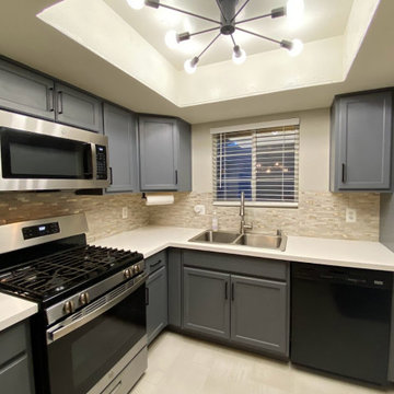
Owner purchased this condo with a very cramped and dated kitchen and light fixtures, and early 2000s-era café paint colors.
Owner did a lot of the work himself or with friends to keep the budget down.
HDC advised on design details and paint colors, chose light fixtures (ceiling lights for kitchen and dining and arch floor lamp in living room). HDC also assisted with creating a new kitchen floor plan, which involved removing one wall, replacing existing tile and modifying flooring transition location, replacing all cabinetry except for the tall pantry cabinet, choosing cabinet paint, installing modern cabinet hardware, replacing laminate counters with a budget white quartz prefab counter, replacing appliances, sink, and faucet, and installing a low-cost peel & stick backsplash.
Due to budget constraints, we could not remove the entire wall between the kitchen and dining space to make the wall completely flush from the kitchen to dining area transition, but decided to relocate the refrigerator to that wall nonetheless, in order to improve sightlines and improve traffic flow and function for refrigerator access. We created a coffee/drinks bar where the original fridge was located. The owner decided to keep the existing water line that had serviced the ice maker in the fridge where it was previously located (and cap it temporarily). He plans to plumb it in the future to support a filtered drinking water line and auto-filling coffee maker to finish out the drink center.
Ultimately, we couldn't stretch the budget for a perfect layout, but we were still able to improve the function and open up the flow of this hub of the condo for better entertaining and more convenient homeowner use of the space.

 Michael Nash Design, Build & Homes
When the homeowners purchased this traditional colonial in Vienna, Virginia, they were already planning on making some serious changes. The home’s original floor plan was boxy and closed in, making traffic flow from one room to the next virtually non-existent. Additionally, the existing décor left a lot to be desired. Their vision was to open up the layout and create a more contemporary look using lots of light, soft colors and high end materials.
They decided to add a two-story addition to the back of the home’s existing breakfast room and the small upstairs bedroom above it. The old breakfast area was too small for their daily meals and their teenage son needed more space in his bedroom. They also decided to add a sunroom/family room to the left side of their old family room. This new room offers a vaulted ceiling with four skylights and lots of windows with a better view of the side and backyard.
To create a more open floor plan, the team at Michael Nash Design, Build & Homes removed the load bearing wall between the kitchen and family room and installed a large beam to handle the second floor load. Not only did this open up the space, but it allowed for the addition of a breakfast bar.
The right side bearing wall of the old family room was also removed and replaced with structural beams. This action created a continuous flow between the new sunroom and old family room. Separated by a double-sided stone fireplace, this new sunroom is connected to a new outside sun deck built using a maintenance-free decking material. The old family room with new lighting now serves as a casual seating area. It also features an eight-foot long built-in desk.
The newly updated kitchen features granite countertops with matching tile backsplash, professional-quality appliances, a porcelain tile floor and custom cabinets, including a large pantry. The new breakfast room is more spacious and gets daylight from three different angles.
Upstairs, a new 12’ x 20’ bedroom is a great place for this teenage football fan to hang out. It provides significantly more closet space than the old room and lets in more sunlight as well.
The old laundry room was converted to a new mudroom with locker style cabinetry and a place for kids to store their bag packs. New plumbing and electrical were implemented in a new closet in an upper hallway to facilitate the new washer and dryer.
In this remodel, form and function have come together in an open concept design that meets the needs of the entire family.
 House of a Different Color
Design consultation and advising for DIY/Budget Renovation.
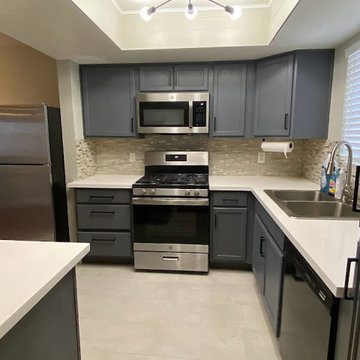
Owner purchased this condo with a very cramped and dated kitchen and light fixtures, and early 2000s-era café paint colors.
Owner did a lot of the work himself or with friends to keep the budget down.
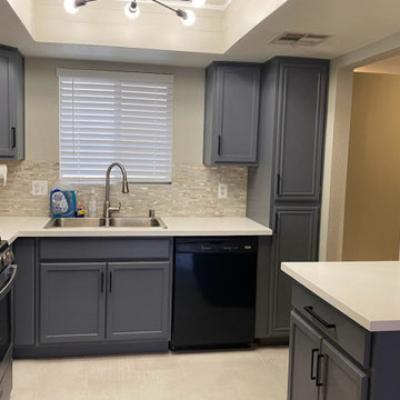
HDC advised on design details and paint colors, chose light fixtures (ceiling lights for kitchen and dining and arch floor lamp in living room). HDC also assisted with creating a new kitchen floor plan, which involved removing one wall, replacing existing tile and modifying flooring transition location, replacing all cabinetry except for the tall pantry cabinet, choosing cabinet paint, installing modern cabinet hardware, replacing laminate counters with a budget white quartz prefab counter, replacing appliances, sink, and faucet, and installing a low-cost peel & stick backsplash.
Due to budget constraints, we could not remove the entire wall between the kitchen and dining space to make the wall completely flush from the kitchen to dining area transition, but decided to relocate the refrigerator to that wall nonetheless, in order to improve sightlines and improve traffic flow and function for refrigerator access. We created a coffee/drinks bar where the original fridge was located. The owner decided to keep the existing water line that had serviced the ice maker in the fridge where it was previously located (and cap it temporarily). He plans to plumb it in the future to support a filtered drinking water line and auto-filling coffee maker to finish out the drink center.
Ultimately, we couldn't stretch the budget for a perfect layout, but we were still able to improve the function and open up the flow of this hub of the condo for better entertaining and more convenient homeowner use of the space.
 Michael Nash Design, Build & Homes
2010 NARI CAPITAL COTY FINALIST AWARD WINNER
A military couple bought this single family home in a prominent Mount Vernon neighborhood about a year ago. The home had a three-level deck on the back of the house which was falling apart and from which there was no access via the kitchen or breakfast area. Additionally, water run-off was washing a large amount of dirt against the lower level basement door because there was little in terms of landscaping in place. The homeowners wanted to entertain in the backyard and have a good flow from the family room and kitchen onto the back patio.
To help them achieve their goals, they hired Michael Nash Design, Build & Homes as their contractor. The first step in the renovation was to remove the entire back deck. Next, they designed and built an 18’x 45’ concrete foundation and slab; designed and built a tall retaining wall coved with flagstone to support the upper level patio; and installed a new patio with flagstone and brick pavers.
The new patio level only requires two short steps to get inside of the house. A new set of French doors with sidelights replaces the old breakfast room window to improve the traffic pattern. A new set of French doors with ½ arched transom and two side windows connects the new gourmet kitchen to the back patio.
The kitchen offers professional-grade stainless steel appliances, hard wood floors, granite countertops with a tile backsplash and beautiful custom cabinetry. A large center island is the focal point of the room and the gathering spot in this new space.
 House of a Different Color
Design consultation and advising for DIY/Budget Renovation.
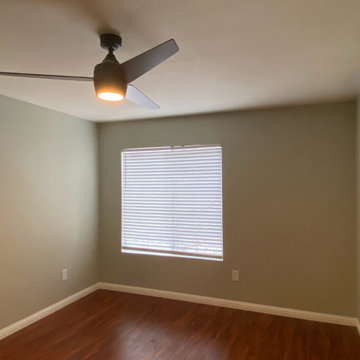
Owner purchased this condo with a very cramped and dated kitchen and light fixtures, and early 2000s-era café paint colors.
Owner did a lot of the work himself or with friends to keep the budget down.
HDC advised on design details and paint colors, chose light fixtures (ceiling lights for kitchen and dining and arch floor lamp in living room). HDC also assisted with creating a new kitchen floor plan, which involved removing one wall, replacing existing tile and modifying flooring transition location, replacing all cabinetry except for the tall pantry cabinet, choosing cabinet paint, installing modern cabinet hardware, replacing laminate counters with a budget white quartz prefab counter, replacing appliances, sink, and faucet, and installing a low-cost peel & stick backsplash.
Due to budget constraints, we could not remove the entire wall between the kitchen and dining space to make the wall completely flush from the kitchen to dining area transition, but decided to relocate the refrigerator to that wall nonetheless, in order to improve sightlines and improve traffic flow and function for refrigerator access. We created a coffee/drinks bar where the original fridge was located. The owner decided to keep the existing water line that had serviced the ice maker in the fridge where it was previously located (and cap it temporarily). He plans to plumb it in the future to support a filtered drinking water line and auto-filling coffee maker to finish out the drink center.
Ultimately, we couldn't stretch the budget for a perfect layout, but we were still able to improve the function and open up the flow of this hub of the condo for better entertaining and more convenient homeowner use of the space.

 Thompson Remodeling
Our clients had lovingly cared for their home for 16 years. In this small home, space was at a premium and the couple wanted to update this poorly functioning kitchen to match the rest of their Arts & Crafts style home.
Key requirements of this kitchen remodel design included:
- Improved lighting
- Better traffic pattern
- More storage
- Incorporating the Pewabic tile the clients loved
IMPROVED LIGHTING
A new lighting plan for the kitchen included:
- Three pendants over the new island
- Pendant lighting over the sink
- Recessed lights throughout
- Under cabinet lighting
BETTER TRAFFIC PATTERN
The refrigerator was moved from the main walkway to a perimeter wall. Its new location creates one point in the now smaller working triangle.
Prep space was previously scarce and the new island allows two to work in the kitchen without one getting trapped in the corner.
MORE STORAGE
A new island supplies storage that was non-existent before and it creates a place for people to sit and connect.
Although we replaced a slider with a door, we added a pantry cabinet which was also new storage the kitchen did not previously have.
Bulkheads were removed allowing cabinets to extend to the ceiling.
INCORPORATING PEWABIC TILE
Pewabic tile is handcrafted stoneware clay tile that is made in Detroit with a history dating back to 1903. Our clients fell in love with this tile years ago and used it on the landing of their staircase and wanted to incorporate it into the kitchen design.
We decided to let this gorgeous tile take center stage by creating an eye-catching backsplash. The flooring also incorporates details that connect back to the Pewabic tiles used on the walls.
OVERALL RESULTS
The remodeled kitchen has improved the feel of the whole first floor. A clear pathway runs from the living room through the kitchen and from the kitchen into the dining room. A new island supplies much-needed storage and provides a place for people to eat casual meals and hang out. The new lighting plan brightened not only the kitchen, but also the adjacent rooms. Now, with the kitchen completed, the whole house has a cohesive Arts & Crafts aesthetic – Mission Accomplished!
“The kitchen design is everything we hoped it would be. It’s a reflection of our tastes – it’s us. Our designer really understood what we liked and how to make the kitchen fit with the look of the rest of the house.”
“What do we love? Lighting, lighting, lighting! The Pewabic backsplash! The storage additions. The overall look – it’s new, but it looks & feels like it could have been original to the house.”
– Homeowner


 Main Line Kitchen Design
 is a unique business model! We are a group of skilled Kitchen Designers each with many years of experience planning kitchens around the Delaware Valley. And we are cabinet dealers for 8 nationally distributed cabinet lines much like traditional showrooms.
Appointment Information
Unlike full showrooms open to the general public, Main Line Kitchen Design works only by appointment. Appointments can be scheduled days, nights, and weekends either in your home or in our office and selection center. During office appointments we display clients kitchens on a flat screen TV and help them look through 100’s of sample doorstyles, almost a thousand sample finish blocks and sample kitchen cabinets. During home visits we can bring samples, take measurements, and make design changes on laptops showing you what your kitchen can look like in the very room being renovated. This is more convenient for our customers and it eliminates the expense of staffing and maintaining a larger space that is open to walk in traffic. We pass the significant savings on to our customers and so we sell cabinetry for less than other dealers, even home centers like Lowes and The Home Depot.
We believe that since a web site like Houzz.com has over half a million kitchen photos, any advantage to going to a full kitchen showroom with full kitchen displays has been lost. Almost no customer today will ever get to see a display kitchen in their door style and finish because there are just too many possibilities. And the design of each kitchen is unique anyway. Our design process allows us to spend more time working on our customer’s designs. This is what we enjoy most about our business and it is what makes the difference between an average and a great kitchen design
 Michael Nash Design, Build & Homes
2010 NARI CAPITAL COTY FINALIST AWARD WINNER
A military couple bought this single family home in a prominent Mount Vernon neighborhood about a year ago. The home had a three-level deck on the back of the house which was falling apart and from which there was no access via the kitchen or breakfast area. Additionally, water run-off was washing a large amount of dirt against the lower level basement door because there was little in terms of landscaping in place. The homeowners wanted to entertain in the backyard and have a good flow from the family room and kitchen onto the back patio.
To help them achieve their goals, they hired Michael Nash Design, Build & Homes as their contractor. The first step in the renovation was to remove the entire back deck. Next, they designed and built an 18’x 45’ concrete foundation and slab; designed and built a tall retaining wall coved with flagstone to support the upper level patio; and installed a new patio with flagstone and brick pavers.
The new patio level only requires two short steps to get inside of the house. A new set of French doors with sidelights replaces the old breakfast room window to improve the traffic pattern. A new set of French doors with ½ arched transom and two side windows connects the new gourmet kitchen to the back patio.
The kitchen offers professional-grade stainless steel appliances, hard wood floors, granite countertops with a tile backsplash and beautiful custom cabinetry. A large center island is the focal point of the room and the gathering spot in this new space.
 House of a Different Color
Design consultation and advising for DIY/Budget Renovation.
Owner purchased this condo with a very cramped and dated kitchen and light fixtures, and early 2000s-era café paint colors.
Owner did a lot of the work himself or with friends to keep the budget down.
HDC advised on design details and paint colors, chose light fixtures (ceiling lights for kitchen and dining and arch floor lamp in living room). HDC also assisted with creating a new kitchen floor plan, which involved removing one wall, replacing existing tile and modifying flooring transition location, replacing all cabinetry except for the tall pantry cabinet, choosing cabinet paint, installing modern cabinet hardware, replacing laminate counters with a budget white quartz prefab counter, replacing appliances, sink, and faucet, and installing a low-cost peel & stick backsplash.
Due to budget constraints, we could not remove the entire wall between the kitchen and dining space to make the wall completely flush from the kitchen to dining area transition, but decided to relocate the refrigerator to that wall nonetheless, in order to improve sightlines and improve traffic flow and function for refrigerator access. We created a coffee/drinks bar where the original fridge was located. The owner decided to keep the existing water line that had serviced the ice maker in the fridge where it was previously located (and cap it temporarily). He plans to plumb it in the future to support a filtered drinking water line and auto-filling coffee maker to finish out the drink center.
Ultimately, we couldn't stretch the budget for a perfect layout, but we were still able to improve the function and open up the flow of this hub of the condo for better entertaining and more convenient homeowner use of the space.

 We Make It Our Home
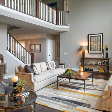
The living room was long and narrow but with an amazing bay window. Instead of a galley style living room used by the previous owner, we decided to change the furniture arrangement by putting one big comfy L-shaped sectional all the way to one side to create a pass-through area enabling a better foot traffic. We then added two side chairs for extra seats. We also mounted our TV on top of the fireplace to gain more space. Although it's not my favorite design choice to have TV on top of the fireplace because I think it takes away from the fireplace but we had to work within the limitation of the space.
For the fireplace, we bought wood stove insert and inserted it into the existing masonry fireplace. The look was updated by granite tiles around the insert and custom built wood mantel.
Buying wood fireplace insert was the best decision we made. First of all, it created a memorable space in our home. I LOVE the sound of wood cracking and the smell of wood burning. In winter nights we would sit around the fireplace and make s'mores like it's a campfire. Second, it's a clean burning and efficient heater. You don't lose the majority the fire’s heat up the chimney thereby saving money on your heating bill.
The coffee table is purchased from Wicker Emporium and it's made from reclaimed pine timbers giving the house a rustic feel.
The side chair by the fireplace is the perfect spot for me to relax, put my feet up on the large ball shaped knitted foot rest and enjoy a cup of cappuccino or cozy up with a good book.

 Murphy Bros. Design | Build | Remodel
Steroids? Perhaps that's a bit over the top, but we wanted to frame this project from the outset as a definite step up to the next level.
These Mahtomedi homeowners wanted a larger more protected space to grill, entertain and enjoy their spectacular view of woods and lake without worrying about the weather. Nothing worse than trying to remember, as thunder peels overhead, if you left your laptop or library book out on the porch or deck while stuck in heavy traffic. Well, except if you were in a convertible. That would definitely be worse.
During our initial discovery meeting we also learned they were tired of the constant maintenance their existing cedar deck required. The head of our paint and fine finishing department, is often overheard lamenting how homeowners have no idea how much maintenance is actually required to care for wood decks. So, these folks apparently did know, and had their fill of it.
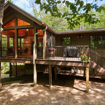
We discussed a traditional heated, glassed-in and insulated 3 & 4-season porch, but they felt that was a bit more than they needed or wanted. Our solution? Screen porch 2.0. — a new approach. The plan: expand the footprint of the existing deck, replacing it with Timbertech® low-maintenance decking, creating an additional 12 x 6 foot enclosed porch with an uncovered 6 x 9 foot deck space for grilling. After much research and evaluation we selected the Eze-Breeze®enclosure system—a customizable, panelized enclosure system that has the look of a 4-season with the protection of a 3-season porch, but for far less than a 3 or 4-season price tag. Bingo! Screen porch to the next level.
Murphy Bros. Design/Build Consultant — Jeff Robinson
Photography — Alyssa Lee
 Highland Design+Build
Built in the 1990’s by the homeowner, this kitchen design was rushed to be finished and was never their dream kitchen. Now, with the ability to accomplish their goals, the design team worked closely with the homeowner to create the kitchen they always wanted. The new kitchen was designed to be more conducive to entertaining and more enjoyable while meeting the homeowner’s day to day family needs.
The existing pantry closet sat on an awkward angled wall that it shared with a built-in desk area. By removing that pantry closet wall, the new design allowed for two pantries, buffet space with glass display as well as enough room for a larger island.
With the abundance of cabinetry, we chose to brighten the room with Alabaster perimeter cabinets while contrasting the island with a java stain and vintage glaze. The custom wood hood was an important detail for completing the owners vision. The banquet seat allowed the table to permanently live closer to the wall relaxing traffic flow as well as adding warmth and coziness to the space. Winter Storm granite countertops, beige travertine 3 x 6 backsplash kept the room light. A dark mocha decorative framed accent behind the cooktop and perimeter border adds visual interest and compliments the warms of the island.
The clients had a need for an abundance of storage in their kitchen redesign. By reconfiguring the existing pantry and desk wall, we were able to rework the island size and pantry storage. The new layout also allowed for a small buffet space for ease of entertaining guests in the adjacent dining room.
Working around an existing return vent posed a challenge. Forced to be creative, we added depth to one of the pantry units and enclosed the air return in the lower portion allowing a fully functional upper cabinet.
205 Photography
 Pennsylvania Landscape & Nursery Association
Terren Landscapes http://www.terrenlandscapes.com
2014 PLNA Awards for Landscape Excellence Winner
Category: Residential $120,000 & Over
Award Level: Silver
Project Description:
The goal of the Vaccaro project was to change the existing non-functional landscape into multiple entertainment spaces while working within the tight confines of impervious coverage requirements. The project consisted of removing, redesigning and re-installing existing hardscaping, front and rear, reconfiguring the driveway to accommodate more parking, handling storm water on-site, and increasing the aesthetic appeal of the property.
The client was remodeling the home in the theme of a rustic French country estate and in our design we endeavored to adhere to this chosen theme. The existing driveway was a circular driveway located off of the main axis of the front door. Reconfiguring the driveway improved vehicular flow, provided additional parking, and reduced impervious space. By consolidating the parking to the side of the house where the garage is located, we maintained the French theme in encouraging arriving cars to pull up closer to the home's entry. We also worked with the architect in the renovation of the home to position the garage windows so that they were placed in the voids of the arbor we constructed over the parking spaces by the garage. The rustic arbor creates a vertical element and delineates the pedestrian walkway from vehicular traffic. The main walkway spans the front of the home so that it extends down to the parking area to guide visitors to the main entrance.
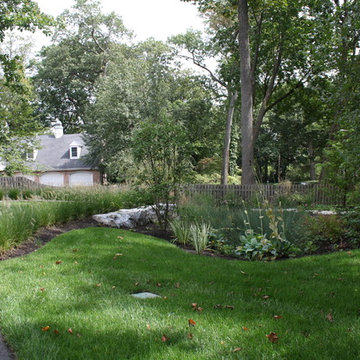
To handle the storm water generated by the driveway, we installed a rain garden, which was placed in the front right side yard. The rain garden area was excavated, the soil in the planting areas was heavily amended with compost, sand, and diatomaceous earth, and mostly native plant material was installed to help absorb excess water. In the bottom-most area of the basin filter fabric was laid to help prevent migration of the stone into the soil and decorative stone was spread to slow the flow of water. Storm water is held until it successfully infiltrates the soil, and the plant material provides a natural habitat that supports butterflies, birds, and beneficial insects.
The existing front patio was removed and the size increased to make the space more functional. To increase function and circulation we worked with the architect to create a dining room that extends to the out-of-doors by adding French doors to the front of the home, which open to the new gravel front terrace. The homeowner desired a planting scheme that would create delineation between the front yard and the gravel terrace without blocking the morning sunlight. To achieve this we chose standardized Physocarpus 'Diablo' to compliment the warm cream-colored stucco of the home and provide structure to the patio space.
In the rear of the property we removed the existing brick patio and installed a dry-laid quartzite patio that nicely compliments the cream-colored stucco. We redesigned the rear patio space using 45 degree angles to represent the old French design theory of bisecting spaces with diagonals. Utilizing this design theory created more interesting patio spaces and allowed us to soften the sharp angles by planting the negative spaces between the house and patio. Seat walls were also designed and installed to create more seating without sacrificing impervious space.
Per the homeowner's wishes, we also designed a separate area in the rear of the yard for a natural boulder fire pit, which is located along the axis of the kitchen window. Half of the ring utilizes boulders for seating for a small gathering while the other half
allowed the homeowner's addition of colorful Adirondack chairs to finish the fire circle.
Incorporating the French theme throughout, we also designed and installed a small vegetable garden in the side yard so the homeowner could grow her own vegetables and herbs.
Photo Credit:
Terren Landscapes
206