
Search results for "Traffic areas" in Home Design Ideas

 In Detail Interiors
Cozy and Colorful Beach House Remodel!
When you think funky little house by the beach – images like what you are about to see may not be what you would have anticipated. This furnishings project aimed to capture a colorful, fun, active space for a family who wanted to feel at home .Thus, creating casual and comfortable but not boring in the least. A little traveled, a lot of texture, and not much clutter!
From the start, the space was not much to write home about!
The common living areas were boxy with lower ceilings. Quirky ins and outs needed to be optimized. Overall, this project was a prime opportunity for us to really dig in. From treating each room top to bottom and finding the client’s mojo when it came to wallcoverings. Selecting funky lighting and the right mix and match of bold colors and more natural, organic textures.
We came in too late to get involved with the kitchen but helped the client with a few little accents and color choices. Thus, acting as a jumping off point for the large dining space featuring a beautiful (and resilient!) wooden trestle table. We created a mix of seating that offers a little funk, and the fun additional cabinet storage to each end which offered a hideaway. We loved that this vista had such opportunity for great lighting and art, also!
A Colorful, Cozy Living Room
We knew we needed a cozy, lower profile seating area but also some sort of great reading nook by the fireplace. With the large windows and the main entry just off this space, a traffic pattern was delianted that helped guide decisions with the furniture. A funky, nubbier woven fabric on the sectional that hinted towards mid-century modern. The irregular shaped, petrified wood coffee table. The bold statement and colors carried through in the wallcovering and area rug. Jumping to the fireplace area where you can lounge or read with those gorgeous cognac leather recliners. This space needed to feel separate and the same all at once. The balance of scale and colors really helped achieve this!
Can’t forget the bedrooms!
Of course we can’t get by without mentioning a little bedroom love, either.
In the master the overall designs dictated by a bold, saturated woven wood cloth on the headboard wall. We love the mix of color and pattern in here. The bold, sexier mood is 100% a byproduct of the level of rich colors and unusual combinations. Those bold hand-glazed ceramic lamps against those strict geo-pattern bed pillows – so good!
Our sweet tween bedroom that should grow with her for a good, long time. All in all, filled with original art and layered in a softer palette. There was a lot of matching in here at first, but once we convinced her to trust us she started to understand why adding in the unexpected hit of bright coral and spring green made everything sing!
 In Detail Interiors
Cozy and Colorful Beach House Remodel!
When you think funky little house by the beach – images like what you are about to see may not be what you would have anticipated. This furnishings project aimed to capture a colorful, fun, active space for a family who wanted to feel at home .Thus, creating casual and comfortable but not boring in the least. A little traveled, a lot of texture, and not much clutter!
From the start, the space was not much to write home about!
The common living areas were boxy with lower ceilings. Quirky ins and outs needed to be optimized. Overall, this project was a prime opportunity for us to really dig in. From treating each room top to bottom and finding the client’s mojo when it came to wallcoverings. Selecting funky lighting and the right mix and match of bold colors and more natural, organic textures.
We came in too late to get involved with the kitchen but helped the client with a few little accents and color choices. Thus, acting as a jumping off point for the large dining space featuring a beautiful (and resilient!) wooden trestle table. We created a mix of seating that offers a little funk, and the fun additional cabinet storage to each end which offered a hideaway. We loved that this vista had such opportunity for great lighting and art, also!
A Colorful, Cozy Living Room
We knew we needed a cozy, lower profile seating area but also some sort of great reading nook by the fireplace. With the large windows and the main entry just off this space, a traffic pattern was delianted that helped guide decisions with the furniture. A funky, nubbier woven fabric on the sectional that hinted towards mid-century modern. The irregular shaped, petrified wood coffee table. The bold statement and colors carried through in the wallcovering and area rug. Jumping to the fireplace area where you can lounge or read with those gorgeous cognac leather recliners. This space needed to feel separate and the same all at once. The balance of scale and colors really helped achieve this!
Can’t forget the bedrooms!
Of course we can’t get by without mentioning a little bedroom love, either.
In the master the overall designs dictated by a bold, saturated woven wood cloth on the headboard wall. We love the mix of color and pattern in here. The bold, sexier mood is 100% a byproduct of the level of rich colors and unusual combinations. Those bold hand-glazed ceramic lamps against those strict geo-pattern bed pillows – so good!
Our sweet tween bedroom that should grow with her for a good, long time. All in all, filled with original art and layered in a softer palette. There was a lot of matching in here at first, but once we convinced her to trust us she started to understand why adding in the unexpected hit of bright coral and spring green made everything sing!

 Renovisions
This client requested that we design her new kitchen space to look and function with her and her family’s usage in mind. She was not happy with her existing kitchen due to builder-grade ceramic flooring, lack of countertop space, poor lighting, inadequate and unorganized storage and the closed off feel of the area. Renovisions resolved all of these issues by designing and building an impressive, transitional styled kitchen; delivering a beautifully well thought-out space that provides a multi-functional approach and meets the needs of this busy and dynamic household.
Typically, we encounter challenges in every project, and this was no different. The upstairs bathroom plumbing ran across the entire length of the kitchen sink wall and it was necessary to work with it by moving the plumbing as far up as possible and then building a soffit to hide it.
Creating a space that has a more open feel was top of mind for our client. Installing a new wood floor that matched the existing dining room floor helped with this and in addition, warmed up the room. By relocating the refrigerator to the opposite wall and adding a bar area at the end toward the family room, the flow of traffic for family members and guests became more managed.
The open floor plan allowed for additional island cabinets to accommodate smart storage and better functionality when prepping meals, sitting to eat or gathering with friends and family. We believe having ample countertop surface space is a critical improvement in any renovation and this particular project now boasts a large countertop area with a stunning wide vein pattern that accentuates the design instead of overpowering it. The soft look of the Blanco Arabescato quartz enhances the space and looks lovely with the white inset styled cabinetry.
Beauty and function go hand-in-hand in this kitchen with several exceptional elements such as under-cabinet lighting with dimmers to control the mood light. Glass doors were added to the wall cabinets which flank the wine rack for displaying their decorative glassware and a beverage cooler below provided added convenience and access to cold beverages. The GE Café line of appliances in ‘Slate’ and ‘Stainless Steel’ finishes are a stunning contrast here.
The sensational looking decorative marble 6”x6” backsplash tile over the gas range and in the bar area creates nice focal points by creating a unique look for her that family and guests love.
Convenient and functional elements were added such as a blind corner pull-out for easier pot/pan storage, a sweep-o-vac under cabinet vacuum system for those constant quick clean-ups, a pull-out caddy under the sink base for storage of cleaning products and a protective mat to collect potential spills.
Our client let us know it was time for a change and we listened. She shared a few pictures she loved from a home magazine, we shared our insight and then designed/built the kitchen of her dreams! … A fabulous and functional space.
Find the right local pro for your project
 In Detail Interiors
Cozy and Colorful Beach House Remodel!
When you think funky little house by the beach – images like what you are about to see may not be what you would have anticipated. This furnishings project aimed to capture a colorful, fun, active space for a family who wanted to feel at home .Thus, creating casual and comfortable but not boring in the least. A little traveled, a lot of texture, and not much clutter!
From the start, the space was not much to write home about!
The common living areas were boxy with lower ceilings. Quirky ins and outs needed to be optimized. Overall, this project was a prime opportunity for us to really dig in. From treating each room top to bottom and finding the client’s mojo when it came to wallcoverings. Selecting funky lighting and the right mix and match of bold colors and more natural, organic textures.
We came in too late to get involved with the kitchen but helped the client with a few little accents and color choices. Thus, acting as a jumping off point for the large dining space featuring a beautiful (and resilient!) wooden trestle table. We created a mix of seating that offers a little funk, and the fun additional cabinet storage to each end which offered a hideaway. We loved that this vista had such opportunity for great lighting and art, also!
A Colorful, Cozy Living Room
We knew we needed a cozy, lower profile seating area but also some sort of great reading nook by the fireplace. With the large windows and the main entry just off this space, a traffic pattern was delianted that helped guide decisions with the furniture. A funky, nubbier woven fabric on the sectional that hinted towards mid-century modern. The irregular shaped, petrified wood coffee table. The bold statement and colors carried through in the wallcovering and area rug. Jumping to the fireplace area where you can lounge or read with those gorgeous cognac leather recliners. This space needed to feel separate and the same all at once. The balance of scale and colors really helped achieve this!
Can’t forget the bedrooms!
Of course we can’t get by without mentioning a little bedroom love, either.
In the master the overall designs dictated by a bold, saturated woven wood cloth on the headboard wall. We love the mix of color and pattern in here. The bold, sexier mood is 100% a byproduct of the level of rich colors and unusual combinations. Those bold hand-glazed ceramic lamps against those strict geo-pattern bed pillows – so good!
Our sweet tween bedroom that should grow with her for a good, long time. All in all, filled with original art and layered in a softer palette. There was a lot of matching in here at first, but once we convinced her to trust us she started to understand why adding in the unexpected hit of bright coral and spring green made everything sing!

 MainStreet Design Build
For this young family, their existing space wasn’t working for their lifestyle. Besides the aesthetics, they felt the kitchen wasn’t living up to its full potential. A list of their wants/needs included an open, sleek design that allowed their three children to eat at the island and have a place at a nearby desk to complete homework or watch television while dinner was being prepared.
With the family’s main traffic area leading directly from the garage into the kitchen, it was critical to consider a place for the kids to place their schoolwork, sports equipment, art supplies and even bring in groceries. With all of that in mind, we added lockers for each child right at the garage entry, with the idea that the cabinets could be transitioned into additional pantry storage as the family matures.
With the new open space, we were able to update the room using dark and light grays, on the cabinetry and walls. Combining the elegance of traditional design with the fresh and refined look of contemporary style trends, we mixed natural wood and stone and dark oak flooring with the contemporary look of paneled cabinetry, stainless steel appliances, sleek hardware, and a glass and marble tile backsplash.
By mixing these materials the home’s traditional heritage is kept intact, but the young tech savvy family now has a fantastic space where they can gather for family meals and entertainment.
Kate Benjamin Photography
 Tile Doctor Ltd
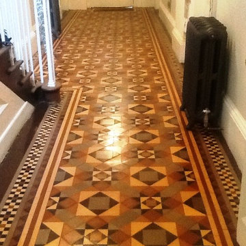
This hallway floor was actually at a house in the town of Stamford which is just over the northern border of Northamptonshire and slightly out of my area; however I was recommended to the owner by another client which is always welcome and a testimonial in itself. I work right across the county so it wasn’t long before I was in the general area and arranged a visit to carry out an inspection of the Victorian Quarry tiled floor and provide a quote for a full restoration.
The owner of the house had just moved in recently and although the floor was in good overall physical, it was in need of a thorough clean and new seal to bring back some life to the tiles. Additionally she was having lots of other building work done to the house and she wanted to retain this as an original feature of the property. My quote was accepted and I was able to book the work in for the following week.
These first photos show how dull the floor looked due to a build-up of builder’s dust and general wear and tear. They also show some of the equipment needed to undertake the following cleaning process.
I used a brush and vacuum to remove as much loose debris and dust from the surface of the floor as possible. I then applied a strong dilution of Tile Doctor Pro Clean to the floor which is a strong alkaline cleaner which can also be used to remove sealers; the solution was left it to dwell for roughly ten minutes before agitating it with scrubbing pads and brushes to remove the muck that was lifted to the surface. This was then wet-vacuumed twice to remove all the slurry and neutralise any chemicals.
As it was such an old property I then used a steamer to heat up the tiles and draw up any contaminants and assist with the drying process. I also chose to install two fans and a dehumidifier to dry the floor even further.
With the cleaning process complete – and achieving a marked difference to the appearance of the floor – I left the tiles to finish drying for 24 hours.
Upon my return to the house, I checked for any excess moisture by running damp tests as this has the potential to affect the performance of the sealer. Once satisfied with the results, I sealed the floor with two coats of Tile Doctor Colour Grow, a colour enhancing sealant which offers both a robust surface seal and an aesthetically pleasing finish.
I also carried out water repellency tests to ensure the sealer was working as expected and the floor had sufficient protection and will be hard-wearing for a hallway which is a high traffic area.
On my client’s return to the house she was very happy with the final results – in fact, she was also in contact about some further work in the New Year!
Phil Vissian
Northamptonshire Tile Doctor
 In Detail Interiors
Cozy and Colorful Beach House Remodel!
When you think funky little house by the beach – images like what you are about to see may not be what you would have anticipated. This furnishings project aimed to capture a colorful, fun, active space for a family who wanted to feel at home .Thus, creating casual and comfortable but not boring in the least. A little traveled, a lot of texture, and not much clutter!
From the start, the space was not much to write home about!
The common living areas were boxy with lower ceilings. Quirky ins and outs needed to be optimized. Overall, this project was a prime opportunity for us to really dig in. From treating each room top to bottom and finding the client’s mojo when it came to wallcoverings. Selecting funky lighting and the right mix and match of bold colors and more natural, organic textures.
We came in too late to get involved with the kitchen but helped the client with a few little accents and color choices. Thus, acting as a jumping off point for the large dining space featuring a beautiful (and resilient!) wooden trestle table. We created a mix of seating that offers a little funk, and the fun additional cabinet storage to each end which offered a hideaway. We loved that this vista had such opportunity for great lighting and art, also!
A Colorful, Cozy Living Room
We knew we needed a cozy, lower profile seating area but also some sort of great reading nook by the fireplace. With the large windows and the main entry just off this space, a traffic pattern was delianted that helped guide decisions with the furniture. A funky, nubbier woven fabric on the sectional that hinted towards mid-century modern. The irregular shaped, petrified wood coffee table. The bold statement and colors carried through in the wallcovering and area rug. Jumping to the fireplace area where you can lounge or read with those gorgeous cognac leather recliners. This space needed to feel separate and the same all at once. The balance of scale and colors really helped achieve this!
Can’t forget the bedrooms!
Of course we can’t get by without mentioning a little bedroom love, either.
In the master the overall designs dictated by a bold, saturated woven wood cloth on the headboard wall. We love the mix of color and pattern in here. The bold, sexier mood is 100% a byproduct of the level of rich colors and unusual combinations. Those bold hand-glazed ceramic lamps against those strict geo-pattern bed pillows – so good!
Our sweet tween bedroom that should grow with her for a good, long time. All in all, filled with original art and layered in a softer palette. There was a lot of matching in here at first, but once we convinced her to trust us she started to understand why adding in the unexpected hit of bright coral and spring green made everything sing!
Sponsored
Fredericksburg, OH

High Point Cabinets
Columbus' Experienced Custom Cabinet Builder | 4x Best of Houzz Winner
 In Detail Interiors
Cozy and Colorful Beach House Remodel!
When you think funky little house by the beach – images like what you are about to see may not be what you would have anticipated. This furnishings project aimed to capture a colorful, fun, active space for a family who wanted to feel at home .Thus, creating casual and comfortable but not boring in the least. A little traveled, a lot of texture, and not much clutter!
From the start, the space was not much to write home about!
The common living areas were boxy with lower ceilings. Quirky ins and outs needed to be optimized. Overall, this project was a prime opportunity for us to really dig in. From treating each room top to bottom and finding the client’s mojo when it came to wallcoverings. Selecting funky lighting and the right mix and match of bold colors and more natural, organic textures.
We came in too late to get involved with the kitchen but helped the client with a few little accents and color choices. Thus, acting as a jumping off point for the large dining space featuring a beautiful (and resilient!) wooden trestle table. We created a mix of seating that offers a little funk, and the fun additional cabinet storage to each end which offered a hideaway. We loved that this vista had such opportunity for great lighting and art, also!
A Colorful, Cozy Living Room
We knew we needed a cozy, lower profile seating area but also some sort of great reading nook by the fireplace. With the large windows and the main entry just off this space, a traffic pattern was delianted that helped guide decisions with the furniture. A funky, nubbier woven fabric on the sectional that hinted towards mid-century modern. The irregular shaped, petrified wood coffee table. The bold statement and colors carried through in the wallcovering and area rug. Jumping to the fireplace area where you can lounge or read with those gorgeous cognac leather recliners. This space needed to feel separate and the same all at once. The balance of scale and colors really helped achieve this!
Can’t forget the bedrooms!
Of course we can’t get by without mentioning a little bedroom love, either.
In the master the overall designs dictated by a bold, saturated woven wood cloth on the headboard wall. We love the mix of color and pattern in here. The bold, sexier mood is 100% a byproduct of the level of rich colors and unusual combinations. Those bold hand-glazed ceramic lamps against those strict geo-pattern bed pillows – so good!
Our sweet tween bedroom that should grow with her for a good, long time. All in all, filled with original art and layered in a softer palette. There was a lot of matching in here at first, but once we convinced her to trust us she started to understand why adding in the unexpected hit of bright coral and spring green made everything sing!
 In Detail Interiors
Cozy and Colorful Beach House Remodel!
When you think funky little house by the beach – images like what you are about to see may not be what you would have anticipated. This furnishings project aimed to capture a colorful, fun, active space for a family who wanted to feel at home .Thus, creating casual and comfortable but not boring in the least. A little traveled, a lot of texture, and not much clutter!
From the start, the space was not much to write home about!
The common living areas were boxy with lower ceilings. Quirky ins and outs needed to be optimized. Overall, this project was a prime opportunity for us to really dig in. From treating each room top to bottom and finding the client’s mojo when it came to wallcoverings. Selecting funky lighting and the right mix and match of bold colors and more natural, organic textures.
We came in too late to get involved with the kitchen but helped the client with a few little accents and color choices. Thus, acting as a jumping off point for the large dining space featuring a beautiful (and resilient!) wooden trestle table. We created a mix of seating that offers a little funk, and the fun additional cabinet storage to each end which offered a hideaway. We loved that this vista had such opportunity for great lighting and art, also!
A Colorful, Cozy Living Room
We knew we needed a cozy, lower profile seating area but also some sort of great reading nook by the fireplace. With the large windows and the main entry just off this space, a traffic pattern was delianted that helped guide decisions with the furniture. A funky, nubbier woven fabric on the sectional that hinted towards mid-century modern. The irregular shaped, petrified wood coffee table. The bold statement and colors carried through in the wallcovering and area rug. Jumping to the fireplace area where you can lounge or read with those gorgeous cognac leather recliners. This space needed to feel separate and the same all at once. The balance of scale and colors really helped achieve this!
Can’t forget the bedrooms!
Of course we can’t get by without mentioning a little bedroom love, either.
In the master the overall designs dictated by a bold, saturated woven wood cloth on the headboard wall. We love the mix of color and pattern in here. The bold, sexier mood is 100% a byproduct of the level of rich colors and unusual combinations. Those bold hand-glazed ceramic lamps against those strict geo-pattern bed pillows – so good!
Our sweet tween bedroom that should grow with her for a good, long time. All in all, filled with original art and layered in a softer palette. There was a lot of matching in here at first, but once we convinced her to trust us she started to understand why adding in the unexpected hit of bright coral and spring green made everything sing!

 Progressive Design Build
It was in 2012 when Mike Spreckelmeier first met Roy and Patti. They had been despondent after meeting with multiple contractors in an attempt to start their kitchen remodel. The contractors lacked follow through, came tardy to meetings and even failed to show up at others.
Determined to leave nothing to chance in the pursuit of their dream, Roy and Patti followed up on a recommendation after overhearing a conversation that was taking place while they were standing in a gallingly long line waiting to cast a vote on Election Day.
With a solid recommendation to pursue, Roy and Patti contacted Progressive Design Build. The rest is history.
Mike showed up on time. For a small retainer, he provided preliminary sketches, ideas for maximizing space and storage, and solutions for a sunken family room that created a safety hazard and a problem with traffic flow. More importantly, he designed the project to the homeowners’ budget.
Progressive Design Build shot some different elevations and designed a plan to raise the floor, allowing all finished floors to be on the same level. Upon completion, the kitchen was stunning. Features included LED backlit fire glass shelving, white recessed panel cabinets, a subway tile backsplash, Granite countertop, integrated refrigerator, undermount sink, and more.
The living room was designed with complimentary finishes and included a natural stone fireplace wall with open cabinets flanked on both sides. The 12’ fireplace was made with a floor-to-ceiling white pebble finish.
This Bonita Bay project completed on time and on budget—allowing this fabulous family a wonderful opportunity to create lasting memories for many years to come.

 ED Enterprises, Inc.
Our craftsmen removed an existing wall, doubling the depth of this kitchen. The doorway from kitchen to foyer and the doorway from kitchen to family room were widened and new headers were installed. Now, the remodeled area allowed for TWO islands and more cabinetry. Plug-molds, hidden under the island and under the wall cabinets, maintained a clean look eliminating receptacles. The finishing touch was the brick pattern subway backsplash tile and the accent tile in the niche above the range. The new Red Oak flooring was our final detail.

 Michael Nash Design, Build & Homes
2013 CHRYSALIS AWARD NATIONAL WINNER, KITCHEN REMODEL $50,000 TO $75,000
“Crowded and disturbing” is how the woman of the house described this kitchen. A big peninsula with a huge range hood blocked the kitchen off from the breakfast room, a chimney style wall blocked off another side of the space and the doorways were too narrow. The result was a cramped feel with no traffic flow and a lack of usable storage.
To remedy these issues, the remodeling plan called for regrouping all tall kitchen elements into a low visibility wall, eliminating the peninsula and then creating a natural path through the space using a middle island.
Relocating the stove against the room’s back wall allowed the installation of a beautiful wood mantel hood and improved the work triangle. The side walls house beautiful custom white cabinets; one side housing the pantry, refrigerator and double wall ovens, the other the kitchen sink and dishwasher.
The center island features a mahogany wood countertop and provides plenty of workspace above and storage below. Contrasting with the glazed cabinets, the woodwork is a highlight of the project and a key part of delivering on the homeowner’s desire for a bright, clean kitchen.
They installed exotic mahogany floors to complement center wood Island. The floors also had created a casual ambiance, especially against the soft lemon chiffon wall paint. The ultimate French country style kitchen was completed by furnishing the old breakfast area with casual seating rather than a formal table.


Sponsored
Columbus, OH

Snider & Metcalf Interior Design, LTD
Leading Interior Designers in Columbus, Ohio & Ponte Vedra, Florida

 Coastal Signature Homes
Eat in or eat out? The sliding glass door to the screened in back porch seems to suggest both options are open - bring the outside in or take the inside out. Whichever choice, we have a beautiful dining room with wonderful wainscoting, crown molding, lots of windows, wide plank hardwood flooring ... or more casual dining options on the porch.

 FMA Interior Design, Inc.
Mike Kaskel
Inspiration for a large contemporary u-shaped cork floor eat-in kitchen remodel in Chicago with a single-bowl sink, glass-front cabinets, white cabinets, soapstone countertops, metallic backsplash, mirror backsplash, stainless steel appliances and an island
Inspiration for a large contemporary u-shaped cork floor eat-in kitchen remodel in Chicago with a single-bowl sink, glass-front cabinets, white cabinets, soapstone countertops, metallic backsplash, mirror backsplash, stainless steel appliances and an island

 Bilotta Kitchen & Home
For this project, the entire kitchen was designed around the “must-have” Lacanche range in the stunning French Blue with brass trim. That was the client’s dream and everything had to be built to complement it. Bilotta senior designer, Randy O’Kane, CKD worked with Paul Benowitz and Dipti Shah of Benowitz Shah Architects to contemporize the kitchen while staying true to the original house which was designed in 1928 by regionally noted architect Franklin P. Hammond. The clients purchased the home over two years ago from the original owner. While the house has a magnificent architectural presence from the street, the basic systems, appointments, and most importantly, the layout and flow were inappropriately suited to contemporary living.
The new plan removed an outdated screened porch at the rear which was replaced with the new family room and moved the kitchen from a dark corner in the front of the house to the center. The visual connection from the kitchen through the family room is dramatic and gives direct access to the rear yard and patio. It was important that the island separating the kitchen from the family room have ample space to the left and right to facilitate traffic patterns, and interaction among family members. Hence vertical kitchen elements were placed primarily on existing interior walls. The cabinetry used was Bilotta’s private label, the Bilotta Collection – they selected beautiful, dramatic, yet subdued finishes for the meticulously handcrafted cabinetry. The double islands allow for the busy family to have a space for everything – the island closer to the range has seating and makes a perfect space for doing homework or crafts, or having breakfast or snacks. The second island has ample space for storage and books and acts as a staging area from the kitchen to the dinner table. The kitchen perimeter and both islands are painted in Benjamin Moore’s Paper White. The wall cabinets flanking the sink have wire mesh fronts in a statuary bronze – the insides of these cabinets are painted blue to match the range. The breakfast room cabinetry is Benjamin Moore’s Lampblack with the interiors of the glass cabinets painted in Paper White to match the kitchen. All countertops are Vermont White Quartzite from Eastern Stone. The backsplash is Artistic Tile’s Kyoto White and Kyoto Steel. The fireclay apron-front main sink is from Rohl while the smaller prep sink is from Linkasink. All faucets are from Waterstone in their antique pewter finish. The brass hardware is from Armac Martin and the pendants above the center island are from Circa Lighting. The appliances, aside from the range, are a mix of Sub-Zero, Thermador and Bosch with panels on everything.

 We Make It Our Home
The living room was long and narrow but with an amazing bay window. Instead of a galley style living room used by the previous owner, we decided to change the furniture arrangement by putting one big comfy L-shaped sectional all the way to one side to create a pass-through area enabling a better foot traffic. We then added two side chairs for extra seats. We also mounted our TV on top of the fireplace to gain more space. Although it's not my favorite design choice to have TV on top of the fireplace because I think it takes away from the fireplace but we had to work within the limitation of the space.
For the fireplace, we bought wood stove insert and inserted it into the existing masonry fireplace. The look was updated by granite tiles around the insert and custom built wood mantel.
Buying wood fireplace insert was the best decision we made. First of all, it created a memorable space in our home. I LOVE the sound of wood cracking and the smell of wood burning. In winter nights we would sit around the fireplace and make s'mores like it's a campfire. Second, it's a clean burning and efficient heater. You don't lose the majority the fire’s heat up the chimney thereby saving money on your heating bill.
The coffee table is purchased from Wicker Emporium and it's made from reclaimed pine timbers giving the house a rustic feel.
The side chair by the fireplace is the perfect spot for me to relax, put my feet up on the large ball shaped knitted foot rest and enjoy a cup of cappuccino or cozy up with a good book.

 Progressive Design Build
It was in 2012 when Mike Spreckelmeier first met Roy and Patti. They had been despondent after meeting with multiple contractors in an attempt to start their kitchen remodel. The contractors lacked follow through, came tardy to meetings and even failed to show up at others.
Determined to leave nothing to chance in the pursuit of their dream, Roy and Patti followed up on a recommendation after overhearing a conversation that was taking place while they were standing in a gallingly long line waiting to cast a vote on Election Day.
With a solid recommendation to pursue, Roy and Patti contacted Progressive Design Build. The rest is history.
Mike showed up on time. For a small retainer, he provided preliminary sketches, ideas for maximizing space and storage, and solutions for a sunken family room that created a safety hazard and a problem with traffic flow. More importantly, he designed the project to the homeowners’ budget.
Progressive Design Build shot some different elevations and designed a plan to raise the floor, allowing all finished floors to be on the same level. Upon completion, the kitchen was stunning. Features included LED backlit fire glass shelving, white recessed panel cabinets, a subway tile backsplash, Granite countertop, integrated refrigerator, undermount sink, and more.
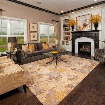
The living room was designed with complimentary finishes and included a natural stone fireplace wall with open cabinets flanked on both sides. The 12’ fireplace was made with a floor-to-ceiling white pebble finish.
This Bonita Bay project completed on time and on budget—allowing this fabulous family a wonderful opportunity to create lasting memories for many years to come.
 Jules + Cole Fine Rugs
Discover the timeless allure of a rug inspired by 150-year-old textile designs, seamlessly blending the past with the present. Adorn your living space with a sophisticated color palette featuring walnut, gold-browns, sage green, and charcoal, making this rug a captivating addition to any room. Crafted from 100% premium EnduraStran nylon yarn, this rug offers long-lasting beauty for every corner of your home. Its machine-loomed construction and low pile height make it a breeze to maintain, ideal for families with kids and pets. Using state-of-the-art dyeing techniques, this vintage-inspired design comes to life with antique motifs, intricate detailing, and a touch of graceful distressing. Elevate your living space with a rug that resonates with whispers of history and the serenity of nature, inviting you to embrace its polished elegance and storied charm.
Features:
--Made of durable commercial-grade premium EnduraStran nylon yarn.
--Art and science meld with our PrecisionPoint Custom Yarn Dye System allowing for supreme colorfastness.
--U/V fade-, stain-, and fire-resistant; Ideal for high-traffic and family-friendly areas, like living room, family room, den and bedroom.
--Serged edges provide long-lasting wear and reduced fraying.
---Synthetic Loc-Bak backing ensures rug lays flat and won’t curl.
--CRI Green Label Plus™ Certified for improved indoor air quality.
--Family- and pet-friendly low pile is approx. 3/8"H; easy to care for, vacuum and spot clean with water.
--Made in the USA; Our rugs are made for you at the time you place your order, so there's no stock sitting in warehouses. Please allow two weeks for manufacture and shipping on regular-sized items (for oversized items, please allow up to 4 weeks).

 Bianchi Design
Previously, this yard was burdened by a typical boulder pile pool, that was heaped higher than typical, trying to hide the towering wall behind. At first, the clients sought merely to reconfigure the BBQ that was congesting the patio, but upon further analysis, they decided it was time to strip the entire yard, leaving only the pool shell. Bianchi’s solution introduced an array of four arbors to distract the eye from the wall behind, solving what the boulder waterfall could never do.
Additionally, the wall was painted a dark earth tone to add contrast and depth. This strategy enabled the wall to recede into the distance, while the agave blue grey arbors floated forward visually from the background. Previously, the patios were a hodgepodge of deck islands that were impossible to navigate, and were of insufficient size to arrange furniture on. A well organized patio streamlined the traffic flow and the living space, featuring a cast in place concrete fire pit and banco couch, as well as a new outdoor bistro, glowing with filtered light from the canvas shade sails overhead.
A turquoise glass overflow spa became the yards focal point, sharing the space between the pool and outdoor living. The striking symmetry of the spa and pot pedestal with regal cacti arrangement behind, flanked by the arbors on either side, created a stately first impression from the front door. This teaser was just a glimpse of what could not yet be seen serving as an invitation to explore and enjoy as the yard unfolds.
See more about this project & hear from the homeowner here: https://www.youtube.com/watch?v=7eT3RkLkg5w&feature=youtu.be
204