
Search results for "Traffic spaces" in Home Design Ideas
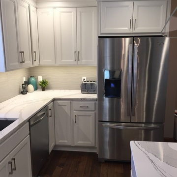
 SHOWCASE -- Hastings, Nebraska
Talk about a dramatic transformation!!
This Customer had a very large, but dark Kitchen & Dining Room. The original design of the Kitchen was very inefficient. Several cabinet doors couldn't open all the way for access into the cabinet. Counter space was broken up. The flow of both cooking and traffic through the Kitchen wasn't efficient. Lighting was dim. It wasn't a bright and cheery space where family gatherings could happen easily.
Now? This is the space where everyone congregates! You can definitely see why. Beautiful!! SHOWCASE is so thrilled for this customer's family to enjoy their lovely new spaces!!
__________________________________________
CABINETRY --
All Cabinetry is Homecrest Cabinetry by Masterbrand Cabinets. Maple wood with "Alpine" paint. The Cabinet door style is Lautner with slab drawer fronts. Hinges are 1/2" overlay. Drawer guides are Full-Extension with Soft-Close.
CABINET HARDWARE --
Hardware Resources / Jeffery Alexander Hardware in the "Sutton" series in a Brushed Nickel finish (Styles - 635-96SN, 635-128SN, 635-160SN)
KITCHEN COUNTERTOPS --
Cambria "Brittanica" quartz tops with an eased edge
Kitchen Sink is a Swanstone QURC3322 in "Metallico"
Kitchen Faucet is Moen "Align" 7565 in "Chrome"
Kitchen Soap is Moen S3947C in "Chrome"

 Michael Nash Design, Build & Homes
2012 NARI CAPITAL COTY, FINALIST AWARD WINNER, RESIDENTIAL KITCHEN $50,000 to $100,000
“Crowded and disturbing” is how the woman of the house described this kitchen. A big peninsula with a huge range hood blocked the kitchen off from the breakfast room, a chimney style wall blocked off another side of the space and the doorways were too narrow. The result was a cramped feel with no traffic flow and a lack of usable storage.
To remedy these issues, the remodeling plan called for regrouping all tall kitchen elements into a low visibility wall, eliminating the peninsula and then creating a natural path through the space using a middle island.
Relocating the stove against the room’s back wall allowed the installation of a beautiful wood mantel hood and improved the work triangle. The side walls house beautiful custom white cabinets; one side housing the pantry, refrigerator and double wall ovens, the other the kitchen sink and dishwasher.
The center island features a mahogany wood countertop and provides plenty of workspace above and storage below. Contrasting with the glazed cabinets, the woodwork is a highlight of the project and a key part of delivering on the homeowner’s desire for a bright, clean kitchen.
They installed exotic mahogany floors that complement the center wood Island. The floors also had created a casual ambiance, especially against the soft lemon chiffon wall paint. The ultimate French country style kitchen was completed by furnishing the old breakfast area with casual seating rather than a formal table.

 Bilotta Kitchen & Home
For this project, the entire kitchen was designed around the “must-have” Lacanche range in the stunning French Blue with brass trim. That was the client’s dream and everything had to be built to complement it. Bilotta senior designer, Randy O’Kane, CKD worked with Paul Benowitz and Dipti Shah of Benowitz Shah Architects to contemporize the kitchen while staying true to the original house which was designed in 1928 by regionally noted architect Franklin P. Hammond. The clients purchased the home over two years ago from the original owner. While the house has a magnificent architectural presence from the street, the basic systems, appointments, and most importantly, the layout and flow were inappropriately suited to contemporary living.
The new plan removed an outdated screened porch at the rear which was replaced with the new family room and moved the kitchen from a dark corner in the front of the house to the center. The visual connection from the kitchen through the family room is dramatic and gives direct access to the rear yard and patio. It was important that the island separating the kitchen from the family room have ample space to the left and right to facilitate traffic patterns, and interaction among family members. Hence vertical kitchen elements were placed primarily on existing interior walls. The cabinetry used was Bilotta’s private label, the Bilotta Collection – they selected beautiful, dramatic, yet subdued finishes for the meticulously handcrafted cabinetry. The double islands allow for the busy family to have a space for everything – the island closer to the range has seating and makes a perfect space for doing homework or crafts, or having breakfast or snacks. The second island has ample space for storage and books and acts as a staging area from the kitchen to the dinner table. The kitchen perimeter and both islands are painted in Benjamin Moore’s Paper White. The wall cabinets flanking the sink have wire mesh fronts in a statuary bronze – the insides of these cabinets are painted blue to match the range. The breakfast room cabinetry is Benjamin Moore’s Lampblack with the interiors of the glass cabinets painted in Paper White to match the kitchen. All countertops are Vermont White Quartzite from Eastern Stone. The backsplash is Artistic Tile’s Kyoto White and Kyoto Steel. The fireclay apron-front main sink is from Rohl while the smaller prep sink is from Linkasink. All faucets are from Waterstone in their antique pewter finish. The brass hardware is from Armac Martin and the pendants above the center island are from Circa Lighting. The appliances, aside from the range, are a mix of Sub-Zero, Thermador and Bosch with panels on everything.
Find the right local pro for your project

 Signature Floors, Inc.
This rustic walnut floor in 3, 4 and 6" widths plays host to the elemental bone, glass and stone design features in this lodge style Park City, Utah living area. Oil finished Richard-Marshall hardwood.
 Everything Home
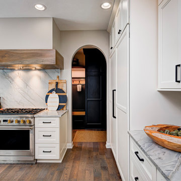
With a vision to blend functionality and aesthetics seamlessly, our design experts embarked on a journey that breathed new life into every corner.
Our design plan was inspired by the large arched opening to the dining room right off the kitchen. This theme is artfully replicated throughout the space, complemented by rustic wooden floors and creamy walls and cabinets, evoking a gentle European countryside ambience. Introducing new arched doorways enhanced both traffic flow and visual intrigue, especially when framing the new range. Additional embellishments included wooden headers on the range hood and kitchen window, further enhancing the overall aesthetic.
Project completed by Wendy Langston's Everything Home interior design firm, which serves Carmel, Zionsville, Fishers, Westfield, Noblesville, and Indianapolis.
For more about Everything Home, see here: https://everythinghomedesigns.com/

 Castle Building & Remodeling
This twin home was the perfect home for these empty nesters – retro-styled bathrooms, beautiful fireplace and built-ins, and a spectacular garden. The only thing the home was lacking was a functional kitchen space.
The old kitchen had three entry points – one to the dining room, one to the back entry, and one to a hallway. The hallway entry was closed off to create a more functional galley style kitchen that isolated traffic running through and allowed for much more countertop and storage space.
The clients wanted a transitional style that mimicked their design choices in the rest of the home. A medium wood stained base cabinet was chosen to warm up the space and create contrast against the soft white upper cabinets. The stove was given two resting points on each side, and a large pantry was added for easy-access storage. The original box window at the kitchen sink remains, but the same granite used for the countertops now sits on the sill of the window, as opposed to the old wood sill that showed all water stains and wears. The granite chosen (Nevaska Granite) is a wonderful color mixture of browns, greys, whites, steely blues and a hint of black. A travertine tile backsplash accents the warmth found in the wood tone of the base cabinets and countertops.
Elegant lighting was installed as well as task lighting to compliment the bright, natural light in this kitchen. A flip-up work station will be added as another work point for the homeowners – likely to be used for their stand mixer while baking goodies with their grandkids. Wallpaper adds another layer of visual interest and texture.
The end result is an elegant and timeless design that the homeowners will gladly use for years to come.
Tour this project in person, September 28 – 29, during the 2019 Castle Home Tour!
 SHOWCASE -- Hastings, Nebraska
Talk about a dramatic transformation!!
This Customer had a very large, but dark Kitchen & Dining Room. The original design of the Kitchen was very inefficient. Several cabinet doors couldn't open all the way for access into the cabinet. Counter space was broken up. The flow of both cooking and traffic through the Kitchen wasn't efficient. Lighting was dim. It wasn't a bright and cheery space where family gatherings could happen easily.
Now? This is the space where everyone congregates! You can definitely see why. Beautiful!! SHOWCASE is so thrilled for this customer's family to enjoy their lovely new spaces!!
__________________________________________
CABINETRY --
All Cabinetry is Homecrest Cabinetry by Masterbrand Cabinets. Maple wood with "Alpine" paint. The Cabinet door style is Lautner with slab drawer fronts. Hinges are 1/2" overlay. Drawer guides are Full-Extension with Soft-Close.
CABINET HARDWARE --
Hardware Resources / Jeffery Alexander Hardware in the "Sutton" series in a Brushed Nickel finish (Styles - 635-96SN, 635-128SN, 635-160SN)
KITCHEN COUNTERTOPS --
Cambria "Brittanica" quartz tops with an eased edge
Kitchen Sink is a Swanstone QURC3322 in "Metallico"
Kitchen Faucet is Moen "Align" 7565 in "Chrome"
Kitchen Soap is Moen S3947C in "Chrome"
Sponsored
Plain City, OH

The Creative Kitchen Company
Columbus Area Kitchen Remodeling and Refacing Professional

 Irene Designs
This Master Suite while being spacious, was poorly planned in the beginning. Master Bathroom and Walk-in Closet were small relative to the Bedroom size. Bathroom, being a maze of turns, offered a poor traffic flow. It only had basic fixtures and was never decorated to look like a living space. Geometry of the Bedroom (long and stretched) allowed to use some of its' space to build two Walk-in Closets while the original walk-in closet space was added to adjacent Bathroom. New Master Bathroom layout has changed dramatically (walls, door, and fixtures moved). The new space was carefully planned for two people using it at once with no sacrifice to the comfort. New shower is huge. It stretches wall-to-wall and has a full length bench with granite top. Frame-less glass enclosure partially sits on the tub platform (it is a drop-in tub). Tiles on the walls and on the floor are of the same collection. Elegant, time-less, neutral - something you would enjoy for years. This selection leaves no boundaries on the decor. Beautiful open shelf vanity cabinet was actually made by the Home Owners! They both were actively involved into the process of creating their new oasis. New Master Suite has two separate Walk-in Closets. Linen closet which used to be a part of the Bathroom, is now accessible from the hallway. Master Bedroom, still big, looks stunning. It reflects taste and life style of the Home Owners and blends in with the overall style of the House. Some of the furniture in the Bedroom was also made by the Home Owners.
 Michael Nash Design, Build & Homes
The lake views from this townhome’s master bathroom are panoramic and breathtaking. Unfortunately, the original layout of the bathroom itself left much to be desired. An old whirlpool tub took up too much floor space, the shower stall was too small and the room itself was cramped and dysfunctional.
The homeowners’ goals called for improving the room’s traffic flow, creating a larger and more functional shower stall with dual use, taking full advantage of the lake view and bringing a Romanesque theme to the space.
The first step in the renovation was to replace the old whirlpool with a small corner tub that took up half the space. The rest of that side of the room is devoted to the beautiful Roman-style shower stall with double rain shower, double body sprays and built in niches, arch headers and a heavy glass enclosure. The stalls creative use of mosaic tiles and medallion has made this shower stall the jewel of this project.
The vanity uses dark cherry cabinetry which complements the cream rustic tumbled marble and oil rubbed bronze fixtures. A beautiful, curved slab of exotic marble was cut for the countertop and two hand-crafted vessel sinks made from tumbled stone are on top of it.
The homeowners have never been happier to use their master bathroom .They get to have their own Roman-style bath experience by taking a few steps from their bedroom. Looking out of this gorgeous bathroom overlooking the lake just cannot be expressed with words.

 Stage Coach Services LLC dba "The Stage Coach"
After painting the space a putty color and rearranging the furniture, this area felt much brighter and more current with a much broader appeal to more buyers.
 Michael Nash Design, Build & Homes
2013 NARI CAPITAL COTY, GRAND AWARD WINNER, RESIDENTIAL KTICHEN $80,001 -$120,000
This Old Town Alexandria home was ready for a major kitchen renovation. After 20 years of putting up with the dark, short cabinets and a dysfunctional traffic pattern and layout, the owners were ready to roll up their sleeves and throw this kitchen out the window.
Design challenges include a peninsula that was too big for the space, appliance locations that were all over, a stackable washer and dryer in the middle of the kitchen and a lack of storage.
The first step toward a remodeling solution was to move the washer and dryer to a new lower level laundry area. That created space for a new built-in refrigerator, microwave/oven cabinet, pantry and angular end cabinets. This move also created more room on the walls of kitchen for added cabinetry and countertops.
The cook top was moved to one of the walls with a custom wood hood over it. Having removed the old bulkheads, there was space for taller cabinets and some glass front cabinetry (with inside lights) to display china. Large crown molding, along with big arched valances, legs and corbels made this brushed stoke custom cabinetry really stand out.
A big knee wall and a middle post made the breakfast room too closed in and separated from adjacent family room. By installing a couple of structural beams, the space was opened up and dressed up with a large arch opening to replicate the front hall columns.
Similarly, the front door separating the front hall to the kitchen was taken off, widened and then had the same panel arch treatment done. Now all the doorways in the home have a very classy, yet sophisticated detailed molding.
A previously wasted corner area is now home to a custom hutch cabinet. The middle island, not only improved the traffic flow, but also dressed up this kitchen with its furniture look. The expansion of hardwood flooring, from the front hall into the kitchen and beyond, created a seamless transition to the entire first floor.
Use of this highly custom brushed stroke glazed cabinetry in a soft vanilla tone complemented the uniqueness of a slab of granite. The light color tumbled marble backsplash made the glazing of this cabinetry stand out. The transformation of this kitchen was so incredible that no one believes the before photos.

 Foran Interior Design
Based on extensive interviews with our clients, one of our challenges of this job was to provide a practical and useable home for a couple who worked hard and played hard. They wanted a home that would be comfortable for them and since they entertained often, they required function yet desired drama and style. We worked with them from the ground up, selecting finishes, materials and fixtures for the entire home. We achieved comfort by using deep furniture pieces with white goose down cushions, suitable for curling up on. Colors and materials were selected based on rich tones and textures to provide drama while keeping with the practicality they desired. We also used eclectic pieces like the oversized chair and ottoman in the great room to add an unexpected yet comfortable touch. The chair is of a Balinese style with a unique wood frame offering a graceful balance of curved and straight lines. The floor plan was created to be conducive to traffic flow, necessary for entertaining.
The other challenge we faced, was to give each room its own identity while maintaining a consistent flow throughout the home. Each space shares a similar color palette, attention to detail and uniqueness, while the furnishings, draperies and accessories provide individuality to each room.

 Tileshop
Photo credit: Edimax Ceramiche
Elios has a line that is sure to get people excited. The Marks series is an interesting take on rustic, aged and weathered tile that looks to have been traces of past traffic and peeling paint. It is applicable for any interior commercial or residential spaces such as dining rooms, bathrooms, living rooms, and bedrooms.
Tileshop
480 E. Brokaw Road
San Jose, CA 95112
Other California locations: Berkeley and Van Nuys (Los Angeles)

 Twelve Stones Designs, LLC
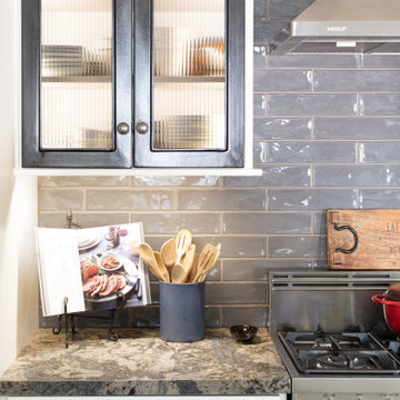
The owners of this kitchen had spent the money to upgrade the finishes in their kitchen upon building the home 12 years ago, but after living in the space for several years they realized how nonfunctional the layout really was. The (then) two preschool aged children had grown into busy, hungry teenagers with many friends who also liked to hang out at the house. So the family needed a more functional kitchen with better traffic flow, space for daily activities revolving around the kitchen at different times of day, and a kitchen that could accommodate cooking for and serving large groups. Furthermore, the dark, traditional finishes no longer reflected the homeowners’ style. They requested a brighter, more relaxed, coastal style that reflected their love of the seaside cities they like to visit.
Originally, the kitchen was U-shaped with a narrow island in the middle. The island created narrow aisles that bottle-necked at the dishwasher, refrigerator, and cooktop areas. There was a pass-through from the foyer into the kitchen, but the owners never liked that the pass-through was also located so close to the powder room. The awkward proximity was unappealing and made guests feel uncomfortable.
The kitchen’s storage was made up of lots of narrow cabinets, apothecary drawers, clipped corner units, and very few drawers. It lacked useful storage for the larger items the family used on a daily basis. And the kitchen’s only pantry was small closet that had only builder-grade, narrow shelving with no illumination to be able to see the contents inside.
Overall, the kitchen’s lighting plan was poorly executed. Only six recessed cans illuminated the entire kitchen and nook areas. The under cabinet lighting was not evenly distributed either. In fact, the builder had mis-placed the under cabinet lighting around the decorative pilasters which made for choppy, dark cubbies. Further, the builder didn’t include any lighting over the sink or the bar area, which meant whoever was doing the dishes was always in their own shadow. That, coupled with the steep overhang of the game room above made the bar area feel like a dim, cavernous space that wasn’t inviting or task oriented. The kitchen looked out into the main living space, but the raised bar and a narrow wall (which held the only large cabinet in the kitchen) created more of a barrier than a relationship to the living room or breakfast nook. In fact, one couldn’t even see the breakfast nook from the cooktop or sink areas due to its orientation. The raised bar top was too narrow to comfortably sit to either dine at or chat from due to the lack of knee space. The the homeowners confided that the kitchen felt more like a dark, dirty prison than place where the family, or their guests, wanted to gather and commune.
The clients' needs and desires were:
➢ to create a kitchen that would be a space the family loved to be in; to relate to the adjacent spaces all around, and to have better flow for entertaining large groups
➢ to remove the walls between the breakfast nook and living area and to be able to utilize the natural light from the windows in both those areas
➢ to incorporate a functional chopping block for prepping fresh food for home cooked meals, an island with a large sink and drain board, 2 pull out trash cans, and seating for at least the 2 teens to eat or do homework
➢ to design a kitchen and breakfast nook with an airy, coastal, relaxed vibe that blended with the rest of the house's coastal theme
➢ to integrate a layered lighting plan which would include ample general illumination, specific task lighting, decorative lighting, and lots of illuminated storage
➢ to design a kitchen with not only more storage for all the husband’s kitchen gadgets and collection of oils and spices, but smart storage, including a coffee/breakfast bar and a place to store and conceal the toaster oven and microwave
➢ to find a way to utilize the large open space between the kitchen, pantry area, and breakfast nook
Twelve Stones Designs achieved the owner's goals by:
➢ removing the walls between the kitchen and living room to allow the natural light to filter in from the adjacent rooms and to create a connection between the kitchen, nook, and living spaces for a sense of unity and communion
➢ removing the existing pantry and designing 3 large pantry style cabinets with LED tape lights and rollout drawers to house lots of kitchen appliances, gadgets, and tons of groceries. We also took the cabinets all the way up to the 9’ ceiling for additional storage for seasonal items and bulk storage.
➢ designing 2 islands - 1 with a gorgeous black walnut chopping block that houses a drawer for chopping and carving knives and a custom double pull out trash unit for point of use utilization - and 1 that houses the dishwasher, a large Blanco Gourmet sink with integrated drain board, woven baskets for fresh root vegetables and kitchen towels, plenty of drawer storage for kitchen items, and bar seating for up to 4 diners.
➢ closing off the space between the kitchen and the powder room to create a beautiful new private alcove for the powder room as well as adding some decorative storage. This also gave us space to include more tall storage near the new range for precision placement of the husband’s extensive oil and spice collection as well as a location for a combo-steam oven the wife wanted for baking and cooking healthy meals.
The project is enhanced functionally by:
➢ incorporated USB and standard receptacles for the kids’ laptops and phone charging in the large island
➢ designing the small island to include additional open shelving for items used on a daily basis such as a variety of bowls, plates, and colanders. This set up also works well for the husband who prefers to “plate” his dinners in restaurant-style fashion before presenting them to the table.
➢ the integration of specific storage units, such as double stacked cutlery drawers, a custom spice pull-out, a Kuerig coffee and tea pod drawer, and custom double stacked utensil drawers
➢ moving the refrigerator to the old oven location - this eliminated the bottle neck as well as created a better relationship to the eating table. It also utilizes the floor space between the pantry, nook, and kitchen
➢ creating a banquet style breakfast nook - this banquette seating not only doubles the amount of seating for large gatherings but it better utilizes the odd space between the kitchen and the previous nook area. It also helps to create a distinct pathway from the mudroom room through the pantry area, kitchen, nook, and living room.
➢ the coffee/breakfast bar area which includes the perfect location for the concealed microwave and toaster oven, convenient storage for the coffee pods and tea accoutrements. Roll-out drawers below also house the smoothie maker, hot water kettle, and a plethora of smoothie-making ingredients such as protein powders, smoothie additives, etc. Furthermore, the drawers below the Keurig house measuring utensil, cutlery, baking supplies and tupperware storage.
➢ incorporating lots of wide drawers and pullouts to accommodate large cookware.
➢ utilizing as much vertical space as possible by building storage to the ceiling which accommodates the family’s abundant amount of serving platters, baking sheets, bakeware, casserole dishes, and additional cutting boards.
The project is enhanced aesthetically by:
➢ new 5-piece Versailles pattern porcelain tile that now seamlessly joins the entire down stairs area together creating a bright, cohesiveness feeling instead of choppy separated spaces - it also adds a coastal feeling
➢ designing a cabinet to conceal the microwave and toaster oven
➢ the coastal influenced light fixtures over the nook table and island
➢ the sandy colors of the Langdon Cambria countertops. The swirling pattern and sparkling quartz pieces remind the homeowner of black-and-tan sandy beaches
➢ the striped banquet seating whose creamy white background and blue-green stripes were the inspiration for the cabinet and wall colors.
➢ All the interior doors were painted black to coordinate with the blacks and grays in the backsplash tile and countertop. This also adds a hint of tailored formality to an otherwise casual space.
➢ the use of WAC's Oculux small aperture LED units for the overhead lighting complimented with Diode LED strips for task lighting under the cabinets and inside the pantry and glass wall cabinets. All of the lighting applications are on separate dimmer switches.
Innovative uses of materials or construction methods by Realty Restoration LLC:
➢ Each 1-1/2” x 3” block of reclaimed end-grain black walnut that makes up the center island chopping block was hand milled and built in the shop. It was designed to look substantial and proportional to the surrounding elements, executed by creating the 4 inch tall top with a solid wood chamfered edge band.
➢ The metal doors on either side of the vent hood were also custom designed for this project and built in the Realty Restoration LLC shop. They are made 1x2, 11-gauge mild steel with ribbed glass. Weighing 60 lbs a piece, heavy duty cabinet hinges were added to support the weight of the door and keep them from sagging.
➢ Under-cabinet receptacles were added along the range wall in order to have a clean, uninterrupted backsplash.
Design obstacles to overcome:
➢ Because we were removing the demising walls between the kitchen and living room, we had to find a way to plumb and vent the new island. We did this by tunneling through the slab (the slab had post tension cables which prevented us from just trenching) to run a new wet vent through a nearby structural wall. We pulled the existing hot and cold lines between upper floor joists and ran them down the structural wall as well and up through a conduit in the tunnel.
➢ Since we were converting from wall overs to a gas range it allowed us to utilize the 220 feed for the wall ovens to provide a new sub panel for all the new kitchen circuits
➢ Due to framing deficiencies inherited from the original build there was a 1-1/2” differential in the floor-to-ceiling height over a 20 foot span; by utilizing the process of cutting and furring coupled with the crown moulding details on the cabinet elevations we were able to mask the problem and provide seamless transitions between the cabinet components.
Evidence of superior craftsmanship:
➢ uniquely designed, one-of-a-kind metal “X” end panels on the large island. The end panels were custom made in the Realty Restoration LLC shop and fitted to the exact dimensions of the island. The welding seams are completely indistinguishable - the posts look like they are cut from a single sheet of metal
➢ square metal posts on the small island were also custom made and designed to compliment and carry through the metal element s throughout the kitchen
➢ the beautiful, oversized end panels on the pantry cabinets which give the breakfast nook a tailored look
➢ integrating a large format 5 piece Versailles tile pattern to seamlessly flow from the existing spaces into the new kitchen space
➢ By constructing a custom cabinet that jogged around a corner we could not remodel (housing the entry way coat closet) we were able to camouflage the adjacent wall offset within the upper and lower cabinets. By designing around the existing jog in the structural walls we accomplished a few things: we were able to find the space to house, and hide, the microwave and toaster oven yet still have a clean cohesive appearance from the kitchen side. Additionally, the owners were able to keep their much needed coat closet and we didn’t have to increase the budget with unnecessary structural work.

 Bianchi Design
Previously, this yard was burdened by a typical boulder pile pool, that was heaped higher than typical, trying to hide the towering wall behind. At first, the clients sought merely to reconfigure the BBQ that was congesting the patio, but upon further analysis, they decided it was time to strip the entire yard, leaving only the pool shell. Bianchi’s solution introduced an array of four arbors to distract the eye from the wall behind, solving what the boulder waterfall could never do.
Additionally, the wall was painted a dark earth tone to add contrast and depth. This strategy enabled the wall to recede into the distance, while the agave blue grey arbors floated forward visually from the background. Previously, the patios were a hodgepodge of deck islands that were impossible to navigate, and were of insufficient size to arrange furniture on. A well organized patio streamlined the traffic flow and the living space, featuring a cast in place concrete fire pit and banco couch, as well as a new outdoor bistro, glowing with filtered light from the canvas shade sails overhead.
A turquoise glass overflow spa became the yards focal point, sharing the space between the pool and outdoor living. The striking symmetry of the spa and pot pedestal with regal cacti arrangement behind, flanked by the arbors on either side, created a stately first impression from the front door. This teaser was just a glimpse of what could not yet be seen serving as an invitation to explore and enjoy as the yard unfolds.
See more about this project & hear from the homeowner here: https://www.youtube.com/watch?v=7eT3RkLkg5w&feature=youtu.be

 Ball Homes
The Jackson II Expanded adds 353sf of living space to the Jackson II floor plan. This spacious four bedroom home has a downstairs study/guest suite with walk-in closet, which can be configured with a full bath and a bay window option. A mudroom with storage closet opens from the garage, creating a separate entry to the guest suite. A large pantry is added to the kitchen area in the Expanded version of the plan. Space is also added to the family room and dining room in this plan, and the dining room has a trey ceiling. The relocated utility room offers the convenience of second floor laundry and a folding counter.
Bedrooms two and three share a private hallway access to the hall bath, which is designed for shared use. The primary bedroom suite features a large bedroom, a reconfigured bath with dual vanity, and a room-sized closet. A garden tub and separate shower are included, and additional luxury bath options are also offered on this plan.
Like the original Jackson II plan, the two story foyer has a railed overlook above, and encompasses a feature window over the landing. The family room and breakfast area overlook the rear yard, and the centrally located kitchen is open to all main living areas of the home, for good traffic flow and entertaining. Nine foot ceilings throughout the first floor are included. Exterior plan details include a metal-roofed front porch, shake siding accents, and true radius head windows.
 Charles Vincent George Architects, Inc.
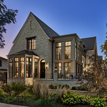
This 5,523-square-foot French Country residence offers a modern twist on classic European elegance. Located on a prominent corner lot near downtown Naperville, this home blends timeless style with contemporary living. The open-concept main floor flows seamlessly, highlighted by a stunning glass stair tower showcasing the custom curved staircase. A spacious, wrap-around patio provides ample seating to enjoy the vibrant pedestrian traffic of the nearby downtown area. Interior details include groin vaulted hallways on both levels, creating a sense of character and warmth throughout the home. The south-facing Orangerie, bathed in natural light from floor-to-ceiling windows, evokes the charm of a Parisian salon with its classic checkerboard floor and comfortable lounge furniture. The great room, anchored by a transitional fireplace with a black onyx full-height mantel, connects effortlessly to the kitchen and its expansive window-lined back counter and island, creating a generous and inviting living space. The property also includes an attached two-car garage and a detached one-car garage.
Sponsored
Columbus, OH
Free consultation for landscape design!

Peabody Landscape Group
Franklin County's Reliable Landscape Design & Contracting
 Charles Vincent George Architects, Inc.
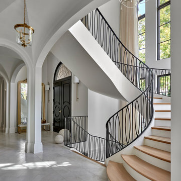
This 5,523-square-foot French Country residence offers a modern twist on classic European elegance. Located on a prominent corner lot near downtown Naperville, this home blends timeless style with contemporary living. The open-concept main floor flows seamlessly, highlighted by a stunning glass stair tower showcasing the custom curved staircase. A spacious, wrap-around patio provides ample seating to enjoy the vibrant pedestrian traffic of the nearby downtown area. Interior details include groin vaulted hallways on both levels, creating a sense of character and warmth throughout the home. The south-facing Orangerie, bathed in natural light from floor-to-ceiling windows, evokes the charm of a Parisian salon with its classic checkerboard floor and comfortable lounge furniture. The great room, anchored by a transitional fireplace with a black onyx full-height mantel, connects effortlessly to the kitchen and its expansive window-lined back counter and island, creating a generous and inviting living space. The property also includes an attached two-car garage and a detached one-car garage.


 Clearcut & Co
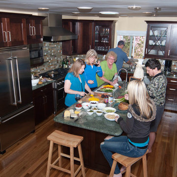
A traditional kitchen with touches of the farmhouse and Mediterranean styles. We used cool, light tones adding pops of color and warmth with natural wood.
161