
Search results for "Translate" in Home Design Ideas
 BJOID Inc.
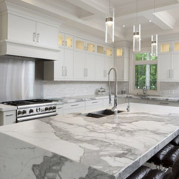
This home in an older area of town, underwent a huge addition, where the kitchen was pushed out to the back of the home, and was placed in the great room with dining and living spaces, to gain an open-concept space – something not common with this age of house. The client wanted something bold, traditional, but with an edgy contemporary flare, so with traditional touches like the large-scale coffered ceiling, cove molding and hood detail, matched with the suggestions of contemporary like the minimalist doors style and gorgeous island design, we managed to create something to fit all molds.
The star of this space is the gorgeous Statuario marble found on the 3” mitered counters, on the fireplace wall in a bold modern design, and beautifully translated on the modern waterfall edges of the island. The ovens and pantries are set into a niche, and the butler’s pantry around the corner houses enough glassware for any party. Across the room there are walnut accents on a slab door with horizontal grain to include the connected homework area for their three children. The stacked upper cabinets offer ambient lighting when nighttime entertaining, and the bright colour scheme reflects the natural light from the wall of windows and matching ceiling lights within the space. With classic touches and neutral finishes, this beautiful white kitchen will always be in fashion.
Photo Credit: Casey's Creative Kitchens
 CHARLES STREET DESIGN, LLC
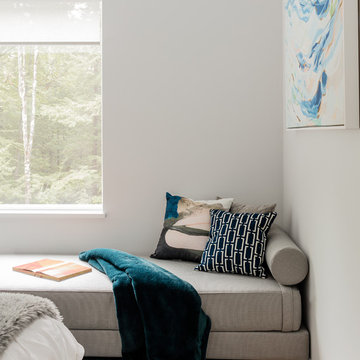
We gave this newly-built weekend home in New London, New Hampshire a decidedly colorful and contemporary interior style. The successful result of a partnership with Smart Architecture, Grace Hill Construction and Terri Wilcox Gardens, we translated the contemporary-style architecture into modern, yet comfortable interiors for a Massachusetts family. Creating a lake home designed for gatherings of extended family and friends that will provide weekends of memories for many years to come.
 Sandra Costa Design Group
A kitchen by award-winning designer and licensed general contractor Sandra Costa is never simply built—it is composed, curated, and brought to life as a complete experience.
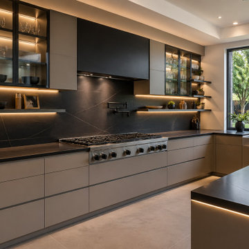
In this new construction, the client’s request was clear: earth tones, warmth, and a space that feels both inviting and refined. Sandra Costa translated that vision into a layered design where natural hues meet architectural precision. Soft browns, warm taupes, and subtle textured finishes create a grounded palette, allowing the kitchen to feel calm, welcoming, and effortlessly sophisticated.
At the heart of the space sits a statement La Cornue range—more than an appliance, it is a centerpiece. Paired with integrated double refrigerators, the kitchen balances luxury with function, ensuring the space performs as beautifully as it presents. Every element is intentional, from the flow of movement to the placement of each surface.
LED lighting is used not as a feature, but as an invisible layer of atmosphere. Carefully positioned, it washes the cabinetry, highlights textures, and enhances depth—creating a warm glow that evolves from day to evening. The lighting elevates the materials, allowing the tones to shift subtly throughout the day, adding life and dimension to the room.
What defines this kitchen is its refusal to follow trends. There are no fleeting design statements here—only enduring choices. Proportion, materiality, and balance take precedence over fashion. The result is a space that feels as relevant years from now as it does today.
This is not a “designed kitchen” in the conventional sense. It is a timeless composition—an art piece built for living.
Find the right local pro for your project
 Reico Kitchen & Bath
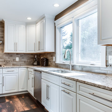
Designed by Maggie Walker of Reico Kitchen & Bath in Frederick, MD this traditional style kitchen design features kitchen cabinets from Merillat Masterpiece in the Fairlane Evercore door style in 2 finishes. The perimeter kitchen cabinets feature a Dove White finish. The kitchen island cabinets feature the darker Onyx finish. Kitchen countertops are Cambria engineered quartz in the color Bellingham. According to the client, Maggie "translated our wants and needs into a beautiful yet functional space. Her suggestion to move an exterior window brightened and opened up the room as well." The clients particularly enjoy the deep drawers that are designed to hold dishes, pots and pans as well as the pull out bins in the lower cabinets, saying "..not only does it make meal prep and clean up easy now, we also know these features will be appreciated even more as we age."
Photos courtesy of BTW Images.
 Paragon Exteriors LLC
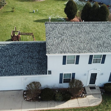
This roof replacement project was completed using CertainTeed Northgate shingles in the Granite Gray color along with new white seamless gutters.
The Northgate shingle is a Class 4 Impact Resistant shingle which may translate to lower homeowners insurance costs for you. This roof also comes with a 4-Star warranty meaning 50 years of non-prorated coverage against manufacturing defects.
 Nightscaping USA
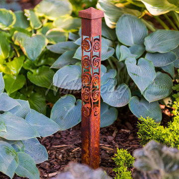
The 2x2 Courtyard Series - Spiral Design, by Nightscaping®, is a bollard style path and area light. The dramatic shadow patterns created by these beautifully handcrafted Cor-Ten steel fixtures translate into a breathtaking alternative to the traditional pathway and area light. Nightscaping's® heavy duty 12 gauge steel bollards are designed to last through generations and is handcrafted in America. The 2 Series steel light bollards are great for driveway garden, pathway lighting and much more.
 Devine Bath & Kitchen
This condo was stuck in the 70s: dingy brown cabinets, worn out fixtures, and ready for a complete overhaul. What started as a bathroom update turned into a complete remodel of the condo. The kitchen became our main target, and as we brought it out of the 70s, the rest came with it.
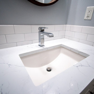
Our client wanted a home closer to their grandchildren, but to be comfortable and functional, it needed an update. Once we begin on a design plan for one space, the vision can spread across to the other rooms, up the walls, and down to the floors. Beginning with the bathroom, our client opted for a clean and elegant look: white quartz, subway tile, and floating shelves, all of which was easy to translate into the kitchen.
The shower and tub were replaced and tiled with a perfectly sized niche for soap and shampoo, and a slide bar hand shower from Delta for an easy shower experience. Perfect for bath time with the grandkids! And to maximize storage, we installed floating shelves to hide away those extra bath toys! In a condo where the kitchen is only a few steps from the master bath, it's helpful to stay consistent, so we used the same quartz countertops, tiles, and colors for a consistent look that's easy on the eyes.
The kitchen received a total overhaul. New appliances, way more storage with tall corner cabinets, and lighting that makes the space feel bright and inviting. But the work did not stop there! Our team repaired and painted sheetrock throughout the entire condo, and also replaced the doors and window frames. So when we're asked, "Do you do kitchens?" the answer is, "We do it all!"
 Meridian Construction
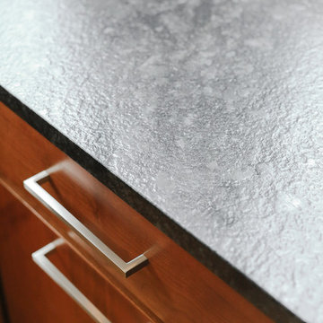
This homeowner’s minimalist style translated beautifully in this space. This kitchen remodel is a great example of not sacrificing practicality in the name of style: even the cleanest designs still hold the most intricate features, such as the expandable appliance shelf. Our favorite part of this improvement is how the customer selected natural wood tones to complement the modern space. See how this space was upgraded in our Before & After Gallery. Design and Construction by Meridian.

 McBrayer Landscapes
Reaches 3 to 5 ft. tall, 4 ft. wide in 10 years; taller with age. Partial to full sun. Goshiki translates from Japanese as "five colors". Its new leaves emerge red and quickly turn green. The green leaves are daubed with spots of creamy white, gray-green, and yellow-green. This lovely evergreen selection makes a great accent or hedge.

 Lindy Design Build
Kitchen
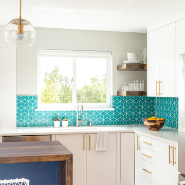
The original kitchen had been on the small side and cut-off from the rest of the home, but after we removed the coat closet, this kitchen opened up beautifully. Our plan was to create an open and light filled kitchen with a design that translated well to the other spaces in this home, and a layout that offered plenty of space for multiple cooks. We utilized clean white cabinets around the perimeter of the kitchen and popped the island with a spunky shade of blue. To add a real element of fun, we jazzed it up with the colorful escher tile at the backsplash and brought in accents of brass in the hardware and light fixtures to tie it all together. Through out this home we brought in warm wood accents and the kitchen was no exception, with its custom floating shelves and graceful waterfall butcher block counter at the island.
 Dimensions in Wood Inc
This master bathroom renovation in Fulton, MO turned out beautifully and used two revolutionary new products, Thinscape Performance Countertops and Wetwall Waterproof Panels.
Access to the bathrom from the master bedroom is through a unique sliding barn door.
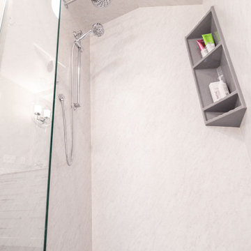
Inside the Dimensions In Wood team laid ceramic tile flooring. We built a walk-in Onyx base shower with frameless glass. For shampoo and other storage an Onyx Shower Caddie was attached to the wall.
A full size bathtub gives the home owners the option to shower or bathe and has Wetwall panels surrounding the tub instead of traditional tile.
The double sink vanity has a Thinscape Performance Countertop which is a unique new material that is ultra thin with a stylish surface both sleek and strong. Thinscape is very durable, resistant to impact, scratches and water.
Recessed lighting in the ceiling makes the bathroom bright, in connection with the mirror mounted fixtures.
Wainscoting on the walls surrounding the toilet give the luxury touch of unique millwork and finishes out this beautiful bathroom.
Contact Us Today to discuss Translating Your Bathroom Renovation Vision into a Reality.
 NILES
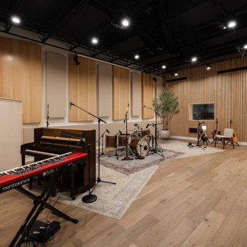
NILESThis 2022 project for Sovereign Grace Music was a full-scale, purpose-built recording and production facility designed to support songwriting, live tracking, mixing, and video content creation. Working alongside the extraordinary Sovereign Grace team—and in collaboration with Authentic Carpentry—NILES handled sound reduction, audio integration, and all acoustic treatment design and installation.
The facility features a full Control Room, a spacious Live Room, and a large Isolation Booth engineered for dry drum capture or vocal tracking during full-band sessions. Each space was crafted for accuracy, clarity, and intuitive workflow, ensuring that engineers and artists can move seamlessly between rooms without breaking creative momentum.
Clear sightlines, generous lighting, and intentional layout choices make the studio equally suited for recording and video production. Every room is wired for a plug-and-play workflow, supporting multi-camera shoots, ensemble tracking, and efficient session flow.
Behind the aesthetic, the acoustic infrastructure is highly robust. The Control Room, Live Room, and ISO Booth sit on independent floor systems with tailored sound-reducing wall assemblies and strategic treatments throughout. No suite is mechanically bonded, allowing simultaneous use of all rooms with minimal sound transmission.
Monitoring in the Control Room centers around PMC 6-2 loudspeakers, precisely tuned to ensure accurate translation from mix position to the final master.
The result is a balanced, inviting, and technically exact environment—built to serve the diverse creative needs of Sovereign Grace Music for years to come.
 NILES
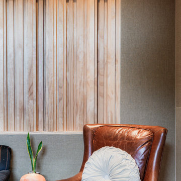
NILESThis 1,000ft² recording and production studio, built in 2021 for producer couple Latifah Alattas and Lucas Morton, was designed as a fully custom creative environment that supports writing, mixing, and collaboration at the highest level. Both Latifah and Lucas are multi-instrumentalists, engineers, and mixers, and the studio reflects the full range of their workflows—visually inspiring, technically precise, and intuitive in every room.
The facility was built from the ground up with a strong emphasis on architectural acoustics and plug-and-play connectivity. The layout includes two Control Rooms, multiple isolation booths, and shared common spaces, all tied together with seamless audio integration. No matter where you are in the studio, routing, monitoring, and communication remain effortless and consistent.
Behind the aesthetic, the acoustic design is exceptionally robust. Six independent floating-floor systems support the suites, ensuring each room operates with minimal sound transmission. Tailored sound-reducing wall assemblies, full-lite doors, engineered window systems, and intentional treatment plans deliver clarity, isolation, and precision for tracking and mixing. Each space is mechanically decoupled, allowing multiple rooms to run simultaneously without compromise.
For monitoring, both Latifah and Lucas chose Genelec “The Ones” series monitors with GLM calibration to ensure accurate translation and consistency across the entire facility.
Natural light and a warm, welcoming aesthetic anchor the visual identity of the studio, reflecting the creative energy and personality of its owners. The result is a highly functional, beautifully crafted space where ideas can move freely and production can happen without limitations.
 TVL Creative Ltd.
[Our Clients]
We were so excited to help these new homeowners re-envision their split-level diamond in the rough. There was so much potential in those walls, and we couldn’t wait to delve in and start transforming spaces. Our primary goal was to re-imagine the main level of the home and create an open flow between the space. So, we started by converting the existing single car garage into their living room (complete with a new fireplace) and opening up the kitchen to the rest of the level.
[Kitchen]
The original kitchen had been on the small side and cut-off from the rest of the home, but after we removed the coat closet, this kitchen opened up beautifully. Our plan was to create an open and light filled kitchen with a design that translated well to the other spaces in this home, and a layout that offered plenty of space for multiple cooks. We utilized clean white cabinets around the perimeter of the kitchen and popped the island with a spunky shade of blue. To add a real element of fun, we jazzed it up with the colorful escher tile at the backsplash and brought in accents of brass in the hardware and light fixtures to tie it all together. Through out this home we brought in warm wood accents and the kitchen was no exception, with its custom floating shelves and graceful waterfall butcher block counter at the island.
[Dining Room]
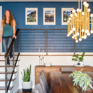
The dining room had once been the home’s living room, but we had other plans in mind. With its dramatic vaulted ceiling and new custom steel railing, this room was just screaming for a dramatic light fixture and a large table to welcome one-and-all.
[Living Room]
We converted the original garage into a lovely little living room with a cozy fireplace. There is plenty of new storage in this space (that ties in with the kitchen finishes), but the real gem is the reading nook with two of the most comfortable armchairs you’ve ever sat in.
[Master Suite]
This home didn’t originally have a master suite, so we decided to convert one of the bedrooms and create a charming suite that you’d never want to leave. The master bathroom aesthetic quickly became all about the textures. With a sultry black hex on the floor and a dimensional geometric tile on the walls we set the stage for a calm space. The warm walnut vanity and touches of brass cozy up the space and relate with the feel of the rest of the home. We continued the warm wood touches into the master bedroom, but went for a rich accent wall that elevated the sophistication level and sets this space apart.
[Hall Bathroom]
The floor tile in this bathroom still makes our hearts skip a beat. We designed the rest of the space to be a clean and bright white, and really let the lovely blue of the floor tile pop. The walnut vanity cabinet (complete with hairpin legs) adds a lovely level of warmth to this bathroom, and the black and brass accents add the sophisticated touch we were looking for.
[Office]
We loved the original built-ins in this space, and knew they needed to always be a part of this house, but these 60-year-old beauties definitely needed a little help. We cleaned up the cabinets and brass hardware, switched out the formica counter for a new quartz top, and painted wall a cheery accent color to liven it up a bit. And voila! We have an office that is the envy of the neighborhood.
 Klopf Architecture
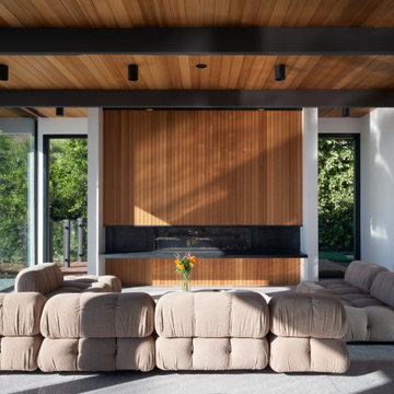
Malibu Glass Box House by Klopf Architecture
Following the devastating Woolsey Fire of 2018, the site in Malibu offered a unique opportunity to rebuild not just a home, but a new architectural composition that highlighted the property’s potential while navigating strict fire-rebuild codes in the area. Designed by Klopf Architecture, this project embraced a set of limitations and translated them into an architectural asset.
The city’s fire-rebuild process required the new structure to remain close to the original footprint, size and bulk, a constraint that ultimately clarified the architectural direction. Perched near the front of a long, narrow lot, the new home frames and overlooks a private, park-like rear expanse, an uncommon luxury especially in this part of Malibu .
Without a fixed program, the design process allowed for a different kind of creative focus allowing Klopf Architecture the opportunity to explore how a modernist home could best respond to this site. The team approached the project not with a list of requirements, but with a question: How might a modernist live here? What spatial qualities would inspire calm, connection, and a sense of wonder in this setting? The process became less about problem-solving and more about architectural storytelling—letting the site, the light, and the principles of modern design guide the form and flow of the home.
The response emerged in the form of a glass-box pavilion, an open, Mid-Century Modern inspired living, dining, and kitchen space that floats at the edge of the property’s natural descent. Connected to the more enclosed, private areas of the home by a glass-walled hallway, the living pavilion becomes a distinct centerpiece of the design. It opens on all four sides to the landscape with decks and patios on the flanks, an internal garden and water feature to the north, and a dramatic unguarded view of the expansive backyard and ocean horizon to the south.
Because of the mandated footprint, careful planning was required to ensure every space could still engage with light, landscape, or both. Strategic voids in the form of atriums and courtyards allow daylight to filter deep into the home’s core, while offering moments of surprise and retreat. These design gestures allow natural light to filter deep into the interior, creating a sense of brightness and openness throughout the day. At the same time, they expand the perceptual boundaries between inside and out, making the home feel more expansive while anchoring its connection to the surrounding landscape.
The siting of the house is what gives it its unique character. Rather than receding into the backyard like the neighboring homes, the house holds a slight prominence. From the central living pavilion, stepping down into the landscape feels more like entering a secluded park where a separate existing accessory structure, trail, and recreational areas await. The home’s modest street presence gives way to this unfolding drama of space, view, and nature.
Fire-resilient materials and assemblies are integrated seamlessly throughout including triple-pane glazing, under-slab and roof insulation, and locally sourced fire-rated cladding ensure the house not only meets Calfornia’s rigorous wildland-urban interface (WUI) standards, but feels effortlessly aligned with them. While technical decisions like fire-hardening and mechanical systems presented some construction challenges, particularly around the cantilevered glass box, the team found a functional compromise that preserved the integrity of the design.
Inside, a restrained palette and exposed post and beam design celebrate the ethos of mid-century modernism. A central circulation spine extends from the entry to the rear glass wall, offering a continuous visual link from street to ocean. Spaces such as the library and office, though more intimate in scale, are never cut off from nature as each opens to its own unique courtyard or garden view.
Though born out of a strict regulatory framework and developed without a specific client, the rebuild design unfolded with remarkable clarity. Grounded in site logic, refined by limitations and an emphasis on timeless spatial relationships – light, proportion, and a strong connection to nature, the resulting design feels both effortless and uplifting. The home lives lightly on the land, opens generously to its surroundings, and strikes a careful balance between privacy, openness, and calm. For Klopf Architecture, it stands as a compelling case study in how site, code, and circumstantial constraints can inspire enduring, modernist architecture. With years of experience reimagining mid-century modern design for how people live today, the firm took the project’s limitations as an opportunity. The result is a home shaped by open, flowing spaces, strong indoor-outdoor connections, and a calm, clear sense of structure. It’s a good reminder that even with strict constraints, there’s still room for architecture to breathe—and for modernism to keep moving forward.
Klopf Architecture project team: Geoff Campen, John Klopf, AIA, and Sherry Tan
Structural Engineer: ZFA
Contractor: Maison D’Artiste
Photography: ©2025 Mariko Reed
Year Completed: 2023
 Premier Design-Build-Remodel
Check out this eye-catching kitchen remodel that we finished. Our designer’s keen sense of style and functionality, paired with the client’s love of color and specific working needs, translate beautifully in this whimsical, yet highly functional gem.
Photo Credit: Alicia Villarreal
 Archadeck of Austin
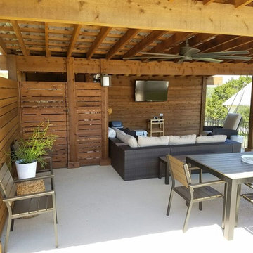
Our talented design team here at Archadeck of Austin are experts at translating the needs and desires of our clients’ into our outdoor living spaces. For this project, we designed a pergola with a metal roof. The interior of the pergola is spacious enough at 20′ x 15′ to facilitate a changing area covered in cedar slats at one end. In addition, the addition serves as the perfect spot for the homeowner’s to store pool supplies when not in use.

 Ashlina Design Atelier
A restaurant that has been around for more than 20 years, Rebecca's was given a fresh new look to enhance their romantic date night ambience by bringing in classy, tailored, and hip features. A smoky blue envelopes the whole interior and it accented with custom woodwork, adding dimension to the walls. The existing bench seat backs were reimagined with a luxurious and velvety chenille in a channel tuft pattern for a lofty aesthetic and all chairs were repainted in a charcoal, translating that smoky look from one area to another. On the main wall, we hung unique mirrors with brass detail to give the woodwork by Paradigm Custom Woodworks more meaning and to reflect light throughout the dim-lit space. Greenery is strategically placed in multiple spots for a fresh, organic vibe as it adds a pop of color, and the new drapery was installed to fuse into the design and carefully frame the windows and entry. The counter area features an installation utilizing their house wines as art.
In the private sector of the restaurant, a funky geometric woodwork accent wall is made to add dimension and play with a custom graffiti mural created by local and renowned artist, Sebastian Ferreira. To balance out the many textures in this room, Fine Arts Designs installed concrete-look commercial-grade wallcovering which sits behind a custom neon sign for social media moments.
Out in the patio dining area, we brought Cuban textures in with the use of black and white encaustic tile which play nicely with the new South American Walnut butcher block tabletops.
Formal photographs to follow soon...
 Wood-Mode Fine Custom Cabinetry
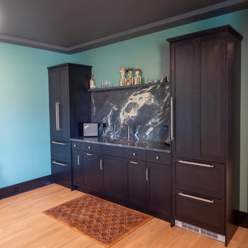
When Blues music legend and fourth generation builder, Albert Cummings and his interior designer wife, Christina decided to build their forever home in the Berkshire Mountains, they knew they wanted Wood-Mode cabinetry throughout. After specifying Wood-Mode in many of their customers’ homes, the Cummings collaborated with Wood-Mode dealer Vonnie Marcyoniak of Kitchens & Baths by Herzenberg to translate their vision into ideal spaces within their own build. The “House That Blues Built” features spaces inspired by the homeowners’ vision and unique background.
The Cummings put enormous thought into every space of their home, spending years collecting the design ideas they would eventually incorporate. It is Wood-Mode’s craftmanship they were familiar with and wanted the “feel” of their cabinetry – a quality that they know will last a lifetime – and the finishing touches inside each drawer and behind every cabinet.
Starting in the kitchen where Christina gave a lot of thought to how the space would be used, pulling inspiration from a range hood, and incorporating furniture details such as the Vintage Navy Blue island that would become the focal point of the room. Taking advantage of the kitchen’s 10 foot ceilings, upper glass front cabinets were designed to safely store yet publicly showcase heirloom cookie jars. Professional-grade appliances were selected, such as an integrated coffee machine, not only for appearance but because of Christina’s love for cooking and entertaining.
Christina shared that her favorite room in the house is the pantry, which is open and visible to the kitchen. Fitted with floor to ceiling cabinets in the same Vintage Navy Blue as the island, the space includes floating walnut shelves and a farmhouse sink with a mountaintop view.
The most innovative space of the home can be found on the lower floor in the guitar bar. Designed for acoustic perfection, the space includes a full-size bar where friends and family can gather to enjoy nights of music. To create the look and feel of a New Orleans Blues Bar, the Cummings’ chose Plain Sawn American Oak, which provides an interesting texture, and then finished it in an Ebony stain.
Designed by Vonnie Marcyoniak
Kitchens & Baths by Herzenberg
 Lindy Design Build
Kitchen
The original kitchen had been on the small side and cut-off from the rest of the home, but after we removed the coat closet, this kitchen opened up beautifully. Our plan was to create an open and light filled kitchen with a design that translated well to the other spaces in this home, and a layout that offered plenty of space for multiple cooks. We utilized clean white cabinets around the perimeter of the kitchen and popped the island with a spunky shade of blue. To add a real element of fun, we jazzed it up with the colorful escher tile at the backsplash and brought in accents of brass in the hardware and light fixtures to tie it all together. Through out this home we brought in warm wood accents and the kitchen was no exception, with its custom floating shelves and graceful waterfall butcher block counter at the island.
78