
Search results for "Typefaces" in Home Design Ideas



 Red Oak Remodeling
Example of a mid-sized transitional u-shaped laminate floor and gray floor kitchen design with an undermount sink, recessed-panel cabinets, white cabinets, granite countertops, multicolored backsplash, mosaic tile backsplash, stainless steel appliances, an island and multicolored countertops
Find the right local pro for your project






 Mila Held
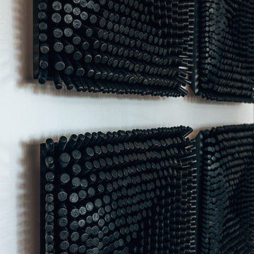
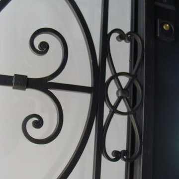
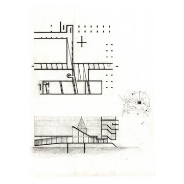
Studying master architect, Le Corbusier’s control of light in his famous monastery, La Tourette.
In the afternoon, a friar embarks on a solitary hike through the woods surrounding the convent. Upon his return, he is met with a solemn staircase at the west entrance of La Tourette. Sprouting from the grass beneath, they beckon to the friar. He reaches the dimly lit opening to a cloister, admiring the upward slope of the ceiling. Asymmetrical windows facing the adjacent courtyard comprise the right side of the hall. The friar continues his journey through the cloister. The ceiling reaches maximum height, revealing a moderately sized atrium. Tall, open walls reach for the heavens, inviting the friar to meditate as divine light shines onto him in rhythmic vertical patterns. He reflects upon his life before becoming a member of the Couvent. He had meandered aimlessly through life until religion finally offered direction. God tenderly guides the friar as the staircase draws him to enter the cloister. The fabric of La Tourette defines a religious experience; its very shadows encouraging the devout musings of the deferential friar.

 Miss Frugal Fancy Pants
Inspiration for a shabby-chic style family room remodel in Tampa
Inspiration for a shabby-chic style family room remodel in Tampa


 Civis USA
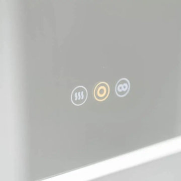
The Hannah LED Mirror by Civis USA, Inc. turns your bathroom into a five star hotel! Featuring an easy installation using a polished edge mirror that hangs on a white powder coated chassis. Bright LED backlight shines through the frost interior of the glass to illuminate your room from the top and each side.
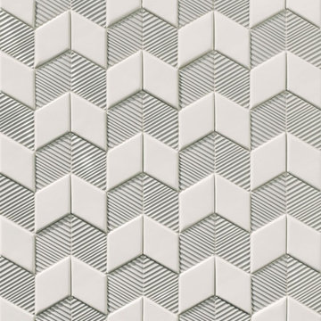
 Olympia Tile
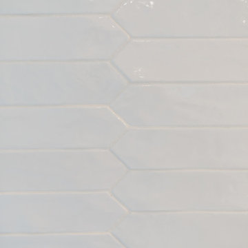
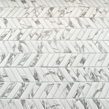
Our New Panal series is a beautiful collection of various sizes, shapes and colors, where all can be mixed and matched to create beautiful designs for any environment; residential and commercial.

 KURV Architecture DPC (Alex Hughes Architects)
Located in the heart of Manhattan’s Lower East Side, the building was erected on a shallow commercial lot between two 120 year old masonry buildings and a new residential rental building. 330 Grand Street is a mix of 725 SF 1BRs and 1050 SF 2BR apartments. It also contains a 1100 SF two story duplex as well as private and public rooftop space, large private balconies for most units and two large private terraces for the ground floor units.
330 Grand Street was originally designed and approved at the NYC DOB as a prefabricated modular building. During the pandemic, as shipping costs skyrocketed putting the project at risk, we suggested redesigning the building as a reinforced cast-in-place concrete structure. Concrete was readily available and prices had not been affected by the demand increase that many other materials suffered in the pandemic. We took this opportunity to raise floor to ceiling heights, enlarge high performance windows and redistribute the buildings MEPFS and Structural Systems to create very open floor plans.
The challenge was to create a luxurious sensorial living experience with very limited means. In a city with very high construction costs, low cost residential buildings in the area are usually devoid of good quality, design and character. Our approach was to aim high for the end user, prioritizing natural light, open space with long visual perspectives, high ceilings and as always, rejecting the use of predefined building templates.
Our biggest challenge was to ensure that the small spaces feel as clean cut, large and bright as possible. Several unique design decisions were made to ensure low cost and high quality;
Floor plans were laid out so that spaces were wide open and free of clutter from mechanical or structural interruptions. Therefore all infrastructure was placed in lateral demising walls, which in turn act as the unit’s storage and kitchen. The apartments feel wide open, are super quiet and have more storage space than any other comparable apartment in the city.
To solve the problem of the site’s shallow commercial lot which is typically prone to dark interior spaces we focused our attention on the building’s envelope. Instead of the usual small punched window openings, oversized high performance windows were designed to ensure that light penetrated as far as possible into the units. In the smaller 1BR units, the full 50’ depth of the lot is perceived by partitioning spaces with sliding pocket doors that can be retracted to allow deep visual perspectives, making the sight lines in the space feel longer, larger, more ample than normal. In addition to the full height glazing, each unit above the 2nd floor receives a 7 foot covered balcony, adding 120 to 240 sf to each apartment, something unusual in New York City buildings. The space is large enough for a full size dining table, when the weather permits being outside.
We also worked hard to ensure modularity. For example, all kitchen units are all identical throughout the building. The idea of modularity and the economy of the repetitive unit is exercised to the maximum through the building.
Hardware, appliances, flooring, wall coverings and material finishes are all carefully selected to feel bespoke, high quality and unique.
It was important to KURV that the result of this work manifest into something that would deeply connect with the end user and sustain relationships with the consumers of this space.
All images by KURV Architecture ©



 Cure Design Group
CURE Senior Designer, Cori Dyer's personal home. Takes you through a home tour of her exquisitely designed spaces. Recently Renovated Kitchen, here is what Cori has to say about that process...Initially, I had to have the "upgrade" of thermafoil cabinets, but that was 25 years ago...it was time to bring my trendy kitchen space up to my current design standards! Ann Sachs.... Kelly Wearstler tile were the inspiration for the entire space. Eliminating walls between cabinetry, appliances, and a desk no longer necessary, were just the beginning. Adding a warm morel wood tone to these new cabinets and integrating a wine/coffee station were just some of the updates. I decided to keep the "White Kitchen" on the north side and add the same warm wood tone to the hood. A fresh version of the traditional farmhouse sink, Grohe faucet and Rio Blanc Quartzite were all part of the design. To keep the space open I added floating shelves both on the north side of the white kitchen and again above the wine refrigerator. A great spot in incorporate my love of artwork and travel!
Cure Design Group (636) 294-2343 https://curedesigngroup.com/


52