
Search results for "Typical list" in Home Design Ideas
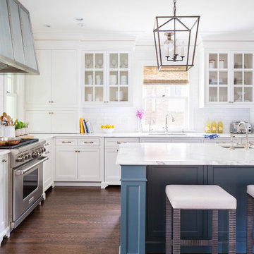
 O’Hara Interiors
Martha O'Hara Interiors, Interior Design & Photo Styling | John Kraemer & Sons, Remodel | Troy Thies, Photography
Please Note: All “related,” “similar,” and “sponsored” products tagged or listed by Houzz are not actual products pictured. They have not been approved by Martha O’Hara Interiors nor any of the professionals credited. For information about our work, please contact design@oharainteriors.com.
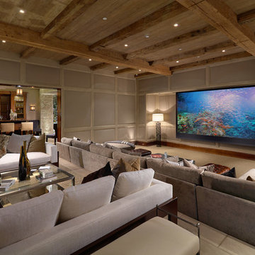
 Dugally Oberfeld, Inc.
Family room - huge mediterranean enclosed family room idea in Orange County with beige walls and a wall-mounted tv
 LeichtUSA
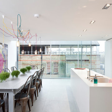
Attractive living as an architectural experiment: a 136-year-old water tower, a listed building with a spectacular 360-degree panorama view over the City of London. The task, to transform it into a superior residence, initially seemed an absolute impossibility. But when the owners came across architect Mike Collier, they had found a partner who was to make the impossible possible. The tower, which had been empty for decades, underwent radical renovation work and was extended by a four-storey cube containing kitchen, dining and living room - connected by glazed tunnels and a lift shaft. The kitchen, realised by Enclosure Interiors in Tunbridge Wells, Kent, with furniture from LEICHT is the very heart of living in this new building.
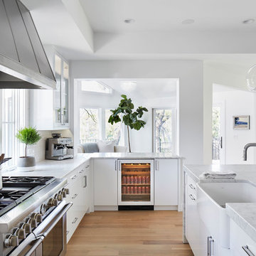
Shiny white matt-lacquered kitchen fronts (AVANCE-LR), tone-on-tone with the worktops, reflect the light in the room and thus create expanse and openness. The surface of the handle-less kitchen fronts has a horizontal relief embossing; depending on the light incidence, this results in a vitally structured surface. The free-standing preparation isle with its vertical side panels with a seamlessly integrated sink represents the transition between kitchen and living room. The fronts of the floor units facing the dining table were extended to the floor to do away with the plinth typical of most kitchens. Ceiling-high tall units on the wall provide plenty of storage space; the electrical appliances are integrated here invisible to the eye. Floor units on a high plinth which thus appear to be floating form the actual cooking centre within the kitchen, attached to the wall. A range of handle-less wall units concludes the glazed niche at the top.
LEICHT international: “Architecture and kitchen” in the centre of London. www.LeichtUSA.com
Find the right local pro for your project
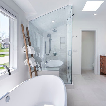 O’Hara Interiors
Martha O'Hara Interiors, Interior Design & Photo Styling | Corey Gaffer, Photography | Please Note: All “related,” “similar,” and “sponsored” products tagged or listed by Houzz are not actual products pictured. They have not been approved by Martha O’Hara Interiors nor any of the professionals credited. For information about our work, please contact design@oharainteriors.com.
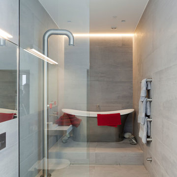 LeichtUSA
Attractive living as an architectural experiment: a 136-year-old water tower, a listed building with a spectacular 360-degree panorama view over the City of London. The task, to transform it into a superior residence, initially seemed an absolute impossibility. But when the owners came across architect Mike Collier, they had found a partner who was to make the impossible possible. The tower, which had been empty for decades, underwent radical renovation work and was extended by a four-storey cube containing kitchen, dining and living room - connected by glazed tunnels and a lift shaft. The kitchen, realised by Enclosure Interiors in Tunbridge Wells, Kent, with furniture from LEICHT is the very heart of living in this new building.
Shiny white matt-lacquered kitchen fronts (AVANCE-LR), tone-on-tone with the worktops, reflect the light in the room and thus create expanse and openness. The surface of the handle-less kitchen fronts has a horizontal relief embossing; depending on the light incidence, this results in a vitally structured surface. The free-standing preparation isle with its vertical side panels with a seamlessly integrated sink represents the transition between kitchen and living room. The fronts of the floor units facing the dining table were extended to the floor to do away with the plinth typical of most kitchens. Ceiling-high tall units on the wall provide plenty of storage space; the electrical appliances are integrated here invisible to the eye. Floor units on a high plinth which thus appear to be floating form the actual cooking centre within the kitchen, attached to the wall. A range of handle-less wall units concludes the glazed niche at the top.
LEICHT international: “Architecture and kitchen” in the centre of London. www.LeichtUSA.com
 RD Architecture, LLC
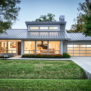
1960s gray one-story concrete fiberboard house exterior photo in Houston with a hip roof and a metal roof
 LeichtUSA
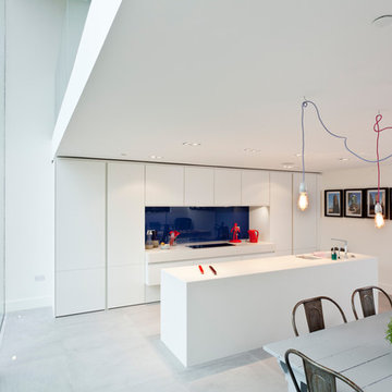
Attractive living as an architectural experiment: a 136-year-old water tower, a listed building with a spectacular 360-degree panorama view over the City of London. The task, to transform it into a superior residence, initially seemed an absolute impossibility. But when the owners came across architect Mike Collier, they had found a partner who was to make the impossible possible. The tower, which had been empty for decades, underwent radical renovation work and was extended by a four-storey cube containing kitchen, dining and living room - connected by glazed tunnels and a lift shaft. The kitchen, realised by Enclosure Interiors in Tunbridge Wells, Kent, with furniture from LEICHT is the very heart of living in this new building.
Shiny white matt-lacquered kitchen fronts (AVANCE-LR), tone-on-tone with the worktops, reflect the light in the room and thus create expanse and openness. The surface of the handle-less kitchen fronts has a horizontal relief embossing; depending on the light incidence, this results in a vitally structured surface. The free-standing preparation isle with its vertical side panels with a seamlessly integrated sink represents the transition between kitchen and living room. The fronts of the floor units facing the dining table were extended to the floor to do away with the plinth typical of most kitchens. Ceiling-high tall units on the wall provide plenty of storage space; the electrical appliances are integrated here invisible to the eye. Floor units on a high plinth which thus appear to be floating form the actual cooking centre within the kitchen, attached to the wall. A range of handle-less wall units concludes the glazed niche at the top.
LEICHT international: “Architecture and kitchen” in the centre of London. www.LeichtUSA.com


 Kass & Associates
Halkin Mason Photography
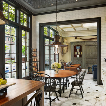
Large ornate marble floor kitchen/dining room combo photo in Philadelphia with white walls and no fireplace
Large ornate marble floor kitchen/dining room combo photo in Philadelphia with white walls and no fireplace
 User
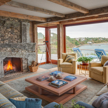
UserExample of a mid-sized mountain style formal and open concept light wood floor living room design in Boston with a standard fireplace, brown walls, a stone fireplace and no tv
 Milgard Windows & Doors
The Kiguchi family moved into their Austin, Texas home in 1994. Built in the 1980’s as part of a neighborhood development, they happily raised their family here but longed for something more contemporary. Once they became empty nesters, they decided it was time for a major remodel. After spending many years visiting Austin AIA Home Tours that highlight contemporary residential architecture, they had a lot of ideas and in 2013 were ready to interview architects and get their renovation underway.
The project turned into a major remodel due to an unstable foundation. Architects Ben Arbib and Ed Hughey, of Arbib Hughey Design were hired to solve the structural issue and look for inspiration in the bones of the house, which sat on top of a hillside and was surrounded by great views.
Unfortunately, with the old floor plan, the beautiful views were hidden by small windows that were poorly placed. In order to bring more natural light into the house the window sizes and configurations had to be addressed, all while keeping in mind the homeowners desire for a modern look and feel.
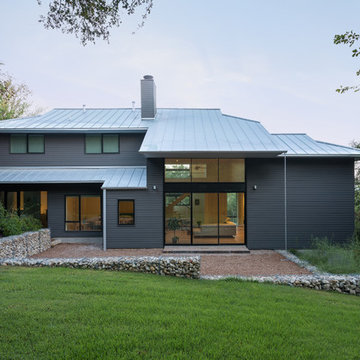
To achieve a more contemporary and sophisticated front of house, a new entry was designed that included removing a two-story bay window and porch. The entrance of the home also became more integrated with the landscape creating a template for new foliage to be planted. Older exterior materials were updated to incorporate a more muted palette of colors with a metal roof, dark grey siding in the back and white stucco in the front. Deep eaves were added over many of the new large windows for clean lines and sun protection.
“Inside it was about opening up the floor plan, expanding the views throughout the house, and updating the material palette to get a modern look that was also warm and inviting,” said Ben from Arbib Hughey Design. “Prior to the remodel, the house had the typical separation of rooms. We removed the walls between them and changed all of the windows to Milgard Thermally Improved Aluminum to connect the inside with the outside. No matter where you are you get nice views and natural light.”
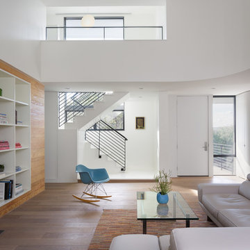
The architects wanted to create some drama, which they accomplished with the window placement and opening up the interior floor plan to an open concept approach. Cabinetry was used to help delineate intimate spaces. To add warmth to an all-white living room, white-washed oak wood floors were installed and pine planks were used around the fireplace. The large windows served as artwork bringing the color of nature into the space.
An octagon shaped, elevated dining room, (named “the turret”), had a big impact on the design of the house. They architects rounded the corners and added larger window openings overlooking a new sunken garden. The great room was also softened by rounding out the corners and that circular theme continued throughout the house, being picked up in skylight wells and kitchen cabinetry. A staircase leading to a catwalk was added and the result was a two-story window wall that flooded the home with natural light.
When asked why Milgard® Thermally Improved Aluminum windows were selected, the architectural team listed many reasons:
1) Aesthetics: “We liked the slim profiles and narrow sightlines. The window frames never get in the way of the view and that was important to us. They also have a very contemporary look that went well with our design.”
2) Options: “We liked that we could get large sliding doors that matched the windows, giving us a very cohesive look and feel throughout the project.”
3) Cost Effective: “Milgard windows are affordable. You get a good product at a good price.”
4) Custom Sizes: “Milgard windows are customizable, which allowed us to get the right window for each location.”
Ready to take on your own traditional to modern home remodeling project? Arbib Hughey Design advises, “Work with a good architect. That means picking a team that is creative, communicative, listens well and is responsive. We think it’s important for an architect to listen to their clients and give them something they want, not something the architect thinks they should have. At the same time you want an architect who is willing and able to think outside the box and offer up design options that you may not have considered. Design is about a lot of back and forth, trying out ideas, getting feedback and trying again.”
The home was completely transformed into a unique, contemporary house perfectly integrated with its site. Internally the home has a natural flow for the occupants and externally it is integrated with the surroundings taking advantage of great natural light. As a side note, it was highly praised as part of the Austin AIA homes tour.
 9 square studio
Andrea Calo
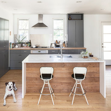
Inspiration for a mid-sized scandinavian l-shaped light wood floor open concept kitchen remodel in Austin with an undermount sink, flat-panel cabinets, gray cabinets, quartz countertops, stainless steel appliances and an island
Inspiration for a mid-sized scandinavian l-shaped light wood floor open concept kitchen remodel in Austin with an undermount sink, flat-panel cabinets, gray cabinets, quartz countertops, stainless steel appliances and an island
 Amazing Spaces
The existing U-shaped kitchen was tucked away in a small corner while the dining table was swimming in a room much too large for its size. The client’s needs and the architecture of the home made it apparent that the perfect design solution for the home was to swap the spaces.
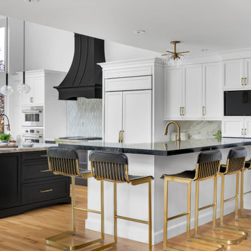
The homeowners entertain frequently and wanted the new layout to accommodate a lot of counter seating, a bar/buffet for serving hors d’oeuvres, an island with prep sink, and all new appliances. They had a strong preference that the hood be a focal point and wanted to go beyond a typical white color scheme even though they wanted white cabinets.
While moving the kitchen to the dining space gave us a generous amount of real estate to work with, two of the exterior walls are occupied with full-height glass creating a challenge how best to fulfill their wish list. We used one available wall for the needed tall appliances, taking advantage of its height to create the hood as a focal point. We opted for both a peninsula and island instead of one large island in order to maximize the seating requirements and create a barrier when entertaining so guests do not flow directly into the work area of the kitchen. This also made it possible to add a second sink as requested. Lastly, the peninsula sets up a well-defined path to the new dining room without feeling like you are walking through the kitchen. We used the remaining fourth wall for the bar/buffet.
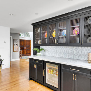
Black cabinetry adds strong contrast in several areas of the new kitchen. Wire mesh wall cabinet doors at the bar and gold accents on the hardware, light fixtures, faucets and furniture add further drama to the concept. The focal point is definitely the black hood, looking both dramatic and cohesive at the same time.
 O’Hara Interiors
Martha O'Hara Interiors, Interior Design & Photo Styling | Corey Gaffer, Photography | Please Note: All “related,” “similar,” and “sponsored” products tagged or listed by Houzz are not actual products pictured. They have not been approved by Martha O’Hara Interiors nor any of the professionals credited. For information about our work, please contact design@oharainteriors.com.
Sponsored
Westerville, OH

The Steele Group
Industry Leading General Contractors in Franklin County, Ohio
 LeichtUSA
Attractive living as an architectural experiment: a 136-year-old water tower, a listed building with a spectacular 360-degree panorama view over the City of London. The task, to transform it into a superior residence, initially seemed an absolute impossibility. But when the owners came across architect Mike Collier, they had found a partner who was to make the impossible possible. The tower, which had been empty for decades, underwent radical renovation work and was extended by a four-storey cube containing kitchen, dining and living room - connected by glazed tunnels and a lift shaft. The kitchen, realised by Enclosure Interiors in Tunbridge Wells, Kent, with furniture from LEICHT is the very heart of living in this new building.
Shiny white matt-lacquered kitchen fronts (AVANCE-LR), tone-on-tone with the worktops, reflect the light in the room and thus create expanse and openness. The surface of the handle-less kitchen fronts has a horizontal relief embossing; depending on the light incidence, this results in a vitally structured surface. The free-standing preparation isle with its vertical side panels with a seamlessly integrated sink represents the transition between kitchen and living room. The fronts of the floor units facing the dining table were extended to the floor to do away with the plinth typical of most kitchens. Ceiling-high tall units on the wall provide plenty of storage space; the electrical appliances are integrated here invisible to the eye. Floor units on a high plinth which thus appear to be floating form the actual cooking centre within the kitchen, attached to the wall. A range of handle-less wall units concludes the glazed niche at the top.
LEICHT international: “Architecture and kitchen” in the centre of London. www.LeichtUSA.com

 Milgard Windows & Doors
The Kiguchi family moved into their Austin, Texas home in 1994. Built in the 1980’s as part of a neighborhood development, they happily raised their family here but longed for something more contemporary. Once they became empty nesters, they decided it was time for a major remodel. After spending many years visiting Austin AIA Home Tours that highlight contemporary residential architecture, they had a lot of ideas and in 2013 were ready to interview architects and get their renovation underway.
The project turned into a major remodel due to an unstable foundation. Architects Ben Arbib and Ed Hughey, of Arbib Hughey Design were hired to solve the structural issue and look for inspiration in the bones of the house, which sat on top of a hillside and was surrounded by great views.
Unfortunately, with the old floor plan, the beautiful views were hidden by small windows that were poorly placed. In order to bring more natural light into the house the window sizes and configurations had to be addressed, all while keeping in mind the homeowners desire for a modern look and feel.
To achieve a more contemporary and sophisticated front of house, a new entry was designed that included removing a two-story bay window and porch. The entrance of the home also became more integrated with the landscape creating a template for new foliage to be planted. Older exterior materials were updated to incorporate a more muted palette of colors with a metal roof, dark grey siding in the back and white stucco in the front. Deep eaves were added over many of the new large windows for clean lines and sun protection.
“Inside it was about opening up the floor plan, expanding the views throughout the house, and updating the material palette to get a modern look that was also warm and inviting,” said Ben from Arbib Hughey Design. “Prior to the remodel, the house had the typical separation of rooms. We removed the walls between them and changed all of the windows to Milgard Thermally Improved Aluminum to connect the inside with the outside. No matter where you are you get nice views and natural light.”
The architects wanted to create some drama, which they accomplished with the window placement and opening up the interior floor plan to an open concept approach. Cabinetry was used to help delineate intimate spaces. To add warmth to an all-white living room, white-washed oak wood floors were installed and pine planks were used around the fireplace. The large windows served as artwork bringing the color of nature into the space.
An octagon shaped, elevated dining room, (named “the turret”), had a big impact on the design of the house. They architects rounded the corners and added larger window openings overlooking a new sunken garden. The great room was also softened by rounding out the corners and that circular theme continued throughout the house, being picked up in skylight wells and kitchen cabinetry. A staircase leading to a catwalk was added and the result was a two-story window wall that flooded the home with natural light.
When asked why Milgard® Thermally Improved Aluminum windows were selected, the architectural team listed many reasons:
1) Aesthetics: “We liked the slim profiles and narrow sightlines. The window frames never get in the way of the view and that was important to us. They also have a very contemporary look that went well with our design.”
2) Options: “We liked that we could get large sliding doors that matched the windows, giving us a very cohesive look and feel throughout the project.”
3) Cost Effective: “Milgard windows are affordable. You get a good product at a good price.”
4) Custom Sizes: “Milgard windows are customizable, which allowed us to get the right window for each location.”
Ready to take on your own traditional to modern home remodeling project? Arbib Hughey Design advises, “Work with a good architect. That means picking a team that is creative, communicative, listens well and is responsive. We think it’s important for an architect to listen to their clients and give them something they want, not something the architect thinks they should have. At the same time you want an architect who is willing and able to think outside the box and offer up design options that you may not have considered. Design is about a lot of back and forth, trying out ideas, getting feedback and trying again.”
The home was completely transformed into a unique, contemporary house perfectly integrated with its site. Internally the home has a natural flow for the occupants and externally it is integrated with the surroundings taking advantage of great natural light. As a side note, it was highly praised as part of the Austin AIA homes tour.
 Amazing Spaces
The existing U-shaped kitchen was tucked away in a small corner while the dining table was swimming in a room much too large for its size. The client’s needs and the architecture of the home made it apparent that the perfect design solution for the home was to swap the spaces.
The homeowners entertain frequently and wanted the new layout to accommodate a lot of counter seating, a bar/buffet for serving hors d’oeuvres, an island with prep sink, and all new appliances. They had a strong preference that the hood be a focal point and wanted to go beyond a typical white color scheme even though they wanted white cabinets.
While moving the kitchen to the dining space gave us a generous amount of real estate to work with, two of the exterior walls are occupied with full-height glass creating a challenge how best to fulfill their wish list. We used one available wall for the needed tall appliances, taking advantage of its height to create the hood as a focal point. We opted for both a peninsula and island instead of one large island in order to maximize the seating requirements and create a barrier when entertaining so guests do not flow directly into the work area of the kitchen. This also made it possible to add a second sink as requested. Lastly, the peninsula sets up a well-defined path to the new dining room without feeling like you are walking through the kitchen. We used the remaining fourth wall for the bar/buffet.
Black cabinetry adds strong contrast in several areas of the new kitchen. Wire mesh wall cabinet doors at the bar and gold accents on the hardware, light fixtures, faucets and furniture add further drama to the concept. The focal point is definitely the black hood, looking both dramatic and cohesive at the same time.
Sponsored
Westerville, OH
The Steele Group
Industry Leading General Contractors in Franklin County, Ohio
 Union Studio, Architecture & Community Design
Nat Rea
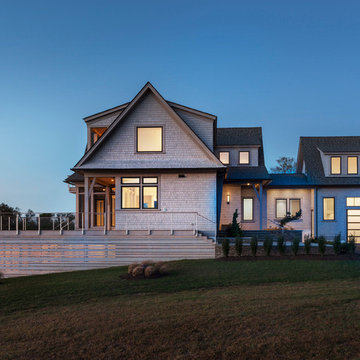
Example of a beach style two-story wood gable roof design in Providence
Example of a beach style two-story wood gable roof design in Providence
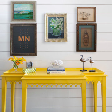 O’Hara Interiors
Martha O'Hara Interiors, Interior Design & Photo Styling | Stellar Homes | Troy Thies, Photography
Please Note: All “related,” “similar,” and “sponsored” products tagged or listed by Houzz are not actual products pictured. They have not been approved by Martha O’Hara Interiors nor any of the professionals credited. For information about our work, please contact design@oharainteriors.com.
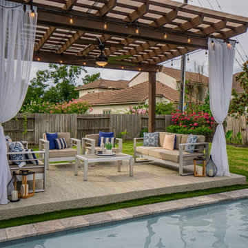
 Richard's Total Backyard Solutions
Picture perfect Outdoor Living Space for the family to enjoy and even for the perfect date night under the stars!
100' perimeter geometric style pool & spa combo in Sugar Land. Key features of the project:
- Centered and slightly raised geometric style spa
- Travertine ledger stone and coping throughout the pool & raised wall feature
- "California Smoke" Comfort Decking around the pool and under the pergola
- 15' wide tanning ledge that is incorporated into the pool steps
- Two large fire bowls
- 10 x 16 Pergola with polycarbonate clear cover
- Artificial turf borders most the pool area in
- Plaster color: Marquis Saphire
#HotTubs #SwimSpas #CustomPools #HoustonPoolBuilder #Top50Builder #Top50Service #Outdoorkitchens #Outdoorliving
1