
Search results for "Typical challenges" in Home Design Ideas
 Prima Construction
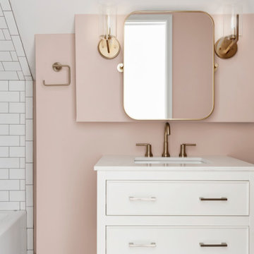
Project Goal: Utilize an unfinished story and a half-space to give each daughter a bedroom on the second floor along with a new full bath.
Challenge 1: The sloped ceilings in the area presented a challenge to how we could most cost-effectively add a bathroom within building code limits.
Solution 1: We’ve come across this challenge often when trying to fit a bathroom in sloped ceiling spaces and the budget or roof doesn't support adding a dormer. In these cases, we built out what we call a "vanity soffit", a tall soffit spanning from higher on the angled portion down to a comfortable height above the faucet bringing the upper portion of the flat wall forward. Its width typically depends on lighting needs and other considerations in the space. The vanity soffit allows the vanity to drop back to the original wall maintaining floor space and clearances while also providing just enough additional height for a practical mirror. For further flexibility, we typically recommend a pivoting mirror.
Challenge 2: Homeowners were told the floor structure was sound to finish for living space. Due to the spans, the first-floor ceiling joists did not meet the requirements to be second-floor floor joists.
Solution 2: In order to provide a solid base for the new living space, we consulted our engineer. The existing 2x6 members spanned beyond the distance they could while still structurally supporting the new living space floor. We determined throughout most of the space we needed to add in (“sister”) 2 additional 2x6 joists between the existing joists.
This additional work also took place during an unseasonably warm spell in June yet we persevered. So proud of our hard-working team.
 Alexandra Lauren Interior Design
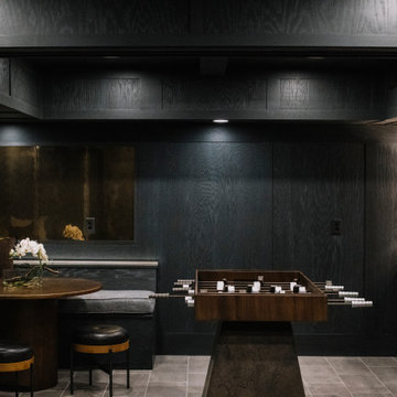
The basement was completely devoid of natural light which can typically be challenging in design. Rather than fight it we leaned into it and went with a black cerused oak finish on the walls and added ambient uplighting on the amulet mist gold reflective tiles to create the illusion of mirrors and a continuation of space in the bar and gaming area. A variation of the same wood tone turns into fluted wall paneling in the adjacent room. A corner banquette forms flexible seating around a beautiful wood gaming table and artful foosball table.
 2 Gays & a Design, LLC
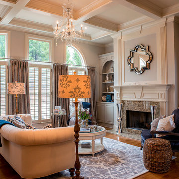
Living room - traditional formal dark wood floor living room idea in Atlanta with gray walls, a standard fireplace and no tv
Find the right local pro for your project
 Breeze Giannasio Interiors
Stacey Zarin Goldberg
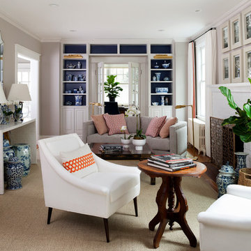
Large eclectic open concept light wood floor living room library photo in DC Metro with white walls, a standard fireplace, a brick fireplace and no tv
Large eclectic open concept light wood floor living room library photo in DC Metro with white walls, a standard fireplace, a brick fireplace and no tv
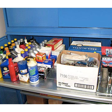
 Lista & Vidmar - Storage & Workspace Systems
When Joe Germann founded Motorhead Extraordinaire in 2005, his shop was your typical motorhead shop – lots of hand-me-downs, "way too many" piles of junk, and always too much work going on. Joe used the shop for full frame-up restorations that involved engine work, body work, painting, etc. – your typical hard-core home based restoration shop.
The shop was a 24' x 32' building with a cathedral ceiling and was carved up into two car bays (one with a lift), and a bay for the workshop area. The office was located in a spare room in the house, only big enough for one person to work in at a time. Typical of 15 year old shops, it had a collection of everything in every corner – "your basic junk shop."
Joe knew he needed a shop and home office to better meet his needs and to be a reflection of his business philosophies. His goals were simple:
1. Upgrade the workshop to the 21st century and make it more efficient for the space he had and the type of work he likes to do in there
2. Add a new office to run the business out of
3. Make it an enjoyable place to hang out to swill a few beers and smoke a few good cigars!
Mission accomplished.
Joe added a 12' x 22' office addition and remodeled the existing garage/workshop area. (Trying to simultaneously work on restorations – a '71 Corvette and a Raven – as well as doing engine work on his Wild Child drag car was a challenge, to say the least.) Both the new shop and office are fully furnished with a host of Lista storage and workspace products.
“ The Lista workspaces are simply awesome and work out so well for us. ”
Joe raves, "The Lista workspaces are simply awesome and work out so well for us. The desks are at a 35-1/2" workbench height so they are comfortable to use either standing up or sitting down in a Lista work chair. My workspace uses a Nexus frame system with 16" overhead cabinets and a large double hinged door storage cabinet with roll-out trays, which we use to store product catalogs and other heavy stacks of literature. In my wife Isabelle's work area, we used 12' of standard overhead cabinets fastened directly to the wall and a large 12' long double workspace. She has two heavy-duty Lista file cabinets, and believe me they are loaded up and work flawlessly!"
Joe is a big fan of Lista products, which he sells through his business. "Well-thought-out is an understatement. Lista workspace solutions are among the most functional, highest quality, and best value available today. There is nothing as sturdy and long lasting as Lista workspace products."
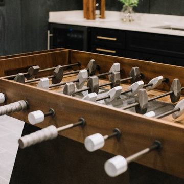 Alexandra Lauren Interior Design
 The basement was completely devoid of natural light which can typically be challenging in design. Rather than fight it we leaned into it and went with a black cerused oak finish on the walls and added ambient uplighting on the amulet mist gold reflective tiles to create the illusion of mirrors and a continuation of space in the bar and gaming area. A variation of the same wood tone turns into fluted wall paneling in the adjacent room. A corner banquette forms flexible seating around a beautiful wood gaming table and artful foosball table.
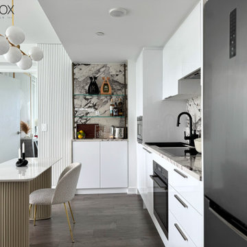
 Paradox Interior Design Inc.
Challenge: Our client needed their downtown Toronto condo to serve as a peaceful retreat from the demanding pace of urban professional life. The space suffered from the sterile, impersonal aesthetic typical of many Toronto condos, lacking the warmth and tranquility needed to truly unwind after busy workdays in the city's core.
Solution: We approached this project in thoughtful stages, transforming the condo into a serene sanctuary that promotes relaxation and rejuvenation. By incorporating a palette of light, calming colors and introducing rich textural elements throughout the space, we elevated the sterile interior into a sophisticated retreat. Each design decision was made with the goal of creating visual and tactile interest that would engage the senses and promote a sense of calm.
Highlights: • Staged design approach that allowed for thoughtful evolution of the space • Light color palette that enhances natural light and creates an airy, peaceful atmosphere • Rich variety of textures that add warmth and visual interest to combat sterile condo interiors • Strategic material selection that transforms typical condo finishes into sophisticated design elements
Results: The transformed Downtown Zen condo now serves as the perfect urban escape—a space that immediately shifts the client's mindset from work mode to relaxation. This project demonstrates how thoughtful design can overcome the limitations of typical Toronto condo interiors, creating a personalized sanctuary that enhances daily life and well-being.


 Paradox Interior Design Inc.
Challenge: Our client needed their downtown Toronto condo to serve as a peaceful retreat from the demanding pace of urban professional life. The space suffered from the sterile, impersonal aesthetic typical of many Toronto condos, lacking the warmth and tranquility needed to truly unwind after busy workdays in the city's core.
Solution: We approached this project in thoughtful stages, transforming the condo into a serene sanctuary that promotes relaxation and rejuvenation. By incorporating a palette of light, calming colors and introducing rich textural elements throughout the space, we elevated the sterile interior into a sophisticated retreat. Each design decision was made with the goal of creating visual and tactile interest that would engage the senses and promote a sense of calm.
Highlights: • Staged design approach that allowed for thoughtful evolution of the space • Light color palette that enhances natural light and creates an airy, peaceful atmosphere • Rich variety of textures that add warmth and visual interest to combat sterile condo interiors • Strategic material selection that transforms typical condo finishes into sophisticated design elements
Results: The transformed Downtown Zen condo now serves as the perfect urban escape—a space that immediately shifts the client's mindset from work mode to relaxation. This project demonstrates how thoughtful design can overcome the limitations of typical Toronto condo interiors, creating a personalized sanctuary that enhances daily life and well-being.
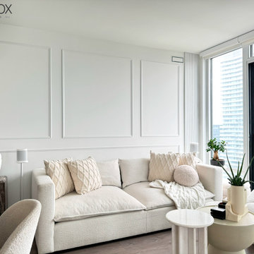 Paradox Interior Design Inc.
Challenge: Our client needed their downtown Toronto condo to serve as a peaceful retreat from the demanding pace of urban professional life. The space suffered from the sterile, impersonal aesthetic typical of many Toronto condos, lacking the warmth and tranquility needed to truly unwind after busy workdays in the city's core.
Solution: We approached this project in thoughtful stages, transforming the condo into a serene sanctuary that promotes relaxation and rejuvenation. By incorporating a palette of light, calming colors and introducing rich textural elements throughout the space, we elevated the sterile interior into a sophisticated retreat. Each design decision was made with the goal of creating visual and tactile interest that would engage the senses and promote a sense of calm.
Highlights: • Staged design approach that allowed for thoughtful evolution of the space • Light color palette that enhances natural light and creates an airy, peaceful atmosphere • Rich variety of textures that add warmth and visual interest to combat sterile condo interiors • Strategic material selection that transforms typical condo finishes into sophisticated design elements
Results: The transformed Downtown Zen condo now serves as the perfect urban escape—a space that immediately shifts the client's mindset from work mode to relaxation. This project demonstrates how thoughtful design can overcome the limitations of typical Toronto condo interiors, creating a personalized sanctuary that enhances daily life and well-being.
 Paradox Interior Design Inc.
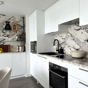
Challenge: Our client needed their downtown Toronto condo to serve as a peaceful retreat from the demanding pace of urban professional life. The space suffered from the sterile, impersonal aesthetic typical of many Toronto condos, lacking the warmth and tranquility needed to truly unwind after busy workdays in the city's core.
Solution: We approached this project in thoughtful stages, transforming the condo into a serene sanctuary that promotes relaxation and rejuvenation. By incorporating a palette of light, calming colors and introducing rich textural elements throughout the space, we elevated the sterile interior into a sophisticated retreat. Each design decision was made with the goal of creating visual and tactile interest that would engage the senses and promote a sense of calm.
Highlights: • Staged design approach that allowed for thoughtful evolution of the space • Light color palette that enhances natural light and creates an airy, peaceful atmosphere • Rich variety of textures that add warmth and visual interest to combat sterile condo interiors • Strategic material selection that transforms typical condo finishes into sophisticated design elements
Results: The transformed Downtown Zen condo now serves as the perfect urban escape—a space that immediately shifts the client's mindset from work mode to relaxation. This project demonstrates how thoughtful design can overcome the limitations of typical Toronto condo interiors, creating a personalized sanctuary that enhances daily life and well-being.
 Architect
Not all architectural imagery is created equal. Some renderings look obviously computer-generated, with flat lighting and plastic-looking materials that fail to convince viewers. Others are so precise that they are indistinguishable from photographs. That second category, realistic architectural visualization rendering, has become the standard expectation for architects, developers, and marketers who need imagery capable of withstanding close scrutiny from investors, buyers, and planning authorities. As audiences grow more visually literate, the tolerance for obviously artificial, video-game-like imagery in professional presentations continues to shrink.
What Sets Realistic Visualization Apart
Realistic architectural visualization goes beyond simply modeling a building in three dimensions. It requires physically accurate lighting simulation, true-to-life material properties, and careful attention to the small imperfections that make real-world photography convincing, such as subtle reflections, ambient occlusion in corners, and natural depth of field. The goal is an image that a viewer would believe was captured by a camera on-site rather than generated by software. Achieving that level of believability typically means dozens of small adjustments layered on top of one another rather than any single dramatic setting.
Realistic Versus Stylized Rendering Approaches
Stylized or conceptual renderings still have their place, particularly in early design phases when a looser, more artistic representation helps convey mood without locking in every detail. But once a project moves toward marketing, investment, or permitting, stakeholders need to see exactly what they are getting. Realistic visualization removes ambiguity, showing true material colors, accurate proportions, and honest lighting conditions rather than idealized abstractions. Understanding which approach a project actually needs at each stage helps clients avoid paying for a level of polish that a given milestone does not yet require.
Why Realism Builds Client and Buyer Confidence
Buyers and investors are understandably skeptical of overly polished or unrealistic marketing images. When a rendering looks convincingly real, it builds trust rather than raising doubts about what the finished project will actually look like. This is especially important in real estate presales, where buyers are committing significant sums based largely on visual material rather than a finished physical space. A rendering that later turns out to have misrepresented the finished product can also create legal and reputational exposure for developers, making accuracy a genuine business risk rather than just an aesthetic preference.
The Technical Pillars Behind Every Realistic Scene
Achieving true realism depends on several technical disciplines working together: physically based rendering engines that simulate how light actually behaves, high-resolution texture libraries that replicate real materials like stone, wood, and glass, and careful camera work that mimics real photographic lenses and exposure. Post-production adds a final layer of color grading and atmospheric effects that ties everything together into a cohesive, believable image. Each of these pillars depends on the others; even flawless material work can be undermined by lighting that behaves in a physically implausible way.
Applications Across Residential, Commercial, and Institutional Projects
Realistic visualization serves a wide range of building types, from single-family homes and luxury condominiums to office towers, hotels, schools, and healthcare facilities. Each typology has its own material palette and lighting expectations, and an experienced studio adjusts its approach accordingly, whether that means warm, inviting tones for a residential lobby or crisp, professional lighting for a corporate headquarters. Institutional clients such as universities and hospitals often have additional requirements around accessibility signage and wayfinding, which need to be represented accurately alongside the architecture itself.
How AIMIR CG Delivers Photorealistic Accuracy
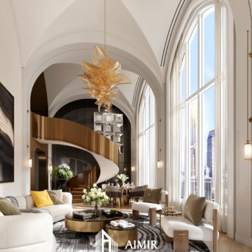
Our studio specializes in realistic architectural visualization rendering that holds up under close inspection. Every project moves through a disciplined pipeline of modeling, texturing, lighting, and post-production review, with artists cross-checking material references and lighting studies against real-world photography. This attention to detail is why clients consistently describe our end product as impressive and our process as easy to work with. A dedicated quality review stage before delivery catches inconsistencies that might otherwise slip through a faster, less structured pipeline.
Common Challenges in Achieving True Realism
Realistic rendering is technically demanding. Common obstacles include accurately simulating how light bounces between surfaces, matching material reflectivity to real product specifications, and avoiding the uncanny, slightly artificial look that comes from over-processed images. Overcoming these challenges requires experienced artists who understand both the science of light and the craft of photography, not just software proficiency. Rushed production schedules are often the real culprit behind unconvincing renderings, since realism typically requires several iterative passes rather than a single render.
What to Look for in a Realism-Focused Rendering Studio
When evaluating a rendering partner, review their portfolio critically. Do the images include convincing shadow detail and material variation, or do surfaces look uniformly smooth and artificial? Ask about their revision process and how closely they work with architects to source accurate material and lighting references, since realism is ultimately the product of disciplined collaboration, not a single software setting. It also helps to ask for examples of past projects in a similar building type, since a studio's strengths can vary across typologies.
Ready for Renderings That Look Real
If your project deserves imagery that can stand up to the scrutiny of investors, buyers, and planning boards, AIMIR CG is ready to help. Our team combines technical precision with artistic judgment to deliver visualization that looks and feels genuinely real. Contact us to discuss how photorealistic rendering can strengthen your next presentation or marketing campaign, and let us show you examples from projects similar to your own.
 Alexandra Lauren Interior Design
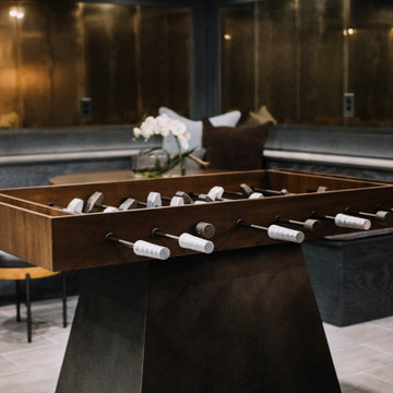
 The basement was completely devoid of natural light which can typically be challenging in design. Rather than fight it we leaned into it and went with a black cerused oak finish on the walls and added ambient uplighting on the amulet mist gold reflective tiles to create the illusion of mirrors and a continuation of space in the bar and gaming area. A variation of the same wood tone turns into fluted wall paneling in the adjacent room. A corner banquette forms flexible seating around a beautiful wood gaming table and artful foosball table.
 Alexandra Lauren Interior Design
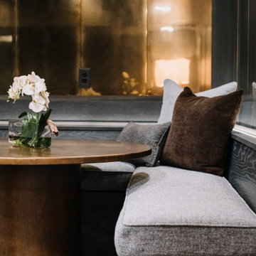
 The basement was completely devoid of natural light which can typically be challenging in design. Rather than fight it we leaned into it and went with a black cerused oak finish on the walls and added ambient uplighting on the amulet mist gold reflective tiles to create the illusion of mirrors and a continuation of space in the bar and gaming area. A variation of the same wood tone turns into fluted wall paneling in the adjacent room. A corner banquette forms flexible seating around a beautiful wood gaming table and artful foosball table.
 Cochrane Floors & More
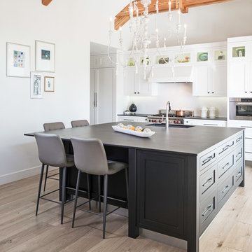
This amazing hardwood is build for the most challenging of climates! Although available in 6" 7"& 8" wide planks as seen here, the meticulous construction provides excellent dimensional stability and a durable surface that easily stands up to normal wear while offering an exquisite finish.
With the large open layout in this home, the soft tones and wide planks really help to warm the space up and add just enough coziness to keep this expansive space from feeling industrial or clinical. Great blend on tone and texture!
 Karly Kristina Design
Reka Ivany Photography
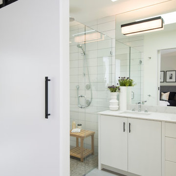
Inspiration for a mid-sized transitional master white tile and subway tile porcelain tile and gray floor walk-in shower remodel in Vancouver with flat-panel cabinets, white cabinets, a one-piece toilet, white walls, an undermount sink, quartzite countertops and a hinged shower door
Inspiration for a mid-sized transitional master white tile and subway tile porcelain tile and gray floor walk-in shower remodel in Vancouver with flat-panel cabinets, white cabinets, a one-piece toilet, white walls, an undermount sink, quartzite countertops and a hinged shower door
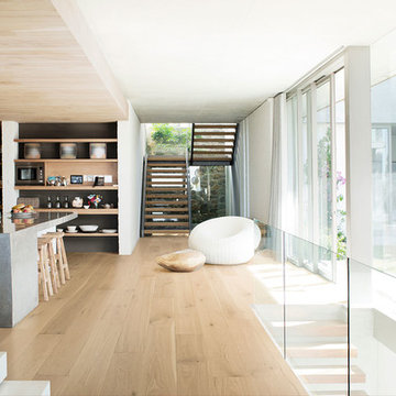
Inspiration for a contemporary medium tone wood floor and beige floor kitchen remodel in Vancouver with an island
 Carriage Lane Design-Build Inc.
Photography: Stephani Buchman
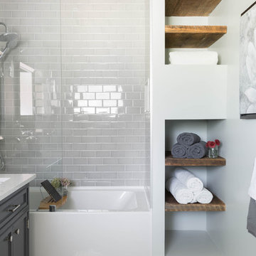
Bathroom - mid-sized contemporary master gray tile and subway tile marble floor and gray floor bathroom idea in Toronto with an undermount sink, recessed-panel cabinets, gray cabinets and gray walls
Bathroom - mid-sized contemporary master gray tile and subway tile marble floor and gray floor bathroom idea in Toronto with an undermount sink, recessed-panel cabinets, gray cabinets and gray walls
 Simply Home Decorating
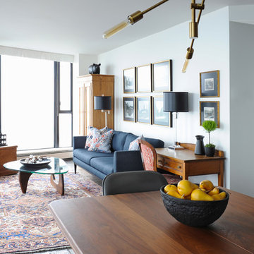
The homeowners of this condo sought our assistance when downsizing from a large family home on Howe Sound to a small urban condo in Lower Lonsdale, North Vancouver. They asked us to incorporate many of their precious antiques and art pieces into the new design. Our challenges here were twofold; first, how to deal with the unconventional curved floor plan with vast South facing windows that provide a 180 degree view of downtown Vancouver, and second, how to successfully merge an eclectic collection of antique pieces into a modern setting. We began by updating most of their artwork with new matting and framing. We created a gallery effect by grouping like artwork together and displaying larger pieces on the sections of wall between the windows, lighting them with black wall sconces for a graphic effect. We re-upholstered their antique seating with more contemporary fabrics choices - a gray flannel on their Victorian fainting couch and a fun orange chenille animal print on their Louis style chairs. We selected black as an accent colour for many of the accessories as well as the dining room wall to give the space a sophisticated modern edge. The new pieces that we added, including the sofa, coffee table and dining light fixture are mid century inspired, bridging the gap between old and new. White walls and understated wallpaper provide the perfect backdrop for the colourful mix of antique pieces. Interior Design by Lori Steeves, Simply Home Decorating. Photos by Tracey Ayton Photography

 LeichtUSA
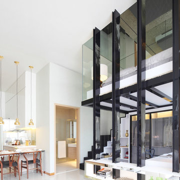
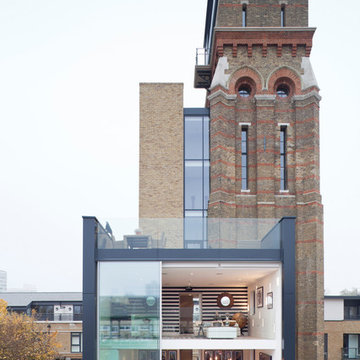
Attractive living as an architectural experiment: a 136-year-old water tower, a listed building with a spectacular 360-degree panorama view over the City of London. The task, to transform it into a superior residence, initially seemed an absolute impossibility. But when the owners came across architect Mike Collier, they had found a partner who was to make the impossible possible. The tower, which had been empty for decades, underwent radical renovation work and was extended by a four-storey cube containing kitchen, dining and living room - connected by glazed tunnels and a lift shaft. The kitchen, realised by Enclosure Interiors in Tunbridge Wells, Kent, with furniture from LEICHT is the very heart of living in this new building.
Shiny white matt-lacquered kitchen fronts (AVANCE-LR), tone-on-tone with the worktops, reflect the light in the room and thus create expanse and openness. The surface of the handle-less kitchen fronts has a horizontal relief embossing; depending on the light incidence, this results in a vitally structured surface. The free-standing preparation isle with its vertical side panels with a seamlessly integrated sink represents the transition between kitchen and living room. The fronts of the floor units facing the dining table were extended to the floor to do away with the plinth typical of most kitchens. Ceiling-high tall units on the wall provide plenty of storage space; the electrical appliances are integrated here invisible to the eye. Floor units on a high plinth which thus appear to be floating form the actual cooking centre within the kitchen, attached to the wall. A range of handle-less wall units concludes the glazed niche at the top.
LEICHT international: “Architecture and kitchen” in the centre of London. www.LeichtUSA.com
9