
Search results for "Typical client" in Home Design Ideas

 RAJ Kitchen and Bath, LLC
“Full apartment design”.
IF you have not yet seen this apartment conversion before, we strongly urge you to go to the bottom left of this page and click on the short 2-minutes video. It would put a lot of things into perspective when you come back and continue reading this.
It is true we were literally handed the keys and told a list of things that they wanted to have happen and we were to go into the apartment, look at the space and come up with a design that would satisfy all of that need. UNTIL we showed up! The unit had really seen some better days but we knew we had to look past that and come up with a concept that would work for them.
The immediate challenges were centered around 3 big ideas:
1. Adding a second bedroom to the already small footprint
2. Figuring out a way to make the kitchen bigger, better and brighter
3. Creating a master room walk in closet
It’s always difficult to add new rooms into existing footprint without expanding out or up and not incurring any opportunity cost. In this case, that was exactly what we had to do. Item one and two above had to be tackled as one. We went ahead and switched out the location of the dining room and eliminating an area where there was a “nook” type eat-in area. By doing so, we were able to cut right into that footprint and change the layout of the kitchen.
That one move allowed us to dig into the kitchen design because it was now the main focal point in the apartment. It was no longer an option to keep it in that tiny hole where it was, so we had to ensure that this design was functional and aesthetically pleasing at the same time. By adding the table into the space where an Island typically would go, we were able to both cut cost and still provide a dining experience. The Table serves as an Island as well when cooking.
We then proceeded to block in the existing doorway to the dining room. By doing this, we were able to create a full room which allowed us to put a door on the other side and called that room Bedroom #2. This was easier to do because all of the mechanicals were already in that space (light, heater and windows). By shifting things around, we also achieved a huge wall to wall closet from inside. PERFECT!
Then we moved into the Single bedroom. We thought it was a big room with a small closet, so by creatively adding an L shaped wall and steal some footprint into the bedroom side, we were able to put a door on that new room and design it for the walk-in closet. Even after this, the bedroom still holds a queen size bed with 2 night stands, a TV on the wall, a sitting chair and plenty of room to walk around. This was done by rethinking the location for the bed and night stands.
The bathroom was gutted to make sure there was no leaks and rebuild from the ground up. We kept all of the plumbing where it was, added a new vanity, medicine cabinet, tiles and lighting and it was done.
From there, the rest of the unit had new flooring all throughout, paint, and lighting. After completion and walk through, this project was handed over back to the clients.
Execution and collaboration between all the trades were: Reggie and his team from Premier Interiors and Rohan from RD Mechanical Services.
p.s. Please see our website to see the video.
 RAJ Kitchen and Bath, LLC
“Full apartment design”.
IF you have not yet seen this apartment conversion before, we strongly urge you to go to the bottom left of this page and click on the short 2-minutes video. It would put a lot of things into perspective when you come back and continue reading this.
It is true we were literally handed the keys and told a list of things that they wanted to have happen and we were to go into the apartment, look at the space and come up with a design that would satisfy all of that need. UNTIL we showed up! The unit had really seen some better days but we knew we had to look past that and come up with a concept that would work for them.
The immediate challenges were centered around 3 big ideas:
1. Adding a second bedroom to the already small footprint
2. Figuring out a way to make the kitchen bigger, better and brighter
3. Creating a master room walk in closet
It’s always difficult to add new rooms into existing footprint without expanding out or up and not incurring any opportunity cost. In this case, that was exactly what we had to do. Item one and two above had to be tackled as one. We went ahead and switched out the location of the dining room and eliminating an area where there was a “nook” type eat-in area. By doing so, we were able to cut right into that footprint and change the layout of the kitchen.
That one move allowed us to dig into the kitchen design because it was now the main focal point in the apartment. It was no longer an option to keep it in that tiny hole where it was, so we had to ensure that this design was functional and aesthetically pleasing at the same time. By adding the table into the space where an Island typically would go, we were able to both cut cost and still provide a dining experience. The Table serves as an Island as well when cooking.
We then proceeded to block in the existing doorway to the dining room. By doing this, we were able to create a full room which allowed us to put a door on the other side and called that room Bedroom #2. This was easier to do because all of the mechanicals were already in that space (light, heater and windows). By shifting things around, we also achieved a huge wall to wall closet from inside. PERFECT!
Then we moved into the Single bedroom. We thought it was a big room with a small closet, so by creatively adding an L shaped wall and steal some footprint into the bedroom side, we were able to put a door on that new room and design it for the walk-in closet. Even after this, the bedroom still holds a queen size bed with 2 night stands, a TV on the wall, a sitting chair and plenty of room to walk around. This was done by rethinking the location for the bed and night stands.
The bathroom was gutted to make sure there was no leaks and rebuild from the ground up. We kept all of the plumbing where it was, added a new vanity, medicine cabinet, tiles and lighting and it was done.
From there, the rest of the unit had new flooring all throughout, paint, and lighting. After completion and walk through, this project was handed over back to the clients.
Execution and collaboration between all the trades were: Reggie and his team from Premier Interiors and Rohan from RD Mechanical Services.
p.s. Please see our website to see the video.
 RAJ Kitchen and Bath, LLC
“Full apartment design”.
IF you have not yet seen this apartment conversion before, we strongly urge you to go to the bottom left of this page and click on the short 2-minutes video. It would put a lot of things into perspective when you come back and continue reading this.
It is true we were literally handed the keys and told a list of things that they wanted to have happen and we were to go into the apartment, look at the space and come up with a design that would satisfy all of that need. UNTIL we showed up! The unit had really seen some better days but we knew we had to look past that and come up with a concept that would work for them.
The immediate challenges were centered around 3 big ideas:
1. Adding a second bedroom to the already small footprint
2. Figuring out a way to make the kitchen bigger, better and brighter
3. Creating a master room walk in closet
It’s always difficult to add new rooms into existing footprint without expanding out or up and not incurring any opportunity cost. In this case, that was exactly what we had to do. Item one and two above had to be tackled as one. We went ahead and switched out the location of the dining room and eliminating an area where there was a “nook” type eat-in area. By doing so, we were able to cut right into that footprint and change the layout of the kitchen.
That one move allowed us to dig into the kitchen design because it was now the main focal point in the apartment. It was no longer an option to keep it in that tiny hole where it was, so we had to ensure that this design was functional and aesthetically pleasing at the same time. By adding the table into the space where an Island typically would go, we were able to both cut cost and still provide a dining experience. The Table serves as an Island as well when cooking.
We then proceeded to block in the existing doorway to the dining room. By doing this, we were able to create a full room which allowed us to put a door on the other side and called that room Bedroom #2. This was easier to do because all of the mechanicals were already in that space (light, heater and windows). By shifting things around, we also achieved a huge wall to wall closet from inside. PERFECT!
Then we moved into the Single bedroom. We thought it was a big room with a small closet, so by creatively adding an L shaped wall and steal some footprint into the bedroom side, we were able to put a door on that new room and design it for the walk-in closet. Even after this, the bedroom still holds a queen size bed with 2 night stands, a TV on the wall, a sitting chair and plenty of room to walk around. This was done by rethinking the location for the bed and night stands.
The bathroom was gutted to make sure there was no leaks and rebuild from the ground up. We kept all of the plumbing where it was, added a new vanity, medicine cabinet, tiles and lighting and it was done.
From there, the rest of the unit had new flooring all throughout, paint, and lighting. After completion and walk through, this project was handed over back to the clients.
Execution and collaboration between all the trades were: Reggie and his team from Premier Interiors and Rohan from RD Mechanical Services.
p.s. Please see our website to see the video.
Find the right local pro for your project

 Not Just Closets
SOME OF OUR PROJECTS
We at Not Just Closets are proud of our workmanship, our creativity, and the help we have been able to provide to our many clients. We look forward to meeting you, and working with you to find just the right solution to your space organization problems. Perhaps photos of your project will wind up here in the Portfolio section.
We will be adding to the examples in this web page as we complete more projects. This web page was created on 11/05/2013, so expect the examples displayed to continue to grow in the coming years.
We were pleased to be invited to do a new Master Bedroom Closet project for a home in Albuquerque that was featured in the 2013 Parade of Homes. Perhaps you visited it during the 2013 Parade? The next 4 images are from that home.
The closet was long and narrow but there was plenty of space for hanging clothes and drawer units as well as for folded clothes, shoes and other items. All this was accomplished without sacrificing elbow room in this narrow space.
Views from the bathroom into the Master Closet.
Another perspective of the Master Closet.
The closets shown here were designed for a NE Heights home in Albuquerque. They were installed and photos were taken before any clothes or other items were added. The dark pullout in the first image is a clothes hamper.
These light colored cabinets were chosen for the Master Bedroom closet to help keep the space bright and light. Note the two rows of hangars for shirts and dresses above, and pants below.
The double row of drawers in this closet replaces the typical Chest of Drawers without sacrificing the extra space needed for the chest. This is a great addition to any closet.
The last closet photo shows a two-door vertical storage closet on the right that is very flexible to configure. It can be outfitted to store clothes, shoes, jewelry, or other items. Also note the extra-length hangar space for formal dresses or long gowns.
Not Just Closets was also contracted to do the Pantry in the above home. Please notice that the shelving wraps around the corners, providing the greatest amount of storage space. Also you will find that the spacing on the shelves was designed to allow for a large number of varying size items in the pantry. There are large shelves on the bottom since large items are usually heavy and bulky. Seldom-used items can also be stored on the top shelf.
The storage shelves shown are in a large walk-in pantry, with a concommitantly large number of shelves. Dark colored cabinets were chosen for the Pantry to match the Kitchen cabinets.
We were asked to design and install the closets for a house in the October 2014 Parade of Homes. The view is of an extremely large walk-in closet with upper and lower hanging bars, tall hanging areas, and a huge amount of cabinet and drawer storage.
The next two views portray the same closet, demonstrating the size of the closet and the many wrap around hanging areas, shelves, storage cabinets, and drawers. All four walls were filled with these features.
The closet also has a pull-down ironing board, allowing for quick refreshing of creases in trousers or straightening of dresses.
Not Just Closets also does commercial installations, as evidenced by the corporate office kitchen and file storage solutions shown here. This photo is of a work center island incorporating file storage. Not shown is another large set of shelves for bulk storage.
The back side of the work center also has cabinets for storage.
This is a view of the Break Center at the corporate office. The counter, sink and upper and lower cabinets were all designed and installed by Not Just Closets.
Photo A - Shown is a corner shelf unit for a child's closet in a 2015 Parade of Homes residence. The corner unit stores many toys in a neat, orderly fashion.
Photo B - Hanging space above drawers illustrates the versatility of our units.
Every inch of space is utilized in this Master Bedroom Closet in the 2015 Parade of Homes residence.
Roll-out shelves offer convenience and easy access to a pantry in the 2015 Parade of Homes kitchen.
This customer said - "Total 100% customer satisfaction. I love it! It is the crown jewel of the room. Every woman who has seen it has mentioned they are jealous of it all". We agree.
This closet was custom-designed for blueprint storage for an architect.
Master Bedroom closet units offer a variety of ways to hang and store clothes. Above the double hang and drawer unit are wardrobe lifts (not shown at the top of this photograph) to store seasonal clothes.
A small bedroom closet can be made more useful with the right combination of hangs (hanging racks) and shelving.
An entry closet with double hangs and a convenient bench for removing and storing shoes.
This is a Master Bedroom Closet with adjustable shelves to organize and optimize the storage needs of the customer. The large nest of small drawers just exudes an aura of organization, and the shoe storage is adjusted to hold different sizes of boots and shoes.

 CRC Builders Inc.
The homeowers' home is in the Napa Valley area of California where style is everything. The area has a rich history and the home has a magnificent view of Mt. Diablo.
The clients wanted to upgrade from the 80s tract look to early California Colonial look. They wanted attention to detail, and they wanted an indoor and outdoor "living" home because they wanted to spend as much time outdoors as indoors. They also wanted to construct an open, outside cabana style living room with a classic fireplace.
The home was completely remodeled. Every room and every surface, inside and out, to some extent, got a makeover. The existing "typical" California patio was made part of the structure with a 20x20, 400 square foot cabana style addition, with 14' ceilings under a new roof system. In an effort to bring the outside in, a two-tiered pre-cast concrete fountain was installed, providing just the right touch of ambiance. A pre-cast concrete fireplace with a double corbel Mediterranean mantle was then set and surrounded with tile. The floor was set with travertine and the walls were finished with a smooth finish plaster.
To create a more formal atmosphere, the cabana patio has Mediterranean archways with fabric curtains for inclement weather. The cabana patio is divided into two separate areas, one for enjoying a meal with friends, and the other for merely sitting and enjoying the beautiful Northern California weather. Each of the areas received Mission-style chandeliers; task lighting was provided by recessed can lights. Hacienda blend cap and pan roof tiles were applied to the entire roof and then finished with a copper Conestoga chimney top. Smooth stucco was applied and painted in a Fallbrook color.
A new, stamped concrete driveway accents and welcomes visitors The new front door is a custom round top plank door from Antigua Door with a round transom system, 2-1/4" thick Spanish cedar planks, round transom-lights, and a speakeasy opening with an inset diamond grill; it received a light glaze and was manually distressed.
The kitchen ceiling became a vaulted ceiling. The floor was covered with travertine set in a basket weave pattern and the back splash as set with 4x4, multi-color tiles set on a center grid pattern. The cabinet carcasses were custom manufactured Cimino doors and finished with an opaque conversion varnish with a two-art glaze. Display cabinets were inset with decorative wire grilles and then finished with a custom glaze. Bourdeux granite was used on the countertops. A new Thermodor gas range was installed with a custom built plaster range hood with a Vent-a-hood liner insert. This was particularly troublesome because structural members had to be modfied to accommodate the installation. New drywall was installed with an imperfect, smooth finish.
The family room also received a vaulted ceiling and ten-lite exterior, out-swing, wooden doors with a walnut finish and dark glaze. A flat screen TV was placed over the mantle with three surrounding speakers. The mantle is of hand-hewn alder, distressed, and finished with a dark glaze. The cabinetry matches that of the kitchen with Juliano upper doors, shaker lower doors with lattice inset to allow air cooling for the electronics, and a rope detail flanking either end. These were finished with a pigmented glaze. The inside fireplace mantle was constructed from a single, hand-hewn, irregular planed, 8" alder timber. The tile on the fireplace consisted of 4x8 Gamelan Border, 6x6 W.Z. Lambok, and 6x24 W.Z. Buyan in burnt umber from Walker Zanger.
The entry powder room received custom cabinets with custom furniture finish of opaque conversion varnish with glaze top coats. The floor received the same tile as the kitchen. The great room has a 14' ceiling, three 5-foot by 7-foot wood outswing doors with arched tops, and the tile used was the same as that used in the kitchen.
The custom front door has an arch and is made of knotty alder. The master bathroom was finished with custom furniture style cabinetry using opaque conversion varnish with glaze top coats. Countertops were Onyx. Inset into the ceiling is a custom, plaster dome with rope lighting and a central, Mission-style chandelier.
The shower is appointed with travertine tile and edging, and enclosed with custom frameless glass front panels and door. Then this well-appointed room was finished with a slipper style tub. In an effort to bring sound throughout the house, an RA, wireless radio system was installed with separate controls in each room. This was an afterthought of the clients, thus the use of wireless technology. Two spaces originally dedicated to smaller bedrooms, were converted into a state-of-the-art workout room replete with mirrors surrounding the walls. And a custom office was constructed in the other. The office, build in a "L" shape received the same cabinetry with places for computer, fax, etc., as the rest of the house and the closet received custom storage units.
California living at its best.
 TKS Design Group
Download our free ebook, Creating the Ideal Kitchen. DOWNLOAD NOW
I am still sometimes shocked myself at how much of a difference a kitchen remodel can make in a space, you think I would know by now! This was one of those jobs. The small U-shaped room was a bit cramped, a bit dark and a bit dated. A neighboring sunroom/breakfast room addition was awkwardly used, and most of the time the couple hung out together at the small peninsula.
The client wish list included a larger, lighter kitchen with an island that would seat 7 people. They have a large family and wanted to be able to gather and entertain in the space. Right outside is a lovely backyard and patio with a fireplace, so having easy access and flow to that area was also important.
Our first move was to eliminate the wall between kitchen and breakfast room, which we anticipated would need a large beam and some structural maneuvering since it was the old exterior wall. However, what we didn’t anticipate was that the stucco exterior of the original home was layered over hollow clay tiles which was impossible to shore up in the typical manner. After much back and forth with our structural team, we were able to develop a plan to shore the wall and install a large steal & wood structural beam with minimal disruption to the original floor plan. That was important because we had already ordered everything customized to fit the plan.
We all breathed a collective sigh of relief once that part was completed. Now we could move on to building the kitchen we had all been waiting for. Oh, and let’s not forget that this was all being done amidst COVID 2020.
We covered the rough beam with cedar and stained it to coordinate with the floors. It’s actually one of my favorite elements in the space. The homeowners now have a big beautiful island that seats up to 7 people and has a wonderful flow to the outdoor space just like they wanted. The large island provides not only seating but also substantial prep area perfectly situated between the sink and cooktop. In addition to a built-in oven below the large gas cooktop, there is also a steam oven to the left of the sink. The steam oven is great for baking as well for heating daily meals without having to heat up the large oven.
The other side of the room houses a substantial pantry, the refrigerator, a small bar area as well as a TV.
The homeowner fell in love the with the Aqua quartzite that is on the island, so we married that with a custom mosaic in a similar tone behind the cooktop. Soft white cabinetry, Cambria quartz and Thassos marble subway tile complete the soft traditional look. Gold accents, wood wrapped beams and oak barstools add warmth the room. The little powder room was also included in the project. Some fun wallpaper, a vanity with a pop of color and pretty fixtures and accessories finish off this cute little space.
Designed by: Susan Klimala, CKD, CBD
Photography by: Michael Kaskel
For more information on kitchen and bath design ideas go to: www.kitchenstudio-ge.com
 USI Design & Remodeling
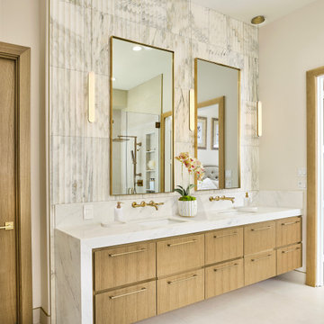
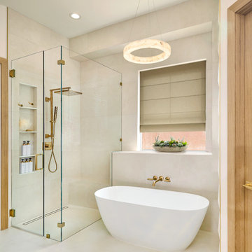
This master bathroom renovation in Frisco was completed for a repeat USI Design & Remodeling client as part of a larger first-floor transformation of the home. The original bathroom reflected a very typical North Texas layout of its era — dark stained cabinetry, granite countertops, compartmentalized vanities, a built-in tub adjoining a framed shower, and separated spaces that no longer aligned with how the homeowners wanted to live. As their aesthetic evolved toward a more transitional and contemporary direction, the goal became less about replacing finishes and more about redefining the experience of the room itself. The project needed to feel calmer, more architectural, and far more intentional in how the space functioned visually and emotionally.
One of the most important changes was removing the original shower curb and pony wall in favor of a fully open curbless shower with ultra-clear ½-inch heavy glass. Achieving that look required recessing the slab, re-floating the shower floor toward a linear drain, and engineering the space so the room would read as visually uninterrupted from end to end. Throughout the project, many of the design decisions were rooted in restraint rather than excess. The oversized 24x48 Porcelanosa flooring carries very little shade variation, creating a quieter visual field, while the cabinetry was executed in rift-sawn white oak specifically because it produces a far more controlled and consistent finish outcome than more common cuts of wood. In luxury projects, consistency itself becomes part of the refinement.
The floating vanity was designed more like custom furniture than traditional cabinetry, utilizing waterfall mitered edges and fully reworked plumbing locations so both homeowners could share in having generous functional countertop space. The original makeup station was repurposed into integrated storage with powered drawers and concealed organization for everyday items such as blow dryers and flat irons. Along the vanity wall, wall-mounted plumbing fixtures were paired with ribbed natural marble surfaces — a detail that required intentional planning long before construction began. Rather than allowing the ribbed material to terminate awkwardly behind the fixtures, the backsplash and stone transitions were specifically designed to resolve those conditions cleanly. Those are the types of details that distinguish highly coordinated design-build work from projects that simply assemble materials together.
While the room contains a significant amount of luxury detailing — from the freestanding tub and geoprism marble focal wall to the custom rift-sawn white oak closet doors and elongated mirrors that leverage the 11-foot ceiling heights — the project was always guided by quiet luxury rather than visual competition. Even the water closet enclosure was handled with restraint through the use of a satin-etched glass door rather than another heavy solid opening. The intent throughout was to create a bathroom that feels restorative and serene rather than overdesigned. In our view, the best luxury spaces are the ones that feel composed long after the initial impression wears off.
Sponsored
Columbus, OH

Wannemacher Interiors
Customized Award-Winning Interior Design Solutions in Franklin Cnty OH
 USI Design & Remodeling
This master bathroom renovation in Frisco was completed for a repeat USI Design & Remodeling client as part of a larger first-floor transformation of the home. The original bathroom reflected a very typical North Texas layout of its era — dark stained cabinetry, granite countertops, compartmentalized vanities, a built-in tub adjoining a framed shower, and separated spaces that no longer aligned with how the homeowners wanted to live. As their aesthetic evolved toward a more transitional and contemporary direction, the goal became less about replacing finishes and more about redefining the experience of the room itself. The project needed to feel calmer, more architectural, and far more intentional in how the space functioned visually and emotionally.
One of the most important changes was removing the original shower curb and pony wall in favor of a fully open curbless shower with ultra-clear ½-inch heavy glass. Achieving that look required recessing the slab, re-floating the shower floor toward a linear drain, and engineering the space so the room would read as visually uninterrupted from end to end. Throughout the project, many of the design decisions were rooted in restraint rather than excess. The oversized 24x48 Porcelanosa flooring carries very little shade variation, creating a quieter visual field, while the cabinetry was executed in rift-sawn white oak specifically because it produces a far more controlled and consistent finish outcome than more common cuts of wood. In luxury projects, consistency itself becomes part of the refinement.
The floating vanity was designed more like custom furniture than traditional cabinetry, utilizing waterfall mitered edges and fully reworked plumbing locations so both homeowners could share in having generous functional countertop space. The original makeup station was repurposed into integrated storage with powered drawers and concealed organization for everyday items such as blow dryers and flat irons. Along the vanity wall, wall-mounted plumbing fixtures were paired with ribbed natural marble surfaces — a detail that required intentional planning long before construction began. Rather than allowing the ribbed material to terminate awkwardly behind the fixtures, the backsplash and stone transitions were specifically designed to resolve those conditions cleanly. Those are the types of details that distinguish highly coordinated design-build work from projects that simply assemble materials together.
While the room contains a significant amount of luxury detailing — from the freestanding tub and geoprism marble focal wall to the custom rift-sawn white oak closet doors and elongated mirrors that leverage the 11-foot ceiling heights — the project was always guided by quiet luxury rather than visual competition. Even the water closet enclosure was handled with restraint through the use of a satin-etched glass door rather than another heavy solid opening. The intent throughout was to create a bathroom that feels restorative and serene rather than overdesigned. In our view, the best luxury spaces are the ones that feel composed long after the initial impression wears off.
 CRC Builders Inc.
The homeowers' home is in the Napa Valley area of California where style is everything. The area has a rich history and the home has a magnificent view of Mt. Diablo.
The clients wanted to upgrade from the 80s tract look to early California Colonial look. They wanted attention to detail, and they wanted an indoor and outdoor "living" home because they wanted to spend as much time outdoors as indoors. They also wanted to construct an open, outside cabana style living room with a classic fireplace.
The home was completely remodeled. Every room and every surface, inside and out, to some extent, got a makeover. The existing "typical" California patio was made part of the structure with a 20x20, 400 square foot cabana style addition, with 14' ceilings under a new roof system. In an effort to bring the outside in, a two-tiered pre-cast concrete fountain was installed, providing just the right touch of ambiance. A pre-cast concrete fireplace with a double corbel Mediterranean mantle was then set and surrounded with tile. The floor was set with travertine and the walls were finished with a smooth finish plaster.
To create a more formal atmosphere, the cabana patio has Mediterranean archways with fabric curtains for inclement weather. The cabana patio is divided into two separate areas, one for enjoying a meal with friends, and the other for merely sitting and enjoying the beautiful Northern California weather. Each of the areas received Mission-style chandeliers; task lighting was provided by recessed can lights. Hacienda blend cap and pan roof tiles were applied to the entire roof and then finished with a copper Conestoga chimney top. Smooth stucco was applied and painted in a Fallbrook color.
A new, stamped concrete driveway accents and welcomes visitors The new front door is a custom round top plank door from Antigua Door with a round transom system, 2-1/4" thick Spanish cedar planks, round transom-lights, and a speakeasy opening with an inset diamond grill; it received a light glaze and was manually distressed.
The kitchen ceiling became a vaulted ceiling. The floor was covered with travertine set in a basket weave pattern and the back splash as set with 4x4, multi-color tiles set on a center grid pattern. The cabinet carcasses were custom manufactured Cimino doors and finished with an opaque conversion varnish with a two-art glaze. Display cabinets were inset with decorative wire grilles and then finished with a custom glaze. Bourdeux granite was used on the countertops. A new Thermodor gas range was installed with a custom built plaster range hood with a Vent-a-hood liner insert. This was particularly troublesome because structural members had to be modfied to accommodate the installation. New drywall was installed with an imperfect, smooth finish.
The family room also received a vaulted ceiling and ten-lite exterior, out-swing, wooden doors with a walnut finish and dark glaze. A flat screen TV was placed over the mantle with three surrounding speakers. The mantle is of hand-hewn alder, distressed, and finished with a dark glaze. The cabinetry matches that of the kitchen with Juliano upper doors, shaker lower doors with lattice inset to allow air cooling for the electronics, and a rope detail flanking either end. These were finished with a pigmented glaze. The inside fireplace mantle was constructed from a single, hand-hewn, irregular planed, 8" alder timber. The tile on the fireplace consisted of 4x8 Gamelan Border, 6x6 W.Z. Lambok, and 6x24 W.Z. Buyan in burnt umber from Walker Zanger.
The entry powder room received custom cabinets with custom furniture finish of opaque conversion varnish with glaze top coats. The floor received the same tile as the kitchen. The great room has a 14' ceiling, three 5-foot by 7-foot wood outswing doors with arched tops, and the tile used was the same as that used in the kitchen.
The custom front door has an arch and is made of knotty alder. The master bathroom was finished with custom furniture style cabinetry using opaque conversion varnish with glaze top coats. Countertops were Onyx. Inset into the ceiling is a custom, plaster dome with rope lighting and a central, Mission-style chandelier.
The shower is appointed with travertine tile and edging, and enclosed with custom frameless glass front panels and door. Then this well-appointed room was finished with a slipper style tub. In an effort to bring sound throughout the house, an RA, wireless radio system was installed with separate controls in each room. This was an afterthought of the clients, thus the use of wireless technology. Two spaces originally dedicated to smaller bedrooms, were converted into a state-of-the-art workout room replete with mirrors surrounding the walls. And a custom office was constructed in the other. The office, build in a "L" shape received the same cabinetry with places for computer, fax, etc., as the rest of the house and the closet received custom storage units.
California living at its best.

 Story Barns
Inspiration for a mid-sized rustic carpeted straight cable railing staircase remodel in Denver with carpeted risers
 CRC Builders Inc.
The homeowers' home is in the Napa Valley area of California where style is everything. The area has a rich history and the home has a magnificent view of Mt. Diablo.
The clients wanted to upgrade from the 80s tract look to early California Colonial look. They wanted attention to detail, and they wanted an indoor and outdoor "living" home because they wanted to spend as much time outdoors as indoors. They also wanted to construct an open, outside cabana style living room with a classic fireplace.
The home was completely remodeled. Every room and every surface, inside and out, to some extent, got a makeover. The existing "typical" California patio was made part of the structure with a 20x20, 400 square foot cabana style addition, with 14' ceilings under a new roof system. In an effort to bring the outside in, a two-tiered pre-cast concrete fountain was installed, providing just the right touch of ambiance. A pre-cast concrete fireplace with a double corbel Mediterranean mantle was then set and surrounded with tile. The floor was set with travertine and the walls were finished with a smooth finish plaster.
To create a more formal atmosphere, the cabana patio has Mediterranean archways with fabric curtains for inclement weather. The cabana patio is divided into two separate areas, one for enjoying a meal with friends, and the other for merely sitting and enjoying the beautiful Northern California weather. Each of the areas received Mission-style chandeliers; task lighting was provided by recessed can lights. Hacienda blend cap and pan roof tiles were applied to the entire roof and then finished with a copper Conestoga chimney top. Smooth stucco was applied and painted in a Fallbrook color.
A new, stamped concrete driveway accents and welcomes visitors The new front door is a custom round top plank door from Antigua Door with a round transom system, 2-1/4" thick Spanish cedar planks, round transom-lights, and a speakeasy opening with an inset diamond grill; it received a light glaze and was manually distressed.
The kitchen ceiling became a vaulted ceiling. The floor was covered with travertine set in a basket weave pattern and the back splash as set with 4x4, multi-color tiles set on a center grid pattern. The cabinet carcasses were custom manufactured Cimino doors and finished with an opaque conversion varnish with a two-art glaze. Display cabinets were inset with decorative wire grilles and then finished with a custom glaze. Bourdeux granite was used on the countertops. A new Thermodor gas range was installed with a custom built plaster range hood with a Vent-a-hood liner insert. This was particularly troublesome because structural members had to be modfied to accommodate the installation. New drywall was installed with an imperfect, smooth finish.
The family room also received a vaulted ceiling and ten-lite exterior, out-swing, wooden doors with a walnut finish and dark glaze. A flat screen TV was placed over the mantle with three surrounding speakers. The mantle is of hand-hewn alder, distressed, and finished with a dark glaze. The cabinetry matches that of the kitchen with Juliano upper doors, shaker lower doors with lattice inset to allow air cooling for the electronics, and a rope detail flanking either end. These were finished with a pigmented glaze. The inside fireplace mantle was constructed from a single, hand-hewn, irregular planed, 8" alder timber. The tile on the fireplace consisted of 4x8 Gamelan Border, 6x6 W.Z. Lambok, and 6x24 W.Z. Buyan in burnt umber from Walker Zanger.
The entry powder room received custom cabinets with custom furniture finish of opaque conversion varnish with glaze top coats. The floor received the same tile as the kitchen. The great room has a 14' ceiling, three 5-foot by 7-foot wood outswing doors with arched tops, and the tile used was the same as that used in the kitchen.
The custom front door has an arch and is made of knotty alder. The master bathroom was finished with custom furniture style cabinetry using opaque conversion varnish with glaze top coats. Countertops were Onyx. Inset into the ceiling is a custom, plaster dome with rope lighting and a central, Mission-style chandelier.
The shower is appointed with travertine tile and edging, and enclosed with custom frameless glass front panels and door. Then this well-appointed room was finished with a slipper style tub. In an effort to bring sound throughout the house, an RA, wireless radio system was installed with separate controls in each room. This was an afterthought of the clients, thus the use of wireless technology. Two spaces originally dedicated to smaller bedrooms, were converted into a state-of-the-art workout room replete with mirrors surrounding the walls. And a custom office was constructed in the other. The office, build in a "L" shape received the same cabinetry with places for computer, fax, etc., as the rest of the house and the closet received custom storage units.
California living at its best.


 CRC Builders Inc.
The homeowers' home is in the Napa Valley area of California where style is everything. The area has a rich history and the home has a magnificent view of Mt. Diablo.
The clients wanted to upgrade from the 80s tract look to early California Colonial look. They wanted attention to detail, and they wanted an indoor and outdoor "living" home because they wanted to spend as much time outdoors as indoors. They also wanted to construct an open, outside cabana style living room with a classic fireplace.
The home was completely remodeled. Every room and every surface, inside and out, to some extent, got a makeover. The existing "typical" California patio was made part of the structure with a 20x20, 400 square foot cabana style addition, with 14' ceilings under a new roof system. In an effort to bring the outside in, a two-tiered pre-cast concrete fountain was installed, providing just the right touch of ambiance. A pre-cast concrete fireplace with a double corbel Mediterranean mantle was then set and surrounded with tile. The floor was set with travertine and the walls were finished with a smooth finish plaster.
To create a more formal atmosphere, the cabana patio has Mediterranean archways with fabric curtains for inclement weather. The cabana patio is divided into two separate areas, one for enjoying a meal with friends, and the other for merely sitting and enjoying the beautiful Northern California weather. Each of the areas received Mission-style chandeliers; task lighting was provided by recessed can lights. Hacienda blend cap and pan roof tiles were applied to the entire roof and then finished with a copper Conestoga chimney top. Smooth stucco was applied and painted in a Fallbrook color.
A new, stamped concrete driveway accents and welcomes visitors The new front door is a custom round top plank door from Antigua Door with a round transom system, 2-1/4" thick Spanish cedar planks, round transom-lights, and a speakeasy opening with an inset diamond grill; it received a light glaze and was manually distressed.
The kitchen ceiling became a vaulted ceiling. The floor was covered with travertine set in a basket weave pattern and the back splash as set with 4x4, multi-color tiles set on a center grid pattern. The cabinet carcasses were custom manufactured Cimino doors and finished with an opaque conversion varnish with a two-art glaze. Display cabinets were inset with decorative wire grilles and then finished with a custom glaze. Bourdeux granite was used on the countertops. A new Thermodor gas range was installed with a custom built plaster range hood with a Vent-a-hood liner insert. This was particularly troublesome because structural members had to be modfied to accommodate the installation. New drywall was installed with an imperfect, smooth finish.
The family room also received a vaulted ceiling and ten-lite exterior, out-swing, wooden doors with a walnut finish and dark glaze. A flat screen TV was placed over the mantle with three surrounding speakers. The mantle is of hand-hewn alder, distressed, and finished with a dark glaze. The cabinetry matches that of the kitchen with Juliano upper doors, shaker lower doors with lattice inset to allow air cooling for the electronics, and a rope detail flanking either end. These were finished with a pigmented glaze. The inside fireplace mantle was constructed from a single, hand-hewn, irregular planed, 8" alder timber. The tile on the fireplace consisted of 4x8 Gamelan Border, 6x6 W.Z. Lambok, and 6x24 W.Z. Buyan in burnt umber from Walker Zanger.
The entry powder room received custom cabinets with custom furniture finish of opaque conversion varnish with glaze top coats. The floor received the same tile as the kitchen. The great room has a 14' ceiling, three 5-foot by 7-foot wood outswing doors with arched tops, and the tile used was the same as that used in the kitchen.
The custom front door has an arch and is made of knotty alder. The master bathroom was finished with custom furniture style cabinetry using opaque conversion varnish with glaze top coats. Countertops were Onyx. Inset into the ceiling is a custom, plaster dome with rope lighting and a central, Mission-style chandelier.
The shower is appointed with travertine tile and edging, and enclosed with custom frameless glass front panels and door. Then this well-appointed room was finished with a slipper style tub. In an effort to bring sound throughout the house, an RA, wireless radio system was installed with separate controls in each room. This was an afterthought of the clients, thus the use of wireless technology. Two spaces originally dedicated to smaller bedrooms, were converted into a state-of-the-art workout room replete with mirrors surrounding the walls. And a custom office was constructed in the other. The office, build in a "L" shape received the same cabinetry with places for computer, fax, etc., as the rest of the house and the closet received custom storage units.
California living at its best.
Sponsored
Columbus, OH

Snider & Metcalf Interior Design, LTD
Leading Interior Designers in Columbus, Ohio & Ponte Vedra, Florida
 RAJ Kitchen and Bath, LLC
“Full apartment design”.
IF you have not yet seen this apartment conversion before, we strongly urge you to go to the bottom left of this page and click on the short 2-minutes video. It would put a lot of things into perspective when you come back and continue reading this.
It is true we were literally handed the keys and told a list of things that they wanted to have happen and we were to go into the apartment, look at the space and come up with a design that would satisfy all of that need. UNTIL we showed up! The unit had really seen some better days but we knew we had to look past that and come up with a concept that would work for them.
The immediate challenges were centered around 3 big ideas:
1. Adding a second bedroom to the already small footprint
2. Figuring out a way to make the kitchen bigger, better and brighter
3. Creating a master room walk in closet
It’s always difficult to add new rooms into existing footprint without expanding out or up and not incurring any opportunity cost. In this case, that was exactly what we had to do. Item one and two above had to be tackled as one. We went ahead and switched out the location of the dining room and eliminating an area where there was a “nook” type eat-in area. By doing so, we were able to cut right into that footprint and change the layout of the kitchen.
That one move allowed us to dig into the kitchen design because it was now the main focal point in the apartment. It was no longer an option to keep it in that tiny hole where it was, so we had to ensure that this design was functional and aesthetically pleasing at the same time. By adding the table into the space where an Island typically would go, we were able to both cut cost and still provide a dining experience. The Table serves as an Island as well when cooking.
We then proceeded to block in the existing doorway to the dining room. By doing this, we were able to create a full room which allowed us to put a door on the other side and called that room Bedroom #2. This was easier to do because all of the mechanicals were already in that space (light, heater and windows). By shifting things around, we also achieved a huge wall to wall closet from inside. PERFECT!
Then we moved into the Single bedroom. We thought it was a big room with a small closet, so by creatively adding an L shaped wall and steal some footprint into the bedroom side, we were able to put a door on that new room and design it for the walk-in closet. Even after this, the bedroom still holds a queen size bed with 2 night stands, a TV on the wall, a sitting chair and plenty of room to walk around. This was done by rethinking the location for the bed and night stands.
The bathroom was gutted to make sure there was no leaks and rebuild from the ground up. We kept all of the plumbing where it was, added a new vanity, medicine cabinet, tiles and lighting and it was done.
From there, the rest of the unit had new flooring all throughout, paint, and lighting. After completion and walk through, this project was handed over back to the clients.
Execution and collaboration between all the trades were: Reggie and his team from Premier Interiors and Rohan from RD Mechanical Services.
p.s. Please see our website to see the video.
 RAJ Kitchen and Bath, LLC
“Full apartment design”.
IF you have not yet seen this apartment conversion before, we strongly urge you to go to the bottom left of this page and click on the short 2-minutes video. It would put a lot of things into perspective when you come back and continue reading this.
It is true we were literally handed the keys and told a list of things that they wanted to have happen and we were to go into the apartment, look at the space and come up with a design that would satisfy all of that need. UNTIL we showed up! The unit had really seen some better days but we knew we had to look past that and come up with a concept that would work for them.
The immediate challenges were centered around 3 big ideas:
1. Adding a second bedroom to the already small footprint
2. Figuring out a way to make the kitchen bigger, better and brighter
3. Creating a master room walk in closet
It’s always difficult to add new rooms into existing footprint without expanding out or up and not incurring any opportunity cost. In this case, that was exactly what we had to do. Item one and two above had to be tackled as one. We went ahead and switched out the location of the dining room and eliminating an area where there was a “nook” type eat-in area. By doing so, we were able to cut right into that footprint and change the layout of the kitchen.
That one move allowed us to dig into the kitchen design because it was now the main focal point in the apartment. It was no longer an option to keep it in that tiny hole where it was, so we had to ensure that this design was functional and aesthetically pleasing at the same time. By adding the table into the space where an Island typically would go, we were able to both cut cost and still provide a dining experience. The Table serves as an Island as well when cooking.
We then proceeded to block in the existing doorway to the dining room. By doing this, we were able to create a full room which allowed us to put a door on the other side and called that room Bedroom #2. This was easier to do because all of the mechanicals were already in that space (light, heater and windows). By shifting things around, we also achieved a huge wall to wall closet from inside. PERFECT!
Then we moved into the Single bedroom. We thought it was a big room with a small closet, so by creatively adding an L shaped wall and steal some footprint into the bedroom side, we were able to put a door on that new room and design it for the walk-in closet. Even after this, the bedroom still holds a queen size bed with 2 night stands, a TV on the wall, a sitting chair and plenty of room to walk around. This was done by rethinking the location for the bed and night stands.
The bathroom was gutted to make sure there was no leaks and rebuild from the ground up. We kept all of the plumbing where it was, added a new vanity, medicine cabinet, tiles and lighting and it was done.
From there, the rest of the unit had new flooring all throughout, paint, and lighting. After completion and walk through, this project was handed over back to the clients.
Execution and collaboration between all the trades were: Reggie and his team from Premier Interiors and Rohan from RD Mechanical Services.
p.s. Please see our website to see the video.
 RAJ Kitchen and Bath, LLC
“Full apartment design”.
IF you have not yet seen this apartment conversion before, we strongly urge you to go to the bottom left of this page and click on the short 2-minutes video. It would put a lot of things into perspective when you come back and continue reading this.
It is true we were literally handed the keys and told a list of things that they wanted to have happen and we were to go into the apartment, look at the space and come up with a design that would satisfy all of that need. UNTIL we showed up! The unit had really seen some better days but we knew we had to look past that and come up with a concept that would work for them.
The immediate challenges were centered around 3 big ideas:
1. Adding a second bedroom to the already small footprint
2. Figuring out a way to make the kitchen bigger, better and brighter
3. Creating a master room walk in closet
It’s always difficult to add new rooms into existing footprint without expanding out or up and not incurring any opportunity cost. In this case, that was exactly what we had to do. Item one and two above had to be tackled as one. We went ahead and switched out the location of the dining room and eliminating an area where there was a “nook” type eat-in area. By doing so, we were able to cut right into that footprint and change the layout of the kitchen.
That one move allowed us to dig into the kitchen design because it was now the main focal point in the apartment. It was no longer an option to keep it in that tiny hole where it was, so we had to ensure that this design was functional and aesthetically pleasing at the same time. By adding the table into the space where an Island typically would go, we were able to both cut cost and still provide a dining experience. The Table serves as an Island as well when cooking.
We then proceeded to block in the existing doorway to the dining room. By doing this, we were able to create a full room which allowed us to put a door on the other side and called that room Bedroom #2. This was easier to do because all of the mechanicals were already in that space (light, heater and windows). By shifting things around, we also achieved a huge wall to wall closet from inside. PERFECT!
Then we moved into the Single bedroom. We thought it was a big room with a small closet, so by creatively adding an L shaped wall and steal some footprint into the bedroom side, we were able to put a door on that new room and design it for the walk-in closet. Even after this, the bedroom still holds a queen size bed with 2 night stands, a TV on the wall, a sitting chair and plenty of room to walk around. This was done by rethinking the location for the bed and night stands.
The bathroom was gutted to make sure there was no leaks and rebuild from the ground up. We kept all of the plumbing where it was, added a new vanity, medicine cabinet, tiles and lighting and it was done.
From there, the rest of the unit had new flooring all throughout, paint, and lighting. After completion and walk through, this project was handed over back to the clients.
Execution and collaboration between all the trades were: Reggie and his team from Premier Interiors and Rohan from RD Mechanical Services.
p.s. Please see our website to see the video.

Sponsored
Columbus, OH
Wannemacher Interiors
Customized Award-Winning Interior Design Solutions in Franklin Cnty OH
 USI Design & Remodeling
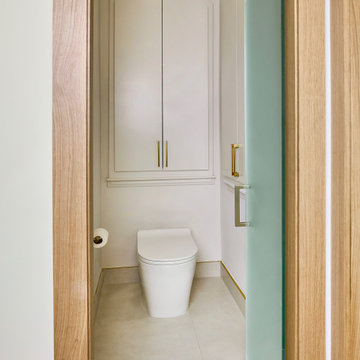
This master bathroom renovation in Frisco was completed for a repeat USI Design & Remodeling client as part of a larger first-floor transformation of the home. The original bathroom reflected a very typical North Texas layout of its era — dark stained cabinetry, granite countertops, compartmentalized vanities, a built-in tub adjoining a framed shower, and separated spaces that no longer aligned with how the homeowners wanted to live. As their aesthetic evolved toward a more transitional and contemporary direction, the goal became less about replacing finishes and more about redefining the experience of the room itself. The project needed to feel calmer, more architectural, and far more intentional in how the space functioned visually and emotionally.
One of the most important changes was removing the original shower curb and pony wall in favor of a fully open curbless shower with ultra-clear ½-inch heavy glass. Achieving that look required recessing the slab, re-floating the shower floor toward a linear drain, and engineering the space so the room would read as visually uninterrupted from end to end. Throughout the project, many of the design decisions were rooted in restraint rather than excess. The oversized 24x48 Porcelanosa flooring carries very little shade variation, creating a quieter visual field, while the cabinetry was executed in rift-sawn white oak specifically because it produces a far more controlled and consistent finish outcome than more common cuts of wood. In luxury projects, consistency itself becomes part of the refinement.
The floating vanity was designed more like custom furniture than traditional cabinetry, utilizing waterfall mitered edges and fully reworked plumbing locations so both homeowners could share in having generous functional countertop space. The original makeup station was repurposed into integrated storage with powered drawers and concealed organization for everyday items such as blow dryers and flat irons. Along the vanity wall, wall-mounted plumbing fixtures were paired with ribbed natural marble surfaces — a detail that required intentional planning long before construction began. Rather than allowing the ribbed material to terminate awkwardly behind the fixtures, the backsplash and stone transitions were specifically designed to resolve those conditions cleanly. Those are the types of details that distinguish highly coordinated design-build work from projects that simply assemble materials together.
While the room contains a significant amount of luxury detailing — from the freestanding tub and geoprism marble focal wall to the custom rift-sawn white oak closet doors and elongated mirrors that leverage the 11-foot ceiling heights — the project was always guided by quiet luxury rather than visual competition. Even the water closet enclosure was handled with restraint through the use of a satin-etched glass door rather than another heavy solid opening. The intent throughout was to create a bathroom that feels restorative and serene rather than overdesigned. In our view, the best luxury spaces are the ones that feel composed long after the initial impression wears off.
 RAJ Kitchen and Bath, LLC
“Full apartment design”.
IF you have not yet seen this apartment conversion before, we strongly urge you to go to the bottom left of this page and click on the short 2-minutes video. It would put a lot of things into perspective when you come back and continue reading this.
It is true we were literally handed the keys and told a list of things that they wanted to have happen and we were to go into the apartment, look at the space and come up with a design that would satisfy all of that need. UNTIL we showed up! The unit had really seen some better days but we knew we had to look past that and come up with a concept that would work for them.
The immediate challenges were centered around 3 big ideas:
1. Adding a second bedroom to the already small footprint
2. Figuring out a way to make the kitchen bigger, better and brighter
3. Creating a master room walk in closet
It’s always difficult to add new rooms into existing footprint without expanding out or up and not incurring any opportunity cost. In this case, that was exactly what we had to do. Item one and two above had to be tackled as one. We went ahead and switched out the location of the dining room and eliminating an area where there was a “nook” type eat-in area. By doing so, we were able to cut right into that footprint and change the layout of the kitchen.
That one move allowed us to dig into the kitchen design because it was now the main focal point in the apartment. It was no longer an option to keep it in that tiny hole where it was, so we had to ensure that this design was functional and aesthetically pleasing at the same time. By adding the table into the space where an Island typically would go, we were able to both cut cost and still provide a dining experience. The Table serves as an Island as well when cooking.
We then proceeded to block in the existing doorway to the dining room. By doing this, we were able to create a full room which allowed us to put a door on the other side and called that room Bedroom #2. This was easier to do because all of the mechanicals were already in that space (light, heater and windows). By shifting things around, we also achieved a huge wall to wall closet from inside. PERFECT!
Then we moved into the Single bedroom. We thought it was a big room with a small closet, so by creatively adding an L shaped wall and steal some footprint into the bedroom side, we were able to put a door on that new room and design it for the walk-in closet. Even after this, the bedroom still holds a queen size bed with 2 night stands, a TV on the wall, a sitting chair and plenty of room to walk around. This was done by rethinking the location for the bed and night stands.
The bathroom was gutted to make sure there was no leaks and rebuild from the ground up. We kept all of the plumbing where it was, added a new vanity, medicine cabinet, tiles and lighting and it was done.
From there, the rest of the unit had new flooring all throughout, paint, and lighting. After completion and walk through, this project was handed over back to the clients.
Execution and collaboration between all the trades were: Reggie and his team from Premier Interiors and Rohan from RD Mechanical Services.
p.s. Please see our website to see the video.

 Lancko Group Inc.
Wide Symmetrical Slats Frame a center ribbon of Encountered Grain. Available with Vertical Grain on the Edges and Horizontal in the Center or vice-versa with Horizontal Grain on Edges and Vertical Grain on the center.
No standard sizes of doors. Each door is produced to your exact specifications at our manufacturing facilities.
Industry accepted lead times; each manufacturing step is made with caution and care to insure a quality product that hopefully outlasts our generation.
It is good to be green; we use Formaldehyde Free products and low VOC Glues, Stains and Cores.
Our cores are FSC certified and we can get any material with FSC certifications.
We build our doors with engineered FSC certified laminated veneer lumber (LVL) cores. This material is none other than the best in the industry and provides superior strength and unmatched dimensional stability. It also has the best results in warping and twist tests. Our LVL core can hold screws with the same capacity as many wood species and is a MUCH better product than the cheap fiberboard core local carpenters typically use. Our cores can be machined the same as many solid wood species and they accept any hardware prep without affecting door integrity.
Stainless steel inserts, special wood elements or leather or cowhide inlays are a common landscape at Lancko. Please let us know what you are dreaming, most likely we can come up with a solution to achieve it.
About 80% of our doors are built with Hidden Hinges. Cool and exclusive and although they are a time consuming & difficult part to put together, we love it when our clients choose this available option. It is a luxury that will pay for itself, an investment into pure refinement and quality that greatly complements Lancko Doors and most definitively your project.
Capabilities. Can we do 20mins, 45 mins., 60 mins. and up to 3 Hour Fire Rated Doors, Bullet Proof Doors, Sound Proof Doors, Barn Doors, Huge Doors, Mini Doors, Hidden Doors, Louver Doors, Bi-pass Doors, Bi-fold doors, Pocket Doors, Dutch Doors, Rustic Doors, Stile and Rail Doors, Leather Doors, Cowhide Doors? Yes we can.. oh and dog doors too and of course we can do normal swing doors. What about gates? Yes. Modern Entry Doors? Yes. Garage doors? No, we need to draw the line somewhere.
Available as: Slabs only, slabs and jambs knocked down,Pre-hung units or Pre-hung & pre-finished units with hardware installed. You decide your level of door package. The best way to go to insure a top notch factory controlled quality product??... well that would be the Pre-Hung, Pre-Finished and Hardware installed product. It will cost you the same as doing it at the uncontrollable job site and the quality will be incomparable. Plus we use Conversion Varnish to finish our products. Who uses Conversion Varnish? High-End Kitchen Manufacturers and Lancko.
At Lancko, we can also manufacture Contemporary and Modern trim to complement your doors and integrate your design throughout your project.
116