
Search results for "Typical client" in Home Design Ideas

 Gayle Berkey Architects
Real estate photos - Public Domain
Inspiration for a mediterranean patio remodel in Denver
Inspiration for a mediterranean patio remodel in Denver
 User
DECO Window Fashions.
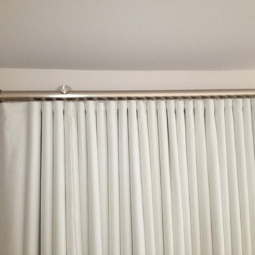
Ripple Fold Draperies
Home design - contemporary home design idea in Austin
Home design - contemporary home design idea in Austin

 ZeroEnergy Design
This LEED Platinum certified house reflects the homeowner's desire for an exceptionally healthy and comfortable living environment, within a traditional neighborhood.
INFILL SITE. The family, who moved from another area of Wellesley, sought out this property to be within walking distance of the high school and downtown area. An existing structure on the tight lot was removed to make way for the new home. 84% of the construction waste, from both the previous structure and the new home, was diverted from a landfill. ZED designed to preserve the existing mature trees on the perimeter of the property to minimize site impacts, and to maintain the character of the neighborhood as well as privacy on the site.
EXTERIOR EXPRESSION. The street facade of the home relates to the local New England vernacular. The rear uses contemporary language, a nod to the family’s Californian roots, to incorporate a roof deck, solar panels, outdoor living space, and the backyard swimming pool. ZED’s careful planning avoided to the need to face the garage doors towards the street, a common syndrome of a narrow lot.
THOUGHTFUL SPACE. Homes with dual entries can often result in duplicate and unused spaces. In this home, the everyday and formal entry areas are one and the same; the front and garage doors share the entry program of coat closets, mudroom storage with bench for removing your shoes, and a laundry room with generous closets for the children's sporting equipment. The entry area leads directly to the living space, encompassing the kitchen, dining and sitting area areas in an L-shaped open plan arrangement. The kitchen is placed at the south-west corner of the space to allow for a strong connection to the dining, sitting and outdoor living spaces. A fire pit on the deck satisfies the family’s desire for an open flame while a sealed gas fireplace is used indoors - ZED’s preference after omitting gas burning appliances completely from an airtight home. A small study, with a window seat, is conveniently located just off of the living space. A first floor guest bedroom includes an accessible bathroom for aging visitors and can be used as a master suite to accommodate aging in place.
HEALTHY LIVING. The client requested a home that was easy to clean and would provide a respite from seasonal allergies and common contaminants that are found in many indoor spaces. ZED selected easy to clean solid surface flooring throughout, provided ample space for cleaning supplies on each floor, and designed a mechanical system with ventilation that provides a constant supply of fresh outdoor air. ZED selected durable materials, finishes, cabinetry, and casework with low or no volatile organic compounds (VOCs) and no added urea formaldehyde.
YEAR-ROUND COMFORT. The home is super insulated and air-tight, paired with high performance triple-paned windows, to ensure it is draft-free throughout the winter (even when in front of the large windows and doors). ZED designed a right-sized heating and cooling system to pair with the thermally improved building enclosure to ensure year-round comfort. The glazing on the home maximizes passive solar gains, and facilitates cross ventilation and daylighting.
ENERGY EFFICIENT. As one of the most energy efficient houses built to date in Wellesley, the home highlights a practical solution for Massachusetts. First, the building enclosure reduces the largest energy requirement for typical houses (heating). Super-insulation, exceptional air sealing, a thermally broken wall assembly, triple pane windows, and passive solar gain combine for a sizable heating load reduction. Second, within the house only efficient systems consume energy. These include an air source heat pump for heating & cooling, a heat pump hot water heater, LED lighting, energy recovery ventilation, and high efficiency appliances. Lastly, photovoltaics provide renewable energy help offset energy consumption. The result is an 89% reduction in energy use compared to a similar brand new home built to code requirements.
RESILIENT. The home will fare well in extreme weather events. During a winter power outage, heat loss will be very slow due to the super-insulated and airtight envelope– taking multiple days to drop to 60 degrees even with no heat source. An engineered drainage system, paired with careful the detailing of the foundation, will help to keep the finished basement dry. A generator will provide full operation of the all-electric house during a power outage.
OVERALL. The home is a reflection of the family goals and an expression of their values, beautifully enabling health, comfort, safety, resilience, and utility, all while respecting the planet.
ZED - Architect & Mechanical Designer
Bevilacqua Builders Inc - Contractor
Creative Land & Water Engineering - Civil Engineering
Barbara Peterson Landscape - Landscape Design
Nest & Company - Interior Furnishings
Eric Roth Photography - Photography
Find the right local pro for your project

 Advance Design Studio, Ltd.
Jennifer and Dan have lived in their Deer Park Illinois home for 15 years, slowly making minor fixes like painting and decorating; but they had a new plan for their kitchen the entire time. An awkwardly placed garage door, and an island cooktop with a terrible downdraft made a full-scale kitchen remodel an absolute must. Jennifer had many ideas in mind and wanted to work with a company that could provide high-end work, while partnering with a designer that would tailor the kitchen to her ideas.
She was intrigued by the phrase “Common Sense Remodeling” in Advance Design’s feature she discovered while perusing an issue of the community’s Quintessential Barrington Magazine. Doing further research on the company’s website, as she looked through project profiles and read about Advance Design’s “Common Sense Remodeling” philosophy, she promptly scheduled an appointment to see if the people and ideas she read about were truly who they said they were. The more she read, the more she knew that the “Common Sense” approach to remodeling they described was exactly the type of company she was looking for.
The partnership was sealed after an initial consultation with Owner Todd Jurs and Project Designer Michelle Lecinski. They displayed a combination of friendliness, professionalism and respect that was unmatched by any of the other companies Jennifer talked to. She knew that with Advance Design, she would be able to retain the vision that she had in mind with high-quality craftsmanship.
“I reached out to Advance Design because of the ‘Common Sense Remodeling’ tagline,” Jennifer said. “That’s what lingered for me”. “Advance Design was the most respectful- of the house and of my design ideas, and the most professional of the handful of companies that looked at my project”.
Soon after the meeting Jennifer began working with Michelle on the project design. They quickly developed chemistry. Jennifer loved how Michelle researched and located every detail that Jennifer wanted for the kitchen. Between the two of them, every concept and idea was worked through and perfected. “Jennifer had definite ideas about what she wanted the new kitchen to look like, she just didn’t know how to bring it all together. We worked together really well to make her ideas into the practical reality necessary for a well-functioning kitchen, with the look and feel that she had envisioned”, says Michelle.
“Michelle was wonderful in using the CAD system she would show me new drawings every time we changed the layout while working through the design,” Jennifer said. “She was a really wonderful partner in execution, she made sure everything happened quickly and easily.”
The finished design drew out elements of Jennifer’s style and personality. The pair call the look “sophisticated farmhouse” to describe the kitchen renovation to family and friends. The result was a beautifully crafted, authentic-feeling space that satisfied Jennifer’s dreams 15 years in the making. The whole project consisted of a kitchen remodel, mudroom upgrade with powder room, and garage entry relocation. “The projects I personally like the best, are the ones that put the client’s dreams on display,” Project Designer Michelle said. “And this is one of those projects.”
The main focal point of the kitchen is custom zinc and brass ventilation hood with a vintage sheen, which was hand made to order by a small company in Indiana named Vogler Metalworking. “It’s like sculpture, a true work of art”, says Jennifer. Your eye is immediately drawn towards this elegant yet practical hood that eliminated the home’s downdraft problem and added a striking conversation piece at the same time. The carpenters had to use special gloves when transporting and installing it, so they didn’t smudge it with fingerprints. The beautiful hood centers proudly over the stunning black enamel and brass LaCornue Range. “I had a friend who had a LaCornue range and after learning how easy it was to cook perfect meals, I was convinced I wanted to have one”, says Jennifer. This unique, breathtaking combination anchors the entire kitchen and is apparent immediately as you walk into the great room the surrounds the space.
DuraSupreme Crestwood cabinets with a Kendall Panel add function and sophistication. A custom gray paint color paired with a storm blue was developed so that the new kitchen looked like it belonged to the existing space. Unlacquered brass faucets and hardware were important to Jennifer because she wanted the living finishes to age over time. Remarkable brass diamond mesh cabinet door inserts imported from the UK continue to add this one-of-a-kind kitchen renovation; giving it a “you won’t see this everywhere” quality. The use of old railcar flooring for the coffee bar countertop and reclaimed oak for the open shelving gives an authenticity to the space uncommon in kitchens today.
Jennifer and Michelle fell in love with the Limestone Grey Stone while they were investigating unique island countertop ideas. They liked the fact that the limestone as a living finish will age and change over time. Calcutta Miel Quartz countertops made for an excellent pairing around the perimeter, as it’s durable and perfect for cooking preparations. A textured white subway tile backsplash that runs to the ceiling keeps your eye moving towards the open shelving, and to the main focal point of the stunning range hood combination.
“The kitchen functions beautifully, and it’s gorgeous,” beams Jennifer as she gestures with both hands while smiling ear to ear. “The most important thing was I wanted a kitchen that had a wonderful flow, cooked beautiful meals and was a great gathering place for family and friends, and this space does that perfectly! Beauty wise, it turned out exactly how I had envisioned. I felt the function part was the hardest part, and that was nailed”!
Relocating the garage entry to the new mudroom was a huge priority and has finally separated the family’s arriving home functions from their kitchen. Now coats and shoes and bags have their own area for dropping once members arrive home. Matching gray DuraSupreme cabinetry helped create gorgeous, purposeful lockers for the family. A reclaimed vintage sink and custom wall paper were added to the tiny powder room to beautify the once previously only functional space. Advance Design was even able to create a custom space for their dog to sleep while the family is away.
“It was unbelievable that a project of this size was completed in such a short time, and I think that’s because of the large amount of planning and preparation that went into it,” Jennifer marveled, “When we started, we were ready, and everything was prepared”.
When it came to execution, Project Manager Justin Davis and his crew were quick, accessible, and organized. Projects like this kitchen are typically completed in as little as 8-10 weeks. Jennifer’s kitchen however despite the relocation of some challenging HVAC in a soffit and moving of an exterior door was completed remarkably fast in part because the team was working with an existing tile floor that ran throughout the first floor that the client really loved.
“You get to know these people really well because they’re living in your house while you’re living in your house. They were so fast and really good, it didn’t take as long as even planned” reported Jennifer. “I would text Justin and he always responded almost immediately. I got to know all the guys who were working in our house and they were all wonderful people”.
Details in a customized kitchen like this one require skill and care from the people who install it. “All the guys on the job were skilled at what the did. I wanted small details like little feet to look like furniture, that is where their carpentry skill came in to make these all perfect”, said Jennifer. “The tile guys were wonderful. They even let me determine how I wanted the texture with the grout to appear for a salt and pepper look; now that is a very skilled trade person making it custom”.
In Jennifer’s interview, she continued to reference Advance Design’s “Common Sense Remodeling”, so I took a minute to ask her exactly what that phrase meant to her and how it played out in her experience with her project and the Advance Design team. Here is what she said: “I was intrigued about Common Sense Remodeling and in my head that there would be clear costs and prices, great communication between the design team, the execution team and me”, said Jennifer. They did deliver on that, it was so clear about the cost breakdown, what I could expect from everyone who came to my house, and everything that we had ordered. That to me is the Common Sense”!
It’s great to see a client take literally our assertion that a well-planned remodeling project is simply “Common Sense”! She anticipated each step of the way would be clear, concise, and predictable, all the while protecting the outcome due to the careful upfront planning. “Advance Design delivered on their ‘Common Sense Remodeling’ promise,” Jennifer said. “From the design team, to the execution team - everything was straight forward like I imagined. The project turned out exactly how I envisioned, I enjoyed this process and absolutely would recommend Advance Design Studio to anyone.”


 Taylor Made Cabinets, Leominster MA
Angela Taylor, Taylor Made Cabinets of Leominster MA
Kitchen pantry - mid-sized transitional l-shaped light wood floor kitchen pantry idea in Boston with recessed-panel cabinets, white cabinets, granite countertops, stainless steel appliances and an island
Kitchen pantry - mid-sized transitional l-shaped light wood floor kitchen pantry idea in Boston with recessed-panel cabinets, white cabinets, granite countertops, stainless steel appliances and an island

 Bella Vista Company
Shoot2Sell
Open concept kitchen - mid-sized traditional l-shaped painted wood floor open concept kitchen idea in Dallas with an undermount sink, shaker cabinets, white cabinets, quartz countertops, multicolored backsplash, stainless steel appliances and an island
Open concept kitchen - mid-sized traditional l-shaped painted wood floor open concept kitchen idea in Dallas with an undermount sink, shaker cabinets, white cabinets, quartz countertops, multicolored backsplash, stainless steel appliances and an island
Sponsored
Columbus, OH

Wannemacher Interiors
Customized Award-Winning Interior Design Solutions in Franklin Cnty OH

 RAJ Kitchen and Bath, LLC
“Full apartment design”.
IF you have not yet seen this apartment conversion before, we strongly urge you to go to the bottom left of this page and click on the short 2-minutes video. It would put a lot of things into perspective when you come back and continue reading this.
It is true we were literally handed the keys and told a list of things that they wanted to have happen and we were to go into the apartment, look at the space and come up with a design that would satisfy all of that need. UNTIL we showed up! The unit had really seen some better days but we knew we had to look past that and come up with a concept that would work for them.
The immediate challenges were centered around 3 big ideas:
1. Adding a second bedroom to the already small footprint
2. Figuring out a way to make the kitchen bigger, better and brighter
3. Creating a master room walk in closet
It’s always difficult to add new rooms into existing footprint without expanding out or up and not incurring any opportunity cost. In this case, that was exactly what we had to do. Item one and two above had to be tackled as one. We went ahead and switched out the location of the dining room and eliminating an area where there was a “nook” type eat-in area. By doing so, we were able to cut right into that footprint and change the layout of the kitchen.
That one move allowed us to dig into the kitchen design because it was now the main focal point in the apartment. It was no longer an option to keep it in that tiny hole where it was, so we had to ensure that this design was functional and aesthetically pleasing at the same time. By adding the table into the space where an Island typically would go, we were able to both cut cost and still provide a dining experience. The Table serves as an Island as well when cooking.
We then proceeded to block in the existing doorway to the dining room. By doing this, we were able to create a full room which allowed us to put a door on the other side and called that room Bedroom #2. This was easier to do because all of the mechanicals were already in that space (light, heater and windows). By shifting things around, we also achieved a huge wall to wall closet from inside. PERFECT!
Then we moved into the Single bedroom. We thought it was a big room with a small closet, so by creatively adding an L shaped wall and steal some footprint into the bedroom side, we were able to put a door on that new room and design it for the walk-in closet. Even after this, the bedroom still holds a queen size bed with 2 night stands, a TV on the wall, a sitting chair and plenty of room to walk around. This was done by rethinking the location for the bed and night stands.
The bathroom was gutted to make sure there was no leaks and rebuild from the ground up. We kept all of the plumbing where it was, added a new vanity, medicine cabinet, tiles and lighting and it was done.
From there, the rest of the unit had new flooring all throughout, paint, and lighting. After completion and walk through, this project was handed over back to the clients.
Execution and collaboration between all the trades were: Reggie and his team from Premier Interiors and Rohan from RD Mechanical Services.
p.s. Please see our website to see the video.

 CRC Builders Inc.
The homeowers' home is in the Napa Valley area of California where style is everything. The area has a rich history and the home has a magnificent view of Mt. Diablo.
The clients wanted to upgrade from the 80s tract look to early California Colonial look. They wanted attention to detail, and they wanted an indoor and outdoor "living" home because they wanted to spend as much time outdoors as indoors. They also wanted to construct an open, outside cabana style living room with a classic fireplace.
The home was completely remodeled. Every room and every surface, inside and out, to some extent, got a makeover. The existing "typical" California patio was made part of the structure with a 20x20, 400 square foot cabana style addition, with 14' ceilings under a new roof system. In an effort to bring the outside in, a two-tiered pre-cast concrete fountain was installed, providing just the right touch of ambiance. A pre-cast concrete fireplace with a double corbel Mediterranean mantle was then set and surrounded with tile. The floor was set with travertine and the walls were finished with a smooth finish plaster.
To create a more formal atmosphere, the cabana patio has Mediterranean archways with fabric curtains for inclement weather. The cabana patio is divided into two separate areas, one for enjoying a meal with friends, and the other for merely sitting and enjoying the beautiful Northern California weather. Each of the areas received Mission-style chandeliers; task lighting was provided by recessed can lights. Hacienda blend cap and pan roof tiles were applied to the entire roof and then finished with a copper Conestoga chimney top. Smooth stucco was applied and painted in a Fallbrook color.
A new, stamped concrete driveway accents and welcomes visitors The new front door is a custom round top plank door from Antigua Door with a round transom system, 2-1/4" thick Spanish cedar planks, round transom-lights, and a speakeasy opening with an inset diamond grill; it received a light glaze and was manually distressed.
The kitchen ceiling became a vaulted ceiling. The floor was covered with travertine set in a basket weave pattern and the back splash as set with 4x4, multi-color tiles set on a center grid pattern. The cabinet carcasses were custom manufactured Cimino doors and finished with an opaque conversion varnish with a two-art glaze. Display cabinets were inset with decorative wire grilles and then finished with a custom glaze. Bourdeux granite was used on the countertops. A new Thermodor gas range was installed with a custom built plaster range hood with a Vent-a-hood liner insert. This was particularly troublesome because structural members had to be modfied to accommodate the installation. New drywall was installed with an imperfect, smooth finish.
The family room also received a vaulted ceiling and ten-lite exterior, out-swing, wooden doors with a walnut finish and dark glaze. A flat screen TV was placed over the mantle with three surrounding speakers. The mantle is of hand-hewn alder, distressed, and finished with a dark glaze. The cabinetry matches that of the kitchen with Juliano upper doors, shaker lower doors with lattice inset to allow air cooling for the electronics, and a rope detail flanking either end. These were finished with a pigmented glaze. The inside fireplace mantle was constructed from a single, hand-hewn, irregular planed, 8" alder timber. The tile on the fireplace consisted of 4x8 Gamelan Border, 6x6 W.Z. Lambok, and 6x24 W.Z. Buyan in burnt umber from Walker Zanger.
The entry powder room received custom cabinets with custom furniture finish of opaque conversion varnish with glaze top coats. The floor received the same tile as the kitchen. The great room has a 14' ceiling, three 5-foot by 7-foot wood outswing doors with arched tops, and the tile used was the same as that used in the kitchen.
The custom front door has an arch and is made of knotty alder. The master bathroom was finished with custom furniture style cabinetry using opaque conversion varnish with glaze top coats. Countertops were Onyx. Inset into the ceiling is a custom, plaster dome with rope lighting and a central, Mission-style chandelier.
The shower is appointed with travertine tile and edging, and enclosed with custom frameless glass front panels and door. Then this well-appointed room was finished with a slipper style tub. In an effort to bring sound throughout the house, an RA, wireless radio system was installed with separate controls in each room. This was an afterthought of the clients, thus the use of wireless technology. Two spaces originally dedicated to smaller bedrooms, were converted into a state-of-the-art workout room replete with mirrors surrounding the walls. And a custom office was constructed in the other. The office, build in a "L" shape received the same cabinetry with places for computer, fax, etc., as the rest of the house and the closet received custom storage units.
California living at its best.

 Milgard Windows & Doors
The Kiguchi family moved into their Austin, Texas home in 1994. Built in the 1980’s as part of a neighborhood development, they happily raised their family here but longed for something more contemporary. Once they became empty nesters, they decided it was time for a major remodel. After spending many years visiting Austin AIA Home Tours that highlight contemporary residential architecture, they had a lot of ideas and in 2013 were ready to interview architects and get their renovation underway.
The project turned into a major remodel due to an unstable foundation. Architects Ben Arbib and Ed Hughey, of Arbib Hughey Design were hired to solve the structural issue and look for inspiration in the bones of the house, which sat on top of a hillside and was surrounded by great views.
Unfortunately, with the old floor plan, the beautiful views were hidden by small windows that were poorly placed. In order to bring more natural light into the house the window sizes and configurations had to be addressed, all while keeping in mind the homeowners desire for a modern look and feel.
To achieve a more contemporary and sophisticated front of house, a new entry was designed that included removing a two-story bay window and porch. The entrance of the home also became more integrated with the landscape creating a template for new foliage to be planted. Older exterior materials were updated to incorporate a more muted palette of colors with a metal roof, dark grey siding in the back and white stucco in the front. Deep eaves were added over many of the new large windows for clean lines and sun protection.
“Inside it was about opening up the floor plan, expanding the views throughout the house, and updating the material palette to get a modern look that was also warm and inviting,” said Ben from Arbib Hughey Design. “Prior to the remodel, the house had the typical separation of rooms. We removed the walls between them and changed all of the windows to Milgard Thermally Improved Aluminum to connect the inside with the outside. No matter where you are you get nice views and natural light.”
The architects wanted to create some drama, which they accomplished with the window placement and opening up the interior floor plan to an open concept approach. Cabinetry was used to help delineate intimate spaces. To add warmth to an all-white living room, white-washed oak wood floors were installed and pine planks were used around the fireplace. The large windows served as artwork bringing the color of nature into the space.
An octagon shaped, elevated dining room, (named “the turret”), had a big impact on the design of the house. They architects rounded the corners and added larger window openings overlooking a new sunken garden. The great room was also softened by rounding out the corners and that circular theme continued throughout the house, being picked up in skylight wells and kitchen cabinetry. A staircase leading to a catwalk was added and the result was a two-story window wall that flooded the home with natural light.
When asked why Milgard® Thermally Improved Aluminum windows were selected, the architectural team listed many reasons:
1) Aesthetics: “We liked the slim profiles and narrow sightlines. The window frames never get in the way of the view and that was important to us. They also have a very contemporary look that went well with our design.”
2) Options: “We liked that we could get large sliding doors that matched the windows, giving us a very cohesive look and feel throughout the project.”
3) Cost Effective: “Milgard windows are affordable. You get a good product at a good price.”
4) Custom Sizes: “Milgard windows are customizable, which allowed us to get the right window for each location.”
Ready to take on your own traditional to modern home remodeling project? Arbib Hughey Design advises, “Work with a good architect. That means picking a team that is creative, communicative, listens well and is responsive. We think it’s important for an architect to listen to their clients and give them something they want, not something the architect thinks they should have. At the same time you want an architect who is willing and able to think outside the box and offer up design options that you may not have considered. Design is about a lot of back and forth, trying out ideas, getting feedback and trying again.”
The home was completely transformed into a unique, contemporary house perfectly integrated with its site. Internally the home has a natural flow for the occupants and externally it is integrated with the surroundings taking advantage of great natural light. As a side note, it was highly praised as part of the Austin AIA homes tour.


 Otogawa-Anschel Design-Build
With the pending arrival of a beautiful baby girl, the homeowners of this 1928 Minneapolis Tudor wanted a basement that was conducive to a young child, but would still allow a place for family to gather and the occasional house guest. The original basement was typical; cold, lacking natural light with tiny, uncomfortably confined rooms and that “unique” basement smell. The goal was to reverse all of the ill effects of a rarely unappreciated space while increasing the performance of the older home.
The frigid temperatures and wet, mildew odor was remedied by demolishing the entire slab floor and excavating to gain an extra six inches in ceiling height. It also allowed us to insulate to R-15, moisture proof under the new slab, install a drain tile and sump pump. Within the concrete slab is a hydronic, in-floor radiant heating system which further helps to add comfort to the space. Lastly, we also sprayed a closed-cell, expanding urethane foam on the inside of the foundation walls all the way to the first floor.
To help bring more light down to the basement, we started by opening up the staircase on both sides. A curved wall bends light into the lower level while a countertop and cubbies below provide storage space for odds and ends. On the opposite wall, creatively placed cubbies provide places for paintings, ceramics and plants. We also removed the tiny 18” x 34” window on the south wall and installed a full-sized, high-efficiency, triple pane Pella egress window. To let lots of natural light into the window, we expanded the size of the cedar-lined egress well and included a built-in planter at the base to help bring life into an otherwise empty cavity.
Small, unspecified spaces that became storage areas now have purpose. The areas are defined, yet open. Upon descending down the stairs, one is greeted by a large living room with curved walls, custom design media center, built-in daybed and bookshelves. Use of paint was important in the design. Naturally in older homes basements are going to have exposed beams, soffits and a whole gambit of nooks and crannies. Instead of disguising them, we played them up, which created a layer effect with the color. The color also adds a touch of playfulness which anyone, regardless of age, can enjoy.
We scavenged the client’s garage and discovered that the previous homeowner kept the old, full-view glass front entry door in the garage. We re-installed the original glass knob and attached the door to sliding barn door hardware which was attached to the main structural beam of the lower level. On the other side of the door was the homeowners’ combined office and small fitness area. The office floor is a blend of thin strips of different colored cork. A built-in storage cabinet sits across from a site-built desk which forms to the curve of the dividing wall. A small, square hole in the curved wall provides a view to see who is coming down the stairs. Opposite of the office area and directly at the base of the stairs is a place for the homeowner’s treadmill.
Hidden is the mechanical room, which is home to many green and energy efficient products. The washing machine is a low-water consumption unit while the dryer requires less energy to operate than most standard units. Both sit atop a checkerboard pattern of different colored VCT tiles. We also replaced the aging boiler, which only heated the first and second level, with a 95% efficient heat source for the entire house—including the basement.
Behind the curved wall, the bathroom is conveniently located. A large, custom built no-formaldehyde added vanity supports the slab of remnant granite countertop. A piece of eco-resin wall panel, embedded with organic material, contains water in the shower and blends beautifully with the updated colors. Tucked under the stairs, we installed a dual-flush, low-water consumption toilet.
Through creative space planning, we packed a lot of into a rather small space. As a result, we have three very happy homeowners who are enjoying their light, clean and safe lower level of their home—however, they’ve been hard pressed to think of it as a “basement”.
highlights
Moisture management system
Insulated slab
Hydronic in-floor heat
Formaldehyde free cabinetry
MN-made custom cabinets
Ultra-low VOC paints
Wool carpet
Dual-flush toilet
Cork floor
No recessed lights
Cedar egress window well with planter
Re-used door
Eco-resin
 RAJ Kitchen and Bath, LLC
“Full apartment design”.
IF you have not yet seen this apartment conversion before, we strongly urge you to go to the bottom left of this page and click on the short 2-minutes video. It would put a lot of things into perspective when you come back and continue reading this.
It is true we were literally handed the keys and told a list of things that they wanted to have happen and we were to go into the apartment, look at the space and come up with a design that would satisfy all of that need. UNTIL we showed up! The unit had really seen some better days but we knew we had to look past that and come up with a concept that would work for them.
The immediate challenges were centered around 3 big ideas:
1. Adding a second bedroom to the already small footprint
2. Figuring out a way to make the kitchen bigger, better and brighter
3. Creating a master room walk in closet
It’s always difficult to add new rooms into existing footprint without expanding out or up and not incurring any opportunity cost. In this case, that was exactly what we had to do. Item one and two above had to be tackled as one. We went ahead and switched out the location of the dining room and eliminating an area where there was a “nook” type eat-in area. By doing so, we were able to cut right into that footprint and change the layout of the kitchen.
That one move allowed us to dig into the kitchen design because it was now the main focal point in the apartment. It was no longer an option to keep it in that tiny hole where it was, so we had to ensure that this design was functional and aesthetically pleasing at the same time. By adding the table into the space where an Island typically would go, we were able to both cut cost and still provide a dining experience. The Table serves as an Island as well when cooking.
We then proceeded to block in the existing doorway to the dining room. By doing this, we were able to create a full room which allowed us to put a door on the other side and called that room Bedroom #2. This was easier to do because all of the mechanicals were already in that space (light, heater and windows). By shifting things around, we also achieved a huge wall to wall closet from inside. PERFECT!
Then we moved into the Single bedroom. We thought it was a big room with a small closet, so by creatively adding an L shaped wall and steal some footprint into the bedroom side, we were able to put a door on that new room and design it for the walk-in closet. Even after this, the bedroom still holds a queen size bed with 2 night stands, a TV on the wall, a sitting chair and plenty of room to walk around. This was done by rethinking the location for the bed and night stands.
The bathroom was gutted to make sure there was no leaks and rebuild from the ground up. We kept all of the plumbing where it was, added a new vanity, medicine cabinet, tiles and lighting and it was done.
From there, the rest of the unit had new flooring all throughout, paint, and lighting. After completion and walk through, this project was handed over back to the clients.
Execution and collaboration between all the trades were: Reggie and his team from Premier Interiors and Rohan from RD Mechanical Services.
p.s. Please see our website to see the video.
Sponsored
Columbus, OH

Snider & Metcalf Interior Design, LTD
Leading Interior Designers in Columbus, Ohio & Ponte Vedra, Florida

 Milgard Windows & Doors
The Kiguchi family moved into their Austin, Texas home in 1994. Built in the 1980’s as part of a neighborhood development, they happily raised their family here but longed for something more contemporary. Once they became empty nesters, they decided it was time for a major remodel. After spending many years visiting Austin AIA Home Tours that highlight contemporary residential architecture, they had a lot of ideas and in 2013 were ready to interview architects and get their renovation underway.
The project turned into a major remodel due to an unstable foundation. Architects Ben Arbib and Ed Hughey, of Arbib Hughey Design were hired to solve the structural issue and look for inspiration in the bones of the house, which sat on top of a hillside and was surrounded by great views.
Unfortunately, with the old floor plan, the beautiful views were hidden by small windows that were poorly placed. In order to bring more natural light into the house the window sizes and configurations had to be addressed, all while keeping in mind the homeowners desire for a modern look and feel.
To achieve a more contemporary and sophisticated front of house, a new entry was designed that included removing a two-story bay window and porch. The entrance of the home also became more integrated with the landscape creating a template for new foliage to be planted. Older exterior materials were updated to incorporate a more muted palette of colors with a metal roof, dark grey siding in the back and white stucco in the front. Deep eaves were added over many of the new large windows for clean lines and sun protection.
“Inside it was about opening up the floor plan, expanding the views throughout the house, and updating the material palette to get a modern look that was also warm and inviting,” said Ben from Arbib Hughey Design. “Prior to the remodel, the house had the typical separation of rooms. We removed the walls between them and changed all of the windows to Milgard Thermally Improved Aluminum to connect the inside with the outside. No matter where you are you get nice views and natural light.”
The architects wanted to create some drama, which they accomplished with the window placement and opening up the interior floor plan to an open concept approach. Cabinetry was used to help delineate intimate spaces. To add warmth to an all-white living room, white-washed oak wood floors were installed and pine planks were used around the fireplace. The large windows served as artwork bringing the color of nature into the space.
An octagon shaped, elevated dining room, (named “the turret”), had a big impact on the design of the house. They architects rounded the corners and added larger window openings overlooking a new sunken garden. The great room was also softened by rounding out the corners and that circular theme continued throughout the house, being picked up in skylight wells and kitchen cabinetry. A staircase leading to a catwalk was added and the result was a two-story window wall that flooded the home with natural light.
When asked why Milgard® Thermally Improved Aluminum windows were selected, the architectural team listed many reasons:
1) Aesthetics: “We liked the slim profiles and narrow sightlines. The window frames never get in the way of the view and that was important to us. They also have a very contemporary look that went well with our design.”
2) Options: “We liked that we could get large sliding doors that matched the windows, giving us a very cohesive look and feel throughout the project.”
3) Cost Effective: “Milgard windows are affordable. You get a good product at a good price.”
4) Custom Sizes: “Milgard windows are customizable, which allowed us to get the right window for each location.”
Ready to take on your own traditional to modern home remodeling project? Arbib Hughey Design advises, “Work with a good architect. That means picking a team that is creative, communicative, listens well and is responsive. We think it’s important for an architect to listen to their clients and give them something they want, not something the architect thinks they should have. At the same time you want an architect who is willing and able to think outside the box and offer up design options that you may not have considered. Design is about a lot of back and forth, trying out ideas, getting feedback and trying again.”
The home was completely transformed into a unique, contemporary house perfectly integrated with its site. Internally the home has a natural flow for the occupants and externally it is integrated with the surroundings taking advantage of great natural light. As a side note, it was highly praised as part of the Austin AIA homes tour.
 CRC Builders Inc.
The homeowers' home is in the Napa Valley area of California where style is everything. The area has a rich history and the home has a magnificent view of Mt. Diablo.
The clients wanted to upgrade from the 80s tract look to early California Colonial look. They wanted attention to detail, and they wanted an indoor and outdoor "living" home because they wanted to spend as much time outdoors as indoors. They also wanted to construct an open, outside cabana style living room with a classic fireplace.
The home was completely remodeled. Every room and every surface, inside and out, to some extent, got a makeover. The existing "typical" California patio was made part of the structure with a 20x20, 400 square foot cabana style addition, with 14' ceilings under a new roof system. In an effort to bring the outside in, a two-tiered pre-cast concrete fountain was installed, providing just the right touch of ambiance. A pre-cast concrete fireplace with a double corbel Mediterranean mantle was then set and surrounded with tile. The floor was set with travertine and the walls were finished with a smooth finish plaster.
To create a more formal atmosphere, the cabana patio has Mediterranean archways with fabric curtains for inclement weather. The cabana patio is divided into two separate areas, one for enjoying a meal with friends, and the other for merely sitting and enjoying the beautiful Northern California weather. Each of the areas received Mission-style chandeliers; task lighting was provided by recessed can lights. Hacienda blend cap and pan roof tiles were applied to the entire roof and then finished with a copper Conestoga chimney top. Smooth stucco was applied and painted in a Fallbrook color.
A new, stamped concrete driveway accents and welcomes visitors The new front door is a custom round top plank door from Antigua Door with a round transom system, 2-1/4" thick Spanish cedar planks, round transom-lights, and a speakeasy opening with an inset diamond grill; it received a light glaze and was manually distressed.
The kitchen ceiling became a vaulted ceiling. The floor was covered with travertine set in a basket weave pattern and the back splash as set with 4x4, multi-color tiles set on a center grid pattern. The cabinet carcasses were custom manufactured Cimino doors and finished with an opaque conversion varnish with a two-art glaze. Display cabinets were inset with decorative wire grilles and then finished with a custom glaze. Bourdeux granite was used on the countertops. A new Thermodor gas range was installed with a custom built plaster range hood with a Vent-a-hood liner insert. This was particularly troublesome because structural members had to be modfied to accommodate the installation. New drywall was installed with an imperfect, smooth finish.
The family room also received a vaulted ceiling and ten-lite exterior, out-swing, wooden doors with a walnut finish and dark glaze. A flat screen TV was placed over the mantle with three surrounding speakers. The mantle is of hand-hewn alder, distressed, and finished with a dark glaze. The cabinetry matches that of the kitchen with Juliano upper doors, shaker lower doors with lattice inset to allow air cooling for the electronics, and a rope detail flanking either end. These were finished with a pigmented glaze. The inside fireplace mantle was constructed from a single, hand-hewn, irregular planed, 8" alder timber. The tile on the fireplace consisted of 4x8 Gamelan Border, 6x6 W.Z. Lambok, and 6x24 W.Z. Buyan in burnt umber from Walker Zanger.
The entry powder room received custom cabinets with custom furniture finish of opaque conversion varnish with glaze top coats. The floor received the same tile as the kitchen. The great room has a 14' ceiling, three 5-foot by 7-foot wood outswing doors with arched tops, and the tile used was the same as that used in the kitchen.
The custom front door has an arch and is made of knotty alder. The master bathroom was finished with custom furniture style cabinetry using opaque conversion varnish with glaze top coats. Countertops were Onyx. Inset into the ceiling is a custom, plaster dome with rope lighting and a central, Mission-style chandelier.
The shower is appointed with travertine tile and edging, and enclosed with custom frameless glass front panels and door. Then this well-appointed room was finished with a slipper style tub. In an effort to bring sound throughout the house, an RA, wireless radio system was installed with separate controls in each room. This was an afterthought of the clients, thus the use of wireless technology. Two spaces originally dedicated to smaller bedrooms, were converted into a state-of-the-art workout room replete with mirrors surrounding the walls. And a custom office was constructed in the other. The office, build in a "L" shape received the same cabinetry with places for computer, fax, etc., as the rest of the house and the closet received custom storage units.
California living at its best.

 Vintage Cellars - Luxury Custom Wine Cellars LA
This project is more than meets the eye! In a gorgeous neighborhood in Del Mar, San Diego, California, This unique small custom wine cellar truly acts as a showstopper. Originally within this house, the door which now faces outward used to be around the corner in a small hallway, virtually eliminating any visibility into this contemporary walk in custom wine cellar. Upon seeing the location of this space within the house, Gene Walder and the knowledgeable team at Vintage Cellars knew that to really take advantage of the room provided, (which is actually below the stairs), they needed to get rid of the original door and add a brand new one facing the main living space.
Just a small feat in a series of unique custom features within this cellar!
Here at Vintage Cellars, before any design takes shape, it is vital to understand what the clients wants and needs are based on their growing collection of wine. With a good idea of bottle sizes, shapes (some pinot noir bottles, for example have a wider bottom than a typical cabernet sauvignon bottle) and unique features desired, the team of wine cellar designers and wine cellar builders at Vintage Cellars are able to create a very special and desirable wine cellar for each client.
The owners of this beautiful home collaborated heavily with the Vintage Cellars team in the design process of this rustic custom wine cellar - something that we aim to do with every project. The homeowners wanted to showcase some of their favorite Magnum sized bottles in a high reveal horizontal display row, directly on top of another area highlighting the best 750 ml's in their collection.
This small custom wine room fills most of the left wall with single deep, individual bottle storage. Directly below this wine racking is room for wine case / wine bin storage. Centered within this wall is a nice space for opening and decanting wines with a gorgeous dark stone countertop and room for hanging wine glasses above.
The opposite wall is filled floor to ceiling with label revealing horizontal display rows. Again, this type of feature is very desirable in recent years. Homeowners want to be able to showcase the best bottles they own within their custom wine cellars in the most stunning and beautiful ways possible. Additionally, this feature is commonly replicated with metal bars for a more contemporary and modern look and feel.
Within Beach Cities such as Del Mar, La Jolla, Cardiff, Coronado, Rancho Santa Fe, Encinitas, Solana Beach, Newport Beach and Orange County alike, small walk wine cellars are all the rage. Custom Wine Closet s and Under the Stairs Custom Wine Room s are quickly becoming a commonplace feature within modern luxury homes.
Funny enough, because San Diego has become such a hub and mecca for craft beer breweries, luxury homes within communities such as La Jolla, Del Mar, Encinitas, Coronado, Cardiff, Rancho Santa Fe, Solana Beach, Carlsbad, La Costa and Torrey Pines have taken notice and began including space for unique beer storage within their custom wine cellars as well.
This right side wall horizontal display racking does just that. If you look closely, those intricately labeled bottles are craft brews kept at a chill and refreshing 55 Degrees- just waiting to be opened and enjoyed immediately.
Just when you thought the custom wine cellar tour was over, another unique feature catches your eye. You see the back stone wall? Press ever so gently in the top left corner two thirds of the way up and - Voila! - a secret door appears and slowly reveals more room under the stairway for case storage and the like.
The homeowner also decided to add interesting lighting to this cellar. The Custom wine room can turn any color of the rainbow - allowing you to focus on all lights or just one a time, creating that perfect mood lighting for the holidays, springtime, or summer.
This entire custom wine cellar and all wine racking were done in raw black walnut.
Vintage Cellars has built gorgeous custom wine cellars and wine storage rooms across the United States and World for over 25 years. We are your go-to business for anything wine cellar and wine storage related! Whether you're interested in a wine closet, wine racking, custom wine racks, a custom wine cellar door, or a cooling system for your existing space, Vintage Cellars has you covered!
We carry all kinds of wine cellar cooling and refrigeration systems, incuding: Breezaire, CellarCool, WhisperKool, Wine Guardian, CellarPro and Commercial systems.
We also carry many types of Wine Refrigerators, Wine Cabinets, and wine racking types, including La Cache, Marvel, N'Finity, Transtherm, Vinotheque, Vintage Series, Credenza, Walk in wine rooms, Climadiff, Riedel, Fontenay, and VintageView.
Vintage Cellars also does work in many styles, including Contemporary and Modern, Rustic, Farmhouse, Traditional, Craftsman, Industrial, Mediterranean, Mid-Century, Industrial and Eclectic.
Some locations we cover often include: San Diego, Rancho Santa Fe, Corona Del Mar, Del Mar, La Jolla, Newport Beach, Newport Coast, Huntington Beach, Del Mar, Solana Beach, Carlsbad, Orange County, Beverly Hills, Malibu, Pacific Palisades, Santa Monica, Bel Air, Los Angeles, Encinitas, Cardiff, Coronado, Manhattan Beach, Palos Verdes, San Marino, Ladera Heights, Santa Monica, Brentwood, Westwood, Hancock Park, Laguna Beach, Crystal Cove, Laguna Niguel, Torrey Pines, Thousand Oaks, Coto De Caza, Coronado Island, San Francisco, Danville, Walnut Creek, Marin, Tiburon, Hillsborough, Berkeley, Oakland, Napa, Sonoma, Agoura Hills, Hollywood Hills, Laurel Canyon, Sausalito, Mill Valley, San Rafael, Piedmont, Paso Robles, Carmel, Pebble Beach
Contact Vintage Cellars today with any of your Wine Cellar needs!
(800) 876-8789
Vintage Cellars
904 Rancheros Drive
San Marcos, California 92069
(800) 876-8789
Sponsored
Delaware, OH

Buckeye Basements, Inc.
Central Ohio's Basement Finishing ExpertsBest Of Houzz '13-'21
 Milgard Windows & Doors
The Kiguchi family moved into their Austin, Texas home in 1994. Built in the 1980’s as part of a neighborhood development, they happily raised their family here but longed for something more contemporary. Once they became empty nesters, they decided it was time for a major remodel. After spending many years visiting Austin AIA Home Tours that highlight contemporary residential architecture, they had a lot of ideas and in 2013 were ready to interview architects and get their renovation underway.
The project turned into a major remodel due to an unstable foundation. Architects Ben Arbib and Ed Hughey, of Arbib Hughey Design were hired to solve the structural issue and look for inspiration in the bones of the house, which sat on top of a hillside and was surrounded by great views.
Unfortunately, with the old floor plan, the beautiful views were hidden by small windows that were poorly placed. In order to bring more natural light into the house the window sizes and configurations had to be addressed, all while keeping in mind the homeowners desire for a modern look and feel.
To achieve a more contemporary and sophisticated front of house, a new entry was designed that included removing a two-story bay window and porch. The entrance of the home also became more integrated with the landscape creating a template for new foliage to be planted. Older exterior materials were updated to incorporate a more muted palette of colors with a metal roof, dark grey siding in the back and white stucco in the front. Deep eaves were added over many of the new large windows for clean lines and sun protection.
“Inside it was about opening up the floor plan, expanding the views throughout the house, and updating the material palette to get a modern look that was also warm and inviting,” said Ben from Arbib Hughey Design. “Prior to the remodel, the house had the typical separation of rooms. We removed the walls between them and changed all of the windows to Milgard Thermally Improved Aluminum to connect the inside with the outside. No matter where you are you get nice views and natural light.”
The architects wanted to create some drama, which they accomplished with the window placement and opening up the interior floor plan to an open concept approach. Cabinetry was used to help delineate intimate spaces. To add warmth to an all-white living room, white-washed oak wood floors were installed and pine planks were used around the fireplace. The large windows served as artwork bringing the color of nature into the space.
An octagon shaped, elevated dining room, (named “the turret”), had a big impact on the design of the house. They architects rounded the corners and added larger window openings overlooking a new sunken garden. The great room was also softened by rounding out the corners and that circular theme continued throughout the house, being picked up in skylight wells and kitchen cabinetry. A staircase leading to a catwalk was added and the result was a two-story window wall that flooded the home with natural light.
When asked why Milgard® Thermally Improved Aluminum windows were selected, the architectural team listed many reasons:
1) Aesthetics: “We liked the slim profiles and narrow sightlines. The window frames never get in the way of the view and that was important to us. They also have a very contemporary look that went well with our design.”
2) Options: “We liked that we could get large sliding doors that matched the windows, giving us a very cohesive look and feel throughout the project.”
3) Cost Effective: “Milgard windows are affordable. You get a good product at a good price.”
4) Custom Sizes: “Milgard windows are customizable, which allowed us to get the right window for each location.”
Ready to take on your own traditional to modern home remodeling project? Arbib Hughey Design advises, “Work with a good architect. That means picking a team that is creative, communicative, listens well and is responsive. We think it’s important for an architect to listen to their clients and give them something they want, not something the architect thinks they should have. At the same time you want an architect who is willing and able to think outside the box and offer up design options that you may not have considered. Design is about a lot of back and forth, trying out ideas, getting feedback and trying again.”
The home was completely transformed into a unique, contemporary house perfectly integrated with its site. Internally the home has a natural flow for the occupants and externally it is integrated with the surroundings taking advantage of great natural light. As a side note, it was highly praised as part of the Austin AIA homes tour.
 CRC Builders Inc.
The homeowers' home is in the Napa Valley area of California where style is everything. The area has a rich history and the home has a magnificent view of Mt. Diablo.
The clients wanted to upgrade from the 80s tract look to early California Colonial look. They wanted attention to detail, and they wanted an indoor and outdoor "living" home because they wanted to spend as much time outdoors as indoors. They also wanted to construct an open, outside cabana style living room with a classic fireplace.
The home was completely remodeled. Every room and every surface, inside and out, to some extent, got a makeover. The existing "typical" California patio was made part of the structure with a 20x20, 400 square foot cabana style addition, with 14' ceilings under a new roof system. In an effort to bring the outside in, a two-tiered pre-cast concrete fountain was installed, providing just the right touch of ambiance. A pre-cast concrete fireplace with a double corbel Mediterranean mantle was then set and surrounded with tile. The floor was set with travertine and the walls were finished with a smooth finish plaster.
To create a more formal atmosphere, the cabana patio has Mediterranean archways with fabric curtains for inclement weather. The cabana patio is divided into two separate areas, one for enjoying a meal with friends, and the other for merely sitting and enjoying the beautiful Northern California weather. Each of the areas received Mission-style chandeliers; task lighting was provided by recessed can lights. Hacienda blend cap and pan roof tiles were applied to the entire roof and then finished with a copper Conestoga chimney top. Smooth stucco was applied and painted in a Fallbrook color.
A new, stamped concrete driveway accents and welcomes visitors The new front door is a custom round top plank door from Antigua Door with a round transom system, 2-1/4" thick Spanish cedar planks, round transom-lights, and a speakeasy opening with an inset diamond grill; it received a light glaze and was manually distressed.
The kitchen ceiling became a vaulted ceiling. The floor was covered with travertine set in a basket weave pattern and the back splash as set with 4x4, multi-color tiles set on a center grid pattern. The cabinet carcasses were custom manufactured Cimino doors and finished with an opaque conversion varnish with a two-art glaze. Display cabinets were inset with decorative wire grilles and then finished with a custom glaze. Bourdeux granite was used on the countertops. A new Thermodor gas range was installed with a custom built plaster range hood with a Vent-a-hood liner insert. This was particularly troublesome because structural members had to be modfied to accommodate the installation. New drywall was installed with an imperfect, smooth finish.
The family room also received a vaulted ceiling and ten-lite exterior, out-swing, wooden doors with a walnut finish and dark glaze. A flat screen TV was placed over the mantle with three surrounding speakers. The mantle is of hand-hewn alder, distressed, and finished with a dark glaze. The cabinetry matches that of the kitchen with Juliano upper doors, shaker lower doors with lattice inset to allow air cooling for the electronics, and a rope detail flanking either end. These were finished with a pigmented glaze. The inside fireplace mantle was constructed from a single, hand-hewn, irregular planed, 8" alder timber. The tile on the fireplace consisted of 4x8 Gamelan Border, 6x6 W.Z. Lambok, and 6x24 W.Z. Buyan in burnt umber from Walker Zanger.
The entry powder room received custom cabinets with custom furniture finish of opaque conversion varnish with glaze top coats. The floor received the same tile as the kitchen. The great room has a 14' ceiling, three 5-foot by 7-foot wood outswing doors with arched tops, and the tile used was the same as that used in the kitchen.
The custom front door has an arch and is made of knotty alder. The master bathroom was finished with custom furniture style cabinetry using opaque conversion varnish with glaze top coats. Countertops were Onyx. Inset into the ceiling is a custom, plaster dome with rope lighting and a central, Mission-style chandelier.
The shower is appointed with travertine tile and edging, and enclosed with custom frameless glass front panels and door. Then this well-appointed room was finished with a slipper style tub. In an effort to bring sound throughout the house, an RA, wireless radio system was installed with separate controls in each room. This was an afterthought of the clients, thus the use of wireless technology. Two spaces originally dedicated to smaller bedrooms, were converted into a state-of-the-art workout room replete with mirrors surrounding the walls. And a custom office was constructed in the other. The office, build in a "L" shape received the same cabinetry with places for computer, fax, etc., as the rest of the house and the closet received custom storage units.
California living at its best.
 RAJ Kitchen and Bath, LLC
“Full apartment design”.
IF you have not yet seen this apartment conversion before, we strongly urge you to go to the bottom left of this page and click on the short 2-minutes video. It would put a lot of things into perspective when you come back and continue reading this.
It is true we were literally handed the keys and told a list of things that they wanted to have happen and we were to go into the apartment, look at the space and come up with a design that would satisfy all of that need. UNTIL we showed up! The unit had really seen some better days but we knew we had to look past that and come up with a concept that would work for them.
The immediate challenges were centered around 3 big ideas:
1. Adding a second bedroom to the already small footprint
2. Figuring out a way to make the kitchen bigger, better and brighter
3. Creating a master room walk in closet
It’s always difficult to add new rooms into existing footprint without expanding out or up and not incurring any opportunity cost. In this case, that was exactly what we had to do. Item one and two above had to be tackled as one. We went ahead and switched out the location of the dining room and eliminating an area where there was a “nook” type eat-in area. By doing so, we were able to cut right into that footprint and change the layout of the kitchen.
That one move allowed us to dig into the kitchen design because it was now the main focal point in the apartment. It was no longer an option to keep it in that tiny hole where it was, so we had to ensure that this design was functional and aesthetically pleasing at the same time. By adding the table into the space where an Island typically would go, we were able to both cut cost and still provide a dining experience. The Table serves as an Island as well when cooking.
We then proceeded to block in the existing doorway to the dining room. By doing this, we were able to create a full room which allowed us to put a door on the other side and called that room Bedroom #2. This was easier to do because all of the mechanicals were already in that space (light, heater and windows). By shifting things around, we also achieved a huge wall to wall closet from inside. PERFECT!
Then we moved into the Single bedroom. We thought it was a big room with a small closet, so by creatively adding an L shaped wall and steal some footprint into the bedroom side, we were able to put a door on that new room and design it for the walk-in closet. Even after this, the bedroom still holds a queen size bed with 2 night stands, a TV on the wall, a sitting chair and plenty of room to walk around. This was done by rethinking the location for the bed and night stands.
The bathroom was gutted to make sure there was no leaks and rebuild from the ground up. We kept all of the plumbing where it was, added a new vanity, medicine cabinet, tiles and lighting and it was done.
From there, the rest of the unit had new flooring all throughout, paint, and lighting. After completion and walk through, this project was handed over back to the clients.
Execution and collaboration between all the trades were: Reggie and his team from Premier Interiors and Rohan from RD Mechanical Services.
p.s. Please see our website to see the video.
114