
Search results for "Typical list" in Home Design Ideas
 Milgard Windows & Doors
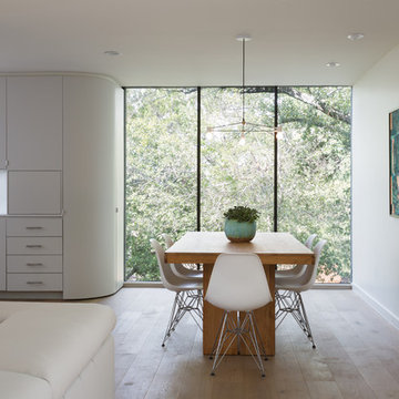
The Kiguchi family moved into their Austin, Texas home in 1994. Built in the 1980’s as part of a neighborhood development, they happily raised their family here but longed for something more contemporary. Once they became empty nesters, they decided it was time for a major remodel. After spending many years visiting Austin AIA Home Tours that highlight contemporary residential architecture, they had a lot of ideas and in 2013 were ready to interview architects and get their renovation underway.
The project turned into a major remodel due to an unstable foundation. Architects Ben Arbib and Ed Hughey, of Arbib Hughey Design were hired to solve the structural issue and look for inspiration in the bones of the house, which sat on top of a hillside and was surrounded by great views.
Unfortunately, with the old floor plan, the beautiful views were hidden by small windows that were poorly placed. In order to bring more natural light into the house the window sizes and configurations had to be addressed, all while keeping in mind the homeowners desire for a modern look and feel.
To achieve a more contemporary and sophisticated front of house, a new entry was designed that included removing a two-story bay window and porch. The entrance of the home also became more integrated with the landscape creating a template for new foliage to be planted. Older exterior materials were updated to incorporate a more muted palette of colors with a metal roof, dark grey siding in the back and white stucco in the front. Deep eaves were added over many of the new large windows for clean lines and sun protection.
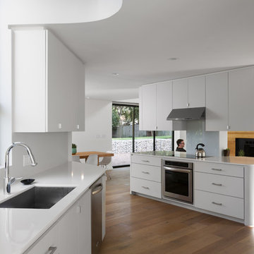
“Inside it was about opening up the floor plan, expanding the views throughout the house, and updating the material palette to get a modern look that was also warm and inviting,” said Ben from Arbib Hughey Design. “Prior to the remodel, the house had the typical separation of rooms. We removed the walls between them and changed all of the windows to Milgard Thermally Improved Aluminum to connect the inside with the outside. No matter where you are you get nice views and natural light.”
The architects wanted to create some drama, which they accomplished with the window placement and opening up the interior floor plan to an open concept approach. Cabinetry was used to help delineate intimate spaces. To add warmth to an all-white living room, white-washed oak wood floors were installed and pine planks were used around the fireplace. The large windows served as artwork bringing the color of nature into the space.
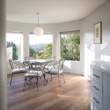
An octagon shaped, elevated dining room, (named “the turret”), had a big impact on the design of the house. They architects rounded the corners and added larger window openings overlooking a new sunken garden. The great room was also softened by rounding out the corners and that circular theme continued throughout the house, being picked up in skylight wells and kitchen cabinetry. A staircase leading to a catwalk was added and the result was a two-story window wall that flooded the home with natural light.
When asked why Milgard® Thermally Improved Aluminum windows were selected, the architectural team listed many reasons:
1) Aesthetics: “We liked the slim profiles and narrow sightlines. The window frames never get in the way of the view and that was important to us. They also have a very contemporary look that went well with our design.”
2) Options: “We liked that we could get large sliding doors that matched the windows, giving us a very cohesive look and feel throughout the project.”
3) Cost Effective: “Milgard windows are affordable. You get a good product at a good price.”
4) Custom Sizes: “Milgard windows are customizable, which allowed us to get the right window for each location.”
Ready to take on your own traditional to modern home remodeling project? Arbib Hughey Design advises, “Work with a good architect. That means picking a team that is creative, communicative, listens well and is responsive. We think it’s important for an architect to listen to their clients and give them something they want, not something the architect thinks they should have. At the same time you want an architect who is willing and able to think outside the box and offer up design options that you may not have considered. Design is about a lot of back and forth, trying out ideas, getting feedback and trying again.”
The home was completely transformed into a unique, contemporary house perfectly integrated with its site. Internally the home has a natural flow for the occupants and externally it is integrated with the surroundings taking advantage of great natural light. As a side note, it was highly praised as part of the Austin AIA homes tour.
 Milgard Windows & Doors
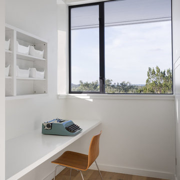
The Kiguchi family moved into their Austin, Texas home in 1994. Built in the 1980’s as part of a neighborhood development, they happily raised their family here but longed for something more contemporary. Once they became empty nesters, they decided it was time for a major remodel. After spending many years visiting Austin AIA Home Tours that highlight contemporary residential architecture, they had a lot of ideas and in 2013 were ready to interview architects and get their renovation underway.
The project turned into a major remodel due to an unstable foundation. Architects Ben Arbib and Ed Hughey, of Arbib Hughey Design were hired to solve the structural issue and look for inspiration in the bones of the house, which sat on top of a hillside and was surrounded by great views.
Unfortunately, with the old floor plan, the beautiful views were hidden by small windows that were poorly placed. In order to bring more natural light into the house the window sizes and configurations had to be addressed, all while keeping in mind the homeowners desire for a modern look and feel.
To achieve a more contemporary and sophisticated front of house, a new entry was designed that included removing a two-story bay window and porch. The entrance of the home also became more integrated with the landscape creating a template for new foliage to be planted. Older exterior materials were updated to incorporate a more muted palette of colors with a metal roof, dark grey siding in the back and white stucco in the front. Deep eaves were added over many of the new large windows for clean lines and sun protection.
“Inside it was about opening up the floor plan, expanding the views throughout the house, and updating the material palette to get a modern look that was also warm and inviting,” said Ben from Arbib Hughey Design. “Prior to the remodel, the house had the typical separation of rooms. We removed the walls between them and changed all of the windows to Milgard Thermally Improved Aluminum to connect the inside with the outside. No matter where you are you get nice views and natural light.”
The architects wanted to create some drama, which they accomplished with the window placement and opening up the interior floor plan to an open concept approach. Cabinetry was used to help delineate intimate spaces. To add warmth to an all-white living room, white-washed oak wood floors were installed and pine planks were used around the fireplace. The large windows served as artwork bringing the color of nature into the space.
An octagon shaped, elevated dining room, (named “the turret”), had a big impact on the design of the house. They architects rounded the corners and added larger window openings overlooking a new sunken garden. The great room was also softened by rounding out the corners and that circular theme continued throughout the house, being picked up in skylight wells and kitchen cabinetry. A staircase leading to a catwalk was added and the result was a two-story window wall that flooded the home with natural light.
When asked why Milgard® Thermally Improved Aluminum windows were selected, the architectural team listed many reasons:
1) Aesthetics: “We liked the slim profiles and narrow sightlines. The window frames never get in the way of the view and that was important to us. They also have a very contemporary look that went well with our design.”
2) Options: “We liked that we could get large sliding doors that matched the windows, giving us a very cohesive look and feel throughout the project.”
3) Cost Effective: “Milgard windows are affordable. You get a good product at a good price.”
4) Custom Sizes: “Milgard windows are customizable, which allowed us to get the right window for each location.”
Ready to take on your own traditional to modern home remodeling project? Arbib Hughey Design advises, “Work with a good architect. That means picking a team that is creative, communicative, listens well and is responsive. We think it’s important for an architect to listen to their clients and give them something they want, not something the architect thinks they should have. At the same time you want an architect who is willing and able to think outside the box and offer up design options that you may not have considered. Design is about a lot of back and forth, trying out ideas, getting feedback and trying again.”
The home was completely transformed into a unique, contemporary house perfectly integrated with its site. Internally the home has a natural flow for the occupants and externally it is integrated with the surroundings taking advantage of great natural light. As a side note, it was highly praised as part of the Austin AIA homes tour.
 Milgard Windows & Doors
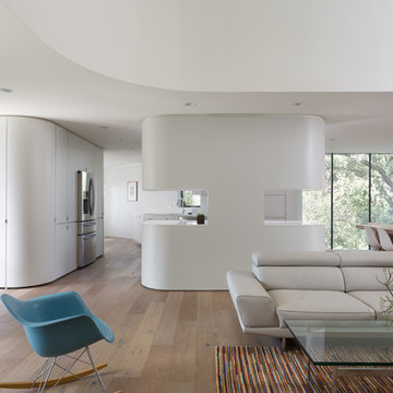
The Kiguchi family moved into their Austin, Texas home in 1994. Built in the 1980’s as part of a neighborhood development, they happily raised their family here but longed for something more contemporary. Once they became empty nesters, they decided it was time for a major remodel. After spending many years visiting Austin AIA Home Tours that highlight contemporary residential architecture, they had a lot of ideas and in 2013 were ready to interview architects and get their renovation underway.
The project turned into a major remodel due to an unstable foundation. Architects Ben Arbib and Ed Hughey, of Arbib Hughey Design were hired to solve the structural issue and look for inspiration in the bones of the house, which sat on top of a hillside and was surrounded by great views.
Unfortunately, with the old floor plan, the beautiful views were hidden by small windows that were poorly placed. In order to bring more natural light into the house the window sizes and configurations had to be addressed, all while keeping in mind the homeowners desire for a modern look and feel.
To achieve a more contemporary and sophisticated front of house, a new entry was designed that included removing a two-story bay window and porch. The entrance of the home also became more integrated with the landscape creating a template for new foliage to be planted. Older exterior materials were updated to incorporate a more muted palette of colors with a metal roof, dark grey siding in the back and white stucco in the front. Deep eaves were added over many of the new large windows for clean lines and sun protection.
“Inside it was about opening up the floor plan, expanding the views throughout the house, and updating the material palette to get a modern look that was also warm and inviting,” said Ben from Arbib Hughey Design. “Prior to the remodel, the house had the typical separation of rooms. We removed the walls between them and changed all of the windows to Milgard Thermally Improved Aluminum to connect the inside with the outside. No matter where you are you get nice views and natural light.”
The architects wanted to create some drama, which they accomplished with the window placement and opening up the interior floor plan to an open concept approach. Cabinetry was used to help delineate intimate spaces. To add warmth to an all-white living room, white-washed oak wood floors were installed and pine planks were used around the fireplace. The large windows served as artwork bringing the color of nature into the space.
An octagon shaped, elevated dining room, (named “the turret”), had a big impact on the design of the house. They architects rounded the corners and added larger window openings overlooking a new sunken garden. The great room was also softened by rounding out the corners and that circular theme continued throughout the house, being picked up in skylight wells and kitchen cabinetry. A staircase leading to a catwalk was added and the result was a two-story window wall that flooded the home with natural light.
When asked why Milgard® Thermally Improved Aluminum windows were selected, the architectural team listed many reasons:
1) Aesthetics: “We liked the slim profiles and narrow sightlines. The window frames never get in the way of the view and that was important to us. They also have a very contemporary look that went well with our design.”
2) Options: “We liked that we could get large sliding doors that matched the windows, giving us a very cohesive look and feel throughout the project.”
3) Cost Effective: “Milgard windows are affordable. You get a good product at a good price.”
4) Custom Sizes: “Milgard windows are customizable, which allowed us to get the right window for each location.”
Ready to take on your own traditional to modern home remodeling project? Arbib Hughey Design advises, “Work with a good architect. That means picking a team that is creative, communicative, listens well and is responsive. We think it’s important for an architect to listen to their clients and give them something they want, not something the architect thinks they should have. At the same time you want an architect who is willing and able to think outside the box and offer up design options that you may not have considered. Design is about a lot of back and forth, trying out ideas, getting feedback and trying again.”
The home was completely transformed into a unique, contemporary house perfectly integrated with its site. Internally the home has a natural flow for the occupants and externally it is integrated with the surroundings taking advantage of great natural light. As a side note, it was highly praised as part of the Austin AIA homes tour.
Find the right local pro for your project
 Milgard Windows & Doors
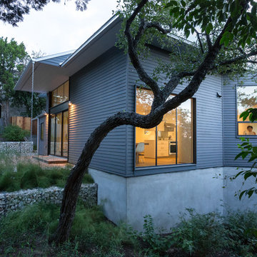
The Kiguchi family moved into their Austin, Texas home in 1994. Built in the 1980’s as part of a neighborhood development, they happily raised their family here but longed for something more contemporary. Once they became empty nesters, they decided it was time for a major remodel. After spending many years visiting Austin AIA Home Tours that highlight contemporary residential architecture, they had a lot of ideas and in 2013 were ready to interview architects and get their renovation underway.
The project turned into a major remodel due to an unstable foundation. Architects Ben Arbib and Ed Hughey, of Arbib Hughey Design were hired to solve the structural issue and look for inspiration in the bones of the house, which sat on top of a hillside and was surrounded by great views.
Unfortunately, with the old floor plan, the beautiful views were hidden by small windows that were poorly placed. In order to bring more natural light into the house the window sizes and configurations had to be addressed, all while keeping in mind the homeowners desire for a modern look and feel.
To achieve a more contemporary and sophisticated front of house, a new entry was designed that included removing a two-story bay window and porch. The entrance of the home also became more integrated with the landscape creating a template for new foliage to be planted. Older exterior materials were updated to incorporate a more muted palette of colors with a metal roof, dark grey siding in the back and white stucco in the front. Deep eaves were added over many of the new large windows for clean lines and sun protection.
“Inside it was about opening up the floor plan, expanding the views throughout the house, and updating the material palette to get a modern look that was also warm and inviting,” said Ben from Arbib Hughey Design. “Prior to the remodel, the house had the typical separation of rooms. We removed the walls between them and changed all of the windows to Milgard Thermally Improved Aluminum to connect the inside with the outside. No matter where you are you get nice views and natural light.”
The architects wanted to create some drama, which they accomplished with the window placement and opening up the interior floor plan to an open concept approach. Cabinetry was used to help delineate intimate spaces. To add warmth to an all-white living room, white-washed oak wood floors were installed and pine planks were used around the fireplace. The large windows served as artwork bringing the color of nature into the space.
An octagon shaped, elevated dining room, (named “the turret”), had a big impact on the design of the house. They architects rounded the corners and added larger window openings overlooking a new sunken garden. The great room was also softened by rounding out the corners and that circular theme continued throughout the house, being picked up in skylight wells and kitchen cabinetry. A staircase leading to a catwalk was added and the result was a two-story window wall that flooded the home with natural light.
When asked why Milgard® Thermally Improved Aluminum windows were selected, the architectural team listed many reasons:
1) Aesthetics: “We liked the slim profiles and narrow sightlines. The window frames never get in the way of the view and that was important to us. They also have a very contemporary look that went well with our design.”
2) Options: “We liked that we could get large sliding doors that matched the windows, giving us a very cohesive look and feel throughout the project.”
3) Cost Effective: “Milgard windows are affordable. You get a good product at a good price.”
4) Custom Sizes: “Milgard windows are customizable, which allowed us to get the right window for each location.”
Ready to take on your own traditional to modern home remodeling project? Arbib Hughey Design advises, “Work with a good architect. That means picking a team that is creative, communicative, listens well and is responsive. We think it’s important for an architect to listen to their clients and give them something they want, not something the architect thinks they should have. At the same time you want an architect who is willing and able to think outside the box and offer up design options that you may not have considered. Design is about a lot of back and forth, trying out ideas, getting feedback and trying again.”
The home was completely transformed into a unique, contemporary house perfectly integrated with its site. Internally the home has a natural flow for the occupants and externally it is integrated with the surroundings taking advantage of great natural light. As a side note, it was highly praised as part of the Austin AIA homes tour.
 Milgard Windows & Doors
The Kiguchi family moved into their Austin, Texas home in 1994. Built in the 1980’s as part of a neighborhood development, they happily raised their family here but longed for something more contemporary. Once they became empty nesters, they decided it was time for a major remodel. After spending many years visiting Austin AIA Home Tours that highlight contemporary residential architecture, they had a lot of ideas and in 2013 were ready to interview architects and get their renovation underway.
The project turned into a major remodel due to an unstable foundation. Architects Ben Arbib and Ed Hughey, of Arbib Hughey Design were hired to solve the structural issue and look for inspiration in the bones of the house, which sat on top of a hillside and was surrounded by great views.
Unfortunately, with the old floor plan, the beautiful views were hidden by small windows that were poorly placed. In order to bring more natural light into the house the window sizes and configurations had to be addressed, all while keeping in mind the homeowners desire for a modern look and feel.
To achieve a more contemporary and sophisticated front of house, a new entry was designed that included removing a two-story bay window and porch. The entrance of the home also became more integrated with the landscape creating a template for new foliage to be planted. Older exterior materials were updated to incorporate a more muted palette of colors with a metal roof, dark grey siding in the back and white stucco in the front. Deep eaves were added over many of the new large windows for clean lines and sun protection.
“Inside it was about opening up the floor plan, expanding the views throughout the house, and updating the material palette to get a modern look that was also warm and inviting,” said Ben from Arbib Hughey Design. “Prior to the remodel, the house had the typical separation of rooms. We removed the walls between them and changed all of the windows to Milgard Thermally Improved Aluminum to connect the inside with the outside. No matter where you are you get nice views and natural light.”
The architects wanted to create some drama, which they accomplished with the window placement and opening up the interior floor plan to an open concept approach. Cabinetry was used to help delineate intimate spaces. To add warmth to an all-white living room, white-washed oak wood floors were installed and pine planks were used around the fireplace. The large windows served as artwork bringing the color of nature into the space.
An octagon shaped, elevated dining room, (named “the turret”), had a big impact on the design of the house. They architects rounded the corners and added larger window openings overlooking a new sunken garden. The great room was also softened by rounding out the corners and that circular theme continued throughout the house, being picked up in skylight wells and kitchen cabinetry. A staircase leading to a catwalk was added and the result was a two-story window wall that flooded the home with natural light.
When asked why Milgard® Thermally Improved Aluminum windows were selected, the architectural team listed many reasons:
1) Aesthetics: “We liked the slim profiles and narrow sightlines. The window frames never get in the way of the view and that was important to us. They also have a very contemporary look that went well with our design.”
2) Options: “We liked that we could get large sliding doors that matched the windows, giving us a very cohesive look and feel throughout the project.”
3) Cost Effective: “Milgard windows are affordable. You get a good product at a good price.”
4) Custom Sizes: “Milgard windows are customizable, which allowed us to get the right window for each location.”
Ready to take on your own traditional to modern home remodeling project? Arbib Hughey Design advises, “Work with a good architect. That means picking a team that is creative, communicative, listens well and is responsive. We think it’s important for an architect to listen to their clients and give them something they want, not something the architect thinks they should have. At the same time you want an architect who is willing and able to think outside the box and offer up design options that you may not have considered. Design is about a lot of back and forth, trying out ideas, getting feedback and trying again.”
The home was completely transformed into a unique, contemporary house perfectly integrated with its site. Internally the home has a natural flow for the occupants and externally it is integrated with the surroundings taking advantage of great natural light. As a side note, it was highly praised as part of the Austin AIA homes tour.
 TKS Design Group
Download our free ebook, Creating the Ideal Kitchen. DOWNLOAD NOW
Lakefront property in the northwest suburbs of Chicago is hard to come by, so when we were hired by this young family with exactly that, we were immediately inspired by not just the unusually large footprint of this 1950’s colonial revival but also the lovely views of the manmade lake it was sited on. The large 5-bedroom home was solidly stuck in the 1980’s, but we saw tons of potential. We started out by updating the existing staircase with a fresh coat of paint and adding new herringbone slate to the entry hall.
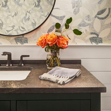
The powder room off the entryway also got a refresh - new flooring, new cabinets and fixtures. We ran the new slate right through into this space for some consistency. A fun wallpaper and shiplap trim add a welcoming feel and set the tone for the home.
Next, we tackled the kitchen. Located away from the rest of the first floor, the kitchen felt a little isolated, so we immediately began planning for how to better connect it to the rest of the first floor. We landed on removing the wall between the kitchen and dining room and designed a modified galley style space with separate cooking and clean up zones. The cooking zone consists of the refrigerator, prep sink and cooktop, along with a nice long run of prep space at the island. The cleanup side of the kitchen consists of the main sink and dishwasher. Both areas are situated so that the user can view the lake during prep work and cleanup!
One of the home’s main puzzles was how to incorporate the mudroom and area in front of the patio doors at the back of the house. We already had a breakfast table area, so the space by the patio doors was a bit of a no man’s land. We decided to separate the kitchen proper from what became the new mudroom with a large set of barn doors. That way you can quickly hide any mudroom messes but have easy access to the light coming in through the patio doors as well as the outdoor grilling station. We also love the impact the barn doors add to the overall space.
The homeowners’ first words to us were “it’s time to ditch the brown,” so we did! We chose a lovely blue pallet that reflects the home’s location on the lake which is also vibrant yet easy on the eye. Countertops are white quartz, and the natural oak floor works well with the other honey accents. The breakfast table was given a refresh with new chairs, chandelier and window treatments that frame the gorgeous views of the lake out the back.
We coordinated the slate mudroom flooring with that used in the home’s main entrance for a consistent feel. The storage area consists of open and closed storage to allow for some clutter control as needed.
Next on our “to do” list was revamping the dated brown bar area in the neighboring dining room. We eliminated the clutter by adding some closed cabinets and did some easy updates to help the space feel more current. One snag we ran into here was the discovery of a beam above the existing open shelving that had to be modified with a smaller structural beam to allow for our new design to work. This was an unexpected surprise, but in the end we think it was well worth it!
We kept the colors here a bit more muted to blend with the homeowner’s existing furnishings. Open shelving and polished nickel hardware add some simple detail to the new entertainment zone which also looks out onto the lake!
Next we tackled the upstairs starting with the homeowner’s son’s bath. The bath originally had both a tub shower and a separate shower, so we decided to swap out the shower for a new laundry area. This freed up some space downstairs in what used to be the mudroom/laundry room and is much more convenient for daily laundry needs.
We continued the blue palette here with navy cabinetry and the navy tile in the shower. Porcelain floor tile and chrome fixtures keep maintenance to a minimum while matte black mirrors and lighting add some depth the design. A low maintenance runner adds some warmth underfoot and ties the whole space together.
We added a pocket door to the bathroom to minimize interference with the door swings. The left door of the laundry closet is on a 180 degree hinge to allow for easy full access to the machines. Next we tackled the master bath which is an en suite arrangement. The original was typical of the 1980’s with the vanity outside of the bathroom, situated near the master closet. And the brown theme continued here with multiple shades of brown.
Our first move was to segment off the bath and the closet from the master bedroom. We created a short hall from the bedroom to the bathroom with his and hers walk-in closets on the left and right as well as a separate toilet closet outside of the main bathroom for privacy and flexibility.
The original bathroom had a giant soaking tub with steps (dangerous!) as well as a small shower that did not work well for our homeowner who is 6’3”. With other bathtubs in the home, they decided to eliminate the tub and create an oversized shower which takes up the space where the old tub was located. The double vanity is on the opposite wall and a bench is located under the window for morning conversations and a place to set a couple of towels.
The pallet in here is light and airy with a mix of blond wood, creamy porcelain and marble tile, and brass accents. A simple roman shade adds some texture and it’s top-down mechanism allows for light and privacy.
This large whole house remodel gave our homeowners not only the ability to maximize the potential of their home but also created a lovely new frame from which to view their fabulous lake views.
Designed by: Susan Klimala, CKD, CBD
Photography by: Michael Kaskel
For more information on kitchen and bath design ideas go to: www.kitchenstudio-ge.com
 TKS Design Group
Download our free ebook, Creating the Ideal Kitchen. DOWNLOAD NOW
I am still sometimes shocked myself at how much of a difference a kitchen remodel can make in a space, you think I would know by now! This was one of those jobs. The small U-shaped room was a bit cramped, a bit dark and a bit dated. A neighboring sunroom/breakfast room addition was awkwardly used, and most of the time the couple hung out together at the small peninsula.
The client wish list included a larger, lighter kitchen with an island that would seat 7 people. They have a large family and wanted to be able to gather and entertain in the space. Right outside is a lovely backyard and patio with a fireplace, so having easy access and flow to that area was also important.
Our first move was to eliminate the wall between kitchen and breakfast room, which we anticipated would need a large beam and some structural maneuvering since it was the old exterior wall. However, what we didn’t anticipate was that the stucco exterior of the original home was layered over hollow clay tiles which was impossible to shore up in the typical manner. After much back and forth with our structural team, we were able to develop a plan to shore the wall and install a large steal & wood structural beam with minimal disruption to the original floor plan. That was important because we had already ordered everything customized to fit the plan.
We all breathed a collective sigh of relief once that part was completed. Now we could move on to building the kitchen we had all been waiting for. Oh, and let’s not forget that this was all being done amidst COVID 2020.
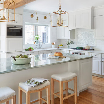
We covered the rough beam with cedar and stained it to coordinate with the floors. It’s actually one of my favorite elements in the space. The homeowners now have a big beautiful island that seats up to 7 people and has a wonderful flow to the outdoor space just like they wanted. The large island provides not only seating but also substantial prep area perfectly situated between the sink and cooktop. In addition to a built-in oven below the large gas cooktop, there is also a steam oven to the left of the sink. The steam oven is great for baking as well for heating daily meals without having to heat up the large oven.
The other side of the room houses a substantial pantry, the refrigerator, a small bar area as well as a TV.
The homeowner fell in love the with the Aqua quartzite that is on the island, so we married that with a custom mosaic in a similar tone behind the cooktop. Soft white cabinetry, Cambria quartz and Thassos marble subway tile complete the soft traditional look. Gold accents, wood wrapped beams and oak barstools add warmth the room. The little powder room was also included in the project. Some fun wallpaper, a vanity with a pop of color and pretty fixtures and accessories finish off this cute little space.
Designed by: Susan Klimala, CKD, CBD
Photography by: Michael Kaskel
For more information on kitchen and bath design ideas go to: www.kitchenstudio-ge.com


 Milgard Windows & Doors
The Kiguchi family moved into their Austin, Texas home in 1994. Built in the 1980’s as part of a neighborhood development, they happily raised their family here but longed for something more contemporary. Once they became empty nesters, they decided it was time for a major remodel. After spending many years visiting Austin AIA Home Tours that highlight contemporary residential architecture, they had a lot of ideas and in 2013 were ready to interview architects and get their renovation underway.
The project turned into a major remodel due to an unstable foundation. Architects Ben Arbib and Ed Hughey, of Arbib Hughey Design were hired to solve the structural issue and look for inspiration in the bones of the house, which sat on top of a hillside and was surrounded by great views.
Unfortunately, with the old floor plan, the beautiful views were hidden by small windows that were poorly placed. In order to bring more natural light into the house the window sizes and configurations had to be addressed, all while keeping in mind the homeowners desire for a modern look and feel.
To achieve a more contemporary and sophisticated front of house, a new entry was designed that included removing a two-story bay window and porch. The entrance of the home also became more integrated with the landscape creating a template for new foliage to be planted. Older exterior materials were updated to incorporate a more muted palette of colors with a metal roof, dark grey siding in the back and white stucco in the front. Deep eaves were added over many of the new large windows for clean lines and sun protection.
“Inside it was about opening up the floor plan, expanding the views throughout the house, and updating the material palette to get a modern look that was also warm and inviting,” said Ben from Arbib Hughey Design. “Prior to the remodel, the house had the typical separation of rooms. We removed the walls between them and changed all of the windows to Milgard Thermally Improved Aluminum to connect the inside with the outside. No matter where you are you get nice views and natural light.”
The architects wanted to create some drama, which they accomplished with the window placement and opening up the interior floor plan to an open concept approach. Cabinetry was used to help delineate intimate spaces. To add warmth to an all-white living room, white-washed oak wood floors were installed and pine planks were used around the fireplace. The large windows served as artwork bringing the color of nature into the space.
An octagon shaped, elevated dining room, (named “the turret”), had a big impact on the design of the house. They architects rounded the corners and added larger window openings overlooking a new sunken garden. The great room was also softened by rounding out the corners and that circular theme continued throughout the house, being picked up in skylight wells and kitchen cabinetry. A staircase leading to a catwalk was added and the result was a two-story window wall that flooded the home with natural light.
When asked why Milgard® Thermally Improved Aluminum windows were selected, the architectural team listed many reasons:
1) Aesthetics: “We liked the slim profiles and narrow sightlines. The window frames never get in the way of the view and that was important to us. They also have a very contemporary look that went well with our design.”
2) Options: “We liked that we could get large sliding doors that matched the windows, giving us a very cohesive look and feel throughout the project.”
3) Cost Effective: “Milgard windows are affordable. You get a good product at a good price.”
4) Custom Sizes: “Milgard windows are customizable, which allowed us to get the right window for each location.”
Ready to take on your own traditional to modern home remodeling project? Arbib Hughey Design advises, “Work with a good architect. That means picking a team that is creative, communicative, listens well and is responsive. We think it’s important for an architect to listen to their clients and give them something they want, not something the architect thinks they should have. At the same time you want an architect who is willing and able to think outside the box and offer up design options that you may not have considered. Design is about a lot of back and forth, trying out ideas, getting feedback and trying again.”
The home was completely transformed into a unique, contemporary house perfectly integrated with its site. Internally the home has a natural flow for the occupants and externally it is integrated with the surroundings taking advantage of great natural light. As a side note, it was highly praised as part of the Austin AIA homes tour.
 Eldorado Stone
Custom Home Theater
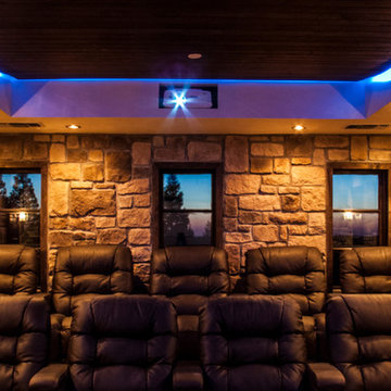
The creative minds behind Theater Monster put their heads together to develop an inspired and unique home theater for the residents of this particular home. They wanted to design a rustic theater that their client would be proud to show to guests, so it was a must to think outside the box. After conducting extensive research, Eldorado Stone was selected to meet their design needs and Autumn Leaf RoughCut was applied to the main walls. Additionally, they incorporated further visual appeal by constructing a modern, rolling tongue and groove ceiling to resemble a sound wave.
Surprisingly, the use of architectural stone veneer in this space didn’t interfere with the quality of sound throughout the home theater. The rough edges of the stone helped to break up the sound waves emitted from the sound system and resulted in an even emission of sound in this space. Smooth walls typically cause refraction of sound unless heavily insulated, so the stone did double-duty by not only looking aesthetically appealing but also acting as natural insulation.
Considering this was the first time the professionals at Theater Monster veered from more standard materials and utilized stone in a theater, they couldn’t have been happier with the end result.
Architect/Designer: Nathan Goldstein
www.theatermonster.com
Builder: Theater Monster LLC
Website: www.theatermonster.com
Mason: Dustin Mathenia
Phone: (559) 471-9140
Photography: Nathan Goldstein and Anthonie Mcgowan
 Shaw Floors
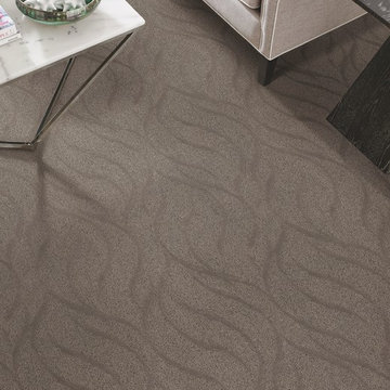
Flooring by Shaw Industries, Foundations Collection
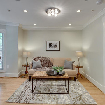
Living room - contemporary living room idea in Atlanta
Living room - contemporary living room idea in Atlanta
 TKS Design Group
Download our free ebook, Creating the Ideal Kitchen. DOWNLOAD NOW
Lakefront property in the northwest suburbs of Chicago is hard to come by, so when we were hired by this young family with exactly that, we were immediately inspired by not just the unusually large footprint of this 1950’s colonial revival but also the lovely views of the manmade lake it was sited on. The large 5-bedroom home was solidly stuck in the 1980’s, but we saw tons of potential. We started out by updating the existing staircase with a fresh coat of paint and adding new herringbone slate to the entry hall.
The powder room off the entryway also got a refresh - new flooring, new cabinets and fixtures. We ran the new slate right through into this space for some consistency. A fun wallpaper and shiplap trim add a welcoming feel and set the tone for the home.
Next, we tackled the kitchen. Located away from the rest of the first floor, the kitchen felt a little isolated, so we immediately began planning for how to better connect it to the rest of the first floor. We landed on removing the wall between the kitchen and dining room and designed a modified galley style space with separate cooking and clean up zones. The cooking zone consists of the refrigerator, prep sink and cooktop, along with a nice long run of prep space at the island. The cleanup side of the kitchen consists of the main sink and dishwasher. Both areas are situated so that the user can view the lake during prep work and cleanup!
One of the home’s main puzzles was how to incorporate the mudroom and area in front of the patio doors at the back of the house. We already had a breakfast table area, so the space by the patio doors was a bit of a no man’s land. We decided to separate the kitchen proper from what became the new mudroom with a large set of barn doors. That way you can quickly hide any mudroom messes but have easy access to the light coming in through the patio doors as well as the outdoor grilling station. We also love the impact the barn doors add to the overall space.
The homeowners’ first words to us were “it’s time to ditch the brown,” so we did! We chose a lovely blue pallet that reflects the home’s location on the lake which is also vibrant yet easy on the eye. Countertops are white quartz, and the natural oak floor works well with the other honey accents. The breakfast table was given a refresh with new chairs, chandelier and window treatments that frame the gorgeous views of the lake out the back.
We coordinated the slate mudroom flooring with that used in the home’s main entrance for a consistent feel. The storage area consists of open and closed storage to allow for some clutter control as needed.
Next on our “to do” list was revamping the dated brown bar area in the neighboring dining room. We eliminated the clutter by adding some closed cabinets and did some easy updates to help the space feel more current. One snag we ran into here was the discovery of a beam above the existing open shelving that had to be modified with a smaller structural beam to allow for our new design to work. This was an unexpected surprise, but in the end we think it was well worth it!
We kept the colors here a bit more muted to blend with the homeowner’s existing furnishings. Open shelving and polished nickel hardware add some simple detail to the new entertainment zone which also looks out onto the lake!
Next we tackled the upstairs starting with the homeowner’s son’s bath. The bath originally had both a tub shower and a separate shower, so we decided to swap out the shower for a new laundry area. This freed up some space downstairs in what used to be the mudroom/laundry room and is much more convenient for daily laundry needs.
We continued the blue palette here with navy cabinetry and the navy tile in the shower. Porcelain floor tile and chrome fixtures keep maintenance to a minimum while matte black mirrors and lighting add some depth the design. A low maintenance runner adds some warmth underfoot and ties the whole space together.
We added a pocket door to the bathroom to minimize interference with the door swings. The left door of the laundry closet is on a 180 degree hinge to allow for easy full access to the machines. Next we tackled the master bath which is an en suite arrangement. The original was typical of the 1980’s with the vanity outside of the bathroom, situated near the master closet. And the brown theme continued here with multiple shades of brown.
Our first move was to segment off the bath and the closet from the master bedroom. We created a short hall from the bedroom to the bathroom with his and hers walk-in closets on the left and right as well as a separate toilet closet outside of the main bathroom for privacy and flexibility.
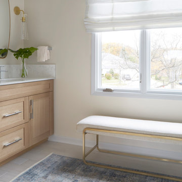
The original bathroom had a giant soaking tub with steps (dangerous!) as well as a small shower that did not work well for our homeowner who is 6’3”. With other bathtubs in the home, they decided to eliminate the tub and create an oversized shower which takes up the space where the old tub was located. The double vanity is on the opposite wall and a bench is located under the window for morning conversations and a place to set a couple of towels.
The pallet in here is light and airy with a mix of blond wood, creamy porcelain and marble tile, and brass accents. A simple roman shade adds some texture and it’s top-down mechanism allows for light and privacy.
This large whole house remodel gave our homeowners not only the ability to maximize the potential of their home but also created a lovely new frame from which to view their fabulous lake views.
Designed by: Susan Klimala, CKD, CBD
Photography by: Michael Kaskel
For more information on kitchen and bath design ideas go to: www.kitchenstudio-ge.com
 Sandra Hambley
With a listing price of just under $4 million, this gorgeous row home located near the Convention Center in Washington DC required a very specific look to attract the proper buyer.
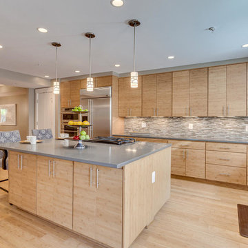
The home has been completely remodeled in a modern style with bamboo flooring and bamboo kitchen cabinetry so the furnishings and decor needed to be complimentary. Typically, transitional furnishings are used in staging across the board, however, for this property we wanted an urban loft, industrial look with heavy elements of reclaimed wood to create a city, hotel luxe style. As with all DC properties, this one is long and narrow but is completely open concept on each level, so continuity in color and design selections was critical.
The row home had several open areas that needed a defined purpose such as a reception area, which includes a full bar service area, pub tables, stools and several comfortable seating areas for additional entertaining. It also boasts an in law suite with kitchen and living quarters as well as 3 outdoor spaces, which are highly sought after in the District.
 Sandra Hambley
With a listing price of just under $4 million, this gorgeous row home located near the Convention Center in Washington DC required a very specific look to attract the proper buyer.
The home has been completely remodeled in a modern style with bamboo flooring and bamboo kitchen cabinetry so the furnishings and decor needed to be complimentary. Typically, transitional furnishings are used in staging across the board, however, for this property we wanted an urban loft, industrial look with heavy elements of reclaimed wood to create a city, hotel luxe style. As with all DC properties, this one is long and narrow but is completely open concept on each level, so continuity in color and design selections was critical.
The row home had several open areas that needed a defined purpose such as a reception area, which includes a full bar service area, pub tables, stools and several comfortable seating areas for additional entertaining. It also boasts an in law suite with kitchen and living quarters as well as 3 outdoor spaces, which are highly sought after in the District.
 Myers Constructs, Inc.
We recently took on an exciting whole-home renovation for this lovely historic Trinity in Center City Philadelphia. Originally built in the mid-1800s, the house footprint is just over 17’ x 13’. As is typical of this type of 3-story house, the kitchen is located in the basement, making this house four floors of occupied space with overall square footage totaling just under 900 square feet.
The homeowner felt the former kitchen was cramped, dimly lit, and inefficiently designed, and she was in search of help in bringing her artistic vision for the space to life, blending both old and new elements through an exciting mix of textures and character. High on her priority list was integrating her wonderful collection of objects gathered from her travels around the world.
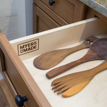
We brought our design skills and construction experience to the team, working with the homeowner and the designer to develop a host of creative solutions, including the installation of an Indonesian screen as a sliding door covering a newly reconfigured utility area, which includes a new on-demand hot water heater, mounted next to a new electrical panel with ample room for service and access.
Other Noteworthy Features and Solutions:
New crisp drywall blended with original masonry wall textures and original exposed beams
Custom-glazed adler wood cabinets, beautiful fusion Quartzite and custom cherry counters, and a copper sink were selected for a wonderful interplay of colors, textures, and Old World feel
Small-space efficiencies designed for real-size humans, including built-ins wherever possible, limited free-standing furniture, and no upper cabinets
Built-in storage and appliances under the counter (refrigerator, freezer, washer, dryer, and microwave drawer)
Additional multi-function storage under stairs
Extensive lighting plan with multiple sources and types of light to make this partially below-grade space feel bright and cheery
Enlarged window well to bring much more light into the space
Insulation added to create sound buffer from the floor above
All Photos by Linda McManus Photography
 Talon Construction Inc.
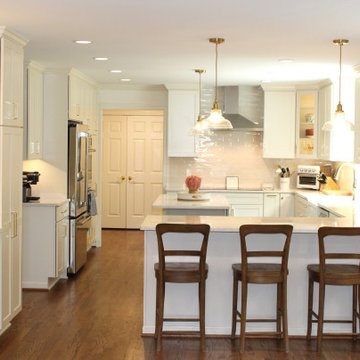
Finding a reputable contractor to design and build your kitchen remodel in Maryland with quality results involves several steps. Here are some general guidelines to help you find the right professional for your project:
1. Ask for Recommendations: Start by asking friends, family, neighbors, or colleagues who have recently completed kitchen remodels for recommendations. Personal referrals can be a valuable source of trustworthy contractors.
2. Check Online Reviews: Websites like Yelp, Angie's List, and Google Reviews can provide insights into the experiences of previous clients. Look for contractors with consistently positive feedback.
3. Check Credentials: Verify that the contractor has the necessary licenses and insurance to work in Maryland. You can typically check this information on your state's licensing board website.
4. Ask for References: Request references from the contractor and contact previous clients to inquire about their experiences. Visit some of their completed projects if possible.
5. Review Portfolios: Examine the contractor's portfolio of past kitchen remodels. Look for examples of work that match your style and preferences.
6. Check for Permits: Ensure that the contractor will handle any necessary permits and inspections for your remodel. Avoid contractors who suggest bypassing required permits, as this can lead to legal and safety issues.
7. Discuss Communication: Clear communication is crucial throughout the project. Discuss how the contractor will keep you updated on progress and address any concerns or changes during the remodel.
8. Get Everything in Writing: Never rely solely on verbal agreements. Ensure that all project details, warranties, and expectations are documented in a written contract.
9. Check for Red Flags: Be wary of contractors who pressure you into making quick decisions, lack a physical business address, or have a history of disputes or legal issues.
10. Trust Your Instincts: Choose a contractor you feel comfortable working with. Trust your instincts and select someone who listens to your ideas and concerns.
11. Visit Completed Projects: If possible, visit some of the contractors’ completed kitchen remodels to assess the quality of their work in person.
Once you've completed your due diligence and gathered all the necessary information, you'll be better equipped to make an informed decision about which contractor to hire for your kitchen remodel in Maryland. Remember that quality results often come from working with experienced, licensed professionals who prioritize clear communication and transparency throughout the project.
 Sandra Hambley
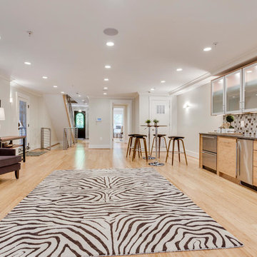
With a listing price of just under $4 million, this gorgeous row home located near the Convention Center in Washington DC required a very specific look to attract the proper buyer.
The home has been completely remodeled in a modern style with bamboo flooring and bamboo kitchen cabinetry so the furnishings and decor needed to be complimentary. Typically, transitional furnishings are used in staging across the board, however, for this property we wanted an urban loft, industrial look with heavy elements of reclaimed wood to create a city, hotel luxe style. As with all DC properties, this one is long and narrow but is completely open concept on each level, so continuity in color and design selections was critical.
The row home had several open areas that needed a defined purpose such as a reception area, which includes a full bar service area, pub tables, stools and several comfortable seating areas for additional entertaining. It also boasts an in law suite with kitchen and living quarters as well as 3 outdoor spaces, which are highly sought after in the District.
 RAJ Kitchen and Bath, LLC
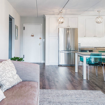
 “Full apartment design”.
IF you have not yet seen this apartment conversion before, we strongly urge you to go to the bottom left of this page and click on the short 2-minutes video. It would put a lot of things into perspective when you come back and continue reading this.
It is true we were literally handed the keys and told a list of things that they wanted to have happen and we were to go into the apartment, look at the space and come up with a design that would satisfy all of that need. UNTIL we showed up! The unit had really seen some better days but we knew we had to look past that and come up with a concept that would work for them.
The immediate challenges were centered around 3 big ideas:
1. Adding a second bedroom to the already small footprint
2. Figuring out a way to make the kitchen bigger, better and brighter
3. Creating a master room walk in closet
It’s always difficult to add new rooms into existing footprint without expanding out or up and not incurring any opportunity cost. In this case, that was exactly what we had to do. Item one and two above had to be tackled as one. We went ahead and switched out the location of the dining room and eliminating an area where there was a “nook” type eat-in area. By doing so, we were able to cut right into that footprint and change the layout of the kitchen.
That one move allowed us to dig into the kitchen design because it was now the main focal point in the apartment. It was no longer an option to keep it in that tiny hole where it was, so we had to ensure that this design was functional and aesthetically pleasing at the same time. By adding the table into the space where an Island typically would go, we were able to both cut cost and still provide a dining experience. The Table serves as an Island as well when cooking.
We then proceeded to block in the existing doorway to the dining room. By doing this, we were able to create a full room which allowed us to put a door on the other side and called that room Bedroom #2. This was easier to do because all of the mechanicals were already in that space (light, heater and windows). By shifting things around, we also achieved a huge wall to wall closet from inside. PERFECT!
Then we moved into the Single bedroom. We thought it was a big room with a small closet, so by creatively adding an L shaped wall and steal some footprint into the bedroom side, we were able to put a door on that new room and design it for the walk-in closet. Even after this, the bedroom still holds a queen size bed with 2 night stands, a TV on the wall, a sitting chair and plenty of room to walk around. This was done by rethinking the location for the bed and night stands.
The bathroom was gutted to make sure there was no leaks and rebuild from the ground up. We kept all of the plumbing where it was, added a new vanity, medicine cabinet, tiles and lighting and it was done.
From there, the rest of the unit had new flooring all throughout, paint, and lighting. After completion and walk through, this project was handed over back to the clients.
Execution and collaboration between all the trades were: Reggie and his team from Premier Interiors and Rohan from RD Mechanical Services.
p.s. Please see our website to see the video.
 Sandra Hambley
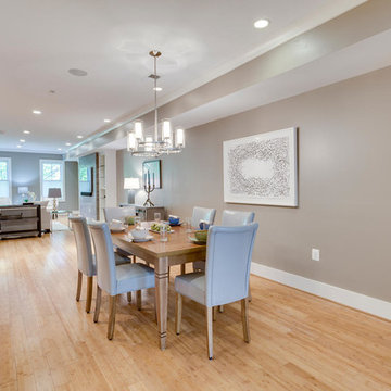
With a listing price of just under $4 million, this gorgeous row home located near the Convention Center in Washington DC required a very specific look to attract the proper buyer.
The home has been completely remodeled in a modern style with bamboo flooring and bamboo kitchen cabinetry so the furnishings and decor needed to be complimentary. Typically, transitional furnishings are used in staging across the board, however, for this property we wanted an urban loft, industrial look with heavy elements of reclaimed wood to create a city, hotel luxe style. As with all DC properties, this one is long and narrow but is completely open concept on each level, so continuity in color and design selections was critical.
The row home had several open areas that needed a defined purpose such as a reception area, which includes a full bar service area, pub tables, stools and several comfortable seating areas for additional entertaining. It also boasts an in law suite with kitchen and living quarters as well as 3 outdoor spaces, which are highly sought after in the District.
 Myers Constructs, Inc.
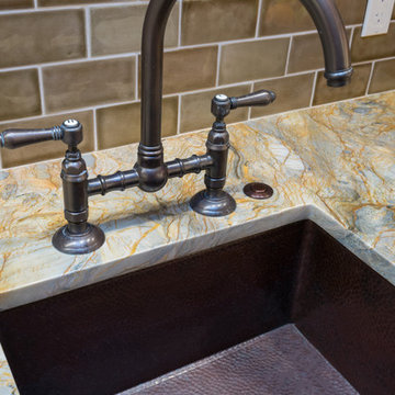
We recently took on an exciting whole-home renovation for this lovely historic Trinity in Center City Philadelphia. Originally built in the mid-1800s, the house footprint is just over 17’ x 13’. As is typical of this type of 3-story house, the kitchen is located in the basement, making this house four floors of occupied space with overall square footage totaling just under 900 square feet.
The homeowner felt the former kitchen was cramped, dimly lit, and inefficiently designed, and she was in search of help in bringing her artistic vision for the space to life, blending both old and new elements through an exciting mix of textures and character. High on her priority list was integrating her wonderful collection of objects gathered from her travels around the world.
We brought our design skills and construction experience to the team, working with the homeowner and the designer to develop a host of creative solutions, including the installation of an Indonesian screen as a sliding door covering a newly reconfigured utility area, which includes a new on-demand hot water heater, mounted next to a new electrical panel with ample room for service and access.
Other Noteworthy Features and Solutions:
New crisp drywall blended with original masonry wall textures and original exposed beams
Custom-glazed adler wood cabinets, beautiful fusion Quartzite and custom cherry counters, and a copper sink were selected for a wonderful interplay of colors, textures, and Old World feel
Small-space efficiencies designed for real-size humans, including built-ins wherever possible, limited free-standing furniture, and no upper cabinets
Built-in storage and appliances under the counter (refrigerator, freezer, washer, dryer, and microwave drawer)
Additional multi-function storage under stairs
Extensive lighting plan with multiple sources and types of light to make this partially below-grade space feel bright and cheery
Enlarged window well to bring much more light into the space
Insulation added to create sound buffer from the floor above
All Photos by Linda McManus Photography
 TKS Design Group
Download our free ebook, Creating the Ideal Kitchen. DOWNLOAD NOW
I am still sometimes shocked myself at how much of a difference a kitchen remodel can make in a space, you think I would know by now! This was one of those jobs. The small U-shaped room was a bit cramped, a bit dark and a bit dated. A neighboring sunroom/breakfast room addition was awkwardly used, and most of the time the couple hung out together at the small peninsula.
The client wish list included a larger, lighter kitchen with an island that would seat 7 people. They have a large family and wanted to be able to gather and entertain in the space. Right outside is a lovely backyard and patio with a fireplace, so having easy access and flow to that area was also important.
Our first move was to eliminate the wall between kitchen and breakfast room, which we anticipated would need a large beam and some structural maneuvering since it was the old exterior wall. However, what we didn’t anticipate was that the stucco exterior of the original home was layered over hollow clay tiles which was impossible to shore up in the typical manner. After much back and forth with our structural team, we were able to develop a plan to shore the wall and install a large steal & wood structural beam with minimal disruption to the original floor plan. That was important because we had already ordered everything customized to fit the plan.
We all breathed a collective sigh of relief once that part was completed. Now we could move on to building the kitchen we had all been waiting for. Oh, and let’s not forget that this was all being done amidst COVID 2020.
We covered the rough beam with cedar and stained it to coordinate with the floors. It’s actually one of my favorite elements in the space. The homeowners now have a big beautiful island that seats up to 7 people and has a wonderful flow to the outdoor space just like they wanted. The large island provides not only seating but also substantial prep area perfectly situated between the sink and cooktop. In addition to a built-in oven below the large gas cooktop, there is also a steam oven to the left of the sink. The steam oven is great for baking as well for heating daily meals without having to heat up the large oven.
The other side of the room houses a substantial pantry, the refrigerator, a small bar area as well as a TV.
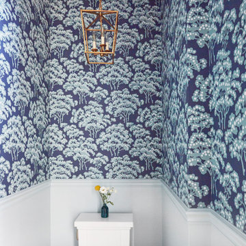
The homeowner fell in love the with the Aqua quartzite that is on the island, so we married that with a custom mosaic in a similar tone behind the cooktop. Soft white cabinetry, Cambria quartz and Thassos marble subway tile complete the soft traditional look. Gold accents, wood wrapped beams and oak barstools add warmth the room. The little powder room was also included in the project. Some fun wallpaper, a vanity with a pop of color and pretty fixtures and accessories finish off this cute little space.
Designed by: Susan Klimala, CKD, CBD
Photography by: Michael Kaskel
For more information on kitchen and bath design ideas go to: www.kitchenstudio-ge.com
14