
Search results for "Typical list" in Home Design Ideas
 Curbio Home Improvement
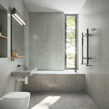
Bathrooms weren’t always a focal point for homeowners and buyers, and it shows in homes that haven’t been built or updated recently. Now, home buyers and homeowners are looking for more than just a bathroom focused solely on utility.
Bathrooms with double-sink vanities, soaker tubs, steam showers, and other spa-like features are at the top of the list for buyers. Even just updating to a neutral color scheme and reglazed the tub can increase buyer interest and modernize this essential part of the home.
At Curbio, we are a pay-at-closing concierge solution that helps homeowners captivate buyers while walking away with the most money in their pocket. We pride ourselves on making smart home improvements to modernize dated bathrooms and get sellers more money back at the closing table.
After determining which pre-listing bathroom updates will result in the greatest return on investment, our licensed general contractors will get started whether the project is a quick bathroom refresh or a full remodel. With typically a faster project completion than traditional general home contractors, the project will not face unnecessary delays. Our teams also handle the entire project from start to finish so you do not have to. This makes for happier homeowners, and agents.
 Stephanie Charest Interior Design
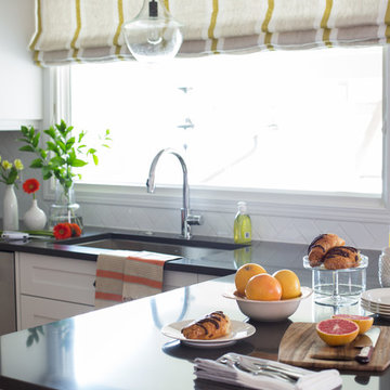
We completed this kitchen renovation for a SW. Calgary couple and as you’ll see, it was a much needed update after their 20+ years in the home.
Clearly the look of the cabinets needed to be brought up to date, but function was on the top of the list for this client. She enjoys cooking and often hosts several friends over for canning and other big cooking parties so countertop space was a priority. Seeing as they also host large family gatherings, the cook didn’t want to feel abandoned in the kitchen when everyone else was in the next room so opening up the space was crucial.
Here is what we did to change the way this space works for them…
We revised the layout of the appliances and cabinets and relocated the plumbing so she could look out the window while she stood at the sink. Taking the cabinets up to the ceiling also gave them more storage as does the large pantry next to the fridge. An island wouldn’t fit, so we added a peninsula which gave them a spot to sit to have their morning coffee and a significant amount of additional counter space. By removing the walls between the kitchen and dining room it eliminated a small hallway that separated the kitchen and dining room and allowed for an open concept in their 1960’s home.
To add visual interest to the space and to define the dining room, we added a coffered celing. Now, typically a coffered ceiling is done when you have three or four walls to anchor it in. It was a bit of a risk to add a “floating” coffered ceiling! However, it turned out beautifully. It wasn’t without it issues but I’m glad we added this element as it wouldn’t have been as interesting with a typical flat ceiling.
In the dining room, a buffet was added for additional storage as well as new drapery panels, lighting and furniture. The peacock blue end chairs are stunning! Without that punch of color the dining room just wouldn’t be as outstanding. They are so lovely and really pushed the client out of her comfort zone – but she loves them and is glad she trusted us with that design decision.
The result is a much more usable space that is also classic in style and just darn pretty to look at and be in! And I know this client is enjoying her new kitchen day to day and on special family occasions.
Adrian Shellard Photography
 Crafted Custom Homes + Renovations
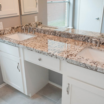
While we typically focus on high end homes, this small 1980's house in Stafford sold for under $200,000. We did a remodel and make ready for the homeowner prior to listing so they could take advantage of our hot market. This house is proof that good design can make inexpensive material selections look really good, and that you don't have to spend a fortune on a nice remodel.
Floors: Emser Tile 6x24 Heritage Walnut
Backsplash: Emser Tile 6x6 Ancient Tumbled Travertine
Backsplash Insert: Emser Tile Lucente Grazia Mosaic 5/8"
Bath Floors: Emser Tile 18x18 St Moritz Silver
Bath Insert: Emser Tile Lucente Grazia Linear
Kitchen Granite: Diamond Arrow
Master Bath Granite: Diamond Arrow
Guest Bath Granite: White Galaxy
Wall Paint: PPG Grey Marble
Trim Paint: PPG Arctic Cotton
Ceiling Paint: PPG Arctic Cotton
All Photos by Curtis Lawson
Find the right local pro for your project
 William Hoffman Architect
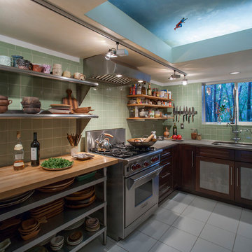
What simply started out as the purchase of a 30” Wolf gas stove to replace the old, turned into a complete kitchen renovation. The original intent was to replace the existing stove with the new. The new Wolf came other issues one being installing an adequate exhaust system to meet the needs of the stove. One thing led to the next and with that a new kitchen. The renovation included removing all existing fixtures, cabinetry and lighting. The existing tile floor remained the same but with some added area that was previously under existing base cabinets.
The goal of the project, once the decision was made to do a complete renovation, was to update the kitchen creating an eclectic aesthetic with all new fixtures of the best quality that could be afforded. Listed below are the changes that were made. All fixtures remained in their existing locations other than removing small piece of wall that allowed an extended length of the new bakers table to extend 24” into the existing dining and living room space to pull the spaces together and provide a small eating bar with adjoining bar stools. One stool was a custom design and fabrication (Marlin Stool)
Fixtures
1. Existing gas stove replaced with new 30” gas Wolf stove.
2. Existing Refrigerator replace with new 36” stainless steel Jen-Air refrigerator with bottom freezer.
3. Existing Dishwasher replace with new Jen-Air stainless steel interior and exterior dishwasher.
4. Existing base cabinets replaced with a combination of open and closed tables and cabinets. Two stainless steel commercial kitchen tables with an open bases and shelving. One with a stainless steel top the other a bakers table with a wood butcher block top. The cabinets were Kraft Made traditional wood base cabinets with a Kaffe finish and Fireslate counter surface. These cabinets were customized with stainless steel perforated door inserts and Mockett stainless steel drawer and door pulls.
5. Surface counter and table material included wood butcher block, stainless steel and Fireslate.
6. Overhead shelving included open commercial kitchen stainless steel shelves and open Appleply wood shelves with Rakks aluminum shelf brackets.
7. Existing lighting was replaced with Zumtobel track lighting with Ushio lamps, Lutron dimmers and an up lighted coffered ceiling (see Superman).
8. Existing kitchen sink was replaced with a large single compartment sink from Kindred with an In-Sinkerator Evolution garbage disposal. Filter water tap was added that connects to an Everprue water filter system.
9. Walls were tiled with Bottle Green 4 1/4” x 4 1/4” Daltile to staying consistent with existing original house tile.
10. The ceiling was reworked as required with a plaster finish
11. Marine grade caulk was used as required.
12. A soffit with up lighting was added to the periphery of kitchen facing the adjoining living and dining rooms.
13. Silver Masonite peg board storage wall adjacent to refrigerator.
Credits:
• Little Pete the Parakeet.....for being there
• Catalina Aguirre.....pots
• Many Friends....pots
• David D’Imperio.....Sputnik lamp
• Jose Maria Concha Sali.....painting
• Ron Meyers.....Plates on wall
• Bill Sanders.....Bunny screen painting
• William Hoffman....Beverly lamp
• William Hoffman.....marlin stool
• William Hoffman.....Gulfstream side chair
• William Hoffman.....Gulfstream dining table
• William Hoffman.....5 from 1 plywood chair
Problems
• A custom fabricated exhaust duct was required due to existing soffit framing conditions.
• The ceiling was not parallel to the floor so the intended full wall tile installation was held short of the ceiling.
• Return Air duct to A/C air handler required relocation
Project cost
• +/- $22,000
Fixtures, materials and appliances
Selection of fixtures, materials and fixtures were made based on quality, aesthetic and cost. Extensive research was done to find the best quality at a price point that was affordable. Items that were splurged on were the Wolf stove and Jen-Air refrigerator and dishwasher and the Zumtobel lighting
Bill Sanders Photography
 DCI Home Improvements
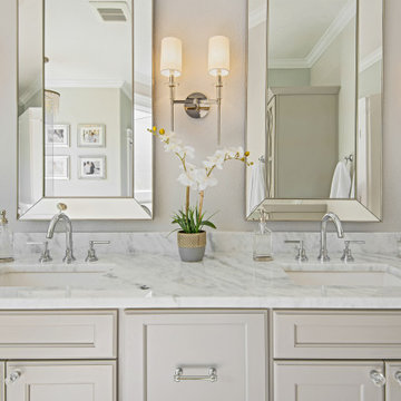
Take a look at the latest home renovation that we had the pleasure of performing for a client in Trinity. This was a full master bathroom remodel, guest bathroom remodel, and a laundry room. The existing bathroom and laundry room were the typical early 2000’s era décor that you would expect in the area. The client came to us with a list of things that they wanted to accomplish in the various spaces. The master bathroom features new cabinetry with custom elements provided by Palm Harbor Cabinets. A free standing bathtub. New frameless glass shower. Custom tile that was provided by Pro Source Port Richey. New lighting and wainscoting finish off the look. In the master bathroom, we took the same steps and updated all of the tile, cabinetry, lighting, and trim as well. The laundry room was finished off with new cabinets, shelving, and custom tile work to give the space a dramatic feel.
 DCI Home Improvements
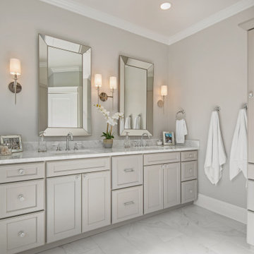
Take a look at the latest home renovation that we had the pleasure of performing for a client in Trinity. This was a full master bathroom remodel, guest bathroom remodel, and a laundry room. The existing bathroom and laundry room were the typical early 2000’s era décor that you would expect in the area. The client came to us with a list of things that they wanted to accomplish in the various spaces. The master bathroom features new cabinetry with custom elements provided by Palm Harbor Cabinets. A free standing bathtub. New frameless glass shower. Custom tile that was provided by Pro Source Port Richey. New lighting and wainscoting finish off the look. In the master bathroom, we took the same steps and updated all of the tile, cabinetry, lighting, and trim as well. The laundry room was finished off with new cabinets, shelving, and custom tile work to give the space a dramatic feel.
 Dillman & Upton, Inc.
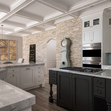
Dura Supreme Silverton inset door. White paint for perimeter and outer island. Pearl paint for glass cabinets and pantry. Heritage "E" finish for cooktop island. Kate Benjamin Photographer, Lindsey Markel Kitchen & Bath Designer, Shana Smith Interior Designer and Don Henderson Custom Installer.


 Milgard Windows & Doors
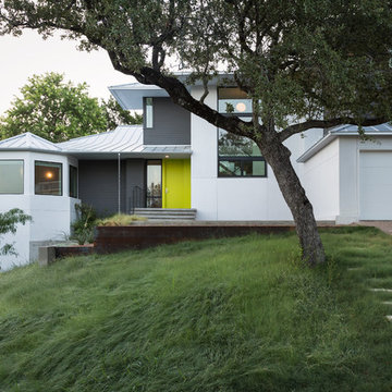
The Kiguchi family moved into their Austin, Texas home in 1994. Built in the 1980’s as part of a neighborhood development, they happily raised their family here but longed for something more contemporary. Once they became empty nesters, they decided it was time for a major remodel. After spending many years visiting Austin AIA Home Tours that highlight contemporary residential architecture, they had a lot of ideas and in 2013 were ready to interview architects and get their renovation underway.
The project turned into a major remodel due to an unstable foundation. Architects Ben Arbib and Ed Hughey, of Arbib Hughey Design were hired to solve the structural issue and look for inspiration in the bones of the house, which sat on top of a hillside and was surrounded by great views.
Unfortunately, with the old floor plan, the beautiful views were hidden by small windows that were poorly placed. In order to bring more natural light into the house the window sizes and configurations had to be addressed, all while keeping in mind the homeowners desire for a modern look and feel.
To achieve a more contemporary and sophisticated front of house, a new entry was designed that included removing a two-story bay window and porch. The entrance of the home also became more integrated with the landscape creating a template for new foliage to be planted. Older exterior materials were updated to incorporate a more muted palette of colors with a metal roof, dark grey siding in the back and white stucco in the front. Deep eaves were added over many of the new large windows for clean lines and sun protection.
“Inside it was about opening up the floor plan, expanding the views throughout the house, and updating the material palette to get a modern look that was also warm and inviting,” said Ben from Arbib Hughey Design. “Prior to the remodel, the house had the typical separation of rooms. We removed the walls between them and changed all of the windows to Milgard Thermally Improved Aluminum to connect the inside with the outside. No matter where you are you get nice views and natural light.”
The architects wanted to create some drama, which they accomplished with the window placement and opening up the interior floor plan to an open concept approach. Cabinetry was used to help delineate intimate spaces. To add warmth to an all-white living room, white-washed oak wood floors were installed and pine planks were used around the fireplace. The large windows served as artwork bringing the color of nature into the space.
An octagon shaped, elevated dining room, (named “the turret”), had a big impact on the design of the house. They architects rounded the corners and added larger window openings overlooking a new sunken garden. The great room was also softened by rounding out the corners and that circular theme continued throughout the house, being picked up in skylight wells and kitchen cabinetry. A staircase leading to a catwalk was added and the result was a two-story window wall that flooded the home with natural light.
When asked why Milgard® Thermally Improved Aluminum windows were selected, the architectural team listed many reasons:
1) Aesthetics: “We liked the slim profiles and narrow sightlines. The window frames never get in the way of the view and that was important to us. They also have a very contemporary look that went well with our design.”
2) Options: “We liked that we could get large sliding doors that matched the windows, giving us a very cohesive look and feel throughout the project.”
3) Cost Effective: “Milgard windows are affordable. You get a good product at a good price.”
4) Custom Sizes: “Milgard windows are customizable, which allowed us to get the right window for each location.”
Ready to take on your own traditional to modern home remodeling project? Arbib Hughey Design advises, “Work with a good architect. That means picking a team that is creative, communicative, listens well and is responsive. We think it’s important for an architect to listen to their clients and give them something they want, not something the architect thinks they should have. At the same time you want an architect who is willing and able to think outside the box and offer up design options that you may not have considered. Design is about a lot of back and forth, trying out ideas, getting feedback and trying again.”
The home was completely transformed into a unique, contemporary house perfectly integrated with its site. Internally the home has a natural flow for the occupants and externally it is integrated with the surroundings taking advantage of great natural light. As a side note, it was highly praised as part of the Austin AIA homes tour.
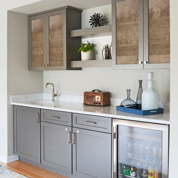
 TKS Design Group
Download our free ebook, Creating the Ideal Kitchen. DOWNLOAD NOW
Lakefront property in the northwest suburbs of Chicago is hard to come by, so when we were hired by this young family with exactly that, we were immediately inspired by not just the unusually large footprint of this 1950’s colonial revival but also the lovely views of the manmade lake it was sited on. The large 5-bedroom home was solidly stuck in the 1980’s, but we saw tons of potential. We started out by updating the existing staircase with a fresh coat of paint and adding new herringbone slate to the entry hall.
The powder room off the entryway also got a refresh - new flooring, new cabinets and fixtures. We ran the new slate right through into this space for some consistency. A fun wallpaper and shiplap trim add a welcoming feel and set the tone for the home.
Next, we tackled the kitchen. Located away from the rest of the first floor, the kitchen felt a little isolated, so we immediately began planning for how to better connect it to the rest of the first floor. We landed on removing the wall between the kitchen and dining room and designed a modified galley style space with separate cooking and clean up zones. The cooking zone consists of the refrigerator, prep sink and cooktop, along with a nice long run of prep space at the island. The cleanup side of the kitchen consists of the main sink and dishwasher. Both areas are situated so that the user can view the lake during prep work and cleanup!
One of the home’s main puzzles was how to incorporate the mudroom and area in front of the patio doors at the back of the house. We already had a breakfast table area, so the space by the patio doors was a bit of a no man’s land. We decided to separate the kitchen proper from what became the new mudroom with a large set of barn doors. That way you can quickly hide any mudroom messes but have easy access to the light coming in through the patio doors as well as the outdoor grilling station. We also love the impact the barn doors add to the overall space.
The homeowners’ first words to us were “it’s time to ditch the brown,” so we did! We chose a lovely blue pallet that reflects the home’s location on the lake which is also vibrant yet easy on the eye. Countertops are white quartz, and the natural oak floor works well with the other honey accents. The breakfast table was given a refresh with new chairs, chandelier and window treatments that frame the gorgeous views of the lake out the back.
We coordinated the slate mudroom flooring with that used in the home’s main entrance for a consistent feel. The storage area consists of open and closed storage to allow for some clutter control as needed.
Next on our “to do” list was revamping the dated brown bar area in the neighboring dining room. We eliminated the clutter by adding some closed cabinets and did some easy updates to help the space feel more current. One snag we ran into here was the discovery of a beam above the existing open shelving that had to be modified with a smaller structural beam to allow for our new design to work. This was an unexpected surprise, but in the end we think it was well worth it!
We kept the colors here a bit more muted to blend with the homeowner’s existing furnishings. Open shelving and polished nickel hardware add some simple detail to the new entertainment zone which also looks out onto the lake!
Next we tackled the upstairs starting with the homeowner’s son’s bath. The bath originally had both a tub shower and a separate shower, so we decided to swap out the shower for a new laundry area. This freed up some space downstairs in what used to be the mudroom/laundry room and is much more convenient for daily laundry needs.
We continued the blue palette here with navy cabinetry and the navy tile in the shower. Porcelain floor tile and chrome fixtures keep maintenance to a minimum while matte black mirrors and lighting add some depth the design. A low maintenance runner adds some warmth underfoot and ties the whole space together.
We added a pocket door to the bathroom to minimize interference with the door swings. The left door of the laundry closet is on a 180 degree hinge to allow for easy full access to the machines. Next we tackled the master bath which is an en suite arrangement. The original was typical of the 1980’s with the vanity outside of the bathroom, situated near the master closet. And the brown theme continued here with multiple shades of brown.
Our first move was to segment off the bath and the closet from the master bedroom. We created a short hall from the bedroom to the bathroom with his and hers walk-in closets on the left and right as well as a separate toilet closet outside of the main bathroom for privacy and flexibility.
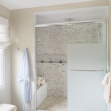
The original bathroom had a giant soaking tub with steps (dangerous!) as well as a small shower that did not work well for our homeowner who is 6’3”. With other bathtubs in the home, they decided to eliminate the tub and create an oversized shower which takes up the space where the old tub was located. The double vanity is on the opposite wall and a bench is located under the window for morning conversations and a place to set a couple of towels.
The pallet in here is light and airy with a mix of blond wood, creamy porcelain and marble tile, and brass accents. A simple roman shade adds some texture and it’s top-down mechanism allows for light and privacy.
This large whole house remodel gave our homeowners not only the ability to maximize the potential of their home but also created a lovely new frame from which to view their fabulous lake views.
Designed by: Susan Klimala, CKD, CBD
Photography by: Michael Kaskel
For more information on kitchen and bath design ideas go to: www.kitchenstudio-ge.com
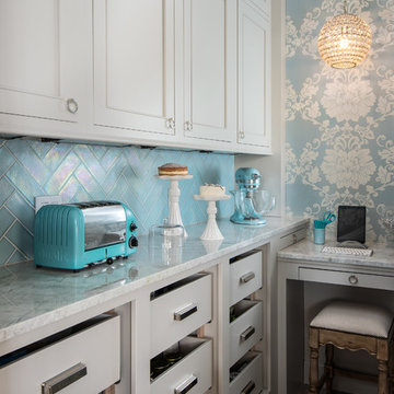 Dillman & Upton, Inc.
Dura Supreme Silverton inset door. Pearl paint for pantry. Extra- tall, doorless base cabinets outfitted with custom painted deep rollouts. Kate Benjamin Photographer, Lindsey Markel Kitchen & Bath Designer, Shana Smith Interior Designer and Don Henderson Custom Installer.
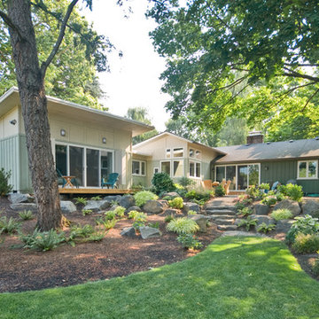
 SunSwallow Design, LLC
West & South elevations of New addition, Garden and existing home.
All photo's by CWR
Example of a mid-sized 1960s green one-story wood exterior home design in Portland with a shed roof
Example of a mid-sized 1960s green one-story wood exterior home design in Portland with a shed roof
 TKS Design Group
Download our free ebook, Creating the Ideal Kitchen. DOWNLOAD NOW
Lakefront property in the northwest suburbs of Chicago is hard to come by, so when we were hired by this young family with exactly that, we were immediately inspired by not just the unusually large footprint of this 1950’s colonial revival but also the lovely views of the manmade lake it was sited on. The large 5-bedroom home was solidly stuck in the 1980’s, but we saw tons of potential. We started out by updating the existing staircase with a fresh coat of paint and adding new herringbone slate to the entry hall.
The powder room off the entryway also got a refresh - new flooring, new cabinets and fixtures. We ran the new slate right through into this space for some consistency. A fun wallpaper and shiplap trim add a welcoming feel and set the tone for the home.
Next, we tackled the kitchen. Located away from the rest of the first floor, the kitchen felt a little isolated, so we immediately began planning for how to better connect it to the rest of the first floor. We landed on removing the wall between the kitchen and dining room and designed a modified galley style space with separate cooking and clean up zones. The cooking zone consists of the refrigerator, prep sink and cooktop, along with a nice long run of prep space at the island. The cleanup side of the kitchen consists of the main sink and dishwasher. Both areas are situated so that the user can view the lake during prep work and cleanup!
One of the home’s main puzzles was how to incorporate the mudroom and area in front of the patio doors at the back of the house. We already had a breakfast table area, so the space by the patio doors was a bit of a no man’s land. We decided to separate the kitchen proper from what became the new mudroom with a large set of barn doors. That way you can quickly hide any mudroom messes but have easy access to the light coming in through the patio doors as well as the outdoor grilling station. We also love the impact the barn doors add to the overall space.
The homeowners’ first words to us were “it’s time to ditch the brown,” so we did! We chose a lovely blue pallet that reflects the home’s location on the lake which is also vibrant yet easy on the eye. Countertops are white quartz, and the natural oak floor works well with the other honey accents. The breakfast table was given a refresh with new chairs, chandelier and window treatments that frame the gorgeous views of the lake out the back.
We coordinated the slate mudroom flooring with that used in the home’s main entrance for a consistent feel. The storage area consists of open and closed storage to allow for some clutter control as needed.
Next on our “to do” list was revamping the dated brown bar area in the neighboring dining room. We eliminated the clutter by adding some closed cabinets and did some easy updates to help the space feel more current. One snag we ran into here was the discovery of a beam above the existing open shelving that had to be modified with a smaller structural beam to allow for our new design to work. This was an unexpected surprise, but in the end we think it was well worth it!
We kept the colors here a bit more muted to blend with the homeowner’s existing furnishings. Open shelving and polished nickel hardware add some simple detail to the new entertainment zone which also looks out onto the lake!
Next we tackled the upstairs starting with the homeowner’s son’s bath. The bath originally had both a tub shower and a separate shower, so we decided to swap out the shower for a new laundry area. This freed up some space downstairs in what used to be the mudroom/laundry room and is much more convenient for daily laundry needs.
We continued the blue palette here with navy cabinetry and the navy tile in the shower. Porcelain floor tile and chrome fixtures keep maintenance to a minimum while matte black mirrors and lighting add some depth the design. A low maintenance runner adds some warmth underfoot and ties the whole space together.
We added a pocket door to the bathroom to minimize interference with the door swings. The left door of the laundry closet is on a 180 degree hinge to allow for easy full access to the machines. Next we tackled the master bath which is an en suite arrangement. The original was typical of the 1980’s with the vanity outside of the bathroom, situated near the master closet. And the brown theme continued here with multiple shades of brown.
Our first move was to segment off the bath and the closet from the master bedroom. We created a short hall from the bedroom to the bathroom with his and hers walk-in closets on the left and right as well as a separate toilet closet outside of the main bathroom for privacy and flexibility.
The original bathroom had a giant soaking tub with steps (dangerous!) as well as a small shower that did not work well for our homeowner who is 6’3”. With other bathtubs in the home, they decided to eliminate the tub and create an oversized shower which takes up the space where the old tub was located. The double vanity is on the opposite wall and a bench is located under the window for morning conversations and a place to set a couple of towels.
The pallet in here is light and airy with a mix of blond wood, creamy porcelain and marble tile, and brass accents. A simple roman shade adds some texture and it’s top-down mechanism allows for light and privacy.
This large whole house remodel gave our homeowners not only the ability to maximize the potential of their home but also created a lovely new frame from which to view their fabulous lake views.
Designed by: Susan Klimala, CKD, CBD
Photography by: Michael Kaskel
For more information on kitchen and bath design ideas go to: www.kitchenstudio-ge.com
 TKS Design Group
Download our free ebook, Creating the Ideal Kitchen. DOWNLOAD NOW
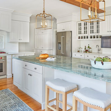
I am still sometimes shocked myself at how much of a difference a kitchen remodel can make in a space, you think I would know by now! This was one of those jobs. The small U-shaped room was a bit cramped, a bit dark and a bit dated. A neighboring sunroom/breakfast room addition was awkwardly used, and most of the time the couple hung out together at the small peninsula.
The client wish list included a larger, lighter kitchen with an island that would seat 7 people. They have a large family and wanted to be able to gather and entertain in the space. Right outside is a lovely backyard and patio with a fireplace, so having easy access and flow to that area was also important.
Our first move was to eliminate the wall between kitchen and breakfast room, which we anticipated would need a large beam and some structural maneuvering since it was the old exterior wall. However, what we didn’t anticipate was that the stucco exterior of the original home was layered over hollow clay tiles which was impossible to shore up in the typical manner. After much back and forth with our structural team, we were able to develop a plan to shore the wall and install a large steal & wood structural beam with minimal disruption to the original floor plan. That was important because we had already ordered everything customized to fit the plan.
We all breathed a collective sigh of relief once that part was completed. Now we could move on to building the kitchen we had all been waiting for. Oh, and let’s not forget that this was all being done amidst COVID 2020.
We covered the rough beam with cedar and stained it to coordinate with the floors. It’s actually one of my favorite elements in the space. The homeowners now have a big beautiful island that seats up to 7 people and has a wonderful flow to the outdoor space just like they wanted. The large island provides not only seating but also substantial prep area perfectly situated between the sink and cooktop. In addition to a built-in oven below the large gas cooktop, there is also a steam oven to the left of the sink. The steam oven is great for baking as well for heating daily meals without having to heat up the large oven.
The other side of the room houses a substantial pantry, the refrigerator, a small bar area as well as a TV.
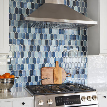
The homeowner fell in love the with the Aqua quartzite that is on the island, so we married that with a custom mosaic in a similar tone behind the cooktop. Soft white cabinetry, Cambria quartz and Thassos marble subway tile complete the soft traditional look. Gold accents, wood wrapped beams and oak barstools add warmth the room. The little powder room was also included in the project. Some fun wallpaper, a vanity with a pop of color and pretty fixtures and accessories finish off this cute little space.
Designed by: Susan Klimala, CKD, CBD
Photography by: Michael Kaskel
For more information on kitchen and bath design ideas go to: www.kitchenstudio-ge.com
 TKS Design Group
Download our free ebook, Creating the Ideal Kitchen. DOWNLOAD NOW
Lakefront property in the northwest suburbs of Chicago is hard to come by, so when we were hired by this young family with exactly that, we were immediately inspired by not just the unusually large footprint of this 1950’s colonial revival but also the lovely views of the manmade lake it was sited on. The large 5-bedroom home was solidly stuck in the 1980’s, but we saw tons of potential. We started out by updating the existing staircase with a fresh coat of paint and adding new herringbone slate to the entry hall.
The powder room off the entryway also got a refresh - new flooring, new cabinets and fixtures. We ran the new slate right through into this space for some consistency. A fun wallpaper and shiplap trim add a welcoming feel and set the tone for the home.
Next, we tackled the kitchen. Located away from the rest of the first floor, the kitchen felt a little isolated, so we immediately began planning for how to better connect it to the rest of the first floor. We landed on removing the wall between the kitchen and dining room and designed a modified galley style space with separate cooking and clean up zones. The cooking zone consists of the refrigerator, prep sink and cooktop, along with a nice long run of prep space at the island. The cleanup side of the kitchen consists of the main sink and dishwasher. Both areas are situated so that the user can view the lake during prep work and cleanup!
One of the home’s main puzzles was how to incorporate the mudroom and area in front of the patio doors at the back of the house. We already had a breakfast table area, so the space by the patio doors was a bit of a no man’s land. We decided to separate the kitchen proper from what became the new mudroom with a large set of barn doors. That way you can quickly hide any mudroom messes but have easy access to the light coming in through the patio doors as well as the outdoor grilling station. We also love the impact the barn doors add to the overall space.
The homeowners’ first words to us were “it’s time to ditch the brown,” so we did! We chose a lovely blue pallet that reflects the home’s location on the lake which is also vibrant yet easy on the eye. Countertops are white quartz, and the natural oak floor works well with the other honey accents. The breakfast table was given a refresh with new chairs, chandelier and window treatments that frame the gorgeous views of the lake out the back.
We coordinated the slate mudroom flooring with that used in the home’s main entrance for a consistent feel. The storage area consists of open and closed storage to allow for some clutter control as needed.
Next on our “to do” list was revamping the dated brown bar area in the neighboring dining room. We eliminated the clutter by adding some closed cabinets and did some easy updates to help the space feel more current. One snag we ran into here was the discovery of a beam above the existing open shelving that had to be modified with a smaller structural beam to allow for our new design to work. This was an unexpected surprise, but in the end we think it was well worth it!
We kept the colors here a bit more muted to blend with the homeowner’s existing furnishings. Open shelving and polished nickel hardware add some simple detail to the new entertainment zone which also looks out onto the lake!
Next we tackled the upstairs starting with the homeowner’s son’s bath. The bath originally had both a tub shower and a separate shower, so we decided to swap out the shower for a new laundry area. This freed up some space downstairs in what used to be the mudroom/laundry room and is much more convenient for daily laundry needs.
We continued the blue palette here with navy cabinetry and the navy tile in the shower. Porcelain floor tile and chrome fixtures keep maintenance to a minimum while matte black mirrors and lighting add some depth the design. A low maintenance runner adds some warmth underfoot and ties the whole space together.
We added a pocket door to the bathroom to minimize interference with the door swings. The left door of the laundry closet is on a 180 degree hinge to allow for easy full access to the machines. Next we tackled the master bath which is an en suite arrangement. The original was typical of the 1980’s with the vanity outside of the bathroom, situated near the master closet. And the brown theme continued here with multiple shades of brown.
Our first move was to segment off the bath and the closet from the master bedroom. We created a short hall from the bedroom to the bathroom with his and hers walk-in closets on the left and right as well as a separate toilet closet outside of the main bathroom for privacy and flexibility.
The original bathroom had a giant soaking tub with steps (dangerous!) as well as a small shower that did not work well for our homeowner who is 6’3”. With other bathtubs in the home, they decided to eliminate the tub and create an oversized shower which takes up the space where the old tub was located. The double vanity is on the opposite wall and a bench is located under the window for morning conversations and a place to set a couple of towels.
The pallet in here is light and airy with a mix of blond wood, creamy porcelain and marble tile, and brass accents. A simple roman shade adds some texture and it’s top-down mechanism allows for light and privacy.
This large whole house remodel gave our homeowners not only the ability to maximize the potential of their home but also created a lovely new frame from which to view their fabulous lake views.
Designed by: Susan Klimala, CKD, CBD
Photography by: Michael Kaskel
For more information on kitchen and bath design ideas go to: www.kitchenstudio-ge.com
 Dillman & Upton, Inc.
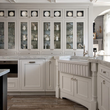
Dura Supreme Silverton inset door. White paint for perimeter and outer island. Pearl paint for glass cabinets and pantry. Heritage "E" finish for cooktop island. Kate Benjamin Photographer, Lindsey Markel Kitchen & Bath Designer, Shana Smith Interior Designer and Don Henderson Custom Installer.
 Design Connection, Inc.
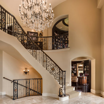
Staircase - huge mediterranean wooden curved staircase idea in Kansas City with painted risers
 Crafted Custom Homes + Renovations
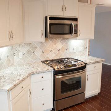
While we typically focus on high end homes, this small 1980's house in Stafford sold for under $200,000. We did a remodel and make ready for the homeowner prior to listing so they could take advantage of our hot market. This house is proof that good design can make inexpensive material selections look really good, and that you don't have to spend a fortune on a nice remodel.
Floors: Emser Tile 6x24 Heritage Walnut
Backsplash: Emser Tile 6x6 Ancient Tumbled Travertine
Backsplash Insert: Emser Tile Lucente Grazia Mosaic 5/8"
Bath Floors: Emser Tile 18x18 St Moritz Silver
Bath Insert: Emser Tile Lucente Grazia Linear
Kitchen Granite: Diamond Arrow
Master Bath Granite: Diamond Arrow
Guest Bath Granite: White Galaxy
Wall Paint: PPG Grey Marble
Trim Paint: PPG Arctic Cotton
Ceiling Paint: PPG Arctic Cotton
All Photos by Curtis Lawson
 DCI Home Improvements
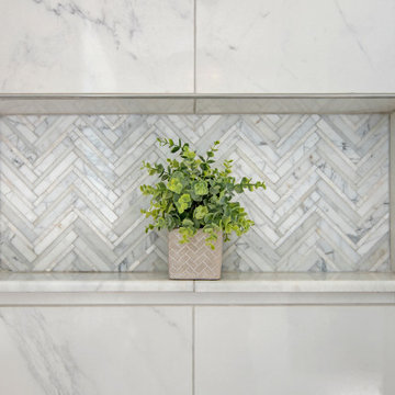
Take a look at the latest home renovation that we had the pleasure of performing for a client in Trinity. This was a full master bathroom remodel, guest bathroom remodel, and a laundry room. The existing bathroom and laundry room were the typical early 2000’s era décor that you would expect in the area. The client came to us with a list of things that they wanted to accomplish in the various spaces. The master bathroom features new cabinetry with custom elements provided by Palm Harbor Cabinets. A free standing bathtub. New frameless glass shower. Custom tile that was provided by Pro Source Port Richey. New lighting and wainscoting finish off the look. In the master bathroom, we took the same steps and updated all of the tile, cabinetry, lighting, and trim as well. The laundry room was finished off with new cabinets, shelving, and custom tile work to give the space a dramatic feel.
 TKS Design Group
Download our free ebook, Creating the Ideal Kitchen. DOWNLOAD NOW
Lakefront property in the northwest suburbs of Chicago is hard to come by, so when we were hired by this young family with exactly that, we were immediately inspired by not just the unusually large footprint of this 1950’s colonial revival but also the lovely views of the manmade lake it was sited on. The large 5-bedroom home was solidly stuck in the 1980’s, but we saw tons of potential. We started out by updating the existing staircase with a fresh coat of paint and adding new herringbone slate to the entry hall.
The powder room off the entryway also got a refresh - new flooring, new cabinets and fixtures. We ran the new slate right through into this space for some consistency. A fun wallpaper and shiplap trim add a welcoming feel and set the tone for the home.
Next, we tackled the kitchen. Located away from the rest of the first floor, the kitchen felt a little isolated, so we immediately began planning for how to better connect it to the rest of the first floor. We landed on removing the wall between the kitchen and dining room and designed a modified galley style space with separate cooking and clean up zones. The cooking zone consists of the refrigerator, prep sink and cooktop, along with a nice long run of prep space at the island. The cleanup side of the kitchen consists of the main sink and dishwasher. Both areas are situated so that the user can view the lake during prep work and cleanup!
One of the home’s main puzzles was how to incorporate the mudroom and area in front of the patio doors at the back of the house. We already had a breakfast table area, so the space by the patio doors was a bit of a no man’s land. We decided to separate the kitchen proper from what became the new mudroom with a large set of barn doors. That way you can quickly hide any mudroom messes but have easy access to the light coming in through the patio doors as well as the outdoor grilling station. We also love the impact the barn doors add to the overall space.
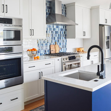
The homeowners’ first words to us were “it’s time to ditch the brown,” so we did! We chose a lovely blue pallet that reflects the home’s location on the lake which is also vibrant yet easy on the eye. Countertops are white quartz, and the natural oak floor works well with the other honey accents. The breakfast table was given a refresh with new chairs, chandelier and window treatments that frame the gorgeous views of the lake out the back.
We coordinated the slate mudroom flooring with that used in the home’s main entrance for a consistent feel. The storage area consists of open and closed storage to allow for some clutter control as needed.
Next on our “to do” list was revamping the dated brown bar area in the neighboring dining room. We eliminated the clutter by adding some closed cabinets and did some easy updates to help the space feel more current. One snag we ran into here was the discovery of a beam above the existing open shelving that had to be modified with a smaller structural beam to allow for our new design to work. This was an unexpected surprise, but in the end we think it was well worth it!
We kept the colors here a bit more muted to blend with the homeowner’s existing furnishings. Open shelving and polished nickel hardware add some simple detail to the new entertainment zone which also looks out onto the lake!
Next we tackled the upstairs starting with the homeowner’s son’s bath. The bath originally had both a tub shower and a separate shower, so we decided to swap out the shower for a new laundry area. This freed up some space downstairs in what used to be the mudroom/laundry room and is much more convenient for daily laundry needs.
We continued the blue palette here with navy cabinetry and the navy tile in the shower. Porcelain floor tile and chrome fixtures keep maintenance to a minimum while matte black mirrors and lighting add some depth the design. A low maintenance runner adds some warmth underfoot and ties the whole space together.
We added a pocket door to the bathroom to minimize interference with the door swings. The left door of the laundry closet is on a 180 degree hinge to allow for easy full access to the machines. Next we tackled the master bath which is an en suite arrangement. The original was typical of the 1980’s with the vanity outside of the bathroom, situated near the master closet. And the brown theme continued here with multiple shades of brown.
Our first move was to segment off the bath and the closet from the master bedroom. We created a short hall from the bedroom to the bathroom with his and hers walk-in closets on the left and right as well as a separate toilet closet outside of the main bathroom for privacy and flexibility.
The original bathroom had a giant soaking tub with steps (dangerous!) as well as a small shower that did not work well for our homeowner who is 6’3”. With other bathtubs in the home, they decided to eliminate the tub and create an oversized shower which takes up the space where the old tub was located. The double vanity is on the opposite wall and a bench is located under the window for morning conversations and a place to set a couple of towels.
The pallet in here is light and airy with a mix of blond wood, creamy porcelain and marble tile, and brass accents. A simple roman shade adds some texture and it’s top-down mechanism allows for light and privacy.
This large whole house remodel gave our homeowners not only the ability to maximize the potential of their home but also created a lovely new frame from which to view their fabulous lake views.
Designed by: Susan Klimala, CKD, CBD
Photography by: Michael Kaskel
For more information on kitchen and bath design ideas go to: www.kitchenstudio-ge.com
 Crafted Custom Homes + Renovations
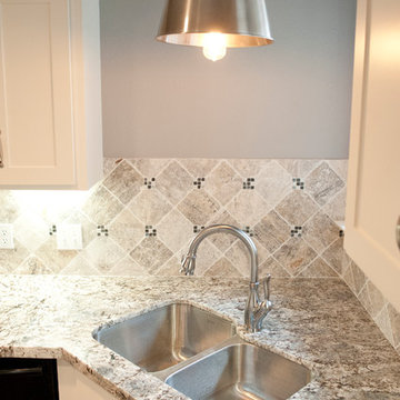
While we typically focus on high end homes, this small 1980's house in Stafford sold for under $200,000. We did a remodel and make ready for the homeowner prior to listing so they could take advantage of our hot market. This house is proof that good design can make inexpensive material selections look really good, and that you don't have to spend a fortune on a nice remodel.
Floors: Emser Tile 6x24 Heritage Walnut
Backsplash: Emser Tile 6x6 Ancient Tumbled Travertine
Backsplash Insert: Emser Tile Lucente Grazia Mosaic 5/8"
Bath Floors: Emser Tile 18x18 St Moritz Silver
Bath Insert: Emser Tile Lucente Grazia Linear
Kitchen Granite: Diamond Arrow
Master Bath Granite: Diamond Arrow
Guest Bath Granite: White Galaxy
Wall Paint: PPG Grey Marble
Trim Paint: PPG Arctic Cotton
Ceiling Paint: PPG Arctic Cotton
All Photos by Curtis Lawson
12