
Search results for "Typically played" in Home Design Ideas
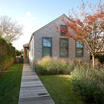
 Axis Mundi | Chicago
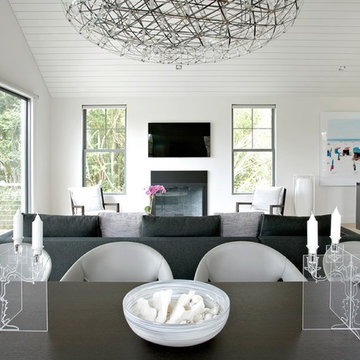
Axis Mundi typically decided not to play by the rules. Instead of de rigeur nautical artifacts, floppy sofas and wicker furniture, the firm responded to Makoid’s all-white interior envelope by injecting rooms with comfortable modern elegance that’s more contemporary Cap Ferrat than Eastern Long Island. Clean furniture silhouettes—from Cassina, Poltrona Frau and B&B Italia—a Massimo Vitali beach scene, a Moooi chandelier and industrial finishes (such as the steel of the fireplace surround and the anodized aluminum of a sleek Bulthaup kitchen) spark a creative tension between indoors and out. The gray palette provides a quiet backdrop for the nature outside, except for the master suite, where custom oak panels and blue shades create a reassuring warmth conducive to sleep.
Size: 1,920 sf
Project Team: John Beckmann, Nick Messerlian and Richard Rosenbloom
Architect: Blaze Makoid Architecture
Contractor: Greg D'Angelo Construction Inc.
Photographer: Mark Roskams
© Axis Mundi Design LLC.

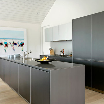 Axis Mundi | Chicago
Axis Mundi typically decided not to play by the rules. Instead of de rigeur nautical artifacts, floppy sofas and wicker furniture, the firm responded to Makoid’s all-white interior envelope by injecting rooms with comfortable modern elegance that’s more contemporary Cap Ferrat than Eastern Long Island. Clean furniture silhouettes—from Cassina, Poltrona Frau and B&B Italia—a Massimo Vitali beach scene, a Moooi chandelier and industrial finishes (such as the steel of the fireplace surround and the anodized aluminum of a sleek Bulthaup kitchen) spark a creative tension between indoors and out. The gray palette provides a quiet backdrop for the nature outside, except for the master suite, where custom oak panels and blue shades create a reassuring warmth conducive to sleep.
Size: 1,920 sf
Project Team: John Beckmann, Nick Messerlian and Richard Rosenbloom
Architect: Blaze Makoid Architecture
Contractor: Greg D'Angelo Construction Inc.
Photographer: Mark Roskams
© Axis Mundi Design LLC.
Find the right local pro for your project
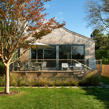 Axis Mundi | Chicago
Axis Mundi typically decided not to play by the rules. Instead of de rigeur nautical artifacts, floppy sofas and wicker furniture, the firm responded to Makoid’s all-white interior envelope by injecting rooms with comfortable modern elegance that’s more contemporary Cap Ferrat than Eastern Long Island. Clean furniture silhouettes—from Cassina, Poltrona Frau and B&B Italia—a Massimo Vitali beach scene, a Moooi chandelier and industrial finishes (such as the steel of the fireplace surround and the anodized aluminum of a sleek Bulthaup kitchen) spark a creative tension between indoors and out. The gray palette provides a quiet backdrop for the nature outside, except for the master suite, where custom oak panels and blue shades create a reassuring warmth conducive to sleep.
Size: 1,920 sf
Project Team: John Beckmann, Nick Messerlian and Richard Rosenbloom
Architect: Blaze Makoid Architecture
Contractor: Greg D'Angelo Construction Inc.
Photographer: Mark Roskams
© Axis Mundi Design LLC.
 Axis Mundi | Chicago
Axis Mundi typically decided not to play by the rules. Instead of de rigeur nautical artifacts, floppy sofas and wicker furniture, the firm responded to Makoid’s all-white interior envelope by injecting rooms with comfortable modern elegance that’s more contemporary Cap Ferrat than Eastern Long Island. Clean furniture silhouettes—from Cassina, Poltrona Frau and B&B Italia—a Massimo Vitali beach scene, a Moooi chandelier and industrial finishes (such as the steel of the fireplace surround and the anodized aluminum of a sleek Bulthaup kitchen) spark a creative tension between indoors and out. The gray palette provides a quiet backdrop for the nature outside, except for the master suite, where custom oak panels and blue shades create a reassuring warmth conducive to sleep.
Size: 1,920 sf
Project Team: John Beckmann, Nick Messerlian and Richard Rosenbloom
Architect: Blaze Makoid Architecture
Contractor: Greg D'Angelo Construction Inc.
Photographer: Mark Roskams
© Axis Mundi Design LLC.
 Advance Design Studio, Ltd.
Jennifer and Dan have lived in their Deer Park Illinois home for 15 years, slowly making minor fixes like painting and decorating; but they had a new plan for their kitchen the entire time. An awkwardly placed garage door, and an island cooktop with a terrible downdraft made a full-scale kitchen remodel an absolute must. Jennifer had many ideas in mind and wanted to work with a company that could provide high-end work, while partnering with a designer that would tailor the kitchen to her ideas.
She was intrigued by the phrase “Common Sense Remodeling” in Advance Design’s feature she discovered while perusing an issue of the community’s Quintessential Barrington Magazine. Doing further research on the company’s website, as she looked through project profiles and read about Advance Design’s “Common Sense Remodeling” philosophy, she promptly scheduled an appointment to see if the people and ideas she read about were truly who they said they were. The more she read, the more she knew that the “Common Sense” approach to remodeling they described was exactly the type of company she was looking for.
The partnership was sealed after an initial consultation with Owner Todd Jurs and Project Designer Michelle Lecinski. They displayed a combination of friendliness, professionalism and respect that was unmatched by any of the other companies Jennifer talked to. She knew that with Advance Design, she would be able to retain the vision that she had in mind with high-quality craftsmanship.
“I reached out to Advance Design because of the ‘Common Sense Remodeling’ tagline,” Jennifer said. “That’s what lingered for me”. “Advance Design was the most respectful- of the house and of my design ideas, and the most professional of the handful of companies that looked at my project”.
Soon after the meeting Jennifer began working with Michelle on the project design. They quickly developed chemistry. Jennifer loved how Michelle researched and located every detail that Jennifer wanted for the kitchen. Between the two of them, every concept and idea was worked through and perfected. “Jennifer had definite ideas about what she wanted the new kitchen to look like, she just didn’t know how to bring it all together. We worked together really well to make her ideas into the practical reality necessary for a well-functioning kitchen, with the look and feel that she had envisioned”, says Michelle.
“Michelle was wonderful in using the CAD system she would show me new drawings every time we changed the layout while working through the design,” Jennifer said. “She was a really wonderful partner in execution, she made sure everything happened quickly and easily.”
The finished design drew out elements of Jennifer’s style and personality. The pair call the look “sophisticated farmhouse” to describe the kitchen renovation to family and friends. The result was a beautifully crafted, authentic-feeling space that satisfied Jennifer’s dreams 15 years in the making. The whole project consisted of a kitchen remodel, mudroom upgrade with powder room, and garage entry relocation. “The projects I personally like the best, are the ones that put the client’s dreams on display,” Project Designer Michelle said. “And this is one of those projects.”
The main focal point of the kitchen is custom zinc and brass ventilation hood with a vintage sheen, which was hand made to order by a small company in Indiana named Vogler Metalworking. “It’s like sculpture, a true work of art”, says Jennifer. Your eye is immediately drawn towards this elegant yet practical hood that eliminated the home’s downdraft problem and added a striking conversation piece at the same time. The carpenters had to use special gloves when transporting and installing it, so they didn’t smudge it with fingerprints. The beautiful hood centers proudly over the stunning black enamel and brass LaCornue Range. “I had a friend who had a LaCornue range and after learning how easy it was to cook perfect meals, I was convinced I wanted to have one”, says Jennifer. This unique, breathtaking combination anchors the entire kitchen and is apparent immediately as you walk into the great room the surrounds the space.
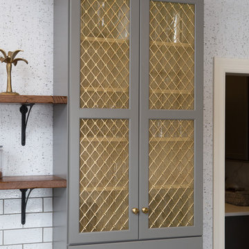
DuraSupreme Crestwood cabinets with a Kendall Panel add function and sophistication. A custom gray paint color paired with a storm blue was developed so that the new kitchen looked like it belonged to the existing space. Unlacquered brass faucets and hardware were important to Jennifer because she wanted the living finishes to age over time. Remarkable brass diamond mesh cabinet door inserts imported from the UK continue to add this one-of-a-kind kitchen renovation; giving it a “you won’t see this everywhere” quality. The use of old railcar flooring for the coffee bar countertop and reclaimed oak for the open shelving gives an authenticity to the space uncommon in kitchens today.
Jennifer and Michelle fell in love with the Limestone Grey Stone while they were investigating unique island countertop ideas. They liked the fact that the limestone as a living finish will age and change over time. Calcutta Miel Quartz countertops made for an excellent pairing around the perimeter, as it’s durable and perfect for cooking preparations. A textured white subway tile backsplash that runs to the ceiling keeps your eye moving towards the open shelving, and to the main focal point of the stunning range hood combination.
“The kitchen functions beautifully, and it’s gorgeous,” beams Jennifer as she gestures with both hands while smiling ear to ear. “The most important thing was I wanted a kitchen that had a wonderful flow, cooked beautiful meals and was a great gathering place for family and friends, and this space does that perfectly! Beauty wise, it turned out exactly how I had envisioned. I felt the function part was the hardest part, and that was nailed”!
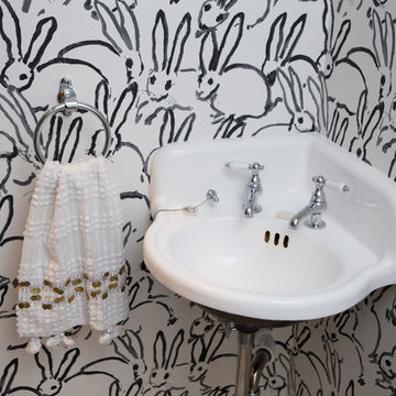
Relocating the garage entry to the new mudroom was a huge priority and has finally separated the family’s arriving home functions from their kitchen. Now coats and shoes and bags have their own area for dropping once members arrive home. Matching gray DuraSupreme cabinetry helped create gorgeous, purposeful lockers for the family. A reclaimed vintage sink and custom wall paper were added to the tiny powder room to beautify the once previously only functional space. Advance Design was even able to create a custom space for their dog to sleep while the family is away.
“It was unbelievable that a project of this size was completed in such a short time, and I think that’s because of the large amount of planning and preparation that went into it,” Jennifer marveled, “When we started, we were ready, and everything was prepared”.
When it came to execution, Project Manager Justin Davis and his crew were quick, accessible, and organized. Projects like this kitchen are typically completed in as little as 8-10 weeks. Jennifer’s kitchen however despite the relocation of some challenging HVAC in a soffit and moving of an exterior door was completed remarkably fast in part because the team was working with an existing tile floor that ran throughout the first floor that the client really loved.
“You get to know these people really well because they’re living in your house while you’re living in your house. They were so fast and really good, it didn’t take as long as even planned” reported Jennifer. “I would text Justin and he always responded almost immediately. I got to know all the guys who were working in our house and they were all wonderful people”.
Details in a customized kitchen like this one require skill and care from the people who install it. “All the guys on the job were skilled at what the did. I wanted small details like little feet to look like furniture, that is where their carpentry skill came in to make these all perfect”, said Jennifer. “The tile guys were wonderful. They even let me determine how I wanted the texture with the grout to appear for a salt and pepper look; now that is a very skilled trade person making it custom”.
In Jennifer’s interview, she continued to reference Advance Design’s “Common Sense Remodeling”, so I took a minute to ask her exactly what that phrase meant to her and how it played out in her experience with her project and the Advance Design team. Here is what she said: “I was intrigued about Common Sense Remodeling and in my head that there would be clear costs and prices, great communication between the design team, the execution team and me”, said Jennifer. They did deliver on that, it was so clear about the cost breakdown, what I could expect from everyone who came to my house, and everything that we had ordered. That to me is the Common Sense”!
It’s great to see a client take literally our assertion that a well-planned remodeling project is simply “Common Sense”! She anticipated each step of the way would be clear, concise, and predictable, all the while protecting the outcome due to the careful upfront planning. “Advance Design delivered on their ‘Common Sense Remodeling’ promise,” Jennifer said. “From the design team, to the execution team - everything was straight forward like I imagined. The project turned out exactly how I envisioned, I enjoyed this process and absolutely would recommend Advance Design Studio to anyone.”
 Warmington Residential
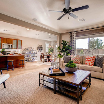
Example of a transitional formal and open concept light wood floor living room design in Las Vegas with beige walls

 Kala Interior Design
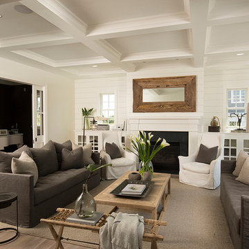
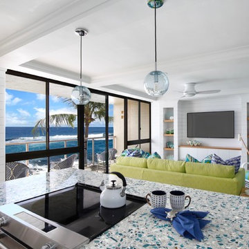
The breathtaking ocean views influenced the dramatic redesign of this water-front Poipu condo. The outdated condo was completely remodeled to allow full appreciation of the surrounding views, bring in a fresh new color palette, and modernize and update everything from the electrical wiring to the new luxury bath towels. The clients wanted the condo to feel “fun, happy, and cheerful,” and to stand apart from the typical vacation rental on Kauai. They wanted to turn this condo into the ultimate “beach house” that felt just as luxurious as the gorgeous natural surroundings.
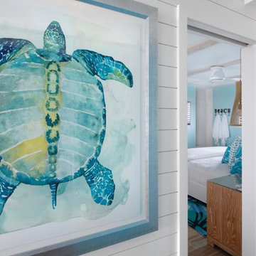
Fresh white ship-lap walls set the backdrop for this modern beach style, which is further enhanced with bold stripes, natural textures, and ocean-themed decor. The palette of cobalt, aqua and lichen green is fresh and vibrant against the neutral backdrop. Trina Turk’s “Peacock Print” was the inspiration fabric for the living and dining room. The print is so lively, colorful, and modern, and was the perfect place to start.
Every custom detail was thoughtfully chosen to bring a sense of luxury and originality to the space. While some elements are whimsical, such as the playful octopus art & fish-themed fabric, other elements are sophisticated and classic, to help keep the design grounded.
Special features include a custom-made “Moroccan Fish Scale” tile backsplash in the kitchen, crushed marble counter tops with oyster shells and float glass, and blue glass pendant lights, reminiscent of water bubbles.
 Shenton Architects LLP
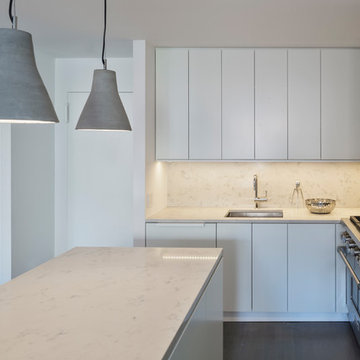
Overlooking Bleecker Street in the heart of the West Village, this compact one bedroom apartment required a gut renovation including the replacement of the windows.
This intricate project focused on providing functional flexibility and ensuring that every square inch of space is put to good use. Cabinetry, closets and shelving play a key role in shaping the spaces.
The typical boundaries between living and sleeping areas are blurred by employing clear glass sliding doors and a clerestory around of the freestanding storage wall between the bedroom and lounge. The kitchen extends into the lounge seamlessly, with an island that doubles as a dining table and layout space for a concealed study/desk adjacent. The bedroom transforms into a playroom for the nursery by folding the bed into another storage wall.
In order to maximize the sense of openness, most materials are white including satin lacquer cabinetry, Corian counters at the seat wall and CNC milled Corian panels enclosing the HVAC systems. White Oak flooring is stained gray with a whitewash finish. Steel elements provide contrast, with a blackened finish to the door system, column and beams. Concrete tile and slab is used throughout the Bathroom to act as a counterpoint to the predominantly white living areas.
archphoto.com
 Kala Interior Design
The breathtaking ocean views influenced the dramatic redesign of this water-front Poipu condo. The outdated condo was completely remodeled to allow full appreciation of the surrounding views, bring in a fresh new color palette, and modernize and update everything from the electrical wiring to the new luxury bath towels. The clients wanted the condo to feel “fun, happy, and cheerful,” and to stand apart from the typical vacation rental on Kauai. They wanted to turn this condo into the ultimate “beach house” that felt just as luxurious as the gorgeous natural surroundings.
Fresh white ship-lap walls set the backdrop for this modern beach style, which is further enhanced with bold stripes, natural textures, and ocean-themed decor. The palette of cobalt, aqua and lichen green is fresh and vibrant against the neutral backdrop. Trina Turk’s “Peacock Print” was the inspiration fabric for the living and dining room. The print is so lively, colorful, and modern, and was the perfect place to start.
Every custom detail was thoughtfully chosen to bring a sense of luxury and originality to the space. While some elements are whimsical, such as the playful octopus art & fish-themed fabric, other elements are sophisticated and classic, to help keep the design grounded.
Special features include a custom-made “Moroccan Fish Scale” tile backsplash in the kitchen, crushed marble counter tops with oyster shells and float glass, and blue glass pendant lights, reminiscent of water bubbles.
 Advance Design Studio, Ltd.
Jennifer and Dan have lived in their Deer Park Illinois home for 15 years, slowly making minor fixes like painting and decorating; but they had a new plan for their kitchen the entire time. An awkwardly placed garage door, and an island cooktop with a terrible downdraft made a full-scale kitchen remodel an absolute must. Jennifer had many ideas in mind and wanted to work with a company that could provide high-end work, while partnering with a designer that would tailor the kitchen to her ideas.
She was intrigued by the phrase “Common Sense Remodeling” in Advance Design’s feature she discovered while perusing an issue of the community’s Quintessential Barrington Magazine. Doing further research on the company’s website, as she looked through project profiles and read about Advance Design’s “Common Sense Remodeling” philosophy, she promptly scheduled an appointment to see if the people and ideas she read about were truly who they said they were. The more she read, the more she knew that the “Common Sense” approach to remodeling they described was exactly the type of company she was looking for.
The partnership was sealed after an initial consultation with Owner Todd Jurs and Project Designer Michelle Lecinski. They displayed a combination of friendliness, professionalism and respect that was unmatched by any of the other companies Jennifer talked to. She knew that with Advance Design, she would be able to retain the vision that she had in mind with high-quality craftsmanship.
“I reached out to Advance Design because of the ‘Common Sense Remodeling’ tagline,” Jennifer said. “That’s what lingered for me”. “Advance Design was the most respectful- of the house and of my design ideas, and the most professional of the handful of companies that looked at my project”.
Soon after the meeting Jennifer began working with Michelle on the project design. They quickly developed chemistry. Jennifer loved how Michelle researched and located every detail that Jennifer wanted for the kitchen. Between the two of them, every concept and idea was worked through and perfected. “Jennifer had definite ideas about what she wanted the new kitchen to look like, she just didn’t know how to bring it all together. We worked together really well to make her ideas into the practical reality necessary for a well-functioning kitchen, with the look and feel that she had envisioned”, says Michelle.
“Michelle was wonderful in using the CAD system she would show me new drawings every time we changed the layout while working through the design,” Jennifer said. “She was a really wonderful partner in execution, she made sure everything happened quickly and easily.”
The finished design drew out elements of Jennifer’s style and personality. The pair call the look “sophisticated farmhouse” to describe the kitchen renovation to family and friends. The result was a beautifully crafted, authentic-feeling space that satisfied Jennifer’s dreams 15 years in the making. The whole project consisted of a kitchen remodel, mudroom upgrade with powder room, and garage entry relocation. “The projects I personally like the best, are the ones that put the client’s dreams on display,” Project Designer Michelle said. “And this is one of those projects.”
The main focal point of the kitchen is custom zinc and brass ventilation hood with a vintage sheen, which was hand made to order by a small company in Indiana named Vogler Metalworking. “It’s like sculpture, a true work of art”, says Jennifer. Your eye is immediately drawn towards this elegant yet practical hood that eliminated the home’s downdraft problem and added a striking conversation piece at the same time. The carpenters had to use special gloves when transporting and installing it, so they didn’t smudge it with fingerprints. The beautiful hood centers proudly over the stunning black enamel and brass LaCornue Range. “I had a friend who had a LaCornue range and after learning how easy it was to cook perfect meals, I was convinced I wanted to have one”, says Jennifer. This unique, breathtaking combination anchors the entire kitchen and is apparent immediately as you walk into the great room the surrounds the space.
DuraSupreme Crestwood cabinets with a Kendall Panel add function and sophistication. A custom gray paint color paired with a storm blue was developed so that the new kitchen looked like it belonged to the existing space. Unlacquered brass faucets and hardware were important to Jennifer because she wanted the living finishes to age over time. Remarkable brass diamond mesh cabinet door inserts imported from the UK continue to add this one-of-a-kind kitchen renovation; giving it a “you won’t see this everywhere” quality. The use of old railcar flooring for the coffee bar countertop and reclaimed oak for the open shelving gives an authenticity to the space uncommon in kitchens today.
Jennifer and Michelle fell in love with the Limestone Grey Stone while they were investigating unique island countertop ideas. They liked the fact that the limestone as a living finish will age and change over time. Calcutta Miel Quartz countertops made for an excellent pairing around the perimeter, as it’s durable and perfect for cooking preparations. A textured white subway tile backsplash that runs to the ceiling keeps your eye moving towards the open shelving, and to the main focal point of the stunning range hood combination.
“The kitchen functions beautifully, and it’s gorgeous,” beams Jennifer as she gestures with both hands while smiling ear to ear. “The most important thing was I wanted a kitchen that had a wonderful flow, cooked beautiful meals and was a great gathering place for family and friends, and this space does that perfectly! Beauty wise, it turned out exactly how I had envisioned. I felt the function part was the hardest part, and that was nailed”!
Relocating the garage entry to the new mudroom was a huge priority and has finally separated the family’s arriving home functions from their kitchen. Now coats and shoes and bags have their own area for dropping once members arrive home. Matching gray DuraSupreme cabinetry helped create gorgeous, purposeful lockers for the family. A reclaimed vintage sink and custom wall paper were added to the tiny powder room to beautify the once previously only functional space. Advance Design was even able to create a custom space for their dog to sleep while the family is away.
“It was unbelievable that a project of this size was completed in such a short time, and I think that’s because of the large amount of planning and preparation that went into it,” Jennifer marveled, “When we started, we were ready, and everything was prepared”.
When it came to execution, Project Manager Justin Davis and his crew were quick, accessible, and organized. Projects like this kitchen are typically completed in as little as 8-10 weeks. Jennifer’s kitchen however despite the relocation of some challenging HVAC in a soffit and moving of an exterior door was completed remarkably fast in part because the team was working with an existing tile floor that ran throughout the first floor that the client really loved.
“You get to know these people really well because they’re living in your house while you’re living in your house. They were so fast and really good, it didn’t take as long as even planned” reported Jennifer. “I would text Justin and he always responded almost immediately. I got to know all the guys who were working in our house and they were all wonderful people”.
Details in a customized kitchen like this one require skill and care from the people who install it. “All the guys on the job were skilled at what the did. I wanted small details like little feet to look like furniture, that is where their carpentry skill came in to make these all perfect”, said Jennifer. “The tile guys were wonderful. They even let me determine how I wanted the texture with the grout to appear for a salt and pepper look; now that is a very skilled trade person making it custom”.
In Jennifer’s interview, she continued to reference Advance Design’s “Common Sense Remodeling”, so I took a minute to ask her exactly what that phrase meant to her and how it played out in her experience with her project and the Advance Design team. Here is what she said: “I was intrigued about Common Sense Remodeling and in my head that there would be clear costs and prices, great communication between the design team, the execution team and me”, said Jennifer. They did deliver on that, it was so clear about the cost breakdown, what I could expect from everyone who came to my house, and everything that we had ordered. That to me is the Common Sense”!
It’s great to see a client take literally our assertion that a well-planned remodeling project is simply “Common Sense”! She anticipated each step of the way would be clear, concise, and predictable, all the while protecting the outcome due to the careful upfront planning. “Advance Design delivered on their ‘Common Sense Remodeling’ promise,” Jennifer said. “From the design team, to the execution team - everything was straight forward like I imagined. The project turned out exactly how I envisioned, I enjoyed this process and absolutely would recommend Advance Design Studio to anyone.”
 Axis Mundi
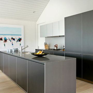
The exterior of what looks like a vernacular Hamptons shingle cottage, designed by architect Blaze Makoid, is intentionally deceiving. For the interiors, Axis Mundi typically decided not to play by the rules. Instead of de rigeur nautical artifacts, floppy sofas and wicker furniture, the firm responded to Makoid’s all-white interior envelope by injecting rooms with comfortable modern elegance that’s more contemporary Cap Ferrat than Eastern Long Island. Clean furniture silhouettes—from Cassina, Poltrona Frau and B&B Italia—a Massimo Vitali beach scene, a Moooi chandelier and industrial finishes (such as the steel of the fireplace surround and the anodized aluminum of a sleek Bulthaup kitchen) spark a creative tension between indoors and out. The gray palette provides a quiet backdrop for the nature outside, except for the master suite, where custom oak panels and blue shades create a reassuring warmth conducive to sleep.
Photography: Mark Roskams
 Shenton Architects LLP
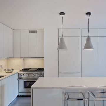
Overlooking Bleecker Street in the heart of the West Village, this compact one bedroom apartment required a gut renovation including the replacement of the windows.
This intricate project focused on providing functional flexibility and ensuring that every square inch of space is put to good use. Cabinetry, closets and shelving play a key role in shaping the spaces.
The typical boundaries between living and sleeping areas are blurred by employing clear glass sliding doors and a clerestory around of the freestanding storage wall between the bedroom and lounge. The kitchen extends into the lounge seamlessly, with an island that doubles as a dining table and layout space for a concealed study/desk adjacent. The bedroom transforms into a playroom for the nursery by folding the bed into another storage wall.
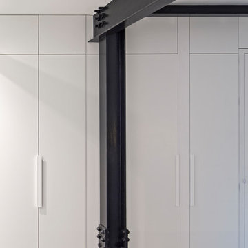
In order to maximize the sense of openness, most materials are white including satin lacquer cabinetry, Corian counters at the seat wall and CNC milled Corian panels enclosing the HVAC systems. White Oak flooring is stained gray with a whitewash finish. Steel elements provide contrast, with a blackened finish to the door system, column and beams. Concrete tile and slab is used throughout the Bathroom to act as a counterpoint to the predominantly white living areas.
archphoto.com
 Kala Interior Design
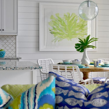
The breathtaking ocean views influenced the dramatic redesign of this water-front Poipu condo. The outdated condo was completely remodeled to allow full appreciation of the surrounding views, bring in a fresh new color palette, and modernize and update everything from the electrical wiring to the new luxury bath towels. The clients wanted the condo to feel “fun, happy, and cheerful,” and to stand apart from the typical vacation rental on Kauai. They wanted to turn this condo into the ultimate “beach house” that felt just as luxurious as the gorgeous natural surroundings.
Fresh white ship-lap walls set the backdrop for this modern beach style, which is further enhanced with bold stripes, natural textures, and ocean-themed decor. The palette of cobalt, aqua and lichen green is fresh and vibrant against the neutral backdrop. Trina Turk’s “Peacock Print” was the inspiration fabric for the living and dining room. The print is so lively, colorful, and modern, and was the perfect place to start.
Every custom detail was thoughtfully chosen to bring a sense of luxury and originality to the space. While some elements are whimsical, such as the playful octopus art & fish-themed fabric, other elements are sophisticated and classic, to help keep the design grounded.
Special features include a custom-made “Moroccan Fish Scale” tile backsplash in the kitchen, crushed marble counter tops with oyster shells and float glass, and blue glass pendant lights, reminiscent of water bubbles.
 Shenton Architects LLP
Overlooking Bleecker Street in the heart of the West Village, this compact one bedroom apartment required a gut renovation including the replacement of the windows.
This intricate project focused on providing functional flexibility and ensuring that every square inch of space is put to good use. Cabinetry, closets and shelving play a key role in shaping the spaces.
The typical boundaries between living and sleeping areas are blurred by employing clear glass sliding doors and a clerestory around of the freestanding storage wall between the bedroom and lounge. The kitchen extends into the lounge seamlessly, with an island that doubles as a dining table and layout space for a concealed study/desk adjacent. The bedroom transforms into a playroom for the nursery by folding the bed into another storage wall.
In order to maximize the sense of openness, most materials are white including satin lacquer cabinetry, Corian counters at the seat wall and CNC milled Corian panels enclosing the HVAC systems. White Oak flooring is stained gray with a whitewash finish. Steel elements provide contrast, with a blackened finish to the door system, column and beams. Concrete tile and slab is used throughout the Bathroom to act as a counterpoint to the predominantly white living areas.
archphoto.com
 Shenton Architects LLP
Overlooking Bleecker Street in the heart of the West Village, this compact one bedroom apartment required a gut renovation including the replacement of the windows.
This intricate project focused on providing functional flexibility and ensuring that every square inch of space is put to good use. Cabinetry, closets and shelving play a key role in shaping the spaces.
The typical boundaries between living and sleeping areas are blurred by employing clear glass sliding doors and a clerestory around of the freestanding storage wall between the bedroom and lounge. The kitchen extends into the lounge seamlessly, with an island that doubles as a dining table and layout space for a concealed study/desk adjacent. The bedroom transforms into a playroom for the nursery by folding the bed into another storage wall.
In order to maximize the sense of openness, most materials are white including satin lacquer cabinetry, Corian counters at the seat wall and CNC milled Corian panels enclosing the HVAC systems. White Oak flooring is stained gray with a whitewash finish. Steel elements provide contrast, with a blackened finish to the door system, column and beams. Concrete tile and slab is used throughout the Bathroom to act as a counterpoint to the predominantly white living areas.
archphoto.com
 Vetter Architects
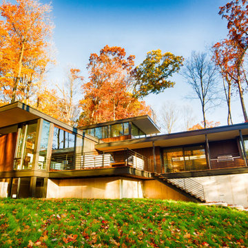
The client’s request was quite common - a typical 2800 sf builder home with 3 bedrooms, 2 baths, living space, and den. However, their desire was for this to be “anything but common.” The result is an innovative update on the production home for the modern era, and serves as a direct counterpoint to the neighborhood and its more conventional suburban housing stock, which focus views to the backyard and seeks to nullify the unique qualities and challenges of topography and the natural environment.
The Terraced House cautiously steps down the site’s steep topography, resulting in a more nuanced approach to site development than cutting and filling that is so common in the builder homes of the area. The compact house opens up in very focused views that capture the natural wooded setting, while masking the sounds and views of the directly adjacent roadway. The main living spaces face this major roadway, effectively flipping the typical orientation of a suburban home, and the main entrance pulls visitors up to the second floor and halfway through the site, providing a sense of procession and privacy absent in the typical suburban home.
Clad in a custom rain screen that reflects the wood of the surrounding landscape - while providing a glimpse into the interior tones that are used. The stepping “wood boxes” rest on a series of concrete walls that organize the site, retain the earth, and - in conjunction with the wood veneer panels - provide a subtle organic texture to the composition.
The interior spaces wrap around an interior knuckle that houses public zones and vertical circulation - allowing more private spaces to exist at the edges of the building. The windows get larger and more frequent as they ascend the building, culminating in the upstairs bedrooms that occupy the site like a tree house - giving views in all directions.
The Terraced House imports urban qualities to the suburban neighborhood and seeks to elevate the typical approach to production home construction, while being more in tune with modern family living patterns.
Overview:
Elm Grove
Size:
2,800 sf,
3 bedrooms, 2 bathrooms
Completion Date:
September 2014
Services:
Architecture, Landscape Architecture
Interior Consultants: Amy Carman Design

 Axis Mundi
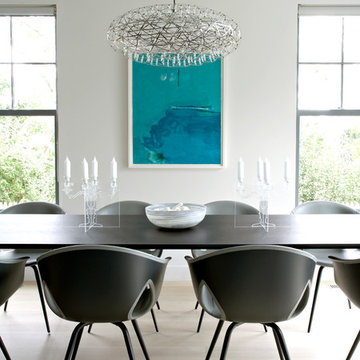
The exterior of what looks like a vernacular Hamptons shingle cottage, designed by architect Blaze Makoid, is intentionally deceiving. For the interiors, Axis Mundi typically decided not to play by the rules. Instead of de rigeur nautical artifacts, floppy sofas and wicker furniture, the firm responded to Makoid’s all-white interior envelope by injecting rooms with comfortable modern elegance that’s more contemporary Cap Ferrat than Eastern Long Island. Clean furniture silhouettes—from Cassina, Poltrona Frau and B&B Italia—a Massimo Vitali beach scene, a Moooi chandelier and industrial finishes (such as the steel of the fireplace surround and the anodized aluminum of a sleek Bulthaup kitchen) spark a creative tension between indoors and out. The gray palette provides a quiet backdrop for the nature outside, except for the master suite, where custom oak panels and blue shades create a reassuring warmth conducive to sleep.
Size: 1,920 sf
Project Team: John Beckmann, Nick Messerlian and Richard Rosenbloom
Architect: Blaze Makoid Architecture
Photographer: Mark Roskams
© Axis Mundi Design LLC
 Shenton Architects LLP
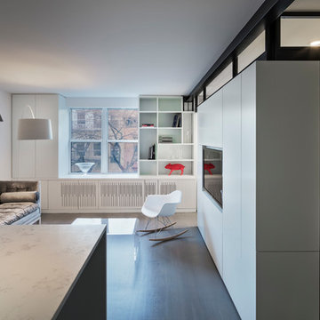
Overlooking Bleecker Street in the heart of the West Village, this compact one bedroom apartment required a gut renovation including the replacement of the windows.
This intricate project focused on providing functional flexibility and ensuring that every square inch of space is put to good use. Cabinetry, closets and shelving play a key role in shaping the spaces.
The typical boundaries between living and sleeping areas are blurred by employing clear glass sliding doors and a clerestory around of the freestanding storage wall between the bedroom and lounge. The kitchen extends into the lounge seamlessly, with an island that doubles as a dining table and layout space for a concealed study/desk adjacent. The bedroom transforms into a playroom for the nursery by folding the bed into another storage wall.
In order to maximize the sense of openness, most materials are white including satin lacquer cabinetry, Corian counters at the seat wall and CNC milled Corian panels enclosing the HVAC systems. White Oak flooring is stained gray with a whitewash finish. Steel elements provide contrast, with a blackened finish to the door system, column and beams. Concrete tile and slab is used throughout the Bathroom to act as a counterpoint to the predominantly white living areas.
archphoto.com
22