
Search results for "Typically played" in Home Design Ideas
 Sustainable Design Group
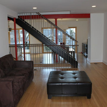
Renovated living room and staircase. This was a typical small 2 story brick home in Bethesda with a walk out basement. The back faced south but there were very few windows making it dark inside. We added a 3 story addition to the back for a new master suite, new kitchen and dining room and a new play room on the lower level. We also added a large deck off the kitchen and a deck off the master bedroom.
The new south facing windows heat the house in the winter and the balcony and overhang shades the windows in the summer. The most dramatic feature of this addition is the new stainless steel stair and the new structural steel that replaced the original brick wall.
This is a classic example of passive solar design.
 Schloegel Design Remodel
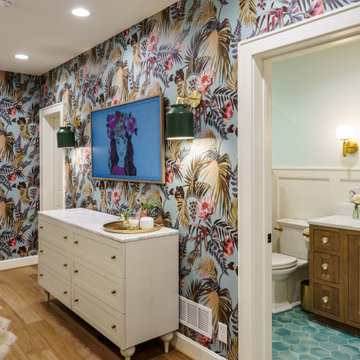
This view perfectly captures the playful yet sophisticated "suite" feel of the girls' bunk room. The vibrant floral wallpaper is a total showstopper—it brings that Grandmillennial flair downstairs, creating a seamless design thread with the rest of the home’s upscale style.
The transition through the doorway into the bathroom highlights the intentional color story, where the blues and teals of the wallpaper pull the eye directly toward that stunning turquoise hexagon floor tile. It’s a masterclass in using pattern and color to connect two distinct spaces, making the bunk room feel like a high-end boutique hotel suite rather than a typical basement bedroom.
 Sustainable Design Group
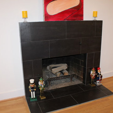
Contemporary fireplace with black tile. This was a typical small 2 story brick home in Bethesda with a walk out basement. The back faced south but there were very few windows making it dark inside. We added a 3 story addition to the back for a new master suite, new kitchen and dining room and a new play room on the lower level. We also added a large deck off the kitchen and a deck off the master bedroom.
The new south facing windows heat the house in the winter and the balcony and overhang shades the windows in the summer. The most dramatic feature of this addition is the new stainless steel stair and the new structural steel that replaced the original brick wall.
This is a classic example of passive solar design.
Find the right local pro for your project
 Axis Mundi | SF
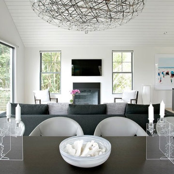
The exterior of what looks like a vernacular Hamptons shingle cottage, designed by architect Blaze Makoid, is intentionally deceiving. For the interiors, Axis Mundi typically decided not to play by the rules. Instead of de rigeur nautical artifacts, floppy sofas and wicker furniture, the firm responded to Makoid’s all-white interior envelope by injecting rooms with comfortable modern elegance that’s more contemporary Cap Ferrat than Eastern Long Island. Clean furniture silhouettes—from Cassina, Poltrona Frau and B&B Italia—a Massimo Vitali beach scene, a Moooi chandelier and industrial finishes (such as the steel of the fireplace surround and the anodized aluminum of a sleek Bulthaup kitchen) spark a creative tension between indoors and out. The gray palette provides a quiet backdrop for the nature outside, except for the master suite, where custom oak panels and blue shades create a reassuring warmth conducive to sleep.
Size: 1,920 sf
Project Team: John Beckmann, Nick Messerlian and Richard Rosenbloom
Architect: Blaze Makoid Architecture
Contractor: Greg D'Angelo Construction Inc.
Photographer: Mark Roskams
© Axis Mundi Design LLC.
 CONTENT Architecture
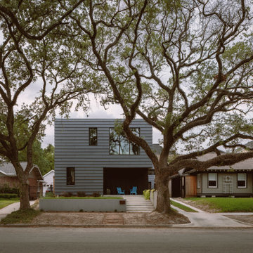
This home for a family of four in Houston Heights nods to the neighborhood’s historic bungalows with oversized 'clapboard' siding and a gable roof form with a distinctly modern reinterpretation. Two mature live oak trees at the front of the site provide a shaded canopy upon entry. The volume of the building tapers slightly from the peak at the center of the site to the primary bedroom at the front of the home where a large window at the foot of the bed frames a view of the tree canopy.
Spaces are carved away from the overall volume in order to bring outdoor space into the interior of the home. In addition to the porches at the front and back of the house that are typical to most homes, each bedroom also opens to a generous private patio recessed within the building’s volume. An interior atrium brings vegetation and natural light into the kitchen and dining spaces while a deep canopy provides shade to a broad opening just outside the living room. At the peak of the gabled roof, a skylight brings daylight into a lofted reading space.
The family’s penchant for puzzles inspired the details within the home. Throughout the house, irregularly shaped millwork door panels overlap with adjacent cabinet boxes to create interlocking planes. Staggered gaps in cabinet doors and drawers serve as handles, creating playful patterns. In the Puzzle Room, a custom designed table allows for puzzles in progress to be stored internally until homework is completed.
 Axis Mundi Design
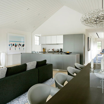
The exterior of what looks like a vernacular Hamptons shingle cottage, designed by architect Blaze Makoid, is intentionally deceiving. For the interiors, Axis Mundi typically decided not to play by the rules. Instead of de rigeur nautical artifacts, floppy sofas and wicker furniture, the firm responded to Makoid’s all-white interior envelope by injecting rooms with comfortable modern elegance that’s more contemporary Cap Ferrat than Eastern Long Island. Clean furniture silhouettes—from Cassina, Poltrona Frau and B&B Italia—a Massimo Vitali beach scene, a Moooi chandelier and industrial finishes (such as the steel of the fireplace surround and the anodized aluminum of a sleek Bulthaup kitchen) spark a creative tension between indoors and out. The gray palette provides a quiet backdrop for the nature outside, except for the master suite, where custom oak panels and blue shades create a reassuring warmth conducive to sleep.
Size: 1,920 sf
Project Team: John Beckmann, Nick Messerlian and Richard Rosenbloom
Architect: Blaze Makoid Architecture
Photographer: Mark Roskams
© Axis Mundi Design LLC
 Sustainable Design Group
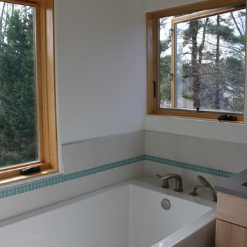
New Bathroom. This was a typical small 2 story brick home in Bethesda with a walk out basement. The back faced south but there were very few windows making it dark inside. We added a 3 story addition to the back for a new master suite, new kitchen and dining room and a new play room on the lower level. We also added a large deck off the kitchen and a deck off the master bedroom.
The new south facing windows heat the house in the winter and the balcony and overhang shades the windows in the summer. The most dramatic feature of this addition is the new stainless steel stair and the new structural steel that replaced the original brick wall.
This is a classic example of passive solar design.

 ONE Design
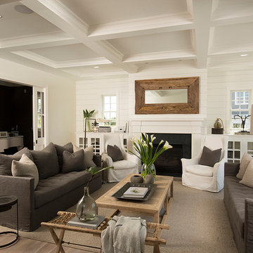
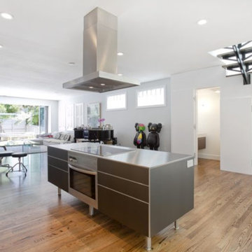
This project was an exercise in minimalism — how it can be embraced and incorporated at multiple levels. Typical of San Franciscan Victorians, the dark interior of this home was segregated and circulation spaces were narrow and dark. The stairs to the upper level was an afterthought and tucked away.
By removing the walls and rebuilding the stairs, we shifted the focus of this home’s interior and made the stairs the focal point. This project pays homage to the stairs, a critical element in the function and tone the home sets. As a transitional element, it carries the user from level to level, function to function, and mindset to mindset. The goal of this remodel was to invite the user upstairs and offer a more integrated transition to the upper level while at the same time using it to create a shaft of light into the inner recesses of the living space below.
As one ascends the stairs, the floor gradually disappears revealing a naked structural spine as the stairs reaches the upper level. The dormer addition offered ample headspace and invites columns of light to penetrate below. The cantilevered floor and shadow play this offers, dynamically marks its imprint on both levels.
Ancillary and storage spaces tucked away neatly and delicately – reminding us that expression should not be at the expense of function. Delicate and clean food preparation areas — now integrated with the rest of the home — invite us to celebrate this expression of unity.
 CONTENT Architecture
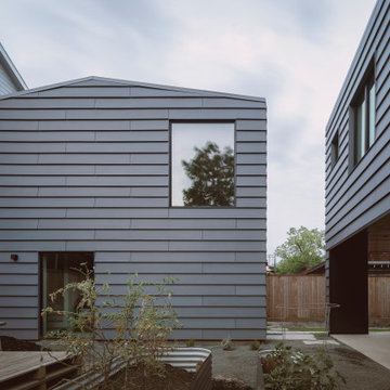
This home for a family of four in Houston Heights nods to the neighborhood’s historic bungalows with oversized 'clapboard' siding and a gable roof form with a distinctly modern reinterpretation. Two mature live oak trees at the front of the site provide a shaded canopy upon entry. The volume of the building tapers slightly from the peak at the center of the site to the primary bedroom at the front of the home where a large window at the foot of the bed frames a view of the tree canopy.
Spaces are carved away from the overall volume in order to bring outdoor space into the interior of the home. In addition to the porches at the front and back of the house that are typical to most homes, each bedroom also opens to a generous private patio recessed within the building’s volume. An interior atrium brings vegetation and natural light into the kitchen and dining spaces while a deep canopy provides shade to a broad opening just outside the living room. At the peak of the gabled roof, a skylight brings daylight into a lofted reading space.
The family’s penchant for puzzles inspired the details within the home. Throughout the house, irregularly shaped millwork door panels overlap with adjacent cabinet boxes to create interlocking planes. Staggered gaps in cabinet doors and drawers serve as handles, creating playful patterns. In the Puzzle Room, a custom designed table allows for puzzles in progress to be stored internally until homework is completed.
 Axis Mundi Design
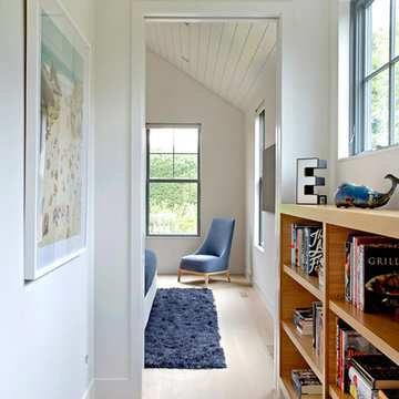
The exterior of what looks like a vernacular Hamptons shingle cottage, designed by architect Blaze Makoid, is intentionally deceiving. For the interiors, Axis Mundi typically decided not to play by the rules. Instead of de rigeur nautical artifacts, floppy sofas and wicker furniture, the firm responded to Makoid’s all-white interior envelope by injecting rooms with comfortable modern elegance that’s more contemporary Cap Ferrat than Eastern Long Island. Clean furniture silhouettes—from Cassina, Poltrona Frau and B&B Italia—a Massimo Vitali beach scene, a Moooi chandelier and industrial finishes (such as the steel of the fireplace surround and the anodized aluminum of a sleek Bulthaup kitchen) spark a creative tension between indoors and out. The gray palette provides a quiet backdrop for the nature outside, except for the master suite, where custom oak panels and blue shades create a reassuring warmth conducive to sleep.
Size: 1,920 sf
Project Team: John Beckmann, Nick Messerlian and Richard Rosenbloom
Architect: Blaze Makoid Architecture
Photographer: Mark Roskams
© Axis Mundi Design LLC
 Sustainable Design Group
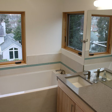
New bath with a view. This was a typical small 2 story brick home in Bethesda with a walk out basement. The back faced south but there were very few windows making it dark inside. We added a 3 story addition to the back for a new master suite, new kitchen and dining room and a new play room on the lower level. We also added a large deck off the kitchen and a deck off the master bedroom.
The new south facing windows heat the house in the winter and the balcony and overhang shades the windows in the summer. The most dramatic feature of this addition is the new stainless steel stair and the new structural steel that replaced the original brick wall.
This is a classic example of passive solar design.
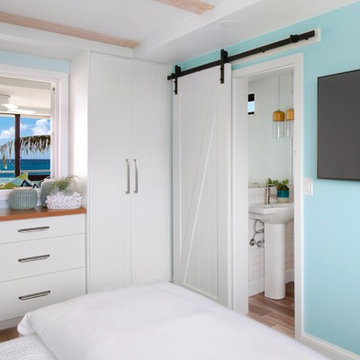
 Kala Interior Design
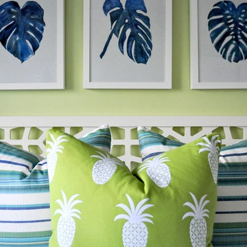
The breathtaking ocean views influenced the dramatic redesign of this water-front Poipu condo. The outdated condo was completely remodeled to allow full appreciation of the surrounding views, bring in a fresh new color palette, and modernize and update everything from the electrical wiring to the new luxury bath towels. The clients wanted the condo to feel “fun, happy, and cheerful,” and to stand apart from the typical vacation rental on Kauai. They wanted to turn this condo into the ultimate “beach house” that felt just as luxurious as the gorgeous natural surroundings.
Fresh white ship-lap walls set the backdrop for this modern beach style, which is further enhanced with bold stripes, natural textures, and ocean-themed decor. The palette of cobalt, aqua and lichen green is fresh and vibrant against the neutral backdrop. Trina Turk’s “Peacock Print” was the inspiration fabric for the living and dining room. The print is so lively, colorful, and modern, and was the perfect place to start.
Every custom detail was thoughtfully chosen to bring a sense of luxury and originality to the space. While some elements are whimsical, such as the playful octopus art & fish-themed fabric, other elements are sophisticated and classic, to help keep the design grounded.
Special features include a custom-made “Moroccan Fish Scale” tile backsplash in the kitchen, crushed marble counter tops with oyster shells and float glass, and blue glass pendant lights, reminiscent of water bubbles.
 ONE Design
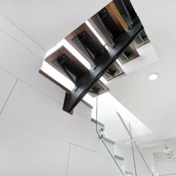
This project was an exercise in minimalism — how it can be embraced and incorporated at multiple levels. Typical of San Franciscan Victorians, the dark interior of this home was segregated and circulation spaces were narrow and dark. The stairs to the upper level was an afterthought and tucked away.
By removing the walls and rebuilding the stairs, we shifted the focus of this home’s interior and made the stairs the focal point. This project pays homage to the stairs, a critical element in the function and tone the home sets. As a transitional element, it carries the user from level to level, function to function, and mindset to mindset. The goal of this remodel was to invite the user upstairs and offer a more integrated transition to the upper level while at the same time using it to create a shaft of light into the inner recesses of the living space below.
As one ascends the stairs, the floor gradually disappears revealing a naked structural spine as the stairs reaches the upper level. The dormer addition offered ample headspace and invites columns of light to penetrate below. The cantilevered floor and shadow play this offers, dynamically marks its imprint on both levels.
Ancillary and storage spaces tucked away neatly and delicately – reminding us that expression should not be at the expense of function. Delicate and clean food preparation areas — now integrated with the rest of the home — invite us to celebrate this expression of unity.
 ONE Design
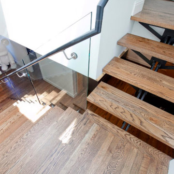
This project was an exercise in minimalism — how it can be embraced and incorporated at multiple levels. Typical of San Franciscan Victorians, the dark interior of this home was segregated and circulation spaces were narrow and dark. The stairs to the upper level was an afterthought and tucked away.
By removing the walls and rebuilding the stairs, we shifted the focus of this home’s interior and made the stairs the focal point. This project pays homage to the stairs, a critical element in the function and tone the home sets. As a transitional element, it carries the user from level to level, function to function, and mindset to mindset. The goal of this remodel was to invite the user upstairs and offer a more integrated transition to the upper level while at the same time using it to create a shaft of light into the inner recesses of the living space below.
As one ascends the stairs, the floor gradually disappears revealing a naked structural spine as the stairs reaches the upper level. The dormer addition offered ample headspace and invites columns of light to penetrate below. The cantilevered floor and shadow play this offers, dynamically marks its imprint on both levels.
Ancillary and storage spaces tucked away neatly and delicately – reminding us that expression should not be at the expense of function. Delicate and clean food preparation areas — now integrated with the rest of the home — invite us to celebrate this expression of unity.
 Santa Barbara Home Design
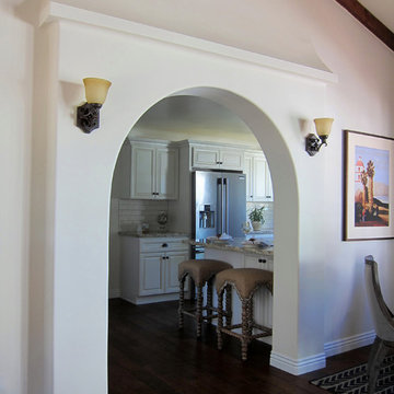
Design Consultant Jeff Doubét is the author of Creating Spanish Style Homes: Before & After – Techniques – Designs – Insights. The 240 page “Design Consultation in a Book” is now available. Please visit SantaBarbaraHomeDesigner.com for more info.
Jeff Doubét specializes in Santa Barbara style home and landscape designs. To learn more info about the variety of custom design services I offer, please visit SantaBarbaraHomeDesigner.com
Jeff Doubét is the Founder of Santa Barbara Home Design - a design studio based in Santa Barbara, California USA.
 ZeroEnergy Design
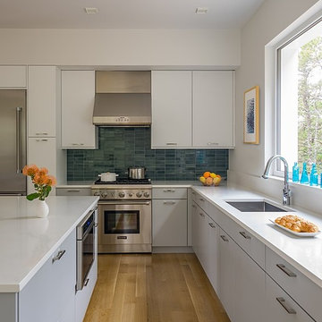
This modern green home offers both a vacation destination on Cape Cod near local family members and an opportunity for rental income.
FAMILY ROOTS. A West Coast couple living in the San Francisco Bay Area sought a permanent East Coast vacation home near family members living on Cape Cod. As academic professionals focused on sustainability, they sought a green, energy efficient home that was well-aligned with their values. With no green homes available for sale on Cape Cod, they decided to purchase land near their family and build their own.
SLOPED SITE. Comprised of a 3/4 acre lot nestled in the pines, the steeply sloping terrain called for a plan that embraced and took advantage of the slope. Of equal priority was optimizing solar exposure, preserving privacy from abutters, and creating outdoor living space. The design accomplished these goals with a simple, rectilinear form, offering living space on the both entry and lower/basement levels. The stepped foundation allows for a walk-out basement level with light-filled living space on the down-hill side of the home. The traditional basement on the eastern, up-hill side houses mechanical equipment and a home gym. The house welcomes natural light throughout, captures views of the forest, and delivers entertainment space that connects indoor living space to outdoor deck and dining patio.
MODERN VISION. The clean building form and uncomplicated finishes pay homage to the modern architectural legacy on the outer Cape. Durable and economical fiber cement panels, fixed with aluminum channels, clad the primary form. Cedar clapboards provide a visual accent at the south-facing living room, which extends a single roof plane to cover the entry porch.
SMART USE OF SPACE. On the entry level, the “L”-shaped living, dining, and kitchen space connects to the exterior living, dining, and grilling spaces to effectively double the home’s summertime entertainment area. Placed at the western end of the entry level (where it can retain privacy but still claim expansive downhill views) is the master suite with a built-in study. The lower level has two guest bedrooms, a second full bathroom, and laundry. The flexibility of the space—crucial in a house with a modest footprint—emerges in one of the guest bedrooms, which doubles as home office by opening the barn-style double doors to connect it to the bright, airy open stair leading up to the entry level. Thoughtful design, generous ceiling heights and large windows transform the modest 1,100 sf* footprint into a well-lit, spacious home. *(total finished space is 1800 sf)
RENTAL INCOME. The property works for its owners by netting rental income when the owners are home in San Francisco. The house especially caters to vacationers bound for nearby Mayo Beach and includes an outdoor shower adjacent to the lower level entry door. In contrast to the bare bones cottages that are typically available on the Cape, this home offers prospective tenants a modern aesthetic, paired with luxurious and green features. Durable finishes inside and out will ensure longevity with the heavier use that comes with a rental property.
COMFORT YEAR-ROUND. The home is super-insulated and air-tight, with mechanical ventilation to provide continuous fresh air from the outside. High performance triple-paned windows complement the building enclosure and maximize passive solar gain while ensuring a warm, draft-free winter, even when sitting close to the glass. A properly sized air source heat pump offers efficient heating & cooling, and includes a carefully designed the duct distribution system to provide even comfort throughout the house. The super-insulated envelope allows us to significantly reduce the equipment capacity, duct size, and airflow quantities, while maintaining unparalleled thermal comfort.
ENERGY EFFICIENT. The building’s shell and mechanical systems play instrumental roles in the home’s exceptional performance. The building enclosure reduces the most significant energy glutton: heating. Continuous super-insulation, thorough air sealing, triple-pane windows, and passive solar gain work together to yield a miniscule heating load. All active energy consumers are extremely efficient: an air source heat pump for heating and cooling, a heat pump hot water heater, LED lighting, energy recovery ventilation (ERV), and high efficiency appliances. The result is a home that uses 70% less energy than a similar new home built to code requirements.
OVERALL. The home embodies the owners’ goals and values while comprehensively enabling thermal comfort, energy efficiency, a vacation respite, and supplementary income.
PROJECT TEAM
ZeroEnergy Design - Architect & Mechanical Designer
A.F. Hultin & Co. - Contractor
Pamet Valley Landscape Design - Landscape & Masonry
Lisa Finch - Original Artwork
European Architectural Supply - Windows
Eric Roth Photography - Photography
 ONE Design
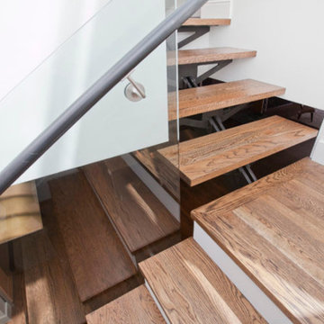
This project was an exercise in minimalism — how it can be embraced and incorporated at multiple levels. Typical of San Franciscan Victorians, the dark interior of this home was segregated and circulation spaces were narrow and dark. The stairs to the upper level was an afterthought and tucked away.
By removing the walls and rebuilding the stairs, we shifted the focus of this home’s interior and made the stairs the focal point. This project pays homage to the stairs, a critical element in the function and tone the home sets. As a transitional element, it carries the user from level to level, function to function, and mindset to mindset. The goal of this remodel was to invite the user upstairs and offer a more integrated transition to the upper level while at the same time using it to create a shaft of light into the inner recesses of the living space below.
As one ascends the stairs, the floor gradually disappears revealing a naked structural spine as the stairs reaches the upper level. The dormer addition offered ample headspace and invites columns of light to penetrate below. The cantilevered floor and shadow play this offers, dynamically marks its imprint on both levels.
Ancillary and storage spaces tucked away neatly and delicately – reminding us that expression should not be at the expense of function. Delicate and clean food preparation areas — now integrated with the rest of the home — invite us to celebrate this expression of unity.
 ONE Design
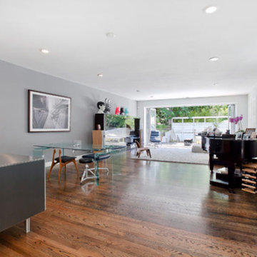
This project was an exercise in minimalism — how it can be embraced and incorporated at multiple levels. Typical of San Franciscan Victorians, the dark interior of this home was segregated and circulation spaces were narrow and dark. The stairs to the upper level was an afterthought and tucked away.
By removing the walls and rebuilding the stairs, we shifted the focus of this home’s interior and made the stairs the focal point. This project pays homage to the stairs, a critical element in the function and tone the home sets. As a transitional element, it carries the user from level to level, function to function, and mindset to mindset. The goal of this remodel was to invite the user upstairs and offer a more integrated transition to the upper level while at the same time using it to create a shaft of light into the inner recesses of the living space below.
As one ascends the stairs, the floor gradually disappears revealing a naked structural spine as the stairs reaches the upper level. The dormer addition offered ample headspace and invites columns of light to penetrate below. The cantilevered floor and shadow play this offers, dynamically marks its imprint on both levels.
Ancillary and storage spaces tucked away neatly and delicately – reminding us that expression should not be at the expense of function. Delicate and clean food preparation areas — now integrated with the rest of the home — invite us to celebrate this expression of unity.
 Grandeur Hills Group,Inc.
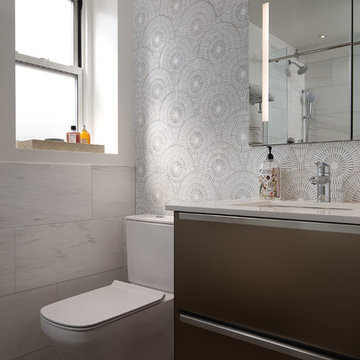
Pay attention to the wallpaper pattern in this bathroom. Typically, in toilets and bathrooms, monotonous wallpaper with one color is used. Our interior designers decided to change this traditional idea of the bathroom by adding liveliness and energy to its interior with the help of small wallpaper patterns.
Despite the small window, the bathroom does not look dark and cramped thanks to the mirrored surfaces, the dominant white color, as well as the large free space.
Make your home interior better than this one along with our talented interior designers!
 Kala Interior Design
The breathtaking ocean views influenced the dramatic redesign of this water-front Poipu condo. The outdated condo was completely remodeled to allow full appreciation of the surrounding views, bring in a fresh new color palette, and modernize and update everything from the electrical wiring to the new luxury bath towels. The clients wanted the condo to feel “fun, happy, and cheerful,” and to stand apart from the typical vacation rental on Kauai. They wanted to turn this condo into the ultimate “beach house” that felt just as luxurious as the gorgeous natural surroundings.
Fresh white ship-lap walls set the backdrop for this modern beach style, which is further enhanced with bold stripes, natural textures, and ocean-themed decor. The palette of cobalt, aqua and lichen green is fresh and vibrant against the neutral backdrop. Trina Turk’s “Peacock Print” was the inspiration fabric for the living and dining room. The print is so lively, colorful, and modern, and was the perfect place to start.
Every custom detail was thoughtfully chosen to bring a sense of luxury and originality to the space. While some elements are whimsical, such as the playful octopus art & fish-themed fabric, other elements are sophisticated and classic, to help keep the design grounded.
Special features include a custom-made “Moroccan Fish Scale” tile backsplash in the kitchen, crushed marble counter tops with oyster shells and float glass, and blue glass pendant lights, reminiscent of water bubbles.
26