Search results for "Uncomfortable" in Home Design Ideas
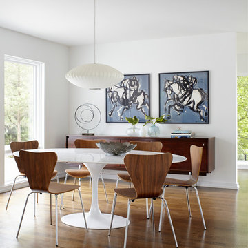
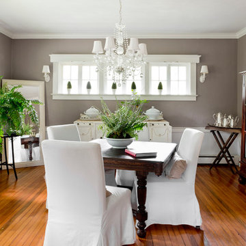
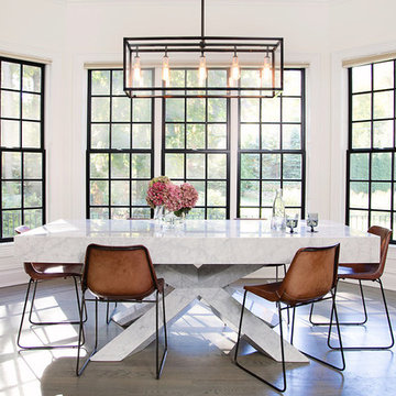
Example of a large country dark wood floor and brown floor enclosed dining room design in Chicago with white walls and no fireplace

Photo: Faith Towers © 2016 Houzz
Example of a transitional home office design in Burlington

So Chic Home Design & Staging, llc
Mid-sized eclectic enclosed medium tone wood floor living room photo in Indianapolis with gray walls, a standard fireplace, a tile fireplace and a wall-mounted tv
Find the right local pro for your project
Master shower is much larger. The River rocks flow from the sinks to the shower and provide a slip proof, beautiful flooring.
Inspiration for a large mediterranean master beige tile and pebble tile pebble tile floor doorless shower remodel in DC Metro with beige walls

Micheal Hospelt
Inspiration for a large country master white tile and stone tile marble floor and white floor freestanding bathtub remodel in San Francisco with furniture-like cabinets, black cabinets, a one-piece toilet, gray walls, an undermount sink, marble countertops, a hinged shower door and gray countertops

Christopher Nelson photos
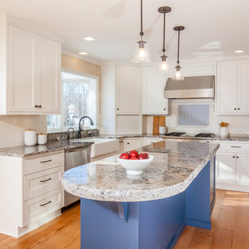
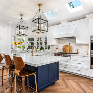
Elegant l-shaped eat-in kitchen photo in Seattle with a farmhouse sink, shaker cabinets, white cabinets, granite countertops, white backsplash, ceramic backsplash and stainless steel appliances

Inspiration for a large contemporary open concept light wood floor game room remodel in Dallas with white walls, no fireplace and a media wall

The kitchen and dining room in this 1960’s colonial were cramped and uncomfortable for any sort of large entertaining or crowd. With a small 3’ bump out along the back wall of the home, both rooms became much more spacious and useable. The kitchen addition allowed for a large center island and hearth cooking center as the focal point for the whole kitchen. While the expanded dining room, now allows room for a large holiday gathering, neighborhood card party or a group of kids after school.
The custom kitchen was designed with Omega Cabinetry, leathered granite countertops around the perimeter and Ceasarstone on the island. The custom hearth hood encapsulates a 36” Thermador professional gas range top that makes cooking a joy! Alongside the 36” built-in Subzero French door refrigerator a Thermador steam/bake oven and convection oven offer the homeowner tremendous cooking and baking options. Finally, the microwave drawer in the island makes quick warm ups easy for the 3 children.
Additionally, the kitchen was opened up dramatically to the home’s family room, creating an open feeling and central place for the family to gather.
Backsplash -
Type: 3x6 Handmade Tile
Collection: South Beach
Color: Olive
Pendants -
Manufacturer/Collection: Elk Lighting, Bergenen Collection, 10"
Finish: Oil Rubbed Bronze
Countertops -
Perimeter: Seafoam Green Granite w/ an Ogee Edge
Island: Quantra Quartz, 2231 Quartz w/ an Ogee Edge
Stools -
Pier One, 2582300 Marchella Rubbed Black Stool
Wall Color -
Benjamin Moore, HC96 Carrington Beige

Alek Lisefski / tiny-project.com
Example of a trendy exterior home design in San Francisco

jeri koegel
Inspiration for a mid-sized partial sun side yard concrete paver outdoor basketball/tennis/multi-game court in Los Angeles with a fire pit for spring.

Contemporary Powder Room depicts a cantilevered basin area with deep roll out cabinetry for added storage. This glam two-toned commercial wall covering creates tactile interest in this residential powder room.
Ross Miller Photography

The large picture window brings abundant light to this contemporary living space. The exposed red brick fireplace was transformed by resurfacing with natural white sandstone and framed in a complimentary white dentil mantel and decorative casing.
Neutral colors of beige, white and off-white were chosen for the new carpet and paint, giving an elegant look throughout.
photo by: Paul Gjording;
staging by: Upstage Designs

 
Download our free ebook, Creating the Ideal Kitchen. DOWNLOAD NOW
 
This client was referred to us from a past client. They are a busy 2-career household with young children and enjoy entertaining friends and family in their home. They have a beautiful open concept home but unfortunately the kitchen was not fitting for the rest of the home. They were not quite sure what to do with the space. We talked about trying to refresh it or do more of a minor remodel, but in the end they decided a full gut would get them to where they wanted to be.
One problem was there was no place for guests to hang out other than the large and awkward banquette area. The brick wall and tiled hood area were feeling a bit dated and tired. The space was just not functional for their lifestyle. There was no prep space near the cooktop and no landing area for items coming out of the ovens or refrigerator, plus a big dead zone in the center of the room.
Banquettes, like the one they previously had in the space, are great for small spaces, but when they get really large like this one, it makes getting in and out of the seating area awkward and uncomfortable. Plus, there was room for a large table, so we eliminated the awkward built in.
We started by removing the faux brick wall between the kitchen and back entry. We relocated the entry to the garage over a couple feet in order to get every last inch out of the new kitchen. We also made the decision to close up the primary window that faced the pretty ho hum brick wall of the neighbor’s house. There was plenty of light coming in from the seating area, so we just didn’t feel the window was adding much to the room.
Construction went smoothy. There was a bit of rework with electrical, flooring and HVAC, but in the end, we think it was well worth it.
The clients really wanted a sleek contemporary look, and we originally had planned for a full height slab backsplash, but due to it’s size, it was a budget buster. Instead, we got creative and settled on large format porcelain tiles that have a similar feel but were a fraction of the cost. We made sure the wall was plumb and level so that the fit and finish would mimic that of slab material.
The final space was quite a change. A large prep sink sits directly across from the new pro-style range with plenty additional prep space on the large island. The refrigerator and ovens now have miles of landing space, and a nice tight work triangle makes cooking a breeze.
Since we wanted a more contemporary feel, not many wall cabinets were included. Instead, we outfitted some of the drawers for dish storage with a peg system. Two large pantries flanking the refrigerator hold baking supplies and small appliances. Large drawers by the cooktop hold pots and pans, and an appliance garage tucked away to the left of the range hides away miscellaneous items. The large island also houses a microwave drawer and tons of storage, most of which is drawers offering maximum convenience.
The island now seats 5-6 people comfortably along with the new table in the seating area which can seat up to 8. Entertaining will be a breeze in this space. With such a clean backdrop, we knew we would need some drama with the lighting, so we chose two sets of staggered pendants, which we adjusted for the right visual balance above the island.
We also included a small coffee station to the right of the main kitchen, which helps keep the coffee clutter out of the kitchen proper. Two tones of complimentary gray are featured in this kitchen. The perimeter is a light gray that reads almost white. The island is a gray stain that adds some depth and interest with the visible wood texture. The countertops are clean white quartz, and the hardware, barstools and light fixtures add warm brass tones. I see lots of cooking and entertaining with family and friends in the near future in this bright and airy new space.
Designed by: Susan Klimala, CKD, CBD
Photography by: Michael Kaskel
For more information on kitchen and bath design ideas go to: www.kitchenstudio-ge.com

With the pending arrival of a beautiful baby girl, the homeowners of this 1928 Minneapolis Tudor wanted a basement that was conducive to a young child, but would still allow a place for family to gather and the occasional house guest. The original basement was typical; cold, lacking natural light with tiny, uncomfortably confined rooms and that “unique” basement smell. The goal was to reverse all of the ill effects of a rarely unappreciated space while increasing the performance of the older home.
The frigid temperatures and wet, mildew odor was remedied by demolishing the entire slab floor and excavating to gain an extra six inches in ceiling height. It also allowed us to insulate to R-15, moisture proof under the new slab, install a drain tile and sump pump. Within the concrete slab is a hydronic, in-floor radiant heating system which further helps to add comfort to the space. Lastly, we also sprayed a closed-cell, expanding urethane foam on the inside of the foundation walls all the way to the first floor.
To help bring more light down to the basement, we started by opening up the staircase on both sides. A curved wall bends light into the lower level while a countertop and cubbies below provide storage space for odds and ends. On the opposite wall, creatively placed cubbies provide places for paintings, ceramics and plants. We also removed the tiny 18” x 34” window on the south wall and installed a full-sized, high-efficiency, triple pane Pella egress window. To let lots of natural light into the window, we expanded the size of the cedar-lined egress well and included a built-in planter at the base to help bring life into an otherwise empty cavity.
Small, unspecified spaces that became storage areas now have purpose. The areas are defined, yet open. Upon descending down the stairs, one is greeted by a large living room with curved walls, custom design media center, built-in daybed and bookshelves. Use of paint was important in the design. Naturally in older homes basements are going to have exposed beams, soffits and a whole gambit of nooks and crannies. Instead of disguising them, we played them up, which created a layer effect with the color. The color also adds a touch of playfulness which anyone, regardless of age, can enjoy.
We scavenged the client’s garage and discovered that the previous homeowner kept the old, full-view glass front entry door in the garage. We re-installed the original glass knob and attached the door to sliding barn door hardware which was attached to the main structural beam of the lower level. On the other side of the door was the homeowners’ combined office and small fitness area. The office floor is a blend of thin strips of different colored cork. A built-in storage cabinet sits across from a site-built desk which forms to the curve of the dividing wall. A small, square hole in the curved wall provides a view to see who is coming down the stairs. Opposite of the office area and directly at the base of the stairs is a place for the homeowner’s treadmill.
Hidden is the mechanical room, which is home to many green and energy efficient products. The washing machine is a low-water consumption unit while the dryer requires less energy to operate than most standard units. Both sit atop a checkerboard pattern of different colored VCT tiles. We also replaced the aging boiler, which only heated the first and second level, with a 95% efficient heat source for the entire house—including the basement.
Behind the curved wall, the bathroom is conveniently located. A large, custom built no-formaldehyde added vanity supports the slab of remnant granite countertop. A piece of eco-resin wall panel, embedded with organic material, contains water in the shower and blends beautifully with the updated colors. Tucked under the stairs, we installed a dual-flush, low-water consumption toilet.
Through creative space planning, we packed a lot of into a rather small space. As a result, we have three very happy homeowners who are enjoying their light, clean and safe lower level of their home—however, they’ve been hard pressed to think of it as a “basement”.
highlights
Moisture management system
Insulated slab
Hydronic in-floor heat
Formaldehyde free cabinetry
MN-made custom cabinets
Ultra-low VOC paints
Wool carpet
Dual-flush toilet
Cork floor
No recessed lights
Cedar egress window well with planter
Re-used door
Eco-resin

Photography by Angle Eye Photography
Inspiration for a mid-sized timeless enclosed dark wood floor living room remodel in Philadelphia with brown walls, a standard fireplace, a plaster fireplace and no tv

Our goal on this project was to make the main floor of this lovely early 20th century home in a popular Vancouver neighborhood work for a growing family of four. We opened up the space, both literally and aesthetically, with windows and skylights, an efficient layout, some carefully selected furniture pieces and a soft colour palette that lends a light and playful feel to the space. Our clients can hardly believe that their once small, dark, uncomfortable main floor has become a bright, functional and beautiful space where they can now comfortably host friends and hang out as a family. Interior Design by Lori Steeves of Simply Home Decorating Inc. Photos by Tracey Ayton Photography.

Our goal on this project was to make the main floor of this lovely early 20th century home in a popular Vancouver neighborhood work for a growing family of four. We opened up the space, both literally and aesthetically, with windows and skylights, an efficient layout, some carefully selected furniture pieces and a soft colour palette that lends a light and playful feel to the space. Our clients can hardly believe that their once small, dark, uncomfortable main floor has become a bright, functional and beautiful space where they can now comfortably host friends and hang out as a family. Interior Design by Lori Steeves of Simply Home Decorating Inc. Photos by Tracey Ayton Photography.

Our goal on this project was to make the main floor of this lovely early 20th century home in a popular Vancouver neighborhood work for a growing family of four. We opened up the space, both literally and aesthetically, with windows and skylights, an efficient layout, some carefully selected furniture pieces and a soft colour palette that lends a light and playful feel to the space. Our clients can hardly believe that their once small, dark, uncomfortable main floor has become a bright, functional and beautiful space where they can now comfortably host friends and hang out as a family. Interior Design by Lori Steeves of Simply Home Decorating Inc. Photos by Tracey Ayton Photography.

Our goal on this project was to make the main floor of this lovely early 20th century home in a popular Vancouver neighborhood work for a growing family of four. We opened up the space, both literally and aesthetically, with windows and skylights, an efficient layout, some carefully selected furniture pieces and a soft colour palette that lends a light and playful feel to the space. Our clients can hardly believe that their once small, dark, uncomfortable main floor has become a bright, functional and beautiful space where they can now comfortably host friends and hang out as a family. Interior Design by Lori Steeves of Simply Home Decorating Inc. Photos by Tracey Ayton Photography.
15