
Search results for "Understood" in Home Design Ideas
 Advance Design Studio, Ltd.
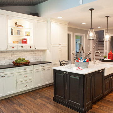
The major kitchen renovation of this old country farmhouse was a task of love, one that had been planned for many years by these Barrington seasoned homeowners. After interviewing no less than five companies, the homeowners chose the design team at Advance Design Studio to make the transformation they had long planned for.
“They had an understanding of the right design for the space almost from the instant they walked in the room”, says Sharon Scott of the design team of Nicole Ryan at Todd Jurs at Advance Design Studio. “They were the only designers who laid out ideas in the first meeting at the house that we really loved”, she says. “It was obvious that they understood the house, and understood us - and from then on the decision to hire them literally made itself”.
The original kitchen had a dividing “wall” of cabinetry…that made the rather large space seem very small, and cut off the kitchen from the eating area that has a beautiful garden view completely hidden from the main kitchen. Circulation was poor, leaving family members on top of one another when entertaining family and friends.
The new kitchen design nearly doubles the kitchen size within the original space; opening it up completely and enjoying an expansive island containing a new Kohler Whitehaven Smart Divide farm sink, a dishwasher, and pull out double trash receptacle. The great new gathering space accommodates four pull out stools beckoning grandchildren and friends alike. Removing the range from the island and relocating it to create a dramatic “feature” wall, completely out of the way of guests; it is now crowned with a beautiful completely customized wood hood designed to ventilate much more efficiently than the original island range containing a limited downdraft system.
The much more efficient use of the space after removing a pantry closet made way for a fully functional “tall wall” housing a double oven and refrigerator, out of the way of guests. Removing the restrictive cabinetry wall now allowed for an expansive floor to ceiling pantry cabinet with full extension pull out shelving, and an elegant display area complete with a beautiful furniture detailed buffet.
Fitting perfectly into the farmhouse charm of the old estate, Medallion Silver Lancaster cabinetry was chosen in a soft white Maple Divinity paint finish lining the perimeter. The stunning island hints to this old home’s past with Medallion Gold’s Maple Devonshire style graced with a Carriage Black Heirloom painted finish. The rubbed off black paint finish reveals the soft wood tones beneath, mimicking furniture you’d see in your grandmother’s home that has lovingly been polished for years to reveal a soft, subtly rubbed-off sheen.
Counter tops reverse contrast with perimeter tops of black “Raven” granite possessing a subtle honed finish, and a shift to Quartz Difinity Viareggio - resembling white Carrera marble on the island. A simple herringbone detail completes the decorative range wall, and subtle porcelain subway tiles grace the backsplash throughout.
The design is finished off with crisp Thermador and Bosch stainless steel appliances, and bright brushed cup pull and handle combination hardware. A pull down Kohler Bellaria faucet makes cleanup a breeze, and soft under-cabinet LED lighting throughout makes every work surface shine softly, and highlights the cabinetry display area with grace.
One special detail was created to make the dramatic ceiling transition to a vaulted area above the breakfast nook extra special. A tongue and groove solid wood ceiling was hung above, and a subtle greenish-grey distressed paint finish was hand developed on site by the talented crew, complementing the new kitchen with a completely unique surface that appears as if it’s been there for many, many years. It’s just one standout feature in the amazing new space that is sure to be in every conversation as newcomers enjoy the newest best hangout in this old home renewed!
After 30 years of renovating homes, this now content homeowner sips a cup of tea enjoying her new garden view, and reminisces projects of past – and lastly reports their experience with Advance Design Studio culminating with their amazing new kitchen to be the most enjoyable and satisfying home experience yet.
Designer: Nicole Ryan
Photographer: Joe Nowak
 Haus of León
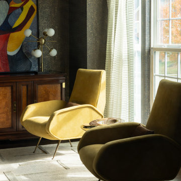
We’ve been excited about posting this project for years now! Especially once we realized what the name of the project would be on our website... iconic! The last of the pillows finally arrived and our photographer Parker did his thing!
We LOVE just how unique this client’s taste is. It’s 1960’s Jetsons meets suble, glamorous, and worldly. The’s such a fun mix of antique and vintage pieces, new rugs and fabrics, reupholstered furniture, and deep colors. Their fearlessness around wallpaper and curtains makes us proud. It’s a project that was as fun to work on with our clients as it was to see installed.
We found this pair of reupholstered 1950’s Italian Marco Zanuso chairs on chairish.com for the piano room. Other unique finds from Chairish are the 1960’s Italian coffee table between said chairs and the entry bench! We did get to reupholster that bench with some royal diamond Stroheim velvet. We got to play with more velvet Schumacher in the dining room by reupholstering their existing dining chair set. Kitschy and royal; elevating without being so serious. The vintage futuristic nod continues in the custom drapery and table runner in the dining room. The antique chrome and brass Sciolari chandelier in the dining room was discovered on 1stDibs.com!
Pause for a pufferfish moment in the powder room; a nautical 60’s surprise!
As we work our way back to the living room we added some simple wall sconces to the fireplace wall, we retiled the surround with lovely frosted gray glass tile, and we really enjoyed ourselves with custom pillow designs. These clients understood that if each piece was chosen for a reason the space would feel satisfying without being overstuffed.
Photography: Parker
 Haus of León
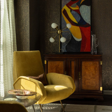
We’ve been excited about posting this project for years now! Especially once we realized what the name of the project would be on our website... iconic! The last of the pillows finally arrived and our photographer Parker did his thing!
We LOVE just how unique this client’s taste is. It’s 1960’s Jetsons meets suble, glamorous, and worldly. The’s such a fun mix of antique and vintage pieces, new rugs and fabrics, reupholstered furniture, and deep colors. Their fearlessness around wallpaper and curtains makes us proud. It’s a project that was as fun to work on with our clients as it was to see installed.
We found this pair of reupholstered 1950’s Italian Marco Zanuso chairs on chairish.com for the piano room. Other unique finds from Chairish are the 1960’s Italian coffee table between said chairs and the entry bench! We did get to reupholster that bench with some royal diamond Stroheim velvet. We got to play with more velvet Schumacher in the dining room by reupholstering their existing dining chair set. Kitschy and royal; elevating without being so serious. The vintage futuristic nod continues in the custom drapery and table runner in the dining room. The antique chrome and brass Sciolari chandelier in the dining room was discovered on 1stDibs.com!
Pause for a pufferfish moment in the powder room; a nautical 60’s surprise!
As we work our way back to the living room we added some simple wall sconces to the fireplace wall, we retiled the surround with lovely frosted gray glass tile, and we really enjoyed ourselves with custom pillow designs. These clients understood that if each piece was chosen for a reason the space would feel satisfying without being overstuffed.
Photography: Parker
Find the right local pro for your project
 JWH Design and Cabinetry LLC
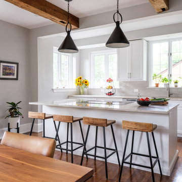
Mid-sized country galley medium tone wood floor and exposed beam eat-in kitchen photo in New York with an undermount sink, white cabinets, quartzite countertops, beige backsplash, ceramic backsplash, stainless steel appliances, an island and beige countertops
 Tower Design Studio, ASID LEED AP
Kathleen McMullen
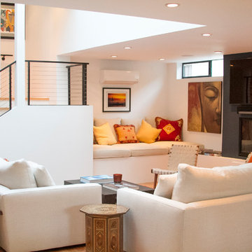
Family room - mid-sized 1950s open concept light wood floor and brown floor family room idea in San Francisco with white walls, a standard fireplace, a wall-mounted tv and a plaster fireplace
Family room - mid-sized 1950s open concept light wood floor and brown floor family room idea in San Francisco with white walls, a standard fireplace, a wall-mounted tv and a plaster fireplace
 Advance Design Studio, Ltd.
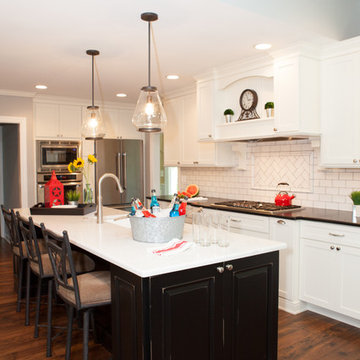
The major kitchen renovation of this old country farmhouse was a task of love, one that had been planned for many years by these Barrington seasoned homeowners. After interviewing no less than five companies, the homeowners chose the design team at Advance Design Studio to make the transformation they had long planned for.
“They had an understanding of the right design for the space almost from the instant they walked in the room”, says Sharon Scott of the design team of Nicole Ryan at Todd Jurs at Advance Design Studio. “They were the only designers who laid out ideas in the first meeting at the house that we really loved”, she says. “It was obvious that they understood the house, and understood us - and from then on the decision to hire them literally made itself”.
The original kitchen had a dividing “wall” of cabinetry…that made the rather large space seem very small, and cut off the kitchen from the eating area that has a beautiful garden view completely hidden from the main kitchen. Circulation was poor, leaving family members on top of one another when entertaining family and friends.
The new kitchen design nearly doubles the kitchen size within the original space; opening it up completely and enjoying an expansive island containing a new Kohler Whitehaven Smart Divide farm sink, a dishwasher, and pull out double trash receptacle. The great new gathering space accommodates four pull out stools beckoning grandchildren and friends alike. Removing the range from the island and relocating it to create a dramatic “feature” wall, completely out of the way of guests; it is now crowned with a beautiful completely customized wood hood designed to ventilate much more efficiently than the original island range containing a limited downdraft system.
The much more efficient use of the space after removing a pantry closet made way for a fully functional “tall wall” housing a double oven and refrigerator, out of the way of guests. Removing the restrictive cabinetry wall now allowed for an expansive floor to ceiling pantry cabinet with full extension pull out shelving, and an elegant display area complete with a beautiful furniture detailed buffet.
Fitting perfectly into the farmhouse charm of the old estate, Medallion Silver Lancaster cabinetry was chosen in a soft white Maple Divinity paint finish lining the perimeter. The stunning island hints to this old home’s past with Medallion Gold’s Maple Devonshire style graced with a Carriage Black Heirloom painted finish. The rubbed off black paint finish reveals the soft wood tones beneath, mimicking furniture you’d see in your grandmother’s home that has lovingly been polished for years to reveal a soft, subtly rubbed-off sheen.
Counter tops reverse contrast with perimeter tops of black “Raven” granite possessing a subtle honed finish, and a shift to Quartz Difinity Viareggio - resembling white Carrera marble on the island. A simple herringbone detail completes the decorative range wall, and subtle porcelain subway tiles grace the backsplash throughout.
The design is finished off with crisp Thermador and Bosch stainless steel appliances, and bright brushed cup pull and handle combination hardware. A pull down Kohler Bellaria faucet makes cleanup a breeze, and soft under-cabinet LED lighting throughout makes every work surface shine softly, and highlights the cabinetry display area with grace.
One special detail was created to make the dramatic ceiling transition to a vaulted area above the breakfast nook extra special. A tongue and groove solid wood ceiling was hung above, and a subtle greenish-grey distressed paint finish was hand developed on site by the talented crew, complementing the new kitchen with a completely unique surface that appears as if it’s been there for many, many years. It’s just one standout feature in the amazing new space that is sure to be in every conversation as newcomers enjoy the newest best hangout in this old home renewed!
After 30 years of renovating homes, this now content homeowner sips a cup of tea enjoying her new garden view, and reminisces projects of past – and lastly reports their experience with Advance Design Studio culminating with their amazing new kitchen to be the most enjoyable and satisfying home experience yet.
Designer: Nicole Ryan
Photographer: Joe Nowak
 Haus of León
We’ve been excited about posting this project for years now! Especially once we realized what the name of the project would be on our website... iconic! The last of the pillows finally arrived and our photographer Parker did his thing!
We LOVE just how unique this client’s taste is. It’s 1960’s Jetsons meets suble, glamorous, and worldly. The’s such a fun mix of antique and vintage pieces, new rugs and fabrics, reupholstered furniture, and deep colors. Their fearlessness around wallpaper and curtains makes us proud. It’s a project that was as fun to work on with our clients as it was to see installed.
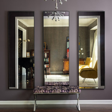
We found this pair of reupholstered 1950’s Italian Marco Zanuso chairs on chairish.com for the piano room. Other unique finds from Chairish are the 1960’s Italian coffee table between said chairs and the entry bench! We did get to reupholster that bench with some royal diamond Stroheim velvet. We got to play with more velvet Schumacher in the dining room by reupholstering their existing dining chair set. Kitschy and royal; elevating without being so serious. The vintage futuristic nod continues in the custom drapery and table runner in the dining room. The antique chrome and brass Sciolari chandelier in the dining room was discovered on 1stDibs.com!
Pause for a pufferfish moment in the powder room; a nautical 60’s surprise!
As we work our way back to the living room we added some simple wall sconces to the fireplace wall, we retiled the surround with lovely frosted gray glass tile, and we really enjoyed ourselves with custom pillow designs. These clients understood that if each piece was chosen for a reason the space would feel satisfying without being overstuffed.
Photography: Parker Michels-Boyce
 Advance Design Studio, Ltd.
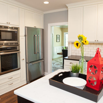
The major kitchen renovation of this old country farmhouse was a task of love, one that had been planned for many years by these Barrington seasoned homeowners. After interviewing no less than five companies, the homeowners chose the design team at Advance Design Studio to make the transformation they had long planned for.
“They had an understanding of the right design for the space almost from the instant they walked in the room”, says Sharon Scott of the design team of Nicole Ryan at Todd Jurs at Advance Design Studio. “They were the only designers who laid out ideas in the first meeting at the house that we really loved”, she says. “It was obvious that they understood the house, and understood us - and from then on the decision to hire them literally made itself”.
The original kitchen had a dividing “wall” of cabinetry…that made the rather large space seem very small, and cut off the kitchen from the eating area that has a beautiful garden view completely hidden from the main kitchen. Circulation was poor, leaving family members on top of one another when entertaining family and friends.
The new kitchen design nearly doubles the kitchen size within the original space; opening it up completely and enjoying an expansive island containing a new Kohler Whitehaven Smart Divide farm sink, a dishwasher, and pull out double trash receptacle. The great new gathering space accommodates four pull out stools beckoning grandchildren and friends alike. Removing the range from the island and relocating it to create a dramatic “feature” wall, completely out of the way of guests; it is now crowned with a beautiful completely customized wood hood designed to ventilate much more efficiently than the original island range containing a limited downdraft system.
The much more efficient use of the space after removing a pantry closet made way for a fully functional “tall wall” housing a double oven and refrigerator, out of the way of guests. Removing the restrictive cabinetry wall now allowed for an expansive floor to ceiling pantry cabinet with full extension pull out shelving, and an elegant display area complete with a beautiful furniture detailed buffet.
Fitting perfectly into the farmhouse charm of the old estate, Medallion Silver Lancaster cabinetry was chosen in a soft white Maple Divinity paint finish lining the perimeter. The stunning island hints to this old home’s past with Medallion Gold’s Maple Devonshire style graced with a Carriage Black Heirloom painted finish. The rubbed off black paint finish reveals the soft wood tones beneath, mimicking furniture you’d see in your grandmother’s home that has lovingly been polished for years to reveal a soft, subtly rubbed-off sheen.
Counter tops reverse contrast with perimeter tops of black “Raven” granite possessing a subtle honed finish, and a shift to Quartz Difinity Viareggio - resembling white Carrera marble on the island. A simple herringbone detail completes the decorative range wall, and subtle porcelain subway tiles grace the backsplash throughout.
The design is finished off with crisp Thermador and Bosch stainless steel appliances, and bright brushed cup pull and handle combination hardware. A pull down Kohler Bellaria faucet makes cleanup a breeze, and soft under-cabinet LED lighting throughout makes every work surface shine softly, and highlights the cabinetry display area with grace.
One special detail was created to make the dramatic ceiling transition to a vaulted area above the breakfast nook extra special. A tongue and groove solid wood ceiling was hung above, and a subtle greenish-grey distressed paint finish was hand developed on site by the talented crew, complementing the new kitchen with a completely unique surface that appears as if it’s been there for many, many years. It’s just one standout feature in the amazing new space that is sure to be in every conversation as newcomers enjoy the newest best hangout in this old home renewed!
After 30 years of renovating homes, this now content homeowner sips a cup of tea enjoying her new garden view, and reminisces projects of past – and lastly reports their experience with Advance Design Studio culminating with their amazing new kitchen to be the most enjoyable and satisfying home experience yet.
Designer: Nicole Ryan
Photographer: Joe Nowak
 Progressive Design Build
In less than 90 days after work began, a dated kitchen is brought back to life with current trends and technologies, along with a neutral color palette.
Introduced to Progressive Design Build from a trusted referral, Mike and Holly approached their kitchen remodel with some trepidation. They had interviewed several contractors who were unsuccessful at solving key traffic flow issues around an island cabinet they wanted—until they met Progressive.
As restaurant owners, the husband and wife team were very familiar with remodeling contractors, having renovated many restaurants in the past. Design/build remodeling, however, was new to them. After learning more about the benefits of working with a design/build firm, Mike and Holly met with Progressive’s certified kitchen and bath designer, Betty Appleby. They understood immediately the value of teaming up with design and construction professionals early in the process.
Mike and Holly had done a lot of their own research and were clear about what they wanted. They had visions of an island cabinet being more usable and accessible. Progressive Design Build brought that vision to life.
While the project was under construction, the homeowners avoided the noise and dust by taking frequent trips to Europe and New York, trusting the entire remodeling project to Progressive Design Build. When they returned, all aspects of their functional and stylistic design needs were met.
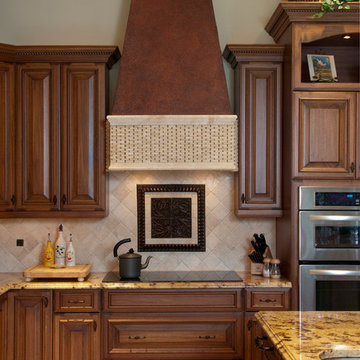
Details of the finished project include a faux finish copper range hood, custom cabinetry, new stainless steel appliances, granite countertops, a new wet bar adjacent to the kitchen, and porcelain tile flooring throughout. The refrigerator was disguised using custom cabinet appliance panels, effectively integrating it with the cabinetry wall for a unified look.
This project was completed on time and on budget. As a result, the homeowners hired Progressive Design Build to complete two more home remodeling projects for them.
 Tiffany Brooks, HGTV Host & Interior Designer
Inquire About Our Design Services
When we first started talking in the spring of 2015, I was impressed. She was witty, realistic, and understood that as much as she loves my shows on HGTV, design does not does not happen in 43 minutes! She told me about her space, and how she felt that her bedroom seemed “blah” to her. She had no retreat. Molly desperately longed for a place that she could spend time in, read in, play in and above all, relax in.
What we did:
Many people are terrified of hiring a designer. Rightfully so, they are investing a pretty penny in their homes. They want to make sure that everything, down to the last floral arrangement, is to their liking, because they will have to live it (and pay for it). Unfortunately, a client can unintentionally stifle a designer’s creativity through micro-management. This can produce lackluster results and ultimately cause more time (and money) to be spent on a project than is really necessary.
With Molly, that was never an issue. Before she even showed me the room in question, she said that I could have full creative license to do what I needed to do to her bedroom. SAY WHAAH!?
With Molly giving me complete creative freedom, I planned everything out and got down to business. The result: Bite-your-bottom-lip sexy. I don’t get jealous of too many of my clients’ spaces, but this one still takes my breath away every time I look at the pics!
The craziest part was that by adding more furniture, it actually made the space feel larger.
Molly and her husband Patrick loved the finished space, and promised me I will be back to finish the rest of the house!
Here’s the highlights of the rest of the project:
I came up with a space plan with three options.
Next, we reviewed mood boards and fabric schemes that would work for both Molly and her hubby Patrick.
We started with the bed. My goal was to add edge to its otherwise traditional style.
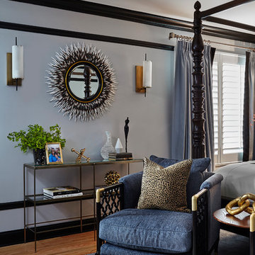
We decided to spice things up by painting the trim work in the room black.
We built in layers of lighting with dimmers. In a bedroom everything should be on dimmers, right? Right.
We designed and customized bedding, chairs and window treatments.
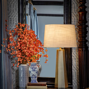
Together with Molly, we selected the most perfect wallpaper. This geometric “grasscloth” adds so much depth and dimension that was just missing before.
What I love:
That light fixture. I mean it is really, really amazing in person.
The porcupine mirror. This thing came packaged like it was the hope diamond, and everyone was terrified to handle it. But it really became a highlight of the room.
 Advance Design Studio, Ltd.
This clean cut kitchen stemmed from the design challenge to place a contemporary kitchen in a traditional Tudor style house in the Northwest Suburbs of Chicago. Our client was a self-described city person living in the country - who wanted an urban contemporary feeling incorporated into her home. She says she waited many years to find the right design team who understood her vision!
Not wanting to ignore the beautiful 50 year old oaks outside her window, Advance Design transformed her traditional kitchen into an urban kitchen utopia with the use of texture and earthy finishes keeping with the feel of the existing home. Dura Supreme Bria frameless cabinets with a soft pillowed door works to incorporate a woodsy feel in shades of grey textured foil appropriately called “Twig”. Aluminum framed opaque glass doors are hinged with a lift up Aventos hinge for a contemporary twist and a super-functional opening. Brushed nickel hardware in various sizes keeps with the clean line feel.
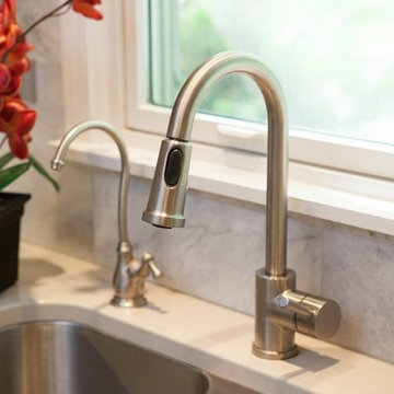
To keep the design organic and “fit it in” with the rest of the house, we covered the floor with a natural looking travertine porcelain laid on a 45 degree angle simulating a more traditional feel in a neutral tone of silvery-brown. The backsplash is clean and crisp with large Carrera marble tiles in a brick pattern, and a splash of energy from a vertical marble and glass mosaic accent. We then finished off the look with clean Cambria Torquay countertops portraying minimal patterning to keep the work surfaces feeling uncluttered and open.
Other areas of the home were addressed to “blend” the style in with lightly distressed grey tone hardwood floors and a “matching” renovated powder room displaying contemporary features to compliment the nearby kitchen’s style.
Photo Credits- Joe Nowak
 Tiffany Brooks, HGTV Host & Interior Designer
Inquire About Our Design Services
When we first started talking in the spring of 2015, I was impressed. She was witty, realistic, and understood that as much as she loves my shows on HGTV, design does not does not happen in 43 minutes! She told me about her space, and how she felt that her bedroom seemed “blah” to her. She had no retreat. Molly desperately longed for a place that she could spend time in, read in, play in and above all, relax in.
What we did:
Many people are terrified of hiring a designer. Rightfully so, they are investing a pretty penny in their homes. They want to make sure that everything, down to the last floral arrangement, is to their liking, because they will have to live it (and pay for it). Unfortunately, a client can unintentionally stifle a designer’s creativity through micro-management. This can produce lackluster results and ultimately cause more time (and money) to be spent on a project than is really necessary.
With Molly, that was never an issue. Before she even showed me the room in question, she said that I could have full creative license to do what I needed to do to her bedroom. SAY WHAAH!?
With Molly giving me complete creative freedom, I planned everything out and got down to business. The result: Bite-your-bottom-lip sexy. I don’t get jealous of too many of my clients’ spaces, but this one still takes my breath away every time I look at the pics!
The craziest part was that by adding more furniture, it actually made the space feel larger.
Molly and her husband Patrick loved the finished space, and promised me I will be back to finish the rest of the house!
Here’s the highlights of the rest of the project:
I came up with a space plan with three options.
Next, we reviewed mood boards and fabric schemes that would work for both Molly and her hubby Patrick.
We started with the bed. My goal was to add edge to its otherwise traditional style.
We decided to spice things up by painting the trim work in the room black.
We built in layers of lighting with dimmers. In a bedroom everything should be on dimmers, right? Right.
We designed and customized bedding, chairs and window treatments.
Together with Molly, we selected the most perfect wallpaper. This geometric “grasscloth” adds so much depth and dimension that was just missing before.
What I love:
That light fixture. I mean it is really, really amazing in person.
The porcupine mirror. This thing came packaged like it was the hope diamond, and everyone was terrified to handle it. But it really became a highlight of the room.
 Black + Vernooy Architects
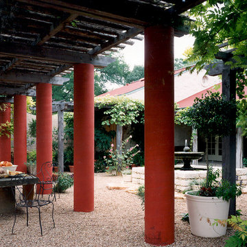
Inspired by the owners' travels in the Mediterranean region yet rooted firmly in Texas soil, this single family residence is designed to provide a secluded, comfortable environment for observing nature, relaxing, entertaining, living, and working. The oddly shaped site determined a house that is removed from the street, resulting in a long drive through a wooded area that leads to the gently sloping house site. The house is designed around a large, central public living area. The basic "H" shaped plan reaches out to define the entry court as well as the rear yard area. The building can only be seen in small vignettes as one moves around and through it, and is finally understood from inside the main room. The public space is central to the plan, where rooms overlay and flow through and into one another. Private rooms are tucked away in more remote parts of the site. The guest bedrooms are located at a slightly lower level, and a remote study, reached by a ship's ladder, overlooks the main living area and enjoys its own roof terrace. The central part of the house is designed as a solid, strong, "original" building to which other wings are added as if built over time. The client desired that the house appear to be of no discernible style or period, and seem older rather than newer.
Built By: Dalgleish Construction Co.
Photography By: Paul Bardagjy
 Black + Vernooy Architects
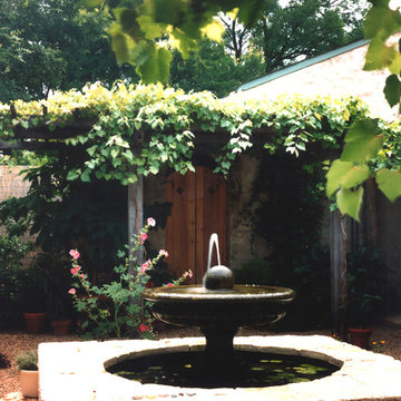
Inspired by the owners' travels in the Mediterranean region yet rooted firmly in Texas soil, this single family residence is designed to provide a secluded, comfortable environment for observing nature, relaxing, entertaining, living, and working. The oddly shaped site determined a house that is removed from the street, resulting in a long drive through a wooded area that leads to the gently sloping house site. The house is designed around a large, central public living area. The basic "H" shaped plan reaches out to define the entry court as well as the rear yard area. The building can only be seen in small vignettes as one moves around and through it, and is finally understood from inside the main room. The public space is central to the plan, where rooms overlay and flow through and into one another. Private rooms are tucked away in more remote parts of the site. The guest bedrooms are located at a slightly lower level, and a remote study, reached by a ship's ladder, overlooks the main living area and enjoys its own roof terrace. The central part of the house is designed as a solid, strong, "original" building to which other wings are added as if built over time. The client desired that the house appear to be of no discernible style or period, and seem older rather than newer.
Built By: Dalgleish Construction Co.
Photography By: Paul Bardagjy
 Advance Design Studio, Ltd.
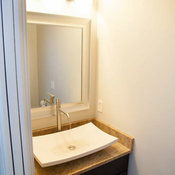
This clean cut kitchen stemmed from the design challenge to place a contemporary kitchen in a traditional Tudor style house in the Northwest Suburbs of Chicago. Our client was a self-described city person living in the country - who wanted an urban contemporary feeling incorporated into her home. She says she waited many years to find the right design team who understood her vision!
Not wanting to ignore the beautiful 50 year old oaks outside her window, Advance Design transformed her traditional kitchen into an urban kitchen utopia with the use of texture and earthy finishes keeping with the feel of the existing home. Dura Supreme Bria frameless cabinets with a soft pillowed door works to incorporate a woodsy feel in shades of grey textured foil appropriately called “Twig”. Aluminum framed opaque glass doors are hinged with a lift up Aventos hinge for a contemporary twist and a super-functional opening. Brushed nickel hardware in various sizes keeps with the clean line feel.
To keep the design organic and “fit it in” with the rest of the house, we covered the floor with a natural looking travertine porcelain laid on a 45 degree angle simulating a more traditional feel in a neutral tone of silvery-brown. The backsplash is clean and crisp with large Carrera marble tiles in a brick pattern, and a splash of energy from a vertical marble and glass mosaic accent. We then finished off the look with clean Cambria Torquay countertops portraying minimal patterning to keep the work surfaces feeling uncluttered and open.
Other areas of the home were addressed to “blend” the style in with lightly distressed grey tone hardwood floors and a “matching” renovated powder room displaying contemporary features to compliment the nearby kitchen’s style.
Photo Credits- Joe Nowak
 Advance Design Studio, Ltd.
The major kitchen renovation of this old country farmhouse was a task of love, one that had been planned for many years by these Barrington seasoned homeowners. After interviewing no less than five companies, the homeowners chose the design team at Advance Design Studio to make the transformation they had long planned for.
“They had an understanding of the right design for the space almost from the instant they walked in the room”, says Sharon Scott of the design team of Nicole Ryan at Todd Jurs at Advance Design Studio. “They were the only designers who laid out ideas in the first meeting at the house that we really loved”, she says. “It was obvious that they understood the house, and understood us - and from then on the decision to hire them literally made itself”.
The original kitchen had a dividing “wall” of cabinetry…that made the rather large space seem very small, and cut off the kitchen from the eating area that has a beautiful garden view completely hidden from the main kitchen. Circulation was poor, leaving family members on top of one another when entertaining family and friends.
The new kitchen design nearly doubles the kitchen size within the original space; opening it up completely and enjoying an expansive island containing a new Kohler Whitehaven Smart Divide farm sink, a dishwasher, and pull out double trash receptacle. The great new gathering space accommodates four pull out stools beckoning grandchildren and friends alike. Removing the range from the island and relocating it to create a dramatic “feature” wall, completely out of the way of guests; it is now crowned with a beautiful completely customized wood hood designed to ventilate much more efficiently than the original island range containing a limited downdraft system.
The much more efficient use of the space after removing a pantry closet made way for a fully functional “tall wall” housing a double oven and refrigerator, out of the way of guests. Removing the restrictive cabinetry wall now allowed for an expansive floor to ceiling pantry cabinet with full extension pull out shelving, and an elegant display area complete with a beautiful furniture detailed buffet.
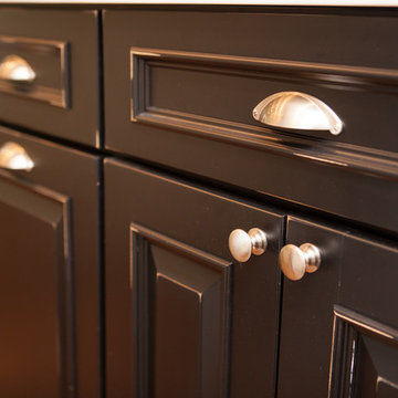
Fitting perfectly into the farmhouse charm of the old estate, Medallion Silver Lancaster cabinetry was chosen in a soft white Maple Divinity paint finish lining the perimeter. The stunning island hints to this old home’s past with Medallion Gold’s Maple Devonshire style graced with a Carriage Black Heirloom painted finish. The rubbed off black paint finish reveals the soft wood tones beneath, mimicking furniture you’d see in your grandmother’s home that has lovingly been polished for years to reveal a soft, subtly rubbed-off sheen.
Counter tops reverse contrast with perimeter tops of black “Raven” granite possessing a subtle honed finish, and a shift to Quartz Difinity Viareggio - resembling white Carrera marble on the island. A simple herringbone detail completes the decorative range wall, and subtle porcelain subway tiles grace the backsplash throughout.
The design is finished off with crisp Thermador and Bosch stainless steel appliances, and bright brushed cup pull and handle combination hardware. A pull down Kohler Bellaria faucet makes cleanup a breeze, and soft under-cabinet LED lighting throughout makes every work surface shine softly, and highlights the cabinetry display area with grace.
One special detail was created to make the dramatic ceiling transition to a vaulted area above the breakfast nook extra special. A tongue and groove solid wood ceiling was hung above, and a subtle greenish-grey distressed paint finish was hand developed on site by the talented crew, complementing the new kitchen with a completely unique surface that appears as if it’s been there for many, many years. It’s just one standout feature in the amazing new space that is sure to be in every conversation as newcomers enjoy the newest best hangout in this old home renewed!
After 30 years of renovating homes, this now content homeowner sips a cup of tea enjoying her new garden view, and reminisces projects of past – and lastly reports their experience with Advance Design Studio culminating with their amazing new kitchen to be the most enjoyable and satisfying home experience yet.
Designer: Nicole Ryan
Photographer: Joe Nowak
 Advance Design Studio, Ltd.
This clean cut kitchen stemmed from the design challenge to place a contemporary kitchen in a traditional Tudor style house in the Northwest Suburbs of Chicago. Our client was a self-described city person living in the country - who wanted an urban contemporary feeling incorporated into her home. She says she waited many years to find the right design team who understood her vision!
Not wanting to ignore the beautiful 50 year old oaks outside her window, Advance Design transformed her traditional kitchen into an urban kitchen utopia with the use of texture and earthy finishes keeping with the feel of the existing home. Dura Supreme Bria frameless cabinets with a soft pillowed door works to incorporate a woodsy feel in shades of grey textured foil appropriately called “Twig”. Aluminum framed opaque glass doors are hinged with a lift up Aventos hinge for a contemporary twist and a super-functional opening. Brushed nickel hardware in various sizes keeps with the clean line feel.
To keep the design organic and “fit it in” with the rest of the house, we covered the floor with a natural looking travertine porcelain laid on a 45 degree angle simulating a more traditional feel in a neutral tone of silvery-brown. The backsplash is clean and crisp with large Carrera marble tiles in a brick pattern, and a splash of energy from a vertical marble and glass mosaic accent. We then finished off the look with clean Cambria Torquay countertops portraying minimal patterning to keep the work surfaces feeling uncluttered and open.
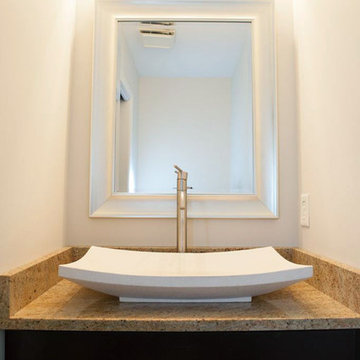
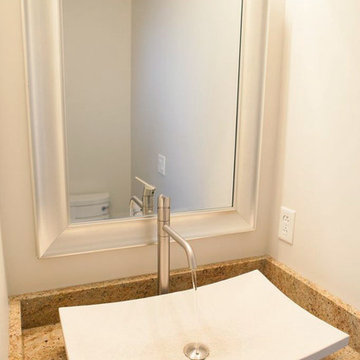
Other areas of the home were addressed to “blend” the style in with lightly distressed grey tone hardwood floors and a “matching” renovated powder room displaying contemporary features to compliment the nearby kitchen’s style.
Photo Credits- Joe Nowak
 Tiffany Brooks, HGTV Host & Interior Designer
Inquire About Our Design Services
When we first started talking in the spring of 2015, I was impressed. She was witty, realistic, and understood that as much as she loves my shows on HGTV, design does not does not happen in 43 minutes! She told me about her space, and how she felt that her bedroom seemed “blah” to her. She had no retreat. Molly desperately longed for a place that she could spend time in, read in, play in and above all, relax in.
What we did:
Many people are terrified of hiring a designer. Rightfully so, they are investing a pretty penny in their homes. They want to make sure that everything, down to the last floral arrangement, is to their liking, because they will have to live it (and pay for it). Unfortunately, a client can unintentionally stifle a designer’s creativity through micro-management. This can produce lackluster results and ultimately cause more time (and money) to be spent on a project than is really necessary.
With Molly, that was never an issue. Before she even showed me the room in question, she said that I could have full creative license to do what I needed to do to her bedroom. SAY WHAAH!?
With Molly giving me complete creative freedom, I planned everything out and got down to business. The result: Bite-your-bottom-lip sexy. I don’t get jealous of too many of my clients’ spaces, but this one still takes my breath away every time I look at the pics!
The craziest part was that by adding more furniture, it actually made the space feel larger.
Molly and her husband Patrick loved the finished space, and promised me I will be back to finish the rest of the house!
Here’s the highlights of the rest of the project:
I came up with a space plan with three options.
Next, we reviewed mood boards and fabric schemes that would work for both Molly and her hubby Patrick.
We started with the bed. My goal was to add edge to its otherwise traditional style.
We decided to spice things up by painting the trim work in the room black.
We built in layers of lighting with dimmers. In a bedroom everything should be on dimmers, right? Right.
We designed and customized bedding, chairs and window treatments.
Together with Molly, we selected the most perfect wallpaper. This geometric “grasscloth” adds so much depth and dimension that was just missing before.
What I love:
That light fixture. I mean it is really, really amazing in person.
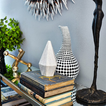
The porcupine mirror. This thing came packaged like it was the hope diamond, and everyone was terrified to handle it. But it really became a highlight of the room.
 Advance Design Studio, Ltd.
This clean cut kitchen stemmed from the design challenge to place a contemporary kitchen in a traditional Tudor style house in the Northwest Suburbs of Chicago. Our client was a self-described city person living in the country - who wanted an urban contemporary feeling incorporated into her home. She says she waited many years to find the right design team who understood her vision!
Not wanting to ignore the beautiful 50 year old oaks outside her window, Advance Design transformed her traditional kitchen into an urban kitchen utopia with the use of texture and earthy finishes keeping with the feel of the existing home. Dura Supreme Bria frameless cabinets with a soft pillowed door works to incorporate a woodsy feel in shades of grey textured foil appropriately called “Twig”. Aluminum framed opaque glass doors are hinged with a lift up Aventos hinge for a contemporary twist and a super-functional opening. Brushed nickel hardware in various sizes keeps with the clean line feel.
To keep the design organic and “fit it in” with the rest of the house, we covered the floor with a natural looking travertine porcelain laid on a 45 degree angle simulating a more traditional feel in a neutral tone of silvery-brown. The backsplash is clean and crisp with large Carrera marble tiles in a brick pattern, and a splash of energy from a vertical marble and glass mosaic accent. We then finished off the look with clean Cambria Torquay countertops portraying minimal patterning to keep the work surfaces feeling uncluttered and open.
Other areas of the home were addressed to “blend” the style in with lightly distressed grey tone hardwood floors and a “matching” renovated powder room displaying contemporary features to compliment the nearby kitchen’s style.
Photo Credits- Joe Nowak
 Black + Vernooy Architects
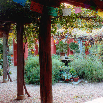
Inspired by the owners' travels in the Mediterranean region yet rooted firmly in Texas soil, this single family residence is designed to provide a secluded, comfortable environment for observing nature, relaxing, entertaining, living, and working. The oddly shaped site determined a house that is removed from the street, resulting in a long drive through a wooded area that leads to the gently sloping house site. The house is designed around a large, central public living area. The basic "H" shaped plan reaches out to define the entry court as well as the rear yard area. The building can only be seen in small vignettes as one moves around and through it, and is finally understood from inside the main room. The public space is central to the plan, where rooms overlay and flow through and into one another. Private rooms are tucked away in more remote parts of the site. The guest bedrooms are located at a slightly lower level, and a remote study, reached by a ship's ladder, overlooks the main living area and enjoys its own roof terrace. The central part of the house is designed as a solid, strong, "original" building to which other wings are added as if built over time. The client desired that the house appear to be of no discernible style or period, and seem older rather than newer.
Built By: Dalgleish Construction Co.
Photography By: Paul Bardagjy
26