
Search results for "Unity" in Home Design Ideas

 down2earth Interior Design, LLC.
It all started with a sliding barn door and a bold and simple thought: what if we painted it “Geranium”? From there, a neutral-meets-ethnic loft interior unfolded at Society Hill Tower, perched high above the city of Philadelphia. Our client brought us in as interior designers to collaborate with Ambit Architecture, who helped her merge two adjacent apartment units into one, large, open floor-plan unit. One of the challenges on a project like this is the very openness of the space – there are many furniture selections visually connected to one another, and connected to the kitchen, with its bold pops of yellow. So it was important to establish some fundamentally neutral tones that would provide unity from one furniture grouping to the next. We also wanted to make sure that the panoramic views of the city would remain an important focus of the space.
Therefore, in the living and dining room, we chose large scale furniture pieces made from rustic or reclaimed wood, while upholstered pieces are covered in crisp linen or neutral leather. Then, we added layer upon layer of cheery textiles and prints. We started with jute and color reform wool rugs. Then, we added an ottoman also wrapped in an ethnic rug, kilim pillows, and velvety throws. The result is a space that is unified, lively, yet calm.
Photos by Ambit Architecture

 Upland Homes
Located in the coveted West End of downtown Greenville, SC, Park Place on Hudson St. brings new living to old Greenville. Just a half-mile from Flour Field, a short walk to the Swamp Rabbit Trail, and steps away from the future Unity Park, this community is ideal for families young and old. The craftsman style town home community consists of twenty-three units, thirteen with 3 beds/2.5 baths and ten with 2 beds/2.5baths.
The design concept they came up with was simple – three separate buildings with two basic floors plans that were fully customizable. Each unit came standard with an elevator, hardwood floors, high-end Kitchen Aid appliances, Moen plumbing fixtures, tile showers, granite countertops, wood shelving in all closets, LED recessed lighting in all rooms, private balconies with built-in grill stations and large sliding glass doors. While the outside craftsman design with large front and back porches was set by the city, the interiors were fully customizable. The homeowners would meet with a designer at the Park Place on Hudson Showroom to pick from a selection of standard options, all items that would go in their home. From cabinets to door handles, from tile to paint colors, there was virtually no interior feature that the owners did not have the option to choose. They also had the ability to fully customize their unit with upgrades by meeting with each vendor individually and selecting the products for their home – some of the owners even choose to re-design the floor plans to better fit their lifestyle.
 Triforce Construction
Welcome to this breathtaking fully custom transitional kitchen, where elegance and functionality blend seamlessly to create the heart of your dream home.
Upon entering the space, you'll be instantly drawn to the striking white cabinets that adorn the perimeter of the kitchen. These beautifully crafted cabinets offer ample storage and are paired with sleek, white quartz countertops for a clean and sophisticated look. The large island, complete with additional storage and seating, serves as the focal point of the room, perfect for casual dining and entertaining guests.
The open concept design effortlessly connects the kitchen with the adjoining living and dining areas, fostering a sense of unity and flow throughout the space. The vaulted ceiling adds a sense of grandeur, while the skylight above floods the room with warm, natural light, creating a bright and inviting atmosphere.
Your eyes will be drawn to the stunning dark hexagonal backsplash tile, which provides a captivating contrast against the crisp white cabinetry. This bold design element not only adds visual interest but also ties the transitional style together with a modern twist.
High-end stainless steel appliances and well-placed fixtures ensure that this kitchen is as functional as it is stylish. The open shelves and glass-front cabinets provide the perfect opportunity to showcase your favorite dishware and decorative items.
This fully custom transitional kitchen is a perfect blend of traditional charm and contemporary design, creating a space that is both luxurious and welcoming. Experience the harmony of style and functionality in this one-of-a-kind culinary haven that will become the center of your home and the envy of all who visit.
Find the right local pro for your project
 Upland Homes
Located in the coveted West End of downtown Greenville, SC, Park Place on Hudson St. brings new living to old Greenville. Just a half-mile from Flour Field, a short walk to the Swamp Rabbit Trail, and steps away from the future Unity Park, this community is ideal for families young and old. The craftsman style town home community consists of twenty-three units, thirteen with 3 beds/2.5 baths and ten with 2 beds/2.5baths.
The design concept they came up with was simple – three separate buildings with two basic floors plans that were fully customizable. Each unit came standard with an elevator, hardwood floors, high-end Kitchen Aid appliances, Moen plumbing fixtures, tile showers, granite countertops, wood shelving in all closets, LED recessed lighting in all rooms, private balconies with built-in grill stations and large sliding glass doors. While the outside craftsman design with large front and back porches was set by the city, the interiors were fully customizable. The homeowners would meet with a designer at the Park Place on Hudson Showroom to pick from a selection of standard options, all items that would go in their home. From cabinets to door handles, from tile to paint colors, there was virtually no interior feature that the owners did not have the option to choose. They also had the ability to fully customize their unit with upgrades by meeting with each vendor individually and selecting the products for their home – some of the owners even choose to re-design the floor plans to better fit their lifestyle.

 West Coast Living
Diningroom by Barclay Butera Newport Collection
Shop now!
Magnolia Round Dining Table: https://www.westcoastlivingoc.com/barclay-butera-by-lexington-magnolia-round/920-875c-1737/iteminformation.aspx?ResetCrumbs=true
Eastbluff Arm Chair:
https://www.westcoastlivingoc.com/barclay-butera-by-lexington-eastbluff-arm-chair/920-881-1737/iteminformation.aspx?ResetCrumbs=true
Seacliff Host Wing Chair:
https://www.westcoastlivingoc.com/barclay-butera-by-lexington-seacliff-host-wing/920-883-1737/iteminformation.aspx?ResetCrumbs=true
 Twelve Stones Designs, LLC
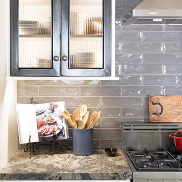
The owners of this kitchen had spent the money to upgrade the finishes in their kitchen upon building the home 12 years ago, but after living in the space for several years they realized how nonfunctional the layout really was. The (then) two preschool aged children had grown into busy, hungry teenagers with many friends who also liked to hang out at the house. So the family needed a more functional kitchen with better traffic flow, space for daily activities revolving around the kitchen at different times of day, and a kitchen that could accommodate cooking for and serving large groups. Furthermore, the dark, traditional finishes no longer reflected the homeowners’ style. They requested a brighter, more relaxed, coastal style that reflected their love of the seaside cities they like to visit.
Originally, the kitchen was U-shaped with a narrow island in the middle. The island created narrow aisles that bottle-necked at the dishwasher, refrigerator, and cooktop areas. There was a pass-through from the foyer into the kitchen, but the owners never liked that the pass-through was also located so close to the powder room. The awkward proximity was unappealing and made guests feel uncomfortable.
The kitchen’s storage was made up of lots of narrow cabinets, apothecary drawers, clipped corner units, and very few drawers. It lacked useful storage for the larger items the family used on a daily basis. And the kitchen’s only pantry was small closet that had only builder-grade, narrow shelving with no illumination to be able to see the contents inside.
Overall, the kitchen’s lighting plan was poorly executed. Only six recessed cans illuminated the entire kitchen and nook areas. The under cabinet lighting was not evenly distributed either. In fact, the builder had mis-placed the under cabinet lighting around the decorative pilasters which made for choppy, dark cubbies. Further, the builder didn’t include any lighting over the sink or the bar area, which meant whoever was doing the dishes was always in their own shadow. That, coupled with the steep overhang of the game room above made the bar area feel like a dim, cavernous space that wasn’t inviting or task oriented. The kitchen looked out into the main living space, but the raised bar and a narrow wall (which held the only large cabinet in the kitchen) created more of a barrier than a relationship to the living room or breakfast nook. In fact, one couldn’t even see the breakfast nook from the cooktop or sink areas due to its orientation. The raised bar top was too narrow to comfortably sit to either dine at or chat from due to the lack of knee space. The the homeowners confided that the kitchen felt more like a dark, dirty prison than place where the family, or their guests, wanted to gather and commune.
The clients' needs and desires were:
➢ to create a kitchen that would be a space the family loved to be in; to relate to the adjacent spaces all around, and to have better flow for entertaining large groups
➢ to remove the walls between the breakfast nook and living area and to be able to utilize the natural light from the windows in both those areas
➢ to incorporate a functional chopping block for prepping fresh food for home cooked meals, an island with a large sink and drain board, 2 pull out trash cans, and seating for at least the 2 teens to eat or do homework
➢ to design a kitchen and breakfast nook with an airy, coastal, relaxed vibe that blended with the rest of the house's coastal theme
➢ to integrate a layered lighting plan which would include ample general illumination, specific task lighting, decorative lighting, and lots of illuminated storage
➢ to design a kitchen with not only more storage for all the husband’s kitchen gadgets and collection of oils and spices, but smart storage, including a coffee/breakfast bar and a place to store and conceal the toaster oven and microwave
➢ to find a way to utilize the large open space between the kitchen, pantry area, and breakfast nook
Twelve Stones Designs achieved the owner's goals by:
➢ removing the walls between the kitchen and living room to allow the natural light to filter in from the adjacent rooms and to create a connection between the kitchen, nook, and living spaces for a sense of unity and communion
➢ removing the existing pantry and designing 3 large pantry style cabinets with LED tape lights and rollout drawers to house lots of kitchen appliances, gadgets, and tons of groceries. We also took the cabinets all the way up to the 9’ ceiling for additional storage for seasonal items and bulk storage.
➢ designing 2 islands - 1 with a gorgeous black walnut chopping block that houses a drawer for chopping and carving knives and a custom double pull out trash unit for point of use utilization - and 1 that houses the dishwasher, a large Blanco Gourmet sink with integrated drain board, woven baskets for fresh root vegetables and kitchen towels, plenty of drawer storage for kitchen items, and bar seating for up to 4 diners.
➢ closing off the space between the kitchen and the powder room to create a beautiful new private alcove for the powder room as well as adding some decorative storage. This also gave us space to include more tall storage near the new range for precision placement of the husband’s extensive oil and spice collection as well as a location for a combo-steam oven the wife wanted for baking and cooking healthy meals.
The project is enhanced functionally by:
➢ incorporated USB and standard receptacles for the kids’ laptops and phone charging in the large island
➢ designing the small island to include additional open shelving for items used on a daily basis such as a variety of bowls, plates, and colanders. This set up also works well for the husband who prefers to “plate” his dinners in restaurant-style fashion before presenting them to the table.
➢ the integration of specific storage units, such as double stacked cutlery drawers, a custom spice pull-out, a Kuerig coffee and tea pod drawer, and custom double stacked utensil drawers
➢ moving the refrigerator to the old oven location - this eliminated the bottle neck as well as created a better relationship to the eating table. It also utilizes the floor space between the pantry, nook, and kitchen
➢ creating a banquet style breakfast nook - this banquette seating not only doubles the amount of seating for large gatherings but it better utilizes the odd space between the kitchen and the previous nook area. It also helps to create a distinct pathway from the mudroom room through the pantry area, kitchen, nook, and living room.
➢ the coffee/breakfast bar area which includes the perfect location for the concealed microwave and toaster oven, convenient storage for the coffee pods and tea accoutrements. Roll-out drawers below also house the smoothie maker, hot water kettle, and a plethora of smoothie-making ingredients such as protein powders, smoothie additives, etc. Furthermore, the drawers below the Keurig house measuring utensil, cutlery, baking supplies and tupperware storage.
➢ incorporating lots of wide drawers and pullouts to accommodate large cookware.
➢ utilizing as much vertical space as possible by building storage to the ceiling which accommodates the family’s abundant amount of serving platters, baking sheets, bakeware, casserole dishes, and additional cutting boards.
The project is enhanced aesthetically by:
➢ new 5-piece Versailles pattern porcelain tile that now seamlessly joins the entire down stairs area together creating a bright, cohesiveness feeling instead of choppy separated spaces - it also adds a coastal feeling
➢ designing a cabinet to conceal the microwave and toaster oven
➢ the coastal influenced light fixtures over the nook table and island
➢ the sandy colors of the Langdon Cambria countertops. The swirling pattern and sparkling quartz pieces remind the homeowner of black-and-tan sandy beaches
➢ the striped banquet seating whose creamy white background and blue-green stripes were the inspiration for the cabinet and wall colors.
➢ All the interior doors were painted black to coordinate with the blacks and grays in the backsplash tile and countertop. This also adds a hint of tailored formality to an otherwise casual space.
➢ the use of WAC's Oculux small aperture LED units for the overhead lighting complimented with Diode LED strips for task lighting under the cabinets and inside the pantry and glass wall cabinets. All of the lighting applications are on separate dimmer switches.
Innovative uses of materials or construction methods by Realty Restoration LLC:
➢ Each 1-1/2” x 3” block of reclaimed end-grain black walnut that makes up the center island chopping block was hand milled and built in the shop. It was designed to look substantial and proportional to the surrounding elements, executed by creating the 4 inch tall top with a solid wood chamfered edge band.
➢ The metal doors on either side of the vent hood were also custom designed for this project and built in the Realty Restoration LLC shop. They are made 1x2, 11-gauge mild steel with ribbed glass. Weighing 60 lbs a piece, heavy duty cabinet hinges were added to support the weight of the door and keep them from sagging.
➢ Under-cabinet receptacles were added along the range wall in order to have a clean, uninterrupted backsplash.
Design obstacles to overcome:
➢ Because we were removing the demising walls between the kitchen and living room, we had to find a way to plumb and vent the new island. We did this by tunneling through the slab (the slab had post tension cables which prevented us from just trenching) to run a new wet vent through a nearby structural wall. We pulled the existing hot and cold lines between upper floor joists and ran them down the structural wall as well and up through a conduit in the tunnel.
➢ Since we were converting from wall overs to a gas range it allowed us to utilize the 220 feed for the wall ovens to provide a new sub panel for all the new kitchen circuits
➢ Due to framing deficiencies inherited from the original build there was a 1-1/2” differential in the floor-to-ceiling height over a 20 foot span; by utilizing the process of cutting and furring coupled with the crown moulding details on the cabinet elevations we were able to mask the problem and provide seamless transitions between the cabinet components.
Evidence of superior craftsmanship:
➢ uniquely designed, one-of-a-kind metal “X” end panels on the large island. The end panels were custom made in the Realty Restoration LLC shop and fitted to the exact dimensions of the island. The welding seams are completely indistinguishable - the posts look like they are cut from a single sheet of metal
➢ square metal posts on the small island were also custom made and designed to compliment and carry through the metal element s throughout the kitchen
➢ the beautiful, oversized end panels on the pantry cabinets which give the breakfast nook a tailored look
➢ integrating a large format 5 piece Versailles tile pattern to seamlessly flow from the existing spaces into the new kitchen space
➢ By constructing a custom cabinet that jogged around a corner we could not remodel (housing the entry way coat closet) we were able to camouflage the adjacent wall offset within the upper and lower cabinets. By designing around the existing jog in the structural walls we accomplished a few things: we were able to find the space to house, and hide, the microwave and toaster oven yet still have a clean cohesive appearance from the kitchen side. Additionally, the owners were able to keep their much needed coat closet and we didn’t have to increase the budget with unnecessary structural work.

 Sotheby's International Realty
Beautifully designed by Giannetti Architects and skillfully built by Morrow & Morrow Construction in 2006 in the highly coveted guard gated Brentwood Circle. The stunning estate features 5bd/5.5ba including maid quarters, library, and detached pool house. Designer finishes throughout with wide plank hardwood floors, crown molding, and interior service elevator. Sumptuous master suite and bath with large terrace overlooking pool and yard. 3 additional bedroom suites + dance studio/4th bedroom upstairs. Spacious family room with custom built-ins, eat-in cook's kitchen with top of the line appliances and butler's pantry & nook. Formal living room w/ french limestone fireplace designed by Steve Gianetti and custom made in France, dining room, and office/library with floor-to ceiling mahogany built-in bookshelves & rolling ladder. Serene backyard with swimmer's pool & spa. Private and secure yet only minutes to the Village. This is a rare offering. Photos by PostRain

 meesderwerk
Clean and bright bathroom with a contrast between the white and the travertin. Gives it a clean but warm feeling.
Small minimalist master beige tile travertine floor freestanding bathtub photo in Amsterdam with white cabinets, solid surface countertops and beige walls
Small minimalist master beige tile travertine floor freestanding bathtub photo in Amsterdam with white cabinets, solid surface countertops and beige walls


 Everything Home
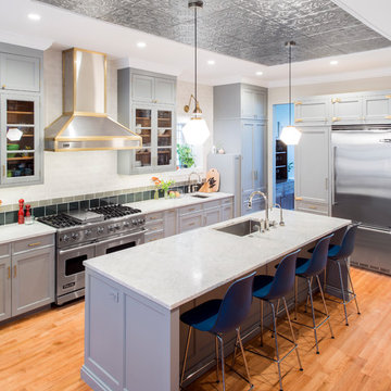
Our Indianapolis studio gave this home an elegant, sophisticated look with sleek, edgy lighting, modern furniture, metal accents, tasteful art, and printed, textured wallpaper and accessories.
Builder: Old Town Design Group
Photographer - Sarah Shields
---
Project completed by Wendy Langston's Everything Home interior design firm, which serves Carmel, Zionsville, Fishers, Westfield, Noblesville, and Indianapolis.
For more about Everything Home, click here: https://everythinghomedesigns.com/
To learn more about this project, click here:
https://everythinghomedesigns.com/portfolio/midwest-luxury-living/
 Remodel Works Bath & Kitchen
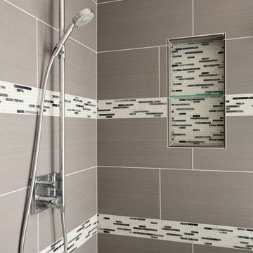
This master bathroom features an Americh "boat" white acrylic freestanding tub. The sink is and undermount IPT sink. The vanity is a Sollid Newport style in white with Richelieu pulls and the countertop is a Pental quartz in Sparkling white. The backsplash strip is a Lucente Linear stone mosaic blend called Grazia. The shower has a glass enclosure with a tile niche and glass shelf using the same linear mosaic splash. the tile is a Spectrum Porrima that is laid in a stagger pattern.
Photography by Scott Basile

 Selle Valley Construction, Inc.
It was essential that our client had a range big enough to be able to entertain large groups of people, so they went with the 48" Wolf Dual Fuel with two ovens and griddle with a 48" stainless steel Wolf hood. Both sinks are Kohler Strive undermounts with Newport Brass East Linear Pull down kitchen faucets. Each sink has a dishwasher installed next to it for easy clean ups, both dishwashers are stainless steel Bosch. To the right of the range are the side by side fully integrated Sub-Zero 36" Fridge and 30" Freezer. Not shown is the Dacor microwave drawer installed on the range side of the island.
Photography by Marie Dominique-Verdier.

 Green Light Window Films
Photo Courtesy of Eastman
Formal living room in traditional home can
benefit from fade protection that window film
can provide
Living room - mid-sized traditional formal and loft-style ceramic tile living room idea in Kansas City with yellow walls, no fireplace and no tv
Living room - mid-sized traditional formal and loft-style ceramic tile living room idea in Kansas City with yellow walls, no fireplace and no tv

 Nar Design Group
Part of an extensive home remodel, this kitchen design was born of one man’s love of all things Harley Davidson. Color inspiration came from the client’s own cherished bike which was a stunning combination of matte black and brushed steel. The client’s wish was to have a large open area in which he could “be one with his guests” when hosting large gatherings.
Cabinets, hardware and appliances all in black allow the focus to be on the beauty of the larger architectural elements as a whole. Included along the main storage wall is a hidden 42” refrigerator, dual pull-out pantries, and extra wide drawers below a pair of upper cabinets with matte black glass fold-up doors that open & close automatically via servo-drive technology.
The new island - which measures just shy of 16 ½ feet! - is a true central point around which all action revolves. Wide walkways on either side provide ease of flow for multiple sous chefs and guests alike. A textured cypress soffit above the island was designed to house the modern hood and also create a feeling of unity as it is the same size as the island below. Textured cypress wood also wraps matte black cabinetry and lines the main wall, changing grain direction to provide visual interest.
The 5’ Galley Workstation is a multi-functional marvel, easily transitioning from prep station to serving surface to clean-up with the addition of its built-in accessories. Placing an undercounter wine refrigerator on the back side of the island makes it easy for guests at the bar to help themselves. Close to the bar seating area, a 42” flat screen tv fits perfectly flush in the wall, practically disappearing when not in use.
Unique details include a large display cabinet with a metal framed front & side crafted out of steel by a local artisan. The glass is 2-way mirror so when the interior light is off, the treasure is concealed inside. The interior is painted in the trademark Harley orange.
Above a modern dining table, a one-of-a-kind chandelier was created from 3 bike helmets, painted in Harley orange by a local automobile detail shop. The interiors are finished in metallic silver for extra glow.
Adjacent to the Kitchen, and initially deceiving in its simplicity, the main tv wall was quite complex and challenging to realize. It has a convex curve from left to right and slopes back from floor to ceiling. The interior hollow space created room for a shallow tv niche on top and partially recessed deep media storage cabinets below. The planning and framing involved to create the proper compound miter connections required extra diligence from the designers and builder, but the finished product was worth the effort!
Photo credit: Fred Donham of Photographerlink
 down2earth Interior Design, LLC.
It all started with a sliding barn door and a bold and simple thought: what if we painted it “Geranium”? From there, a neutral-meets-ethnic loft interior unfolded at Society Hill Tower, perched high above the city of Philadelphia. Our client brought us in as interior designers to collaborate with Ambit Architecture, who helped her merge two adjacent apartment units into one, large, open floor-plan unit. One of the challenges on a project like this is the very openness of the space – there are many furniture selections visually connected to one another, and connected to the kitchen, with its bold pops of yellow. So it was important to establish some fundamentally neutral tones that would provide unity from one furniture grouping to the next. We also wanted to make sure that the panoramic views of the city would remain an important focus of the space.
Therefore, in the living and dining room, we chose large scale furniture pieces made from rustic or reclaimed wood, while upholstered pieces are covered in crisp linen or neutral leather. Then, we added layer upon layer of cheery textiles and prints. We started with jute and color reform wool rugs. Then, we added an ottoman also wrapped in an ethnic rug, kilim pillows, and velvety throws. The result is a space that is unified, lively, yet calm.
Photos by Ambit Architecture

 Dana King Design Build Remodeling
NEXT Project Studio
Inspiration for a mid-sized timeless light wood floor great room remodel in St Louis with green walls, a standard fireplace and a stone fireplace
Inspiration for a mid-sized timeless light wood floor great room remodel in St Louis with green walls, a standard fireplace and a stone fireplace
 NOMASS
Henri Fantin-Latour diceva: ‘‘Si dipingono le persone come si dipingono i fiori in un vaso…ma che dire dell’interiorita’…L’anima e’ come una musica che suona dietro il velo della carne. Non si puo’ dipingere ma si puo’ farla sentire’’
Far ‘‘sentire’’ l’anima dei proprietari, partendo da memorie e radici è l’incipit del progetto.
I proprietari, amanti dell’arte e degli anni 60, desideravano uno spazio che riflettesse le loro passioni condivise e l’esperienze passate vissute separatamente: lui a Venezia, lei a Marrakech, uniti a Milano. Lo spazio aveva bisogno di una storia per essere all’altezza delle vite entusiasmanti dei proprietari. Partendo da un’analisi delle immagini -comuni e diverse- che ognuno di loro porta dentro di sé, abbiamo sviluppato un linguaggio ibrido e omogeneo, che andasse in sintonia con le loro personalità.
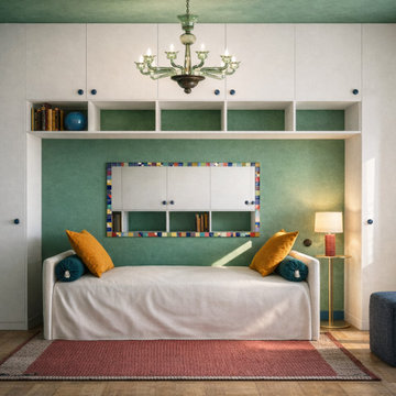
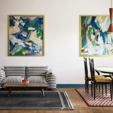
Modifiche chirurgiche al layout hanno perfezionato il flusso generale. Per un risultato più contemporaneo, lo spazio è stato riconfigurato grazie alla commistione di elementi architettonici classici ed una colour palette sofisticata & vivace. Il colore diventa elemento strutturale di per se dialogando con l’arte, l’artigianato ed il design. Gli arredi sono un insieme di objets trouvés, dipinti di collezione privata ed antiquariato; un metissage unico che riflette le personalità dei proprietari. Ove possibile si è fatto risaltare l’elemento artigianale, vetrata in ferro verniciato, backsplash in calcite azul, mobile bagno con riferimenti marocchini, lampade e specchi in vetro soffiato.
 NOMASS
Henri Fantin-Latour diceva: ‘‘Si dipingono le persone come si dipingono i fiori in un vaso…ma che dire dell’interiorita’…L’anima e’ come una musica che suona dietro il velo della carne. Non si puo’ dipingere ma si puo’ farla sentire’’
Far ‘‘sentire’’ l’anima dei proprietari, partendo da memorie e radici è l’incipit del progetto.
I proprietari, amanti dell’arte e degli anni 60, desideravano uno spazio che riflettesse le loro passioni condivise e l’esperienze passate vissute separatamente: lui a Venezia, lei a Marrakech, uniti a Milano. Lo spazio aveva bisogno di una storia per essere all’altezza delle vite entusiasmanti dei proprietari. Partendo da un’analisi delle immagini -comuni e diverse- che ognuno di loro porta dentro di sé, abbiamo sviluppato un linguaggio ibrido e omogeneo, che andasse in sintonia con le loro personalità.
Modifiche chirurgiche al layout hanno perfezionato il flusso generale. Per un risultato più contemporaneo, lo spazio è stato riconfigurato grazie alla commistione di elementi architettonici classici ed una colour palette sofisticata & vivace. Il colore diventa elemento strutturale di per se dialogando con l’arte, l’artigianato ed il design. Gli arredi sono un insieme di objets trouvés, dipinti di collezione privata ed antiquariato; un metissage unico che riflette le personalità dei proprietari. Ove possibile si è fatto risaltare l’elemento artigianale, vetrata in ferro verniciato, backsplash in calcite azul, mobile bagno con riferimenti marocchini, lampade e specchi in vetro soffiato.
 NOMASS
Henri Fantin-Latour diceva: ‘‘Si dipingono le persone come si dipingono i fiori in un vaso…ma che dire dell’interiorita’…L’anima e’ come una musica che suona dietro il velo della carne. Non si puo’ dipingere ma si puo’ farla sentire’’
Far ‘‘sentire’’ l’anima dei proprietari, partendo da memorie e radici è l’incipit del progetto.
I proprietari, amanti dell’arte e degli anni 60, desideravano uno spazio che riflettesse le loro passioni condivise e l’esperienze passate vissute separatamente: lui a Venezia, lei a Marrakech, uniti a Milano. Lo spazio aveva bisogno di una storia per essere all’altezza delle vite entusiasmanti dei proprietari. Partendo da un’analisi delle immagini -comuni e diverse- che ognuno di loro porta dentro di sé, abbiamo sviluppato un linguaggio ibrido e omogeneo, che andasse in sintonia con le loro personalità.
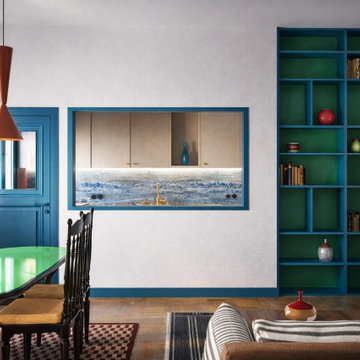
Modifiche chirurgiche al layout hanno perfezionato il flusso generale. Per un risultato più contemporaneo, lo spazio è stato riconfigurato grazie alla commistione di elementi architettonici classici ed una colour palette sofisticata & vivace. Il colore diventa elemento strutturale di per se dialogando con l’arte, l’artigianato ed il design. Gli arredi sono un insieme di objets trouvés, dipinti di collezione privata ed antiquariato; un metissage unico che riflette le personalità dei proprietari. Ove possibile si è fatto risaltare l’elemento artigianale, vetrata in ferro verniciato, backsplash in calcite azul, mobile bagno con riferimenti marocchini, lampade e specchi in vetro soffiato.
 NOMASS
Henri Fantin-Latour diceva: ‘‘Si dipingono le persone come si dipingono i fiori in un vaso…ma che dire dell’interiorita’…L’anima e’ come una musica che suona dietro il velo della carne. Non si puo’ dipingere ma si puo’ farla sentire’’
Far ‘‘sentire’’ l’anima dei proprietari, partendo da memorie e radici è l’incipit del progetto.
I proprietari, amanti dell’arte e degli anni 60, desideravano uno spazio che riflettesse le loro passioni condivise e l’esperienze passate vissute separatamente: lui a Venezia, lei a Marrakech, uniti a Milano. Lo spazio aveva bisogno di una storia per essere all’altezza delle vite entusiasmanti dei proprietari. Partendo da un’analisi delle immagini -comuni e diverse- che ognuno di loro porta dentro di sé, abbiamo sviluppato un linguaggio ibrido e omogeneo, che andasse in sintonia con le loro personalità.
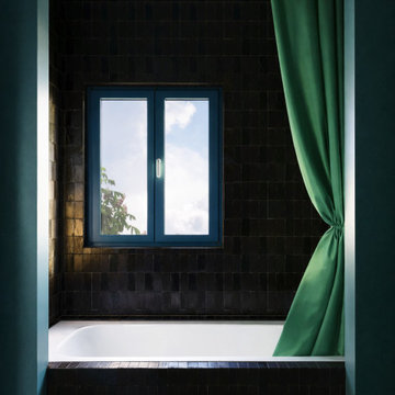
Modifiche chirurgiche al layout hanno perfezionato il flusso generale. Per un risultato più contemporaneo, lo spazio è stato riconfigurato grazie alla commistione di elementi architettonici classici ed una colour palette sofisticata & vivace. Il colore diventa elemento strutturale di per se dialogando con l’arte, l’artigianato ed il design. Gli arredi sono un insieme di objets trouvés, dipinti di collezione privata ed antiquariato; un metissage unico che riflette le personalità dei proprietari. Ove possibile si è fatto risaltare l’elemento artigianale, vetrata in ferro verniciato, backsplash in calcite azul, mobile bagno con riferimenti marocchini, lampade e specchi in vetro soffiato.
120