
Search results for "Up to date asthma" in Home Design Ideas
 Atlanta Porch & Patio
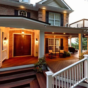
A gorgeous double-decker front porch in Marietta, Georgia. The home overlooks a beautiful tree-lined valley, making the porch a perfect place to enjoy nature!
At Atlanta Porch & Patio we are dedicated to building beautiful custom porches, decks, and outdoor living spaces throughout the metro Atlanta area. Our mission is to turn our clients’ ideas, dreams, and visions into personalized, tangible outcomes. Clients of Atlanta Porch & Patio rest easy knowing each step of their project is performed to the highest standards of honesty, integrity, and dependability. Our team of builders and craftsmen are licensed, insured, and always up to date on trends, products, designs, and building codes. We are constantly educating ourselves in order to provide our clients the best services at the best prices.
We deliver the ultimate professional experience with every step of our projects. After setting up a consultation through our website or by calling the office, we will meet with you in your home to discuss all of your ideas and concerns. After our initial meeting and site consultation, we will compile a detailed design plan and quote complete with renderings and a full listing of the materials to be used. Upon your approval, we will then draw up the necessary paperwork and decide on a project start date. From demo to cleanup, we strive to deliver your ultimate relaxation destination on time and on budget.
 FineLine Kitchens, Inc.
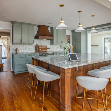
Hi everyone, I'm Sarah and Ogun we are here with fine line kitchens. So we are a couple working together. I do the interior design and remodeling of the space material selection meeting with the clients. And I handled operations outside, you know meaning all the construction work that is taking place the inside. The houses that we work in. I handle all the aspects of the construction, so today's project is very special. We're in Vienna and the client had a very big family. It's a family of seven that lives here. So we had a few aspects that we needed to keep in mind while designing this one. Having everybody be able to sit on the island. So we wanted plenty of seating all the way around. We didn't want anybody standing or anything like that. So what we did is we maximize the space. The center island is the biggest part of the kitchen. We use a natural stone to kind of give it a beautiful texture versus quartz. It's kind of standard white or kind of fabricated, so I wanted something very natural. We did this because I took my inspiration from the outside, so the inspiration if you look at the view right in front of me is there are so many greens there's a lot of brass accents and I wanted to bring this. Into this kitchen while designing it for my clients. She is very warm very. She wanted a very homey, comfy kind of look for the kitchen. So that's what we did today. As you can see, the cabinets are sage green, very light, so I still think it's a neutral, but it's a lighter color that again brings the outside in and we combine that with the oak right behind me so it's a slightly warm oak. It's not very dark. It's not very light. It's a medium brown and the same color went on the island. To kind of tie these two in and the backsplash, my favorite part is where you can see a little bit of design. It is, in my opinion still classic, but includes a pattern so the outside part is as we said in the beginning, is handled by my husband. I'd like him to speak a little bit about that. Thanks, Sarah, I want to talk to you guys a little bit about the construction part of this project. Originally this kitchen was located mostly in this area. They had their stove there sing. It was more of a peninsula layout in Sarah's and the customer vision they wanted. They wanted to get rid of the peninsula and they want to be able to have a huge island that can at least sit seven people because they're familiar with seven. So we wanted to make sure that we can achieve this design and bring it to life so that they can be happy with this layout. Some of the challenges we had, the house, the home being, you know, old home. There were a lot of you know the older electrical and plumbing that had to be replaced. We had to relocate the stove from here to this area. Over here we had put a nice foot fan that we had to relocate all the ductwork and the plumbing. Was being on the peninsula area. We had to relocate it to the center islands. So we achieved all this and kind of like bring it to bring in this kitchen up to date it looks beautiful. That's true, so yes, the old layout did not function for my clients because everything was kind of gathered on one side of the kitchen. So there was like a peninsula right there. So the end of this island kind of continued straight. And that was just the L shape. Kind of where everything was and there used to be another big table here, so they were using only kind of half of the space. So like I said at the beginning, our vision was to kind of feed everybody at the island, create some symmetry. 'cause I love that. So as you can see behind me, this is kind of the focal point symmetrical. Everything is kind of even we wanted to also panel the fridge here so it mimics the pantry and another size. So when you're looking at it, it is bringing again that symmetry back again. I hope you enjoyed this kitchen and this video and I'll see you soon. So how do you think this project turned out? It's nice. I like the color. I think it turned out nice. It's kind of like a little bit different color than what we always do. So I realize. Are you giving me a little bit of credit here that I did something different? Are you proud? I'm so proud of you. Other than that I like it. That they have kind of like a two sink. So if this was our kitchen, if we ever like you can have your own. I can have mine if we ever get into a fight then this can be like my own kitchen. Why are we gonna bring in a fight right now? So I'm cooking anyway. You're grilling most of the time, So what are you even talking about? My kitchen? That's my kitchen. You can just take the small sink. That's fine. It's always good to have your own space right there, so anyways. Thank you guys for watching. We hope to see you soon and if you have any questions please click the link below. It'll lead you to our website, house, YouTube and all of the social media is so nice to have you guys. We'll see you soon. Thanks bye bye-bye.
 White Birch Design
This 1970's home had a complete makeover! The goal of the project was to 1) open up the main floor living and gathering spaces and 2) create a more beautiful and functional kitchen. We took out the dividing wall between the front living room and the kitchen and dining room to create one large gathering space, perfect for a young family and for entertaining friends!
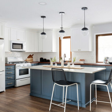
Onto the exciting part - the kitchen! The existing kitchen was U-Shaped with not much room to have more than 1 person working at a time. We kept the appliances in the same locations, but really expanded the amount of workspace and cabinet storage by taking out the peninsula and adding a large island. The cabinetry, from Holiday Kitchens, is a blue-gray color on the lowers and classic white on the uppers. The countertops are walnut butcherblock on the perimeter and a marble looking quartz on the island. The backsplash, one of our favorites, is a diamond shaped mosaic in a rhombus pattern, which adds just the right amount of texture without overpowering all the gorgeous details of the cabinets and countertops. The hardware is a champagne bronze - one thing we love to do is mix and match our metals! The faucet is from Kohler and is in Matte Black, the sink is from Blanco and is white. The flooring is a luxury vinyl plank with a warm wood tone - which helps bring all the elements of the kitchen together we think!
Overall - this is one of our favorite kitchens to date - so many beautiful details on their own, but put together create this gorgeous kitchen!
Find the right local pro for your project
 designstiles
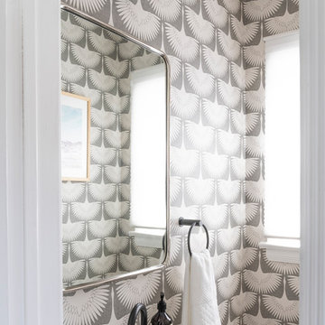
The client wanted to turn her tiny plain powder room into something her guest would enjoy. We updated the sink, faucet, hardware, mirror and lighting freshen up this dated bathroom. The wallpaper actually makes the room feel larger and welcoming!
Photography by: Annie Meisel
 Andrea Brodfuehrer
Mollie Vogt-Welch
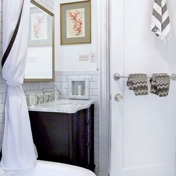
Small elegant master white tile and subway tile porcelain tile bathroom photo in New York with an undermount sink, black cabinets, marble countertops and white walls
Small elegant master white tile and subway tile porcelain tile bathroom photo in New York with an undermount sink, black cabinets, marble countertops and white walls
 Plain & Posh
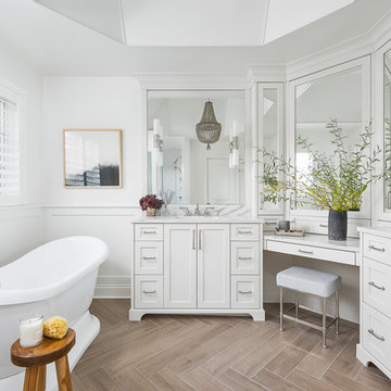
This master bath was dark and dated. Although a large space, the area felt small and obtrusive. By removing the columns and step up, widening the shower and creating a true toilet room I was able to give the homeowner a truly luxurious master retreat. (check out the before pictures at the end) The ceiling detail was the icing on the cake! It follows the angled wall of the shower and dressing table and makes the space seem so much larger than it is. The homeowners love their Nantucket roots and wanted this space to reflect that.
 DC Interiors & Renovations
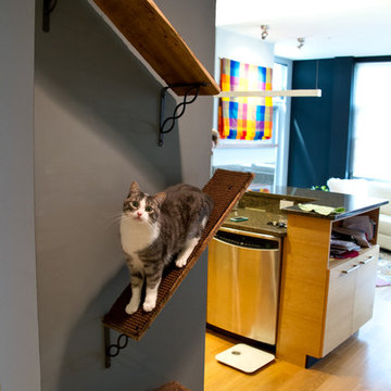
Our client has two very active cats so to keep them off the counters and table; we created a cat walk out of reclaimed barn boards. On one wall they go up and down and they can go up and over the cabinets in the kitchen. It keeps them content when she is out for long hours and it also gives them somewhere to go up.


 Klopf Architecture
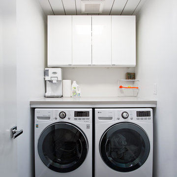
Inspiration for a small 1950s single-wall black floor dedicated laundry room remodel in San Francisco with flat-panel cabinets, white cabinets, white walls, a side-by-side washer/dryer and gray countertops
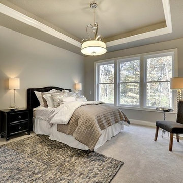
 CAP Carpet & Flooring
Soften up your bedroom and make each morning easier with the warm touch of carpet at your feet.
CAP Carpet & Flooring is the leading provider of flooring & area rugs in the Twin Cities. CAP Carpet & Flooring is a locally owned and operated company, and we pride ourselves on helping our customers feel welcome from the moment they walk in the door. We are your neighbors. We work and live in your community and understand your needs. You can expect the very best personal service on every visit to CAP Carpet & Flooring and value and warranties on every flooring purchase. Our design team has worked with homeowners, contractors and builders who expect the best. With over 30 years combined experience in the design industry, Angela, Sandy, Sunnie,Maria, Caryn and Megan will be able to help whether you are in the process of building, remodeling, or re-doing. Our design team prides itself on being well versed and knowledgeable on all the up to date products and trends in the floor covering industry as well as countertops, paint and window treatments. Their passion and knowledge is abundant, and we're confident you'll be nothing short of impressed with their expertise and professionalism. When you love your job, it shows: the enthusiasm and energy our design team has harnessed will bring out the best in your project. Make CAP Carpet & Flooring your first stop when considering any type of home improvement project- we are happy to help you every single step of the way.
 TVL Creative Ltd.
[Our Clients]
We were so excited to help these new homeowners re-envision their split-level diamond in the rough. There was so much potential in those walls, and we couldn’t wait to delve in and start transforming spaces. Our primary goal was to re-imagine the main level of the home and create an open flow between the space. So, we started by converting the existing single car garage into their living room (complete with a new fireplace) and opening up the kitchen to the rest of the level.
[Kitchen]
The original kitchen had been on the small side and cut-off from the rest of the home, but after we removed the coat closet, this kitchen opened up beautifully. Our plan was to create an open and light filled kitchen with a design that translated well to the other spaces in this home, and a layout that offered plenty of space for multiple cooks. We utilized clean white cabinets around the perimeter of the kitchen and popped the island with a spunky shade of blue. To add a real element of fun, we jazzed it up with the colorful escher tile at the backsplash and brought in accents of brass in the hardware and light fixtures to tie it all together. Through out this home we brought in warm wood accents and the kitchen was no exception, with its custom floating shelves and graceful waterfall butcher block counter at the island.
[Dining Room]
The dining room had once been the home’s living room, but we had other plans in mind. With its dramatic vaulted ceiling and new custom steel railing, this room was just screaming for a dramatic light fixture and a large table to welcome one-and-all.
[Living Room]
We converted the original garage into a lovely little living room with a cozy fireplace. There is plenty of new storage in this space (that ties in with the kitchen finishes), but the real gem is the reading nook with two of the most comfortable armchairs you’ve ever sat in.
[Master Suite]
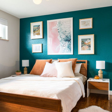
This home didn’t originally have a master suite, so we decided to convert one of the bedrooms and create a charming suite that you’d never want to leave. The master bathroom aesthetic quickly became all about the textures. With a sultry black hex on the floor and a dimensional geometric tile on the walls we set the stage for a calm space. The warm walnut vanity and touches of brass cozy up the space and relate with the feel of the rest of the home. We continued the warm wood touches into the master bedroom, but went for a rich accent wall that elevated the sophistication level and sets this space apart.
[Hall Bathroom]
The floor tile in this bathroom still makes our hearts skip a beat. We designed the rest of the space to be a clean and bright white, and really let the lovely blue of the floor tile pop. The walnut vanity cabinet (complete with hairpin legs) adds a lovely level of warmth to this bathroom, and the black and brass accents add the sophisticated touch we were looking for.
[Office]
We loved the original built-ins in this space, and knew they needed to always be a part of this house, but these 60-year-old beauties definitely needed a little help. We cleaned up the cabinets and brass hardware, switched out the formica counter for a new quartz top, and painted wall a cheery accent color to liven it up a bit. And voila! We have an office that is the envy of the neighborhood.
 Atlanta Porch & Patio
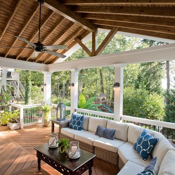
Our client wanted a rustic chic look for their covered porch. We gave the crown molding and trim a more formal look, but kept the roof more rustic with open rafters.
At Atlanta Porch & Patio we are dedicated to building beautiful custom porches, decks, and outdoor living spaces throughout the metro Atlanta area. Our mission is to turn our clients’ ideas, dreams, and visions into personalized, tangible outcomes. Clients of Atlanta Porch & Patio rest easy knowing each step of their project is performed to the highest standards of honesty, integrity, and dependability. Our team of builders and craftsmen are licensed, insured, and always up to date on trends, products, designs, and building codes. We are constantly educating ourselves in order to provide our clients the best services at the best prices.
We deliver the ultimate professional experience with every step of our projects. After setting up a consultation through our website or by calling the office, we will meet with you in your home to discuss all of your ideas and concerns. After our initial meeting and site consultation, we will compile a detailed design plan and quote complete with renderings and a full listing of the materials to be used. Upon your approval, we will then draw up the necessary paperwork and decide on a project start date. From demo to cleanup, we strive to deliver your ultimate relaxation destination on time and on budget.
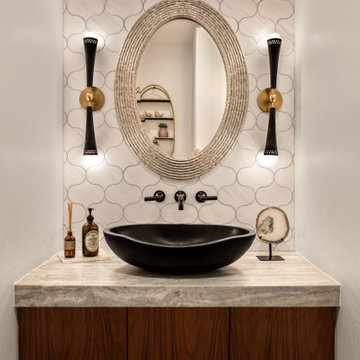
 Spaces Designed, Interior Design Studio, LLC
“We could never have envisioned what could be” – Steiner Ranch Homeowner and Client
It is an especially fulfilling Project for an Interior Designer when the outcome exceeds Client expectations, and imagination. This remodeling project required instilling modern sensibilities, openness, styles and textures into a dated house that was past its prime. Strategically, the goal was to tear down where it made sense without doing a complete teardown.
Starting with the soul of the home, the kitchen, we expanded out room by room to create a cohesiveness and flow that invites, supports and provides the warmth and relaxation that only a home can.
In the Kitchen, we started by removing the wooden beams and adding bright recessed lighting. We removed the old limestone accent wall and moved the sink and cooktop from the island on to the countertop – the key goal was to create room for the family to gather around the kitchen. We replaced all appliances with modern Energy Star ones, along with adding a wine rack.
The first order of business for the Living Room was to brighten it up by adding more lighting and replacing an unused section with a glass door to the backyard. Multi-section windows were replaced with large no-split glass overlooking the backyard. Once more, the limestone accent was removed to create a clean, modern look. Replacing the dated wooden staircase with the clean lines of a metal, wire and wooded staircase added interest and freshness. An odd bend in the staircase was removed to clean things up.
The Master Bedroom went from what looked like a motel room with green carpet and cheap blinds to an oasis of luxury and charm. A section of the wraparound doors were closed off to increase privacy, accentuate the best view from the bedroom and to add usable space. Artwork, rug, contemporary bed and other accent pieces brought together the seamless look across the home.
The Master Bathroom remodel started by replacing the standard windows with a single glass pane that enhanced the view of the outdoors. The dated shower was replaced by a walk-in shower and soaking tub to create the ultimate at-home spa experience. Lighted LED mirrors frame His & Hers sinks and bathe them in a soft light.
The flooring was upgraded throughout the house to reflect the contemporary color scheme.
Each of the smaller bedrooms were similarly upgraded to match the clean and modern décor of the rest of the house.
After such a transformation inside, it was only appropriate that the exterior needed an upgrade as well. All of the legacy limestone accents were replaced by stucco and the color scheme extended from the interior of the house to the gorgeous wrap around balconies, trim, garage doors etc. to complete the inside outside transformation.
 AMD Interiors, LLC
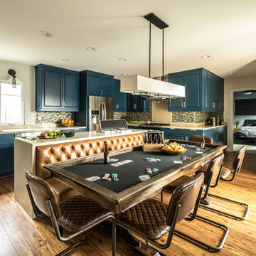
This 1300 square foot home built in the 60's got a new lease on life after this full remodel took it from dark and dated to bright, fresh and functional. Hallways were widened and used as storage corridors and looked at as a continuation of the space, in order to give each room a more spacious feel. The homeowners love of blue was used tastefully, to inspire the concept of the kitchen. Standard euro-style cabinetry was given a custom inset look with the application of recessed crown and light rail.
3 different styles of cabinet pulls were mixed beautifully, to style up the cabinets even more. This remodel was packed with functional details, the dining table even doubles as a game table for boys night!

Sponsored
Delaware, OH

Buckeye Basements, Inc.
Central Ohio's Basement Finishing ExpertsBest Of Houzz '13-'21
 Julie Geyer Studio LLC
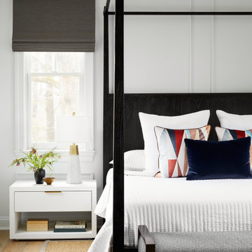
Our clients had a dated bedroom with dusty blue painted walls, blackout cellular shades and carpeting. We pulled up the carpet and installed wide plank wood floors, added millwork, remote-controlled roman shades and all new furniture for a light, airy and contemporary feeling.
 threshold interiors
Location: Nantucket, MA, USA
This classic Nantucket home had not been renovated in several decades and was in serious need of an update. The vision for this summer home was to be a beautiful, light and peaceful family retreat with the ability to entertain guests and extended family. The focal point of the kitchen is the La Canche Chagny Range in Faience with custom hood to match. We love how the tile backsplash on the Prep Sink wall pulls it all together and picks up on the spectacular colors in the White Princess Quartzite countertops. In a nod to traditional Nantucket Craftsmanship, we used Shiplap Panelling on many of the walls including in the Kitchen and Powder Room. We hope you enjoy the quiet and tranquil mood of these images as much as we loved creating this space. Keep your eye out for additional images as we finish up Phase II of this amazing project!
Photographed by: Jamie Salomon
 Crystal Kitchen + Bath
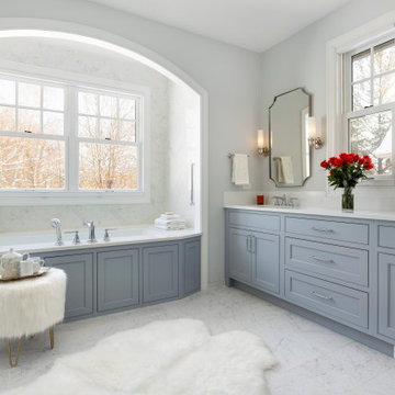
A beautifully remodeled primary bathroom ensuite inspired by the homeowner’s European travels.
This spacious bathroom was dated and had a cold cave like shower. The homeowner desired a beautiful space with a European feel, like the ones she discovered on her travels to Europe. She also wanted a privacy door separating the bathroom from her bedroom.
The designer opened up the closed off shower by removing the soffit and dark cabinet next to the shower to add glass and let light in. Now the entire room is bright and airy with marble look porcelain tile throughout. The archway was added to frame in the under-mount tub. The double vanity in a soft gray paint and topped with Corian Quartz compliments the marble tile. The new chandelier along with the chrome fixtures add just the right amount of luxury to the room. Now when you come in from the bedroom you are enticed to come in and stay a while in this beautiful space.
 Oliver Designs
Photo by Christopher Carter
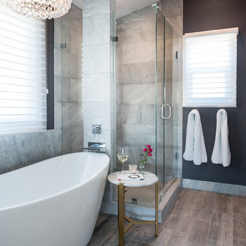
Inspiration for a mid-sized transitional master gray tile and marble tile porcelain tile and gray floor bathroom remodel in Denver with a hinged shower door, black walls, marble countertops and gray countertops
Inspiration for a mid-sized transitional master gray tile and marble tile porcelain tile and gray floor bathroom remodel in Denver with a hinged shower door, black walls, marble countertops and gray countertops
Sponsored
Sunbury, OH

J.Holderby - Renovations
Franklin County's Leading General Contractors - 2X Best of Houzz!
 Milton Development
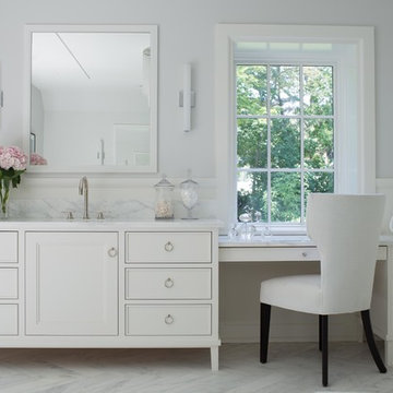
Inspiration for a transitional master bathroom remodel in New York with white cabinets, gray walls and recessed-panel cabinets
 Surface Architecture & Design
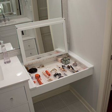
Make-up counter, in open position. Provides area to store make-up and accessories. Mirror on back side of hinged counter gives a proper view when seated. Easy way to hide the mess.
 Che Bella Interiors Design + Remodeling
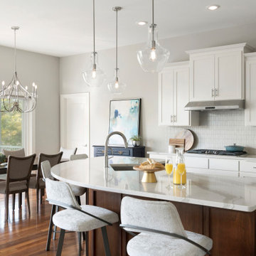
Originally dark and dated, this kitchen was transformed to enhance function and open up the kitchen. We cut down the old, two-tiered island to one level, creating a beautiful contrast against the freshly painted white perimeter cabinets.
Photos by Spacecrafting Photography
1