
Search results for "Update" in Home Design Ideas
 Cure Design Group
KITCHEN RENOVATION CURRENT CRAFTSMAN
This client started off just being curious about our services - what we could do, and if we could even help her update her kitchen. She and her husband with their two teenage kids have lived in their home for several years without updating anything since the house was originally built. They didn’t quite have a budget in mind yet. They didn’t know their style, or even if they had one. Their timeline was simple, “as fast as you can so we’re not without a kitchen for very long” (usually what we hear for kitchen updates).
After a very productive consultation: determining the scope of work and zeroing in on a budget, I was very excited to update this underwhelming space to something that is modern but timeless, something that is theirs. And, it was easy to see what type of design style they gravitated toward looking at the pieces they already own: Craftsman/Prairie Style. I left the meeting so excited to weave in yet another genre of design to my CDG portfolio! We circled in our contractor to discuss the changes they were looking to make and the scope of work that would be theirs. Then I was off to get designing:
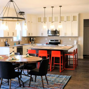
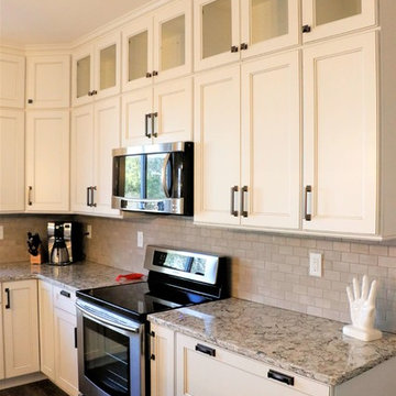
// Because the kitchen’s footprint and the defined breakfast space delineated by the bay, we kept the perimeter cabinetry as it was originally laid out. We updated these cabinets to a beautiful soft Alabaster White with a Barn Wood Glaze to highlight the simplicity of the shaker style doors. We added transom cabinets above the uppers, with only the back wall having seeded glass inserts to highlight some of their collectables.
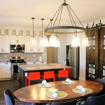
// The original shaped island was counter-productive (See what I did there?) in functionality and design. We squared this off to reduce some of the angles and gain more storage. We highlighted the new island with a contrasting oak cabinet in a dark finish, to pay our respects to the craftsman style, and topped with a concrete-like countertop as a nod to the Prairie Style, allowing the homeowners to gain two extra seats and a massive -uninterrupted- work surface.
// The small section of cabinetry between the garage entry and fridge now is the perfect dump-station for mail, electronics, whatever is in their hands when they come into the house; and completely hidden by the refrigerator.
// The disconnected cabinetry in the breakfast area makes for a great place to have a working office. Accessible from the kitchen or the adjacent great room, this is the perfect place for the kids to do their homework while mom and dad are putting together dinner. The base cabinets are built out for office-type storage: paper and pencil drawers, filing systems, and cord management. Additionally, the long counter provides a ton of worksurface to spread out.
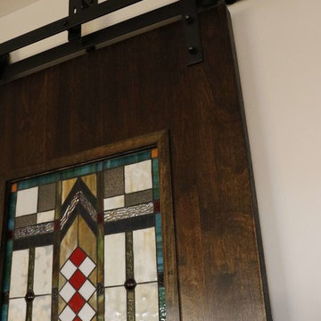
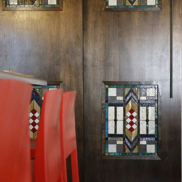
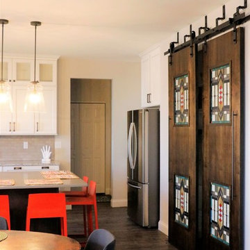
// The largest transformation was the pantry. We raised the height of the doorway and added huge custom designed bypass sliding barndoors. Finished with a dark stain to compliment the island and cut to inset 4 stained glass windows, typical of this style of design, and driving home the concept for the whole space.
// They were desperate to replace their flooring with something extremely durable to flow throughout the kitchen and the whole main level. This beautiful new flooring is actually a textured LVT(!) Which allowed them to save on overall cost and extend the life of their new flooring purchase.
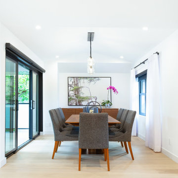
// They loved their copper table, so we kept it and added new simple, mid-century modern chairs around it and a shiny new craftsman-style chandelier above. We added bright barstools in a burnt orange-red accent, and a bright woven rug to tie it all together.
// Because the kitchen renovation was shaping up to be pretty spectacular, they decided they needed to now replace their ‘now-these-look-a-little-too-old’ upholstered seating in the neighboring great room with 2 new sofas. We found the perfect sage-y-grey fabric which we covered on sofa frames that have and exposed oak-wood base, which we finished in a warm weathered grey.
// As every designer knows, a room isn’t finished until there’s something on the windows. Now that the new flooring was installed and every other room on the main level ‘seemed’ to be updated, we needed to update the window treatments in the dining, and great rooms to reflect their new design concept.
I hope you find the ‘after’ photos refreshing (as refreshing as it was for me to work on something that’s not a “Farm House” style that’s saturating the industry right now!) This was such a fun project and a great collaboration with our contractor.
 My House Design|Build|Team
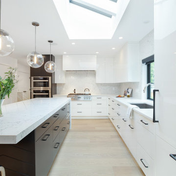
The family who owned this 1965 home chose a dramatic upgrade for their Coquitlam full home renovation. They wanted more room for gatherings, an open concept kitchen, and upgrades to bathrooms and the rec room. Their neighbour knew of our work, and we were glad to bring our skills to another project in the area.
Choosing Dramatic Lines
In the original house, the entryway was cramped, with a closet being the first thing everyone saw.
We opened the entryway and moved the closet, all while maintaining separation between the entry and the living space.
To draw the attention from the entry into the living room, we used a dramatic, flush, black herringbone ceiling detail across the ceiling. This detail goes all the way to the entertainment area on the main floor.
The eye arrives at a stunning waterfall edge walnut mantle, modern fireplace.
Open Concept Kitchen with Lots of Seating
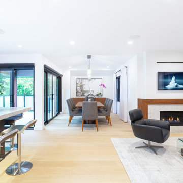
The dividing wall between the kitchen and living areas was removed to create a larger, integrated entertaining space. The kitchen also has easy access to a new outdoor social space.
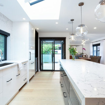
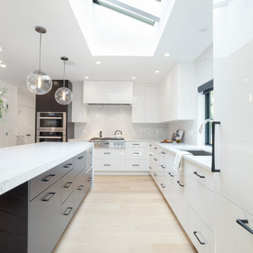
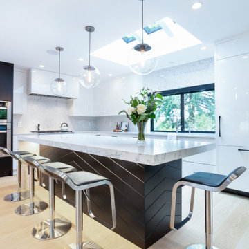
A new large skylight directly over the kitchen floods the space with natural light.
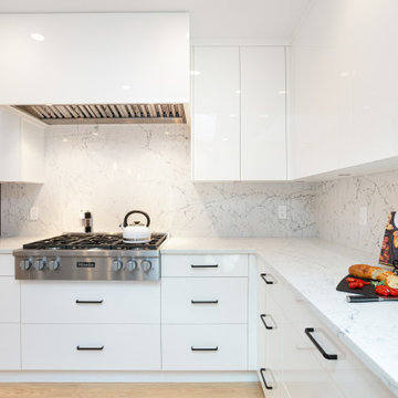
The kitchen now has gloss white cabinetry, with matte black accents and the same herringbone detail as the living room, and is tied together with a low maintenance Caesarstone’s white Attica quartz for the island countertop.
This over-sized island has barstool seating for five while leaving plenty of room for homework, snacking, socializing, and food prep in the same space.
To maximize space and minimize clutter, we integrated the kitchen appliances into the kitchen island, including a food warming drawer, a hidden fridge, and the dishwasher. This takes the eyes to focus off appliances, and onto the design elements which feed throughout the home.
We also installed a beverage center just beside the kitchen so family and guests can fix themselves a drink, without disrupting the flow of the kitchen.
Updated Downstairs Space, Updated Guest Room, Updated Bathrooms
It was a treat to update this entire house. Upstairs, we renovated the master bedroom with new blackout drapery, new decor, and a warm light grey paint colour. The tight bathroom was transformed with modern fixtures and gorgeous grey tile the homeowners loved.
The two teen girls’ rooms were updated with new lighting and furniture that tied in with the whole home decor, but which also reflected their personal taste.
In the basement, we updated the rec room with a bright modern look and updated fireplace. We added a needed door to the garage. We upgraded the bathrooms and created a legal second suite which the young adult daughter will use, for now.
Laundry Its Own Room, Finally
In a family with four women, you can imagine how much laundry gets done in this house. As part of the renovation, we built a proper laundry room with plenty of storage space, countertops, and a large sink.
 Cure Design Group
KITCHEN RENOVATION CURRENT CRAFTSMAN
This client started off just being curious about our services - what we could do, and if we could even help her update her kitchen. She and her husband with their two teenage kids have lived in their home for several years without updating anything since the house was originally built. They didn’t quite have a budget in mind yet. They didn’t know their style, or even if they had one. Their timeline was simple, “as fast as you can so we’re not without a kitchen for very long” (usually what we hear for kitchen updates).
After a very productive consultation: determining the scope of work and zeroing in on a budget, I was very excited to update this underwhelming space to something that is modern but timeless, something that is theirs. And, it was easy to see what type of design style they gravitated toward looking at the pieces they already own: Craftsman/Prairie Style. I left the meeting so excited to weave in yet another genre of design to my CDG portfolio! We circled in our contractor to discuss the changes they were looking to make and the scope of work that would be theirs. Then I was off to get designing:
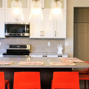
// Because the kitchen’s footprint and the defined breakfast space delineated by the bay, we kept the perimeter cabinetry as it was originally laid out. We updated these cabinets to a beautiful soft Alabaster White with a Barn Wood Glaze to highlight the simplicity of the shaker style doors. We added transom cabinets above the uppers, with only the back wall having seeded glass inserts to highlight some of their collectables.
// The original shaped island was counter-productive (See what I did there?) in functionality and design. We squared this off to reduce some of the angles and gain more storage. We highlighted the new island with a contrasting oak cabinet in a dark finish, to pay our respects to the craftsman style, and topped with a concrete-like countertop as a nod to the Prairie Style, allowing the homeowners to gain two extra seats and a massive -uninterrupted- work surface.
// The small section of cabinetry between the garage entry and fridge now is the perfect dump-station for mail, electronics, whatever is in their hands when they come into the house; and completely hidden by the refrigerator.
// The disconnected cabinetry in the breakfast area makes for a great place to have a working office. Accessible from the kitchen or the adjacent great room, this is the perfect place for the kids to do their homework while mom and dad are putting together dinner. The base cabinets are built out for office-type storage: paper and pencil drawers, filing systems, and cord management. Additionally, the long counter provides a ton of worksurface to spread out.
// The largest transformation was the pantry. We raised the height of the doorway and added huge custom designed bypass sliding barndoors. Finished with a dark stain to compliment the island and cut to inset 4 stained glass windows, typical of this style of design, and driving home the concept for the whole space.
// They were desperate to replace their flooring with something extremely durable to flow throughout the kitchen and the whole main level. This beautiful new flooring is actually a textured LVT(!) Which allowed them to save on overall cost and extend the life of their new flooring purchase.
// They loved their copper table, so we kept it and added new simple, mid-century modern chairs around it and a shiny new craftsman-style chandelier above. We added bright barstools in a burnt orange-red accent, and a bright woven rug to tie it all together.
// Because the kitchen renovation was shaping up to be pretty spectacular, they decided they needed to now replace their ‘now-these-look-a-little-too-old’ upholstered seating in the neighboring great room with 2 new sofas. We found the perfect sage-y-grey fabric which we covered on sofa frames that have and exposed oak-wood base, which we finished in a warm weathered grey.
// As every designer knows, a room isn’t finished until there’s something on the windows. Now that the new flooring was installed and every other room on the main level ‘seemed’ to be updated, we needed to update the window treatments in the dining, and great rooms to reflect their new design concept.
I hope you find the ‘after’ photos refreshing (as refreshing as it was for me to work on something that’s not a “Farm House” style that’s saturating the industry right now!) This was such a fun project and a great collaboration with our contractor.
Find the right local pro for your project
 Cure Design Group
KITCHEN RENOVATION CURRENT CRAFTSMAN
This client started off just being curious about our services - what we could do, and if we could even help her update her kitchen. She and her husband with their two teenage kids have lived in their home for several years without updating anything since the house was originally built. They didn’t quite have a budget in mind yet. They didn’t know their style, or even if they had one. Their timeline was simple, “as fast as you can so we’re not without a kitchen for very long” (usually what we hear for kitchen updates).
After a very productive consultation: determining the scope of work and zeroing in on a budget, I was very excited to update this underwhelming space to something that is modern but timeless, something that is theirs. And, it was easy to see what type of design style they gravitated toward looking at the pieces they already own: Craftsman/Prairie Style. I left the meeting so excited to weave in yet another genre of design to my CDG portfolio! We circled in our contractor to discuss the changes they were looking to make and the scope of work that would be theirs. Then I was off to get designing:
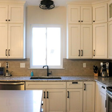
// Because the kitchen’s footprint and the defined breakfast space delineated by the bay, we kept the perimeter cabinetry as it was originally laid out. We updated these cabinets to a beautiful soft Alabaster White with a Barn Wood Glaze to highlight the simplicity of the shaker style doors. We added transom cabinets above the uppers, with only the back wall having seeded glass inserts to highlight some of their collectables.
// The original shaped island was counter-productive (See what I did there?) in functionality and design. We squared this off to reduce some of the angles and gain more storage. We highlighted the new island with a contrasting oak cabinet in a dark finish, to pay our respects to the craftsman style, and topped with a concrete-like countertop as a nod to the Prairie Style, allowing the homeowners to gain two extra seats and a massive -uninterrupted- work surface.
// The small section of cabinetry between the garage entry and fridge now is the perfect dump-station for mail, electronics, whatever is in their hands when they come into the house; and completely hidden by the refrigerator.
// The disconnected cabinetry in the breakfast area makes for a great place to have a working office. Accessible from the kitchen or the adjacent great room, this is the perfect place for the kids to do their homework while mom and dad are putting together dinner. The base cabinets are built out for office-type storage: paper and pencil drawers, filing systems, and cord management. Additionally, the long counter provides a ton of worksurface to spread out.
// The largest transformation was the pantry. We raised the height of the doorway and added huge custom designed bypass sliding barndoors. Finished with a dark stain to compliment the island and cut to inset 4 stained glass windows, typical of this style of design, and driving home the concept for the whole space.
// They were desperate to replace their flooring with something extremely durable to flow throughout the kitchen and the whole main level. This beautiful new flooring is actually a textured LVT(!) Which allowed them to save on overall cost and extend the life of their new flooring purchase.
// They loved their copper table, so we kept it and added new simple, mid-century modern chairs around it and a shiny new craftsman-style chandelier above. We added bright barstools in a burnt orange-red accent, and a bright woven rug to tie it all together.
// Because the kitchen renovation was shaping up to be pretty spectacular, they decided they needed to now replace their ‘now-these-look-a-little-too-old’ upholstered seating in the neighboring great room with 2 new sofas. We found the perfect sage-y-grey fabric which we covered on sofa frames that have and exposed oak-wood base, which we finished in a warm weathered grey.
// As every designer knows, a room isn’t finished until there’s something on the windows. Now that the new flooring was installed and every other room on the main level ‘seemed’ to be updated, we needed to update the window treatments in the dining, and great rooms to reflect their new design concept.
I hope you find the ‘after’ photos refreshing (as refreshing as it was for me to work on something that’s not a “Farm House” style that’s saturating the industry right now!) This was such a fun project and a great collaboration with our contractor.
 My House Design|Build|Team
The family who owned this 1965 home chose a dramatic upgrade for their Coquitlam full home renovation. They wanted more room for gatherings, an open concept kitchen, and upgrades to bathrooms and the rec room. Their neighbour knew of our work, and we were glad to bring our skills to another project in the area.
Choosing Dramatic Lines
In the original house, the entryway was cramped, with a closet being the first thing everyone saw.
We opened the entryway and moved the closet, all while maintaining separation between the entry and the living space.
To draw the attention from the entry into the living room, we used a dramatic, flush, black herringbone ceiling detail across the ceiling. This detail goes all the way to the entertainment area on the main floor.
The eye arrives at a stunning waterfall edge walnut mantle, modern fireplace.
Open Concept Kitchen with Lots of Seating
The dividing wall between the kitchen and living areas was removed to create a larger, integrated entertaining space. The kitchen also has easy access to a new outdoor social space.
A new large skylight directly over the kitchen floods the space with natural light.
The kitchen now has gloss white cabinetry, with matte black accents and the same herringbone detail as the living room, and is tied together with a low maintenance Caesarstone’s white Attica quartz for the island countertop.
This over-sized island has barstool seating for five while leaving plenty of room for homework, snacking, socializing, and food prep in the same space.
To maximize space and minimize clutter, we integrated the kitchen appliances into the kitchen island, including a food warming drawer, a hidden fridge, and the dishwasher. This takes the eyes to focus off appliances, and onto the design elements which feed throughout the home.
We also installed a beverage center just beside the kitchen so family and guests can fix themselves a drink, without disrupting the flow of the kitchen.
Updated Downstairs Space, Updated Guest Room, Updated Bathrooms
It was a treat to update this entire house. Upstairs, we renovated the master bedroom with new blackout drapery, new decor, and a warm light grey paint colour. The tight bathroom was transformed with modern fixtures and gorgeous grey tile the homeowners loved.
The two teen girls’ rooms were updated with new lighting and furniture that tied in with the whole home decor, but which also reflected their personal taste.
In the basement, we updated the rec room with a bright modern look and updated fireplace. We added a needed door to the garage. We upgraded the bathrooms and created a legal second suite which the young adult daughter will use, for now.
Laundry Its Own Room, Finally
In a family with four women, you can imagine how much laundry gets done in this house. As part of the renovation, we built a proper laundry room with plenty of storage space, countertops, and a large sink.
 Cure Design Group
KITCHEN RENOVATION CURRENT CRAFTSMAN
This client started off just being curious about our services - what we could do, and if we could even help her update her kitchen. She and her husband with their two teenage kids have lived in their home for several years without updating anything since the house was originally built. They didn’t quite have a budget in mind yet. They didn’t know their style, or even if they had one. Their timeline was simple, “as fast as you can so we’re not without a kitchen for very long” (usually what we hear for kitchen updates).
After a very productive consultation: determining the scope of work and zeroing in on a budget, I was very excited to update this underwhelming space to something that is modern but timeless, something that is theirs. And, it was easy to see what type of design style they gravitated toward looking at the pieces they already own: Craftsman/Prairie Style. I left the meeting so excited to weave in yet another genre of design to my CDG portfolio! We circled in our contractor to discuss the changes they were looking to make and the scope of work that would be theirs. Then I was off to get designing:
// Because the kitchen’s footprint and the defined breakfast space delineated by the bay, we kept the perimeter cabinetry as it was originally laid out. We updated these cabinets to a beautiful soft Alabaster White with a Barn Wood Glaze to highlight the simplicity of the shaker style doors. We added transom cabinets above the uppers, with only the back wall having seeded glass inserts to highlight some of their collectables.
// The original shaped island was counter-productive (See what I did there?) in functionality and design. We squared this off to reduce some of the angles and gain more storage. We highlighted the new island with a contrasting oak cabinet in a dark finish, to pay our respects to the craftsman style, and topped with a concrete-like countertop as a nod to the Prairie Style, allowing the homeowners to gain two extra seats and a massive -uninterrupted- work surface.
// The small section of cabinetry between the garage entry and fridge now is the perfect dump-station for mail, electronics, whatever is in their hands when they come into the house; and completely hidden by the refrigerator.
// The disconnected cabinetry in the breakfast area makes for a great place to have a working office. Accessible from the kitchen or the adjacent great room, this is the perfect place for the kids to do their homework while mom and dad are putting together dinner. The base cabinets are built out for office-type storage: paper and pencil drawers, filing systems, and cord management. Additionally, the long counter provides a ton of worksurface to spread out.
// The largest transformation was the pantry. We raised the height of the doorway and added huge custom designed bypass sliding barndoors. Finished with a dark stain to compliment the island and cut to inset 4 stained glass windows, typical of this style of design, and driving home the concept for the whole space.
// They were desperate to replace their flooring with something extremely durable to flow throughout the kitchen and the whole main level. This beautiful new flooring is actually a textured LVT(!) Which allowed them to save on overall cost and extend the life of their new flooring purchase.
// They loved their copper table, so we kept it and added new simple, mid-century modern chairs around it and a shiny new craftsman-style chandelier above. We added bright barstools in a burnt orange-red accent, and a bright woven rug to tie it all together.
// Because the kitchen renovation was shaping up to be pretty spectacular, they decided they needed to now replace their ‘now-these-look-a-little-too-old’ upholstered seating in the neighboring great room with 2 new sofas. We found the perfect sage-y-grey fabric which we covered on sofa frames that have and exposed oak-wood base, which we finished in a warm weathered grey.
// As every designer knows, a room isn’t finished until there’s something on the windows. Now that the new flooring was installed and every other room on the main level ‘seemed’ to be updated, we needed to update the window treatments in the dining, and great rooms to reflect their new design concept.
I hope you find the ‘after’ photos refreshing (as refreshing as it was for me to work on something that’s not a “Farm House” style that’s saturating the industry right now!) This was such a fun project and a great collaboration with our contractor.
 My House Design|Build|Team
The family who owned this 1965 home chose a dramatic upgrade for their Coquitlam full home renovation. They wanted more room for gatherings, an open concept kitchen, and upgrades to bathrooms and the rec room. Their neighbour knew of our work, and we were glad to bring our skills to another project in the area.
Choosing Dramatic Lines
In the original house, the entryway was cramped, with a closet being the first thing everyone saw.
We opened the entryway and moved the closet, all while maintaining separation between the entry and the living space.
To draw the attention from the entry into the living room, we used a dramatic, flush, black herringbone ceiling detail across the ceiling. This detail goes all the way to the entertainment area on the main floor.
The eye arrives at a stunning waterfall edge walnut mantle, modern fireplace.
Open Concept Kitchen with Lots of Seating
The dividing wall between the kitchen and living areas was removed to create a larger, integrated entertaining space. The kitchen also has easy access to a new outdoor social space.
A new large skylight directly over the kitchen floods the space with natural light.
The kitchen now has gloss white cabinetry, with matte black accents and the same herringbone detail as the living room, and is tied together with a low maintenance Caesarstone’s white Attica quartz for the island countertop.
This over-sized island has barstool seating for five while leaving plenty of room for homework, snacking, socializing, and food prep in the same space.
To maximize space and minimize clutter, we integrated the kitchen appliances into the kitchen island, including a food warming drawer, a hidden fridge, and the dishwasher. This takes the eyes to focus off appliances, and onto the design elements which feed throughout the home.
We also installed a beverage center just beside the kitchen so family and guests can fix themselves a drink, without disrupting the flow of the kitchen.
Updated Downstairs Space, Updated Guest Room, Updated Bathrooms
It was a treat to update this entire house. Upstairs, we renovated the master bedroom with new blackout drapery, new decor, and a warm light grey paint colour. The tight bathroom was transformed with modern fixtures and gorgeous grey tile the homeowners loved.
The two teen girls’ rooms were updated with new lighting and furniture that tied in with the whole home decor, but which also reflected their personal taste.
In the basement, we updated the rec room with a bright modern look and updated fireplace. We added a needed door to the garage. We upgraded the bathrooms and created a legal second suite which the young adult daughter will use, for now.
Laundry Its Own Room, Finally
In a family with four women, you can imagine how much laundry gets done in this house. As part of the renovation, we built a proper laundry room with plenty of storage space, countertops, and a large sink.
Sponsored
Columbus, OH

HomeCraft Remodeling
Custom Craftsmanship & Build Solutions in Franklin County, Ohio
 Cure Design Group
KITCHEN RENOVATION CURRENT CRAFTSMAN
This client started off just being curious about our services - what we could do, and if we could even help her update her kitchen. She and her husband with their two teenage kids have lived in their home for several years without updating anything since the house was originally built. They didn’t quite have a budget in mind yet. They didn’t know their style, or even if they had one. Their timeline was simple, “as fast as you can so we’re not without a kitchen for very long” (usually what we hear for kitchen updates).
After a very productive consultation: determining the scope of work and zeroing in on a budget, I was very excited to update this underwhelming space to something that is modern but timeless, something that is theirs. And, it was easy to see what type of design style they gravitated toward looking at the pieces they already own: Craftsman/Prairie Style. I left the meeting so excited to weave in yet another genre of design to my CDG portfolio! We circled in our contractor to discuss the changes they were looking to make and the scope of work that would be theirs. Then I was off to get designing:
// Because the kitchen’s footprint and the defined breakfast space delineated by the bay, we kept the perimeter cabinetry as it was originally laid out. We updated these cabinets to a beautiful soft Alabaster White with a Barn Wood Glaze to highlight the simplicity of the shaker style doors. We added transom cabinets above the uppers, with only the back wall having seeded glass inserts to highlight some of their collectables.
// The original shaped island was counter-productive (See what I did there?) in functionality and design. We squared this off to reduce some of the angles and gain more storage. We highlighted the new island with a contrasting oak cabinet in a dark finish, to pay our respects to the craftsman style, and topped with a concrete-like countertop as a nod to the Prairie Style, allowing the homeowners to gain two extra seats and a massive -uninterrupted- work surface.
// The small section of cabinetry between the garage entry and fridge now is the perfect dump-station for mail, electronics, whatever is in their hands when they come into the house; and completely hidden by the refrigerator.
// The disconnected cabinetry in the breakfast area makes for a great place to have a working office. Accessible from the kitchen or the adjacent great room, this is the perfect place for the kids to do their homework while mom and dad are putting together dinner. The base cabinets are built out for office-type storage: paper and pencil drawers, filing systems, and cord management. Additionally, the long counter provides a ton of worksurface to spread out.
// The largest transformation was the pantry. We raised the height of the doorway and added huge custom designed bypass sliding barndoors. Finished with a dark stain to compliment the island and cut to inset 4 stained glass windows, typical of this style of design, and driving home the concept for the whole space.
// They were desperate to replace their flooring with something extremely durable to flow throughout the kitchen and the whole main level. This beautiful new flooring is actually a textured LVT(!) Which allowed them to save on overall cost and extend the life of their new flooring purchase.
// They loved their copper table, so we kept it and added new simple, mid-century modern chairs around it and a shiny new craftsman-style chandelier above. We added bright barstools in a burnt orange-red accent, and a bright woven rug to tie it all together.
// Because the kitchen renovation was shaping up to be pretty spectacular, they decided they needed to now replace their ‘now-these-look-a-little-too-old’ upholstered seating in the neighboring great room with 2 new sofas. We found the perfect sage-y-grey fabric which we covered on sofa frames that have and exposed oak-wood base, which we finished in a warm weathered grey.
// As every designer knows, a room isn’t finished until there’s something on the windows. Now that the new flooring was installed and every other room on the main level ‘seemed’ to be updated, we needed to update the window treatments in the dining, and great rooms to reflect their new design concept.
I hope you find the ‘after’ photos refreshing (as refreshing as it was for me to work on something that’s not a “Farm House” style that’s saturating the industry right now!) This was such a fun project and a great collaboration with our contractor.
 Cure Design Group
KITCHEN RENOVATION CURRENT CRAFTSMAN
This client started off just being curious about our services - what we could do, and if we could even help her update her kitchen. She and her husband with their two teenage kids have lived in their home for several years without updating anything since the house was originally built. They didn’t quite have a budget in mind yet. They didn’t know their style, or even if they had one. Their timeline was simple, “as fast as you can so we’re not without a kitchen for very long” (usually what we hear for kitchen updates).
After a very productive consultation: determining the scope of work and zeroing in on a budget, I was very excited to update this underwhelming space to something that is modern but timeless, something that is theirs. And, it was easy to see what type of design style they gravitated toward looking at the pieces they already own: Craftsman/Prairie Style. I left the meeting so excited to weave in yet another genre of design to my CDG portfolio! We circled in our contractor to discuss the changes they were looking to make and the scope of work that would be theirs. Then I was off to get designing:
// Because the kitchen’s footprint and the defined breakfast space delineated by the bay, we kept the perimeter cabinetry as it was originally laid out. We updated these cabinets to a beautiful soft Alabaster White with a Barn Wood Glaze to highlight the simplicity of the shaker style doors. We added transom cabinets above the uppers, with only the back wall having seeded glass inserts to highlight some of their collectables.
// The original shaped island was counter-productive (See what I did there?) in functionality and design. We squared this off to reduce some of the angles and gain more storage. We highlighted the new island with a contrasting oak cabinet in a dark finish, to pay our respects to the craftsman style, and topped with a concrete-like countertop as a nod to the Prairie Style, allowing the homeowners to gain two extra seats and a massive -uninterrupted- work surface.
// The small section of cabinetry between the garage entry and fridge now is the perfect dump-station for mail, electronics, whatever is in their hands when they come into the house; and completely hidden by the refrigerator.
// The disconnected cabinetry in the breakfast area makes for a great place to have a working office. Accessible from the kitchen or the adjacent great room, this is the perfect place for the kids to do their homework while mom and dad are putting together dinner. The base cabinets are built out for office-type storage: paper and pencil drawers, filing systems, and cord management. Additionally, the long counter provides a ton of worksurface to spread out.
// The largest transformation was the pantry. We raised the height of the doorway and added huge custom designed bypass sliding barndoors. Finished with a dark stain to compliment the island and cut to inset 4 stained glass windows, typical of this style of design, and driving home the concept for the whole space.
// They were desperate to replace their flooring with something extremely durable to flow throughout the kitchen and the whole main level. This beautiful new flooring is actually a textured LVT(!) Which allowed them to save on overall cost and extend the life of their new flooring purchase.
// They loved their copper table, so we kept it and added new simple, mid-century modern chairs around it and a shiny new craftsman-style chandelier above. We added bright barstools in a burnt orange-red accent, and a bright woven rug to tie it all together.
// Because the kitchen renovation was shaping up to be pretty spectacular, they decided they needed to now replace their ‘now-these-look-a-little-too-old’ upholstered seating in the neighboring great room with 2 new sofas. We found the perfect sage-y-grey fabric which we covered on sofa frames that have and exposed oak-wood base, which we finished in a warm weathered grey.
// As every designer knows, a room isn’t finished until there’s something on the windows. Now that the new flooring was installed and every other room on the main level ‘seemed’ to be updated, we needed to update the window treatments in the dining, and great rooms to reflect their new design concept.
I hope you find the ‘after’ photos refreshing (as refreshing as it was for me to work on something that’s not a “Farm House” style that’s saturating the industry right now!) This was such a fun project and a great collaboration with our contractor.
 My House Design|Build|Team
The family who owned this 1965 home chose a dramatic upgrade for their Coquitlam full home renovation. They wanted more room for gatherings, an open concept kitchen, and upgrades to bathrooms and the rec room. Their neighbour knew of our work, and we were glad to bring our skills to another project in the area.
Choosing Dramatic Lines
In the original house, the entryway was cramped, with a closet being the first thing everyone saw.
We opened the entryway and moved the closet, all while maintaining separation between the entry and the living space.
To draw the attention from the entry into the living room, we used a dramatic, flush, black herringbone ceiling detail across the ceiling. This detail goes all the way to the entertainment area on the main floor.
The eye arrives at a stunning waterfall edge walnut mantle, modern fireplace.
Open Concept Kitchen with Lots of Seating
The dividing wall between the kitchen and living areas was removed to create a larger, integrated entertaining space. The kitchen also has easy access to a new outdoor social space.
A new large skylight directly over the kitchen floods the space with natural light.
The kitchen now has gloss white cabinetry, with matte black accents and the same herringbone detail as the living room, and is tied together with a low maintenance Caesarstone’s white Attica quartz for the island countertop.
This over-sized island has barstool seating for five while leaving plenty of room for homework, snacking, socializing, and food prep in the same space.
To maximize space and minimize clutter, we integrated the kitchen appliances into the kitchen island, including a food warming drawer, a hidden fridge, and the dishwasher. This takes the eyes to focus off appliances, and onto the design elements which feed throughout the home.
We also installed a beverage center just beside the kitchen so family and guests can fix themselves a drink, without disrupting the flow of the kitchen.
Updated Downstairs Space, Updated Guest Room, Updated Bathrooms
It was a treat to update this entire house. Upstairs, we renovated the master bedroom with new blackout drapery, new decor, and a warm light grey paint colour. The tight bathroom was transformed with modern fixtures and gorgeous grey tile the homeowners loved.
The two teen girls’ rooms were updated with new lighting and furniture that tied in with the whole home decor, but which also reflected their personal taste.
In the basement, we updated the rec room with a bright modern look and updated fireplace. We added a needed door to the garage. We upgraded the bathrooms and created a legal second suite which the young adult daughter will use, for now.
Laundry Its Own Room, Finally
In a family with four women, you can imagine how much laundry gets done in this house. As part of the renovation, we built a proper laundry room with plenty of storage space, countertops, and a large sink.
 Cure Design Group
KITCHEN RENOVATION CURRENT CRAFTSMAN
This client started off just being curious about our services - what we could do, and if we could even help her update her kitchen. She and her husband with their two teenage kids have lived in their home for several years without updating anything since the house was originally built. They didn’t quite have a budget in mind yet. They didn’t know their style, or even if they had one. Their timeline was simple, “as fast as you can so we’re not without a kitchen for very long” (usually what we hear for kitchen updates).
After a very productive consultation: determining the scope of work and zeroing in on a budget, I was very excited to update this underwhelming space to something that is modern but timeless, something that is theirs. And, it was easy to see what type of design style they gravitated toward looking at the pieces they already own: Craftsman/Prairie Style. I left the meeting so excited to weave in yet another genre of design to my CDG portfolio! We circled in our contractor to discuss the changes they were looking to make and the scope of work that would be theirs. Then I was off to get designing:
// Because the kitchen’s footprint and the defined breakfast space delineated by the bay, we kept the perimeter cabinetry as it was originally laid out. We updated these cabinets to a beautiful soft Alabaster White with a Barn Wood Glaze to highlight the simplicity of the shaker style doors. We added transom cabinets above the uppers, with only the back wall having seeded glass inserts to highlight some of their collectables.
// The original shaped island was counter-productive (See what I did there?) in functionality and design. We squared this off to reduce some of the angles and gain more storage. We highlighted the new island with a contrasting oak cabinet in a dark finish, to pay our respects to the craftsman style, and topped with a concrete-like countertop as a nod to the Prairie Style, allowing the homeowners to gain two extra seats and a massive -uninterrupted- work surface.
// The small section of cabinetry between the garage entry and fridge now is the perfect dump-station for mail, electronics, whatever is in their hands when they come into the house; and completely hidden by the refrigerator.
// The disconnected cabinetry in the breakfast area makes for a great place to have a working office. Accessible from the kitchen or the adjacent great room, this is the perfect place for the kids to do their homework while mom and dad are putting together dinner. The base cabinets are built out for office-type storage: paper and pencil drawers, filing systems, and cord management. Additionally, the long counter provides a ton of worksurface to spread out.
// The largest transformation was the pantry. We raised the height of the doorway and added huge custom designed bypass sliding barndoors. Finished with a dark stain to compliment the island and cut to inset 4 stained glass windows, typical of this style of design, and driving home the concept for the whole space.
// They were desperate to replace their flooring with something extremely durable to flow throughout the kitchen and the whole main level. This beautiful new flooring is actually a textured LVT(!) Which allowed them to save on overall cost and extend the life of their new flooring purchase.
// They loved their copper table, so we kept it and added new simple, mid-century modern chairs around it and a shiny new craftsman-style chandelier above. We added bright barstools in a burnt orange-red accent, and a bright woven rug to tie it all together.
// Because the kitchen renovation was shaping up to be pretty spectacular, they decided they needed to now replace their ‘now-these-look-a-little-too-old’ upholstered seating in the neighboring great room with 2 new sofas. We found the perfect sage-y-grey fabric which we covered on sofa frames that have and exposed oak-wood base, which we finished in a warm weathered grey.
// As every designer knows, a room isn’t finished until there’s something on the windows. Now that the new flooring was installed and every other room on the main level ‘seemed’ to be updated, we needed to update the window treatments in the dining, and great rooms to reflect their new design concept.
I hope you find the ‘after’ photos refreshing (as refreshing as it was for me to work on something that’s not a “Farm House” style that’s saturating the industry right now!) This was such a fun project and a great collaboration with our contractor.
 My House Design|Build|Team
The family who owned this 1965 home chose a dramatic upgrade for their Coquitlam full home renovation. They wanted more room for gatherings, an open concept kitchen, and upgrades to bathrooms and the rec room. Their neighbour knew of our work, and we were glad to bring our skills to another project in the area.
Choosing Dramatic Lines
In the original house, the entryway was cramped, with a closet being the first thing everyone saw.
We opened the entryway and moved the closet, all while maintaining separation between the entry and the living space.
To draw the attention from the entry into the living room, we used a dramatic, flush, black herringbone ceiling detail across the ceiling. This detail goes all the way to the entertainment area on the main floor.
The eye arrives at a stunning waterfall edge walnut mantle, modern fireplace.
Open Concept Kitchen with Lots of Seating
The dividing wall between the kitchen and living areas was removed to create a larger, integrated entertaining space. The kitchen also has easy access to a new outdoor social space.
A new large skylight directly over the kitchen floods the space with natural light.
The kitchen now has gloss white cabinetry, with matte black accents and the same herringbone detail as the living room, and is tied together with a low maintenance Caesarstone’s white Attica quartz for the island countertop.
This over-sized island has barstool seating for five while leaving plenty of room for homework, snacking, socializing, and food prep in the same space.
To maximize space and minimize clutter, we integrated the kitchen appliances into the kitchen island, including a food warming drawer, a hidden fridge, and the dishwasher. This takes the eyes to focus off appliances, and onto the design elements which feed throughout the home.
We also installed a beverage center just beside the kitchen so family and guests can fix themselves a drink, without disrupting the flow of the kitchen.
Updated Downstairs Space, Updated Guest Room, Updated Bathrooms
It was a treat to update this entire house. Upstairs, we renovated the master bedroom with new blackout drapery, new decor, and a warm light grey paint colour. The tight bathroom was transformed with modern fixtures and gorgeous grey tile the homeowners loved.
The two teen girls’ rooms were updated with new lighting and furniture that tied in with the whole home decor, but which also reflected their personal taste.
In the basement, we updated the rec room with a bright modern look and updated fireplace. We added a needed door to the garage. We upgraded the bathrooms and created a legal second suite which the young adult daughter will use, for now.
Laundry Its Own Room, Finally
In a family with four women, you can imagine how much laundry gets done in this house. As part of the renovation, we built a proper laundry room with plenty of storage space, countertops, and a large sink.
 Cure Design Group
KITCHEN RENOVATION CURRENT CRAFTSMAN
This client started off just being curious about our services - what we could do, and if we could even help her update her kitchen. She and her husband with their two teenage kids have lived in their home for several years without updating anything since the house was originally built. They didn’t quite have a budget in mind yet. They didn’t know their style, or even if they had one. Their timeline was simple, “as fast as you can so we’re not without a kitchen for very long” (usually what we hear for kitchen updates).
After a very productive consultation: determining the scope of work and zeroing in on a budget, I was very excited to update this underwhelming space to something that is modern but timeless, something that is theirs. And, it was easy to see what type of design style they gravitated toward looking at the pieces they already own: Craftsman/Prairie Style. I left the meeting so excited to weave in yet another genre of design to my CDG portfolio! We circled in our contractor to discuss the changes they were looking to make and the scope of work that would be theirs. Then I was off to get designing:
// Because the kitchen’s footprint and the defined breakfast space delineated by the bay, we kept the perimeter cabinetry as it was originally laid out. We updated these cabinets to a beautiful soft Alabaster White with a Barn Wood Glaze to highlight the simplicity of the shaker style doors. We added transom cabinets above the uppers, with only the back wall having seeded glass inserts to highlight some of their collectables.
// The original shaped island was counter-productive (See what I did there?) in functionality and design. We squared this off to reduce some of the angles and gain more storage. We highlighted the new island with a contrasting oak cabinet in a dark finish, to pay our respects to the craftsman style, and topped with a concrete-like countertop as a nod to the Prairie Style, allowing the homeowners to gain two extra seats and a massive -uninterrupted- work surface.
// The small section of cabinetry between the garage entry and fridge now is the perfect dump-station for mail, electronics, whatever is in their hands when they come into the house; and completely hidden by the refrigerator.
// The disconnected cabinetry in the breakfast area makes for a great place to have a working office. Accessible from the kitchen or the adjacent great room, this is the perfect place for the kids to do their homework while mom and dad are putting together dinner. The base cabinets are built out for office-type storage: paper and pencil drawers, filing systems, and cord management. Additionally, the long counter provides a ton of worksurface to spread out.
// The largest transformation was the pantry. We raised the height of the doorway and added huge custom designed bypass sliding barndoors. Finished with a dark stain to compliment the island and cut to inset 4 stained glass windows, typical of this style of design, and driving home the concept for the whole space.
// They were desperate to replace their flooring with something extremely durable to flow throughout the kitchen and the whole main level. This beautiful new flooring is actually a textured LVT(!) Which allowed them to save on overall cost and extend the life of their new flooring purchase.
// They loved their copper table, so we kept it and added new simple, mid-century modern chairs around it and a shiny new craftsman-style chandelier above. We added bright barstools in a burnt orange-red accent, and a bright woven rug to tie it all together.
// Because the kitchen renovation was shaping up to be pretty spectacular, they decided they needed to now replace their ‘now-these-look-a-little-too-old’ upholstered seating in the neighboring great room with 2 new sofas. We found the perfect sage-y-grey fabric which we covered on sofa frames that have and exposed oak-wood base, which we finished in a warm weathered grey.
// As every designer knows, a room isn’t finished until there’s something on the windows. Now that the new flooring was installed and every other room on the main level ‘seemed’ to be updated, we needed to update the window treatments in the dining, and great rooms to reflect their new design concept.
I hope you find the ‘after’ photos refreshing (as refreshing as it was for me to work on something that’s not a “Farm House” style that’s saturating the industry right now!) This was such a fun project and a great collaboration with our contractor.
Sponsored
Columbus, OH

Snider & Metcalf Interior Design, LTD
Leading Interior Designers in Columbus, Ohio & Ponte Vedra, Florida
 My House Design|Build|Team
The family who owned this 1965 home chose a dramatic upgrade for their Coquitlam full home renovation. They wanted more room for gatherings, an open concept kitchen, and upgrades to bathrooms and the rec room. Their neighbour knew of our work, and we were glad to bring our skills to another project in the area.
Choosing Dramatic Lines
In the original house, the entryway was cramped, with a closet being the first thing everyone saw.
We opened the entryway and moved the closet, all while maintaining separation between the entry and the living space.
To draw the attention from the entry into the living room, we used a dramatic, flush, black herringbone ceiling detail across the ceiling. This detail goes all the way to the entertainment area on the main floor.
The eye arrives at a stunning waterfall edge walnut mantle, modern fireplace.
Open Concept Kitchen with Lots of Seating
The dividing wall between the kitchen and living areas was removed to create a larger, integrated entertaining space. The kitchen also has easy access to a new outdoor social space.
A new large skylight directly over the kitchen floods the space with natural light.
The kitchen now has gloss white cabinetry, with matte black accents and the same herringbone detail as the living room, and is tied together with a low maintenance Caesarstone’s white Attica quartz for the island countertop.
This over-sized island has barstool seating for five while leaving plenty of room for homework, snacking, socializing, and food prep in the same space.
To maximize space and minimize clutter, we integrated the kitchen appliances into the kitchen island, including a food warming drawer, a hidden fridge, and the dishwasher. This takes the eyes to focus off appliances, and onto the design elements which feed throughout the home.
We also installed a beverage center just beside the kitchen so family and guests can fix themselves a drink, without disrupting the flow of the kitchen.
Updated Downstairs Space, Updated Guest Room, Updated Bathrooms
It was a treat to update this entire house. Upstairs, we renovated the master bedroom with new blackout drapery, new decor, and a warm light grey paint colour. The tight bathroom was transformed with modern fixtures and gorgeous grey tile the homeowners loved.
The two teen girls’ rooms were updated with new lighting and furniture that tied in with the whole home decor, but which also reflected their personal taste.
In the basement, we updated the rec room with a bright modern look and updated fireplace. We added a needed door to the garage. We upgraded the bathrooms and created a legal second suite which the young adult daughter will use, for now.
Laundry Its Own Room, Finally
In a family with four women, you can imagine how much laundry gets done in this house. As part of the renovation, we built a proper laundry room with plenty of storage space, countertops, and a large sink.
 My House Design|Build|Team
The family who owned this 1965 home chose a dramatic upgrade for their Coquitlam full home renovation. They wanted more room for gatherings, an open concept kitchen, and upgrades to bathrooms and the rec room. Their neighbour knew of our work, and we were glad to bring our skills to another project in the area.
Choosing Dramatic Lines
In the original house, the entryway was cramped, with a closet being the first thing everyone saw.
We opened the entryway and moved the closet, all while maintaining separation between the entry and the living space.
To draw the attention from the entry into the living room, we used a dramatic, flush, black herringbone ceiling detail across the ceiling. This detail goes all the way to the entertainment area on the main floor.
The eye arrives at a stunning waterfall edge walnut mantle, modern fireplace.
Open Concept Kitchen with Lots of Seating
The dividing wall between the kitchen and living areas was removed to create a larger, integrated entertaining space. The kitchen also has easy access to a new outdoor social space.
A new large skylight directly over the kitchen floods the space with natural light.
The kitchen now has gloss white cabinetry, with matte black accents and the same herringbone detail as the living room, and is tied together with a low maintenance Caesarstone’s white Attica quartz for the island countertop.
This over-sized island has barstool seating for five while leaving plenty of room for homework, snacking, socializing, and food prep in the same space.
To maximize space and minimize clutter, we integrated the kitchen appliances into the kitchen island, including a food warming drawer, a hidden fridge, and the dishwasher. This takes the eyes to focus off appliances, and onto the design elements which feed throughout the home.
We also installed a beverage center just beside the kitchen so family and guests can fix themselves a drink, without disrupting the flow of the kitchen.
Updated Downstairs Space, Updated Guest Room, Updated Bathrooms
It was a treat to update this entire house. Upstairs, we renovated the master bedroom with new blackout drapery, new decor, and a warm light grey paint colour. The tight bathroom was transformed with modern fixtures and gorgeous grey tile the homeowners loved.
The two teen girls’ rooms were updated with new lighting and furniture that tied in with the whole home decor, but which also reflected their personal taste.
In the basement, we updated the rec room with a bright modern look and updated fireplace. We added a needed door to the garage. We upgraded the bathrooms and created a legal second suite which the young adult daughter will use, for now.
Laundry Its Own Room, Finally
In a family with four women, you can imagine how much laundry gets done in this house. As part of the renovation, we built a proper laundry room with plenty of storage space, countertops, and a large sink.
 In Detail Interiors
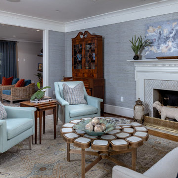
Transitional medium tone wood floor, brown floor and wallpaper living room photo in Jacksonville with gray walls and a standard fireplace
 Factor Design Build
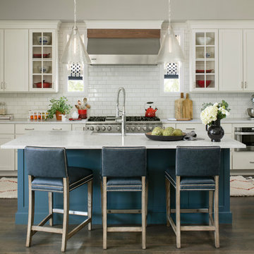
Located in Denver’s Cory Merrill area, our clients were in need of an updated kitchen, mudroom, and bathroom. For the kitchen, the goal was to update the lighting in the kitchen and breakfast nook area while also brightening all counter tops and butler pantry with Ceasarstone.
Other updates included adding hardwood floors throughout the mudroom and bathroom for functionality in addition to pulling the light design from the kitchen throughout with design elements such as porcelain herringbone patterned tile and new powder room scones.
Project Year: 2019
Country: United States
Zip Code: 80206
Sponsored
Columbus, OH
HomeCraft Remodeling
Custom Craftsmanship & Build Solutions in Franklin County, Ohio
 Jessica Cain
Jessica Cain © 2017 Houzz
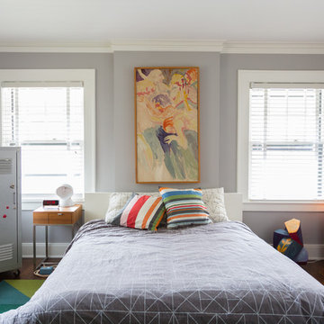
Example of a mid-sized transitional bedroom design in Kansas City
Example of a mid-sized transitional bedroom design in Kansas City
 Alair Homes Plano
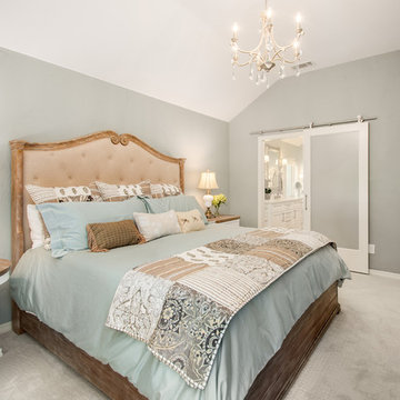
Our clients called us wanting to not only update their master bathroom but to specifically make it more functional. She had just had knee surgery, so taking a shower wasn’t easy. They wanted to remove the tub and enlarge the shower, as much as possible, and add a bench. She really wanted a seated makeup vanity area, too. They wanted to replace all vanity cabinets making them one height, and possibly add tower storage. With the current layout, they felt that there were too many doors, so we discussed possibly using a barn door to the bedroom.
We removed the large oval bathtub and expanded the shower, with an added bench. She got her seated makeup vanity and it’s placed between the shower and the window, right where she wanted it by the natural light. A tilting oval mirror sits above the makeup vanity flanked with Pottery Barn “Hayden” brushed nickel vanity lights. A lit swing arm makeup mirror was installed, making for a perfect makeup vanity! New taller Shiloh “Eclipse” bathroom cabinets painted in Polar with Slate highlights were installed (all at one height), with Kohler “Caxton” square double sinks. Two large beautiful mirrors are hung above each sink, again, flanked with Pottery Barn “Hayden” brushed nickel vanity lights on either side. Beautiful Quartzmasters Polished Calacutta Borghini countertops were installed on both vanities, as well as the shower bench top and shower wall cap.
Carrara Valentino basketweave mosaic marble tiles was installed on the shower floor and the back of the niches, while Heirloom Clay 3x9 tile was installed on the shower walls. A Delta Shower System was installed with both a hand held shower and a rainshower. The linen closet that used to have a standard door opening into the middle of the bathroom is now storage cabinets, with the classic Restoration Hardware “Campaign” pulls on the drawers and doors. A beautiful Birch forest gray 6”x 36” floor tile, laid in a random offset pattern was installed for an updated look on the floor. New glass paneled doors were installed to the closet and the water closet, matching the barn door. A gorgeous Shades of Light 20” “Pyramid Crystals” chandelier was hung in the center of the bathroom to top it all off!
The bedroom was painted a soothing Magnetic Gray and a classic updated Capital Lighting “Harlow” Chandelier was hung for an updated look.
We were able to meet all of our clients needs by removing the tub, enlarging the shower, installing the seated makeup vanity, by the natural light, right were she wanted it and by installing a beautiful barn door between the bathroom from the bedroom! Not only is it beautiful, but it’s more functional for them now and they love it!
Design/Remodel by Hatfield Builders & Remodelers | Photography by Versatile Imaging

54