
Search results for "Video existence" in Home Design Ideas
 InnovationLand
We are so excited about this stylish Houston patio addition!
It's one of our most recent outdoor living space design projects - and one of our new favorites!
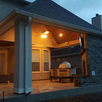
We particularly love the rustic corner fireplace, the beautiful, vaulted pine ceiling and the Restoration Hardware furniture and accessories.
"Even though this space has an outdoor kitchen - often the highlight of our projects - the focus here is beautiful, comfortable outdoor living," says Outdoor Homescapes of Houston owner Wayne Franks. "And I have to say, I think this is one of the most gorgeous spaces we've created for doing that - in style."
"This project was special from the start, as we were creating this space for a friend of Wayne’s who had been a long time mentor to his boys growing up," adds Lisha Maxey, owner of LGH Designs in Houston (she coordinated furniture and finishes for the project). "This client was the principal of their high school and knew all of them very well and Wayne, too. This made it very personal, indeed, and we wanted everything to be perfect!"
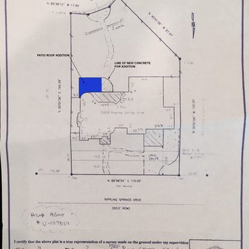
The 23- by 16-foot addition, located at the back of the house in Cypress, looks out onto a manmade lake in the homeowners' subdivision. The focal point? A 9-foot-8-inch-high-by-7-foot-wide corner fireplace in Earth Grey rustic ledgestone from Colorstone in Houston. The fireplace features a custom wooden mantel, stone bench seating and a 52-inch Sunbrite outdoor TV.
Another highlight is the flooring - silver travertine tile laid out in a Versailles pattern. "We chose silver travertine in a 'Tumbled' color palette with variations of cream and brown," says Lisha. "So we had those two colors, plus grey, to pull from."
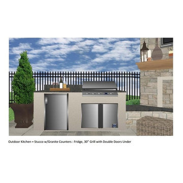
The 7-foot-long, stucco outdoor kitchen island's countertops are also noteworthy - Absolute Black granite in a leathered finish offering a modern look and a dark grey hue that works perfectly with the color palette. The kitchen island also houses an RCS 30-inch grill and fridge.
The seating area includes a sectional couch, coffee table, two swivel chairs and two ottomans - all from Restoration Hardware.
"We used Restoration Hardware's Biscayne sectional, swivel chairs and ottomans in gray, with textured linen weave in Sand and cushions and peacock accent pillows in gray," says Lisha. The coffee table is made of solid teak with a concrete top - as is the matching side table.
"We added a console table, also in teak, behind the sofa. And for accents, we added three Amalfi lanterns from Restoration Hardware in weathered zinc."
A Sunbrella® Heathered area rug (in Gray) was added to anchor the space and visually tie it together.
"The space as a whole leans towards a transitional style, in that it has many traditional cozy comforts and colors, but the furniture gives it a more contemporary look," says Lisha. "The idea from the beginning was to marry these two styles, as our clients wanted a look that would not age and be in vogue for years to come."
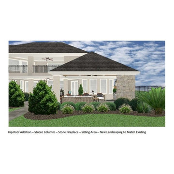
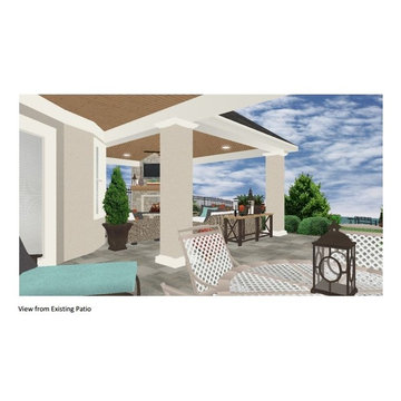
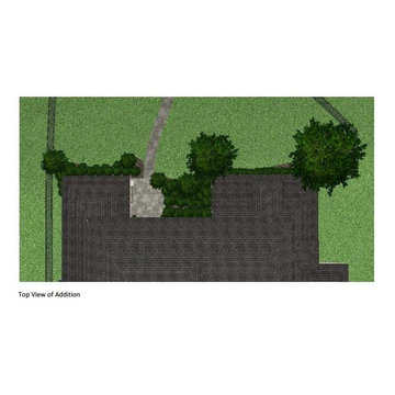
On the exterior, you can see how we worked to make the addition blend with the existing home - matching the shingles and stucco and continuing the landscaping.
3D graphic renderings and a virtual video tour allowed the clients to know exactly what the space would look like beforehand.
"It takes a lot of the guesswork out of the process," says Outdoor Homescapes' graphic designer, Kristy Buell Franks. "Floor plans and elevation drawings are good for giving an idea of the overall scope of the project, but it's the 3D renderings that really show what the space is going to look like."
The 3D graphics and video tours also help immensely when choosing finishing materials and furniture, she says: "The clients' choices can be put into the design to allow the clients to see how the materials will work with the existing materials on the house and how the furniture will look in the space."
What do you like about this space? Post a comment and let us know!
URL http://www.outdoorhomescapes.com
 RAJ Kitchen and Bath, LLC
 “Full apartment design”.
IF you have not yet seen this apartment conversion before, we strongly urge you to go to the bottom left of this page and click on the short 2-minutes video. It would put a lot of things into perspective when you come back and continue reading this.
It is true we were literally handed the keys and told a list of things that they wanted to have happen and we were to go into the apartment, look at the space and come up with a design that would satisfy all of that need. UNTIL we showed up! The unit had really seen some better days but we knew we had to look past that and come up with a concept that would work for them.
The immediate challenges were centered around 3 big ideas:
1. Adding a second bedroom to the already small footprint
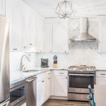
2. Figuring out a way to make the kitchen bigger, better and brighter
3. Creating a master room walk in closet
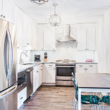
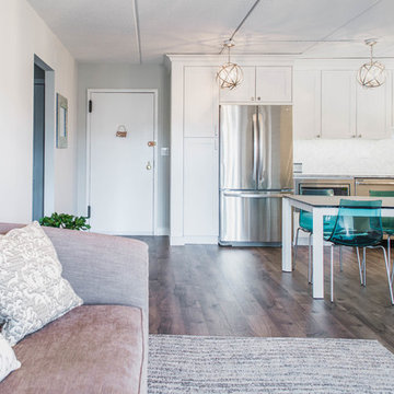
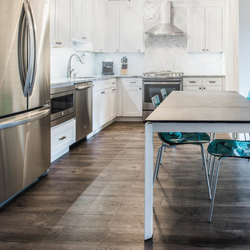
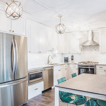
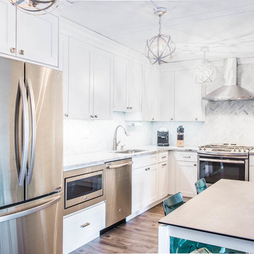
It’s always difficult to add new rooms into existing footprint without expanding out or up and not incurring any opportunity cost. In this case, that was exactly what we had to do. Item one and two above had to be tackled as one. We went ahead and switched out the location of the dining room and eliminating an area where there was a “nook” type eat-in area. By doing so, we were able to cut right into that footprint and change the layout of the kitchen.
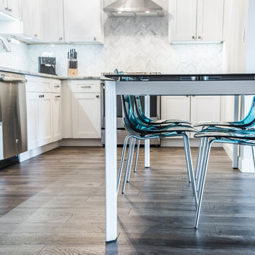
That one move allowed us to dig into the kitchen design because it was now the main focal point in the apartment. It was no longer an option to keep it in that tiny hole where it was, so we had to ensure that this design was functional and aesthetically pleasing at the same time. By adding the table into the space where an Island typically would go, we were able to both cut cost and still provide a dining experience. The Table serves as an Island as well when cooking.
We then proceeded to block in the existing doorway to the dining room. By doing this, we were able to create a full room which allowed us to put a door on the other side and called that room Bedroom #2. This was easier to do because all of the mechanicals were already in that space (light, heater and windows). By shifting things around, we also achieved a huge wall to wall closet from inside. PERFECT!
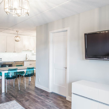
Then we moved into the Single bedroom. We thought it was a big room with a small closet, so by creatively adding an L shaped wall and steal some footprint into the bedroom side, we were able to put a door on that new room and design it for the walk-in closet. Even after this, the bedroom still holds a queen size bed with 2 night stands, a TV on the wall, a sitting chair and plenty of room to walk around. This was done by rethinking the location for the bed and night stands.
The bathroom was gutted to make sure there was no leaks and rebuild from the ground up. We kept all of the plumbing where it was, added a new vanity, medicine cabinet, tiles and lighting and it was done.
From there, the rest of the unit had new flooring all throughout, paint, and lighting. After completion and walk through, this project was handed over back to the clients.
Execution and collaboration between all the trades were: Reggie and his team from Premier Interiors and Rohan from RD Mechanical Services.
p.s. Please see our website to see the video.
 RAJ Kitchen and Bath, LLC
 “Full apartment design”.
IF you have not yet seen this apartment conversion before, we strongly urge you to go to the bottom left of this page and click on the short 2-minutes video. It would put a lot of things into perspective when you come back and continue reading this.
It is true we were literally handed the keys and told a list of things that they wanted to have happen and we were to go into the apartment, look at the space and come up with a design that would satisfy all of that need. UNTIL we showed up! The unit had really seen some better days but we knew we had to look past that and come up with a concept that would work for them.
The immediate challenges were centered around 3 big ideas:
1. Adding a second bedroom to the already small footprint
2. Figuring out a way to make the kitchen bigger, better and brighter
3. Creating a master room walk in closet
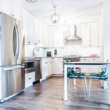
It’s always difficult to add new rooms into existing footprint without expanding out or up and not incurring any opportunity cost. In this case, that was exactly what we had to do. Item one and two above had to be tackled as one. We went ahead and switched out the location of the dining room and eliminating an area where there was a “nook” type eat-in area. By doing so, we were able to cut right into that footprint and change the layout of the kitchen.
That one move allowed us to dig into the kitchen design because it was now the main focal point in the apartment. It was no longer an option to keep it in that tiny hole where it was, so we had to ensure that this design was functional and aesthetically pleasing at the same time. By adding the table into the space where an Island typically would go, we were able to both cut cost and still provide a dining experience. The Table serves as an Island as well when cooking.
We then proceeded to block in the existing doorway to the dining room. By doing this, we were able to create a full room which allowed us to put a door on the other side and called that room Bedroom #2. This was easier to do because all of the mechanicals were already in that space (light, heater and windows). By shifting things around, we also achieved a huge wall to wall closet from inside. PERFECT!
Then we moved into the Single bedroom. We thought it was a big room with a small closet, so by creatively adding an L shaped wall and steal some footprint into the bedroom side, we were able to put a door on that new room and design it for the walk-in closet. Even after this, the bedroom still holds a queen size bed with 2 night stands, a TV on the wall, a sitting chair and plenty of room to walk around. This was done by rethinking the location for the bed and night stands.
The bathroom was gutted to make sure there was no leaks and rebuild from the ground up. We kept all of the plumbing where it was, added a new vanity, medicine cabinet, tiles and lighting and it was done.
From there, the rest of the unit had new flooring all throughout, paint, and lighting. After completion and walk through, this project was handed over back to the clients.
Execution and collaboration between all the trades were: Reggie and his team from Premier Interiors and Rohan from RD Mechanical Services.
p.s. Please see our website to see the video.
Find the right local pro for your project
 RAJ Kitchen and Bath, LLC
 “Full apartment design”.
IF you have not yet seen this apartment conversion before, we strongly urge you to go to the bottom left of this page and click on the short 2-minutes video. It would put a lot of things into perspective when you come back and continue reading this.
It is true we were literally handed the keys and told a list of things that they wanted to have happen and we were to go into the apartment, look at the space and come up with a design that would satisfy all of that need. UNTIL we showed up! The unit had really seen some better days but we knew we had to look past that and come up with a concept that would work for them.
The immediate challenges were centered around 3 big ideas:
1. Adding a second bedroom to the already small footprint
2. Figuring out a way to make the kitchen bigger, better and brighter
3. Creating a master room walk in closet
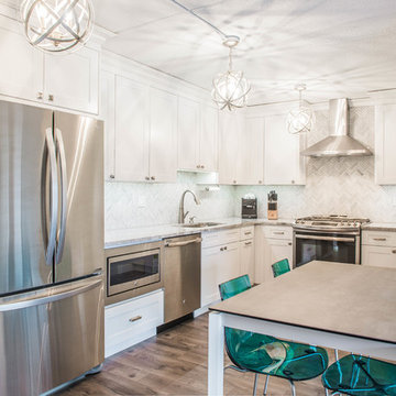
It’s always difficult to add new rooms into existing footprint without expanding out or up and not incurring any opportunity cost. In this case, that was exactly what we had to do. Item one and two above had to be tackled as one. We went ahead and switched out the location of the dining room and eliminating an area where there was a “nook” type eat-in area. By doing so, we were able to cut right into that footprint and change the layout of the kitchen.
That one move allowed us to dig into the kitchen design because it was now the main focal point in the apartment. It was no longer an option to keep it in that tiny hole where it was, so we had to ensure that this design was functional and aesthetically pleasing at the same time. By adding the table into the space where an Island typically would go, we were able to both cut cost and still provide a dining experience. The Table serves as an Island as well when cooking.
We then proceeded to block in the existing doorway to the dining room. By doing this, we were able to create a full room which allowed us to put a door on the other side and called that room Bedroom #2. This was easier to do because all of the mechanicals were already in that space (light, heater and windows). By shifting things around, we also achieved a huge wall to wall closet from inside. PERFECT!
Then we moved into the Single bedroom. We thought it was a big room with a small closet, so by creatively adding an L shaped wall and steal some footprint into the bedroom side, we were able to put a door on that new room and design it for the walk-in closet. Even after this, the bedroom still holds a queen size bed with 2 night stands, a TV on the wall, a sitting chair and plenty of room to walk around. This was done by rethinking the location for the bed and night stands.
The bathroom was gutted to make sure there was no leaks and rebuild from the ground up. We kept all of the plumbing where it was, added a new vanity, medicine cabinet, tiles and lighting and it was done.
From there, the rest of the unit had new flooring all throughout, paint, and lighting. After completion and walk through, this project was handed over back to the clients.
Execution and collaboration between all the trades were: Reggie and his team from Premier Interiors and Rohan from RD Mechanical Services.
p.s. Please see our website to see the video.
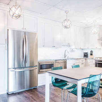 RAJ Kitchen and Bath, LLC
 “Full apartment design”.
IF you have not yet seen this apartment conversion before, we strongly urge you to go to the bottom left of this page and click on the short 2-minutes video. It would put a lot of things into perspective when you come back and continue reading this.
It is true we were literally handed the keys and told a list of things that they wanted to have happen and we were to go into the apartment, look at the space and come up with a design that would satisfy all of that need. UNTIL we showed up! The unit had really seen some better days but we knew we had to look past that and come up with a concept that would work for them.
The immediate challenges were centered around 3 big ideas:
1. Adding a second bedroom to the already small footprint
2. Figuring out a way to make the kitchen bigger, better and brighter
3. Creating a master room walk in closet
It’s always difficult to add new rooms into existing footprint without expanding out or up and not incurring any opportunity cost. In this case, that was exactly what we had to do. Item one and two above had to be tackled as one. We went ahead and switched out the location of the dining room and eliminating an area where there was a “nook” type eat-in area. By doing so, we were able to cut right into that footprint and change the layout of the kitchen.
That one move allowed us to dig into the kitchen design because it was now the main focal point in the apartment. It was no longer an option to keep it in that tiny hole where it was, so we had to ensure that this design was functional and aesthetically pleasing at the same time. By adding the table into the space where an Island typically would go, we were able to both cut cost and still provide a dining experience. The Table serves as an Island as well when cooking.
We then proceeded to block in the existing doorway to the dining room. By doing this, we were able to create a full room which allowed us to put a door on the other side and called that room Bedroom #2. This was easier to do because all of the mechanicals were already in that space (light, heater and windows). By shifting things around, we also achieved a huge wall to wall closet from inside. PERFECT!
Then we moved into the Single bedroom. We thought it was a big room with a small closet, so by creatively adding an L shaped wall and steal some footprint into the bedroom side, we were able to put a door on that new room and design it for the walk-in closet. Even after this, the bedroom still holds a queen size bed with 2 night stands, a TV on the wall, a sitting chair and plenty of room to walk around. This was done by rethinking the location for the bed and night stands.
The bathroom was gutted to make sure there was no leaks and rebuild from the ground up. We kept all of the plumbing where it was, added a new vanity, medicine cabinet, tiles and lighting and it was done.
From there, the rest of the unit had new flooring all throughout, paint, and lighting. After completion and walk through, this project was handed over back to the clients.
Execution and collaboration between all the trades were: Reggie and his team from Premier Interiors and Rohan from RD Mechanical Services.
p.s. Please see our website to see the video.
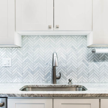 RAJ Kitchen and Bath, LLC
 “Full apartment design”.
IF you have not yet seen this apartment conversion before, we strongly urge you to go to the bottom left of this page and click on the short 2-minutes video. It would put a lot of things into perspective when you come back and continue reading this.
It is true we were literally handed the keys and told a list of things that they wanted to have happen and we were to go into the apartment, look at the space and come up with a design that would satisfy all of that need. UNTIL we showed up! The unit had really seen some better days but we knew we had to look past that and come up with a concept that would work for them.
The immediate challenges were centered around 3 big ideas:
1. Adding a second bedroom to the already small footprint
2. Figuring out a way to make the kitchen bigger, better and brighter
3. Creating a master room walk in closet
It’s always difficult to add new rooms into existing footprint without expanding out or up and not incurring any opportunity cost. In this case, that was exactly what we had to do. Item one and two above had to be tackled as one. We went ahead and switched out the location of the dining room and eliminating an area where there was a “nook” type eat-in area. By doing so, we were able to cut right into that footprint and change the layout of the kitchen.
That one move allowed us to dig into the kitchen design because it was now the main focal point in the apartment. It was no longer an option to keep it in that tiny hole where it was, so we had to ensure that this design was functional and aesthetically pleasing at the same time. By adding the table into the space where an Island typically would go, we were able to both cut cost and still provide a dining experience. The Table serves as an Island as well when cooking.
We then proceeded to block in the existing doorway to the dining room. By doing this, we were able to create a full room which allowed us to put a door on the other side and called that room Bedroom #2. This was easier to do because all of the mechanicals were already in that space (light, heater and windows). By shifting things around, we also achieved a huge wall to wall closet from inside. PERFECT!
Then we moved into the Single bedroom. We thought it was a big room with a small closet, so by creatively adding an L shaped wall and steal some footprint into the bedroom side, we were able to put a door on that new room and design it for the walk-in closet. Even after this, the bedroom still holds a queen size bed with 2 night stands, a TV on the wall, a sitting chair and plenty of room to walk around. This was done by rethinking the location for the bed and night stands.
The bathroom was gutted to make sure there was no leaks and rebuild from the ground up. We kept all of the plumbing where it was, added a new vanity, medicine cabinet, tiles and lighting and it was done.
From there, the rest of the unit had new flooring all throughout, paint, and lighting. After completion and walk through, this project was handed over back to the clients.
Execution and collaboration between all the trades were: Reggie and his team from Premier Interiors and Rohan from RD Mechanical Services.
p.s. Please see our website to see the video.
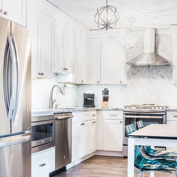 RAJ Kitchen and Bath, LLC
 “Full apartment design”.
IF you have not yet seen this apartment conversion before, we strongly urge you to go to the bottom left of this page and click on the short 2-minutes video. It would put a lot of things into perspective when you come back and continue reading this.
It is true we were literally handed the keys and told a list of things that they wanted to have happen and we were to go into the apartment, look at the space and come up with a design that would satisfy all of that need. UNTIL we showed up! The unit had really seen some better days but we knew we had to look past that and come up with a concept that would work for them.
The immediate challenges were centered around 3 big ideas:
1. Adding a second bedroom to the already small footprint
2. Figuring out a way to make the kitchen bigger, better and brighter
3. Creating a master room walk in closet
It’s always difficult to add new rooms into existing footprint without expanding out or up and not incurring any opportunity cost. In this case, that was exactly what we had to do. Item one and two above had to be tackled as one. We went ahead and switched out the location of the dining room and eliminating an area where there was a “nook” type eat-in area. By doing so, we were able to cut right into that footprint and change the layout of the kitchen.
That one move allowed us to dig into the kitchen design because it was now the main focal point in the apartment. It was no longer an option to keep it in that tiny hole where it was, so we had to ensure that this design was functional and aesthetically pleasing at the same time. By adding the table into the space where an Island typically would go, we were able to both cut cost and still provide a dining experience. The Table serves as an Island as well when cooking.
We then proceeded to block in the existing doorway to the dining room. By doing this, we were able to create a full room which allowed us to put a door on the other side and called that room Bedroom #2. This was easier to do because all of the mechanicals were already in that space (light, heater and windows). By shifting things around, we also achieved a huge wall to wall closet from inside. PERFECT!
Then we moved into the Single bedroom. We thought it was a big room with a small closet, so by creatively adding an L shaped wall and steal some footprint into the bedroom side, we were able to put a door on that new room and design it for the walk-in closet. Even after this, the bedroom still holds a queen size bed with 2 night stands, a TV on the wall, a sitting chair and plenty of room to walk around. This was done by rethinking the location for the bed and night stands.
The bathroom was gutted to make sure there was no leaks and rebuild from the ground up. We kept all of the plumbing where it was, added a new vanity, medicine cabinet, tiles and lighting and it was done.
From there, the rest of the unit had new flooring all throughout, paint, and lighting. After completion and walk through, this project was handed over back to the clients.
Execution and collaboration between all the trades were: Reggie and his team from Premier Interiors and Rohan from RD Mechanical Services.
p.s. Please see our website to see the video.

Sponsored
Columbus, OH

Hope Restoration & General Contracting
Columbus Design-Build, Kitchen & Bath Remodeling, Historic Renovations
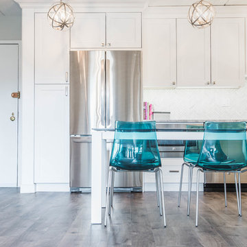 RAJ Kitchen and Bath, LLC
 “Full apartment design”.
IF you have not yet seen this apartment conversion before, we strongly urge you to go to the bottom left of this page and click on the short 2-minutes video. It would put a lot of things into perspective when you come back and continue reading this.
It is true we were literally handed the keys and told a list of things that they wanted to have happen and we were to go into the apartment, look at the space and come up with a design that would satisfy all of that need. UNTIL we showed up! The unit had really seen some better days but we knew we had to look past that and come up with a concept that would work for them.
The immediate challenges were centered around 3 big ideas:
1. Adding a second bedroom to the already small footprint
2. Figuring out a way to make the kitchen bigger, better and brighter
3. Creating a master room walk in closet
It’s always difficult to add new rooms into existing footprint without expanding out or up and not incurring any opportunity cost. In this case, that was exactly what we had to do. Item one and two above had to be tackled as one. We went ahead and switched out the location of the dining room and eliminating an area where there was a “nook” type eat-in area. By doing so, we were able to cut right into that footprint and change the layout of the kitchen.
That one move allowed us to dig into the kitchen design because it was now the main focal point in the apartment. It was no longer an option to keep it in that tiny hole where it was, so we had to ensure that this design was functional and aesthetically pleasing at the same time. By adding the table into the space where an Island typically would go, we were able to both cut cost and still provide a dining experience. The Table serves as an Island as well when cooking.
We then proceeded to block in the existing doorway to the dining room. By doing this, we were able to create a full room which allowed us to put a door on the other side and called that room Bedroom #2. This was easier to do because all of the mechanicals were already in that space (light, heater and windows). By shifting things around, we also achieved a huge wall to wall closet from inside. PERFECT!
Then we moved into the Single bedroom. We thought it was a big room with a small closet, so by creatively adding an L shaped wall and steal some footprint into the bedroom side, we were able to put a door on that new room and design it for the walk-in closet. Even after this, the bedroom still holds a queen size bed with 2 night stands, a TV on the wall, a sitting chair and plenty of room to walk around. This was done by rethinking the location for the bed and night stands.
The bathroom was gutted to make sure there was no leaks and rebuild from the ground up. We kept all of the plumbing where it was, added a new vanity, medicine cabinet, tiles and lighting and it was done.
From there, the rest of the unit had new flooring all throughout, paint, and lighting. After completion and walk through, this project was handed over back to the clients.
Execution and collaboration between all the trades were: Reggie and his team from Premier Interiors and Rohan from RD Mechanical Services.
p.s. Please see our website to see the video.
 RAJ Kitchen and Bath, LLC
 “Full apartment design”.
IF you have not yet seen this apartment conversion before, we strongly urge you to go to the bottom left of this page and click on the short 2-minutes video. It would put a lot of things into perspective when you come back and continue reading this.
It is true we were literally handed the keys and told a list of things that they wanted to have happen and we were to go into the apartment, look at the space and come up with a design that would satisfy all of that need. UNTIL we showed up! The unit had really seen some better days but we knew we had to look past that and come up with a concept that would work for them.
The immediate challenges were centered around 3 big ideas:
1. Adding a second bedroom to the already small footprint
2. Figuring out a way to make the kitchen bigger, better and brighter
3. Creating a master room walk in closet
It’s always difficult to add new rooms into existing footprint without expanding out or up and not incurring any opportunity cost. In this case, that was exactly what we had to do. Item one and two above had to be tackled as one. We went ahead and switched out the location of the dining room and eliminating an area where there was a “nook” type eat-in area. By doing so, we were able to cut right into that footprint and change the layout of the kitchen.
That one move allowed us to dig into the kitchen design because it was now the main focal point in the apartment. It was no longer an option to keep it in that tiny hole where it was, so we had to ensure that this design was functional and aesthetically pleasing at the same time. By adding the table into the space where an Island typically would go, we were able to both cut cost and still provide a dining experience. The Table serves as an Island as well when cooking.
We then proceeded to block in the existing doorway to the dining room. By doing this, we were able to create a full room which allowed us to put a door on the other side and called that room Bedroom #2. This was easier to do because all of the mechanicals were already in that space (light, heater and windows). By shifting things around, we also achieved a huge wall to wall closet from inside. PERFECT!
Then we moved into the Single bedroom. We thought it was a big room with a small closet, so by creatively adding an L shaped wall and steal some footprint into the bedroom side, we were able to put a door on that new room and design it for the walk-in closet. Even after this, the bedroom still holds a queen size bed with 2 night stands, a TV on the wall, a sitting chair and plenty of room to walk around. This was done by rethinking the location for the bed and night stands.
The bathroom was gutted to make sure there was no leaks and rebuild from the ground up. We kept all of the plumbing where it was, added a new vanity, medicine cabinet, tiles and lighting and it was done.
From there, the rest of the unit had new flooring all throughout, paint, and lighting. After completion and walk through, this project was handed over back to the clients.
Execution and collaboration between all the trades were: Reggie and his team from Premier Interiors and Rohan from RD Mechanical Services.
p.s. Please see our website to see the video.
 RAJ Kitchen and Bath, LLC
 “Full apartment design”.
IF you have not yet seen this apartment conversion before, we strongly urge you to go to the bottom left of this page and click on the short 2-minutes video. It would put a lot of things into perspective when you come back and continue reading this.
It is true we were literally handed the keys and told a list of things that they wanted to have happen and we were to go into the apartment, look at the space and come up with a design that would satisfy all of that need. UNTIL we showed up! The unit had really seen some better days but we knew we had to look past that and come up with a concept that would work for them.
The immediate challenges were centered around 3 big ideas:
1. Adding a second bedroom to the already small footprint
2. Figuring out a way to make the kitchen bigger, better and brighter
3. Creating a master room walk in closet
It’s always difficult to add new rooms into existing footprint without expanding out or up and not incurring any opportunity cost. In this case, that was exactly what we had to do. Item one and two above had to be tackled as one. We went ahead and switched out the location of the dining room and eliminating an area where there was a “nook” type eat-in area. By doing so, we were able to cut right into that footprint and change the layout of the kitchen.
That one move allowed us to dig into the kitchen design because it was now the main focal point in the apartment. It was no longer an option to keep it in that tiny hole where it was, so we had to ensure that this design was functional and aesthetically pleasing at the same time. By adding the table into the space where an Island typically would go, we were able to both cut cost and still provide a dining experience. The Table serves as an Island as well when cooking.
We then proceeded to block in the existing doorway to the dining room. By doing this, we were able to create a full room which allowed us to put a door on the other side and called that room Bedroom #2. This was easier to do because all of the mechanicals were already in that space (light, heater and windows). By shifting things around, we also achieved a huge wall to wall closet from inside. PERFECT!
Then we moved into the Single bedroom. We thought it was a big room with a small closet, so by creatively adding an L shaped wall and steal some footprint into the bedroom side, we were able to put a door on that new room and design it for the walk-in closet. Even after this, the bedroom still holds a queen size bed with 2 night stands, a TV on the wall, a sitting chair and plenty of room to walk around. This was done by rethinking the location for the bed and night stands.
The bathroom was gutted to make sure there was no leaks and rebuild from the ground up. We kept all of the plumbing where it was, added a new vanity, medicine cabinet, tiles and lighting and it was done.
From there, the rest of the unit had new flooring all throughout, paint, and lighting. After completion and walk through, this project was handed over back to the clients.
Execution and collaboration between all the trades were: Reggie and his team from Premier Interiors and Rohan from RD Mechanical Services.
p.s. Please see our website to see the video.
 InnovationLand
We are so excited about this stylish Houston patio addition!
It's one of our most recent outdoor living space design projects - and one of our new favorites!
We particularly love the rustic corner fireplace, the beautiful, vaulted pine ceiling and the Restoration Hardware furniture and accessories.
"Even though this space has an outdoor kitchen - often the highlight of our projects - the focus here is beautiful, comfortable outdoor living," says Outdoor Homescapes of Houston owner Wayne Franks. "And I have to say, I think this is one of the most gorgeous spaces we've created for doing that - in style."
"This project was special from the start, as we were creating this space for a friend of Wayne’s who had been a long time mentor to his boys growing up," adds Lisha Maxey, owner of LGH Designs in Houston (she coordinated furniture and finishes for the project). "This client was the principal of their high school and knew all of them very well and Wayne, too. This made it very personal, indeed, and we wanted everything to be perfect!"
The 23- by 16-foot addition, located at the back of the house in Cypress, looks out onto a manmade lake in the homeowners' subdivision. The focal point? A 9-foot-8-inch-high-by-7-foot-wide corner fireplace in Earth Grey rustic ledgestone from Colorstone in Houston. The fireplace features a custom wooden mantel, stone bench seating and a 52-inch Sunbrite outdoor TV.
Another highlight is the flooring - silver travertine tile laid out in a Versailles pattern. "We chose silver travertine in a 'Tumbled' color palette with variations of cream and brown," says Lisha. "So we had those two colors, plus grey, to pull from."
The 7-foot-long, stucco outdoor kitchen island's countertops are also noteworthy - Absolute Black granite in a leathered finish offering a modern look and a dark grey hue that works perfectly with the color palette. The kitchen island also houses an RCS 30-inch grill and fridge.
The seating area includes a sectional couch, coffee table, two swivel chairs and two ottomans - all from Restoration Hardware.
"We used Restoration Hardware's Biscayne sectional, swivel chairs and ottomans in gray, with textured linen weave in Sand and cushions and peacock accent pillows in gray," says Lisha. The coffee table is made of solid teak with a concrete top - as is the matching side table.
"We added a console table, also in teak, behind the sofa. And for accents, we added three Amalfi lanterns from Restoration Hardware in weathered zinc."
A Sunbrella® Heathered area rug (in Gray) was added to anchor the space and visually tie it together.
"The space as a whole leans towards a transitional style, in that it has many traditional cozy comforts and colors, but the furniture gives it a more contemporary look," says Lisha. "The idea from the beginning was to marry these two styles, as our clients wanted a look that would not age and be in vogue for years to come."
On the exterior, you can see how we worked to make the addition blend with the existing home - matching the shingles and stucco and continuing the landscaping.
3D graphic renderings and a virtual video tour allowed the clients to know exactly what the space would look like beforehand.
"It takes a lot of the guesswork out of the process," says Outdoor Homescapes' graphic designer, Kristy Buell Franks. "Floor plans and elevation drawings are good for giving an idea of the overall scope of the project, but it's the 3D renderings that really show what the space is going to look like."
The 3D graphics and video tours also help immensely when choosing finishing materials and furniture, she says: "The clients' choices can be put into the design to allow the clients to see how the materials will work with the existing materials on the house and how the furniture will look in the space."
What do you like about this space? Post a comment and let us know!
 RAJ Kitchen and Bath, LLC
 “Full apartment design”.
IF you have not yet seen this apartment conversion before, we strongly urge you to go to the bottom left of this page and click on the short 2-minutes video. It would put a lot of things into perspective when you come back and continue reading this.
It is true we were literally handed the keys and told a list of things that they wanted to have happen and we were to go into the apartment, look at the space and come up with a design that would satisfy all of that need. UNTIL we showed up! The unit had really seen some better days but we knew we had to look past that and come up with a concept that would work for them.
The immediate challenges were centered around 3 big ideas:
1. Adding a second bedroom to the already small footprint
2. Figuring out a way to make the kitchen bigger, better and brighter
3. Creating a master room walk in closet
It’s always difficult to add new rooms into existing footprint without expanding out or up and not incurring any opportunity cost. In this case, that was exactly what we had to do. Item one and two above had to be tackled as one. We went ahead and switched out the location of the dining room and eliminating an area where there was a “nook” type eat-in area. By doing so, we were able to cut right into that footprint and change the layout of the kitchen.
That one move allowed us to dig into the kitchen design because it was now the main focal point in the apartment. It was no longer an option to keep it in that tiny hole where it was, so we had to ensure that this design was functional and aesthetically pleasing at the same time. By adding the table into the space where an Island typically would go, we were able to both cut cost and still provide a dining experience. The Table serves as an Island as well when cooking.
We then proceeded to block in the existing doorway to the dining room. By doing this, we were able to create a full room which allowed us to put a door on the other side and called that room Bedroom #2. This was easier to do because all of the mechanicals were already in that space (light, heater and windows). By shifting things around, we also achieved a huge wall to wall closet from inside. PERFECT!
Then we moved into the Single bedroom. We thought it was a big room with a small closet, so by creatively adding an L shaped wall and steal some footprint into the bedroom side, we were able to put a door on that new room and design it for the walk-in closet. Even after this, the bedroom still holds a queen size bed with 2 night stands, a TV on the wall, a sitting chair and plenty of room to walk around. This was done by rethinking the location for the bed and night stands.
The bathroom was gutted to make sure there was no leaks and rebuild from the ground up. We kept all of the plumbing where it was, added a new vanity, medicine cabinet, tiles and lighting and it was done.
From there, the rest of the unit had new flooring all throughout, paint, and lighting. After completion and walk through, this project was handed over back to the clients.
Execution and collaboration between all the trades were: Reggie and his team from Premier Interiors and Rohan from RD Mechanical Services.
p.s. Please see our website to see the video.
 RAJ Kitchen and Bath, LLC
 “Full apartment design”.
IF you have not yet seen this apartment conversion before, we strongly urge you to go to the bottom left of this page and click on the short 2-minutes video. It would put a lot of things into perspective when you come back and continue reading this.
It is true we were literally handed the keys and told a list of things that they wanted to have happen and we were to go into the apartment, look at the space and come up with a design that would satisfy all of that need. UNTIL we showed up! The unit had really seen some better days but we knew we had to look past that and come up with a concept that would work for them.
The immediate challenges were centered around 3 big ideas:
1. Adding a second bedroom to the already small footprint
2. Figuring out a way to make the kitchen bigger, better and brighter
3. Creating a master room walk in closet
It’s always difficult to add new rooms into existing footprint without expanding out or up and not incurring any opportunity cost. In this case, that was exactly what we had to do. Item one and two above had to be tackled as one. We went ahead and switched out the location of the dining room and eliminating an area where there was a “nook” type eat-in area. By doing so, we were able to cut right into that footprint and change the layout of the kitchen.
That one move allowed us to dig into the kitchen design because it was now the main focal point in the apartment. It was no longer an option to keep it in that tiny hole where it was, so we had to ensure that this design was functional and aesthetically pleasing at the same time. By adding the table into the space where an Island typically would go, we were able to both cut cost and still provide a dining experience. The Table serves as an Island as well when cooking.
We then proceeded to block in the existing doorway to the dining room. By doing this, we were able to create a full room which allowed us to put a door on the other side and called that room Bedroom #2. This was easier to do because all of the mechanicals were already in that space (light, heater and windows). By shifting things around, we also achieved a huge wall to wall closet from inside. PERFECT!
Then we moved into the Single bedroom. We thought it was a big room with a small closet, so by creatively adding an L shaped wall and steal some footprint into the bedroom side, we were able to put a door on that new room and design it for the walk-in closet. Even after this, the bedroom still holds a queen size bed with 2 night stands, a TV on the wall, a sitting chair and plenty of room to walk around. This was done by rethinking the location for the bed and night stands.
The bathroom was gutted to make sure there was no leaks and rebuild from the ground up. We kept all of the plumbing where it was, added a new vanity, medicine cabinet, tiles and lighting and it was done.
From there, the rest of the unit had new flooring all throughout, paint, and lighting. After completion and walk through, this project was handed over back to the clients.
Execution and collaboration between all the trades were: Reggie and his team from Premier Interiors and Rohan from RD Mechanical Services.
p.s. Please see our website to see the video.
Sponsored
Columbus, OH
Hope Restoration & General Contracting
Columbus Design-Build, Kitchen & Bath Remodeling, Historic Renovations
 RAJ Kitchen and Bath, LLC
 “Full apartment design”.
IF you have not yet seen this apartment conversion before, we strongly urge you to go to the bottom left of this page and click on the short 2-minutes video. It would put a lot of things into perspective when you come back and continue reading this.
It is true we were literally handed the keys and told a list of things that they wanted to have happen and we were to go into the apartment, look at the space and come up with a design that would satisfy all of that need. UNTIL we showed up! The unit had really seen some better days but we knew we had to look past that and come up with a concept that would work for them.
The immediate challenges were centered around 3 big ideas:
1. Adding a second bedroom to the already small footprint
2. Figuring out a way to make the kitchen bigger, better and brighter
3. Creating a master room walk in closet
It’s always difficult to add new rooms into existing footprint without expanding out or up and not incurring any opportunity cost. In this case, that was exactly what we had to do. Item one and two above had to be tackled as one. We went ahead and switched out the location of the dining room and eliminating an area where there was a “nook” type eat-in area. By doing so, we were able to cut right into that footprint and change the layout of the kitchen.
That one move allowed us to dig into the kitchen design because it was now the main focal point in the apartment. It was no longer an option to keep it in that tiny hole where it was, so we had to ensure that this design was functional and aesthetically pleasing at the same time. By adding the table into the space where an Island typically would go, we were able to both cut cost and still provide a dining experience. The Table serves as an Island as well when cooking.
We then proceeded to block in the existing doorway to the dining room. By doing this, we were able to create a full room which allowed us to put a door on the other side and called that room Bedroom #2. This was easier to do because all of the mechanicals were already in that space (light, heater and windows). By shifting things around, we also achieved a huge wall to wall closet from inside. PERFECT!
Then we moved into the Single bedroom. We thought it was a big room with a small closet, so by creatively adding an L shaped wall and steal some footprint into the bedroom side, we were able to put a door on that new room and design it for the walk-in closet. Even after this, the bedroom still holds a queen size bed with 2 night stands, a TV on the wall, a sitting chair and plenty of room to walk around. This was done by rethinking the location for the bed and night stands.
The bathroom was gutted to make sure there was no leaks and rebuild from the ground up. We kept all of the plumbing where it was, added a new vanity, medicine cabinet, tiles and lighting and it was done.
From there, the rest of the unit had new flooring all throughout, paint, and lighting. After completion and walk through, this project was handed over back to the clients.
Execution and collaboration between all the trades were: Reggie and his team from Premier Interiors and Rohan from RD Mechanical Services.
p.s. Please see our website to see the video.
 RAJ Kitchen and Bath, LLC
 “Full apartment design”.
IF you have not yet seen this apartment conversion before, we strongly urge you to go to the bottom left of this page and click on the short 2-minutes video. It would put a lot of things into perspective when you come back and continue reading this.
It is true we were literally handed the keys and told a list of things that they wanted to have happen and we were to go into the apartment, look at the space and come up with a design that would satisfy all of that need. UNTIL we showed up! The unit had really seen some better days but we knew we had to look past that and come up with a concept that would work for them.
The immediate challenges were centered around 3 big ideas:
1. Adding a second bedroom to the already small footprint
2. Figuring out a way to make the kitchen bigger, better and brighter
3. Creating a master room walk in closet
It’s always difficult to add new rooms into existing footprint without expanding out or up and not incurring any opportunity cost. In this case, that was exactly what we had to do. Item one and two above had to be tackled as one. We went ahead and switched out the location of the dining room and eliminating an area where there was a “nook” type eat-in area. By doing so, we were able to cut right into that footprint and change the layout of the kitchen.
That one move allowed us to dig into the kitchen design because it was now the main focal point in the apartment. It was no longer an option to keep it in that tiny hole where it was, so we had to ensure that this design was functional and aesthetically pleasing at the same time. By adding the table into the space where an Island typically would go, we were able to both cut cost and still provide a dining experience. The Table serves as an Island as well when cooking.
We then proceeded to block in the existing doorway to the dining room. By doing this, we were able to create a full room which allowed us to put a door on the other side and called that room Bedroom #2. This was easier to do because all of the mechanicals were already in that space (light, heater and windows). By shifting things around, we also achieved a huge wall to wall closet from inside. PERFECT!
Then we moved into the Single bedroom. We thought it was a big room with a small closet, so by creatively adding an L shaped wall and steal some footprint into the bedroom side, we were able to put a door on that new room and design it for the walk-in closet. Even after this, the bedroom still holds a queen size bed with 2 night stands, a TV on the wall, a sitting chair and plenty of room to walk around. This was done by rethinking the location for the bed and night stands.
The bathroom was gutted to make sure there was no leaks and rebuild from the ground up. We kept all of the plumbing where it was, added a new vanity, medicine cabinet, tiles and lighting and it was done.
From there, the rest of the unit had new flooring all throughout, paint, and lighting. After completion and walk through, this project was handed over back to the clients.
Execution and collaboration between all the trades were: Reggie and his team from Premier Interiors and Rohan from RD Mechanical Services.
p.s. Please see our website to see the video.
 InnovationLand
We are so excited about this stylish Houston patio addition!
It's one of our most recent outdoor living space design projects - and one of our new favorites!
We particularly love the rustic corner fireplace, the beautiful, vaulted pine ceiling and the Restoration Hardware furniture and accessories.
"Even though this space has an outdoor kitchen - often the highlight of our projects - the focus here is beautiful, comfortable outdoor living," says Outdoor Homescapes of Houston owner Wayne Franks. "And I have to say, I think this is one of the most gorgeous spaces we've created for doing that - in style."
"This project was special from the start, as we were creating this space for a friend of Wayne’s who had been a long time mentor to his boys growing up," adds Lisha Maxey, owner of LGH Designs in Houston (she coordinated furniture and finishes for the project). "This client was the principal of their high school and knew all of them very well and Wayne, too. This made it very personal, indeed, and we wanted everything to be perfect!"
The 23- by 16-foot addition, located at the back of the house in Cypress, looks out onto a manmade lake in the homeowners' subdivision. The focal point? A 9-foot-8-inch-high-by-7-foot-wide corner fireplace in Earth Grey rustic ledgestone from Colorstone in Houston. The fireplace features a custom wooden mantel, stone bench seating and a 52-inch Sunbrite outdoor TV.
Another highlight is the flooring - silver travertine tile laid out in a Versailles pattern. "We chose silver travertine in a 'Tumbled' color palette with variations of cream and brown," says Lisha. "So we had those two colors, plus grey, to pull from."
The 7-foot-long, stucco outdoor kitchen island's countertops are also noteworthy - Absolute Black granite in a leathered finish offering a modern look and a dark grey hue that works perfectly with the color palette. The kitchen island also houses an RCS 30-inch grill and fridge.
The seating area includes a sectional couch, coffee table, two swivel chairs and two ottomans - all from Restoration Hardware.
"We used Restoration Hardware's Biscayne sectional, swivel chairs and ottomans in gray, with textured linen weave in Sand and cushions and peacock accent pillows in gray," says Lisha. The coffee table is made of solid teak with a concrete top - as is the matching side table.
"We added a console table, also in teak, behind the sofa. And for accents, we added three Amalfi lanterns from Restoration Hardware in weathered zinc."
A Sunbrella® Heathered area rug (in Gray) was added to anchor the space and visually tie it together.
"The space as a whole leans towards a transitional style, in that it has many traditional cozy comforts and colors, but the furniture gives it a more contemporary look," says Lisha. "The idea from the beginning was to marry these two styles, as our clients wanted a look that would not age and be in vogue for years to come."
On the exterior, you can see how we worked to make the addition blend with the existing home - matching the shingles and stucco and continuing the landscaping.
3D graphic renderings and a virtual video tour allowed the clients to know exactly what the space would look like beforehand.
"It takes a lot of the guesswork out of the process," says Outdoor Homescapes' graphic designer, Kristy Buell Franks. "Floor plans and elevation drawings are good for giving an idea of the overall scope of the project, but it's the 3D renderings that really show what the space is going to look like."
The 3D graphics and video tours also help immensely when choosing finishing materials and furniture, she says: "The clients' choices can be put into the design to allow the clients to see how the materials will work with the existing materials on the house and how the furniture will look in the space."
What do you like about this space? Post a comment and let us know!
URL http://www.outdoorhomescapes.com
 InnovationLand
We are so excited about this stylish Houston patio addition!
It's one of our most recent outdoor living space design projects - and one of our new favorites!
We particularly love the rustic corner fireplace, the beautiful, vaulted pine ceiling and the Restoration Hardware furniture and accessories.
"Even though this space has an outdoor kitchen - often the highlight of our projects - the focus here is beautiful, comfortable outdoor living," says Outdoor Homescapes of Houston owner Wayne Franks. "And I have to say, I think this is one of the most gorgeous spaces we've created for doing that - in style."
"This project was special from the start, as we were creating this space for a friend of Wayne’s who had been a long time mentor to his boys growing up," adds Lisha Maxey, owner of LGH Designs in Houston (she coordinated furniture and finishes for the project). "This client was the principal of their high school and knew all of them very well and Wayne, too. This made it very personal, indeed, and we wanted everything to be perfect!"
The 23- by 16-foot addition, located at the back of the house in Cypress, looks out onto a manmade lake in the homeowners' subdivision. The focal point? A 9-foot-8-inch-high-by-7-foot-wide corner fireplace in Earth Grey rustic ledgestone from Colorstone in Houston. The fireplace features a custom wooden mantel, stone bench seating and a 52-inch Sunbrite outdoor TV.
Another highlight is the flooring - silver travertine tile laid out in a Versailles pattern. "We chose silver travertine in a 'Tumbled' color palette with variations of cream and brown," says Lisha. "So we had those two colors, plus grey, to pull from."
The 7-foot-long, stucco outdoor kitchen island's countertops are also noteworthy - Absolute Black granite in a leathered finish offering a modern look and a dark grey hue that works perfectly with the color palette. The kitchen island also houses an RCS 30-inch grill and fridge.
The seating area includes a sectional couch, coffee table, two swivel chairs and two ottomans - all from Restoration Hardware.
"We used Restoration Hardware's Biscayne sectional, swivel chairs and ottomans in gray, with textured linen weave in Sand and cushions and peacock accent pillows in gray," says Lisha. The coffee table is made of solid teak with a concrete top - as is the matching side table.
"We added a console table, also in teak, behind the sofa. And for accents, we added three Amalfi lanterns from Restoration Hardware in weathered zinc."
A Sunbrella® Heathered area rug (in Gray) was added to anchor the space and visually tie it together.
"The space as a whole leans towards a transitional style, in that it has many traditional cozy comforts and colors, but the furniture gives it a more contemporary look," says Lisha. "The idea from the beginning was to marry these two styles, as our clients wanted a look that would not age and be in vogue for years to come."
On the exterior, you can see how we worked to make the addition blend with the existing home - matching the shingles and stucco and continuing the landscaping.
3D graphic renderings and a virtual video tour allowed the clients to know exactly what the space would look like beforehand.
"It takes a lot of the guesswork out of the process," says Outdoor Homescapes' graphic designer, Kristy Buell Franks. "Floor plans and elevation drawings are good for giving an idea of the overall scope of the project, but it's the 3D renderings that really show what the space is going to look like."
The 3D graphics and video tours also help immensely when choosing finishing materials and furniture, she says: "The clients' choices can be put into the design to allow the clients to see how the materials will work with the existing materials on the house and how the furniture will look in the space."
What do you like about this space? Post a comment and let us know!
URL http://www.outdoorhomescapes.com

Sponsored
Columbus, OH
Hope Restoration & General Contracting
Columbus Design-Build, Kitchen & Bath Remodeling, Historic Renovations
 RAJ Kitchen and Bath, LLC
 “Full apartment design”.
IF you have not yet seen this apartment conversion before, we strongly urge you to go to the bottom left of this page and click on the short 2-minutes video. It would put a lot of things into perspective when you come back and continue reading this.
It is true we were literally handed the keys and told a list of things that they wanted to have happen and we were to go into the apartment, look at the space and come up with a design that would satisfy all of that need. UNTIL we showed up! The unit had really seen some better days but we knew we had to look past that and come up with a concept that would work for them.
The immediate challenges were centered around 3 big ideas:
1. Adding a second bedroom to the already small footprint
2. Figuring out a way to make the kitchen bigger, better and brighter
3. Creating a master room walk in closet
It’s always difficult to add new rooms into existing footprint without expanding out or up and not incurring any opportunity cost. In this case, that was exactly what we had to do. Item one and two above had to be tackled as one. We went ahead and switched out the location of the dining room and eliminating an area where there was a “nook” type eat-in area. By doing so, we were able to cut right into that footprint and change the layout of the kitchen.
That one move allowed us to dig into the kitchen design because it was now the main focal point in the apartment. It was no longer an option to keep it in that tiny hole where it was, so we had to ensure that this design was functional and aesthetically pleasing at the same time. By adding the table into the space where an Island typically would go, we were able to both cut cost and still provide a dining experience. The Table serves as an Island as well when cooking.
We then proceeded to block in the existing doorway to the dining room. By doing this, we were able to create a full room which allowed us to put a door on the other side and called that room Bedroom #2. This was easier to do because all of the mechanicals were already in that space (light, heater and windows). By shifting things around, we also achieved a huge wall to wall closet from inside. PERFECT!
Then we moved into the Single bedroom. We thought it was a big room with a small closet, so by creatively adding an L shaped wall and steal some footprint into the bedroom side, we were able to put a door on that new room and design it for the walk-in closet. Even after this, the bedroom still holds a queen size bed with 2 night stands, a TV on the wall, a sitting chair and plenty of room to walk around. This was done by rethinking the location for the bed and night stands.
The bathroom was gutted to make sure there was no leaks and rebuild from the ground up. We kept all of the plumbing where it was, added a new vanity, medicine cabinet, tiles and lighting and it was done.
From there, the rest of the unit had new flooring all throughout, paint, and lighting. After completion and walk through, this project was handed over back to the clients.
Execution and collaboration between all the trades were: Reggie and his team from Premier Interiors and Rohan from RD Mechanical Services.
p.s. Please see our website to see the video.
 InnovationLand
We are so excited about this stylish Houston patio addition!
It's one of our most recent outdoor living space design projects - and one of our new favorites!
We particularly love the rustic corner fireplace, the beautiful, vaulted pine ceiling and the Restoration Hardware furniture and accessories.
"Even though this space has an outdoor kitchen - often the highlight of our projects - the focus here is beautiful, comfortable outdoor living," says Outdoor Homescapes of Houston owner Wayne Franks. "And I have to say, I think this is one of the most gorgeous spaces we've created for doing that - in style."
"This project was special from the start, as we were creating this space for a friend of Wayne’s who had been a long time mentor to his boys growing up," adds Lisha Maxey, owner of LGH Designs in Houston (she coordinated furniture and finishes for the project). "This client was the principal of their high school and knew all of them very well and Wayne, too. This made it very personal, indeed, and we wanted everything to be perfect!"
The 23- by 16-foot addition, located at the back of the house in Cypress, looks out onto a manmade lake in the homeowners' subdivision. The focal point? A 9-foot-8-inch-high-by-7-foot-wide corner fireplace in Earth Grey rustic ledgestone from Colorstone in Houston. The fireplace features a custom wooden mantel, stone bench seating and a 52-inch Sunbrite outdoor TV.
Another highlight is the flooring - silver travertine tile laid out in a Versailles pattern. "We chose silver travertine in a 'Tumbled' color palette with variations of cream and brown," says Lisha. "So we had those two colors, plus grey, to pull from."
The 7-foot-long, stucco outdoor kitchen island's countertops are also noteworthy - Absolute Black granite in a leathered finish offering a modern look and a dark grey hue that works perfectly with the color palette. The kitchen island also houses an RCS 30-inch grill and fridge.
The seating area includes a sectional couch, coffee table, two swivel chairs and two ottomans - all from Restoration Hardware.
"We used Restoration Hardware's Biscayne sectional, swivel chairs and ottomans in gray, with textured linen weave in Sand and cushions and peacock accent pillows in gray," says Lisha. The coffee table is made of solid teak with a concrete top - as is the matching side table.
"We added a console table, also in teak, behind the sofa. And for accents, we added three Amalfi lanterns from Restoration Hardware in weathered zinc."
A Sunbrella® Heathered area rug (in Gray) was added to anchor the space and visually tie it together.
"The space as a whole leans towards a transitional style, in that it has many traditional cozy comforts and colors, but the furniture gives it a more contemporary look," says Lisha. "The idea from the beginning was to marry these two styles, as our clients wanted a look that would not age and be in vogue for years to come."
On the exterior, you can see how we worked to make the addition blend with the existing home - matching the shingles and stucco and continuing the landscaping.
3D graphic renderings and a virtual video tour allowed the clients to know exactly what the space would look like beforehand.
"It takes a lot of the guesswork out of the process," says Outdoor Homescapes' graphic designer, Kristy Buell Franks. "Floor plans and elevation drawings are good for giving an idea of the overall scope of the project, but it's the 3D renderings that really show what the space is going to look like."
The 3D graphics and video tours also help immensely when choosing finishing materials and furniture, she says: "The clients' choices can be put into the design to allow the clients to see how the materials will work with the existing materials on the house and how the furniture will look in the space."
What do you like about this space? Post a comment and let us know!
 InnovationLand
We are so excited about this stylish Houston patio addition!
It's one of our most recent outdoor living space design projects - and one of our new favorites!
We particularly love the rustic corner fireplace, the beautiful, vaulted pine ceiling and the Restoration Hardware furniture and accessories.
"Even though this space has an outdoor kitchen - often the highlight of our projects - the focus here is beautiful, comfortable outdoor living," says Outdoor Homescapes of Houston owner Wayne Franks. "And I have to say, I think this is one of the most gorgeous spaces we've created for doing that - in style."
"This project was special from the start, as we were creating this space for a friend of Wayne’s who had been a long time mentor to his boys growing up," adds Lisha Maxey, owner of LGH Designs in Houston (she coordinated furniture and finishes for the project). "This client was the principal of their high school and knew all of them very well and Wayne, too. This made it very personal, indeed, and we wanted everything to be perfect!"
The 23- by 16-foot addition, located at the back of the house in Cypress, looks out onto a manmade lake in the homeowners' subdivision. The focal point? A 9-foot-8-inch-high-by-7-foot-wide corner fireplace in Earth Grey rustic ledgestone from Colorstone in Houston. The fireplace features a custom wooden mantel, stone bench seating and a 52-inch Sunbrite outdoor TV.
Another highlight is the flooring - silver travertine tile laid out in a Versailles pattern. "We chose silver travertine in a 'Tumbled' color palette with variations of cream and brown," says Lisha. "So we had those two colors, plus grey, to pull from."
The 7-foot-long, stucco outdoor kitchen island's countertops are also noteworthy - Absolute Black granite in a leathered finish offering a modern look and a dark grey hue that works perfectly with the color palette. The kitchen island also houses an RCS 30-inch grill and fridge.
The seating area includes a sectional couch, coffee table, two swivel chairs and two ottomans - all from Restoration Hardware.
"We used Restoration Hardware's Biscayne sectional, swivel chairs and ottomans in gray, with textured linen weave in Sand and cushions and peacock accent pillows in gray," says Lisha. The coffee table is made of solid teak with a concrete top - as is the matching side table.
"We added a console table, also in teak, behind the sofa. And for accents, we added three Amalfi lanterns from Restoration Hardware in weathered zinc."
A Sunbrella® Heathered area rug (in Gray) was added to anchor the space and visually tie it together.
"The space as a whole leans towards a transitional style, in that it has many traditional cozy comforts and colors, but the furniture gives it a more contemporary look," says Lisha. "The idea from the beginning was to marry these two styles, as our clients wanted a look that would not age and be in vogue for years to come."
On the exterior, you can see how we worked to make the addition blend with the existing home - matching the shingles and stucco and continuing the landscaping.
3D graphic renderings and a virtual video tour allowed the clients to know exactly what the space would look like beforehand.
"It takes a lot of the guesswork out of the process," says Outdoor Homescapes' graphic designer, Kristy Buell Franks. "Floor plans and elevation drawings are good for giving an idea of the overall scope of the project, but it's the 3D renderings that really show what the space is going to look like."
The 3D graphics and video tours also help immensely when choosing finishing materials and furniture, she says: "The clients' choices can be put into the design to allow the clients to see how the materials will work with the existing materials on the house and how the furniture will look in the space."
What do you like about this space? Post a comment and let us know!
URL http://www.outdoorhomescapes.com
7