
Search results for "Videos ago" in Home Design Ideas
 RAJ Kitchen and Bath, LLC
**Check out the video of this transformation on our website**
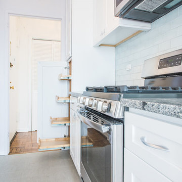
This small kitchen was way too small for this 2 bedrooms, 2 bathrooms apartment. Not only was it a very small kitchen, but the physical location of it made it very difficult to make it any bigger. There wasn't much that could have been done without incurring astronomical cost, which would get little or no return on the investment. The client wanted a kitchen that can be optimized in its current location to add a ton of value for resale.
This was difficult to do, because there was no moving of any mechanical around in the kitchen and even if we wanted to, the management of the building would not allow. For those of you who live in condos, co-ops or apartment building, you know how difficult it is to rework these foot prints. When we showed up, we saw the problems, but we also saw a huge opportunity where we can achieve those goals in the small space. This was accomplished by making some key changes and to incorporate some new things that was not possible when this kitchen was built years ago.
The crucial part of the design that would drive the entire new layout, was selecting the only appliance; that was the Refrigerator. Once we nailed down that refrigerator, we then proceeded to design the kitchen around it. We moved it to the other side of the wall where the sink was so that we can tap into the water line from the sink plumbing. It was crucial that it stays exactly 24" deep, not an inch more because we had to keep the entry as open as possible. Also, it was going to be directly in front of another big storage unit - The pantry. It is not ideal in most cases, but we needed the rest of the space to ramp up the design and open feel towards the side where all of the activities would take place, which happend to be the dining room and the view.
Once all that was figured out, we re-positioned the sink, dishwasher and the range and proceeded to wrap the cabinets around the columns to integrate them into the space. Thirty- six inches cabinets height was used so that they can be installed higher towards the ceiling height to give more room rather than the standard 18" required height between the counter tops. This was done to make the room feel a lot bigger than it really was. Not to mention, we also didn't want the faucet to be buried under the cabinets so that was also a necessary design detail for the space.
We then lowered both knee walls so that the counter top can sit on top of them, by removing that stop point that would have otherwise defined the kitchen area. This allowed us to pick up that extra footprint into the room for added prep space and enabled us to create the illusion of a kitchen that is looking longer than it really is. Every inch mattered when designing this kitchen and we made a conscious decision to use every one of that inch.
White cabinets were selected to do just what white cabinets are design to do; make a small or dark room appear bigger, brighter and more open. In this kitchen, this was amplified the more because of the kitchen location. It was perfect! We knew we did justice to the space because while we were there taking some photos, a few potential buyers walked in and went straight for the kitchen! They said its design just to fit the apartment.
Pantry roll out shelving, Double recycle bin, fancy handles, LED lighting, Quartz counter top, beautiful backslash tiles and grey linen floors finished off the kitchen which looked over a beautiful view of the George Washington Bridge from the top of this lovely 4th floor apartment.
Credit to Masterpiece Tile and Marble (Annmarie on the selection of Tiles and countertop and Val on the Construction to complete this project).
Davor Kokic Photography
 Paul Arcoite
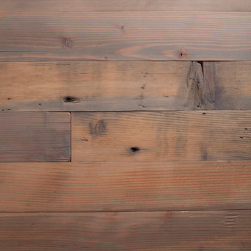
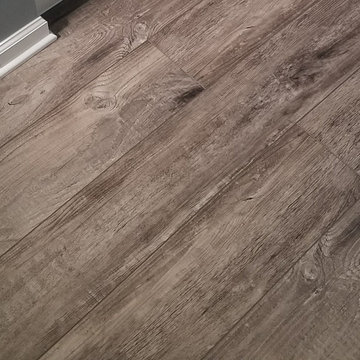
Reclaimed fir T&G with faded grey finish.
Photo: Sterling Lorence
Example of a beach style deck design in Vancouver
Example of a beach style deck design in Vancouver
 Gaile Guevara
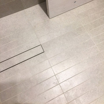
| DETAILS | in concrete constructed condos it's very rare that we ever want to have to core new drain locations. For the Master Ensuite more and more when we do full renovations down to studs we are removing the terrible 5' tubs and tiny itty bitty 3x3' showers. For some reason the idea of luxury meant squeeze as much as you can so you have a long list of features when you go to market. More and more we are doing oversized his and hers showers. So when you have a drain that you are repurposing from previous plumbing fixtures and the drain isn't centred, it's pretty much magic to have the team surprise you after several site meetings and evaluations - we opted for the plumbers favourite to use Schluter linear tile over drains and have the oversized tile cut to fit and provide the necessary grout lines for a flush shower threshold. This might seem like nothing but is everything when we have the perfect tile layout be inline with the what we think is a centred drain. These are the kind of details that make my OCD sister inside so happy, we call it the centre flush drain happy dance. Kudos to @caisleydevelopments @4thdimensionconstruction with the help of @stonetilevancouver for finding a perfect subtle sand toned oversized porcelain. A large format tile in a shade and same tone value as our hardwood floor and one shade darker than our Baltic Birch flush panels for ease of cleaning and hiding dirt. When you want things clean I opt for showers with minimal detailing to be in shades darker than white. Cleaning becomes less treacherous. Also gone is this idea of ugly accent tile, we opt for uniform tile one material throughout a bathroom floor to ceiling and if possible all walls. Construction geekery 101 continues
Find the right local pro for your project

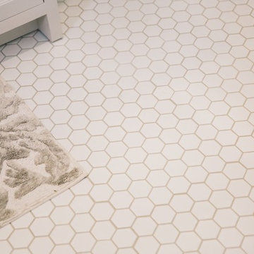
 South Cypress
White hexagon tile flooring was a classic, affordable choice for this guest bathroom.
Example of a mid-sized transitional 3/4 white tile and porcelain tile porcelain tile alcove bathtub design in Birmingham with shaker cabinets, white cabinets, a one-piece toilet, white walls, an undermount sink and solid surface countertops
Example of a mid-sized transitional 3/4 white tile and porcelain tile porcelain tile alcove bathtub design in Birmingham with shaker cabinets, white cabinets, a one-piece toilet, white walls, an undermount sink and solid surface countertops
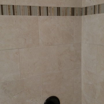
 Copper Creek Homes
Mid-sized elegant kids' beige tile and porcelain tile ceramic tile alcove bathtub photo with an undermount sink, shaker cabinets, dark wood cabinets, granite countertops, a two-piece toilet and beige walls



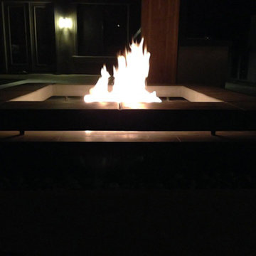
 Bianchi Design
Kirk Bianchi created this resort like setting for a couple from Mexico City. They were looking for a contemporary twist on traditional themes, and Luis Barragán was the inspiration. The outer walls were painted a darker color to recede, while floating panels of color and varying heights provided sculptural interest and opportunities for lighting and shadow.
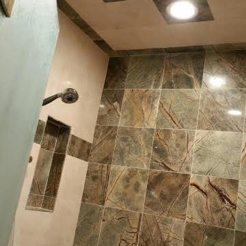

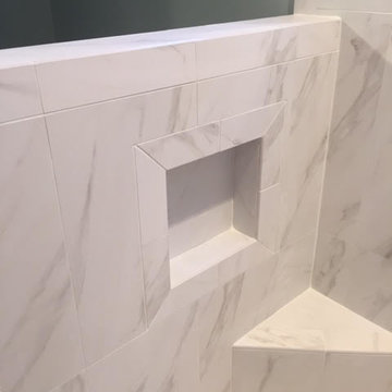
 Northshore Renovations
Inspiration for a transitional master gray tile and marble tile pebble tile floor and brown floor freestanding bathtub remodel in New Orleans with gray walls
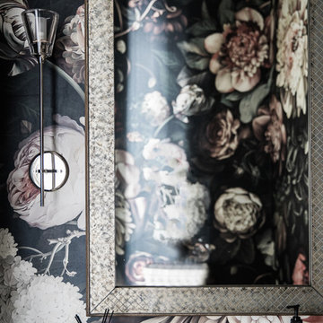

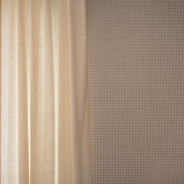

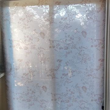
 ResCom Designs
This patterned roller shade provides privacy, style and light control on this patio door in Etobicoke.
Example of a mid-sized minimalist single-wall medium tone wood floor eat-in kitchen design in Toronto
Example of a mid-sized minimalist single-wall medium tone wood floor eat-in kitchen design in Toronto

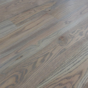

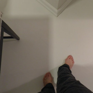
 User
UserFloor primer: Zinsser Bullseye 1-2-3 latex
Floor paint: Valspar Porch and Floor Paint in white. Latex
Home design - mid-sized transitional master painted wood floor home design idea with gray walls and no fireplace
Home design - mid-sized transitional master painted wood floor home design idea with gray walls and no fireplace
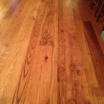
 Historic Flooring LLC
The Old Growth Red Oak Flooring really compliments the light cabinets and teal island. The entryway has end grain cobblestone design. We can produce the cobblestone from any species in our inventory :)
All of our flooring is custom crafted according to your specifications. We will deliver right to your doorstep!


 Flores Artscape, Inc.
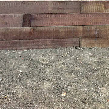
A close-up of part of a railroad tie retaining wall with decomposed granite in front along with one of the flowering drought-tolerant plant.
Inspiration for a traditional landscaping in Los Angeles.
Inspiration for a traditional landscaping in Los Angeles.
 Valerie J Johnson Custom Tailored Home Furnishings
Example of a mid-sized transitional porcelain tile hallway design in Kansas City with beige walls

6