
Search results for "Visual identity" in Home Design Ideas
 SM Design
Bridle Path Residence — Luxury Wellness Bathroom & Hydrotherapy Suite
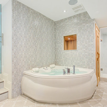
This Bridle Path Residence bathroom is conceived as a private hydrotherapy retreat, bringing a resort-like wellness experience into the home while maintaining the architectural detailing and craftsmanship of the residence. The design is less about creating a conventional bathroom and more about establishing a dedicated space for relaxation, recovery, and ritual.
The hydrotherapy tub becomes the central sculptural element of the room. Its generous curved profile creates a soft, organic focal point against the highly detailed wall treatment, while the integrated jets and ergonomic form emphasize the room's wellness-driven purpose. Positioning the tub within the main architectural composition gives it the presence of a luxury amenity rather than treating it as a standard fixture.
The walls are enveloped in a small-format decorative mosaic with an intricate, almost textile-like pattern. This repeated surface creates remarkable visual depth and gives the room a distinctly crafted quality. The subtle variation within the mosaic prevents the predominantly light palette from feeling flat, while its fine geometry provides a counterpoint to the smooth, sculptural tub.
A particularly thoughtful feature is the integrated sauna viewing window, which creates a visual relationship between the hydrotherapy area and the warm timber sauna beyond. The opening turns the sauna into part of the overall composition and establishes a clear sequence of wellness experiences—hydrotherapy, heat, and showering—within one cohesive suite.
The adjacent shower introduces a contrasting material language. Large-format marble-look surfaces create a cleaner, more serene backdrop, while the vertical patterned accent strip adds a strong decorative moment. This controlled use of pattern prevents the space from becoming visually overwhelming and gives the shower its own identity.
The sauna itself introduces warmth through natural timber, creating an immediate sensory contrast with the cool, pale surfaces surrounding it. The wood adds depth and reinforces the feeling of a private spa retreat, while the glass enclosure maintains openness and allows the different wellness zones to remain visually connected.
The flooring continues the decorative approach with a carefully patterned layout that complements the wall mosaic without simply repeating it. This creates a layered surface treatment in which scale, geometry, and texture work together to give the room a highly customized character.
Even the circulation area is treated as part of the design experience. The glass door and open stair connection allow light to move through the space, while the traditional architectural detailing visible beyond the bathroom establishes continuity with the broader residence.
The overall concept is residential wellness with an emphasis on craftsmanship and sensory experience. Decorative mosaic, natural timber, glass, stone-inspired surfaces, sculptural plumbing, and carefully integrated wellness features create a room that feels more like a private boutique spa than a conventional home bathroom.
 Identity Design Studio by Olena Lemak
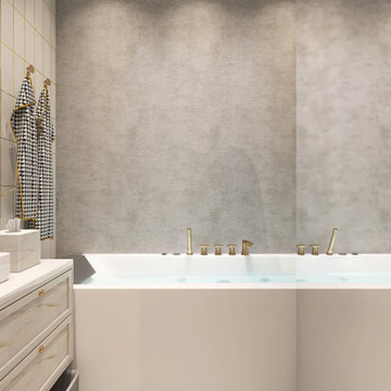
This compact bathroom combines full bathing comfort with a bold, highly individual material palette. A built-in jetted tub uses the width of the room efficiently, while deck-mounted brass fixtures and an overhead shower provide flexible everyday use. The calm gray concrete-look wall balances the graphic white-and-gold floor, marble-look vanity, and patterned textiles. These contrasting elements give the bathroom a lighter and more expressive identity while maintaining a visual connection with the apartment’s industrial character.
 Identity Design Studio by Olena Lemak
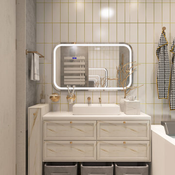
This compact bathroom combines full bathing comfort with a bold, highly individual material palette. A built-in jetted tub uses the width of the room efficiently, while deck-mounted brass fixtures and an overhead shower provide flexible everyday use. The calm gray concrete-look wall balances the graphic white-and-gold floor, marble-look vanity, and patterned textiles. These contrasting elements give the bathroom a lighter and more expressive identity while maintaining a visual connection with the apartment’s industrial character.
Find the right local pro for your project
 Identity Design Studio by Olena Lemak
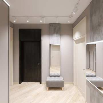
This compact apartment entryway combines storage, seating, mirrors, and clear circulation within a narrow footprint. A floor-to-ceiling wardrobe keeps coats, shoes, and everyday items concealed close to the entrance, while the upholstered bench provides a comfortable place to sit. Full-length and illuminated mirrors support daily routines and visually expand the hallway by reflecting light and adjacent spaces. Dark interior doors, textured wall panels, and flexible track lighting add depth and contrast to the otherwise light, practical composition.
 Identity Design Studio by Olena Lemak
This compact apartment entryway combines storage, seating, mirrors, and clear circulation within a narrow footprint. A floor-to-ceiling wardrobe keeps coats, shoes, and everyday items concealed close to the entrance, while the upholstered bench provides a comfortable place to sit. Full-length and illuminated mirrors support daily routines and visually expand the hallway by reflecting light and adjacent spaces. Dark interior doors, textured wall panels, and flexible track lighting add depth and contrast to the otherwise light, practical composition.
 Identity Design Studio by Olena Lemak
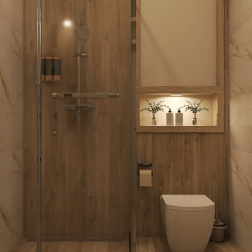
This view focuses on a compact storage composition built around the toilet and shower. A softly illuminated niche keeps frequently used toiletries accessible, while the concealed cabinet above provides additional storage without occupying valuable floor area. Wood-look surfaces bring warmth to the shower and storage wall, while marble-look tiles add lightness and subtle contrast. The clear glass enclosure preserves visual depth and allows the different finishes to read as one calm, cohesive bathroom.
 Identity Design Studio by Olena Lemak
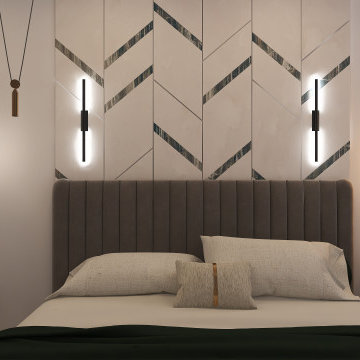
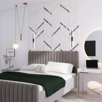
This close-up shows how layered lighting brings flexibility to a compact primary bedroom. Rather than relying on a single ceiling fixture, vertical wall sconces, suspended bedside lights, and a softly backlit mirror create separate pools of light for reading, working, and winding down. Behind the upholstered headboard, custom geometric panels with marble-look inlays add rhythm and individuality while keeping the room calm and visually uncluttered.


 Identity Design Studio by Olena Lemak
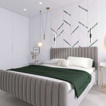
This angle focuses on the storage strategy within a compact 16 m² primary bedroom. Floor-to-ceiling fitted wardrobes use the full height of the wall, while flat white fronts recede visually and provide generous storage without making the room feel heavy. The layout preserves comfortable circulation around a large upholstered bed and keeps the adjacent workspace easily accessible. Deep green bedding adds a personal, grounding accent to the otherwise light and neutral palette.
 Identity Design Studio by Olena Lemak
A compact desk beside the bed creates a flexible workspace and vanity without requiring a separate room. Its marble-look top, slim gold frame, and large backlit mirror keep the composition visually light, while natural daylight, indoor greenery, and a sculptural chair make the area comfortable for working or getting ready. Careful zoning allows the desk to coexist with the sleeping and storage areas while preserving comfortable circulation within the 16 m² bedroom.
 Identity Design Studio by Olena Lemak
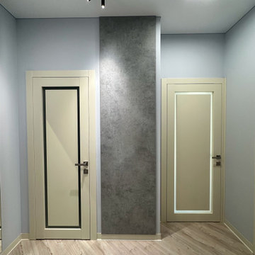
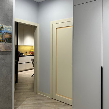
This narrow apartment corridor is designed to provide clear, comfortable circulation while using the available wall space efficiently. Floor-to-ceiling cabinetry creates generous concealed storage without obstructing the passage. Light wood flooring and pale doors visually extend the hallway, while a concrete-look accent surface, artwork, and linear lighting add depth and character. The open view towards the kitchen also creates a natural connection between adjoining spaces.
 Identity Design Studio by Olena Lemak
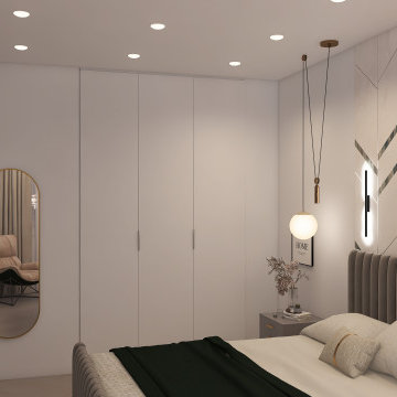
This evening view shows how a full storage wall, dressing mirror, and wall-mounted TV can fit into a compact bedroom without competing with the sleeping area. Handleless white wardrobes blend into the surrounding walls, concealing generous storage and reducing visual clutter. A full-length arched mirror supports the dressing routine while reflecting light and creating a greater sense of depth. Recessed ceiling lights provide practical overall illumination, while the bedside pendant and wall lights create a softer atmosphere for evening relaxation.
 Skypak GmbH
Airport codes are among the most concise and recognisable symbols of international travel. Created to identify destinations with precision, three-letter combinations such as FRA, JFK and SYD have acquired a meaning that extends far beyond logistics. They can evoke the memory of an arrival, the feeling of returning home or the anticipation of a journey still to come.
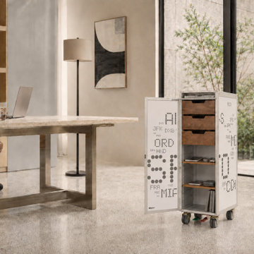
The Skypak Airline Trolley – Airport Codes Edition translates this universal visual language into a distinctive piece of contemporary furniture. Airport codes in a dot-matrix-inspired typeface extend across the door and side panels, giving the characteristic trolley silhouette a graphic identity connected to destinations around the world.
Constructed from aluminium and stainless steel, the full-size trolley measures approximately 103 centimetres high, 30 centimetres wide and 40 centimetres deep. Its compact proportions preserve valuable floor space, while integrated wheels allow it to be moved easily between different areas.
The interior can be individually configured with drawers, shelves and storage elements. In the contemporary home office shown here, dark wooden drawers introduce warmth and material contrast, while the open lower shelves provide accessible storage for books, devices and everyday work essentials. Positioned beside the desk, the trolley functions as a mobile storage cabinet without visually overwhelming the room.
Its flexibility also allows the Airport Codes Edition to take on different roles in other interiors. It can serve as an exclusive minibar in a private residence, a mobile bar in a lounge, a coffee station in an office or a compact service and storage unit in a hotel suite.
This versatility reflects Skypak’s approach to functional design: creating furniture that combines mobility, technical clarity and a strong visual narrative. For architects and interior designers, the trolley offers a characterful focal point that can be integrated into residential, hospitality and executive environments.
More than a practical storage solution, the Airline Trolley – Airport Codes Edition expresses an enduring fascination with aviation and the personal stories associated with destinations around the world.
(AI-assisted visualalisation of a real product.)
 Mamaar Studio
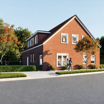
This remodeling project focused on revitalizing a 25-year-old residence while preserving its original architectural character. The client's vision was to maintain the existing exterior appearance, with targeted upgrades including brick refurbishment, updated window frames, and refreshed exterior trims to give the home a renewed and contemporary feel without altering its identity.
The interior underwent a more comprehensive transformation. The scope included new flooring throughout the home, updated wall and ceiling finishes, redesigned lighting schemes, and complete bathroom renovations. The furniture layout was intentionally left flexible, allowing the client to explore and finalize furnishing options independently while visualizing the renovated spaces.
The project was modeled in SketchUp and rendered using D5 Render, providing realistic visualizations that helped communicate the proposed improvements and guide design decisions throughout the renovation process.

Sponsored
Columbus, OH

Snider & Metcalf Interior Design, LTD
Leading Interior Designers in Columbus, Ohio & Ponte Vedra, Florida
 Mamaar Studio
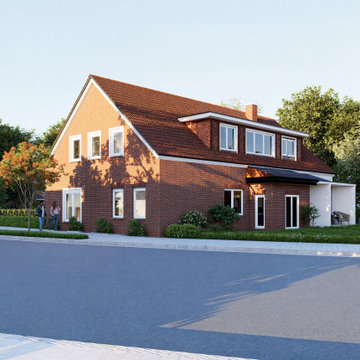
This remodeling project focused on revitalizing a 25-year-old residence while preserving its original architectural character. The client's vision was to maintain the existing exterior appearance, with targeted upgrades including brick refurbishment, updated window frames, and refreshed exterior trims to give the home a renewed and contemporary feel without altering its identity.
The interior underwent a more comprehensive transformation. The scope included new flooring throughout the home, updated wall and ceiling finishes, redesigned lighting schemes, and complete bathroom renovations. The furniture layout was intentionally left flexible, allowing the client to explore and finalize furnishing options independently while visualizing the renovated spaces.
The project was modeled in SketchUp and rendered using D5 Render, providing realistic visualizations that helped communicate the proposed improvements and guide design decisions throughout the renovation process.
 Rachelle Design Studio
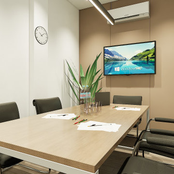
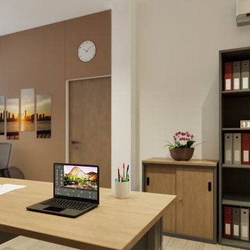
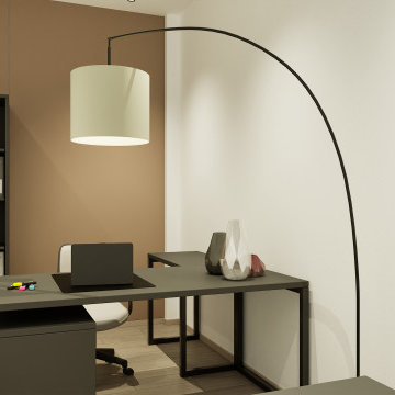
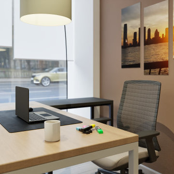
Designing a modern accounting firm requires a delicate balance between focused functionality, acoustic privacy, and a welcoming atmosphere for visiting clients. For this commercial project located in Coimbra, Portugal, Rachelle Design Lab implemented a "Warm Minimalism" concept to move away from the traditional, sterile office environment.
Key Features & Solutions:
Acoustic & Visual Comfort: Extensive use of vertical wood-slatted panels not only adds warmth and visual height to the space but also significantly improves the acoustic quality of the open-plan areas.
Smart Space Planning: Frameless glass partitions with frosted linear decals were strategically used to divide private meeting rooms and executive offices. This ensures acoustic privacy while allowing natural light to penetrate deep into the workspace.
Employee Well-being: A fully equipped, ergonomic kitchenette and dining area was designed using calming taupe tones and durable materials, providing a comfortable space for staff breaks.
Brand Integration: The color palette relies on calming neutrals (sand, light oak, grey) accented with deep burgundy tones that subtly echo the corporate identity of the company.
The result is a highly functional, ergonomic workspace that promotes productivity while reflecting the company's reliability and modern approach.
 SM Design
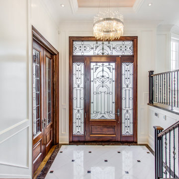
Bridle Path Residence — Grand Traditional Entrance
This Bridle Path Residence entry is designed around the idea of a formal architectural arrival, where craftsmanship, proportion, and heritage-inspired detailing create an immediate sense of permanence. Rather than treating the foyer as simply a passage into the home, the design gives the entrance its own identity and establishes a sophisticated visual language from the moment of arrival.
The custom wood entry door is the defining architectural element. Richly stained timber brings warmth and depth to the predominantly light interior, while the extensive decorative glasswork introduces a handcrafted quality. The intricate leaded-glass pattern combines geometric structure with ornamental curves, creating a focal point that feels timeless rather than tied to a particular trend.
The surrounding architecture intentionally remains restrained. Crisp white wall panelling and tailored trim provide a quiet backdrop for the richness of the door, allowing the craftsmanship of the entry to take center stage. This contrast between the clean architectural envelope and the detailed timber and glasswork gives the foyer a refined sense of hierarchy.
The marble floor reinforces the formality of the entrance. Its light field and dark border create a tailored, almost estate-inspired foundation, while the small geometric insets add another layer of detail without competing with the door. The reflective stone also amplifies natural and artificial light, making the relatively compact entry feel brighter and more expansive.
Above, the crystal chandelier introduces a moment of understated glamour. Its cascading form draws the eye upward toward the coffered ceiling and reinforces the verticality of the foyer. The combination of sparkling crystal, polished stone, stained wood, and painted millwork creates a carefully balanced material palette.
The staircase and railing extend the traditional character of the entrance into the circulation space. Decorative metalwork adds rhythm and craftsmanship along the stair edge, while the open railing maintains visual connection between the levels. A sculptural artwork positioned along the stair further reinforces the idea that the circulation areas are treated as curated architectural spaces rather than secondary zones.
The overall design is rooted in timeless elegance and craftsmanship. Rich natural wood, ornamental glazing, marble, refined millwork, decorative metalwork, and crystal lighting are brought together with disciplined proportions so that the space feels luxurious without becoming overly ornate. The result is a grand yet welcoming entrance with a distinctly sophisticated, enduring character.
 Rachelle Design Studio
Designing a modern accounting firm requires a delicate balance between focused functionality, acoustic privacy, and a welcoming atmosphere for visiting clients. For this commercial project located in Coimbra, Portugal, Rachelle Design Lab implemented a "Warm Minimalism" concept to move away from the traditional, sterile office environment.
Key Features & Solutions:
Acoustic & Visual Comfort: Extensive use of vertical wood-slatted panels not only adds warmth and visual height to the space but also significantly improves the acoustic quality of the open-plan areas.
Smart Space Planning: Frameless glass partitions with frosted linear decals were strategically used to divide private meeting rooms and executive offices. This ensures acoustic privacy while allowing natural light to penetrate deep into the workspace.
Employee Well-being: A fully equipped, ergonomic kitchenette and dining area was designed using calming taupe tones and durable materials, providing a comfortable space for staff breaks.
Brand Integration: The color palette relies on calming neutrals (sand, light oak, grey) accented with deep burgundy tones that subtly echo the corporate identity of the company.
The result is a highly functional, ergonomic workspace that promotes productivity while reflecting the company's reliability and modern approach.
Sponsored
Columbus, OH
Snider & Metcalf Interior Design, LTD
Leading Interior Designers in Columbus, Ohio & Ponte Vedra, Florida
 Rachelle Design Studio
Designing a modern accounting firm requires a delicate balance between focused functionality, acoustic privacy, and a welcoming atmosphere for visiting clients. For this commercial project located in Coimbra, Portugal, Rachelle Design Lab implemented a "Warm Minimalism" concept to move away from the traditional, sterile office environment.
Key Features & Solutions:
Acoustic & Visual Comfort: Extensive use of vertical wood-slatted panels not only adds warmth and visual height to the space but also significantly improves the acoustic quality of the open-plan areas.
Smart Space Planning: Frameless glass partitions with frosted linear decals were strategically used to divide private meeting rooms and executive offices. This ensures acoustic privacy while allowing natural light to penetrate deep into the workspace.
Employee Well-being: A fully equipped, ergonomic kitchenette and dining area was designed using calming taupe tones and durable materials, providing a comfortable space for staff breaks.
Brand Integration: The color palette relies on calming neutrals (sand, light oak, grey) accented with deep burgundy tones that subtly echo the corporate identity of the company.
The result is a highly functional, ergonomic workspace that promotes productivity while reflecting the company's reliability and modern approach.
 Rachelle Design Studio
Designing a modern accounting firm requires a delicate balance between focused functionality, acoustic privacy, and a welcoming atmosphere for visiting clients. For this commercial project located in Coimbra, Portugal, Rachelle Design Lab implemented a "Warm Minimalism" concept to move away from the traditional, sterile office environment.
Key Features & Solutions:
Acoustic & Visual Comfort: Extensive use of vertical wood-slatted panels not only adds warmth and visual height to the space but also significantly improves the acoustic quality of the open-plan areas.
Smart Space Planning: Frameless glass partitions with frosted linear decals were strategically used to divide private meeting rooms and executive offices. This ensures acoustic privacy while allowing natural light to penetrate deep into the workspace.
Employee Well-being: A fully equipped, ergonomic kitchenette and dining area was designed using calming taupe tones and durable materials, providing a comfortable space for staff breaks.
Brand Integration: The color palette relies on calming neutrals (sand, light oak, grey) accented with deep burgundy tones that subtly echo the corporate identity of the company.
The result is a highly functional, ergonomic workspace that promotes productivity while reflecting the company's reliability and modern approach.
 George Group Cabinetry
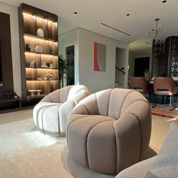
This perspective shows the natural visual connection between the casual living room and open dining area, highlighting the unified design language applied throughout the residence: the identical fish-scale hollow wood folding screens run through both zones to unify spatial style, realizing visual coherence while defining independent functional zones. Floor-to-ceiling customized illuminated display cabinets beside the TV wall continue the wood tone texture of the whole house, matching abstract wall art for subtle color echo with dining room decor. The open layout improves indoor ventilation and light transmission, creating a smooth, connected dynamic circulation for the entire public area of this private villa.
8