
Search results for "Visual identity" in Home Design Ideas
 KURV Architecture DPC (Alex Hughes Architects)
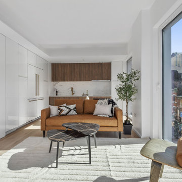
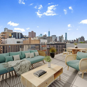
Located in the heart of Manhattan’s Lower East Side, the building was erected on a shallow commercial lot between two 120 year old masonry buildings and a new residential rental building. 330 Grand Street is a mix of 725 SF 1BRs and 1050 SF 2BR apartments. It also contains a 1100 SF two story duplex as well as private and public rooftop space, large private balconies for most units and two large private terraces for the ground floor units.
330 Grand Street was originally designed and approved at the NYC DOB as a prefabricated modular building. During the pandemic, as shipping costs skyrocketed putting the project at risk, we suggested redesigning the building as a reinforced cast-in-place concrete structure. Concrete was readily available and prices had not been affected by the demand increase that many other materials suffered in the pandemic. We took this opportunity to raise floor to ceiling heights, enlarge high performance windows and redistribute the buildings MEPFS and Structural Systems to create very open floor plans.
The challenge was to create a luxurious sensorial living experience with very limited means. In a city with very high construction costs, low cost residential buildings in the area are usually devoid of good quality, design and character. Our approach was to aim high for the end user, prioritizing natural light, open space with long visual perspectives, high ceilings and as always, rejecting the use of predefined building templates.
Our biggest challenge was to ensure that the small spaces feel as clean cut, large and bright as possible. Several unique design decisions were made to ensure low cost and high quality;
Floor plans were laid out so that spaces were wide open and free of clutter from mechanical or structural interruptions. Therefore all infrastructure was placed in lateral demising walls, which in turn act as the unit’s storage and kitchen. The apartments feel wide open, are super quiet and have more storage space than any other comparable apartment in the city.
To solve the problem of the site’s shallow commercial lot which is typically prone to dark interior spaces we focused our attention on the building’s envelope. Instead of the usual small punched window openings, oversized high performance windows were designed to ensure that light penetrated as far as possible into the units. In the smaller 1BR units, the full 50’ depth of the lot is perceived by partitioning spaces with sliding pocket doors that can be retracted to allow deep visual perspectives, making the sight lines in the space feel longer, larger, more ample than normal. In addition to the full height glazing, each unit above the 2nd floor receives a 7 foot covered balcony, adding 120 to 240 sf to each apartment, something unusual in New York City buildings. The space is large enough for a full size dining table, when the weather permits being outside.
We also worked hard to ensure modularity. For example, all kitchen units are all identical throughout the building. The idea of modularity and the economy of the repetitive unit is exercised to the maximum through the building.
Hardware, appliances, flooring, wall coverings and material finishes are all carefully selected to feel bespoke, high quality and unique.
It was important to KURV that the result of this work manifest into something that would deeply connect with the end user and sustain relationships with the consumers of this space.
All images by KURV Architecture ©
 NILES
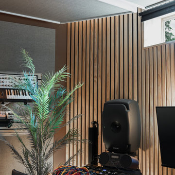
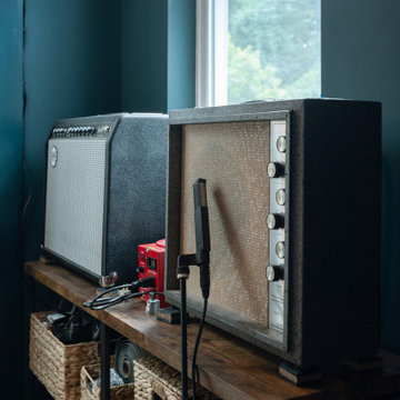
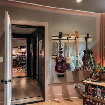
NILESThis 1,000ft² recording and production studio, built in 2021 for producer couple Latifah Alattas and Lucas Morton, was designed as a fully custom creative environment that supports writing, mixing, and collaboration at the highest level. Both Latifah and Lucas are multi-instrumentalists, engineers, and mixers, and the studio reflects the full range of their workflows—visually inspiring, technically precise, and intuitive in every room.
The facility was built from the ground up with a strong emphasis on architectural acoustics and plug-and-play connectivity. The layout includes two Control Rooms, multiple isolation booths, and shared common spaces, all tied together with seamless audio integration. No matter where you are in the studio, routing, monitoring, and communication remain effortless and consistent.
Behind the aesthetic, the acoustic design is exceptionally robust. Six independent floating-floor systems support the suites, ensuring each room operates with minimal sound transmission. Tailored sound-reducing wall assemblies, full-lite doors, engineered window systems, and intentional treatment plans deliver clarity, isolation, and precision for tracking and mixing. Each space is mechanically decoupled, allowing multiple rooms to run simultaneously without compromise.
For monitoring, both Latifah and Lucas chose Genelec “The Ones” series monitors with GLM calibration to ensure accurate translation and consistency across the entire facility.
Natural light and a warm, welcoming aesthetic anchor the visual identity of the studio, reflecting the creative energy and personality of its owners. The result is a highly functional, beautifully crafted space where ideas can move freely and production can happen without limitations.
 Texan Landscape Group LLC
Backsplash Adds Character, Structure & Identity to a Kitchen
A backsplash is one of the most underrated design elements in a kitchen.
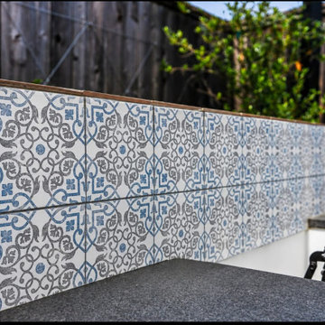
Beyond protecting walls from moisture, grease, and heat, it creates structure, depth, and personality throughout the entire space. A well-designed backsplash helps define the kitchen visually by adding contrast, texture, pattern, and architectural flow.
In this project, the custom tile selection transformed the kitchen from a standard cooking area into a statement feature with a clean modern aesthetic and strong visual identity.
The right backsplash can:
• Add warmth and character
• Create a focal point
• Tie together surrounding materials and finishes
• Make the kitchen feel more custom and intentional
• Elevate the overall architectural design
At Texan Landscape Group, we believe the small details are what make a project stand out.
Call/Text: 832-230-7277
https://landscapedesignhouston.com/contact/
Pro Tip:
Patterned backsplash tile can help break up flat surfaces and add movement, depth, and dimension to modern kitchen designs.
Find the right local pro for your project
 RWH Architect PLLC
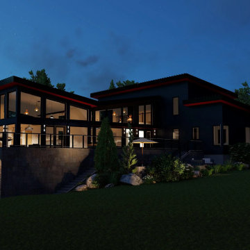
Whistle Hill Lot 2 residence stands as one of the most architecturally ambitious homes in the development, a striking example of RWH Architect’s commitment to elevating modern design. Defined by its dramatic butterfly roof and a façade composed of clean horizontal cladding, vertical accents, and expansive window groupings, the home captures a sculptural presence rarely seen in the region. This is a residence designed to open itself to its surroundings, embracing light, volume, and long views in a way that signals a new era of contemporary architecture.
The home features an attached three-car garage with an adjacent storage area, creating a practical yet visually streamlined entry sequence. Inside, the first floor is designed around livability and connection to the landscape. The foyer opens into a private office and then flows toward the main living areas. The master suite is intentionally tucked into a quiet corner on the first floor, positioned to overlook the backyard and shaped to allow morning light to filter softly into the space. Adjacent to the master suite is the laundry room, placed strategically for convenience. A secondary bedroom on the first floor includes a walk-in closet, and a nearby three-quarter bath offers flexibility for guests or extended family.
The kitchen serves as the central gathering point of the home, anchored by a large island and complemented by a walk-in pantry. It overlooks an expansive wraparound deck that transitions seamlessly to a lower patio, creating layered outdoor living spaces. Both the dining room and the great room open directly to the deck, enhancing the indoor-outdoor connection. The sunken great room is one of the home’s signature moments, featuring a floating fireplace that appears to hover within the space and accentuates the dramatic ceiling height created by the butterfly roof. The result is a room filled with daylight and volume, a contemporary living environment with an architectural presence that feels both bold and welcoming.
Upstairs, the second floor includes two additional bedrooms, each with walk-in closets, and a full bathroom designed with modern simplicity. From the upper level, the design allows for open views extending back toward the dining room, creating visual connectivity between floors and emphasizing the vertical openness of the home. This intentional play of volume heightens the spatial experience and enhances the sense of modern airiness throughout the interior.
This residence presented several unique design challenges that ultimately helped refine and elevate the final architectural expression. The sweeping butterfly roof created structural complexities due to its dramatic angles and its role in defining the home’s entire visual identity. RWH addressed this by carefully coordinating structural supports and framing patterns that allowed the roof to appear effortless while maintaining its sculptural form. Another significant challenge was balancing the extensive glazing with the need to preserve privacy and energy performance. RWH solved this by thoughtfully arranging high windows, angled openings, and varied window groupings that capture natural light without compromising comfort. Integrating a sunken great room with a floating fireplace required a precise approach to grading, floor transitions, and structural anchoring. Through detailed modeling and coordination, RWH ensured that the fireplace would appear weightless while remaining fully functional and safe. Creating uninterrupted views from the second floor to the dining room also required creative alignment of floor systems and rail detailing, which RWH resolved by designing sleek, integrated guardrails that preserve openness while meeting safety requirements.
Whistle Hill Lot 2 stands as a bold architectural statement and a defining example of the evolving design language within the development. Through innovative forms, expansive volumes, and carefully orchestrated transitions between indoor and outdoor spaces, RWH Architect has created a home that reflects the future of contemporary living in the area—forward-thinking, refined, and undeniably modern.
 NILES
NILESThis 1,000ft² recording and production studio, built in 2021 for producer couple Latifah Alattas and Lucas Morton, was designed as a fully custom creative environment that supports writing, mixing, and collaboration at the highest level. Both Latifah and Lucas are multi-instrumentalists, engineers, and mixers, and the studio reflects the full range of their workflows—visually inspiring, technically precise, and intuitive in every room.
The facility was built from the ground up with a strong emphasis on architectural acoustics and plug-and-play connectivity. The layout includes two Control Rooms, multiple isolation booths, and shared common spaces, all tied together with seamless audio integration. No matter where you are in the studio, routing, monitoring, and communication remain effortless and consistent.
Behind the aesthetic, the acoustic design is exceptionally robust. Six independent floating-floor systems support the suites, ensuring each room operates with minimal sound transmission. Tailored sound-reducing wall assemblies, full-lite doors, engineered window systems, and intentional treatment plans deliver clarity, isolation, and precision for tracking and mixing. Each space is mechanically decoupled, allowing multiple rooms to run simultaneously without compromise.
For monitoring, both Latifah and Lucas chose Genelec “The Ones” series monitors with GLM calibration to ensure accurate translation and consistency across the entire facility.
Natural light and a warm, welcoming aesthetic anchor the visual identity of the studio, reflecting the creative energy and personality of its owners. The result is a highly functional, beautifully crafted space where ideas can move freely and production can happen without limitations.
 NILES
NILESThis 1,000ft² recording and production studio, built in 2021 for producer couple Latifah Alattas and Lucas Morton, was designed as a fully custom creative environment that supports writing, mixing, and collaboration at the highest level. Both Latifah and Lucas are multi-instrumentalists, engineers, and mixers, and the studio reflects the full range of their workflows—visually inspiring, technically precise, and intuitive in every room.
The facility was built from the ground up with a strong emphasis on architectural acoustics and plug-and-play connectivity. The layout includes two Control Rooms, multiple isolation booths, and shared common spaces, all tied together with seamless audio integration. No matter where you are in the studio, routing, monitoring, and communication remain effortless and consistent.
Behind the aesthetic, the acoustic design is exceptionally robust. Six independent floating-floor systems support the suites, ensuring each room operates with minimal sound transmission. Tailored sound-reducing wall assemblies, full-lite doors, engineered window systems, and intentional treatment plans deliver clarity, isolation, and precision for tracking and mixing. Each space is mechanically decoupled, allowing multiple rooms to run simultaneously without compromise.
For monitoring, both Latifah and Lucas chose Genelec “The Ones” series monitors with GLM calibration to ensure accurate translation and consistency across the entire facility.
Natural light and a warm, welcoming aesthetic anchor the visual identity of the studio, reflecting the creative energy and personality of its owners. The result is a highly functional, beautifully crafted space where ideas can move freely and production can happen without limitations.

 safe ZOnea
Ask a kitchen designer in Chicago which countertop question comes up most and you will hear the same answer: white or off-white quartz, and which shade. Homeowners walk into showrooms with a photo saved on their phone, usually a bright, veined slab from a magazine spread, and leave an hour later realizing there are a dozen versions of that same look. The confusion is not about taste. It is about the fact that "white quartz" covers a huge range of patterns, undertones, and price points, and nobody explains the differences before the sale.
Older bungalows and newer builds alike are getting stripped of their dated laminate and butcher block in favor of quartz, and the reasons are practical rather than trendy. Quartz does not need sealing, resists the kind of staining that granite can suffer over decades, and holds up to the freeze-thaw humidity swings that Chicago basements and kitchens go through every year. Once a homeowner commits to quartz, though, the real decision starts: which white, and does the pattern justify the difference in cost.
This piece walks through three specific slabs that keep showing up in Chicago renovation projects, why designers reach for them in different rooms, and what actually separates a flat white surface from one with real depth. None of this requires a design background to follow. It is mostly about paying attention to how a slab behaves under kitchen lighting, how busy the vending gets, and how it photographs versus how it looks in person.
Why White Quartz Took Over Chicago Kitchens
Ten years ago, granite dominated Chicago kitchen remodels almost by default. It was durable, it looked expensive, and every fabricator in the metro area carried a wide range of colors. Quartz has since taken over that position, and the shift happened faster than most contractors expected. Engineered stone gave homeowners a more predictable surface, since natural granite varies slab to slab while quartz is manufactured to a consistent pattern batch after batch.
The other driver is light. Chicago winters are long and gray, and a lot of kitchens, especially in older two-flats and courtyard buildings, do not get much direct sun. A dark granite countertop in a dim kitchen can make the whole room feel smaller. White and light-toned quartz reflects what little natural light comes through the windows, and it makes a galley kitchen or a north-facing space feel noticeably brighter without touching the cabinetry or the layout.
There is also a resale argument that local real estate agents bring up constantly. White quartz photographs well for listings, reads as updated and low-maintenance to buyers touring in person, and does not compete visually with whatever cabinet color the next owner might prefer. It is a safer bet than a bold veined marble look or a colored quartz that might feel dated in five years.
Arctic White and the Cost Question
Among the flatter, more uniform whites, arctic white quartz price comes up constantly in budget conversations because the slab sits at a more approachable point than the heavily veined Italian-marble-inspired patterns. It reads as clean and bright without the busy movement that some homeowners find overwhelming in a small kitchen. Fabricators in the Chicago area tend to keep it in stock precisely because demand stays steady across both new construction and remodel projects.
Part of what keeps this slab affordable relative to its heavily patterned cousins comes down to manufacturing complexity. A quartz surface with minimal veining and a consistent white base is simpler to produce at scale than one that mimics the irregular, high-contrast movement of natural Calacatta marble. That production difference shows up directly in what a homeowner pays per square foot, and it is worth asking a fabricator to walk through that pricing before assuming every white quartz costs the same.
Homeowners planning a full kitchen, including an island, backsplash, and perimeter counters, often use a flatter white like this specifically because it lets other elements carry the visual interest. A patterned tile backsplash or a bold cabinet color reads more clearly against a calm countertop than against one already fighting for attention with heavy veining. Designers frequently pair simpler whites with statement lighting fixtures for exactly this reason.
What Makes Calacatta Patterns Different
Calacatta refers to a family of marble originally quarried in Italy, known for a bright white background broken up by bold, often gold-toned veining that moves in thick, dramatic streaks rather than thin gray lines. Natural Calacatta marble is soft, porous, and expensive to maintain, which is exactly why quartz manufacturers spent years developing engineered versions that replicate the look without the upkeep headaches.
The challenge with any Calacatta-style quartz is getting the veining to look organic instead of printed. Early generations of engineered stone struggled with repetitive patterns that gave away the fact the slab was manufactured rather than cut from actual marble. Modern digital printing and layering techniques have closed that gap considerably, and the better Calacatta-inspired quartz lines now vary the veining across each slab batch so two counters in the same kitchen do not look identical.
Chicago designers gravitate toward Calacatta patterns for kitchens that function as the visual centerpiece of an open floor plan, which describes a large share of the gut renovations happening in neighborhoods like Lincoln Park, Roscoe Village, and the North Shore suburbs. When the kitchen island is visible from the living room and dining area, a dramatic veined surface becomes part of the home's overall design language rather than a purely functional work surface.
Calacatta Arno Under Kitchen Lighting
One of the more popular options in this category, calacatta arno quartz, balances a warm white base with soft gray and gold veining that avoids looking too stark under the cooler LED lighting common in newer Chicago builds. Homeowners touring showrooms sometimes make the mistake of judging a slab entirely under warm incandescent lighting, then get surprised when the same surface looks slightly different once installed under their kitchen's actual fixtures.
What separates this particular pattern from flatter competitors is how the veining clusters rather than spreading evenly across the slab. That clustering mimics the way real quarried marble forms, with denser mineral deposits in some sections and cleaner stretches in others. Fabricators cutting a large island slab from a single piece will often orient the pattern intentionally so the busiest veining lands somewhere visually interesting rather than getting cut off at an edge.
Because the background reads warmer than a stark white, this pattern tends to pair well with brass or matte gold hardware, a combination that has been showing up repeatedly in Chicago kitchen remodels over the past few renovation seasons. Cabinet painters report a similar trend, with more clients requesting warm white or greige cabinet colors specifically because they complement this kind of veined quartz better than a cooler, blue-toned white would.
Silestone's Version of the Calacatta Look
Manufacturers compete directly in this Calacatta-inspired category, and silestone eternal calacatta gold represents one brand's specific take on the pattern, distinguished by richer gold veining set against a brighter white base than some competing slabs in the same family. Silestone has built a reputation around anti-bacterial surface treatments in addition to the standard quartz durability, a detail some homeowners specifically ask about for kitchens used heavily by families with young children.
The veining in this particular slab tends to run in longer, more continuous lines compared to the clustered pattern found in some other Calacatta-style options, which gives large island surfaces a sense of visual flow from one end to the other. Fabricators working with bigger islands, the kind increasingly common in open-concept Chicago remodels, often favor patterns like this because there is less need to worry about seams interrupting a busy, disconnected pattern.
Price positioning for this slab tends to sit toward the upper end of the engineered quartz category, reflecting both the brand's manufacturing process and the complexity of replicating that continuous gold veining consistently across production batches. Homeowners weighing this option against other Calacatta-style quartz should ask their fabricator directly about batch availability, since premium patterns sometimes have longer lead times than standard stock colors.
Living With Quartz Day to Day
Beyond how a slab looks in a showroom or a listing photo, the daily experience of owning quartz countertops matters more once the renovation dust settles. Quartz resists scratching far better than laminate and holds up to the acidic spills, hot pans, and general abuse of an active kitchen without the sealing maintenance that natural stone requires every year or two. That low-maintenance reputation is a large part of why quartz overtook granite in the first place.
Heat resistance is a detail that gets less attention than it should. While quartz handles moderate heat well, manufacturers generally recommend using a trivet or pad for very hot pots straight off the stove, since sudden temperature shock can occasionally cause stress marks in the resin binder that holds the engineered stone together. This is a minor precaution rather than a major limitation, but it is worth mentioning to anyone assuming quartz is entirely indestructible.
Cleaning routines stay simple across almost every pattern in this category. A damp cloth and mild soap handle daily messes, and the nonporous surface means wine, coffee, and tomato-based sauces do not soak in the way they can with unsealed granite or marble. Homeowners moving from an older stone counter often mention how much less they worry about everyday spills once quartz is installed, which is a quality-of-life change that rarely makes it into the initial design conversation.
Choosing Between the Three
There is no single correct answer among these three slabs, and that is exactly why they keep coming up together in the same design conversations across Chicago renovation projects. A flatter white with minimal veining suits kitchens where other elements need to carry the visual interest, while a bolder Calacatta-inspired pattern makes sense when the countertop itself is meant to be the centerpiece of an open floor plan.
Budget matters too, and it is worth having a direct conversation with a fabricator about where each option lands before falling in love with a specific slab in a showroom. Lighting, cabinet color, and how the kitchen connects to the rest of the home all play into which pattern will actually look right once installation is finished rather than just in a photo.
Whatever direction a homeowner leans, seeing a full slab in person under actual kitchen lighting remains the single most useful step before signing off. Photos only go so far once the countertop is sitting in the room it will live in for years.
Sponsored
Columbus, OH

Snider & Metcalf Interior Design, LTD
Leading Interior Designers in Columbus, Ohio & Ponte Vedra, Florida
 KURV Architecture DPC (Alex Hughes Architects)
Located in the heart of Manhattan’s Lower East Side, the building was erected on a shallow commercial lot between two 120 year old masonry buildings and a new residential rental building. 330 Grand Street is a mix of 725 SF 1BRs and 1050 SF 2BR apartments. It also contains a 1100 SF two story duplex as well as private and public rooftop space, large private balconies for most units and two large private terraces for the ground floor units.
330 Grand Street was originally designed and approved at the NYC DOB as a prefabricated modular building. During the pandemic, as shipping costs skyrocketed putting the project at risk, we suggested redesigning the building as a reinforced cast-in-place concrete structure. Concrete was readily available and prices had not been affected by the demand increase that many other materials suffered in the pandemic. We took this opportunity to raise floor to ceiling heights, enlarge high performance windows and redistribute the buildings MEPFS and Structural Systems to create very open floor plans.
The challenge was to create a luxurious sensorial living experience with very limited means. In a city with very high construction costs, low cost residential buildings in the area are usually devoid of good quality, design and character. Our approach was to aim high for the end user, prioritizing natural light, open space with long visual perspectives, high ceilings and as always, rejecting the use of predefined building templates.
Our biggest challenge was to ensure that the small spaces feel as clean cut, large and bright as possible. Several unique design decisions were made to ensure low cost and high quality;
Floor plans were laid out so that spaces were wide open and free of clutter from mechanical or structural interruptions. Therefore all infrastructure was placed in lateral demising walls, which in turn act as the unit’s storage and kitchen. The apartments feel wide open, are super quiet and have more storage space than any other comparable apartment in the city.
To solve the problem of the site’s shallow commercial lot which is typically prone to dark interior spaces we focused our attention on the building’s envelope. Instead of the usual small punched window openings, oversized high performance windows were designed to ensure that light penetrated as far as possible into the units. In the smaller 1BR units, the full 50’ depth of the lot is perceived by partitioning spaces with sliding pocket doors that can be retracted to allow deep visual perspectives, making the sight lines in the space feel longer, larger, more ample than normal. In addition to the full height glazing, each unit above the 2nd floor receives a 7 foot covered balcony, adding 120 to 240 sf to each apartment, something unusual in New York City buildings. The space is large enough for a full size dining table, when the weather permits being outside.
We also worked hard to ensure modularity. For example, all kitchen units are all identical throughout the building. The idea of modularity and the economy of the repetitive unit is exercised to the maximum through the building.
Hardware, appliances, flooring, wall coverings and material finishes are all carefully selected to feel bespoke, high quality and unique.
It was important to KURV that the result of this work manifest into something that would deeply connect with the end user and sustain relationships with the consumers of this space.
All images by KURV Architecture ©
 Square Footage Inc.
Photos by Valerie Wilcox
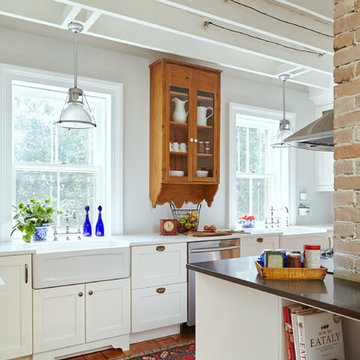
Example of a mid-sized transitional u-shaped medium tone wood floor enclosed kitchen design in Toronto with a farmhouse sink, shaker cabinets, white cabinets, marble countertops, multicolored backsplash, stone tile backsplash, stainless steel appliances and an island
Example of a mid-sized transitional u-shaped medium tone wood floor enclosed kitchen design in Toronto with a farmhouse sink, shaker cabinets, white cabinets, marble countertops, multicolored backsplash, stone tile backsplash, stainless steel appliances and an island
 Architecture BRIO
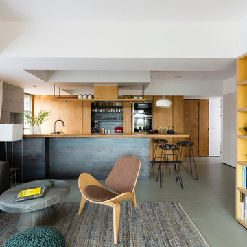
The living room and the open kitchen although connected are spatially defined due to the shift in the walls and the yellow stained birch plywood bookcase.
Jignesh Jhaveri
 KURV Architecture DPC (Alex Hughes Architects)
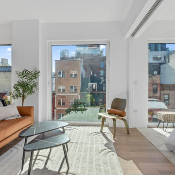
Located in the heart of Manhattan’s Lower East Side, the building was erected on a shallow commercial lot between two 120 year old masonry buildings and a new residential rental building. 330 Grand Street is a mix of 725 SF 1BRs and 1050 SF 2BR apartments. It also contains a 1100 SF two story duplex as well as private and public rooftop space, large private balconies for most units and two large private terraces for the ground floor units.
330 Grand Street was originally designed and approved at the NYC DOB as a prefabricated modular building. During the pandemic, as shipping costs skyrocketed putting the project at risk, we suggested redesigning the building as a reinforced cast-in-place concrete structure. Concrete was readily available and prices had not been affected by the demand increase that many other materials suffered in the pandemic. We took this opportunity to raise floor to ceiling heights, enlarge high performance windows and redistribute the buildings MEPFS and Structural Systems to create very open floor plans.
The challenge was to create a luxurious sensorial living experience with very limited means. In a city with very high construction costs, low cost residential buildings in the area are usually devoid of good quality, design and character. Our approach was to aim high for the end user, prioritizing natural light, open space with long visual perspectives, high ceilings and as always, rejecting the use of predefined building templates.
Our biggest challenge was to ensure that the small spaces feel as clean cut, large and bright as possible. Several unique design decisions were made to ensure low cost and high quality;
Floor plans were laid out so that spaces were wide open and free of clutter from mechanical or structural interruptions. Therefore all infrastructure was placed in lateral demising walls, which in turn act as the unit’s storage and kitchen. The apartments feel wide open, are super quiet and have more storage space than any other comparable apartment in the city.
To solve the problem of the site’s shallow commercial lot which is typically prone to dark interior spaces we focused our attention on the building’s envelope. Instead of the usual small punched window openings, oversized high performance windows were designed to ensure that light penetrated as far as possible into the units. In the smaller 1BR units, the full 50’ depth of the lot is perceived by partitioning spaces with sliding pocket doors that can be retracted to allow deep visual perspectives, making the sight lines in the space feel longer, larger, more ample than normal. In addition to the full height glazing, each unit above the 2nd floor receives a 7 foot covered balcony, adding 120 to 240 sf to each apartment, something unusual in New York City buildings. The space is large enough for a full size dining table, when the weather permits being outside.
We also worked hard to ensure modularity. For example, all kitchen units are all identical throughout the building. The idea of modularity and the economy of the repetitive unit is exercised to the maximum through the building.
Hardware, appliances, flooring, wall coverings and material finishes are all carefully selected to feel bespoke, high quality and unique.
It was important to KURV that the result of this work manifest into something that would deeply connect with the end user and sustain relationships with the consumers of this space.
All images by KURV Architecture ©
 Elements Room
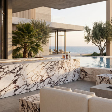
Luxury outdoor living space featuring 2cm Calacatta Viola Honed Marble, a distinctive Italian natural stone known for its dramatic burgundy veining against a creamy white background.
The marble is used as a statement material throughout the custom outdoor bar and surrounding architectural details, creating a bold yet refined visual identity. Neutral furnishings, warm wood accents, a contemporary fire pit, lush landscaping, and seamless integration with the infinity pool complete the space.
The result is a sophisticated modern outdoor retreat that combines natural stone, architecture, and coastal California living in a clean and luxurious composition.
 KURV Architecture DPC (Alex Hughes Architects)
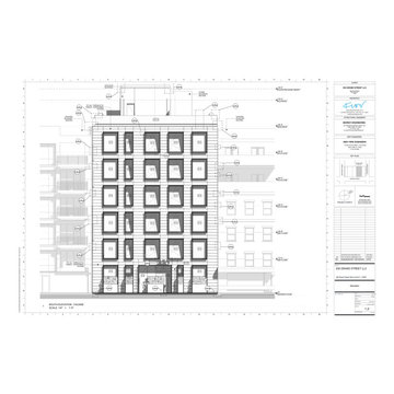
Located in the heart of Manhattan’s Lower East Side, the building was erected on a shallow commercial lot between two 120 year old masonry buildings and a new residential rental building. 330 Grand Street is a mix of 725 SF 1BRs and 1050 SF 2BR apartments. It also contains a 1100 SF two story duplex as well as private and public rooftop space, large private balconies for most units and two large private terraces for the ground floor units.
330 Grand Street was originally designed and approved at the NYC DOB as a prefabricated modular building. During the pandemic, as shipping costs skyrocketed putting the project at risk, we suggested redesigning the building as a reinforced cast-in-place concrete structure. Concrete was readily available and prices had not been affected by the demand increase that many other materials suffered in the pandemic. We took this opportunity to raise floor to ceiling heights, enlarge high performance windows and redistribute the buildings MEPFS and Structural Systems to create very open floor plans.
The challenge was to create a luxurious sensorial living experience with very limited means. In a city with very high construction costs, low cost residential buildings in the area are usually devoid of good quality, design and character. Our approach was to aim high for the end user, prioritizing natural light, open space with long visual perspectives, high ceilings and as always, rejecting the use of predefined building templates.
Our biggest challenge was to ensure that the small spaces feel as clean cut, large and bright as possible. Several unique design decisions were made to ensure low cost and high quality;
Floor plans were laid out so that spaces were wide open and free of clutter from mechanical or structural interruptions. Therefore all infrastructure was placed in lateral demising walls, which in turn act as the unit’s storage and kitchen. The apartments feel wide open, are super quiet and have more storage space than any other comparable apartment in the city.
To solve the problem of the site’s shallow commercial lot which is typically prone to dark interior spaces we focused our attention on the building’s envelope. Instead of the usual small punched window openings, oversized high performance windows were designed to ensure that light penetrated as far as possible into the units. In the smaller 1BR units, the full 50’ depth of the lot is perceived by partitioning spaces with sliding pocket doors that can be retracted to allow deep visual perspectives, making the sight lines in the space feel longer, larger, more ample than normal. In addition to the full height glazing, each unit above the 2nd floor receives a 7 foot covered balcony, adding 120 to 240 sf to each apartment, something unusual in New York City buildings. The space is large enough for a full size dining table, when the weather permits being outside.
We also worked hard to ensure modularity. For example, all kitchen units are all identical throughout the building. The idea of modularity and the economy of the repetitive unit is exercised to the maximum through the building.
Hardware, appliances, flooring, wall coverings and material finishes are all carefully selected to feel bespoke, high quality and unique.
It was important to KURV that the result of this work manifest into something that would deeply connect with the end user and sustain relationships with the consumers of this space.
All images by KURV Architecture ©


 RWH Architect PLLC
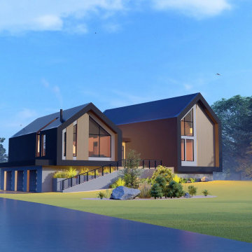
Set within a serene natural landscape and abutting the scenic Campbell's Scottish Highlands Golf Course, this striking custom modern home by RWH Architect blends contemporary architecture, functional living, and site-sensitive design into a residence that feels both dramatic and welcoming. Inspired by Scandinavian architectural principles and modern New England design, the home was carefully crafted to balance bold geometric forms with warm natural materials, creating a timeless luxury residence deeply connected to its surroundings. Expansive views overlooking the rolling fairways and natural landscape of the golf course further reinforce the home’s strong relationship to the site.
One of the primary design challenges of the project was fitting the home between two existing houses while maintaining a high level of privacy for both interior and exterior living spaces, while also maximizing expansive views of the course. Rather than allowing the surrounding structures to limit the design, RWH Architect carefully positioned and shaped the residence to create a sense of separation, openness, and visual connection where appropriate. Through thoughtful massing and strategic orientation, the home is able to open toward the golf course while shielding key living areas from neighboring properties, resulting in a balance of privacy, light, and uninterrupted views.
The architectural composition is defined by two soaring gabled structures connected through a recessed central entry, establishing a bold visual identity while maintaining clean, minimalist lines. A significant challenge in the design process was balancing the large-scale modern forms with a sense of warmth and livability. Through the use of natural wood accents, expansive glazing, and carefully proportioned massing, the home achieves a refined balance between contemporary minimalism and inviting residential comfort. Dark exterior cladding contrasts beautifully against warm materials and the surrounding landscape, allowing the structure to feel sophisticated without appearing cold or overpowering.
Another critical design challenge involved maximizing natural light while preserving energy efficiency and maintaining privacy throughout the home. RWH Architect carefully oriented the structure and strategically positioned the expansive floor-to-ceiling windows to capture sweeping golf course and landscape views while maintaining the comfort and privacy of the interior spaces. The result is a home filled with natural light that maintains a strong connection to the outdoors while still providing private, comfortable living environments.
Inside, the thoughtfully designed floor plan prioritizes openness, comfort, and flexibility for modern living. The residence was intentionally organized into two distinct architectural zones: a private wing dedicated to the bedrooms and personal retreats, and a public living wing centered around the kitchen, dining, and gathering spaces. This separation creates a natural balance between entertaining and privacy, allowing the home to function seamlessly for both intimate daily living and larger social gatherings.
The main living level centers around an expansive open-concept kitchen, dining area, and great room designed to function as the social heart of the home. One challenge within the interior layout was creating a highly open floor plan while still maintaining distinct functional zones and practical circulation. Through careful spatial planning, ceiling volume transitions, and strategic room positioning, the design creates separation without sacrificing openness. Large windows and direct access to the rear outdoor living spaces further reinforce the seamless indoor-outdoor connection, allowing the living spaces to fully embrace the surrounding views of the course and the natural landscape beyond.
Rather than existing on a single flat plane, the residence was thoughtfully designed across multiple levels that respond directly to the site’s natural topography. As occupants move through the home, subtle level changes and transitional stair sequences create a dynamic spatial experience that guides movement between the public and private zones of the residence. This layered circulation approach enhances the architectural character of the interior while creating moments of progression, discovery, and connection between spaces. The result is a home that feels immersive and expansive, where movement throughout the residence becomes part of the overall architectural experience itself.
The first floor also incorporates flexible private accommodations, including a guest suite with ensuite bathroom and additional secondary bedrooms positioned to create privacy away from the primary gathering spaces. This approach allows the residence to comfortably support multigenerational living, guests, and evolving family needs over time.
On the upper level, the luxurious primary suite serves as a private sanctuary complete with dual walk-in closets, a spacious spa-inspired bathroom, and access to a private balcony overlooking the property and adjacent golf course. Dedicated office spaces were intentionally integrated into the design to address the growing demand for functional remote work environments without compromising the home’s residential character. A centrally located laundry room further improves day-to-day convenience and efficiency. Vaulted ceilings, oversized glazing, and carefully framed sightlines enhance the sense of openness and light throughout the upper level.
Throughout the home, minimalist detailing and carefully selected materials reinforce the project’s modern architectural identity while preserving warmth and livability. The interplay of sharp rooflines, expansive glass, natural textures, and integrated landscaping creates a residence that feels sculptural from every angle while remaining exceptionally functional for everyday life.
This custom luxury residence exemplifies RWH Architect’s expertise in contemporary residential architecture, innovative problem solving, and personalized home design. By transforming complex site conditions and modern living demands into opportunities for architectural creativity, the project delivers a sophisticated home that is visually striking, highly functional, and thoughtfully connected to its environment for generations to come.
 NILES
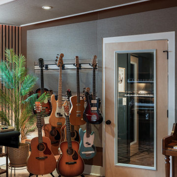
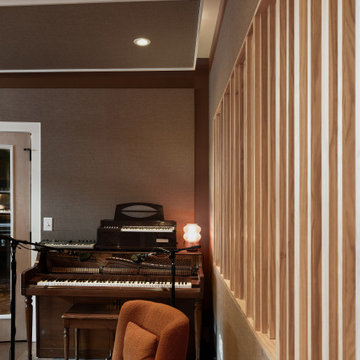
NILESThis 1,000ft² recording and production studio, built in 2021 for producer couple Latifah Alattas and Lucas Morton, was designed as a fully custom creative environment that supports writing, mixing, and collaboration at the highest level. Both Latifah and Lucas are multi-instrumentalists, engineers, and mixers, and the studio reflects the full range of their workflows—visually inspiring, technically precise, and intuitive in every room.
The facility was built from the ground up with a strong emphasis on architectural acoustics and plug-and-play connectivity. The layout includes two Control Rooms, multiple isolation booths, and shared common spaces, all tied together with seamless audio integration. No matter where you are in the studio, routing, monitoring, and communication remain effortless and consistent.
Behind the aesthetic, the acoustic design is exceptionally robust. Six independent floating-floor systems support the suites, ensuring each room operates with minimal sound transmission. Tailored sound-reducing wall assemblies, full-lite doors, engineered window systems, and intentional treatment plans deliver clarity, isolation, and precision for tracking and mixing. Each space is mechanically decoupled, allowing multiple rooms to run simultaneously without compromise.
For monitoring, both Latifah and Lucas chose Genelec “The Ones” series monitors with GLM calibration to ensure accurate translation and consistency across the entire facility.
Natural light and a warm, welcoming aesthetic anchor the visual identity of the studio, reflecting the creative energy and personality of its owners. The result is a highly functional, beautifully crafted space where ideas can move freely and production can happen without limitations.
 NILES
NILESThis 1,000ft² recording and production studio, built in 2021 for producer couple Latifah Alattas and Lucas Morton, was designed as a fully custom creative environment that supports writing, mixing, and collaboration at the highest level. Both Latifah and Lucas are multi-instrumentalists, engineers, and mixers, and the studio reflects the full range of their workflows—visually inspiring, technically precise, and intuitive in every room.
The facility was built from the ground up with a strong emphasis on architectural acoustics and plug-and-play connectivity. The layout includes two Control Rooms, multiple isolation booths, and shared common spaces, all tied together with seamless audio integration. No matter where you are in the studio, routing, monitoring, and communication remain effortless and consistent.
Behind the aesthetic, the acoustic design is exceptionally robust. Six independent floating-floor systems support the suites, ensuring each room operates with minimal sound transmission. Tailored sound-reducing wall assemblies, full-lite doors, engineered window systems, and intentional treatment plans deliver clarity, isolation, and precision for tracking and mixing. Each space is mechanically decoupled, allowing multiple rooms to run simultaneously without compromise.
For monitoring, both Latifah and Lucas chose Genelec “The Ones” series monitors with GLM calibration to ensure accurate translation and consistency across the entire facility.
Natural light and a warm, welcoming aesthetic anchor the visual identity of the studio, reflecting the creative energy and personality of its owners. The result is a highly functional, beautifully crafted space where ideas can move freely and production can happen without limitations.
 NILES
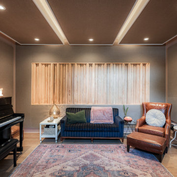
NILESThis 1,000ft² recording and production studio, built in 2021 for producer couple Latifah Alattas and Lucas Morton, was designed as a fully custom creative environment that supports writing, mixing, and collaboration at the highest level. Both Latifah and Lucas are multi-instrumentalists, engineers, and mixers, and the studio reflects the full range of their workflows—visually inspiring, technically precise, and intuitive in every room.
The facility was built from the ground up with a strong emphasis on architectural acoustics and plug-and-play connectivity. The layout includes two Control Rooms, multiple isolation booths, and shared common spaces, all tied together with seamless audio integration. No matter where you are in the studio, routing, monitoring, and communication remain effortless and consistent.
Behind the aesthetic, the acoustic design is exceptionally robust. Six independent floating-floor systems support the suites, ensuring each room operates with minimal sound transmission. Tailored sound-reducing wall assemblies, full-lite doors, engineered window systems, and intentional treatment plans deliver clarity, isolation, and precision for tracking and mixing. Each space is mechanically decoupled, allowing multiple rooms to run simultaneously without compromise.
For monitoring, both Latifah and Lucas chose Genelec “The Ones” series monitors with GLM calibration to ensure accurate translation and consistency across the entire facility.
Natural light and a warm, welcoming aesthetic anchor the visual identity of the studio, reflecting the creative energy and personality of its owners. The result is a highly functional, beautifully crafted space where ideas can move freely and production can happen without limitations.


 RWH Architect PLLC
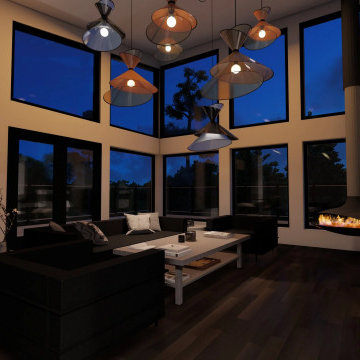
Whistle Hill Lot 2 residence stands as one of the most architecturally ambitious homes in the development, a striking example of RWH Architect’s commitment to elevating modern design. Defined by its dramatic butterfly roof and a façade composed of clean horizontal cladding, vertical accents, and expansive window groupings, the home captures a sculptural presence rarely seen in the region. This is a residence designed to open itself to its surroundings, embracing light, volume, and long views in a way that signals a new era of contemporary architecture.
The home features an attached three-car garage with an adjacent storage area, creating a practical yet visually streamlined entry sequence. Inside, the first floor is designed around livability and connection to the landscape. The foyer opens into a private office and then flows toward the main living areas. The master suite is intentionally tucked into a quiet corner on the first floor, positioned to overlook the backyard and shaped to allow morning light to filter softly into the space. Adjacent to the master suite is the laundry room, placed strategically for convenience. A secondary bedroom on the first floor includes a walk-in closet, and a nearby three-quarter bath offers flexibility for guests or extended family.
The kitchen serves as the central gathering point of the home, anchored by a large island and complemented by a walk-in pantry. It overlooks an expansive wraparound deck that transitions seamlessly to a lower patio, creating layered outdoor living spaces. Both the dining room and the great room open directly to the deck, enhancing the indoor-outdoor connection. The sunken great room is one of the home’s signature moments, featuring a floating fireplace that appears to hover within the space and accentuates the dramatic ceiling height created by the butterfly roof. The result is a room filled with daylight and volume, a contemporary living environment with an architectural presence that feels both bold and welcoming.
Upstairs, the second floor includes two additional bedrooms, each with walk-in closets, and a full bathroom designed with modern simplicity. From the upper level, the design allows for open views extending back toward the dining room, creating visual connectivity between floors and emphasizing the vertical openness of the home. This intentional play of volume heightens the spatial experience and enhances the sense of modern airiness throughout the interior.
This residence presented several unique design challenges that ultimately helped refine and elevate the final architectural expression. The sweeping butterfly roof created structural complexities due to its dramatic angles and its role in defining the home’s entire visual identity. RWH addressed this by carefully coordinating structural supports and framing patterns that allowed the roof to appear effortless while maintaining its sculptural form. Another significant challenge was balancing the extensive glazing with the need to preserve privacy and energy performance. RWH solved this by thoughtfully arranging high windows, angled openings, and varied window groupings that capture natural light without compromising comfort. Integrating a sunken great room with a floating fireplace required a precise approach to grading, floor transitions, and structural anchoring. Through detailed modeling and coordination, RWH ensured that the fireplace would appear weightless while remaining fully functional and safe. Creating uninterrupted views from the second floor to the dining room also required creative alignment of floor systems and rail detailing, which RWH resolved by designing sleek, integrated guardrails that preserve openness while meeting safety requirements.
Whistle Hill Lot 2 stands as a bold architectural statement and a defining example of the evolving design language within the development. Through innovative forms, expansive volumes, and carefully orchestrated transitions between indoor and outdoor spaces, RWH Architect has created a home that reflects the future of contemporary living in the area—forward-thinking, refined, and undeniably modern.
 KURV Architecture DPC (Alex Hughes Architects)
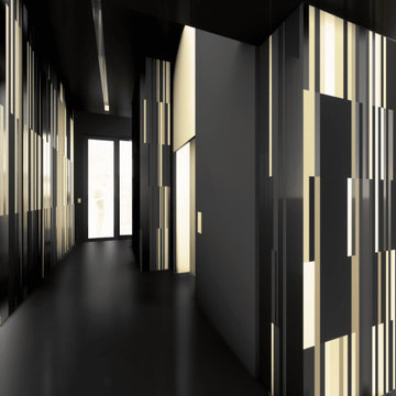
Located in the heart of Manhattan’s Lower East Side, the building was erected on a shallow commercial lot between two 120 year old masonry buildings and a new residential rental building. 330 Grand Street is a mix of 725 SF 1BRs and 1050 SF 2BR apartments. It also contains a 1100 SF two story duplex as well as private and public rooftop space, large private balconies for most units and two large private terraces for the ground floor units.
330 Grand Street was originally designed and approved at the NYC DOB as a prefabricated modular building. During the pandemic, as shipping costs skyrocketed putting the project at risk, we suggested redesigning the building as a reinforced cast-in-place concrete structure. Concrete was readily available and prices had not been affected by the demand increase that many other materials suffered in the pandemic. We took this opportunity to raise floor to ceiling heights, enlarge high performance windows and redistribute the buildings MEPFS and Structural Systems to create very open floor plans.
The challenge was to create a luxurious sensorial living experience with very limited means. In a city with very high construction costs, low cost residential buildings in the area are usually devoid of good quality, design and character. Our approach was to aim high for the end user, prioritizing natural light, open space with long visual perspectives, high ceilings and as always, rejecting the use of predefined building templates.
Our biggest challenge was to ensure that the small spaces feel as clean cut, large and bright as possible. Several unique design decisions were made to ensure low cost and high quality;
Floor plans were laid out so that spaces were wide open and free of clutter from mechanical or structural interruptions. Therefore all infrastructure was placed in lateral demising walls, which in turn act as the unit’s storage and kitchen. The apartments feel wide open, are super quiet and have more storage space than any other comparable apartment in the city.
To solve the problem of the site’s shallow commercial lot which is typically prone to dark interior spaces we focused our attention on the building’s envelope. Instead of the usual small punched window openings, oversized high performance windows were designed to ensure that light penetrated as far as possible into the units. In the smaller 1BR units, the full 50’ depth of the lot is perceived by partitioning spaces with sliding pocket doors that can be retracted to allow deep visual perspectives, making the sight lines in the space feel longer, larger, more ample than normal. In addition to the full height glazing, each unit above the 2nd floor receives a 7 foot covered balcony, adding 120 to 240 sf to each apartment, something unusual in New York City buildings. The space is large enough for a full size dining table, when the weather permits being outside.
We also worked hard to ensure modularity. For example, all kitchen units are all identical throughout the building. The idea of modularity and the economy of the repetitive unit is exercised to the maximum through the building.
Hardware, appliances, flooring, wall coverings and material finishes are all carefully selected to feel bespoke, high quality and unique.
It was important to KURV that the result of this work manifest into something that would deeply connect with the end user and sustain relationships with the consumers of this space.
All images by KURV Architecture ©
 NILES
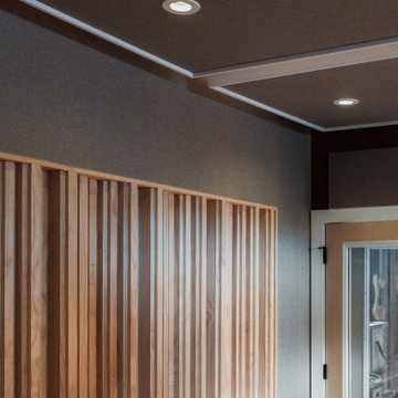
NILESThis 1,000ft² recording and production studio, built in 2021 for producer couple Latifah Alattas and Lucas Morton, was designed as a fully custom creative environment that supports writing, mixing, and collaboration at the highest level. Both Latifah and Lucas are multi-instrumentalists, engineers, and mixers, and the studio reflects the full range of their workflows—visually inspiring, technically precise, and intuitive in every room.
The facility was built from the ground up with a strong emphasis on architectural acoustics and plug-and-play connectivity. The layout includes two Control Rooms, multiple isolation booths, and shared common spaces, all tied together with seamless audio integration. No matter where you are in the studio, routing, monitoring, and communication remain effortless and consistent.
Behind the aesthetic, the acoustic design is exceptionally robust. Six independent floating-floor systems support the suites, ensuring each room operates with minimal sound transmission. Tailored sound-reducing wall assemblies, full-lite doors, engineered window systems, and intentional treatment plans deliver clarity, isolation, and precision for tracking and mixing. Each space is mechanically decoupled, allowing multiple rooms to run simultaneously without compromise.
For monitoring, both Latifah and Lucas chose Genelec “The Ones” series monitors with GLM calibration to ensure accurate translation and consistency across the entire facility.
Natural light and a warm, welcoming aesthetic anchor the visual identity of the studio, reflecting the creative energy and personality of its owners. The result is a highly functional, beautifully crafted space where ideas can move freely and production can happen without limitations.
9