
Search results for "Visually expanded" in Home Design Ideas
 Klopf Architecture
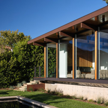
Malibu Glass Box House by Klopf Architecture
Following the devastating Woolsey Fire of 2018, the site in Malibu offered a unique opportunity to rebuild not just a home, but a new architectural composition that highlighted the property’s potential while navigating strict fire-rebuild codes in the area. Designed by Klopf Architecture, this project embraced a set of limitations and translated them into an architectural asset.
The city’s fire-rebuild process required the new structure to remain close to the original footprint, size and bulk, a constraint that ultimately clarified the architectural direction. Perched near the front of a long, narrow lot, the new home frames and overlooks a private, park-like rear expanse, an uncommon luxury especially in this part of Malibu .
Without a fixed program, the design process allowed for a different kind of creative focus allowing Klopf Architecture the opportunity to explore how a modernist home could best respond to this site. The team approached the project not with a list of requirements, but with a question: How might a modernist live here? What spatial qualities would inspire calm, connection, and a sense of wonder in this setting? The process became less about problem-solving and more about architectural storytelling—letting the site, the light, and the principles of modern design guide the form and flow of the home.
The response emerged in the form of a glass-box pavilion, an open, Mid-Century Modern inspired living, dining, and kitchen space that floats at the edge of the property’s natural descent. Connected to the more enclosed, private areas of the home by a glass-walled hallway, the living pavilion becomes a distinct centerpiece of the design. It opens on all four sides to the landscape with decks and patios on the flanks, an internal garden and water feature to the north, and a dramatic unguarded view of the expansive backyard and ocean horizon to the south.
Because of the mandated footprint, careful planning was required to ensure every space could still engage with light, landscape, or both. Strategic voids in the form of atriums and courtyards allow daylight to filter deep into the home’s core, while offering moments of surprise and retreat. These design gestures allow natural light to filter deep into the interior, creating a sense of brightness and openness throughout the day. At the same time, they expand the perceptual boundaries between inside and out, making the home feel more expansive while anchoring its connection to the surrounding landscape.
The siting of the house is what gives it its unique character. Rather than receding into the backyard like the neighboring homes, the house holds a slight prominence. From the central living pavilion, stepping down into the landscape feels more like entering a secluded park where a separate existing accessory structure, trail, and recreational areas await. The home’s modest street presence gives way to this unfolding drama of space, view, and nature.
Fire-resilient materials and assemblies are integrated seamlessly throughout including triple-pane glazing, under-slab and roof insulation, and locally sourced fire-rated cladding ensure the house not only meets Calfornia’s rigorous wildland-urban interface (WUI) standards, but feels effortlessly aligned with them. While technical decisions like fire-hardening and mechanical systems presented some construction challenges, particularly around the cantilevered glass box, the team found a functional compromise that preserved the integrity of the design.
Inside, a restrained palette and exposed post and beam design celebrate the ethos of mid-century modernism. A central circulation spine extends from the entry to the rear glass wall, offering a continuous visual link from street to ocean. Spaces such as the library and office, though more intimate in scale, are never cut off from nature as each opens to its own unique courtyard or garden view.
Though born out of a strict regulatory framework and developed without a specific client, the rebuild design unfolded with remarkable clarity. Grounded in site logic, refined by limitations and an emphasis on timeless spatial relationships – light, proportion, and a strong connection to nature, the resulting design feels both effortless and uplifting. The home lives lightly on the land, opens generously to its surroundings, and strikes a careful balance between privacy, openness, and calm. For Klopf Architecture, it stands as a compelling case study in how site, code, and circumstantial constraints can inspire enduring, modernist architecture. With years of experience reimagining mid-century modern design for how people live today, the firm took the project’s limitations as an opportunity. The result is a home shaped by open, flowing spaces, strong indoor-outdoor connections, and a calm, clear sense of structure. It’s a good reminder that even with strict constraints, there’s still room for architecture to breathe—and for modernism to keep moving forward.
Klopf Architecture project team: Geoff Campen, John Klopf, AIA, and Sherry Tan
Structural Engineer: ZFA
Contractor: Maison D’Artiste
Photography: ©2025 Mariko Reed
Year Completed: 2023
 Bianchi Design
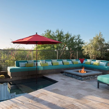
When it comes to small spaces every inch counts! The key to making them work is to think of traffic flow, and how you’re going to arrange furniture for ease of access and comfort. This gives credence to the form over function motto!
For this project we knew we were expanding the indoor outdoor flow by removing a wall of the house, creating a pocket door, so the interior living room was going to merge perfectly with the new exterior living room.
The first element of the design we worked out was a built-in Banco seating around a central fire pit, with cushions and exterior fabrics, that even has a one piece cover that can snap in place. This will protect the fabrics in place while the couple travels, without having to drag them through the house to the garage for storage.
The second critical factor of the design was implementing an outdoor kitchen just off camera, built-in to a patio Column, so that it becomes a serving bar and the appliances are behind the bar not out in the public space.
Across the water, the vanishing edge spa was the visual draw, reflecting a fruitless olive tree, all enjoyed from the fire pit seating area.
The back edge of the pool features a knife edge tile to granite interface without a coping, to minimize the line between water and landscape.
Last but not least, the sweeping arc curvature of the pools leading edge was done so as to ease traffic flow from the entertaining and fire seating area to the spa, and to soften the otherwise rectangular lines of the yard.
 Gather and Spruce Design Remodel
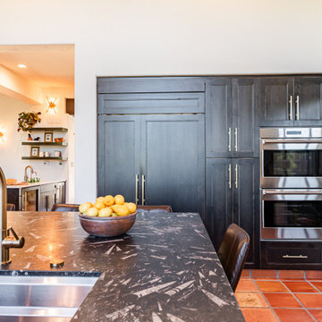
We wanted to maximize space and functional storage for this family of 5. We accomplished this by expanding the island to make it a more functional space for their family. We also created a feature wall for Wolf double ovens, Sub-Zero refrigeration, and a ton of pantry space!
Find the right local pro for your project
 Modern Outdoor
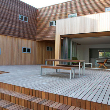
Casual yet elegant, the Etra Collection by Modern Outdoor offers a modern aesthetic that is constructed for outdoor use while being suitable for indoor settings. Etra’s visual inspiration is derived from its architectural-based frame system. Designed using structural angle steel that is mitered and ground, a clean and seamless surface gives Etra its pure appeal.
Frame Options:
• 304 stainless steel that is brushed and electropolished
• marine-grade 316 stainless steel that is brushed and electropolished for use within one mile of salt air, available for an upcharge
• powder coated carbon steel in our standard silver finish
• custom powder coat colors, available for an upcharge
Surface Options:
• sustainably harvested ipe – a beautiful South American hardwood that is three times as dense as teak — naturally resistant to rot, insects, UV exposure, ice, salt, abrasion and splintering – all without the need for toxic chemicals — considered a 25+ year wood
• marine-grade polyboard – a UV stabilized high-density polyethylene material that is non-corrosive and chip resistant – available in six colors for expanded design choices
Fabric Options:
• six standard colors of 100% solution dyed acrylic treated for outdoor use are offered
• custom fabrics and COM service are also available
Cushion Options:
• our standard foam cushions are made from outdoor appropriate high-resiliency (HR) foam
• for clients that prefer less maintenance, a flow-through foam that allows water and moisture to escape the cushion is also available for an upcharge
Etra is a full-breadth line with dining, bar height, lounge, cafe, patio and pool setting pieces included. The pieces are readily customizable for individual client needs.
 Zion Home and Building, LLC
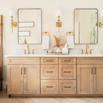
The goal for this master suite was to replace a dated, heavy layout with a sense of "Warm Minimalism." We wanted to trade visual clutter for intentional textures. By pairing the natural grain of White Oak with the crisp, architectural lines of Matte Black fixtures, we created a space that feels grounded, airy, and deeply restorative.
A master bath is a high-stakes environment where every inch counts. We took absolute ownership of the "inch-by-inch" planning required to expand the shower and incorporate a freestanding soaking tub without making the room feel crowded. Our Guided Process ensured the client felt confident in the bold choice of vertical stack tile—a design-forward move that draws the eye upward and adds a custom, boutique-hotel feel to the space.
This is a "Host’s Private Oasis." While the rest of the home is ready for guests, this bathroom is a master-grade sanctuary for the homeowners. The elite craftsmanship is visible in the precision of the tile alignments and the seamless integration of the natural wood elements, providing a feeling of pride and daily joy.
 Inviniti Cellar Design
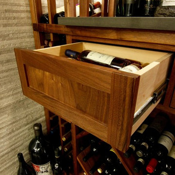
A small existing crawl space was dug out and expanded to make room for this amazing entertainment area / office. The glass wall and double glass doors at the end of the room allows for the dramatic visual while providing a sealed space for the mechanical cooling to keep the wine at the optimum temperature. The combination of label forward aluminum racking with wood end caps and the clear-coated walnut cabinetry is a welcoming contrast.
The cellar holds 373 bottles of unique wines. The Diamond bins, drawers, bottle display and picture opening provides for various bottle sizes. Up lighting from the floor and LED lighting within the racking supports the ever-changing ambiance of the room.
Photos taken by Inviniti Cellar Design
 Sosna Inc
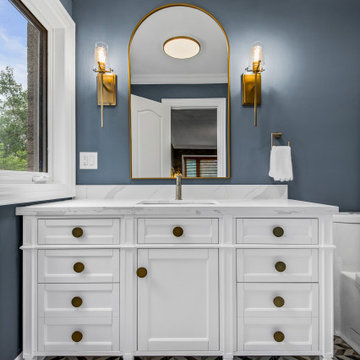
Our returning clients, middle-aged professionals, reached out to us to remodel their bathrooms as they transition from raising children to focusing on their own comfort and living space. They asked us to modernize their ensuite and shared bathroom, both of which had become outdated and impractical for their current needs.
In the ensuite bathroom, we removed a partition wall to redesign and expand the shower and toilet areas, creating a spacious open-concept layout. We added custom cabinetry with pull-out pantries, finished in a bright paint, and a large linear perimeter for ample storage and countertop space. The countertops and backsplash feature dusk veining, paired with brushed nickel sinks, faucets, and cabinet hardware, giving the space a contemporary yet timeless update. A new curbless glass enclosure adds a striking focal point, while the removal of an underused angled jetted tub creates space for an elegant freestanding tub.
In the shared bathroom, we replaced the tub with a modern curbed shower and enhanced the aesthetic with large, colorful porcelain floor tiles that tie together the artistic essence of the home.
The result is a significantly more functional and visually appealing space that reflects our clients' unique style and needs.


 Fusion Cabinets, Inc.
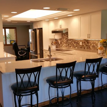
Wood floors and glass mosaics warm up this white on white kitchen. By removing the walls, passthru and hi bar top we have really expanded the space visually.
 Jordan Design Build Group
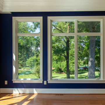
JDBG is wrapping up work on an expansive 2-story sunroom addition that also included modifications to the existing home’s interior and significant exterior improvements as well. The original project brief was to provide a conditioned 4-season sunroom addition where the homeowners could relax and enjoy their wooded views. As we delved deeper into our client’s overall objectives, it became clear that this would be no ordinary sunroom addition. The resulting 16’x25’ sunroom is a showstopper with 10’ high ceilings and wall to wall windows offering expansive views of the surrounding landscape.
As we recommend with most addition projects, the process started with our Preliminary Design Study to determine project goals, design concepts, project feasibility and associated budget estimates. During this process, our design team worked to ensure that both interior and exterior were fully integrated. We conducted in-depth programming to identify key goals and needs which would inform the design and performed a field survey and zoning analysis to identify any constraints that could impact the plans. The next step was to develop conceptual designs that addressed the program requirements.
Using a combination of 3-D massing, interior/exterior renderings, precedent imaging and space planning, the design concept was revised and refined. At the end of the study we had an approved schematic design and comprehensive budget estimates for the 2-story addition and were ready to move into design development, construction documentation, trade coordination, and final pricing. A complex project such as this involves architectural and interior design, structural and civil engineering, landscape design and environmental considerations. Multiple trades and subs are engaged during construction, from HVAC to electrical and plumbing, framers, carpenters and masons, roofers and painters just to name a few. JDBG was there every step of the way to ensure quality construction.
Other notable features of the renovation included expanding the home’s existing dining room, incorporating a custom ‘dish room,’ and providing fully conditioned storage and his & her workrooms on the lower level. A new front portico will visually connect the old and new structures and a brand new roof, shutters and paint will further transform the exterior. Thoughtful planning was also given to the landscape, including a back deck, stone patio and walkways, plantings and exterior lighting. Stay tuned for more photos as this sunroom addition nears completion.
 Jordan Design Build Group
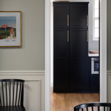
Expanding and updating the kitchen was our top priority – the new layout was designed to straddle the original house and the addition, creating work zones rather than the traditional work triangle. The modified galley layout more than doubled their countertop area and storage space. Extending the kitchen into the addition took full advantage of the vaulted ceilings and light-filled space. To improve flow and connectivity, we opened up a wall between the old kitchen and the front entry hall providing a straight path from front door to the new mudroom/drop zone and kitchen beyond. A door from the dining room into the kitchen was shifted to allow for a more generous kitchen.
The beautifully veined Calacatta Eiffel quartz counters and backsplash provide visual contrast with the black cabinetry and keep the space from feeling too heavy. A continuous ledge and floating shelves replace traditional uppers for a more open and modern feel. Stained wood is used throughout, from the bench top, to shelving, trim and custom millwork; it brings in a natural element and helps unite all of the spaces. A hood with a custom Venetian plaster finish is flanked by vintage inspired sconces and provides a stunning focal point in the room. A deep nook is home to a ‘bubble box’ that dispenses cold sparkling or still water on demand – the marble tile backsplash further differentiates this beverage zone. The brushed brass hardware stands out against the dark cabinets and adds a touch of warmth. With seating for three at the counter and the inclusion of a breakfast area banquette (with drawers), the home is ideal for family time and relaxed gatherings with friends.
 butter+velvet DESIGN · HOME
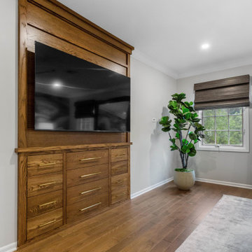
In the primary bedroom, our focus was on creating a space that felt both elevated and
comfortable with a masculine edge. We brightened the room with a dynamic abstract wallpaper
mural, introducing movement and visual depth. The large existing mirror was repositioned
between the windows to expand the sense of scale, making the room feel even more spacious.
Leather seating and a bench add strength and richness, while the channeled upholstered bed
and plush bedding soften the overall feel. Updated wood flooring, new nightstands, and a
custom built-in infuse warmth and ground the space in natural elements. A plush area rug
provides comfort underfoot, while woven window treatments add texture and complement the
darker tones in the wallpaper.
The design carefully balances black and gray tones with bright accents to maintain an airy feel.
Gold finishes and mixed metals were layered throughout, tying into the home’s broader design
palette. A new ceiling fan with wood-toned blades harmonizes with the natural elements and
furnishings. The result is a bedroom that feels polished, grounded, and richly layered with
materials and textures.
 O'Brien Custom Home Designs
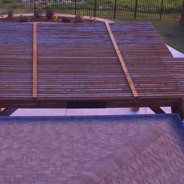
Texas western sun made this area almost unusable. an open air shade pergola was designed to let sun in till past noon and shade after that. All joints were mortised for the upmost visual effect. Details were numerous. The back yard became a area usable in the hot Texas summer sun. virtually expanding the usable patio area time 3. With interlocking joints and all connections screwed, pergola should last years beyond the normal life span for suck a structure. the actual value added exceeds the final cost of the expansion. There was no disturbing of existing structure.
 C2 | Studio Landscape Architecture
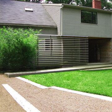
The concept for this project was to reveal the sensation of an active, living landscape in flux and echo the vitality and energy of the wetland that comprises much of this rural site. A mosaic of shifting concrete slabs, set in a field of limestone bands and chip seal, flows through screens of bamboo, set in motion by the slightest breeze. The implied motion of the ground plane blurs the boundary where the terrace and parking court meet, serving the dual purpose of expanded entertaining area or overflow parking during large gatherings. The clipped formal hedge that folds around the house and delineates the lawn stands in stark opposition to the unrestrained hemlock forest that envelops the property, heightening the contrast between the two. The shifting planes of the boardwalk entrance connects these volumes, defining the primary visual and functional axes of the site.
Scott Carman

Sponsored
Columbus, OH

Snider & Metcalf Interior Design, LTD
Leading Interior Designers in Columbus, Ohio & Ponte Vedra, Florida
 MAC Reno Design Build LTD ( MAC Renovations)
Embrace a 1940 farmhouse where rustic charm and modern elegance coexist in perfect harmony for the family of 5.
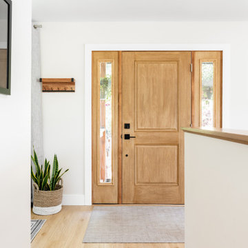
We harmonized the home’s robust heritage with modern design, revealing a custom entry that leads to a new primary suite, visually enhancing the façade while expanding the living space. The redesign extends into a vibrant open floor plan to enhance family interactions.
The heart of the home kitchen hosts soft white cabinetry and natural light to dance on warm wood accents and an inviting island.
The bathroom is adorned with dark, dramatic hues complemented by the warmth of wood and marble.
 MAC Reno Design Build LTD ( MAC Renovations)
Embrace a 1940 farmhouse where rustic charm and modern elegance coexist in perfect harmony for the family of 5.
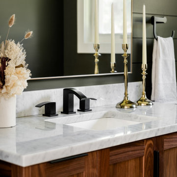
We harmonized the home’s robust heritage with modern design, revealing a custom entry that leads to a new primary suite, visually enhancing the façade while expanding the living space. The redesign extends into a vibrant open floor plan to enhance family interactions.
The heart of the home kitchen hosts soft white cabinetry and natural light to dance on warm wood accents and an inviting island.
The bathroom is adorned with dark, dramatic hues complemented by the warmth of wood and marble.
 BC&J Architecture
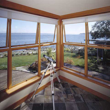
The 2,800 square foot Rockaway Beach Residence is a significant remodel and addition to a small beach cottage built in the 1920’s. The owner’s desire for the building was to maintain a visual connection to the water and Seattle beyond and expand upon the nature of the shingled cottages found along the water’s edge in Puget Sound in the early part of the 20th century.
The two bedroom house includes daytime living spaces on the ground level including a sunroom where one can view both Mt. Baker and Mt. Rainier on a clear day. The second floor includes bedrooms with views, a gallery space over the dining room below, owner’s office and grandchildren’s loft.
Fine attention to craft was taken in preparing the unusual roof shapes and gracious trim assemblies.
Designed by BC&J Architecture.
 Nar Design Group
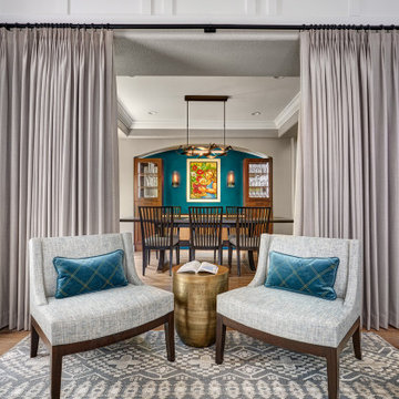
This cozy gathering space in the heart of Davis, CA takes cues from traditional millwork concepts done in a contemporary way.
Accented with light taupe, the grid panel design on the walls adds dimension to the otherwise flat surfaces. A brighter white above celebrates the room’s high ceilings, offering a sense of expanded vertical space and deeper relaxation.
Along the adjacent wall, bench seating wraps around to the front entry, where drawers provide shoe-storage by the front door. A built-in bookcase complements the overall design. A sectional with chaise hides a sleeper sofa. Multiple tables of different sizes and shapes support a variety of activities, whether catching up over coffee, playing a game of chess, or simply enjoying a good book by the fire. Custom drapery wraps around the room, and the curtains between the living room and dining room can be closed for privacy. Petite framed arm-chairs visually divide the living room from the dining room.
In the dining room, a similar arch can be found to the one in the kitchen. A built-in buffet and china cabinet have been finished in a combination of walnut and anegre woods, enriching the space with earthly color. Inspired by the client’s artwork, vibrant hues of teal, emerald, and cobalt were selected for the accessories, uniting the entire gathering space.
 Deep River Partners
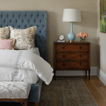
Fulfilling a vision of the future to gather an expanding family, the open home is designed for multi-generational use, while also supporting the everyday lifestyle of the two homeowners. The home is flush with natural light and expansive views of the landscape in an established Wisconsin village. Charming European homes, rich with interesting details and fine millwork, inspired the design for the Modern European Residence. The theming is rooted in historical European style, but modernized through simple architectural shapes and clean lines that steer focus to the beautifully aligned details. Ceiling beams, wallpaper treatments, rugs and furnishings create definition to each space, and fabrics and patterns stand out as visual interest and subtle additions of color. A brighter look is achieved through a clean neutral color palette of quality natural materials in warm whites and lighter woods, contrasting with color and patterned elements. The transitional background creates a modern twist on a traditional home that delivers the desired formal house with comfortable elegance.
 Drury Design
The Setup
For this primary bathroom project, the homeowners wanted to transform their large, T-shaped bathroom into a functional, multi-purpose sanctuary. The existing layout was inefficient, with a bulky built-in tub, a closed-off shower, and an awkward footprint that limited practical use.
This remodel also presented a unique challenge – the homeowners wanted to use the space for workouts as well. The design needed to maximize the large open area in the middle of the T, providing enough room for yoga and light free-weight exercises while maintaining the bathroom’s aesthetic and functionality.
Design objectives:
Expand and brighten the shower area without major layout changes
Replace the oversized built-in tub with a sleek freestanding alternative
Create a flexible space for workouts while maintaining the bathroom’s design integrity
Address cold flooring with added comfort solutions
Enhance lighting for both beauty and functionality
Incorporate storage for workout equipment and everyday essentials
Integrate natural elements to accommodate the homeowners’ love of plants
The Remodel
Design challenges to be solved:
Shower Expansion – The homeowners want a more open, spa-like shower but don’t want to dramatically alter the footprint.
Workout Integration – Balancing fitness functionality with a serene bathroom design will require creative layout adjustments.
Storage Solutions – With workout gear to stow away, the space needs discrete and versatile storage options.
Lighting – Enhancing both natural and artificial lighting to brighten the large space.
Cold Floors – Positioned above the garage, the bathroom tends to feel colder than the adjacent primary bedroom. A solution is needed to add warmth and comfort during use, without the need to reconfigure the home’s overall heating system.
The Renewed Space
Design solutions:
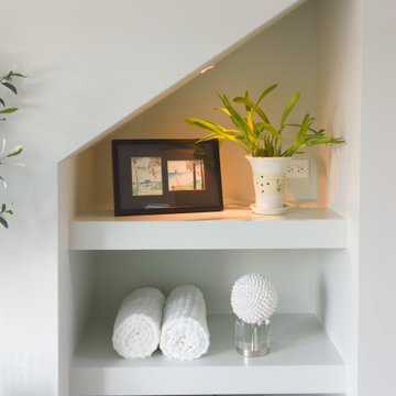
Spa-Like Shower Expansion – Removing a wall and replacing it with glass transformed the shower into an open, airy retreat, allowing natural light to flow freely through the space. A curved black river rock floor and neutral linear wall tiles add warmth and texture, while carefully placed niche lighting enhances the tranquil, luxurious atmosphere.
Workout-Friendly Layout – A custom full-length mirror was strategically placed to accommodate multiple uses, creating a fitness studio-like experience for yoga or light weight training. The mirror’s size and positioning allow for clear visibility during workouts, while also enhancing the room by adding light and a greater sense of depth.
Custom Storage Solutions – A custom cabinet with a wood top was crafted to discreetly store workout equipment, preserving the clean, open feel of the space. Its design not only enhances functionality but also creates a sense of symmetry, bringing visual balance and cohesion to the overall layout.
Enhanced Lighting – Replacing the shower wall with glass, installing a full-length mirror, and incorporating vanity mirrors with built-in lighting dramatically brighten the space. LED strip lighting under the cabinets, along the tub half wall, and in both the side and shower niches adds layered illumination, enhancing both function and ambiance.
Heated Floors – Installing heated flooring provides consistent warmth and comfort year-round, enhancing the space for both workouts and daily routines. A European-style towel warmer brings additional warmth and a touch of luxury, elevating the overall experience.
Final Thoughts:
This transformed bathroom blends luxury with intentional design. By addressing the homeowners’ needs – from workout flexibility to spa-inspired details – the space now serves multiple purposes without compromise. The warm cabinetry, black accents and thoughtful lighting tie the design together, while the curved textures and plant-friendly ledge add a personalized touch. This bathroom is now a bright, welcoming sanctuary for daily routines and mindful moments.
 Kitchen Magic
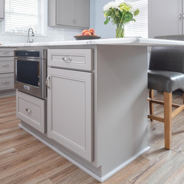
Oak wood cabinets went against the grain for this homeowner. Previously, the former kitchen yielded a yawn-worthy amount of neutral sub-par wood grains. Now, the new remodel is enveloped in warm, inviting taupe hues. Going from woodgrain to flat color instantly infuses a clean, fresh palette. The combination of flat color in a warm tone offers the same warmth of wood.
From traditional to a modern minimalist sensibility, the homeowners refaced existing cabinets in Prestige Statesman Beaded Edge style doors are accented with satin nickel hardware. Additionally, the homeowners knew refacing was an excellent choice. Refacing offers a quicker solution to transform sturdy existing cabinetry to a brand-new effect.
As for the countertops, Cambria Quartz in Brittanicca brings a fresh, rich effect with a simple cream swirl to coordinate perfectly with the stone-hued cabinetry. A round over edge brings a minimalistic look to make a designer statement. The Brittanicca pattern in engineered quartz suggests the look of marble yet offers significantly more durability and antimicrobial properties.
Meanwhile, a solution for the underused space over the kitchen radiator was needed, adding that the area now serves as a highly functional pantry. The custom pantry was the "icing on the cake," particularly with glass front doors, to create a focal point. In all, the design choice also works to expand the kitchen visually.
93