
Search results for "Visually expanded" in Home Design Ideas
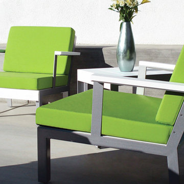
 Modern Outdoor
Casual yet elegant, the Etra Collection by Modern Outdoor offers a modern aesthetic that is constructed for outdoor use while being suitable for indoor settings. Etra’s visual inspiration is derived from its architectural-based frame system. Designed using structural angle steel that is mitered and ground, a clean and seamless surface gives Etra its pure appeal.
Frame Options:
• 304 stainless steel that is brushed and electropolished
• marine-grade 316 stainless steel that is brushed and electropolished for use within one mile of salt air, available for an upcharge
• powder coated carbon steel in our standard silver finish
• custom powder coat colors, available for an upcharge
Surface Options:
• sustainably harvested ipe – a beautiful South American hardwood that is three times as dense as teak — naturally resistant to rot, insects, UV exposure, ice, salt, abrasion and splintering – all without the need for toxic chemicals — considered a 25+ year wood
• marine-grade polyboard – a UV stabilized high-density polyethylene material that is non-corrosive and chip resistant – available in six colors for expanded design choices
Fabric Options:
• six standard colors of 100% solution dyed acrylic treated for outdoor use are offered
• custom fabrics and COM service are also available
Cushion Options:
• our standard foam cushions are made from outdoor appropriate high-resiliency (HR) foam
• for clients that prefer less maintenance, a flow-through foam that allows water and moisture to escape the cushion is also available for an upcharge
Etra is a full-breadth line with dining, bar height, lounge, cafe, patio and pool setting pieces included. The pieces are readily customizable for individual client needs.
 Artscape Garden Associates Ltd
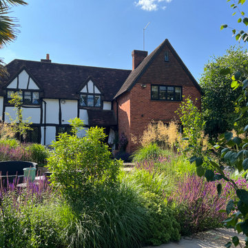
This paving and planting scheme features new hard landscaping elements and a new planting scheme. Artscape was initially briefed to extend and enhance the patio in the garden of a lovely home in the village of Cookham Dean in Berkshire. Our clients wanted to increase the size of the paved area so they could use it more frequently for relaxing and dining in the sun during the day. As well as increasing its size and practicality, they wanted the terrace to look and feel more inviting. The existing site was a mixture of brick paving, which was slippery underfoot, and tired concrete crazy paving. The patio also had stone retaining walls surrounded by sloped lawns and a few poorly maintained and mismatched shrubs.
Redesigned and repaved area
We first created a new, larger layout with a series of wider steps closer to the house, making a more inviting and welcoming area. Our landscapers paved the area with coursed sandstone, renowned for its incredible strength and durability. The earthy tones and unique texture of the sandstone gives it a natural timeless look which blends sympathetically with the garden setting. The worn finish of the paving also makes the surface safer to walk on. The edge of the paving curves in line from the end of the house to visually link the areas.
Bullnosed edges enhance looks and safety
Bullnosing provides the garden step edges with a smooth, luxury appearance, which also enhance safety. Safety is an important factor to consider when renovating or building new steps and paved areas. Smooth, rounded bullnosed steps or edges means there won’t be any harshly cut, sharp edges to injure someone should they trip or fall. Our Artscape paving experts can advise on the best bespoke, professionally profiled bullnose edges to suit the needs of your garden project.
Replacing sloped lawns with plants
Our initial brief was to create a new planted border just around the paved area. However, after various discussions and designs, our clients decided to follow our recommendation to expand the planting, so it included the whole sloping bank. The planting design also included the addition of small trees to create vertical interest.
New nature-friendly planting
The planting features an easy-to-maintain mix of perennials, grasses, and shrubs. This adds softness to the seating area and brings an everchanging display of flowers, foliage, textures and colours to the garden. The plants will attract more birds and butterflies to the garden, and will be beneficial for insects too.
The lawn was doing very little to support a diversity of insects and birds. Replacing even a small section of lawn with perennial flowers, shrubs, grasses, wildflowers, or groundcovers will benefit nature and wildlife. As well as supporting greater biodiversity, plants are more environmentally friendly than maintaining a lawn. Lawns are drought tolerant and will recover even if the grass has turned brown and patchy in a heatwave. But to keep the lawn looking lush, green, and beautiful in a hot, dry spell will require constant and wasteful watering.
The planting is informal and includes grasses, taking inspiration from the fields opposite. Ornamental grasses soften the scheme and bring movement to the garden as they shimmer in the slightest of breezes. Grasses are easy to grow and require little ongoing care. The main maintenance task is to cut the planting back in spring ready for the new growth to come through.
To keep the whole project within our client’s budget, we retained the existing walls, simply carrying out some small repairs and modifications where necessary. We were also able to add stunning new atmospheric lighting to the older existing lighting circuit to illuminate the area at night.
 kimberly peck architect
 photo by Pedro Marti
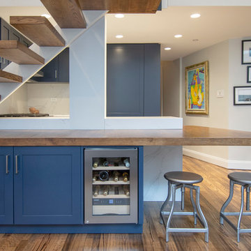
The goal of this renovation was to create a stair with a minimal footprint in order to maximize the usable space in this small apartment. The existing living room was divided in two and contained a steep ladder to access the second floor sleeping loft. The client wanted to create a single living space with a true staircase and to open up and preferably expand the old galley kitchen without taking away too much space from the living area. Our solution was to create a new stair that integrated with the kitchen cabinetry and dining area In order to not use up valuable floor area. The fourth tread of the stair continues to create a counter above additional kitchen storage and then cantilevers and wraps around the kitchen’s stone counters to create a dining area. The stair was custom fabricated in two parts. First a steel structure was created, this was then clad by a wood worker who constructed the kitchen cabinetry and made sure the stair integrated seamlessly with the rest of the kitchen. The treads have a floating appearance when looking from the living room, that along with the open rail helps to visually connect the kitchen to the rest of the space. The angle of the dining area table is informed by the existing angled wall at the entry hall, the line of the table is picked up on the other side of the kitchen by new floor to ceiling cabinetry that folds around the rear wall of the kitchen into the hallway creating additional storage within the hall.
Find the right local pro for your project
 Modern Outdoor
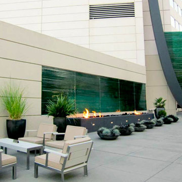
Casual yet elegant, the Etra Collection by Modern Outdoor offers a modern aesthetic that is constructed for outdoor use while being suitable for indoor settings. Etra’s visual inspiration is derived from its architectural-based frame system. Designed using structural angle steel that is mitered and ground, a clean and seamless surface gives Etra its pure appeal.
Frame Options:
• 304 stainless steel that is brushed and electropolished
• marine-grade 316 stainless steel that is brushed and electropolished for use within one mile of salt air, available for an upcharge
• powder coated carbon steel in our standard silver finish
• custom powder coat colors, available for an upcharge
Surface Options:
• sustainably harvested ipe – a beautiful South American hardwood that is three times as dense as teak — naturally resistant to rot, insects, UV exposure, ice, salt, abrasion and splintering – all without the need for toxic chemicals — considered a 25+ year wood
• marine-grade polyboard – a UV stabilized high-density polyethylene material that is non-corrosive and chip resistant – available in six colors for expanded design choices
Fabric Options:
• six standard colors of 100% solution dyed acrylic treated for outdoor use are offered
• custom fabrics and COM service are also available
Cushion Options:
• our standard foam cushions are made from outdoor appropriate high-resiliency (HR) foam
• for clients that prefer less maintenance, a flow-through foam that allows water and moisture to escape the cushion is also available for an upcharge
Etra is a full-breadth line with dining, bar height, lounge, cafe, patio and pool setting pieces included. The pieces are readily customizable for individual client needs.
 Klopf Architecture
Set on a narrow hillside lot overlooking the San Francisco Bay in Point Richmond, California, Bay Heirloom is a Mid-Century Modern family home restored, modernized and adapted for contemporary living. Oriented south-southwest toward the Marin Headlands, with views of the Golden Gate Bridge, the residence captures shifting Bay light throughout the day, from fog-muted mornings to vivid, glowing sunsets.
The home was built by Karlyn Neel’s grandfather, the owner of the construction company Flo-Crete, one of the Bay Area’s early concrete pumping firms. Flo-Crete completed the foundation and structural concrete work, with family photographs documenting the original cinderblock walls and pours. The firm also contributed to major regional infrastructure projects, including the Transbay BART tube and Candlestick Park, situating the house within a broader legacy of Bay Area construction. Growing up, Neel spent considerable time in the home, developing an early appreciation for mid-century modern principles. Instead of parting with this family heirloom, she purchased the home from her grandfather’s estate.
While her grandfather continued to live in the Point Richmond house, Neel purchased a Mid-Century Modern residence in Palm Desert. In contrast to the Bay Area’s cool temperatures, salt air, and persistent winds, the desert home is shaped by heat and sun and requires a different material response. A substantial renovation she led there emphasized thermal performance, filtered light, and restrained detailing. The experience later informed the restoration of her Bay Area family home.
What began as a modest Mid-Century Modern update expanded when decades of exposure to marine conditions revealed leaks and significant structural and seismic deficiencies. Neel was determined to honor her grandfather’s perseverance and without hesitation pivoted to a much more intensive project. Addressing these challenges required close coordination between Neel, Klopf Architecture and Kasten Builders, with architectural restraint and construction precision guiding each intervention. Rather than alter the home’s defining features, the project focused on reinforcing the structure from within. Discreet beams were embedded along the rear facade and in an upstairs wall, strengthening the building while maximizing the wall of glass facing the Bay and opening the wall between the kitchen and the living space. These structural interventions allowed the space to open fully to the Bay without visual interruption, with the kitchen repositioned as the social and functional core of an open, continuous living space. The building envelope was updated using weather- and corrosion-resistant materials appropriate to the marine environment.
The house unfolds vertically from the street, beginning with a modest garage level and workshop, with the main living spaces located below. Original slate flooring at the entry was preserved, along with select furnishings and artwork collected by Neel’s grandfather, anchoring the restored interior in its past. A restrained palette of black accents and pale, natural finishes replaces darker wood tones, reinforcing openness and calm. A naturally illuminated stair connects to the lowest level, where a former basement was transformed into a guest suite and family room opening onto a deck. From there, steps lead directly to a small concrete boat ramp at the water’s edge.
Throughout the project, decisions were guided by continuity rather than transformation for its own sake. Lessons drawn from both desert and coastal climates informed a material strategy rooted in performance and restraint. Bay Heirloom stands as a measured evolution of a family house, structurally renewed and carefully modernized, grounded in the discipline and care that first shaped it.
Klopf Architecture Project Team: John Klopf, AIA, Angela Todorova and Fernanda Bernardes
Landscape Architect: Huettl Landscape Architecture
General Contractor: Kasten Builders
Photography: ©2025 Mariko Reed
Year Completed: 2022
Location: Point Richmond, CA
 Project Guru
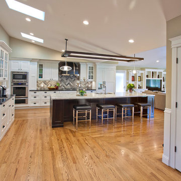
Removing angled wall and vaulting the ceiling expands the space visually. Added skylights bring additional natural light, turning a dark and cramped kitchen expansive.. Custom hood and lighting halo are key features of the space.Large organized pantry completes the functionality. Timothy Manning, Manning Magic Photography, McMahon Construction
 Meadowlark Design+Build
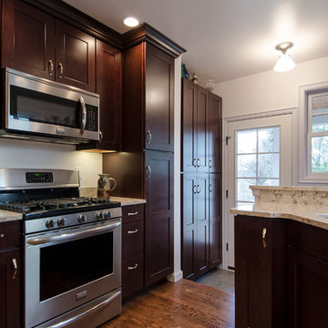
Meadowlark Builders created a framed opening at the center of the house through the new kitchen addition, mudroom and even to the back porch. This open progression of spaces with framed spaces expands your view, visually lengthening one’s perspective and making the overall spaces feel much larger. Jude Walton Photography

Sponsored
Columbus, OH

Snider & Metcalf Interior Design, LTD
Leading Interior Designers in Columbus, Ohio & Ponte Vedra, Florida
 Donald A. Gardner Architects
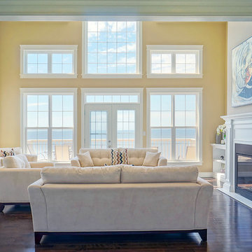
Multiple gables, a center dormer with arched clerestory window, and a striking front staircase create visual excitement for this three bedroom coastal home. Vaulted ceilings in the foyer and great room highlight a dramatic second floor balcony that connects the two upstairs bedrooms, each with its own bath and private porch. The great room is generously proportioned with built-ins on either side of the fireplace and access to a spacious rear deck, which expands the room even more. Private back porches enhance the dining room and the master suite as well. The master suite boasts his and her walk-in closets and a magnificent bath with dual vanities, a garden tub, and separate shower.
 Lori Ramsay Design
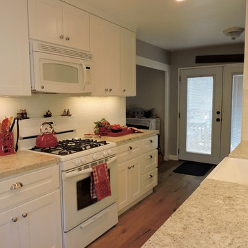
This lovely kitchen lives larger than it's compact square footage. By removing the wall to the right side of the kitchen and expanding the cabinets along that wall we created additional storage as well as a visual opening of the small kitchen.
 mackmiller design+build
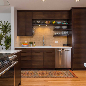
The kitchen and casual dining areas were cramped and separated by a peninsula with limited seating that wasted space. An awkward pass-through to the foyer, located above the corner range, and short wall cabinets limited storage. Overall, there was a lack of general and task lighting. We created a multifunctional, 2-tier peninsula, with a range on the kitchen side and a large, “horse-shoe” shaped, raised seating area on the opposite side. We expanded storage and countertop space by filling in the pass-through to the foyer, relocating the sink, installing a microwave drawer, swapping the locations of the refrigerator and pantry, and by including a large number of rollouts. Sleek, Euro-style cabinets with flush doors and drawer fronts, in a contemporary, horizontal oak grain; pure white quartz countertops; a combination of closed cabinets and open shelving, new hardwood flooring, and repetition of the same natural stone mosaic on the backsplash, fireplace surround and peninsula base create a visually exciting yet harmonious modern design statement.
 Vanity Art LLC
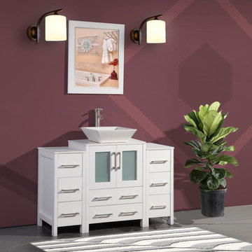
Adding storage to a tiny bathroom is one of the best ways to hide clutter. It also creates a visually larger, more expansive bathroom. This bathroom vanity features smart drawers and shelving that make use of every square inch in the cabinet. Nothing brightens and expands a small space better than a mirror. This vanity set includes a mirror to add style and also create a bigger bathroom effect. The single/double sink elegant bathroom vanity set has ample storage capacity and high-cost performance which fits perfectly with any bathroom decor.
Features:
Soft-closing doors and drawers prevent slamming
Full-width storage shelf, ideal for towels and accessories
Rectangular and practical white ceramic vessel sink
Dove-Tailed Drawers
Brushed nickel handles/hardware
Constructed of high-quality oak wood
Rich and durable finish
Dripless edge profile
 Maria Iacobucci Design
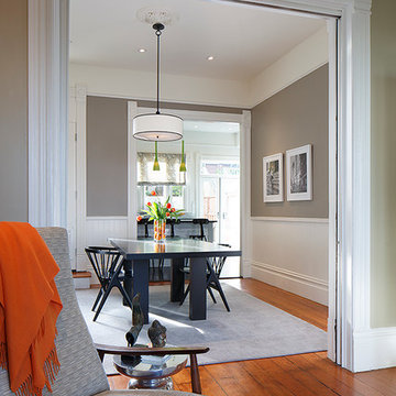
The original 3'w door between the two rooms was expanded to a 9' opening, allowing greater visual and physical access between the kitchen and dining room
 EAG Studio
Refined Continuity: Bridging Classical Architecture and Modern Living
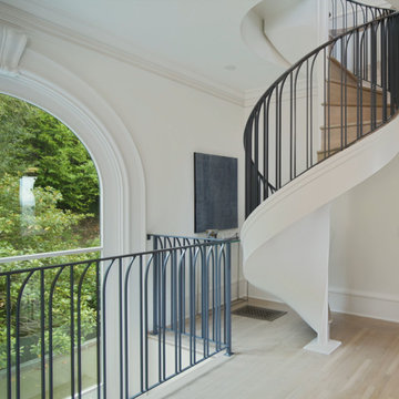
This comprehensive remodel of a grand Cow Hollow residence reimagines a historically expressive envelope through a lens of contemporary livability, precision detailing, and material restraint. The design approach carefully balances the home’s classical proportions and ornamental heritage with a refined, modern sensibility—evident in the disciplined palette of warm neutrals, soft plasters, pale oak flooring, and tailored millwork. Circulation has been clarified and subtly expanded to enhance spatial flow, while openings are leveraged to capture light, garden outlooks, and distant water views. Throughout, architectural interventions are executed with a high level of craft, ensuring that new insertions—whether cabinetry, railings, or apertures—read as seamless continuations of the original structure rather than applied elements.
The kitchen serves as the operational and visual anchor of the home, conceived as a sculptural yet highly functional environment. Custom rift-cut cabinetry, softened through a desaturated finish, is paired with honed stone surfaces and integrated brass hardware to create a quiet, tactile richness. A monolithic island establishes a central gathering point, while perimeter work zones are carefully layered with concealed storage, integrated appliances, and open, backlit shelving that elevates everyday objects into curated displays. The adjacent bar and entertaining areas extend this language, reinforcing a cohesive hospitality-driven program. In parallel, the primary bathroom is designed as a serene, spa-like retreat, where bookmatched stone, frameless glass enclosures, and finely detailed metalwork converge. The composition prioritizes symmetry, clarity, and light—balancing generous volumes with intimate moments through integrated lighting, custom vanities, and a restrained material hierarchy.
The library and ancillary living spaces introduce a more intimate scale, anchored by bespoke built-ins that combine closed storage with illuminated display niches, creating depth and rhythm along the walls. Here, material transitions and furniture integration are handled with particular nuance, allowing the architecture to support both quiet retreat and social gathering. A continuous language of custom railings—executed in refined metal profiles—threads through the interior and extends outward, where the exterior gate and garden elements have been reinterpreted to align with the home’s renewed identity. The entry sequence is now defined by a calibrated interplay of solidity and transparency, with sculptural metalwork and landscape integration establishing a sense of arrival that is both secure and elegant. Collectively, the project reflects a holistic transformation—one that elevates performance, livability, and aesthetic clarity while preserving the inherent dignity of the original architecture.


 Clever Design & Remodeling
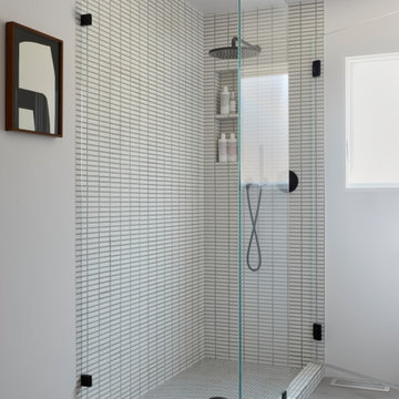
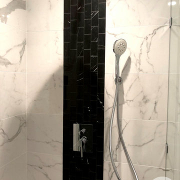
Bedroom and bathroom addition in Sunnyvale, CA - For this project we added on an additional bathroom and bedroom to the existing home to expand the owners living space. The owner had impecable style and wanted a bold and striking black and white modern bathroom. Custom accent tiles added in the shower create visual interest and highlight the gorgeous modern shower fixtures.
 Drury Design
THE SETUP
Multiple ovens, multiple workspaces, multiple sinks – when you think about it, non-jewish kitchens have been adapting the criteria of kosher kitchens for years.
Gladys’ clients in West Rogers Park are Orthodox Jewish. The house they bought already had a kosher kitchen – it just wasn’t done that well. It needed some more things to be duplicated for the dairy side and the meat side. Plus, it was dark and the configuration wasn’t very conducive for a family of eight.
It was time for a remodel.
Design Objectives
Improve kosher kitchen
Add more storage in the island
Better lighting
More open, lighter feel
Change the wood floor in the kitchen to tile
THE REMODEL
Design Challenges
- We had originally planned on removing a wing wall by the breakfast area. During demolition, we learned it contained a support beam.
- The kitchen is a substantial size, but having two sinks, dishwashers, and ovens presented a challenge – how do we fit it all in and make it flow with the storage still accessible near the work areas?
Where do you stop the materials for the new space? - -- The right tile, paint, lighting, etc. would be needed to make the remodeled area cohesive with the rest of the main floor.
- An existing column limited cabinet options and thus, storage capacity. Could we conceal it without disrupting the cabinetry flow?
Design Solutions
- We had to keep the wing wall, but decided to continue the tile on the sides of the cabinets and maintain the height of the tile to line up with the rest of the backsplash. This actually presented a very nice and cohesive look, especially since the opposite side has a wing wall to the left of the refrigerator.
- We used “L-shaped” corner sinks instead of the rectangular ones set on an angle. This gave us more of the legs of the triangles versus the hypotenuse, which allowed for the two dishwashers, and the pullout utensil canisters and spice pullouts while still keeping the 3-drawer cabinets on either side of the range (by the sinks). The old island had the recess for stools which the family never used. By extending the width of the island 6” and utilizing this leg space, we were able to fit 18”-deep cabinets on this side – adding lots of accessible storage. The family can now work simultaneously on the dairy side (the side with the fridge) and the meat side (opposite) without getting in each other’s way. We separated the cooking by using the range oven for the meat and a built-in microwave in the base cabinet. The wall oven with built-in microwave on top is for dairy.
- Corner sinks opened up the middle area for a wider range – we went from a 30” to a 36”. Removing all the wall cabinets (on the range wall) made a big difference. That opened up the entire space while adding some visual impact. (Not pictured: We also made the cabinets directly opposite the range wall tall and removed the countertop, resulting in more room for rollouts and even more storage!) The kitchen now has more storage than it did before.
- We ended up painting the ceiling of the kitchen into the hallway that leads to the foyer. The living and dining rooms were separated by a soffit, so that became a natural boundary. We kept the tile in the kitchen by stopping it short of the hallway and lining it up with the pantry wall. This creates a border between the breakfast area and family room. The rest of the existing wood floors were refinished to refresh and make the hue darker. We also painted a dark accent wall and carried it into the breakfast area to make the rooms look deeper.
- The in-the-way column housed plumbing and couldn’t be moved. We still built cabinets in that spot – we just had to build a chase inside it to conceal the pipes. There was still plenty of room for new storage. We also took the cabinets all the way to the ceiling. The continuous tall cabinets added a functional elegance to the space.
THE RENEWED SPACE
The client’s long-awaited dream of a better kosher kitchen has finally been achieved, beautifully combining enhanced storage solutions with adherence to the family’s orthodox dietary laws. The kitchen’s standout feature, an expanded island, now offers a spacious and efficient workspace. This allows several family members to cook together comfortably, without the inconvenience of bumping into each other, ensuring a harmonious and productive cooking environment.
 Beautiful Backyard Living
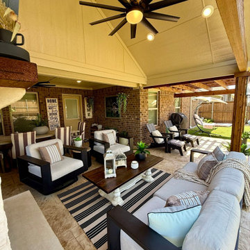
We recently completed a full outdoor living renovation for a homeowner in Celina, Texas, turning their backyard into a stylish and functional retreat. This project brought together multiple elements to create a seamless, well-designed space. We started with expanding the current space with a stamped and stained concrete patio. From there, we designed and built a Gable Roof Patio Cover and added a matching pergola, giving the homeowners both shade and open-air flexibility for entertaining or relaxing. To elevate the comfort level, we included electrical wiring for recessed lighting, ceiling fan, and beautiful lighting on the post to make the space enjoyable well into the evening hours.
The upgrades didn’t stop there. We added plenty of space for outdoor gatherings, and built a beautiful fireplace to anchor the space with warmth and ambiance. A decorative privacy wall was also added for comfort and visual appeal. To enhance the yard we added a stone tree ring that ties in the natural landscape with the finished design. The end result is a backyard that feels like an extension of the home—perfectly suited for family time, entertaining, or quiet evenings by the fire.
 Klopf Architecture
Malibu Glass Box House by Klopf Architecture
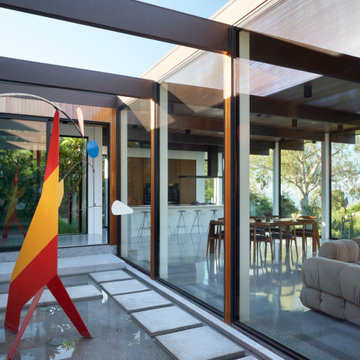
Following the devastating Woolsey Fire of 2018, the site in Malibu offered a unique opportunity to rebuild not just a home, but a new architectural composition that highlighted the property’s potential while navigating strict fire-rebuild codes in the area. Designed by Klopf Architecture, this project embraced a set of limitations and translated them into an architectural asset.
The city’s fire-rebuild process required the new structure to remain close to the original footprint, size and bulk, a constraint that ultimately clarified the architectural direction. Perched near the front of a long, narrow lot, the new home frames and overlooks a private, park-like rear expanse, an uncommon luxury especially in this part of Malibu .
Without a fixed program, the design process allowed for a different kind of creative focus allowing Klopf Architecture the opportunity to explore how a modernist home could best respond to this site. The team approached the project not with a list of requirements, but with a question: How might a modernist live here? What spatial qualities would inspire calm, connection, and a sense of wonder in this setting? The process became less about problem-solving and more about architectural storytelling—letting the site, the light, and the principles of modern design guide the form and flow of the home.
The response emerged in the form of a glass-box pavilion, an open, Mid-Century Modern inspired living, dining, and kitchen space that floats at the edge of the property’s natural descent. Connected to the more enclosed, private areas of the home by a glass-walled hallway, the living pavilion becomes a distinct centerpiece of the design. It opens on all four sides to the landscape with decks and patios on the flanks, an internal garden and water feature to the north, and a dramatic unguarded view of the expansive backyard and ocean horizon to the south.
Because of the mandated footprint, careful planning was required to ensure every space could still engage with light, landscape, or both. Strategic voids in the form of atriums and courtyards allow daylight to filter deep into the home’s core, while offering moments of surprise and retreat. These design gestures allow natural light to filter deep into the interior, creating a sense of brightness and openness throughout the day. At the same time, they expand the perceptual boundaries between inside and out, making the home feel more expansive while anchoring its connection to the surrounding landscape.
The siting of the house is what gives it its unique character. Rather than receding into the backyard like the neighboring homes, the house holds a slight prominence. From the central living pavilion, stepping down into the landscape feels more like entering a secluded park where a separate existing accessory structure, trail, and recreational areas await. The home’s modest street presence gives way to this unfolding drama of space, view, and nature.
Fire-resilient materials and assemblies are integrated seamlessly throughout including triple-pane glazing, under-slab and roof insulation, and locally sourced fire-rated cladding ensure the house not only meets Calfornia’s rigorous wildland-urban interface (WUI) standards, but feels effortlessly aligned with them. While technical decisions like fire-hardening and mechanical systems presented some construction challenges, particularly around the cantilevered glass box, the team found a functional compromise that preserved the integrity of the design.
Inside, a restrained palette and exposed post and beam design celebrate the ethos of mid-century modernism. A central circulation spine extends from the entry to the rear glass wall, offering a continuous visual link from street to ocean. Spaces such as the library and office, though more intimate in scale, are never cut off from nature as each opens to its own unique courtyard or garden view.
Though born out of a strict regulatory framework and developed without a specific client, the rebuild design unfolded with remarkable clarity. Grounded in site logic, refined by limitations and an emphasis on timeless spatial relationships – light, proportion, and a strong connection to nature, the resulting design feels both effortless and uplifting. The home lives lightly on the land, opens generously to its surroundings, and strikes a careful balance between privacy, openness, and calm. For Klopf Architecture, it stands as a compelling case study in how site, code, and circumstantial constraints can inspire enduring, modernist architecture. With years of experience reimagining mid-century modern design for how people live today, the firm took the project’s limitations as an opportunity. The result is a home shaped by open, flowing spaces, strong indoor-outdoor connections, and a calm, clear sense of structure. It’s a good reminder that even with strict constraints, there’s still room for architecture to breathe—and for modernism to keep moving forward.
Klopf Architecture project team: Geoff Campen, John Klopf, AIA, and Sherry Tan
Structural Engineer: ZFA
Contractor: Maison D’Artiste
Photography: ©2025 Mariko Reed
Year Completed: 2023


 NOR Design & Construction
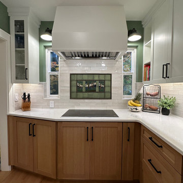
This West Seattle kitchen remodel in the heart of the Admiral District is a thoughtfully designed kitchen renovation that balances craftsmanship, functionality, and timeless style. The project focused on maximizing workspace, improving appliance layout, and creating a warm, inviting aesthetic tailored to the homeowner’s lifestyle.
Custom cabinetry by Superior Cabinets showcases stunning rift-cut white oak with a custom stain on the lower cabinets, paired with painted white upper cabinetry for a clean, classic contrast. Sleek hardware and intentional storage solutions enhance both usability and visual appeal, while the expanded layout delivers significantly more countertop space for cooking and gathering.
Countertops were fabricated by Floform using Pental Quartz in the color Aura (polished)—a durable, elegant surface that brightens the space and complements the cabinetry. The backsplash features Bedrosian Tile Celine White gloss tile, paired with a handcrafted Motawi Deco tile accent that adds a unique focal point behind the induction cooktop.
Appliances were sourced from Albert Lee Appliance, featuring a combination of Bosch and GE appliances. The layout was carefully reconfigured to meet the client’s specific requests, including a wall oven positioned at an ergonomic height, an induction cooktop, and improved workflow throughout the kitchen. To further enhance functionality, an outdated hallway access was closed off, allowing for better use of wall space and cabinetry.
Lighting was a key design priority. The client specifically requested no recessed can lighting, so the space incorporates layered illumination using Rejuvenation Hardware fixtures and under-cabinet lighting. This approach creates a warm, inviting ambiance while maintaining excellent task lighting.
Finishing touches include Sherwin-Williams paint in a rich green tone that adds depth and character, Kohler sink and faucet fixtures for reliability and style, and updated Milgard windows that bring in natural light while improving energy efficiency.
The result is a highly functional, beautifully detailed kitchen that reflects the charm of West Seattle while delivering modern performance and thoughtful design.
 Prompt 2 Design
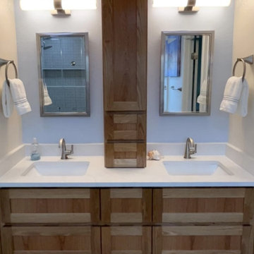
This bathroom was ready for a remodel and the homeowners were more than excited to get rid of the bath tub. Although there was plenty of room to expand the shower, the owners wanted to use the new found tub space for a make up vanity area. Even though the shower only grew by a couple of inches, we visually made it appear larger by incorporating a few design tricks! The other big change was maximizing storage with an all drawer vanity, vanity tower, and modern medicine cabinets.
 Klopf Architecture
Set on a narrow hillside lot overlooking the San Francisco Bay in Point Richmond, California, Bay Heirloom is a Mid-Century Modern family home restored, modernized and adapted for contemporary living. Oriented south-southwest toward the Marin Headlands, with views of the Golden Gate Bridge, the residence captures shifting Bay light throughout the day, from fog-muted mornings to vivid, glowing sunsets.
The home was built by Karlyn Neel’s grandfather, the owner of the construction company Flo-Crete, one of the Bay Area’s early concrete pumping firms. Flo-Crete completed the foundation and structural concrete work, with family photographs documenting the original cinderblock walls and pours. The firm also contributed to major regional infrastructure projects, including the Transbay BART tube and Candlestick Park, situating the house within a broader legacy of Bay Area construction. Growing up, Neel spent considerable time in the home, developing an early appreciation for mid-century modern principles. Instead of parting with this family heirloom, she purchased the home from her grandfather’s estate.
While her grandfather continued to live in the Point Richmond house, Neel purchased a Mid-Century Modern residence in Palm Desert. In contrast to the Bay Area’s cool temperatures, salt air, and persistent winds, the desert home is shaped by heat and sun and requires a different material response. A substantial renovation she led there emphasized thermal performance, filtered light, and restrained detailing. The experience later informed the restoration of her Bay Area family home.
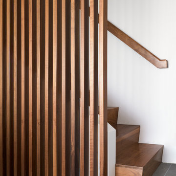
What began as a modest Mid-Century Modern update expanded when decades of exposure to marine conditions revealed leaks and significant structural and seismic deficiencies. Neel was determined to honor her grandfather’s perseverance and without hesitation pivoted to a much more intensive project. Addressing these challenges required close coordination between Neel, Klopf Architecture and Kasten Builders, with architectural restraint and construction precision guiding each intervention. Rather than alter the home’s defining features, the project focused on reinforcing the structure from within. Discreet beams were embedded along the rear facade and in an upstairs wall, strengthening the building while maximizing the wall of glass facing the Bay and opening the wall between the kitchen and the living space. These structural interventions allowed the space to open fully to the Bay without visual interruption, with the kitchen repositioned as the social and functional core of an open, continuous living space. The building envelope was updated using weather- and corrosion-resistant materials appropriate to the marine environment.
The house unfolds vertically from the street, beginning with a modest garage level and workshop, with the main living spaces located below. Original slate flooring at the entry was preserved, along with select furnishings and artwork collected by Neel’s grandfather, anchoring the restored interior in its past. A restrained palette of black accents and pale, natural finishes replaces darker wood tones, reinforcing openness and calm. A naturally illuminated stair connects to the lowest level, where a former basement was transformed into a guest suite and family room opening onto a deck. From there, steps lead directly to a small concrete boat ramp at the water’s edge.
Throughout the project, decisions were guided by continuity rather than transformation for its own sake. Lessons drawn from both desert and coastal climates informed a material strategy rooted in performance and restraint. Bay Heirloom stands as a measured evolution of a family house, structurally renewed and carefully modernized, grounded in the discipline and care that first shaped it.
Klopf Architecture Project Team: John Klopf, AIA, Angela Todorova and Fernanda Bernardes
Landscape Architect: Huettl Landscape Architecture
General Contractor: Kasten Builders
Photography: ©2025 Mariko Reed
Year Completed: 2022
Location: Point Richmond, CA
92