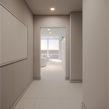
Search results for "Visuals" in Home Design Ideas

Project Objective
The goal of this project was to deliver a highly realistic 3D visualization of a bedroom overlooking the forest, where contemporary comfort is seamlessly combined with natural serenity. The intention was to create not only a functional interior but also an atmosphere that reflects the calm and restorative qualities of the surrounding landscape.
Approach & Process
- Spatial Planning: The layout was developed with a strong focus on ergonomics and user experience, ensuring optimal proportions and flow.
- Materials & Lighting: Natural textures, such as wood and soft textiles, were paired with a warm, diffused lighting scheme to evoke a peaceful and immersive ambiance.
- Camera Work: Each camera angle was strategically chosen to emphasize the interplay between interior details and the expansive forest views, showcasing both design precision and emotional impact.
Outcome
The final visualization demonstrates a refined balance between aesthetics and practicality. Attention to detail — from fabric textures to the way light shifts across surfaces — allowed for the creation of an atmosphere that is not only visually convincing but also emotionally resonant. This project reflects my ability to translate design concepts into immersive, photorealistic visual experiences.

This multi-phased project to a midcentury rambler in the Highland Park neighborhood of St. Paul that started with a broken swimming pool, outdated finishes and one less bedroom than kids and slowly transformed with Nordic design influences and an emphasis on showcasing the owner’s art collection.
The first phase design solution was a two-bedroom, one bath kid’s wing addition over the garage and a kitchen remodel to visually connect the living and dining areas. The kitchen cabinets are IKEA boxes with custom Grey Elm door fronts.
All windows were replaced with new H Windows as well as new white oak hardwood floors installed on the main level complementing the entire home’s light and airy Scandinavian interior design. The existing two main level bedrooms were converted into a primary suite with an office/flex space and the existing bathroom was updated to serve as an ensuite bathroom. Clear cedar soffits were installed to add visual warmth throughout the year and creates visual contrast to the black exterior of the house. Stained cedar slats were installed to provide visual interest and provide shade and shadow interplay. The unfinished basement was updated to create a media room as well as a home office. The original gunite pool was restored a new poolside patio space and a stone patio off the house used for outdoor dining were installed.

Project 196:- Residential Street View & Pool view ideas
Client: - 527. Desi
Location: - Toronto – Canada
https://yantramstudio.com/3d-architectural-exterior-rendering-cgi-animation.html
Classic ornamental landscaping help screen the parking area wile framing the view from the street. Residential front house 3d exterior walkthrough & backyard pool view of 3D Exterior Modeling Company with walkway places, decent atmosphere, road view, trees, garage area, car, bicycle, roof house, garden, people, modelling visualization firms by Architectural Visualisation Studio
Find the right local pro for your project

Photorealistic interior rendering of a warm, modern entryway vignette featuring layered textures, soft lighting, and a clean, transitional aesthetic. Designed for builder marketing and floor plan visualization, this image helps buyers envision how a home can feel when fully furnished. Ideal for real estate marketing, new construction homes, and pre-construction sales, creating an inviting first impression that enhances emotional connection and buyer interest.

Visual Comfort E.F. Chapman Crystal 6 Light Pendant.
Inspiration for a contemporary closet remodel in San Francisco

This interior design project involved a comprehensive renovation that completely transformed the appearance and features of an apartment located on the Costa del Sol, Spain. The goal was to modernize the space, enhance functionality, and create a more sophisticated and welcoming atmosphere, aligned with a Nordic style that emphasizes warmth and natural elements.
### Space Redistribution:
Originally, the apartment had only one bedroom and one bathroom. The first phase of the renovation involved redistributing the space to add a second bathroom, with one of them becoming an en-suite connected directly to the master bedroom. This addition significantly improved comfort and privacy, allowing each bedroom to have its own bathroom. Additionally, a new laundry area was created, providing a dedicated space for the washing machine, water heater, and cleaning supplies, optimizing the home's functionality without compromising aesthetics.
### Flooring and Visual Continuity:
The old dark, square-patterned flooring was replaced with porcelain tiles that mimic the texture and tone of wood. This new material was extended from the interior to the terrace, creating a sense of continuity and spaciousness. This change not only modernized the apartment's appearance but also reinforced the visual harmony between indoor and outdoor spaces, inviting residents to enjoy the natural light and views offered by the coastal location.
### Bathroom Renovation:
With the addition of a second bathroom, both spaces were completely renovated. The old tiles and bathtub were removed in favor of a more modern and functional design. Light-colored ceramics reflecting the Nordic style were installed, along with contemporary fixtures and clean lines. The en-suite bathroom was designed to offer an intimate and luxurious space, while the second bathroom, though equally modern, provides comfort and accessibility for the rest of the home.
### Style and Décor:
The predominant Nordic style was reflected in the choice of materials and colors. The walls were adorned with wooden slats, a detail that adds texture and warmth to the space, while the décor focused on natural elements like wood, linen, and plant fibers, creating a serene and relaxing atmosphere. Neutral tones and simple lines prevail, achieving a perfect balance between sophistication and comfort.
### Final Result:
The result is an apartment that not only looks more spacious and modern but also exudes a sense of tranquility and comfort. The renovation has transformed the space into a home that invites you to enjoy sunny days on the Costa del Sol, with a terrace seamlessly integrated with the interior and living spaces that reflect a sophisticated, functional, and inviting lifestyle.
Este proyecto de interiorismo consistió en una reforma integral que transformó por completo el aspecto y las características de un apartamento ubicado en la Costa del Sol, España. El objetivo era modernizar el espacio, mejorar la funcionalidad y crear un ambiente más sofisticado y acogedor, alineado con un estilo nórdico que resalta la calidez y la naturalidad.
### Redistribución del Espacio:
Inicialmente, el apartamento contaba con una sola habitación y un solo baño. La primera fase de la reforma implicó una redistribución del espacio, añadiendo un segundo baño, de los cuales uno se convirtió en suite, conectado directamente con la habitación principal. Esta ampliación mejoró significativamente la comodidad y privacidad, permitiendo que cada habitación tuviera su propio baño. Además, se creó una nueva zona de lavadero, un espacio dedicado para la lavadora, el termotanque y los elementos de limpieza, optimizando la funcionalidad del hogar sin sacrificar la estética.
### Suelos y Continuidad Visual:
Se reemplazaron los antiguos suelos de color oscuro, de apariencia cuadrada, por un porcelánico que imita la textura y el tono de la madera. Este nuevo material se extendió desde el interior hasta la terraza, creando una sensación de continuidad y amplitud. Este cambio no solo modernizó el aspecto del apartamento, sino que también reforzó la armonía visual entre los espacios interiores y exteriores, invitando a disfrutar de la luz natural y las vistas que ofrece la ubicación costera.
### Renovación de Baños:
Con la adición de un segundo baño, ambos espacios fueron completamente renovados. Se eliminaron los viejos azulejos y la bañera en favor de un diseño más moderno y funcional. Se instalaron cerámicas de tonos claros que reflejan el estilo nórdico, junto con elementos contemporáneos y líneas limpias. El baño en suite, en particular, fue diseñado para ofrecer un espacio íntimo y lujoso, mientras que el segundo baño, aunque igualmente moderno, ofrece comodidad y accesibilidad para el resto de la casa.
### Estilo y Decoración:
El estilo nórdico predominante se reflejó en la elección de materiales y colores. Las paredes fueron adornadas con palillería, un detalle que aporta textura y calidez al espacio, mientras que la decoración se basó en elementos naturales como madera, lino y fibras vegetales, creando una atmósfera serena y relajante. Los tonos neutros y las líneas simples predominan, logrando un equilibrio perfecto entre sofisticación y comodidad.
### Resultado Final:
El resultado es un apartamento que no solo se ve más amplio y moderno, sino que también transmite una sensación de tranquilidad y confort. La reforma ha transformado el espacio en un hogar que invita a disfrutar de los días soleados en la Costa del Sol, con una terraza que se integra perfectamente con el interior, y unos ambientes interiores que reflejan un estilo de vida sofisticado, funcional y acogedor.

Using 3d visualization you can capture even the smallest details of this stylish living room decoration. Visit ArchiCGI and order high quality 3D visualizations of your projects!

Sponsored
Columbus, OH
Snider & Metcalf Interior Design, LTD
Leading Interior Designers in Columbus, Ohio & Ponte Vedra, Florida

Make a Dream Home proudly presents a remarkable showcase of our recently completed garage remodeling project in Elmhurst, IL. With meticulous attention to detail and a commitment to transforming spaces, we have turned an ordinary garage into an exceptional area that combines functionality, organization, and aesthetic appeal.
Our team of skilled professionals worked diligently to deliver outstanding results that surpass expectations. The finished garage stands as a testament to our unwavering dedication to craftsmanship and creating dream spaces.
Upon entering the remodeled garage, you will be greeted by a space that has been completely transformed. Every aspect of the design has been thoughtfully executed to optimize functionality and enhance visual appeal. From organization solutions to exquisite finishes, our goal was to create a garage that is both practical and visually stunning.
In addition to functionality, the aesthetics of the garage have been elevated to create a visually pleasing environment. Thoughtfully chosen flooring materials add a touch of sophistication, while modern lighting fixtures illuminate the space and enhance visibility. The garage now exudes a sense of style and elegance, making it a pleasant extension of your home.
Make a Dream Home's commitment to quality is reflected in every aspect of the project. Our team utilized high-quality materials and employed expert craftsmanship to ensure durability and longevity. The finished garage is not only visually impressive but also built to withstand the demands of everyday use.
With this completed garage remodeling project in Elmhurst, IL, Make a Dream Home has proven to be a trusted partner in creating exceptional spaces. Whether you seek a garage renovation, organization solutions, or a complete makeover, our team is dedicated to turning your vision into reality.
Experience the joy and convenience of a beautifully remodeled garage that perfectly aligns with your needs and surpasses your expectations. Choose Make a Dream Home for your next garage remodeling project and let us bring your dream space to life.

The "Garden City Additions and Alterations" project revitalizes key areas of the home by blending modern elegance with classic charm. This transformation includes a bright and cozy living room, a luxurious bathroom with sleek fixtures, an efficient kitchen equipped with appliances, an elegant staircase enhancing the visual flow, and an inviting exterior with meticulous landscaping. Experience how we’ve seamlessly combined style, comfort, and functionality in this beautiful makeover.

Visual Comfort Square tube hanging pendant. This pendant is great for several applications bringing elegance and functionality to your room.
Dining room - mid-sized contemporary dining room idea in San Francisco

The detailed, colorful visualization of this perfect designed living room is brought to you by the team of ArchiCGI 3d artists. Visit our website and explore the 3D visualization potential for your business!

Bridle Path Residence — Formal Living & Music Room
This Bridle Path Residence living room is conceived as an elegant, light-filled entertaining space where classical architectural structure meets contemporary glamour and collected residential comfort. Rather than relying on ornament alone, the design uses proportion, symmetry, material contrast, and carefully selected furniture to create a room that feels sophisticated yet genuinely livable.
The architecture establishes a strong sense of permanence. Extensive wall panelling, substantial crown moulding, layered ceiling details, and classical fireplace architecture give the room an established character reminiscent of a refined estate interior. At the same time, the clean white envelope keeps the architecture fresh and allows the furnishings and artwork to provide the personality.
The expansive bay windows are one of the defining features of the room. Their repeated vertical proportions bring abundant natural light deep into the space while creating a strong relationship with the surrounding landscape. The windows also soften the formal architecture, giving the room an open, airy quality rather than the heaviness often associated with traditional interiors.
The furniture introduces a deliberately more contemporary language. A blush-toned sofa and upholstered accent chairs bring softness and warmth, while deep navy seating adds contrast and visual depth. Slim brass frames on the chairs and occasional tables introduce a subtle metallic thread throughout the room, connecting the individual seating pieces into a cohesive composition.
The central seating arrangement is intentionally conversational. Rather than orienting every piece toward the fireplace, the furniture creates an intimate social zone within the much larger room. The mix of rounded forms, sculptural silhouettes, and geometric metal bases prevents the formal architecture from feeling rigid.
A sculptural gold-toned coffee table becomes an important visual anchor. Its organic texture contrasts with the linear architectural detailing and polished hardwood floor, adding a layer of tactile richness. Smaller glass and metal tables maintain visual openness and allow the expansive room to remain uncluttered.
The fireplace provides a secondary focal point at the far end of the room, framed by symmetrical architectural detailing and flanking sconces. Its position establishes a visual axis through the space, while the artwork above introduces a curated, contemporary note within the traditional setting.
The piano adds an important dimension to the room's identity. Rather than being treated as a separate musical installation, it is integrated naturally into the overall composition, reinforcing the idea of the room as a space for music, entertaining, conversation, and everyday enjoyment. It also adds a rich dark element that balances the lighter furnishings and architectural envelope.
The warm hardwood flooring provides continuity and grounds the predominantly white palette. Against it, the combination of blush, navy, muted green, brass, glass, and natural textures creates a sophisticated but approachable colour story.
Overall, the room demonstrates a modern interpretation of classic luxury. Traditional architectural detailing provides the foundation, while contemporary furniture, sculptural lighting, metallic accents, art, and layered upholstery bring freshness and personality. The result is an elegant Bridle Path living space that feels tailored, highly finished, and timeless without becoming overly formal.

The Setup:
After purchasing this home, the homeowners faced a unique opportunity to reimagine their kitchen and nearby spaces. Water damage from a burst pipe had left much of the home’s interior in need of repair, and while the existing kitchen was functional and in relatively good shape, it didn’t align with the family’s vision for their new home. The layout included a peninsula that wasn’t ideal, and there were some druthers with the nearby pantry.
Since the space needed to be rebuilt anyway, the homeowners saw this as a chance to create a kitchen that was both highly functional for their four young children and timeless in its design. The project also included a refresh of the adjacent message center and dining room — spaces that play key roles in the family’s daily life. The goal was to create a cohesive flow between these areas, balancing modern functionality with the craftsman-inspired character of the rest of the home.
Design Objectives:
- Replace the outdated peninsula with a large island to maximize counter space and create new seating options.
- Open up the space visually by removing soffits and rethinking the cabinetry layout.
Incorporate concealed refrigeration and freezer units to provide significant storage for the family while maintaining a streamlined aesthetic.
- Integrate black cabinetry into the design without making the space feel harsh or heavy.
- Ensure the lighting plan balances functional task lighting with ambient accent lighting.
- Avoid visual clutter in the cabinetry design while still giving a nod to the craftsman aesthetic.
- Incorporate a slab backsplash as a key design feature.
Design Challenges:
- The outdated peninsula left dead space in the kitchen and lacked sufficient seating for the family.
- The cooktop wall was cramped, with small cabinets flanking the hood, limited storage, and soffits that made the space feel closed-in.
- The family needed significant refrigeration space (two refrigerators and a freezer) but wanted to avoid a cluttered look with visible stainless steel appliances.
- Adding black cabinetry risked making the space feel too dark or heavy.
- The original lighting plan was insufficient, particularly over the dining table where a decorative fixture proved too dim.
- The family wanted shaker-style drawer fronts to match the home’s arts-and-crafts design but worried that too much shaker cabinetry might look overly busy.
- Prioritizing a slab backsplash in the wish list priority planning.
The Renewed Space
Design Solutions:
- A functional island: The peninsula was replaced with a large island that provides continuous countertop space for prepping and serving. The island also features seating for four people, creating a central hub for informal meals and activities.
- Streamlined cooktop wall: The soffits were removed, and the upper cabinets on the cooktop wall were eliminated to create a more open, streamlined design. A custom oversized hood became the focal point of the wall, with the blower unit offset inside it to align with the cooktop while maintaining exterior visual symmetry.
- Concealed refrigeration: Two column refrigerators and one freezer were integrated into the cabinetry, concealing them behind wood paneling that blends seamlessly with the overall design.
- Warm black cabinetry: The black cabinetry was crafted from hickory with a visible grain, softening its appearance and adding warmth. The grain detail gives the cabinetry a rich, textured look that avoids feeling stark or overpowering.
- Additional lighting: In the dining area, recessed can lights were added during an additional installation phase to supplement the gorgeous decorative fixture’s dim output. The new lighting plan creates a layered effect, combining functional task lighting with softer ambient lighting.
- Simplified cabinetry details: Slab drawer fronts were used on the upper drawers, while five-piece shaker fronts (with slightly less prominent rail and stile pieces) were reserved for the middle and lower drawers. This approach simplified the overall look while maintaining the craftsman-inspired aesthetic.
- Slab backsplash priority: The slab backsplash was prioritized by making thoughtful adjustments elsewhere, like opting not to extend cabinetry to the ceiling, which also helped visually prioritize the gorgeous slab backsplash. This decision also enhanced the kitchen’s furniture-like feel, aligning with the home’s craftsman character.
- This kitchen perfectly balances practicality with timeless style. By addressing the family’s functional needs — ample seating, smart storage, and effective lighting — while incorporating thoughtful design elements like warm black cabinetry and a striking slab backsplash, Alicia created a space that works beautifully for a busy household. The result is a cohesive, inviting kitchen that honors the home’s craftsman roots and will serve the family well for years to come.

Sponsored
Columbus, OH
Snider & Metcalf Interior Design, LTD
Leading Interior Designers in Columbus, Ohio & Ponte Vedra, Florida

The Setup:
After purchasing this home, the homeowners faced a unique opportunity to reimagine their kitchen and nearby spaces. Water damage from a burst pipe had left much of the home’s interior in need of repair, and while the existing kitchen was functional and in relatively good shape, it didn’t align with the family’s vision for their new home. The layout included a peninsula that wasn’t ideal, and there were some druthers with the nearby pantry.
Since the space needed to be rebuilt anyway, the homeowners saw this as a chance to create a kitchen that was both highly functional for their four young children and timeless in its design. The project also included a refresh of the adjacent message center and dining room — spaces that play key roles in the family’s daily life. The goal was to create a cohesive flow between these areas, balancing modern functionality with the craftsman-inspired character of the rest of the home.
Design Objectives:
- Replace the outdated peninsula with a large island to maximize counter space and create new seating options.
- Open up the space visually by removing soffits and rethinking the cabinetry layout.
Incorporate concealed refrigeration and freezer units to provide significant storage for the family while maintaining a streamlined aesthetic.
- Integrate black cabinetry into the design without making the space feel harsh or heavy.
- Ensure the lighting plan balances functional task lighting with ambient accent lighting.
- Avoid visual clutter in the cabinetry design while still giving a nod to the craftsman aesthetic.
- Incorporate a slab backsplash as a key design feature.
Design Challenges:
- The outdated peninsula left dead space in the kitchen and lacked sufficient seating for the family.
- The cooktop wall was cramped, with small cabinets flanking the hood, limited storage, and soffits that made the space feel closed-in.
- The family needed significant refrigeration space (two refrigerators and a freezer) but wanted to avoid a cluttered look with visible stainless steel appliances.
- Adding black cabinetry risked making the space feel too dark or heavy.
- The original lighting plan was insufficient, particularly over the dining table where a decorative fixture proved too dim.
- The family wanted shaker-style drawer fronts to match the home’s arts-and-crafts design but worried that too much shaker cabinetry might look overly busy.
- Prioritizing a slab backsplash in the wish list priority planning.
The Renewed Space
Design Solutions:
- A functional island: The peninsula was replaced with a large island that provides continuous countertop space for prepping and serving. The island also features seating for four people, creating a central hub for informal meals and activities.
- Streamlined cooktop wall: The soffits were removed, and the upper cabinets on the cooktop wall were eliminated to create a more open, streamlined design. A custom oversized hood became the focal point of the wall, with the blower unit offset inside it to align with the cooktop while maintaining exterior visual symmetry.
- Concealed refrigeration: Two column refrigerators and one freezer were integrated into the cabinetry, concealing them behind wood paneling that blends seamlessly with the overall design.
- Warm black cabinetry: The black cabinetry was crafted from hickory with a visible grain, softening its appearance and adding warmth. The grain detail gives the cabinetry a rich, textured look that avoids feeling stark or overpowering.
- Additional lighting: In the dining area, recessed can lights were added during an additional installation phase to supplement the gorgeous decorative fixture’s dim output. The new lighting plan creates a layered effect, combining functional task lighting with softer ambient lighting.
- Simplified cabinetry details: Slab drawer fronts were used on the upper drawers, while five-piece shaker fronts (with slightly less prominent rail and stile pieces) were reserved for the middle and lower drawers. This approach simplified the overall look while maintaining the craftsman-inspired aesthetic.
- Slab backsplash priority: The slab backsplash was prioritized by making thoughtful adjustments elsewhere, like opting not to extend cabinetry to the ceiling, which also helped visually prioritize the gorgeous slab backsplash. This decision also enhanced the kitchen’s furniture-like feel, aligning with the home’s craftsman character.
- This kitchen perfectly balances practicality with timeless style. By addressing the family’s functional needs — ample seating, smart storage, and effective lighting — while incorporating thoughtful design elements like warm black cabinetry and a striking slab backsplash, Alicia created a space that works beautifully for a busy household. The result is a cohesive, inviting kitchen that honors the home’s craftsman roots and will serve the family well for years to come.

St. Andrews Project — Custom Kitchen & Sculptural Island
This York Mills kitchen is conceived as a highly tailored architectural composition where traditional cabinetry is reinterpreted through contemporary detailing, creating a space that feels refined, functional, and distinctly custom.
The design is built around a restrained palette of warm white, natural oak, charcoal, and aged-brass accents. The cabinetry establishes a calm architectural envelope, while finely fluted detailing introduces texture and repetition across the island, upper cabinetry, and selected architectural surfaces. This creates a cohesive visual rhythm without relying on excessive ornament.
The island is the defining element of the kitchen. Its generous sculptural curve softens the strong linear geometry of the surrounding cabinetry and creates a more fluid transition through the space. The deep charcoal finish gives the island visual weight, while the slender brass accent beneath the countertop introduces a precise, jewelry-like detail that elevates the composition. The fluted surface catches light subtly, adding depth and movement as the viewer moves through the room.
The range wall is intentionally quieter, allowing the architectural detailing to frame the cooking zone rather than compete with it. Integrated cabinetry, concealed appliances, tailored hardware, and a softly illuminated backsplash maintain a sense of visual order. The combination of panelled doors and vertical fluting creates a sophisticated dialogue between classic cabinetry proportions and contemporary surface treatment.
Natural oak flooring introduces warmth and grounds the predominantly light palette. Its honeyed tone provides an important counterbalance to the cooler whites and dark island, while visually connecting the kitchen to the home's other warm wood elements.
Large black-framed windows bring natural light deep into the kitchen and establish a direct relationship with the exterior. The contrast of the dark window frames against the white architectural envelope reinforces the home's broader black-and-white design language.
Overall, the kitchen is designed around contrast, repetition, and proportion. Traditional cabinetry gives the space its timeless foundation, while sculptural geometry, fluted textures, dark finishes, and restrained brass detailing bring a contemporary edge. The result is a sophisticated luxury kitchen that feels designed as part of the architecture rather than inserted into it.

The detailed, colorful visualization of this perfect designed living room is brought to you by the team of ArchiCGI 3d artists. Visit our website and explore the 3D visualization potential for your business!

Studio IAAD | Hines Conscient Elevate, Gurugram
A tranquil retreat from city-life
Located in the plush suburbs of Gurugram in NCR, Elevate is a co-venture housing project marking the collaboration of Hines and Conscient, two major league developers in the Indian real estate sector. Spread across an area of about 10,000 sq.ft., the design scope comprised architecture, interiors, landscaping and FFE, skillfully realized by Studio IAAD.
The holistic design brief allowed for a versatile and flexible intervention; the idea was to 'elevate' the person entering the condominiums from the chaos of the noisy world's frantic pace to a quieter, peaceful space where they can relax and take a breath of fresh air. The biophilic approach, a signature of Studio IAAD's brand, nurtures an intimate connection of the user with nature without foregoing modern comforts, whilst employing greenery as a buffer to mute the clangour of the cosmopolitan city, enabling well-being.
Nestled in a forest-like setting, the approach to the house evokes tranquility. The visitor is greeted with a narrow pathway on entry, wrapped in an enclosing thicket of overarching trees. It trails up to a circular courtyard with a sculpture at its nucleus, that embodies the aesthetics of grace, harmony and serenity. This courtyard connects to the building through a dynamic walkway peppered with abundant tropical trees and blossoming petunia flower beds on either side, activating the pedestrian experience and crafting a blissful forest-like environment. Encompassed within green canopies, the building seems to emerge from the verdant landscape, akin to the trees that surround it.
Steeped in a contemporary theme, the design also nods to rustic simplicity and examples of European aesthetics in the interiors. The structure metaphorically manifests itself as a glass box at the ground level, wrapped in transparent ribbons of glazing and holding up the levitating opaque mass that houses the private enclosed spaces on top. The expansive glass walls offer unhindered views of the scenic splendour around, enriching the visual experience. A sleek metal skeleton supports the structure, framing the glass facade and giving it a modern edge, thereby reducing the need for boxy columns. An open courtyard that forms the nexus of the project creates a niche in the building mass, dividing it into two distinct parts that remain visually connected. A conscious intervention places multiple human-form sculptures by Mukul Goyal to adorn the courtyard space with their faces directed towards the sky, representing the notion of being liberated and 'elevated'.
Within the main dwelling, the ground floor accommodates the experience centre, a lounge, a café and the audio-visual room leading up to the show apartment, kids’ room, a lounge and meeting rooms at the top level. The seating spaces of the reception, outdoor deck, café and lounge are stitched together around the central courtyard in an unceasing dialogue with each other and the infinite open sky. The spaces flow into one another and unfold as one moves along, enabling a gradual unwinding of the sensory experience instead of making a colossal impact instantly. Careful planning allows the optimization of spaces and an easy concourse of commodious rooms. The audio-visual room is a theatrical experience that allows the visitors to watch a movie when the screen is down and reveals the model room as the screen lifts, unravelling an added dimension. For experience centres, it is imperative to hold the visitor's attention, so the spaces have been designed cohesively in tandem with this intent. A specially designed kids’ room allows young families to explore the building in uninterrupted peace while their kids indulge in recreational activities. The staircase is designed using opulent chandeliers to usher the visitors from the lifts towards the stairs in order to make the ascent a part of the enchanting experience.
The three-bedroom show apartment is finished in inconspicuous, neutral tones and materials, allowing potential home-buyers to layer their personalities onto the house. Each user can relate to their own space, making it a unique selling point for the apartment. Taking a cue from the natural surroundings, a soothing play of textures by ribbed wooden cladding and mirror panelling in subdued browns forms the highlight of the living room, accentuated by flooring and furniture in pristine white. A wrap-around balcony ties two bedrooms and a corner of the living room, creating a sizable spill-out space for relaxation and recreation, enabling transcendence into the enveloping quietude. A juxtaposition of course, with the fine, awe-inspiring artworks adorn the walls of the house, leaving a solid and lingering impression on the minds of the visitor with a recall factor long after they have left. The artistry conjoined with carpets and lighting accessories in fresh and vibrant hues comes together and serenades the space with a warm, welcoming vibe- constituting a harmonious whole that exceeds the sum of its parts. A view gallery outside the apartment frames the sylvan panoramic vistas beneath the blue banner of the sky, acting as the epitome of the experience of 'Elevate' housing.
Many accessories, including lighting fixtures and furniture, have been reused from a previous project, facilitating a sustainable approach to waste management. The sculptures will also become a part of the landscape in the housing project. Concentric cut-outs in the ceiling are designed to achieve a minimal yet elegant look, integrating both HVAC and lighting services into one. The structure is designed with metal, glass and wood as principal materials for quick construction, deconstruction and reuse.
The design corroborates a dialogue between the experience centre and the show apartments through a similar theme and vocabulary. Envisioned as a boutique hotel, the building is averse to the prevailing treatment of experience centres as an afterthought to housing developments. The ethereal slow-burn experience compels the visitor to sit and ponder, escaping in the forest's therapeutic solitude, away from the outer world, becoming a placid haven that people want to connect to, engage with and inhabit.

This interior design project involved a comprehensive renovation that completely transformed the appearance and features of an apartment located on the Costa del Sol, Spain. The goal was to modernize the space, enhance functionality, and create a more sophisticated and welcoming atmosphere, aligned with a Nordic style that emphasizes warmth and natural elements.
### Space Redistribution:
Originally, the apartment had only one bedroom and one bathroom. The first phase of the renovation involved redistributing the space to add a second bathroom, with one of them becoming an en-suite connected directly to the master bedroom. This addition significantly improved comfort and privacy, allowing each bedroom to have its own bathroom. Additionally, a new laundry area was created, providing a dedicated space for the washing machine, water heater, and cleaning supplies, optimizing the home's functionality without compromising aesthetics.
### Flooring and Visual Continuity:
The old dark, square-patterned flooring was replaced with porcelain tiles that mimic the texture and tone of wood. This new material was extended from the interior to the terrace, creating a sense of continuity and spaciousness. This change not only modernized the apartment's appearance but also reinforced the visual harmony between indoor and outdoor spaces, inviting residents to enjoy the natural light and views offered by the coastal location.
### Bathroom Renovation:
With the addition of a second bathroom, both spaces were completely renovated. The old tiles and bathtub were removed in favor of a more modern and functional design. Light-colored ceramics reflecting the Nordic style were installed, along with contemporary fixtures and clean lines. The en-suite bathroom was designed to offer an intimate and luxurious space, while the second bathroom, though equally modern, provides comfort and accessibility for the rest of the home.
### Style and Décor:
The predominant Nordic style was reflected in the choice of materials and colors. The walls were adorned with wooden slats, a detail that adds texture and warmth to the space, while the décor focused on natural elements like wood, linen, and plant fibers, creating a serene and relaxing atmosphere. Neutral tones and simple lines prevail, achieving a perfect balance between sophistication and comfort.
### Final Result:
The result is an apartment that not only looks more spacious and modern but also exudes a sense of tranquility and comfort. The renovation has transformed the space into a home that invites you to enjoy sunny days on the Costa del Sol, with a terrace seamlessly integrated with the interior and living spaces that reflect a sophisticated, functional, and inviting lifestyle.
Este proyecto de interiorismo consistió en una reforma integral que transformó por completo el aspecto y las características de un apartamento ubicado en la Costa del Sol, España. El objetivo era modernizar el espacio, mejorar la funcionalidad y crear un ambiente más sofisticado y acogedor, alineado con un estilo nórdico que resalta la calidez y la naturalidad.
### Redistribución del Espacio:
Inicialmente, el apartamento contaba con una sola habitación y un solo baño. La primera fase de la reforma implicó una redistribución del espacio, añadiendo un segundo baño, de los cuales uno se convirtió en suite, conectado directamente con la habitación principal. Esta ampliación mejoró significativamente la comodidad y privacidad, permitiendo que cada habitación tuviera su propio baño. Además, se creó una nueva zona de lavadero, un espacio dedicado para la lavadora, el termotanque y los elementos de limpieza, optimizando la funcionalidad del hogar sin sacrificar la estética.
### Suelos y Continuidad Visual:
Se reemplazaron los antiguos suelos de color oscuro, de apariencia cuadrada, por un porcelánico que imita la textura y el tono de la madera. Este nuevo material se extendió desde el interior hasta la terraza, creando una sensación de continuidad y amplitud. Este cambio no solo modernizó el aspecto del apartamento, sino que también reforzó la armonía visual entre los espacios interiores y exteriores, invitando a disfrutar de la luz natural y las vistas que ofrece la ubicación costera.
### Renovación de Baños:
Con la adición de un segundo baño, ambos espacios fueron completamente renovados. Se eliminaron los viejos azulejos y la bañera en favor de un diseño más moderno y funcional. Se instalaron cerámicas de tonos claros que reflejan el estilo nórdico, junto con elementos contemporáneos y líneas limpias. El baño en suite, en particular, fue diseñado para ofrecer un espacio íntimo y lujoso, mientras que el segundo baño, aunque igualmente moderno, ofrece comodidad y accesibilidad para el resto de la casa.
### Estilo y Decoración:
El estilo nórdico predominante se reflejó en la elección de materiales y colores. Las paredes fueron adornadas con palillería, un detalle que aporta textura y calidez al espacio, mientras que la decoración se basó en elementos naturales como madera, lino y fibras vegetales, creando una atmósfera serena y relajante. Los tonos neutros y las líneas simples predominan, logrando un equilibrio perfecto entre sofisticación y comodidad.
### Resultado Final:
El resultado es un apartamento que no solo se ve más amplio y moderno, sino que también transmite una sensación de tranquilidad y confort. La reforma ha transformado el espacio en un hogar que invita a disfrutar de los días soleados en la Costa del Sol, con una terraza que se integra perfectamente con el interior, y unos ambientes interiores que reflejan un estilo de vida sofisticado, funcional y acogedor.

Diablo Flooring Inc - Danville CA
HomerWood is an American brand you can trust! Using only the highest quality, local raw materials they hand-craft premium hardwood flooring in a range of beautiful colors, styles, textures and surface treatments to fit both residential and commercial interiors.
HomerWood Hardwood Flooring is visually opulent with distinct looks and is a truly unique hardwood flooring with a personal reflection of one's own taste and lifestyle. Allow Nature To Customize Your Floor!
HomerWood Hardwood Flooring Traditional Character - Click to View Selections
Traditional Character™
Crafted from the entire tree, all of nature's beautiful distinctive markings are revealed. These one-of-a-kind markings are highlighted beneath a smooth durable finish.
Amish Hand-Scraped®
These floors are truly fashioned by hand by local Amish artisans and like a true piece of art, each plank bears the signature of the proud craftsman who created it. HomerWood's Traditional scrape covers the full surface of the floor. Whereas Time Worn, a softer scrape, provides a subtle rolling surface variation.
Smoked Specialties™
Dramatic, rich and alluring visuals that add design and depth to a room. Using a technique achieved by gently flaming the wood, board by board, the heat from the open flame caramelizes the sugars in the sapwood creating a shadowed look that can't be imitated.
Aesthetics™ by HomerWood®
Oak and Ash hardwood sourced from the Appalachian region are custom crafted into beautiful long, wide planks that are precisely milled to enhance the overall presence of your wood floor. These visually pleasing floors are offered in a 9/16" engineered construction to provide installation versatility and excellent stability. HomerWood's designer inspired color choices are highlighted beneath a smooth durable matte finish making these floors an attractive option for both residential and commercial interiors.
Birch Run™
The rich elegance of HomerWood's all American birch lends an air of distinction to any room where the beauty of the wood is of the utmost importance. Birch wood is fine grained with an attractive satin like luster. While all trees are naturally renewable, not all are able to be utilized to the full extent like the Birch tree. This capability makes it an environmentally friendly resource precisely milled by HomerWood.
Raw Material
Homerwood uses only the highest grade, center cut, raw material from verifiable sources in the Appalachian region. Visually beautiful floors with tight grain. Allows for long lengths and wider widths with excellent stability.
Species
Homerwood uses only domestic species which include hickory, cherry, black walnut, hard maple, ash, birch, red oak, white oak and rift and quartered white oak. With a broad range of species and colors to choose from, you have many options and choices to design to your taste and style.
Green
Homerwood hardwood flooring is produced with zero waste, is Carb II compliant with zero off-gassing and no VOC's. Engineered floors are cold pressed with no urea formaldehyde. Environmentally friendly. Provides for healthy living with no allergens.
Warranty - Lifetime Structural Warranty
Superior Finish Warranty - Aluminum Oxide only: 50-year residential / 3-year commercial
Custom Options
Custom stains, gloss levels, long lengths, wide widths, textures, reclaimed flooring, pre-cut herringbone and pre-cut parquets.

This interior design project involved a comprehensive renovation that completely transformed the appearance and features of an apartment located on the Costa del Sol, Spain. The goal was to modernize the space, enhance functionality, and create a more sophisticated and welcoming atmosphere, aligned with a Nordic style that emphasizes warmth and natural elements.
### Space Redistribution:
Originally, the apartment had only one bedroom and one bathroom. The first phase of the renovation involved redistributing the space to add a second bathroom, with one of them becoming an en-suite connected directly to the master bedroom. This addition significantly improved comfort and privacy, allowing each bedroom to have its own bathroom. Additionally, a new laundry area was created, providing a dedicated space for the washing machine, water heater, and cleaning supplies, optimizing the home's functionality without compromising aesthetics.
### Flooring and Visual Continuity:
The old dark, square-patterned flooring was replaced with porcelain tiles that mimic the texture and tone of wood. This new material was extended from the interior to the terrace, creating a sense of continuity and spaciousness. This change not only modernized the apartment's appearance but also reinforced the visual harmony between indoor and outdoor spaces, inviting residents to enjoy the natural light and views offered by the coastal location.
### Bathroom Renovation:
With the addition of a second bathroom, both spaces were completely renovated. The old tiles and bathtub were removed in favor of a more modern and functional design. Light-colored ceramics reflecting the Nordic style were installed, along with contemporary fixtures and clean lines. The en-suite bathroom was designed to offer an intimate and luxurious space, while the second bathroom, though equally modern, provides comfort and accessibility for the rest of the home.
### Style and Décor:
The predominant Nordic style was reflected in the choice of materials and colors. The walls were adorned with wooden slats, a detail that adds texture and warmth to the space, while the décor focused on natural elements like wood, linen, and plant fibers, creating a serene and relaxing atmosphere. Neutral tones and simple lines prevail, achieving a perfect balance between sophistication and comfort.
### Final Result:
The result is an apartment that not only looks more spacious and modern but also exudes a sense of tranquility and comfort. The renovation has transformed the space into a home that invites you to enjoy sunny days on the Costa del Sol, with a terrace seamlessly integrated with the interior and living spaces that reflect a sophisticated, functional, and inviting lifestyle.
Este proyecto de interiorismo consistió en una reforma integral que transformó por completo el aspecto y las características de un apartamento ubicado en la Costa del Sol, España. El objetivo era modernizar el espacio, mejorar la funcionalidad y crear un ambiente más sofisticado y acogedor, alineado con un estilo nórdico que resalta la calidez y la naturalidad.
### Redistribución del Espacio:
Inicialmente, el apartamento contaba con una sola habitación y un solo baño. La primera fase de la reforma implicó una redistribución del espacio, añadiendo un segundo baño, de los cuales uno se convirtió en suite, conectado directamente con la habitación principal. Esta ampliación mejoró significativamente la comodidad y privacidad, permitiendo que cada habitación tuviera su propio baño. Además, se creó una nueva zona de lavadero, un espacio dedicado para la lavadora, el termotanque y los elementos de limpieza, optimizando la funcionalidad del hogar sin sacrificar la estética.
### Suelos y Continuidad Visual:
Se reemplazaron los antiguos suelos de color oscuro, de apariencia cuadrada, por un porcelánico que imita la textura y el tono de la madera. Este nuevo material se extendió desde el interior hasta la terraza, creando una sensación de continuidad y amplitud. Este cambio no solo modernizó el aspecto del apartamento, sino que también reforzó la armonía visual entre los espacios interiores y exteriores, invitando a disfrutar de la luz natural y las vistas que ofrece la ubicación costera.
### Renovación de Baños:
Con la adición de un segundo baño, ambos espacios fueron completamente renovados. Se eliminaron los viejos azulejos y la bañera en favor de un diseño más moderno y funcional. Se instalaron cerámicas de tonos claros que reflejan el estilo nórdico, junto con elementos contemporáneos y líneas limpias. El baño en suite, en particular, fue diseñado para ofrecer un espacio íntimo y lujoso, mientras que el segundo baño, aunque igualmente moderno, ofrece comodidad y accesibilidad para el resto de la casa.
### Estilo y Decoración:
El estilo nórdico predominante se reflejó en la elección de materiales y colores. Las paredes fueron adornadas con palillería, un detalle que aporta textura y calidez al espacio, mientras que la decoración se basó en elementos naturales como madera, lino y fibras vegetales, creando una atmósfera serena y relajante. Los tonos neutros y las líneas simples predominan, logrando un equilibrio perfecto entre sofisticación y comodidad.
### Resultado Final:
El resultado es un apartamento que no solo se ve más amplio y moderno, sino que también transmite una sensación de tranquilidad y confort. La reforma ha transformado el espacio en un hogar que invita a disfrutar de los días soleados en la Costa del Sol, con una terraza que se integra perfectamente con el interior, y unos ambientes interiores que reflejan un estilo de vida sofisticado, funcional y acogedor.
77