
Search results for "Vital elements" in Home Design Ideas
 Ultimate Kitchens & Bathrooms
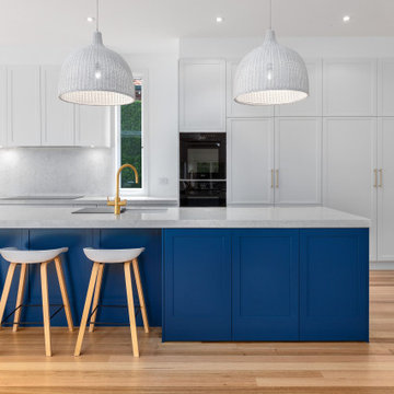
Light, bright and inviting, a beautiful entertainer’s kitchen that combines modern features with beachside characteristics. The open-plan layout connecting with a long Island bench, perfect when you need extra space to prepare a meal, it doubles as casual dining space for guests to eat around or enjoy a glass of wine while having a chat. Striking pendant lighting draws the eye towards the spectacular white profile joinery, that actually works to reflect natural lighting and maximise window views. The blue tone acts as a sophisticated backdrop, a statement against the stone countertop leading up and into the splash back, engineered stone in Casablanca form Stone Ambassador helps to open the space and creates the illusion of a larger area. White leather bar stools are a great casual seating option, and a contrast to the "Dulux Sharp Blue” colour palette used on the Island cabinetry. Smartly positioned bar is a nice addition in this entertainer's space, creating an elegant and also practical storage solution, kept away from plain sight but nearby and handy when situations call for a celebration or a relaxing sip before bed. This cleverly designed area is complete with wine fridge, wine rack and shelves for storage.
The Ultimate adjoining laundry flowing directly from the kitchen, it’s vital that the design is both practical and functional.
Materials continue into this space with the exception of the splash back, the use of textured tiles in a herringbone pattern adds an extra eye-catching element to this desirable laundry space.
Ample storage is necessary in your laundry, this space includes a combination of cupboards, overhead, drawers and bench top space, and the inclusion of tall cupboards allowing you to store brooms, mops and vacuum cleaners out of sight.
Elements of blue that echo the outside connecting the kitchen and garden, allowing a free- flowing design and plenty of natural light, throw open the doors and straight onto the pool.

 Nathan Taylor for Obelisk Home
Objective: The clients childhood memories of a home previously stayed in as a young girl played a vital
role in the decision to totally transform a part of history into a modern retreat for this couple.
Solution: Demo of every room began. One brick wall and center support wall stayed while everything
else was demolished. We rearranged each room to create the perfect home for the soon to
be retired couple. The clients love being outside which is the reasoning for all of large window and
sliding doors which lead to the pool and manicured grounds.
A new master suite was created, new guest room with ensuite bath, laundry room, small family
room, oversized living room, dining room, kitchen, dish pantry, and powder bath were all totally
reimagined to give this family everything they wanted. Furnishings brought from the previous home,
revived heirlooms, and new pieces all combined to create this modern, yet warm inviting home.
In the powder bath a classic pedestal sink, marble mosaic floors, and simple baseboards were the
perfect pairing for this dramatic wallpaper. After construction, a vintage art piece was revived from
storage to become the perfect juxtaposed piece to complete the powder bath.
The kitchen is a chef’s dream with clean lined cabinets, white quartz countertops and plenty of seating
for casual eating.
Find the right local pro for your project

 SUPERIOR CHIMNEY SERVICES CORPORATION
Do you know what ends our time of enjoying the wonderful Fall colors? Rain. The other day when it rained, it took most of those bright yellow leaves and brought them to the ground. It saddened me not only because the colors were gone, but now the leaves have to be cleaned up. And with the trees being larger, those leaves went everywhere. All over the ground, in the tall bushes, stuck on the window sills, lodged in the gutters and up at the chimney. Nature’s going to happen so, what are the effects of Fall rain and the Chimney? Let’s take a further look.
Fall Rain and the Chimney
The Fall leaves are gorgeous and fall is many homeowners favorite time of year. But as with all seasons, it comes to an end. The Fall rain combined with wind takes those colorful leaves and distributes them…everywhere. Especially on the roof where your chimney is located. By having an annual chimney inspection, we’ll take a look to ensure the safety of your chimney stays intact for the upcoming harsher season: Winter.
The Exterior Chimney
With Fall, we have two of the elements to be concerned about and that’s the leaves and rain. Here are a few areas we check and the effects of fall rain and the chimney. Let’s start at the top:
Chimney Cap: The chimney cap is vital for protecting the opening of your chimney which leads to the interior of your home. We inspect the chimney cap ensuring it is tightly secured to the exterior chimney termination. The chimney is typically the tallest part of your home and gets exposed to the harshest winds, rain, snow, animals and blowing debris. All of that hits the chimney cap trying to find that weak spot so it can get inside the chimney. If it does, that debris is easily ignited and can cause harm to your home.
Chimney Crown: This is the slab of concrete that covers the chimney and extends beyond the bricks or materials that make up the chimney. This is to provide protection from the elements. But remember the chimney crown can also develop cracks over time. This is where crown coat can extend the life of the chimney crown ensuring the elements stay where they should… outside.
Brick, Stone and Mortar: The structure of the chimney can be made of brick, stone or other materials. If it is made of brick or stone, then mortar is involved. All of these materials are porous, meaning that it can absorb water and snow melt, which breaks down over time. As a result, this needs to be checked looking for loose bricks, missing mortar, cracks in either one of these materials and more. Tuckpointing is a good solution to ensure the elements stay out. The use of Chimney Saver is a great way to preserve the bricks, stones and mortar as it waterproofs and protects the materials for about 8 – 10 years and slows down the aging process.
Flashing: This is the material that protects the connection of the roof to the chimney. A critical and common area for leaks. The flashing moves the water away from the chimney and down the roof. The flashing adheres to the chimney with a seal, which dries out over time. This area needs to be checked to ensure the seal is strong and doesn’t allow water to get in.
Before the cold sets in and you want to turn on or fire up the fireplace, be sure to take into consideration the effects of fall rain and the chimney. Contact us today at 877-244-6349 to set up an appointment.
 Home Improvement
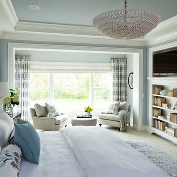
West or east, home is the best. Happy, warm, harmonious home is the dream and target of people. How to decorate our home is very important. We have the experience that the bedding we saw in emporium is beautiful, but the effect does not good when we bring it home. This is because we do not choose bedding according to the color collocation of our dream bedrooms. Here are some classic color collocation methods for you:
Color collocation of light with dark: when the main color of your dream bedroom is light, such as white, light color bedding will make your bedroom feel pale, ordinary and have no sense of color. On the contrary, dark or bright color bedding such as chocolate, purple, green, yellow will make your space full of vitality. The collocation of light and dark color gives people strong visual impact. So when your dream bedroom have dark color as its main tone, light or bright color like white, pink, red and yellow goes well with it. The space will feel depressing if you use dark color bedding.
Color collocation method of similar color: it means choose bedding with similar color to the main color of bedroom. For example, when the main color of your dream bedroom is purple, white bedding with few purple decoration patterns is good choice. There would be no layering if you use bedding in large area purple.
Collocation method of matching complex with simple: if the decoration style of bedroom is complex, concise and elegant bedding goes well with it, or the space will be disorderly and unsystematic.
The intensity of lighting: light intensity is the factor that people often neglect. Avoid using dark color bedding in bedroom with dark light.
The relationship of whole and part: the main color of bedroom is whole, bedding color is part. A guest cannot usurp the host's role. So does the bedding. There should be primary and secondary in bedroom color collocation. Bedding color only plays the role of embellishing.
Take all the elements in bedroom into consideration: all the elements in dream bedroom – wall, furniture, floor, and bedding – should be considered. They should be in consistent.
We all know that color has the function of mood adjustment. We should choose color according to our actually needs.
Green and purple is good to soothe the nerves and relax people. Patient with phobia and schizophrenia can choose the two colors.
Light saffron yellow, blue and pink can make people exciting, happy and full of hope. Depression and anxiety disorder patient can choose them.
Cyan is good to produce sleepiness. It suit for those insomniac.
Besides, warm color bedding with thicker fabric suit to use in winter and autumn for the decrease of temperature.
 Molly Erin Designs Inc
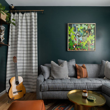
Example of a trendy medium tone wood floor and brown floor family room design in Sacramento with green walls
 Revolutionary Gardens
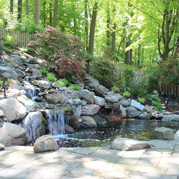
This large fish pond is tucked right up against the patio, creating a seamless transition between spaces
Design ideas for a traditional landscaping in DC Metro.
Design ideas for a traditional landscaping in DC Metro.

Sponsored
Columbus, OH

Wannemacher Interiors
Customized Award-Winning Interior Design Solutions in Franklin Cnty OH
 Fabco Sanctuary
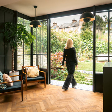
The architect and designer Guy Derwent was approached by his client with a clear and compelling brief: to completely transform a grand Victorian terrace house they were planning to renovate. The client envisioned something far beyond a standard renovation – this was to be a bold and dramatic reimagining of a family home that could grow with them over time.
With the property having remained largely untouched for more than fifty years, the architects saw an opportunity to unlock its potential and deliver a contemporary design that would contrast beautifully with its Victorian heritage.
The existing layout consisted of a series of small, disconnected rooms to the rear of the house. To respond to the client’s need for openness and flexibility, the architect proposed a radical restructuring of the ground floor:
The rear rooms were completely removed
Suspended timber floors were lowered by up to two metres to align with the garden
Two bold extensions were added
The first extension filled in the side return with a London stock brick facade and a glazed roof, while the second – a striking black steel and glass pavilion was glazed on three sides and placed along the garden elevation.
This new pavilion redefined the building’s relationship with the garden. Its steel-framed glazing created a seamless dialogue between interior and exterior, offering a sense of immersion in the surrounding landscape.
At the heart of the plan sits a dramatic, five-metre-tall dining space that acts as a transition from the original entrance hall into the new addition. A large, circular cast-glass window, framed in steel, provides a visual and spatial link between old and new, allowing light and movement to travel through the depth of the home.
Throughout the project, a series of black metal elements were introduced as sculptural interventions – each marking moments of transformation within the house. These included the bespoke steel framed circular window, a custom metal staircase, a cylindrical support column, and the striking steel and glass garden pavilion. Together, they formed a coherent architectural language that underscored the project’s bold intent.
Our steel windows and doors played a vital role in delivering the project’s vision. The architects chose steel for its refined sight lines and distinctive material character, which helped bridge the gap between the historical context of the building and the bold new additions.
The black steel frames provided a crisp contrast to the pale London stock brick and added definition to the glazed pavilion, reinforcing the sense of architectural precision. In particular, the fine steel profiles of the garden room allowed the extension to feel both lightweight and immersive, blurring the boundary between the house and its garden.
The architect drew inspiration from the Bauhaus Movement, particularly the work of Walter Gropius, whose approach to functional beauty and industrial materials informed the design of the garden pavilion.
Here, our glazing system was used not just for transparency, but as an expressive architectural element. The carefully proportioned panels help to conceal the roof thickness and reinforce the pavilion’s industrial yet abstract character – a deliberate nod to product design and modernist detailing.
Sustainability was an important factor in the selection of materials. Our steel systems, made from 99% recycled content and 100% recyclable, aligned with the project’s broader environmental goals.
The architects noted that this commitment to material longevity and circularity was central to their decision to use steel. The durability and recyclability of the windows and doors ensured the project met both aesthetic and ethical criteria.
This London terrace house now stands as a celebration of contrast – between heritage and innovation, solidity and transparency, tradition and transformation. Our steel windows and doors were not simply components; they were essential tools in crafting a home that is as bold and expressive as it is functional.
The result is a home designed for modern family life, where light, space, and materiality come together in perfect harmony.
 Lee Kimball
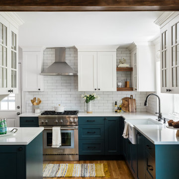
This 1940’s Colonial style home in Boston’s Jamaica Plain had strong bones and rich character but lacked the space, modern conveniences, and storage that our clients desired. While they wished to retain the look of the exterior, as well as some of the home’s unique original features,, the kitchen and dining room needed to be reimagined in design, layout, and functionality.
Key considerations were the compact size of the home and a smaller lot that didn’t give our client the flexibility of an addition. Without adding on to the existing floor plan, we needed to find a way to gain vital extra space in the kitchen, which, with walls enclosing it on all sides, was dark and disconnected from the rest of the house. Our design team coordinated with our client to reconfigure the space by opening up the wall between the dining room and the kitchen to add a few extra inches – just enough to create an open flow between the two rooms. With the removal of that wall, the formerly dark kitchen was flooded with the natural light coming from the existing dining room windows, making the entire space feel brighter and more cohesive.
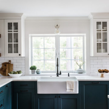
The original kitchen dated back to the mid-20th century and lacked, among other conveniences, a dishwasher, enough storage, or even countertop space for food prep. In redesigning the kitchen, we visually expanded the space by incorporating white upper cabinetry, open shelving, and white subway tiles extending from the backsplash to the ceiling. A new, larger window featuring a deep stone sill brought in even more light, and the appliances and apron sink were selected to retain the traditional look of the home while delivering modern functionality.
Considering how our client would use this space, we focused on creating a purposeful workspace and storage, ensuring that there was ample countertop space and cabinetry between the sink and range. A multi-purpose cabinet and countertop which serves as a microwave station and food service area were added to the backside of the dining room wall, packing a lot of utility into a small space.
Prior to this renovation, our client had painted the dining room in Mount Saint Anne by Benjamin Moore, a tranquil blue-gray that suited the room well and allowed the original built-in corner cabinetry to stand out, highlighting the home’s charm. With the newly opened floor plan extending into the kitchen, we selected a deep custom color for the base cabinets, Yorktowne Green by Benjamin Moore, to complement the dining room and pull all of the elements together in a cohesive space.
This transformation was remarkable, both functionally and visually. The kitchen is now a bright and inviting space that flows seamlessly into the rest of the house. The homeowners are thrilled with the results, and the small changes we incorporated that made a big difference in the overall feel and functionality of the space.

 PI Photography Wall Art & Fine Art
 https://pipafineart.com/pages/after-the-rain-gerbera-daisy-realism-painting-digital-artwork-prints-and-digital-backgrounds. This striking digitally created photorealistic artwork captures the vibrant essence of a red gerbera daisy, freshly kissed by rain. The central focus is undeniably the flower itself, presented in a captivating close-up that highlights its intricate details. Each vivid red petal is adorned with countless shimmering water droplets, catching the light in a way that suggests recent precipitation and infuses the image with a sense of vitality and freshness. The rich, almost fiery red of the petals is beautifully contrasted by the subtly textured, darker hues within the daisy's center, which hints at deeper purples and maroons, adding depth and visual interest. The background is thoughtfully rendered in a soft, dark blur, allowing the brilliant red of the daisy and the crystalline sparkle of the raindrops to truly pop and command attention. It creates a dreamlike, almost ethereal quality, ensuring the flower remains the undisputed star of this botanical tableau. The level of detail achieved here is truly remarkable, mimicking the realism of a high-resolution photograph while retaining the controlled artistry of a digital creation.
After the Rain Gerbera Daisy Photorealistic Floral Digital Artwork Downloadable Printable Art in Living Room Setting
This captivating artwork offers incredible versatility for various interior spaces and decorating styles. In a modern or contemporary living room, its bold color and crisp details would serve as a dynamic focal point against minimalist furniture and neutral palettes, injecting a vibrant burst of life. Imagine it above a sleek, low-profile sofa, bringing an unexpected organic element to a clean-lined aesthetic. For a transitional space, which blends traditional warmth with modern simplicity, this piece would seamlessly integrate, offering both classic floral appeal and a fresh, updated feel. It could perfectly complement a mix of comfortable seating and clean-lined accessories. In a maximalist design scheme, where layers of pattern and color are embraced, this artwork could contribute another rich layer, perhaps contrasting with an ornate wallpaper or complementing other botanical prints.
 Kitchen Design Concepts
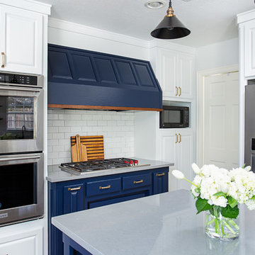
We introduce to you one of our newer services we are providing here at Kitchen Design Concepts: spaces that just need a little reviving! As of recent, we are taking on projects that are in need of minimal updating, as in, spaces that don’t need a full-on remodel. Yes, you heard right! If your space has good bones, you like the layout of your kitchen, and you just need a few cosmetic changes, then today’s feature is for you! Recently, we updated a space where we did just this! The kitchen was in need of a little love, some fresh paint, and new finishes. And if we’re being honest here, the result looks almost as if the kitchen had a full-on remodel! To learn more about this space and how we did our magic, continue reading below:
The Before and After
First, see what an impact new finishes can make! The “before” image shows a kitchen with outdated finishes such as the tile countertops, backsplash, and cabinetry finish. The “after” image, is a kitchen that looks almost as if its brand new, the image speaks for itself!
Cabinetry
With the wooden cabinetry in this kitchen already having great bones, all we needed to do was our refinishing process that involved removing door and drawer fronts, sanding, priming, and painting. The main color of the cabinetry is white (Sherwin Williams Pure White 7005) and as an accent, we applied a deep navy blue that really pops in this space (Sherwin Willaims Naval 6244). As a special design element, we incorporated a natural wooden band across the hood which is subtle but adds an element of surprise.
Countertops
The original countertops in this space were a 12×12 tile with cracks and discolored grout from all the wear and tear. To replace the countertops, we installed a clean and crisp quartz that is not only durable but easy to maintain (no grout here!). The 3cm countertops are a Cambria quartz in a grey-tone color (Carrick).
Backsplash
Keeping things simple, yet classic, we installed a 3×6 subway tile from Interceramic. The crisp white pairs well with all the other finishes of the space and really brighten the space up! To spice things up, we paired the white tile with a contrasting grout color (Cape Grey) that matches the countertop. This is a simple method to add interest to your white backsplash!
Fixtures and Fittings
For the fixtures and fittings of the kitchen, we wanted pieces that made a statement. That’s why we selected this industrial style faucet from Brizo! The faucet is a Brizo LITZE™ PULL-DOWN FAUCET WITH ARC SPOUT AND INDUSTRIAL HANDLE (63044LF-BLGL). The matte black paired with the luxe gold elements really make a statement! To match the gold elements of the faucet, we installed cabinetry hardware from Topknobs in the same gold finish. The hardware is a Channing pull TK743HB. Lastly, the large single bowl sink (who doesn’t want a large sink?!) is a great functional touch to the kitchen. The sink is a Blanco Precision 16″ R10 super single with 16″ Drainer in stainless steel (516216).

 Lee Kimball
This 1940’s Colonial style home in Boston’s Jamaica Plain had strong bones and rich character but lacked the space, modern conveniences, and storage that our clients desired. While they wished to retain the look of the exterior, as well as some of the home’s unique original features,, the kitchen and dining room needed to be reimagined in design, layout, and functionality.
Key considerations were the compact size of the home and a smaller lot that didn’t give our client the flexibility of an addition. Without adding on to the existing floor plan, we needed to find a way to gain vital extra space in the kitchen, which, with walls enclosing it on all sides, was dark and disconnected from the rest of the house. Our design team coordinated with our client to reconfigure the space by opening up the wall between the dining room and the kitchen to add a few extra inches – just enough to create an open flow between the two rooms. With the removal of that wall, the formerly dark kitchen was flooded with the natural light coming from the existing dining room windows, making the entire space feel brighter and more cohesive.
The original kitchen dated back to the mid-20th century and lacked, among other conveniences, a dishwasher, enough storage, or even countertop space for food prep. In redesigning the kitchen, we visually expanded the space by incorporating white upper cabinetry, open shelving, and white subway tiles extending from the backsplash to the ceiling. A new, larger window featuring a deep stone sill brought in even more light, and the appliances and apron sink were selected to retain the traditional look of the home while delivering modern functionality.
Considering how our client would use this space, we focused on creating a purposeful workspace and storage, ensuring that there was ample countertop space and cabinetry between the sink and range. A multi-purpose cabinet and countertop which serves as a microwave station and food service area were added to the backside of the dining room wall, packing a lot of utility into a small space.
Prior to this renovation, our client had painted the dining room in Mount Saint Anne by Benjamin Moore, a tranquil blue-gray that suited the room well and allowed the original built-in corner cabinetry to stand out, highlighting the home’s charm. With the newly opened floor plan extending into the kitchen, we selected a deep custom color for the base cabinets, Yorktowne Green by Benjamin Moore, to complement the dining room and pull all of the elements together in a cohesive space.
This transformation was remarkable, both functionally and visually. The kitchen is now a bright and inviting space that flows seamlessly into the rest of the house. The homeowners are thrilled with the results, and the small changes we incorporated that made a big difference in the overall feel and functionality of the space.
Sponsored
Columbus, OH

Trish Takacs Design
Award Winning & Highly Skilled Kitchen & Bath Designer in Columbus
 Lee Kimball
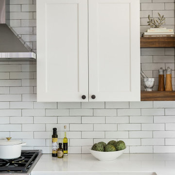
This 1940’s Colonial style home in Boston’s Jamaica Plain had strong bones and rich character but lacked the space, modern conveniences, and storage that our clients desired. While they wished to retain the look of the exterior, as well as some of the home’s unique original features,, the kitchen and dining room needed to be reimagined in design, layout, and functionality.
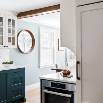
Key considerations were the compact size of the home and a smaller lot that didn’t give our client the flexibility of an addition. Without adding on to the existing floor plan, we needed to find a way to gain vital extra space in the kitchen, which, with walls enclosing it on all sides, was dark and disconnected from the rest of the house. Our design team coordinated with our client to reconfigure the space by opening up the wall between the dining room and the kitchen to add a few extra inches – just enough to create an open flow between the two rooms. With the removal of that wall, the formerly dark kitchen was flooded with the natural light coming from the existing dining room windows, making the entire space feel brighter and more cohesive.
The original kitchen dated back to the mid-20th century and lacked, among other conveniences, a dishwasher, enough storage, or even countertop space for food prep. In redesigning the kitchen, we visually expanded the space by incorporating white upper cabinetry, open shelving, and white subway tiles extending from the backsplash to the ceiling. A new, larger window featuring a deep stone sill brought in even more light, and the appliances and apron sink were selected to retain the traditional look of the home while delivering modern functionality.
Considering how our client would use this space, we focused on creating a purposeful workspace and storage, ensuring that there was ample countertop space and cabinetry between the sink and range. A multi-purpose cabinet and countertop which serves as a microwave station and food service area were added to the backside of the dining room wall, packing a lot of utility into a small space.
Prior to this renovation, our client had painted the dining room in Mount Saint Anne by Benjamin Moore, a tranquil blue-gray that suited the room well and allowed the original built-in corner cabinetry to stand out, highlighting the home’s charm. With the newly opened floor plan extending into the kitchen, we selected a deep custom color for the base cabinets, Yorktowne Green by Benjamin Moore, to complement the dining room and pull all of the elements together in a cohesive space.
This transformation was remarkable, both functionally and visually. The kitchen is now a bright and inviting space that flows seamlessly into the rest of the house. The homeowners are thrilled with the results, and the small changes we incorporated that made a big difference in the overall feel and functionality of the space.
 Lee Kimball
This 1940’s Colonial style home in Boston’s Jamaica Plain had strong bones and rich character but lacked the space, modern conveniences, and storage that our clients desired. While they wished to retain the look of the exterior, as well as some of the home’s unique original features,, the kitchen and dining room needed to be reimagined in design, layout, and functionality.
Key considerations were the compact size of the home and a smaller lot that didn’t give our client the flexibility of an addition. Without adding on to the existing floor plan, we needed to find a way to gain vital extra space in the kitchen, which, with walls enclosing it on all sides, was dark and disconnected from the rest of the house. Our design team coordinated with our client to reconfigure the space by opening up the wall between the dining room and the kitchen to add a few extra inches – just enough to create an open flow between the two rooms. With the removal of that wall, the formerly dark kitchen was flooded with the natural light coming from the existing dining room windows, making the entire space feel brighter and more cohesive.
The original kitchen dated back to the mid-20th century and lacked, among other conveniences, a dishwasher, enough storage, or even countertop space for food prep. In redesigning the kitchen, we visually expanded the space by incorporating white upper cabinetry, open shelving, and white subway tiles extending from the backsplash to the ceiling. A new, larger window featuring a deep stone sill brought in even more light, and the appliances and apron sink were selected to retain the traditional look of the home while delivering modern functionality.
Considering how our client would use this space, we focused on creating a purposeful workspace and storage, ensuring that there was ample countertop space and cabinetry between the sink and range. A multi-purpose cabinet and countertop which serves as a microwave station and food service area were added to the backside of the dining room wall, packing a lot of utility into a small space.
Prior to this renovation, our client had painted the dining room in Mount Saint Anne by Benjamin Moore, a tranquil blue-gray that suited the room well and allowed the original built-in corner cabinetry to stand out, highlighting the home’s charm. With the newly opened floor plan extending into the kitchen, we selected a deep custom color for the base cabinets, Yorktowne Green by Benjamin Moore, to complement the dining room and pull all of the elements together in a cohesive space.
This transformation was remarkable, both functionally and visually. The kitchen is now a bright and inviting space that flows seamlessly into the rest of the house. The homeowners are thrilled with the results, and the small changes we incorporated that made a big difference in the overall feel and functionality of the space.

 Islandway Luxury Home and Pool
Mid-sized elegant backyard tile and custom-shaped lap pool house photo in Tampa
 Fabco Sanctuary
The architect and designer Guy Derwent was approached by his client with a clear and compelling brief: to completely transform a grand Victorian terrace house they were planning to renovate. The client envisioned something far beyond a standard renovation – this was to be a bold and dramatic reimagining of a family home that could grow with them over time.
With the property having remained largely untouched for more than fifty years, the architects saw an opportunity to unlock its potential and deliver a contemporary design that would contrast beautifully with its Victorian heritage.
The existing layout consisted of a series of small, disconnected rooms to the rear of the house. To respond to the client’s need for openness and flexibility, the architect proposed a radical restructuring of the ground floor:
The rear rooms were completely removed
Suspended timber floors were lowered by up to two metres to align with the garden
Two bold extensions were added
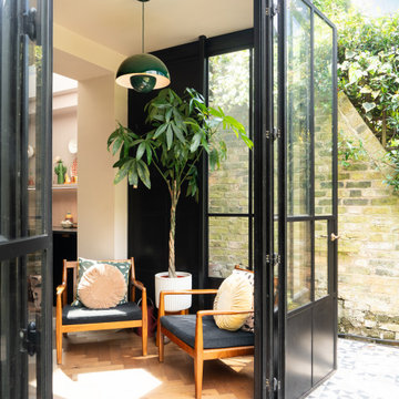
The first extension filled in the side return with a London stock brick facade and a glazed roof, while the second – a striking black steel and glass pavilion was glazed on three sides and placed along the garden elevation.
This new pavilion redefined the building’s relationship with the garden. Its steel-framed glazing created a seamless dialogue between interior and exterior, offering a sense of immersion in the surrounding landscape.
At the heart of the plan sits a dramatic, five-metre-tall dining space that acts as a transition from the original entrance hall into the new addition. A large, circular cast-glass window, framed in steel, provides a visual and spatial link between old and new, allowing light and movement to travel through the depth of the home.
Throughout the project, a series of black metal elements were introduced as sculptural interventions – each marking moments of transformation within the house. These included the bespoke steel framed circular window, a custom metal staircase, a cylindrical support column, and the striking steel and glass garden pavilion. Together, they formed a coherent architectural language that underscored the project’s bold intent.
Our steel windows and doors played a vital role in delivering the project’s vision. The architects chose steel for its refined sight lines and distinctive material character, which helped bridge the gap between the historical context of the building and the bold new additions.
The black steel frames provided a crisp contrast to the pale London stock brick and added definition to the glazed pavilion, reinforcing the sense of architectural precision. In particular, the fine steel profiles of the garden room allowed the extension to feel both lightweight and immersive, blurring the boundary between the house and its garden.
The architect drew inspiration from the Bauhaus Movement, particularly the work of Walter Gropius, whose approach to functional beauty and industrial materials informed the design of the garden pavilion.
Here, our glazing system was used not just for transparency, but as an expressive architectural element. The carefully proportioned panels help to conceal the roof thickness and reinforce the pavilion’s industrial yet abstract character – a deliberate nod to product design and modernist detailing.
Sustainability was an important factor in the selection of materials. Our steel systems, made from 99% recycled content and 100% recyclable, aligned with the project’s broader environmental goals.
The architects noted that this commitment to material longevity and circularity was central to their decision to use steel. The durability and recyclability of the windows and doors ensured the project met both aesthetic and ethical criteria.
This London terrace house now stands as a celebration of contrast – between heritage and innovation, solidity and transparency, tradition and transformation. Our steel windows and doors were not simply components; they were essential tools in crafting a home that is as bold and expressive as it is functional.
The result is a home designed for modern family life, where light, space, and materiality come together in perfect harmony.
 Gallery KBNY
In this Manhattan pied-à-terre renovation, Gallery tackled the entire apartment. A true full renovation, we updated the kitchen, master bathroom, and powder room, installed new flooring throughout the entire space, and built the entertainment center in the living room.
DESIGN DETAILS
The clients wanted their pied-à-terre to have some modern touches, but not too sleek or contemporary. Since it combines a number of styles and elements, transitional turned out to be their ideal aesthetic. Whites, grays, and earthy tones carried this color theme throughout the apartment.
One of the clients is an artist and wanted wall space to display their original work, visible in the dining area and powder room in the photos below. The entertainment center is another highlight, with its white mosaic brick tile accent wall and glass open shelves to display family photos on both sides.
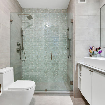
Instead of tiles, the new powder room walls received a textured concrete application, resulting in an almost industrial vibe. In the master bathroom renovation, glass mosaic tile accent walls bring a touch of personality to both the shower and a storage nook opposite the vanity.
UNIQUELY-SHAPED ROOMS
We specialize in adapting to every potential challenge, including uniquely-shaped rooms like the nearly-triangular kitchen in this Manhattan pied-à-terre renovation.
It’s important to design an uncommonly-shaped space as practically as possible, including specs seemingly as small as sink positioning. Every little detail counts tenfold in a room that’s not rectangular!
Other design details in the kitchen renovation include the classic combination of Shaker-style cabinets and quartz countertops, with a glass mosaic backsplash that matches the one used in the bathroom.
VISIBILITY = TRUST
Communication is always a core value at Gallery, but it’s even more vital when working with bi-coastal clients who were in another state throughout almost the entire process. We met with them once; everything else was done virtually thanks to JobTracker, our project management system.
The client had complete visibility into the renovation, including all design renderings, scheduled installations, and daily progress videos and photos. Even though they were 3000 miles away, they had a direct line to everyone on the team at all times.
SOME HIGHLIGHTS
- Entertainment center designed and built to serve as focal point, with white brick mosaic accent wall and open shelves made of glass
- Track lighting for ease of displaying art and to preserve ceiling height instead of the dropped ceiling that recessed lighting would necessitate
- Deliberate consideration of space in the unusually-shaped, nearly triangular kitchen
- Glass mosaic tile accent walls in the master bathroom with matching tile for the backsplash in the kitchen
Thinking about renovating your bathroom? Contact us today to find out how you can benefit from our expertise in remodeling New York City bathrooms. As a design-and-build firm with a full-scale approach, we handle every single aspect of your home renovation from start to finish.
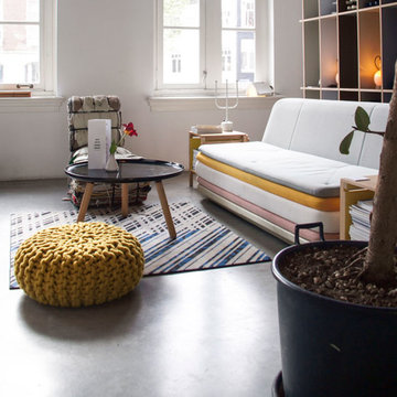
 Carpete hairpin legs
Get modern style home design idea here. Everyone wanna get clean, cool, minimalist look in your home.However most of them are feeling financial strains. Actually there are too many choices available to settle for anything less than fantastic.We share some easy tips here to make a modern style home. These ideas are extremely easy to achieve.Keep reading!
#1 Modern lines furniture & embrace minimalism.
The modern minimalist movement has come a long way from stark, cold interiors with the look, become first choice for home decor. Simple style furniture fits perfectly in a modern organic room. Look for simple shapes and sleek silhouettes with interesting angles.
By adopting this decorating style,your finances can be focused on fewer items cause it having less decor.
Add some modern element with low cost metal furniture legs.Such as try to DIY your TV stand with custom metal table legs, or find modern hairpin legs for coffee table.
#2 Textured furniture
Mixing patterns and textures in your interior design and decorating efforts can add style and interest. Comfortable material help keep your home furniture modern look.
Whether you have a wooden coffee table with hairpin legs, or headboard that has a rustic texture, or a chair that has a soft, rough, or patterned texture,or metal table legs with casters, it can add a whole new level of interest to the room. Texture can be a great way to complement a bold or subdued pattern that makes up the rooms point of interest.
#3 Color
Except for the textures on the furniture and the interesting mix of humble materials, the colors on the walls become popular suddenly in home interior.
We know Pantone additionally released the 9 colors that will trend Fall 2018. If you want to DIY your home or furniture design,except the hairpin table legs we recommend before, check our the 9 fall colors to incorporate in your home decor.
# 4 Plants
We are losing more and more “green” when our building is surrounded by skyscrapers.Add some green color and vitality via plants in your home interior processing.
Plants just have a way of making any space feel bright, lively, and gorgeous. This trailing plant grows extremely fast in a variety of growing conditions. Their versatility makes them ideal for hanging planters in low light homes. Adding some green to your décor has never been easier!Enjoy!
Follow above tips to add some new look in your home interior and furniture design.Also, please pay attention to your budget, double check your simple furniture list. Quit punishing your budget ans start investing in better quality furniture. Welcome to share your simple, modern style home design and home decor ideas, and your DIY project with hairpin legs!
 Fabco Sanctuary
The architect and designer Guy Derwent was approached by his client with a clear and compelling brief: to completely transform a grand Victorian terrace house they were planning to renovate. The client envisioned something far beyond a standard renovation – this was to be a bold and dramatic reimagining of a family home that could grow with them over time.
With the property having remained largely untouched for more than fifty years, the architects saw an opportunity to unlock its potential and deliver a contemporary design that would contrast beautifully with its Victorian heritage.
The existing layout consisted of a series of small, disconnected rooms to the rear of the house. To respond to the client’s need for openness and flexibility, the architect proposed a radical restructuring of the ground floor:
The rear rooms were completely removed
Suspended timber floors were lowered by up to two metres to align with the garden
Two bold extensions were added
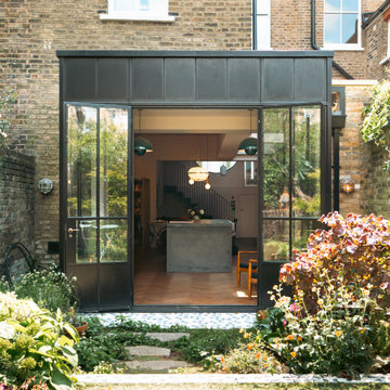
The first extension filled in the side return with a London stock brick facade and a glazed roof, while the second – a striking black steel and glass pavilion was glazed on three sides and placed along the garden elevation.
This new pavilion redefined the building’s relationship with the garden. Its steel-framed glazing created a seamless dialogue between interior and exterior, offering a sense of immersion in the surrounding landscape.
At the heart of the plan sits a dramatic, five-metre-tall dining space that acts as a transition from the original entrance hall into the new addition. A large, circular cast-glass window, framed in steel, provides a visual and spatial link between old and new, allowing light and movement to travel through the depth of the home.
Throughout the project, a series of black metal elements were introduced as sculptural interventions – each marking moments of transformation within the house. These included the bespoke steel framed circular window, a custom metal staircase, a cylindrical support column, and the striking steel and glass garden pavilion. Together, they formed a coherent architectural language that underscored the project’s bold intent.
Our steel windows and doors played a vital role in delivering the project’s vision. The architects chose steel for its refined sight lines and distinctive material character, which helped bridge the gap between the historical context of the building and the bold new additions.
The black steel frames provided a crisp contrast to the pale London stock brick and added definition to the glazed pavilion, reinforcing the sense of architectural precision. In particular, the fine steel profiles of the garden room allowed the extension to feel both lightweight and immersive, blurring the boundary between the house and its garden.
The architect drew inspiration from the Bauhaus Movement, particularly the work of Walter Gropius, whose approach to functional beauty and industrial materials informed the design of the garden pavilion.
Here, our glazing system was used not just for transparency, but as an expressive architectural element. The carefully proportioned panels help to conceal the roof thickness and reinforce the pavilion’s industrial yet abstract character – a deliberate nod to product design and modernist detailing.
Sustainability was an important factor in the selection of materials. Our steel systems, made from 99% recycled content and 100% recyclable, aligned with the project’s broader environmental goals.
The architects noted that this commitment to material longevity and circularity was central to their decision to use steel. The durability and recyclability of the windows and doors ensured the project met both aesthetic and ethical criteria.
This London terrace house now stands as a celebration of contrast – between heritage and innovation, solidity and transparency, tradition and transformation. Our steel windows and doors were not simply components; they were essential tools in crafting a home that is as bold and expressive as it is functional.
The result is a home designed for modern family life, where light, space, and materiality come together in perfect harmony.
9