
Search results for "Well insulated cooking" in Home Design Ideas
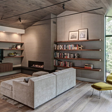
 Tom Bassett-Dilley Architect, Ltd.
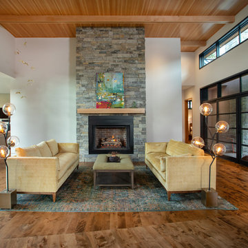
This 1960 house was in need of updating from both design and performance standpoints, and the project turned into a comprehensive deep energy retrofit, with thorough airtightness and insulation, new space conditioning and energy-recovery-ventilation, triple glazed windows, and an interior of incredible elegance. While we maintained the foundation and overall massing, this is essentially a new house, well equipped for a new generation of use and enjoyment.
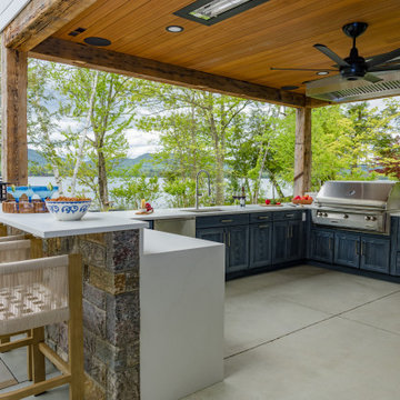
 Zobel & Co. Kitchens
Perched on Lake George in the Adirondacks, this sophisticated outdoor kitchen masterfully blends into its natural surroundings while maximizing functionality for entertaining. The thoughtful U-shaped design ensures that everyone—whether cooking, prepping, or socializing—shares in the magnificent lake views that inspired the space.
The aesthetic harmony is achieved through carefully selected materials: rustic blue outdoor-rated NatureKast cabinetry echoes the lake's hues, while timber frame beams and outdoor-rated white quartz countertops create a seamless transition between built and natural environments. Deep drawers and roll-out cabinetry provide abundant storage while maintaining the space's elegant profile.
The layout is a study in purposeful zoning: one area dedicated to prep work, another to cooking—featuring a grill, smoker, warming drawer, and space for a portable pizza oven, all serviced by a ceiling-mounted hood. The opposite side houses a two-drawer refrigerator, under-counter refrigerator, wet sink, and waste management.
Connecting seamlessly to the indoor kitchen through pass-through windows with adjacent counter space and storage, this outdoor entertainment hub transforms lakeside cooking into an immersive experience. Every element has been carefully considered to create a space that's both functional for serious cooking and perfect for casual gatherings, all while celebrating its stunning Adirondack setting
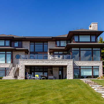
 Heller & Associates
One of the hallmarks of Prairie style architecture is the integration of a home into the surrounding environment. So it is only fitting for a modern Prairie-inspired home to honor its environment through the use of sustainable materials and energy efficient systems to conserve and protect the earth on which it stands. This modern adaptation of a Prairie home in Bloomfield Hills completed in 2015 uses environmentally friendly materials and systems. Geothermal energy provides the home with a clean and sustainable source of power for the heating and cooling mechanisms, and maximizes efficiency, saving on gas and electric heating and cooling costs all year long. High R value foam insulation contributes to the energy saving and year round temperature control for superior comfort indoors. LED lighting illuminates the rooms, both in traditional light fixtures as well as in lighted shelving, display niches, and ceiling applications. Low VOC paint was used throughout the home in order to maintain the purest possible air quality for years to come. The homeowners will enjoy their beautiful home even more knowing it respects the land, because as Thoreau said, “What is the use of a house if you don’t have a decent planet to put it on?”
Find the right local pro for your project
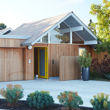
 Klopf Architecture
Klopf Architecture, Outer Space Landscape Architects, Sezen & Moon Structural Engineer and Flegels Construction updated a classic Eichler open, indoor-outdoor home.
Everyone loved the classic, original bones of this house, but it was in need of a major facelift both inside and out. The owners also wanted to remove the barriers between the kitchen and great room, and increase the size of the master bathroom as well as make other layout changes. No addition to the house was contemplated.
The owners worked with Klopf Architecture in part because of Klopf’s extensive mid-century modern / Eichler design portfolio, and in part because one of their neighbors who had worked with Klopf on their Eichler home remodel referred them. The Klopf team knew how to update the worn finishes to make a more sophisticated, higher quality home that both looks better and functions better.
In conjunction with the atrium and the landscaped rear yard / patio, the glassy living room feels open on both sides and allows an indoor / outdoor flow throughout. The new, natural wood exterior siding runs through the house from inside to outside to inside again, updating one of the classic design features of the Eichler homes.
Picking up on the wood siding, walnut vanities and cabinets offset the white walls. Gray porcelain tiles evoke the concrete slab floors and flow from interior to exterior to make the spaces appear to flow together. Similarly the ceiling decking has the same white-washed finish from inside to out. The continuity of materials and space enhances the sense of flow.
The large kitchen, perfect for entertaining, has a wall of built-ins and an oversized island. There’s plenty of storage and space for the whole group to prep and cook together.
One unique approach to the master bedroom is the bed wall. The head of the bed is tucked within a line of built-in wardrobes with a high window above. Replacing the master closet with this wall of wardrobes allowed for both a larger bathroom and a larger bedroom.
This 1,953 square foot, 4 bedroom, 2 bathroom Double Gable Eichler remodeled single-family house is located in Mountain View in the heart of the Silicon Valley.
Klopf Architecture Project Team: John Klopf, AIA, Klara Kevane, and Yegvenia Torres-Zavala
Landscape Architect: Outer Space Landscape Architects
Structural Engineer: Sezen & Moon
Contractor: Flegels Construction
Landscape Contractor: Roco's Gardening & Arroyo Vista Landscaping, Inc.
Photography ©2016 Mariko Reed
Location: Mountain View, CA
Year completed: 2015
 Edgewater Design Group
As written in Northern Home & Cottage by Elizabeth Edwards
Sara and Paul Matthews call their head-turning home, located in a sweet neighborhood just up the hill from downtown Petoskey, “a very human story.” Indeed it is. Sara and her husband, Paul, have a special-needs son as well as an energetic middle-school daughter. This home has an answer for everyone. Located down the street from the school, it is ideally situated for their daughter and a self-contained apartment off the great room accommodates all their son’s needs while giving his caretakers privacy—and the family theirs. The Matthews began the building process by taking their thoughts and
needs to Stephanie Baldwin and her team at Edgewater Design Group. Beyond the above considerations, they wanted their new home to be low maintenance and to stand out architecturally, “But not so much that anyone would complain that it didn’t work in our neighborhood,” says Sara. “We
were thrilled that Edgewater listened to us and were able to give us a unique-looking house that is meeting all our needs.” Lombardy LLC built this handsome home with Paul working alongside the construction crew throughout the project. The low maintenance exterior is a cutting-edge blend of stacked stone, black corrugated steel, black framed windows and Douglas fir soffits—elements that add up to an organic contemporary look. The use of black steel, including interior beams and the staircase system, lend an industrial vibe that is courtesy of the Matthews’ friend Dan Mello of Trimet Industries in Traverse City. The couple first met Dan, a metal fabricator, a number of years ago, right around the time they found out that their then two-year-old son would never be able to walk. After the couple explained to Dan that they couldn’t find a solution for a child who wasn’t big enough for a wheelchair, he designed a comfortable, rolling chair that was just perfect. They still use it. The couple’s gratitude for the chair resulted in a trusting relationship with Dan, so it was natural for them to welcome his talents into their home-building process. A maple floor finished to bring out all of its color-tones envelops the room in warmth. Alder doors and trim and a Doug fir ceiling reflect that warmth. Clearstory windows and floor-to-ceiling window banks fill the space with light—and with views of the spacious grounds that will
become a canvas for Paul, a retired landscaper. The couple’s vibrant art pieces play off against modernist furniture and lighting that is due to an inspired collaboration between Sara and interior designer Kelly Paulsen. “She was absolutely instrumental to the project,” Sara says. “I went through
two designers before I finally found Kelly.” The open clean-lined kitchen, butler’s pantry outfitted with a beverage center and Miele coffee machine (that allows guests to wait on themselves when Sara is cooking), and an outdoor room that centers around a wood-burning fireplace, all make for easy,
fabulous entertaining. A den just off the great room houses the big-screen television and Sara’s loom—
making for relaxing evenings of weaving, game watching and togetherness. Tourgoers will leave understanding that this house is everything great design should be. Form following function—and solving very human issues with soul-soothing style.
 Thyme & Place Design LLC
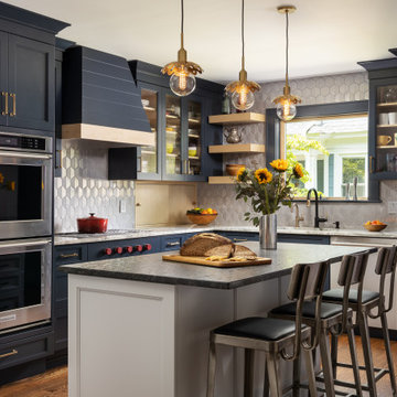
The client requested a kitchen that would not only provide a great space to cook and enjoy family meals but one that would fit in with her unique design sense. An avid collector of contemporary art, she wanted something unexpected in her 100-year-old home in both color and finishes but still providing a great layout with improved lighting, storage, and superior cooking abilities. The existing kitchen was in a closed off space trapped between the family room and the living. If you were in the kitchen, you were isolated from the rest of the house. Making the kitchen an integrated part of the home was a paramount request.
Step one, remove the wall separating the kitchen from the other rooms in the home which allowed the new kitchen to become an integrated space instead of an isolation room for the cook. Next, we relocated the pantry access which was in the family room to the kitchen integrating a poorly used recess which had become a catch all area which did not provide any usable space for storage or working area. To add valuable function in the kitchen we began by capturing unused "cubbies", adding a walk-in pantry from the kitchen, increasing the storage lost to un-needed drop ceilings and bring light and design to the space with a new large awning window, improved lighting, and combining interesting finishes and colors to reflect the artistic attitude of the client.
A bathroom located above the kitchen had been leaking into the plaster ceiling for several years. That along with knob and tube wiring, rotted beams and a brick wall from the back of the fireplace in the adjacent living room all needed to be brought to code. The walls, ceiling and floors in this 100+ year old home were completely out of level and the room’s foot print could not be increased.
The choice of a Sub-Zero wolf product is a standard in my kitchen designs. The quality of the product, its manufacturing and commitment to food preservation is the reason I specify Sub Zero Wolf. For the cook top, the integrated line of the contemporary cooktop and the signature red knobs against the navy blue of the cabinets added to the design vibe of the kitchen. The cooking performance and the large continuous grate on the cooktop makes it an obvious choice for a cook looking for a great cook top with professional results in a more streamlined profile. We selected a Sharp microwave drawer for the island, an XO wine refrigerator, Bosch dishwasher and Kitchen Aid double convection wall ovens to round out the appliance package.
A recess created by the fireplace was outfitted with a cabinet which now holds small appliances within easy reach of my very petite client. Natural maple accents were used inside all the wall cabinets and repeated on the front of the hood and for the sliding door appliance cabinet and the floating shelves. This allows a brighter interior for the painted cabinets instead of the traditional same interior as exterior finish choice. The was an amazing transformation from the old to the new.
The final touches are the honey bronze hardware from Top Knobs, Mitzi pendants from Hudson Valley Lighting group,
a fabulous faucet from Brizo. To eliminate the old freestanding bottled water cooler, we specified a matching water filter faucet.
 Ashwood Designs and Custom Homes
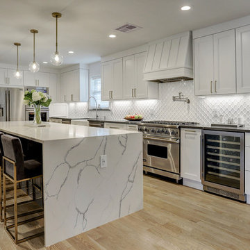
Expansive Island kitchen gives plenty of cook prep space as well as additional seating for entertaining. Beautiful custom stove hood. Wine fridge, double dishwashers, double ovens and custom cabinets are all additional features of this beautifully designed kitchen.

Sponsored
Columbus, OH

Hope Restoration & General Contracting
Columbus Design-Build, Kitchen & Bath Remodeling, Historic Renovations
 Plain & Posh
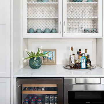
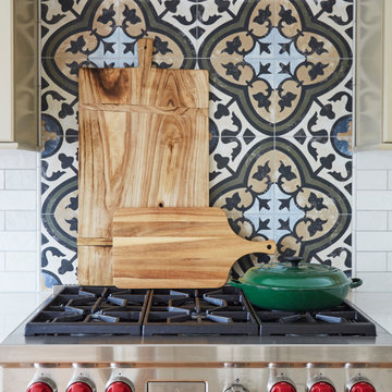
This kitchen was in desperate need of a makeover. (see the original space at the end) There was a truly odd peninsula that blocked the cook from access to the refrigerator behind it. The span was only 33" which made working in the area almost impossible. The peninsula was also the weekly dining area, but did not function well. This makeovers is truly one of my favoirites as it shows what good design can do for a space!
 TKS Design Group
Download our free ebook, Creating the Ideal Kitchen. DOWNLOAD NOW
The homeowners came to us looking to update the kitchen in their historic 1897 home. The home had gone through an extensive renovation several years earlier that added a master bedroom suite and updates to the front façade. The kitchen however was not part of that update and a prior 1990’s update had left much to be desired. The client is an avid cook, and it was just not very functional for the family.
The original kitchen was very choppy and included a large eat in area that took up more than its fair share of the space. On the wish list was a place where the family could comfortably congregate, that was easy and to cook in, that feels lived in and in check with the rest of the home’s décor. They also wanted a space that was not cluttered and dark – a happy, light and airy room. A small powder room off the space also needed some attention so we set out to include that in the remodel as well.
See that arch in the neighboring dining room? The homeowner really wanted to make the opening to the dining room an arch to match, so we incorporated that into the design.
Another unfortunate eyesore was the state of the ceiling and soffits. Turns out it was just a series of shortcuts from the prior renovation, and we were surprised and delighted that we were easily able to flatten out almost the entire ceiling with a couple of little reworks.
Other changes we made were to add new windows that were appropriate to the new design, which included moving the sink window over slightly to give the work zone more breathing room. We also adjusted the height of the windows in what was previously the eat-in area that were too low for a countertop to work. We tried to keep an old island in the plan since it was a well-loved vintage find, but the tradeoff for the function of the new island was not worth it in the end. We hope the old found a new home, perhaps as a potting table.
Designed by: Susan Klimala, CKD, CBD
Photography by: Michael Kaskel
For more information on kitchen and bath design ideas go to: www.kitchenstudio-ge.com
 The Artisans Group, Inc.
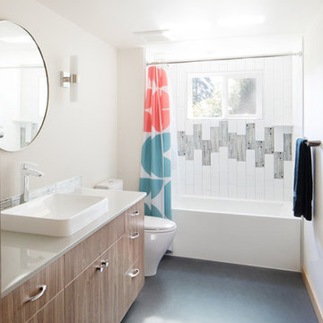
Winner of the 2018 Tour of Homes Best Remodel, this whole house re-design of a 1963 Bennet & Johnson mid-century raised ranch home is a beautiful example of the magic we can weave through the application of more sustainable modern design principles to existing spaces.
We worked closely with our client on extensive updates to create a modernized MCM gem.
Extensive alterations include:
- a completely redesigned floor plan to promote a more intuitive flow throughout
- vaulted the ceilings over the great room to create an amazing entrance and feeling of inspired openness
- redesigned entry and driveway to be more inviting and welcoming as well as to experientially set the mid-century modern stage
- the removal of a visually disruptive load bearing central wall and chimney system that formerly partitioned the homes’ entry, dining, kitchen and living rooms from each other
- added clerestory windows above the new kitchen to accentuate the new vaulted ceiling line and create a greater visual continuation of indoor to outdoor space
- drastically increased the access to natural light by increasing window sizes and opening up the floor plan
- placed natural wood elements throughout to provide a calming palette and cohesive Pacific Northwest feel
- incorporated Universal Design principles to make the home Aging In Place ready with wide hallways and accessible spaces, including single-floor living if needed
- moved and completely redesigned the stairway to work for the home’s occupants and be a part of the cohesive design aesthetic
- mixed custom tile layouts with more traditional tiling to create fun and playful visual experiences
- custom designed and sourced MCM specific elements such as the entry screen, cabinetry and lighting
- development of the downstairs for potential future use by an assisted living caretaker
- energy efficiency upgrades seamlessly woven in with much improved insulation, ductless mini splits and solar gain
 ZeroEnergy Design
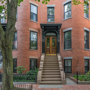
This renovated brick rowhome in Boston’s South End offers a modern aesthetic within a historic structure, creative use of space, exceptional thermal comfort, a reduced carbon footprint, and a passive stream of income.
DESIGN PRIORITIES. The goals for the project were clear - design the primary unit to accommodate the family’s modern lifestyle, rework the layout to create a desirable rental unit, improve thermal comfort and introduce a modern aesthetic. We designed the street-level entry as a shared entrance for both the primary and rental unit. The family uses it as their everyday entrance - we planned for bike storage and an open mudroom with bench and shoe storage to facilitate the change from shoes to slippers or bare feet as they enter their home. On the main level, we expanded the kitchen into the dining room to create an eat-in space with generous counter space and storage, as well as a comfortable connection to the living space. The second floor serves as master suite for the couple - a bedroom with a walk-in-closet and ensuite bathroom, and an adjacent study, with refinished original pumpkin pine floors. The upper floor, aside from a guest bedroom, is the child's domain with interconnected spaces for sleeping, work and play. In the play space, which can be separated from the work space with new translucent sliding doors, we incorporated recreational features inspired by adventurous and competitive television shows, at their son’s request.
MODERN MEETS TRADITIONAL. We left the historic front facade of the building largely unchanged - the security bars were removed from the windows and the single pane windows were replaced with higher performing historic replicas. We designed the interior and rear facade with a vision of warm modernism, weaving in the notable period features. Each element was either restored or reinterpreted to blend with the modern aesthetic. The detailed ceiling in the living space, for example, has a new matte monochromatic finish, and the wood stairs are covered in a dark grey floor paint, whereas the mahogany doors were simply refinished. New wide plank wood flooring with a neutral finish, floor-to-ceiling casework, and bold splashes of color in wall paint and tile, and oversized high-performance windows (on the rear facade) round out the modern aesthetic.
RENTAL INCOME. The existing rowhome was zoned for a 2-family dwelling but included an undesirable, single-floor studio apartment at the garden level with low ceiling heights and questionable emergency egress. In order to increase the quality and quantity of space in the rental unit, we reimagined it as a two-floor, 1 or 2 bedroom, 2 bathroom apartment with a modern aesthetic, increased ceiling height on the lowest level and provided an in-unit washer/dryer. The apartment was listed with Jackie O'Connor Real Estate and rented immediately, providing the owners with a source of passive income.
ENCLOSURE WITH BENEFITS. The homeowners sought a minimal carbon footprint, enabled by their urban location and lifestyle decisions, paired with the benefits of a high-performance home. The extent of the renovation allowed us to implement a deep energy retrofit (DER) to address air tightness, insulation, and high-performance windows. The historic front facade is insulated from the interior, while the rear facade is insulated on the exterior. Together with these building enclosure improvements, we designed an HVAC system comprised of continuous fresh air ventilation, and an efficient, all-electric heating and cooling system to decouple the house from natural gas. This strategy provides optimal thermal comfort and indoor air quality, improved acoustic isolation from street noise and neighbors, as well as a further reduced carbon footprint. We also took measures to prepare the roof for future solar panels, for when the South End neighborhood’s aging electrical infrastructure is upgraded to allow them.
URBAN LIVING. The desirable neighborhood location allows the both the homeowners and tenant to walk, bike, and use public transportation to access the city, while each charging their respective plug-in electric cars behind the building to travel greater distances.
OVERALL. The understated rowhouse is now ready for another century of urban living, offering the owners comfort and convenience as they live life as an expression of their values.
 The Artisans Group, Inc.
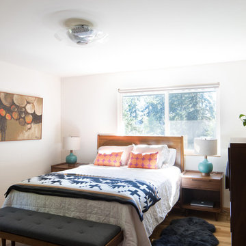
Winner of the 2018 Tour of Homes Best Remodel, this whole house re-design of a 1963 Bennet & Johnson mid-century raised ranch home is a beautiful example of the magic we can weave through the application of more sustainable modern design principles to existing spaces.
We worked closely with our client on extensive updates to create a modernized MCM gem.
Extensive alterations include:
- a completely redesigned floor plan to promote a more intuitive flow throughout
- vaulted the ceilings over the great room to create an amazing entrance and feeling of inspired openness
- redesigned entry and driveway to be more inviting and welcoming as well as to experientially set the mid-century modern stage
- the removal of a visually disruptive load bearing central wall and chimney system that formerly partitioned the homes’ entry, dining, kitchen and living rooms from each other
- added clerestory windows above the new kitchen to accentuate the new vaulted ceiling line and create a greater visual continuation of indoor to outdoor space
- drastically increased the access to natural light by increasing window sizes and opening up the floor plan
- placed natural wood elements throughout to provide a calming palette and cohesive Pacific Northwest feel
- incorporated Universal Design principles to make the home Aging In Place ready with wide hallways and accessible spaces, including single-floor living if needed
- moved and completely redesigned the stairway to work for the home’s occupants and be a part of the cohesive design aesthetic
- mixed custom tile layouts with more traditional tiling to create fun and playful visual experiences
- custom designed and sourced MCM specific elements such as the entry screen, cabinetry and lighting
- development of the downstairs for potential future use by an assisted living caretaker
- energy efficiency upgrades seamlessly woven in with much improved insulation, ductless mini splits and solar gain
 Benvenuti and Stein
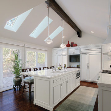
Northfield, IL kitchen remodel has an open floor plan which allows for better daylight dispursement. Defining the kitchen, dining, and sitting room space by varying ceiling design and open cabinetry makes the rooms more spacious, yet each space remains well defined. The added skylights in the hall gave natural light in the interior hallway as well as down the lower level stairway. The updated closets and baths use every inch wisely and the visual sight lines throughout are crisp and clean.
Norman Sizemore Photography
Sponsored
Columbus, OH
Free consultation for landscape design!

Peabody Landscape Group
Franklin County's Reliable Landscape Design & Contracting
 Altura Architects
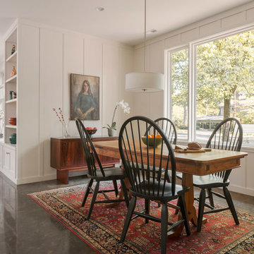
This home combines function, efficiency and style. The homeowners had a limited budget, so maximizing function while minimizing square footage was critical. We used a fully insulated slab on grade foundation of a conventionally framed air-tight building envelope that gives the house a good baseline for energy efficiency. High efficiency lighting, appliance and HVAC system, including a heat exchanger for fresh air, round out the energy saving measures. Rainwater was collected and retained on site.
Working within an older traditional neighborhood has several advantages including close proximity to community amenities and a mature landscape. Our challenge was to create a design that sits well with the early 20th century homes in the area. The resulting solution has a fresh attitude that interprets and reflects the neighborhood’s character rather than mimicking it. Traditional forms and elements merged with a more modern approach.
Photography by Todd Crawford
 FINNE Architects
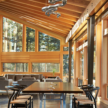
The Mazama house is located in the Methow Valley of Washington State, a secluded mountain valley on the eastern edge of the North Cascades, about 200 miles northeast of Seattle.
The house has been carefully placed in a copse of trees at the easterly end of a large meadow. Two major building volumes indicate the house organization. A grounded 2-story bedroom wing anchors a raised living pavilion that is lifted off the ground by a series of exposed steel columns. Seen from the access road, the large meadow in front of the house continues right under the main living space, making the living pavilion into a kind of bridge structure spanning over the meadow grass, with the house touching the ground lightly on six steel columns. The raised floor level provides enhanced views as well as keeping the main living level well above the 3-4 feet of winter snow accumulation that is typical for the upper Methow Valley.
To further emphasize the idea of lightness, the exposed wood structure of the living pavilion roof changes pitch along its length, so the roof warps upward at each end. The interior exposed wood beams appear like an unfolding fan as the roof pitch changes. The main interior bearing columns are steel with a tapered “V”-shape, recalling the lightness of a dancer.
The house reflects the continuing FINNE investigation into the idea of crafted modernism, with cast bronze inserts at the front door, variegated laser-cut steel railing panels, a curvilinear cast-glass kitchen counter, waterjet-cut aluminum light fixtures, and many custom furniture pieces. The house interior has been designed to be completely integral with the exterior. The living pavilion contains more than twelve pieces of custom furniture and lighting, creating a totality of the designed environment that recalls the idea of Gesamtkunstverk, as seen in the work of Josef Hoffman and the Viennese Secessionist movement in the early 20th century.
The house has been designed from the start as a sustainable structure, with 40% higher insulation values than required by code, radiant concrete slab heating, efficient natural ventilation, large amounts of natural lighting, water-conserving plumbing fixtures, and locally sourced materials. Windows have high-performance LowE insulated glazing and are equipped with concealed shades. A radiant hydronic heat system with exposed concrete floors allows lower operating temperatures and higher occupant comfort levels. The concrete slabs conserve heat and provide great warmth and comfort for the feet.
Deep roof overhangs, built-in shades and high operating clerestory windows are used to reduce heat gain in summer months. During the winter, the lower sun angle is able to penetrate into living spaces and passively warm the exposed concrete floor. Low VOC paints and stains have been used throughout the house. The high level of craft evident in the house reflects another key principle of sustainable design: build it well and make it last for many years!
Photo by Benjamin Benschneider
 ZeroEnergy Design
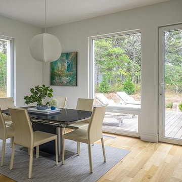
This modern green home offers both a vacation destination on Cape Cod near local family members and an opportunity for rental income.
FAMILY ROOTS. A West Coast couple living in the San Francisco Bay Area sought a permanent East Coast vacation home near family members living on Cape Cod. As academic professionals focused on sustainability, they sought a green, energy efficient home that was well-aligned with their values. With no green homes available for sale on Cape Cod, they decided to purchase land near their family and build their own.
SLOPED SITE. Comprised of a 3/4 acre lot nestled in the pines, the steeply sloping terrain called for a plan that embraced and took advantage of the slope. Of equal priority was optimizing solar exposure, preserving privacy from abutters, and creating outdoor living space. The design accomplished these goals with a simple, rectilinear form, offering living space on the both entry and lower/basement levels. The stepped foundation allows for a walk-out basement level with light-filled living space on the down-hill side of the home. The traditional basement on the eastern, up-hill side houses mechanical equipment and a home gym. The house welcomes natural light throughout, captures views of the forest, and delivers entertainment space that connects indoor living space to outdoor deck and dining patio.
MODERN VISION. The clean building form and uncomplicated finishes pay homage to the modern architectural legacy on the outer Cape. Durable and economical fiber cement panels, fixed with aluminum channels, clad the primary form. Cedar clapboards provide a visual accent at the south-facing living room, which extends a single roof plane to cover the entry porch.
SMART USE OF SPACE. On the entry level, the “L”-shaped living, dining, and kitchen space connects to the exterior living, dining, and grilling spaces to effectively double the home’s summertime entertainment area. Placed at the western end of the entry level (where it can retain privacy but still claim expansive downhill views) is the master suite with a built-in study. The lower level has two guest bedrooms, a second full bathroom, and laundry. The flexibility of the space—crucial in a house with a modest footprint—emerges in one of the guest bedrooms, which doubles as home office by opening the barn-style double doors to connect it to the bright, airy open stair leading up to the entry level. Thoughtful design, generous ceiling heights and large windows transform the modest 1,100 sf* footprint into a well-lit, spacious home. *(total finished space is 1800 sf)
RENTAL INCOME. The property works for its owners by netting rental income when the owners are home in San Francisco. The house especially caters to vacationers bound for nearby Mayo Beach and includes an outdoor shower adjacent to the lower level entry door. In contrast to the bare bones cottages that are typically available on the Cape, this home offers prospective tenants a modern aesthetic, paired with luxurious and green features. Durable finishes inside and out will ensure longevity with the heavier use that comes with a rental property.
COMFORT YEAR-ROUND. The home is super-insulated and air-tight, with mechanical ventilation to provide continuous fresh air from the outside. High performance triple-paned windows complement the building enclosure and maximize passive solar gain while ensuring a warm, draft-free winter, even when sitting close to the glass. A properly sized air source heat pump offers efficient heating & cooling, and includes a carefully designed the duct distribution system to provide even comfort throughout the house. The super-insulated envelope allows us to significantly reduce the equipment capacity, duct size, and airflow quantities, while maintaining unparalleled thermal comfort.
ENERGY EFFICIENT. The building’s shell and mechanical systems play instrumental roles in the home’s exceptional performance. The building enclosure reduces the most significant energy glutton: heating. Continuous super-insulation, thorough air sealing, triple-pane windows, and passive solar gain work together to yield a miniscule heating load. All active energy consumers are extremely efficient: an air source heat pump for heating and cooling, a heat pump hot water heater, LED lighting, energy recovery ventilation (ERV), and high efficiency appliances. The result is a home that uses 70% less energy than a similar new home built to code requirements.
OVERALL. The home embodies the owners’ goals and values while comprehensively enabling thermal comfort, energy efficiency, a vacation respite, and supplementary income.
PROJECT TEAM
ZeroEnergy Design - Architect & Mechanical Designer
A.F. Hultin & Co. - Contractor
Pamet Valley Landscape Design - Landscape & Masonry
Lisa Finch - Original Artwork
European Architectural Supply - Windows
Eric Roth Photography - Photography
 ZeroEnergy Design
This modern green home offers both a vacation destination on Cape Cod near local family members and an opportunity for rental income.
FAMILY ROOTS. A West Coast couple living in the San Francisco Bay Area sought a permanent East Coast vacation home near family members living on Cape Cod. As academic professionals focused on sustainability, they sought a green, energy efficient home that was well-aligned with their values. With no green homes available for sale on Cape Cod, they decided to purchase land near their family and build their own.
SLOPED SITE. Comprised of a 3/4 acre lot nestled in the pines, the steeply sloping terrain called for a plan that embraced and took advantage of the slope. Of equal priority was optimizing solar exposure, preserving privacy from abutters, and creating outdoor living space. The design accomplished these goals with a simple, rectilinear form, offering living space on the both entry and lower/basement levels. The stepped foundation allows for a walk-out basement level with light-filled living space on the down-hill side of the home. The traditional basement on the eastern, up-hill side houses mechanical equipment and a home gym. The house welcomes natural light throughout, captures views of the forest, and delivers entertainment space that connects indoor living space to outdoor deck and dining patio.
MODERN VISION. The clean building form and uncomplicated finishes pay homage to the modern architectural legacy on the outer Cape. Durable and economical fiber cement panels, fixed with aluminum channels, clad the primary form. Cedar clapboards provide a visual accent at the south-facing living room, which extends a single roof plane to cover the entry porch.
SMART USE OF SPACE. On the entry level, the “L”-shaped living, dining, and kitchen space connects to the exterior living, dining, and grilling spaces to effectively double the home’s summertime entertainment area. Placed at the western end of the entry level (where it can retain privacy but still claim expansive downhill views) is the master suite with a built-in study. The lower level has two guest bedrooms, a second full bathroom, and laundry. The flexibility of the space—crucial in a house with a modest footprint—emerges in one of the guest bedrooms, which doubles as home office by opening the barn-style double doors to connect it to the bright, airy open stair leading up to the entry level. Thoughtful design, generous ceiling heights and large windows transform the modest 1,100 sf* footprint into a well-lit, spacious home. *(total finished space is 1800 sf)
RENTAL INCOME. The property works for its owners by netting rental income when the owners are home in San Francisco. The house especially caters to vacationers bound for nearby Mayo Beach and includes an outdoor shower adjacent to the lower level entry door. In contrast to the bare bones cottages that are typically available on the Cape, this home offers prospective tenants a modern aesthetic, paired with luxurious and green features. Durable finishes inside and out will ensure longevity with the heavier use that comes with a rental property.
COMFORT YEAR-ROUND. The home is super-insulated and air-tight, with mechanical ventilation to provide continuous fresh air from the outside. High performance triple-paned windows complement the building enclosure and maximize passive solar gain while ensuring a warm, draft-free winter, even when sitting close to the glass. A properly sized air source heat pump offers efficient heating & cooling, and includes a carefully designed the duct distribution system to provide even comfort throughout the house. The super-insulated envelope allows us to significantly reduce the equipment capacity, duct size, and airflow quantities, while maintaining unparalleled thermal comfort.
ENERGY EFFICIENT. The building’s shell and mechanical systems play instrumental roles in the home’s exceptional performance. The building enclosure reduces the most significant energy glutton: heating. Continuous super-insulation, thorough air sealing, triple-pane windows, and passive solar gain work together to yield a miniscule heating load. All active energy consumers are extremely efficient: an air source heat pump for heating and cooling, a heat pump hot water heater, LED lighting, energy recovery ventilation (ERV), and high efficiency appliances. The result is a home that uses 70% less energy than a similar new home built to code requirements.
OVERALL. The home embodies the owners’ goals and values while comprehensively enabling thermal comfort, energy efficiency, a vacation respite, and supplementary income.
PROJECT TEAM
ZeroEnergy Design - Architect & Mechanical Designer
A.F. Hultin & Co. - Contractor
Pamet Valley Landscape Design - Landscape & Masonry
Lisa Finch - Original Artwork
European Architectural Supply - Windows
Eric Roth Photography - Photography

 AVID Associates LLC
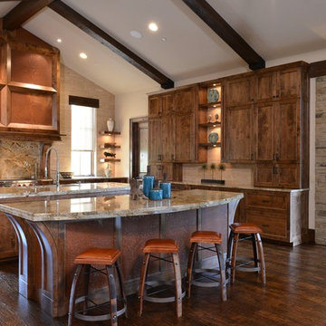
An expansive venthood was designed to balance this large transitional rustic kitchen. Copper panels play to the warm tones in the stone slab countertops while travertine clad walls lend texture to the room. A modern faucet is functional for cooking, as well as the double islands create dual work zones for optimal work flow. Timber beams accent the vaulted ceiling above.
Interior Design: AVID Associates
Builder: Martin Raymond Homes
Photography: Michael Hunter
 LeichtUSA
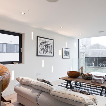
Attractive living as an architectural experiment: a 136-year-old water tower, a listed building with a spectacular 360-degree panorama view over the City of London. The task, to transform it into a superior residence, initially seemed an absolute impossibility. But when the owners came across architect Mike Collier, they had found a partner who was to make the impossible possible. The tower, which had been empty for decades, underwent radical renovation work and was extended by a four-storey cube containing kitchen, dining and living room - connected by glazed tunnels and a lift shaft. The kitchen, realised by Enclosure Interiors in Tunbridge Wells, Kent, with furniture from LEICHT is the very heart of living in this new building.
Shiny white matt-lacquered kitchen fronts (AVANCE-LR), tone-on-tone with the worktops, reflect the light in the room and thus create expanse and openness. The surface of the handle-less kitchen fronts has a horizontal relief embossing; depending on the light incidence, this results in a vitally structured surface. The free-standing preparation isle with its vertical side panels with a seamlessly integrated sink represents the transition between kitchen and living room. The fronts of the floor units facing the dining table were extended to the floor to do away with the plinth typical of most kitchens. Ceiling-high tall units on the wall provide plenty of storage space; the electrical appliances are integrated here invisible to the eye. Floor units on a high plinth which thus appear to be floating form the actual cooking centre within the kitchen, attached to the wall. A range of handle-less wall units concludes the glazed niche at the top.
LEICHT international: “Architecture and kitchen” in the centre of London. www.LeichtUSA.com
 Lumar Interiors
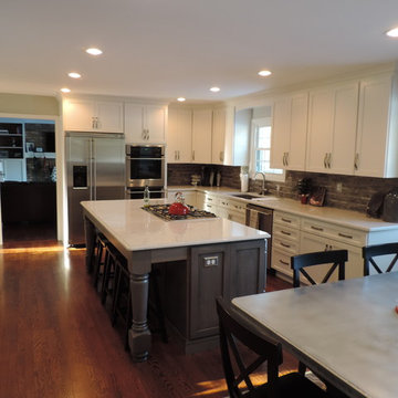
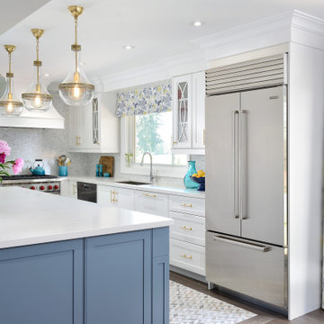
These clients were ready to turn their existing home into their dream home. They wanted to completely gut their main floor to improve the function of the space. Some walls were taken down, others moved, powder room relocated and lots of storage space added to their kitchen. The homeowner loves to bake and cook and really wanted a larger kitchen as well as a large informal dining area for lots of family gatherings. We took this project from concept to completion, right down to furnishings and accessories.
12