
Search results for "Wellness approach" in Home Design Ideas

 Nautilus Architects
Located on a marsh in the upper reaches of the Lieutenant River in Old Lyme, the existing house was well-sited and well-built, but the design failed to exploit the views and more importantly was a confused combination of contemporary and traditional elements. The new homeowners, a successful businesswoman and an accomplished artist and photographer, were interested in creating a fully-contemporary environment to open up space, connect indoors with outdoors, display artwork and showcase the husband’s distinctive photographs.
One glaring deficiency was the curb appeal and approach sequence: the grade sloped down and the path to the house followed, but this led to an uncomfortable dip and abrupt rise to the front door. By creating a virtual “moat,” occupied by a grid of raised-bed grasses contained in aluminum-clad boxes, and spanning the moat with an ipe bridge, the approach becomes level and engaging. The façade of the existing house was blank and bland, and with no cover. Adding a deep overhang with a wide porch creates a welcoming, covered condition, accentuated by a 6’ wide pivoting front door that feels more like a moving piece of wall.
Another deficiency was the connection to the outdoors. By adding glass to the front and back of the house, and removing interior walls selectively, the house takes on a diaphanous quality that allows one to see through to the marsh beyond, even when in the driveway. The raised-bed grasses act as abstract, geometric versions of the marsh beyond. A large, pyramidal skylight establishes a spatial hierarchy around which the rooms revolve.
The house featured several tray-ceilinged spaces – living room, kitchen, and master bedroom – that were poorly-proportioned and with panels at the top that resembled inset flat panel doors. The solution was to use a different strategy for each: the bedroom turns the ceiling into an eggshell through the use of a creative trim detail; the living room has an oversized sculptural, backlit lighting element; and the kitchen has a collage of painted rectangular forms that support or include lighting pieces.
A palette of concrete, blackened steel, stainless steel and colors carefully chosen by homeowner and architect create an interior and exterior environment punctuated by moments that are as artistic as the featured works in the black-ceilinged gallery.

 Trush Construction Company
The design intent for this graceful contemporary home was an approach toward minimalism, yet ensuring that the practical needs of day-to-day life could still be satisfied. Situated on a plateau atop a steep hill, the floor plan and glass walls beautifully incorporated the outdoor environment into the primary living spaces. The grounds were carpeted with sage and lavender.
The contemporary color palette was in pale tones of white, graphite and titanium, complimented with white washed vertical grain oak. The vanity cabinets were of rift cut oak with a conversion varnish finish. Kitchen cabinets were conceived with open shelving in graphite with quartz counters.
Project Architect: Lisa Wang. Wang Architecture
Landscape Architect: Paul Leffingwell. Leffingwell and Associates
Interior Design: Karen Goldberg. Studio G Design
Structural Engineer: John Yadegar. JYASF
Builder: Shahram Ghodsian. Trush Construction Company
Photography: Jason Wells, Golden Gate Creative

 Alair Homes Peterborough
My clients approached me with a building that had become run down over the years they were hoping to transform into a home office. The plaster walls and ceilings were cracking badly, the trim work was patchy, and there was an awkward flow to the second floor due to weird stairs in the back hallway.
There were a ton of amazing elements to the building as well (that were an absolute must to maintain) like the beautiful main staircase, existing marble fireplace mantel and the double set of interior entry doors with a frosted glass design transom above.
The extent of the construction on the interior included extensive demolition. Everything came down except for most of the interior walls and the second floor ceilings. We put in all brand new HVAC, electrical and plumbing. Blow-in-Blanket insulation was installed in all the perimeter walls, new drywall, trim, doors and flooring. The front existing windows were refinished. The exterior windows were replaced with vinyl windows, but the shape and sash locations were maintained in order to maintain the architectural integrity of the original windows.
Exterior work included a new front porch. The side porch was refaced to match the front and both porches received new stamped concrete steps and platform. A new stamped concrete walkway from the street was put in as well. The building had a few doors that weren't being used anymore at the side and back. They were covered up with new Cape Cod siding to match the exterior window color.
Find the right local pro for your project

 Keri Murray Architecture
It’s a 1928 Tudor home that has tons of vintage charm. The client is looking for an expanded Kitchen with Pantry, a dedicated Mudroom, and an additional Master Bedroom with bathroom. As well as updates throughout the home. They wanted something bright and inviting with a contemporary vintage vibe.
The main objective for this 650 SF addition, was to expand the home with an addition that is homogeneous. The beloved style shall remain as true to form as possible with a seamless extension to accommodate additional program needs. The objective was to preserve as much of the existing materials removed during demolition. For the front facade, we mixed the salvaged brick from the demolition with new bricks having the same character. Allowing the addition to seamlessly ties into the existing home. We applied the same approach for the slate roof which also ties seamlessly with the existing.
Careful consideration is paid to scale and materials; dormers mimic and complement the existing house and provide opportunities for second floor living under the eaves.
The goal was to create rooms that feel spacious and livable yet in scale with the existing rooms. The addition maximizes the use of space and takes into consideration carefully designed details.
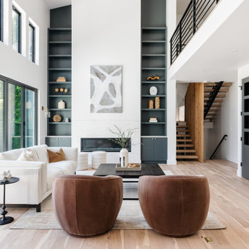
 Cult Creative
This property was originally a 5,900 square foot home built in 1975. Our client approached us with the task of collaborating to renovate and “pop-the-top” on this split-level home with the intention of selling the property at project completion. Throughout the design process we worked alongside the client and contractor to create a home that is light-filled and entertainment focused with large windows and lots of space for gathering with friends and family. The resulting work is now a modern 8,000 square foot luxury residence with a two-story living room space, kitchen with adjacent butler’s pantry, 6 bedrooms, 4.5 bathrooms, a rec-room with built-in bar, and all the amenities one could hope for. The home also contains both a standard two-car garage as well as an oversized recreation garage to house a boat or RV. Some of our favorite design features include the grand entry with its wood exterior and tall windows, and the folding glass wall that opens from the living room to the outdoor patio.

 Faith Blakeney Design Studio
This is not just any project. This is not just any house. This is a house of healing. My beloved and infinitely inspiring brother, Yeshaia Blakeney owns and runs this treatment center, The Integrity House. When my brother approached me about decorating this 7000 square foot Mediteranean home in Brentwood, I was thrilled. When he told me we had 2 weeks to complete this mission I was, well, admittedly a little bit freaked out. With the indispensable help of Emily, my brothers’ wife and powerhouse, we scoured LA to find a harmonious blend of vintage & contemporary furnishings and art, that would bring this house to life. But, before this creative process, before the decor and the art, I brought the sage and we all sat down on the living room floor, my mother lead the ceremony and we blessed the house. This house is a house of healing, may all who pass through find peace, love, inspiration and fulfillment. Amen!
Photographed by Justina Blakeney
 Nautilus Architects
Located on a marsh in the upper reaches of the Lieutenant River in Old Lyme, the existing house was well-sited and well-built, but the design failed to exploit the views and more importantly was a confused combination of contemporary and traditional elements. The new homeowners, a successful businesswoman and an accomplished artist and photographer, were interested in creating a fully-contemporary environment to open up space, connect indoors with outdoors, display artwork and showcase the husband’s distinctive photographs.
One glaring deficiency was the curb appeal and approach sequence: the grade sloped down and the path to the house followed, but this led to an uncomfortable dip and abrupt rise to the front door. By creating a virtual “moat,” occupied by a grid of raised-bed grasses contained in aluminum-clad boxes, and spanning the moat with an ipe bridge, the approach becomes level and engaging. The façade of the existing house was blank and bland, and with no cover. Adding a deep overhang with a wide porch creates a welcoming, covered condition, accentuated by a 6’ wide pivoting front door that feels more like a moving piece of wall.
Another deficiency was the connection to the outdoors. By adding glass to the front and back of the house, and removing interior walls selectively, the house takes on a diaphanous quality that allows one to see through to the marsh beyond, even when in the driveway. The raised-bed grasses act as abstract, geometric versions of the marsh beyond. A large, pyramidal skylight establishes a spatial hierarchy around which the rooms revolve.
The house featured several tray-ceilinged spaces – living room, kitchen, and master bedroom – that were poorly-proportioned and with panels at the top that resembled inset flat panel doors. The solution was to use a different strategy for each: the bedroom turns the ceiling into an eggshell through the use of a creative trim detail; the living room has an oversized sculptural, backlit lighting element; and the kitchen has a collage of painted rectangular forms that support or include lighting pieces.
A palette of concrete, blackened steel, stainless steel and colors carefully chosen by homeowner and architect create an interior and exterior environment punctuated by moments that are as artistic as the featured works in the black-ceilinged gallery.
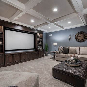
Sponsored
Delaware, OH

Buckeye Basements, Inc.
Central Ohio's Basement Finishing ExpertsBest Of Houzz '13-'21
 Keri Murray Architecture
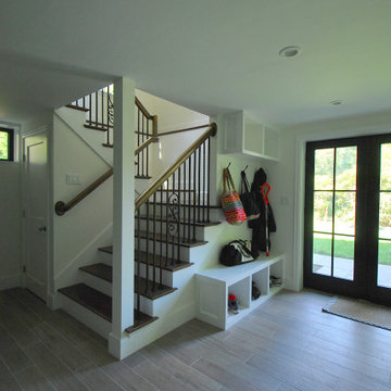
It’s a 1928 Tudor home that has tons of vintage charm. The client is looking for an expanded Kitchen with Pantry, a dedicated Mudroom, and an additional Master Bedroom with bathroom. As well as updates throughout the home. They wanted something bright and inviting with a contemporary vintage vibe.
The main objective for this 650 SF addition, was to expand the home with an addition that is homogeneous. The beloved style shall remain as true to form as possible with a seamless extension to accommodate additional program needs. The objective was to preserve as much of the existing materials removed during demolition. For the front facade, we mixed the salvaged brick from the demolition with new bricks having the same character. Allowing the addition to seamlessly ties into the existing home. We applied the same approach for the slate roof which also ties seamlessly with the existing.
Careful consideration is paid to scale and materials; dormers mimic and complement the existing house and provide opportunities for second floor living under the eaves.
The goal was to create rooms that feel spacious and livable yet in scale with the existing rooms. The addition maximizes the use of space and takes into consideration carefully designed details.


 Nautilus Architects
Located on a marsh in the upper reaches of the Lieutenant River in Old Lyme, the existing house was well-sited and well-built, but the design failed to exploit the views and more importantly was a confused combination of contemporary and traditional elements. The new homeowners, a successful businesswoman and an accomplished artist and photographer, were interested in creating a fully-contemporary environment to open up space, connect indoors with outdoors, display artwork and showcase the husband’s distinctive photographs.
One glaring deficiency was the curb appeal and approach sequence: the grade sloped down and the path to the house followed, but this led to an uncomfortable dip and abrupt rise to the front door. By creating a virtual “moat,” occupied by a grid of raised-bed grasses contained in aluminum-clad boxes, and spanning the moat with an ipe bridge, the approach becomes level and engaging. The façade of the existing house was blank and bland, and with no cover. Adding a deep overhang with a wide porch creates a welcoming, covered condition, accentuated by a 6’ wide pivoting front door that feels more like a moving piece of wall.
Another deficiency was the connection to the outdoors. By adding glass to the front and back of the house, and removing interior walls selectively, the house takes on a diaphanous quality that allows one to see through to the marsh beyond, even when in the driveway. The raised-bed grasses act as abstract, geometric versions of the marsh beyond. A large, pyramidal skylight establishes a spatial hierarchy around which the rooms revolve.
The house featured several tray-ceilinged spaces – living room, kitchen, and master bedroom – that were poorly-proportioned and with panels at the top that resembled inset flat panel doors. The solution was to use a different strategy for each: the bedroom turns the ceiling into an eggshell through the use of a creative trim detail; the living room has an oversized sculptural, backlit lighting element; and the kitchen has a collage of painted rectangular forms that support or include lighting pieces.
A palette of concrete, blackened steel, stainless steel and colors carefully chosen by homeowner and architect create an interior and exterior environment punctuated by moments that are as artistic as the featured works in the black-ceilinged gallery.
 Nautilus Architects
Located on a marsh in the upper reaches of the Lieutenant River in Old Lyme, the existing house was well-sited and well-built, but the design failed to exploit the views and more importantly was a confused combination of contemporary and traditional elements. The new homeowners, a successful businesswoman and an accomplished artist and photographer, were interested in creating a fully-contemporary environment to open up space, connect indoors with outdoors, display artwork and showcase the husband’s distinctive photographs.
One glaring deficiency was the curb appeal and approach sequence: the grade sloped down and the path to the house followed, but this led to an uncomfortable dip and abrupt rise to the front door. By creating a virtual “moat,” occupied by a grid of raised-bed grasses contained in aluminum-clad boxes, and spanning the moat with an ipe bridge, the approach becomes level and engaging. The façade of the existing house was blank and bland, and with no cover. Adding a deep overhang with a wide porch creates a welcoming, covered condition, accentuated by a 6’ wide pivoting front door that feels more like a moving piece of wall.
Another deficiency was the connection to the outdoors. By adding glass to the front and back of the house, and removing interior walls selectively, the house takes on a diaphanous quality that allows one to see through to the marsh beyond, even when in the driveway. The raised-bed grasses act as abstract, geometric versions of the marsh beyond. A large, pyramidal skylight establishes a spatial hierarchy around which the rooms revolve.
The house featured several tray-ceilinged spaces – living room, kitchen, and master bedroom – that were poorly-proportioned and with panels at the top that resembled inset flat panel doors. The solution was to use a different strategy for each: the bedroom turns the ceiling into an eggshell through the use of a creative trim detail; the living room has an oversized sculptural, backlit lighting element; and the kitchen has a collage of painted rectangular forms that support or include lighting pieces.
A palette of concrete, blackened steel, stainless steel and colors carefully chosen by homeowner and architect create an interior and exterior environment punctuated by moments that are as artistic as the featured works in the black-ceilinged gallery.
 Nautilus Architects
Located on a marsh in the upper reaches of the Lieutenant River in Old Lyme, the existing house was well-sited and well-built, but the design failed to exploit the views and more importantly was a confused combination of contemporary and traditional elements. The new homeowners, a successful businesswoman and an accomplished artist and photographer, were interested in creating a fully-contemporary environment to open up space, connect indoors with outdoors, display artwork and showcase the husband’s distinctive photographs.
One glaring deficiency was the curb appeal and approach sequence: the grade sloped down and the path to the house followed, but this led to an uncomfortable dip and abrupt rise to the front door. By creating a virtual “moat,” occupied by a grid of raised-bed grasses contained in aluminum-clad boxes, and spanning the moat with an ipe bridge, the approach becomes level and engaging. The façade of the existing house was blank and bland, and with no cover. Adding a deep overhang with a wide porch creates a welcoming, covered condition, accentuated by a 6’ wide pivoting front door that feels more like a moving piece of wall.
Another deficiency was the connection to the outdoors. By adding glass to the front and back of the house, and removing interior walls selectively, the house takes on a diaphanous quality that allows one to see through to the marsh beyond, even when in the driveway. The raised-bed grasses act as abstract, geometric versions of the marsh beyond. A large, pyramidal skylight establishes a spatial hierarchy around which the rooms revolve.
The house featured several tray-ceilinged spaces – living room, kitchen, and master bedroom – that were poorly-proportioned and with panels at the top that resembled inset flat panel doors. The solution was to use a different strategy for each: the bedroom turns the ceiling into an eggshell through the use of a creative trim detail; the living room has an oversized sculptural, backlit lighting element; and the kitchen has a collage of painted rectangular forms that support or include lighting pieces.
A palette of concrete, blackened steel, stainless steel and colors carefully chosen by homeowner and architect create an interior and exterior environment punctuated by moments that are as artistic as the featured works in the black-ceilinged gallery.

 Dupuis Design
Brand new home in Irvine Great Park in need of flooring, wallpaper, paint, window coverings and furnishings as well as accessories. Dupuis Design took an eclectic approach to the design and selected pieces that were unique, dimensional to scale with color and personality. Keeping in mind the clients personality and style we truly created a one of a kind space with the Dupuis Design touch.
photography: Célia Foussé
Styling: Crista Novak & Peggy Dupuis

Sponsored
Sunbury, OH

J.Holderby - Renovations
Franklin County's Leading General Contractors - 2X Best of Houzz!
 Keri Murray Architecture
It’s a 1928 Tudor home that has tons of vintage charm. The client is looking for an expanded Kitchen with Pantry, a dedicated Mudroom, and an additional Master Bedroom with bathroom. As well as updates throughout the home. They wanted something bright and inviting with a contemporary vintage vibe.
The main objective for this 650 SF addition, was to expand the home with an addition that is homogeneous. The beloved style shall remain as true to form as possible with a seamless extension to accommodate additional program needs. The objective was to preserve as much of the existing materials removed during demolition. For the front facade, we mixed the salvaged brick from the demolition with new bricks having the same character. Allowing the addition to seamlessly ties into the existing home. We applied the same approach for the slate roof which also ties seamlessly with the existing.
Careful consideration is paid to scale and materials; dormers mimic and complement the existing house and provide opportunities for second floor living under the eaves.
The goal was to create rooms that feel spacious and livable yet in scale with the existing rooms. The addition maximizes the use of space and takes into consideration carefully designed details.

 Tracy deShazo Interiors
Location: Midlothian, VA, USA
Aware of the financial investment clients put into their homes, I combine my business and design expertise while working with each client to understand their taste, enhance their style and create spaces they will enjoy for years to come.
It’s been said that I have a “good” eye. I won’t discount that statement and I’d add I have an affinity to people, places and things that tell a story. My clients benefit from my passion and ability to turn their homes into finely curated spaces through the use of beautiful textiles, amazing lighting and furniture pieces that are as timeless as they are wonderfully unique. I enjoy the creative process and work with people who are building their dream homes, remodeling existing homes or desire a fresh take on a well lived-in space.
I see the client–designer relationship as a partnership with a desire to deliver an end result that exceeds my client’s expectations. I approach each project with professionalism, unparalleled excitement and a commitment for designing homes that are as livable as they are beautiful.
 Trush Construction Company
The design intent for this graceful contemporary home was an approach toward minimalism, yet ensuring that the practical needs of day-to-day life could still be satisfied. Situated on a plateau atop a steep hill, the floor plan and glass walls beautifully incorporated the outdoor environment into the primary living spaces. The grounds were carpeted with sage and lavender.
The contemporary color palette was in pale tones of white, graphite and titanium, complimented with white washed vertical grain oak. The vanity cabinets were of rift cut oak with a conversion varnish finish. Kitchen cabinets were conceived with open shelving in graphite with quartz counters.
Project Architect: Lisa Wang. Wang Architecture
Landscape Architect: Paul Leffingwell. Leffingwell and Associates
Interior Design: Karen Goldberg. Studio G Design
Structural Engineer: John Yadegar. JYASF
Builder: Shahram Ghodsian. Trush Construction Company
Photography: Jason Wells, Golden Gate Creative

 Regan Baker Design Inc.
Well-traveled. Relaxed. Timeless.
Our well-traveled clients were soon-to-be empty nesters when they approached us for help reimagining their Presidio Heights home. The expansive Spanish-Revival residence originally constructed in 1908 had been substantially renovated 8 year prior, but needed some adaptations to better suit the needs of a family with three college-bound teens. We evolved the space to be a bright, relaxed reflection of the family’s time together, revising the function and layout of the ground-floor rooms and filling them with casual, comfortable furnishings and artifacts collected abroad.
One of the key changes we made to the space plan was to eliminate the formal dining room and transform an area off the kitchen into a casual gathering spot for our clients and their children. The expandable table and coffee/wine bar means the room can handle large dinner parties and small study sessions with similar ease. The family room was relocated from a lower level to be more central part of the main floor, encouraging more quality family time, and freeing up space for a spacious home gym.
In the living room, lounge-worthy upholstery grounds the space, encouraging a relaxed and effortless West Coast vibe. Exposed wood beams recall the original Spanish-influence, but feel updated and fresh in a light wood stain. Throughout the entry and main floor, found artifacts punctate the softer textures — ceramics from New Mexico, religious sculpture from Asia and a quirky wall-mounted phone that belonged to our client’s grandmother.


 Caroline Sharpnack
Photo: Caroline Sharpnack © 2017 Houzz
Example of an eclectic bedroom design in Nashville
Example of an eclectic bedroom design in Nashville
 Nautilus Architects
Located on a marsh in the upper reaches of the Lieutenant River in Old Lyme, the existing house was well-sited and well-built, but the design failed to exploit the views and more importantly was a confused combination of contemporary and traditional elements. The new homeowners, a successful businesswoman and an accomplished artist and photographer, were interested in creating a fully-contemporary environment to open up space, connect indoors with outdoors, display artwork and showcase the husband’s distinctive photographs.
One glaring deficiency was the curb appeal and approach sequence: the grade sloped down and the path to the house followed, but this led to an uncomfortable dip and abrupt rise to the front door. By creating a virtual “moat,” occupied by a grid of raised-bed grasses contained in aluminum-clad boxes, and spanning the moat with an ipe bridge, the approach becomes level and engaging. The façade of the existing house was blank and bland, and with no cover. Adding a deep overhang with a wide porch creates a welcoming, covered condition, accentuated by a 6’ wide pivoting front door that feels more like a moving piece of wall.
Another deficiency was the connection to the outdoors. By adding glass to the front and back of the house, and removing interior walls selectively, the house takes on a diaphanous quality that allows one to see through to the marsh beyond, even when in the driveway. The raised-bed grasses act as abstract, geometric versions of the marsh beyond. A large, pyramidal skylight establishes a spatial hierarchy around which the rooms revolve.
The house featured several tray-ceilinged spaces – living room, kitchen, and master bedroom – that were poorly-proportioned and with panels at the top that resembled inset flat panel doors. The solution was to use a different strategy for each: the bedroom turns the ceiling into an eggshell through the use of a creative trim detail; the living room has an oversized sculptural, backlit lighting element; and the kitchen has a collage of painted rectangular forms that support or include lighting pieces.
A palette of concrete, blackened steel, stainless steel and colors carefully chosen by homeowner and architect create an interior and exterior environment punctuated by moments that are as artistic as the featured works in the black-ceilinged gallery.

 'g' Green Design Center
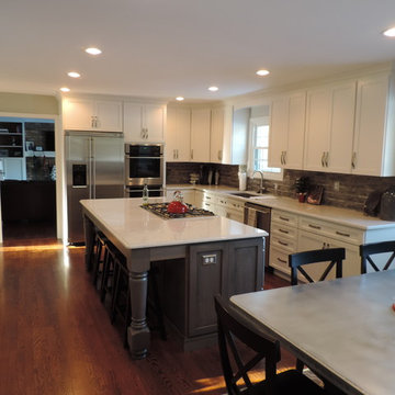
We created this transitional style kitchen for a client who loves color and texture. When she came to ‘g’ she had already chosen to use the large stone wall behind her stove and selected her appliances, which were all high end and therefore guided us in the direction of creating a real cooks kitchen. The two tiered island plays a major roll in the design since the client also had the Charisma Blue Vetrazzo already selected. This tops the top tier of the island and helped us to establish a color palette throughout. Other important features include the appliance garage and the pantry, as well as bar area. The hand scraped bamboo floors also reflect the highly textured approach to this family gathering place as they extend to adjacent rooms.
104