
Search results for "Wellness approach" in Home Design Ideas
 Chapman Design Group, Inc.
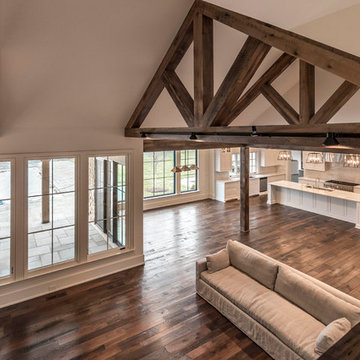
Originally built in 1990 the Heady Lakehouse began as a 2,800SF family retreat and now encompasses over 5,635SF. It is located on a steep yet welcoming lot overlooking a cove on Lake Hartwell that pulls you in through retaining walls wrapped with White Brick into a courtyard laid with concrete pavers in an Ashlar Pattern. This whole home renovation allowed us the opportunity to completely enhance the exterior of the home with all new LP Smartside painted with Amherst Gray with trim to match the Quaker new bone white windows for a subtle contrast. You enter the home under a vaulted tongue and groove white washed ceiling facing an entry door surrounded by White brick.
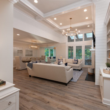
Once inside you’re encompassed by an abundance of natural light flooding in from across the living area from the 9’ triple door with transom windows above. As you make your way into the living area the ceiling opens up to a coffered ceiling which plays off of the 42” fireplace that is situated perpendicular to the dining area. The open layout provides a view into the kitchen as well as the sunroom with floor to ceiling windows boasting panoramic views of the lake. Looking back you see the elegant touches to the kitchen with Quartzite tops, all brass hardware to match the lighting throughout, and a large 4’x8’ Santorini Blue painted island with turned legs to provide a note of color.
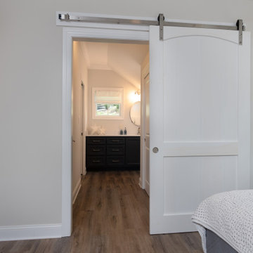
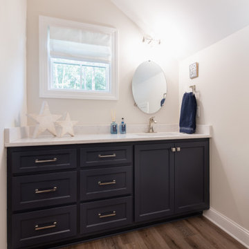
The owner’s suite is situated separate to one side of the home allowing a quiet retreat for the homeowners. Details such as the nickel gap accented bed wall, brass wall mounted bed-side lamps, and a large triple window complete the bedroom. Access to the study through the master bedroom further enhances the idea of a private space for the owners to work. It’s bathroom features clean white vanities with Quartz counter tops, brass hardware and fixtures, an obscure glass enclosed shower with natural light, and a separate toilet room.
The left side of the home received the largest addition which included a new over-sized 3 bay garage with a dog washing shower, a new side entry with stair to the upper and a new laundry room. Over these areas, the stair will lead you to two new guest suites featuring a Jack & Jill Bathroom and their own Lounging and Play Area.
The focal point for entertainment is the lower level which features a bar and seating area. Opposite the bar you walk out on the concrete pavers to a covered outdoor kitchen feature a 48” grill, Large Big Green Egg smoker, 30” Diameter Evo Flat-top Grill, and a sink all surrounded by granite countertops that sit atop a white brick base with stainless steel access doors. The kitchen overlooks a 60” gas fire pit that sits adjacent to a custom gunite eight sided hot tub with travertine coping that looks out to the lake. This elegant and timeless approach to this 5,000SF three level addition and renovation allowed the owner to add multiple sleeping and entertainment areas while rejuvenating a beautiful lake front lot with subtle contrasting colors.
 Chapman Design Group, Inc.
Originally built in 1990 the Heady Lakehouse began as a 2,800SF family retreat and now encompasses over 5,635SF. It is located on a steep yet welcoming lot overlooking a cove on Lake Hartwell that pulls you in through retaining walls wrapped with White Brick into a courtyard laid with concrete pavers in an Ashlar Pattern. This whole home renovation allowed us the opportunity to completely enhance the exterior of the home with all new LP Smartside painted with Amherst Gray with trim to match the Quaker new bone white windows for a subtle contrast. You enter the home under a vaulted tongue and groove white washed ceiling facing an entry door surrounded by White brick.
Once inside you’re encompassed by an abundance of natural light flooding in from across the living area from the 9’ triple door with transom windows above. As you make your way into the living area the ceiling opens up to a coffered ceiling which plays off of the 42” fireplace that is situated perpendicular to the dining area. The open layout provides a view into the kitchen as well as the sunroom with floor to ceiling windows boasting panoramic views of the lake. Looking back you see the elegant touches to the kitchen with Quartzite tops, all brass hardware to match the lighting throughout, and a large 4’x8’ Santorini Blue painted island with turned legs to provide a note of color.
The owner’s suite is situated separate to one side of the home allowing a quiet retreat for the homeowners. Details such as the nickel gap accented bed wall, brass wall mounted bed-side lamps, and a large triple window complete the bedroom. Access to the study through the master bedroom further enhances the idea of a private space for the owners to work. It’s bathroom features clean white vanities with Quartz counter tops, brass hardware and fixtures, an obscure glass enclosed shower with natural light, and a separate toilet room.
The left side of the home received the largest addition which included a new over-sized 3 bay garage with a dog washing shower, a new side entry with stair to the upper and a new laundry room. Over these areas, the stair will lead you to two new guest suites featuring a Jack & Jill Bathroom and their own Lounging and Play Area.
The focal point for entertainment is the lower level which features a bar and seating area. Opposite the bar you walk out on the concrete pavers to a covered outdoor kitchen feature a 48” grill, Large Big Green Egg smoker, 30” Diameter Evo Flat-top Grill, and a sink all surrounded by granite countertops that sit atop a white brick base with stainless steel access doors. The kitchen overlooks a 60” gas fire pit that sits adjacent to a custom gunite eight sided hot tub with travertine coping that looks out to the lake. This elegant and timeless approach to this 5,000SF three level addition and renovation allowed the owner to add multiple sleeping and entertainment areas while rejuvenating a beautiful lake front lot with subtle contrasting colors.
 Drury Design
THE SETUP
Sam’s client had lived in her downtown townhome home for less than a year when she decided to remodel the spacious second level. This open area consisted of three sections: a TV and fireplace zone, a sparsely furnished dining area, and a dominant central kitchen. The kitchen featured a long back wall with three segmented sections and a massive island housing the cooktop. She found the kitchen’s functionality lacking and its presence overwhelming – it dominated the entire floor, regardless of where you stood.
Design objectives:
- Reconfigure key kitchen elements (sink, cooktop, oven) while minimizing the kitchen’s visual impact
- Optimize the kitchen’s back wall, eliminating existing dead space
- Create a purposeful, well-defined dining area
- Establish a distinct, comfortable living area
- Reuse existing appliances and flooring
- Maintain an overall modern design aesthetic
THE REMODEL
Design challenges to be solved:
- Redesign the island to reduce its overwhelming presence
- Create a comfortable, dedicated living room within the available space
- Establish a distinct, inviting dining area within spatial constraints
- Enhance kitchen functionality and style without dominating the entire floor
THE RENEWED SPACE
Design solutions:
- Sam created raised end caps for the island. This separated the kitchen from adjacent living and dining areas while focusing the kitchen’s functionality. The new sink location offers ample workspace, allowing the cook to interact with guests seated at the island. The redesigned island also provides additional storage.
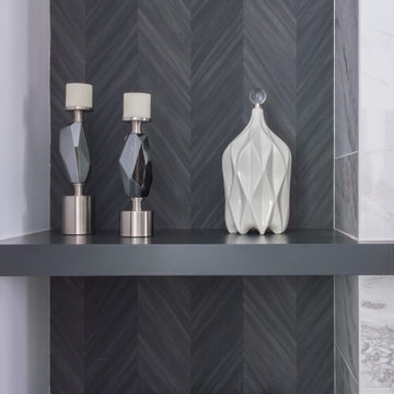
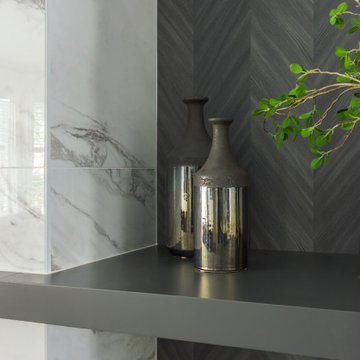
- For the living area, Sam opted for a functional-yet-minimalist approach. Large-format tile creates a natural stone look for the fireplace and TV wall. The recessed TV and extended fireplace shelf maintain a sleek profile. - Artistic wallpaper adds depth and texture, while the intentional lack of extensive shelving keeps the space open and distinct.
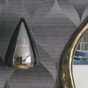
- Sam transformed the dining area’s blank wall into a feature, adding a unique dry bar with counter space, open shelves, cabinet storage and a beverage fridge. - - - Wallpaper behind and above the bar contributes to the area’s personality. A mirror adds depth while pendant lights add style and visual interest.
Relocating the cooktop to the back wall facilitates hidden ventilation, reducing visual clutter. Sam balanced transitional and modern elements for a contemporary yet comfortable feel. The digital control panel on the convection cooktop maintains a sleek look, while the wall oven is now at an easy-to-use height. ----- Mirrored base cabinet fronts and a paneled fridge prevent cabinetry monotony.
The redesign has delighted Sam’s client, achieving her main goal of creating a more inviting and visually appealing space. Each section now has its own visual personality and functionality while harmonizing within a monochromatic palette. The entire floor offers wow-factor pop upon first glance, with each area maintaining its distinct character while contributing to a cohesive, modern aesthetic.
Find the right local pro for your project
 Drury Design
THE SETUP
Sam’s client had lived in her downtown townhome home for less than a year when she decided to remodel the spacious second level. This open area consisted of three sections: a TV and fireplace zone, a sparsely furnished dining area, and a dominant central kitchen. The kitchen featured a long back wall with three segmented sections and a massive island housing the cooktop. She found the kitchen’s functionality lacking and its presence overwhelming – it dominated the entire floor, regardless of where you stood.
Design objectives:
- Reconfigure key kitchen elements (sink, cooktop, oven) while minimizing the kitchen’s visual impact
- Optimize the kitchen’s back wall, eliminating existing dead space
- Create a purposeful, well-defined dining area
- Establish a distinct, comfortable living area
- Reuse existing appliances and flooring
- Maintain an overall modern design aesthetic
THE REMODEL
Design challenges to be solved:
- Redesign the island to reduce its overwhelming presence
- Create a comfortable, dedicated living room within the available space
- Establish a distinct, inviting dining area within spatial constraints
- Enhance kitchen functionality and style without dominating the entire floor
THE RENEWED SPACE
Design solutions:
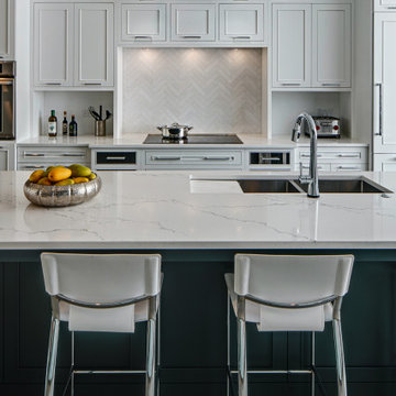
- Sam created raised end caps for the island. This separated the kitchen from adjacent living and dining areas while focusing the kitchen’s functionality. The new sink location offers ample workspace, allowing the cook to interact with guests seated at the island. The redesigned island also provides additional storage.
- For the living area, Sam opted for a functional-yet-minimalist approach. Large-format tile creates a natural stone look for the fireplace and TV wall. The recessed TV and extended fireplace shelf maintain a sleek profile. - Artistic wallpaper adds depth and texture, while the intentional lack of extensive shelving keeps the space open and distinct.
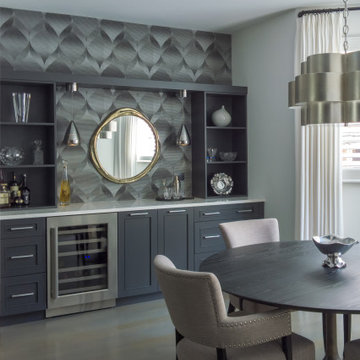
- Sam transformed the dining area’s blank wall into a feature, adding a unique dry bar with counter space, open shelves, cabinet storage and a beverage fridge. - - - Wallpaper behind and above the bar contributes to the area’s personality. A mirror adds depth while pendant lights add style and visual interest.
Relocating the cooktop to the back wall facilitates hidden ventilation, reducing visual clutter. Sam balanced transitional and modern elements for a contemporary yet comfortable feel. The digital control panel on the convection cooktop maintains a sleek look, while the wall oven is now at an easy-to-use height. ----- Mirrored base cabinet fronts and a paneled fridge prevent cabinetry monotony.
The redesign has delighted Sam’s client, achieving her main goal of creating a more inviting and visually appealing space. Each section now has its own visual personality and functionality while harmonizing within a monochromatic palette. The entire floor offers wow-factor pop upon first glance, with each area maintaining its distinct character while contributing to a cohesive, modern aesthetic.
 Drury Design
THE SETUP
Sam’s client had lived in her downtown townhome home for less than a year when she decided to remodel the spacious second level. This open area consisted of three sections: a TV and fireplace zone, a sparsely furnished dining area, and a dominant central kitchen. The kitchen featured a long back wall with three segmented sections and a massive island housing the cooktop. She found the kitchen’s functionality lacking and its presence overwhelming – it dominated the entire floor, regardless of where you stood.
Design objectives:
- Reconfigure key kitchen elements (sink, cooktop, oven) while minimizing the kitchen’s visual impact
- Optimize the kitchen’s back wall, eliminating existing dead space
- Create a purposeful, well-defined dining area
- Establish a distinct, comfortable living area
- Reuse existing appliances and flooring
- Maintain an overall modern design aesthetic
THE REMODEL
Design challenges to be solved:
- Redesign the island to reduce its overwhelming presence
- Create a comfortable, dedicated living room within the available space
- Establish a distinct, inviting dining area within spatial constraints
- Enhance kitchen functionality and style without dominating the entire floor
THE RENEWED SPACE
Design solutions:
- Sam created raised end caps for the island. This separated the kitchen from adjacent living and dining areas while focusing the kitchen’s functionality. The new sink location offers ample workspace, allowing the cook to interact with guests seated at the island. The redesigned island also provides additional storage.
- For the living area, Sam opted for a functional-yet-minimalist approach. Large-format tile creates a natural stone look for the fireplace and TV wall. The recessed TV and extended fireplace shelf maintain a sleek profile. - Artistic wallpaper adds depth and texture, while the intentional lack of extensive shelving keeps the space open and distinct.
- Sam transformed the dining area’s blank wall into a feature, adding a unique dry bar with counter space, open shelves, cabinet storage and a beverage fridge. - - - Wallpaper behind and above the bar contributes to the area’s personality. A mirror adds depth while pendant lights add style and visual interest.
Relocating the cooktop to the back wall facilitates hidden ventilation, reducing visual clutter. Sam balanced transitional and modern elements for a contemporary yet comfortable feel. The digital control panel on the convection cooktop maintains a sleek look, while the wall oven is now at an easy-to-use height. ----- Mirrored base cabinet fronts and a paneled fridge prevent cabinetry monotony.
The redesign has delighted Sam’s client, achieving her main goal of creating a more inviting and visually appealing space. Each section now has its own visual personality and functionality while harmonizing within a monochromatic palette. The entire floor offers wow-factor pop upon first glance, with each area maintaining its distinct character while contributing to a cohesive, modern aesthetic.
 Drury Design
THE SETUP
Sam’s client had lived in her downtown townhome home for less than a year when she decided to remodel the spacious second level. This open area consisted of three sections: a TV and fireplace zone, a sparsely furnished dining area, and a dominant central kitchen. The kitchen featured a long back wall with three segmented sections and a massive island housing the cooktop. She found the kitchen’s functionality lacking and its presence overwhelming – it dominated the entire floor, regardless of where you stood.
Design objectives:
- Reconfigure key kitchen elements (sink, cooktop, oven) while minimizing the kitchen’s visual impact
- Optimize the kitchen’s back wall, eliminating existing dead space
- Create a purposeful, well-defined dining area
- Establish a distinct, comfortable living area
- Reuse existing appliances and flooring
- Maintain an overall modern design aesthetic
THE REMODEL
Design challenges to be solved:
- Redesign the island to reduce its overwhelming presence
- Create a comfortable, dedicated living room within the available space
- Establish a distinct, inviting dining area within spatial constraints
- Enhance kitchen functionality and style without dominating the entire floor
THE RENEWED SPACE
Design solutions:
- Sam created raised end caps for the island. This separated the kitchen from adjacent living and dining areas while focusing the kitchen’s functionality. The new sink location offers ample workspace, allowing the cook to interact with guests seated at the island. The redesigned island also provides additional storage.
- For the living area, Sam opted for a functional-yet-minimalist approach. Large-format tile creates a natural stone look for the fireplace and TV wall. The recessed TV and extended fireplace shelf maintain a sleek profile. - Artistic wallpaper adds depth and texture, while the intentional lack of extensive shelving keeps the space open and distinct.
- Sam transformed the dining area’s blank wall into a feature, adding a unique dry bar with counter space, open shelves, cabinet storage and a beverage fridge. - - - Wallpaper behind and above the bar contributes to the area’s personality. A mirror adds depth while pendant lights add style and visual interest.
Relocating the cooktop to the back wall facilitates hidden ventilation, reducing visual clutter. Sam balanced transitional and modern elements for a contemporary yet comfortable feel. The digital control panel on the convection cooktop maintains a sleek look, while the wall oven is now at an easy-to-use height. ----- Mirrored base cabinet fronts and a paneled fridge prevent cabinetry monotony.
The redesign has delighted Sam’s client, achieving her main goal of creating a more inviting and visually appealing space. Each section now has its own visual personality and functionality while harmonizing within a monochromatic palette. The entire floor offers wow-factor pop upon first glance, with each area maintaining its distinct character while contributing to a cohesive, modern aesthetic.
 KURV Architecture DPC (Alex Hughes Architects)
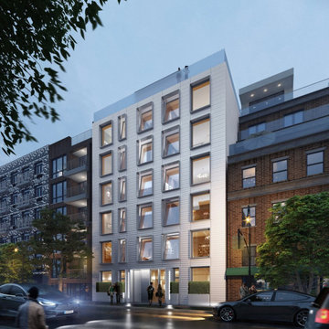
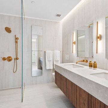
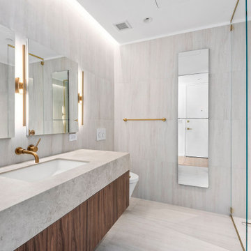
Located in the heart of Manhattan’s Lower East Side, the building was erected on a shallow commercial lot between two 120 year old masonry buildings and a new residential rental building. 330 Grand Street is a mix of 725 SF 1BRs and 1050 SF 2BR apartments. It also contains a 1100 SF two story duplex as well as private and public rooftop space, large private balconies for most units and two large private terraces for the ground floor units.
330 Grand Street was originally designed and approved at the NYC DOB as a prefabricated modular building. During the pandemic, as shipping costs skyrocketed putting the project at risk, we suggested redesigning the building as a reinforced cast-in-place concrete structure. Concrete was readily available and prices had not been affected by the demand increase that many other materials suffered in the pandemic. We took this opportunity to raise floor to ceiling heights, enlarge high performance windows and redistribute the buildings MEPFS and Structural Systems to create very open floor plans.
The challenge was to create a luxurious sensorial living experience with very limited means. In a city with very high construction costs, low cost residential buildings in the area are usually devoid of good quality, design and character. Our approach was to aim high for the end user, prioritizing natural light, open space with long visual perspectives, high ceilings and as always, rejecting the use of predefined building templates.
Our biggest challenge was to ensure that the small spaces feel as clean cut, large and bright as possible. Several unique design decisions were made to ensure low cost and high quality;
Floor plans were laid out so that spaces were wide open and free of clutter from mechanical or structural interruptions. Therefore all infrastructure was placed in lateral demising walls, which in turn act as the unit’s storage and kitchen. The apartments feel wide open, are super quiet and have more storage space than any other comparable apartment in the city.
To solve the problem of the site’s shallow commercial lot which is typically prone to dark interior spaces we focused our attention on the building’s envelope. Instead of the usual small punched window openings, oversized high performance windows were designed to ensure that light penetrated as far as possible into the units. In the smaller 1BR units, the full 50’ depth of the lot is perceived by partitioning spaces with sliding pocket doors that can be retracted to allow deep visual perspectives, making the sight lines in the space feel longer, larger, more ample than normal. In addition to the full height glazing, each unit above the 2nd floor receives a 7 foot covered balcony, adding 120 to 240 sf to each apartment, something unusual in New York City buildings. The space is large enough for a full size dining table, when the weather permits being outside.
We also worked hard to ensure modularity. For example, all kitchen units are all identical throughout the building. The idea of modularity and the economy of the repetitive unit is exercised to the maximum through the building.
Hardware, appliances, flooring, wall coverings and material finishes are all carefully selected to feel bespoke, high quality and unique.
It was important to KURV that the result of this work manifest into something that would deeply connect with the end user and sustain relationships with the consumers of this space.
All images by KURV Architecture ©

 Advance Design Studio, Ltd.
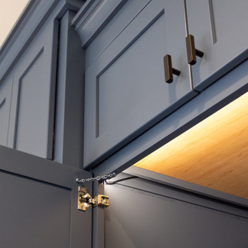
Richard and Monica of Huntley, IL, needed to make better use of their kitchen as well as more storage for pots, pans, and countertop appliances. Their space was laid out unconventionally, making cooking a challenge. A triangular nook held their refrigerator, hard-to-reach cabinets, and a cramped pantry. They needed to find a solution, so they searched Facebook for home remodeling companies in their area. Soon they found Advance Design Studio’s profile and were immediately impressed.
“Advance Design was the first and last studio I contacted,” Richard said.
Richard called Advance Design and felt an immediate connection with Project Designer Nicole. She was knowledgeable and thorough and offered many unique solutions to their kitchen layout problem.
A week later, Nicole came out to their home to meet the couple. They talked about their kitchen remodeling project and told Nicole what they wanted in their dream kitchen. Nicole saw that the kitchen had weird angles that hindered the cabinets you could use. She knew that designing a space that met both the client’s needs and dreams would be challenging.
Nicole worked with Richard and Monica to create an innovative design. When the couple came out to Advance Design Studio in Gilberts, they were blown away by the 3D illustrations Nicole showed them.
“I incorporated a hidden pantry cabinet to not only be a cool feature but also allowed me to square off the walls to gain more cabinet space,” Nicole said.
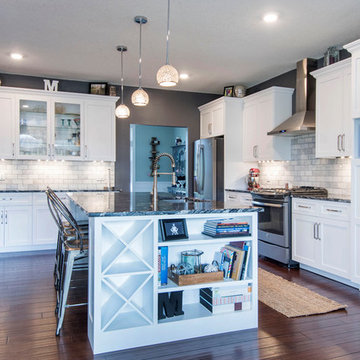
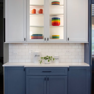
The hidden pantry added storage and squared off the strange triangular nook, creating a more traditional and functional kitchen layout. With the layout problems solved, they worked together to select materials. Richard and Monica wanted something brighter than their previous dark brown kitchen. They chose a combination of blue and white cabinetry with a white subway tile backsplash and white quartz countertops. The design was finalized, the materials were selected. It was time to begin construction.
One fear most homeowners have when beginning a home remodel is dust. Advance Design uses BuildClean HEPA filters to eliminate dust throughout the house while construction is going on. Project Manager Jason and his crew created temporary walls and cleaned up after every day of work.
“We were very impressed with how clean and organized the crew kept things while the remodeling process was underway,” Richard said.
The result is just what Richard and Monica envisioned when they began the process. Richard’s love for cooking can be explored through all-new Thermador appliances, featuring an easy-to-use induction cooktop, built-in double oven, and spacious refrigerator. Matte black hardware contrasts the bright white backsplash, countertops, and cabinets, while the stunning blue cabinets complement the dark hardwood floor and stainless-steel appliances. The dual pendant light fixtures over the reconfigured island are eye-catching and add necessary lighting.
This Huntley kitchen renovation turned out better than Richard and Monica hoped. Their experience with Advance Design’s Common Sense Remodeling process has them thinking about other projects they could do in the future.
Our award-winning design team would love to create a beautiful, functional, and spacious place for you and your family. With our “Common Sense Remodeling” approach, the process of renovating your home has never been easier. Contact us today at 847-665-1711 or schedule an appointment.
 KURV Architecture DPC (Alex Hughes Architects)
Located in the heart of Manhattan’s Lower East Side, the building was erected on a shallow commercial lot between two 120 year old masonry buildings and a new residential rental building. 330 Grand Street is a mix of 725 SF 1BRs and 1050 SF 2BR apartments. It also contains a 1100 SF two story duplex as well as private and public rooftop space, large private balconies for most units and two large private terraces for the ground floor units.
330 Grand Street was originally designed and approved at the NYC DOB as a prefabricated modular building. During the pandemic, as shipping costs skyrocketed putting the project at risk, we suggested redesigning the building as a reinforced cast-in-place concrete structure. Concrete was readily available and prices had not been affected by the demand increase that many other materials suffered in the pandemic. We took this opportunity to raise floor to ceiling heights, enlarge high performance windows and redistribute the buildings MEPFS and Structural Systems to create very open floor plans.
The challenge was to create a luxurious sensorial living experience with very limited means. In a city with very high construction costs, low cost residential buildings in the area are usually devoid of good quality, design and character. Our approach was to aim high for the end user, prioritizing natural light, open space with long visual perspectives, high ceilings and as always, rejecting the use of predefined building templates.
Our biggest challenge was to ensure that the small spaces feel as clean cut, large and bright as possible. Several unique design decisions were made to ensure low cost and high quality;
Floor plans were laid out so that spaces were wide open and free of clutter from mechanical or structural interruptions. Therefore all infrastructure was placed in lateral demising walls, which in turn act as the unit’s storage and kitchen. The apartments feel wide open, are super quiet and have more storage space than any other comparable apartment in the city.
To solve the problem of the site’s shallow commercial lot which is typically prone to dark interior spaces we focused our attention on the building’s envelope. Instead of the usual small punched window openings, oversized high performance windows were designed to ensure that light penetrated as far as possible into the units. In the smaller 1BR units, the full 50’ depth of the lot is perceived by partitioning spaces with sliding pocket doors that can be retracted to allow deep visual perspectives, making the sight lines in the space feel longer, larger, more ample than normal. In addition to the full height glazing, each unit above the 2nd floor receives a 7 foot covered balcony, adding 120 to 240 sf to each apartment, something unusual in New York City buildings. The space is large enough for a full size dining table, when the weather permits being outside.
We also worked hard to ensure modularity. For example, all kitchen units are all identical throughout the building. The idea of modularity and the economy of the repetitive unit is exercised to the maximum through the building.
Hardware, appliances, flooring, wall coverings and material finishes are all carefully selected to feel bespoke, high quality and unique.
It was important to KURV that the result of this work manifest into something that would deeply connect with the end user and sustain relationships with the consumers of this space.
All images by KURV Architecture ©
 DiGiacomo Homes & Renovation
A 1929 urban Bungalow well preserved save for the kitchen. The kitchen had been twice remodeled – most recently in the 1970’s by previous homeowners. Our clients wished to restore the original Craftsman-era charm to their kitchen (which adjoined the dining room and was visible from the front entry). At the same time, our clients were looking to increase the functionality of the kitchen space and create additional seating for frequent dinner guests. Our clients’ tight budget restricted the finish pallet to rather simple options, but that simplicity became the project’s strength.
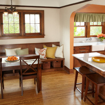
Custom cabinets (using FSC-certified maple) were designed with simple flat panel doors and fabricated using dove-tail joinery as was typical of Bungalow cabinetry. Red oak, stained to match the home’s original millwork was used to construct the cabinet lowers and a new bench to create continuity with the remainder of the home. Carrara marble, authentic to the 1920s period, was used to aesthetically brighten the space. Cabinet uppers were enameled in a historically appropriate cream hue to compliment the countertop stone. The backsplash tile was selected to pay tribute to the home’s original 1929 wall color – found beneath several layers of wallpaper during demolition. Walls were painted a bold, but historically, accurate, copper color (a perfect compliment the red oak cabinetry and trim). Lighting issues in this north-facing kitchen were addressed using hidden over-cabinet lights, task-specific under-cabinet lighting, sink cans and several period fixtures – hand fashioned by a local artisan specializing in historic reproductions to complete the bungalow look and honor the Arts-n-Crafts practice of using local craftsman. Simple and practical…in budget and in period.
To solve the seating issue, a new bench (with storage below) was custom built to span the 12’ dining room wall – allowing plenty of room for family and guests alike during dinner. The larger kitchen approach provided room for a new serve-through with counter seating where snacks, homework, and spill-over food prep can occur. No new square footage… six new seats!
To solve storage needs, the base cabinets in the kitchen were designed 3” deeper than standard 24” box cabinets and a new 28” deep pantry added allowing some of the wasted space at the center of this square kitchen to be used more efficiently. A tall backsplash capped with a 4” ledge provides a place for all of the inevitable items that clutter valuable counter real estate (cooking timers, seasoning jars, etc …) Specialized, task-specific storage - the highlight of Bungalow kitchens - was incorporated throughout: 1) An angled cabinet, built to accommodate an awkward side door location, now holds a trash can, tin-lined recycling bins, and a knife drawer; 2) A difficult deep corner necessitated by the 28” deep fridge gave rise to open cookbook shelves, an appliance cubby and narrow, and a deep pantry with full-extension roll-out trays; 3) An open pot & pan rack, built-in wall spice cabinet, kid-height microwave (a special request from our clients), customized cell-phone/electronics storage, built-in chalk board message center, and new rear entry coat/backpack storage with cork board complete the net storage gain. No new square footage … lots of new, innovative, high-functioning storage.
 Chapman Design Group, Inc.
Originally built in 1990 the Heady Lakehouse began as a 2,800SF family retreat and now encompasses over 5,635SF. It is located on a steep yet welcoming lot overlooking a cove on Lake Hartwell that pulls you in through retaining walls wrapped with White Brick into a courtyard laid with concrete pavers in an Ashlar Pattern. This whole home renovation allowed us the opportunity to completely enhance the exterior of the home with all new LP Smartside painted with Amherst Gray with trim to match the Quaker new bone white windows for a subtle contrast. You enter the home under a vaulted tongue and groove white washed ceiling facing an entry door surrounded by White brick.
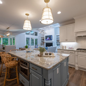
Once inside you’re encompassed by an abundance of natural light flooding in from across the living area from the 9’ triple door with transom windows above. As you make your way into the living area the ceiling opens up to a coffered ceiling which plays off of the 42” fireplace that is situated perpendicular to the dining area. The open layout provides a view into the kitchen as well as the sunroom with floor to ceiling windows boasting panoramic views of the lake. Looking back you see the elegant touches to the kitchen with Quartzite tops, all brass hardware to match the lighting throughout, and a large 4’x8’ Santorini Blue painted island with turned legs to provide a note of color.
The owner’s suite is situated separate to one side of the home allowing a quiet retreat for the homeowners. Details such as the nickel gap accented bed wall, brass wall mounted bed-side lamps, and a large triple window complete the bedroom. Access to the study through the master bedroom further enhances the idea of a private space for the owners to work. It’s bathroom features clean white vanities with Quartz counter tops, brass hardware and fixtures, an obscure glass enclosed shower with natural light, and a separate toilet room.
The left side of the home received the largest addition which included a new over-sized 3 bay garage with a dog washing shower, a new side entry with stair to the upper and a new laundry room. Over these areas, the stair will lead you to two new guest suites featuring a Jack & Jill Bathroom and their own Lounging and Play Area.
The focal point for entertainment is the lower level which features a bar and seating area. Opposite the bar you walk out on the concrete pavers to a covered outdoor kitchen feature a 48” grill, Large Big Green Egg smoker, 30” Diameter Evo Flat-top Grill, and a sink all surrounded by granite countertops that sit atop a white brick base with stainless steel access doors. The kitchen overlooks a 60” gas fire pit that sits adjacent to a custom gunite eight sided hot tub with travertine coping that looks out to the lake. This elegant and timeless approach to this 5,000SF three level addition and renovation allowed the owner to add multiple sleeping and entertainment areas while rejuvenating a beautiful lake front lot with subtle contrasting colors.
 Advance Design Studio, Ltd.
Richard and Monica of Huntley, IL, needed to make better use of their kitchen as well as more storage for pots, pans, and countertop appliances. Their space was laid out unconventionally, making cooking a challenge. A triangular nook held their refrigerator, hard-to-reach cabinets, and a cramped pantry. They needed to find a solution, so they searched Facebook for home remodeling companies in their area. Soon they found Advance Design Studio’s profile and were immediately impressed.
“Advance Design was the first and last studio I contacted,” Richard said.
Richard called Advance Design and felt an immediate connection with Project Designer Nicole. She was knowledgeable and thorough and offered many unique solutions to their kitchen layout problem.
A week later, Nicole came out to their home to meet the couple. They talked about their kitchen remodeling project and told Nicole what they wanted in their dream kitchen. Nicole saw that the kitchen had weird angles that hindered the cabinets you could use. She knew that designing a space that met both the client’s needs and dreams would be challenging.
Nicole worked with Richard and Monica to create an innovative design. When the couple came out to Advance Design Studio in Gilberts, they were blown away by the 3D illustrations Nicole showed them.
“I incorporated a hidden pantry cabinet to not only be a cool feature but also allowed me to square off the walls to gain more cabinet space,” Nicole said.
The hidden pantry added storage and squared off the strange triangular nook, creating a more traditional and functional kitchen layout. With the layout problems solved, they worked together to select materials. Richard and Monica wanted something brighter than their previous dark brown kitchen. They chose a combination of blue and white cabinetry with a white subway tile backsplash and white quartz countertops. The design was finalized, the materials were selected. It was time to begin construction.
One fear most homeowners have when beginning a home remodel is dust. Advance Design uses BuildClean HEPA filters to eliminate dust throughout the house while construction is going on. Project Manager Jason and his crew created temporary walls and cleaned up after every day of work.
“We were very impressed with how clean and organized the crew kept things while the remodeling process was underway,” Richard said.
The result is just what Richard and Monica envisioned when they began the process. Richard’s love for cooking can be explored through all-new Thermador appliances, featuring an easy-to-use induction cooktop, built-in double oven, and spacious refrigerator. Matte black hardware contrasts the bright white backsplash, countertops, and cabinets, while the stunning blue cabinets complement the dark hardwood floor and stainless-steel appliances. The dual pendant light fixtures over the reconfigured island are eye-catching and add necessary lighting.
This Huntley kitchen renovation turned out better than Richard and Monica hoped. Their experience with Advance Design’s Common Sense Remodeling process has them thinking about other projects they could do in the future.
Our award-winning design team would love to create a beautiful, functional, and spacious place for you and your family. With our “Common Sense Remodeling” approach, the process of renovating your home has never been easier. Contact us today at 847-665-1711 or schedule an appointment.
 Drury Design
THE SETUP
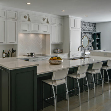
Sam’s client had lived in her downtown townhome home for less than a year when she decided to remodel the spacious second level. This open area consisted of three sections: a TV and fireplace zone, a sparsely furnished dining area, and a dominant central kitchen. The kitchen featured a long back wall with three segmented sections and a massive island housing the cooktop. She found the kitchen’s functionality lacking and its presence overwhelming – it dominated the entire floor, regardless of where you stood.
Design objectives:
- Reconfigure key kitchen elements (sink, cooktop, oven) while minimizing the kitchen’s visual impact
- Optimize the kitchen’s back wall, eliminating existing dead space
- Create a purposeful, well-defined dining area
- Establish a distinct, comfortable living area
- Reuse existing appliances and flooring
- Maintain an overall modern design aesthetic
THE REMODEL
Design challenges to be solved:
- Redesign the island to reduce its overwhelming presence
- Create a comfortable, dedicated living room within the available space
- Establish a distinct, inviting dining area within spatial constraints
- Enhance kitchen functionality and style without dominating the entire floor
THE RENEWED SPACE
Design solutions:
- Sam created raised end caps for the island. This separated the kitchen from adjacent living and dining areas while focusing the kitchen’s functionality. The new sink location offers ample workspace, allowing the cook to interact with guests seated at the island. The redesigned island also provides additional storage.
- For the living area, Sam opted for a functional-yet-minimalist approach. Large-format tile creates a natural stone look for the fireplace and TV wall. The recessed TV and extended fireplace shelf maintain a sleek profile. - Artistic wallpaper adds depth and texture, while the intentional lack of extensive shelving keeps the space open and distinct.
- Sam transformed the dining area’s blank wall into a feature, adding a unique dry bar with counter space, open shelves, cabinet storage and a beverage fridge. - - - Wallpaper behind and above the bar contributes to the area’s personality. A mirror adds depth while pendant lights add style and visual interest.
Relocating the cooktop to the back wall facilitates hidden ventilation, reducing visual clutter. Sam balanced transitional and modern elements for a contemporary yet comfortable feel. The digital control panel on the convection cooktop maintains a sleek look, while the wall oven is now at an easy-to-use height. ----- Mirrored base cabinet fronts and a paneled fridge prevent cabinetry monotony.
The redesign has delighted Sam’s client, achieving her main goal of creating a more inviting and visually appealing space. Each section now has its own visual personality and functionality while harmonizing within a monochromatic palette. The entire floor offers wow-factor pop upon first glance, with each area maintaining its distinct character while contributing to a cohesive, modern aesthetic.

Sponsored
Sunbury, OH

J.Holderby - Renovations
Franklin County's Leading General Contractors - 2X Best of Houzz!
 KURV Architecture DPC (Alex Hughes Architects)
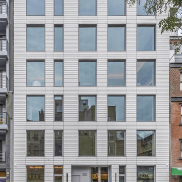
Located in the heart of Manhattan’s Lower East Side, the building was erected on a shallow commercial lot between two 120 year old masonry buildings and a new residential rental building. 330 Grand Street is a mix of 725 SF 1BRs and 1050 SF 2BR apartments. It also contains a 1100 SF two story duplex as well as private and public rooftop space, large private balconies for most units and two large private terraces for the ground floor units.
330 Grand Street was originally designed and approved at the NYC DOB as a prefabricated modular building. During the pandemic, as shipping costs skyrocketed putting the project at risk, we suggested redesigning the building as a reinforced cast-in-place concrete structure. Concrete was readily available and prices had not been affected by the demand increase that many other materials suffered in the pandemic. We took this opportunity to raise floor to ceiling heights, enlarge high performance windows and redistribute the buildings MEPFS and Structural Systems to create very open floor plans.
The challenge was to create a luxurious sensorial living experience with very limited means. In a city with very high construction costs, low cost residential buildings in the area are usually devoid of good quality, design and character. Our approach was to aim high for the end user, prioritizing natural light, open space with long visual perspectives, high ceilings and as always, rejecting the use of predefined building templates.
Our biggest challenge was to ensure that the small spaces feel as clean cut, large and bright as possible. Several unique design decisions were made to ensure low cost and high quality;
Floor plans were laid out so that spaces were wide open and free of clutter from mechanical or structural interruptions. Therefore all infrastructure was placed in lateral demising walls, which in turn act as the unit’s storage and kitchen. The apartments feel wide open, are super quiet and have more storage space than any other comparable apartment in the city.
To solve the problem of the site’s shallow commercial lot which is typically prone to dark interior spaces we focused our attention on the building’s envelope. Instead of the usual small punched window openings, oversized high performance windows were designed to ensure that light penetrated as far as possible into the units. In the smaller 1BR units, the full 50’ depth of the lot is perceived by partitioning spaces with sliding pocket doors that can be retracted to allow deep visual perspectives, making the sight lines in the space feel longer, larger, more ample than normal. In addition to the full height glazing, each unit above the 2nd floor receives a 7 foot covered balcony, adding 120 to 240 sf to each apartment, something unusual in New York City buildings. The space is large enough for a full size dining table, when the weather permits being outside.
We also worked hard to ensure modularity. For example, all kitchen units are all identical throughout the building. The idea of modularity and the economy of the repetitive unit is exercised to the maximum through the building.
Hardware, appliances, flooring, wall coverings and material finishes are all carefully selected to feel bespoke, high quality and unique.
It was important to KURV that the result of this work manifest into something that would deeply connect with the end user and sustain relationships with the consumers of this space.
All images by KURV Architecture ©
 Drury Design
Relocating from San Francisco, this young family immediately zeroed in on the wonderful historic homes around downtown Chicago. Most of the properties they saw checked a lot of wish list boxes, but none of them checked every box. The house they landed on had beautiful curb appeal, a dramatic entry with a welcoming porch and front hall, and a really nice yard. Unfortunately, it did not have a kitchen that was well set-up for cooking and entertaining. Reworking the kitchen area was the top priority.
The family had met with a few other designers and even had an architect take a crack at the space, but they were not able to come up with a viable solution. Here’s how Senior Designer Diana Burton approached the project…
Design Objectives:
Respect the home’s vintage feel while bringing the kitchen up to date
Open up the kitchen area to create an open space for gathering and entertaining
Upgrade appliances to top-of-the-line models
Include a large island with seating
Include seating for casual family meals in a space that won’t be a replacement for the adjacent formal dining room
THE REMODEL
Design Challenges:
Remove a load-bearing wall and combine smaller rooms to create one big kitchen
A powder room in the back corner of the existing kitchen was a huge obstacle to updating the layout
Maintain large windows with views of the yard while still providing ample storage
Design Solutions:
Relocating the powder room to another part of the first floor (a large closet under the stairs) opened up the space dramatically
Create space for a larger island by recessing the fridge/freezer and shifting the pantry to a space adjacent to the kitchen
A banquette saves space and offers a perfect solution for casual dining
The walnut banquette table beautifully complements the fridge/freezer armoire
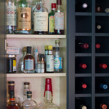
Utilize a gap created by the new fridge location to create a tall shallow cabinet for liquor storage w/ a wine cubby
Closing off one doorway into the dining room and using the “between the studs” space for a tall storage cabinet
Dish organizing drawers offer handy storage for plates, bowls, and serving dishes right by main sink and dishwasher
Cabinetry backing up to the dining room offers ample storage for glassware and functions both as a coffee station and cocktail bar
Open shelves flanking the hood add storage without blocking views and daylight
A beam was required where the wall was removed. Additional beams added architectural interest and helped integrate the beams into the space
Statement lighting adds drama and personality to the space
THE RENEWED SPACE
This project exemplifies the transformative power of good design. Simply put, good design allows you to live life artfully. The newly remodeled kitchen effortlessly combines functionality and aesthetic appeal, providing a delightful space for cooking and spending quality time together. It’s comfy for regular meals but ultimately outfitted for those special gatherings. Infused with classic finishes and a timeless charm, the kitchen emanates an enduring atmosphere that will never go out of style.
This is the special feature utilized a gap created by the new fridge location to create a tall shallow cabinet for liquor storage w/ a wine cubby
 KURV Architecture DPC (Alex Hughes Architects)
Located in the heart of Manhattan’s Lower East Side, the building was erected on a shallow commercial lot between two 120 year old masonry buildings and a new residential rental building. 330 Grand Street is a mix of 725 SF 1BRs and 1050 SF 2BR apartments. It also contains a 1100 SF two story duplex as well as private and public rooftop space, large private balconies for most units and two large private terraces for the ground floor units.
330 Grand Street was originally designed and approved at the NYC DOB as a prefabricated modular building. During the pandemic, as shipping costs skyrocketed putting the project at risk, we suggested redesigning the building as a reinforced cast-in-place concrete structure. Concrete was readily available and prices had not been affected by the demand increase that many other materials suffered in the pandemic. We took this opportunity to raise floor to ceiling heights, enlarge high performance windows and redistribute the buildings MEPFS and Structural Systems to create very open floor plans.
The challenge was to create a luxurious sensorial living experience with very limited means. In a city with very high construction costs, low cost residential buildings in the area are usually devoid of good quality, design and character. Our approach was to aim high for the end user, prioritizing natural light, open space with long visual perspectives, high ceilings and as always, rejecting the use of predefined building templates.
Our biggest challenge was to ensure that the small spaces feel as clean cut, large and bright as possible. Several unique design decisions were made to ensure low cost and high quality;
Floor plans were laid out so that spaces were wide open and free of clutter from mechanical or structural interruptions. Therefore all infrastructure was placed in lateral demising walls, which in turn act as the unit’s storage and kitchen. The apartments feel wide open, are super quiet and have more storage space than any other comparable apartment in the city.
To solve the problem of the site’s shallow commercial lot which is typically prone to dark interior spaces we focused our attention on the building’s envelope. Instead of the usual small punched window openings, oversized high performance windows were designed to ensure that light penetrated as far as possible into the units. In the smaller 1BR units, the full 50’ depth of the lot is perceived by partitioning spaces with sliding pocket doors that can be retracted to allow deep visual perspectives, making the sight lines in the space feel longer, larger, more ample than normal. In addition to the full height glazing, each unit above the 2nd floor receives a 7 foot covered balcony, adding 120 to 240 sf to each apartment, something unusual in New York City buildings. The space is large enough for a full size dining table, when the weather permits being outside.
We also worked hard to ensure modularity. For example, all kitchen units are all identical throughout the building. The idea of modularity and the economy of the repetitive unit is exercised to the maximum through the building.
Hardware, appliances, flooring, wall coverings and material finishes are all carefully selected to feel bespoke, high quality and unique.
It was important to KURV that the result of this work manifest into something that would deeply connect with the end user and sustain relationships with the consumers of this space.
All images by KURV Architecture ©
 Drury Design
THE SETUP
Sam’s client had lived in her downtown townhome home for less than a year when she decided to remodel the spacious second level. This open area consisted of three sections: a TV and fireplace zone, a sparsely furnished dining area, and a dominant central kitchen. The kitchen featured a long back wall with three segmented sections and a massive island housing the cooktop. She found the kitchen’s functionality lacking and its presence overwhelming – it dominated the entire floor, regardless of where you stood.
Design objectives:
- Reconfigure key kitchen elements (sink, cooktop, oven) while minimizing the kitchen’s visual impact
- Optimize the kitchen’s back wall, eliminating existing dead space
- Create a purposeful, well-defined dining area
- Establish a distinct, comfortable living area
- Reuse existing appliances and flooring
- Maintain an overall modern design aesthetic
THE REMODEL
Design challenges to be solved:
- Redesign the island to reduce its overwhelming presence
- Create a comfortable, dedicated living room within the available space
- Establish a distinct, inviting dining area within spatial constraints
- Enhance kitchen functionality and style without dominating the entire floor
THE RENEWED SPACE
Design solutions:
- Sam created raised end caps for the island. This separated the kitchen from adjacent living and dining areas while focusing the kitchen’s functionality. The new sink location offers ample workspace, allowing the cook to interact with guests seated at the island. The redesigned island also provides additional storage.
- For the living area, Sam opted for a functional-yet-minimalist approach. Large-format tile creates a natural stone look for the fireplace and TV wall. The recessed TV and extended fireplace shelf maintain a sleek profile. - Artistic wallpaper adds depth and texture, while the intentional lack of extensive shelving keeps the space open and distinct.
- Sam transformed the dining area’s blank wall into a feature, adding a unique dry bar with counter space, open shelves, cabinet storage and a beverage fridge. - - - Wallpaper behind and above the bar contributes to the area’s personality. A mirror adds depth while pendant lights add style and visual interest.
Relocating the cooktop to the back wall facilitates hidden ventilation, reducing visual clutter. Sam balanced transitional and modern elements for a contemporary yet comfortable feel. The digital control panel on the convection cooktop maintains a sleek look, while the wall oven is now at an easy-to-use height. ----- Mirrored base cabinet fronts and a paneled fridge prevent cabinetry monotony.
The redesign has delighted Sam’s client, achieving her main goal of creating a more inviting and visually appealing space. Each section now has its own visual personality and functionality while harmonizing within a monochromatic palette. The entire floor offers wow-factor pop upon first glance, with each area maintaining its distinct character while contributing to a cohesive, modern aesthetic.

 Chapman Design Group, Inc.
Originally built in 1990 the Heady Lakehouse began as a 2,800SF family retreat and now encompasses over 5,635SF. It is located on a steep yet welcoming lot overlooking a cove on Lake Hartwell that pulls you in through retaining walls wrapped with White Brick into a courtyard laid with concrete pavers in an Ashlar Pattern. This whole home renovation allowed us the opportunity to completely enhance the exterior of the home with all new LP Smartside painted with Amherst Gray with trim to match the Quaker new bone white windows for a subtle contrast. You enter the home under a vaulted tongue and groove white washed ceiling facing an entry door surrounded by White brick.
Once inside you’re encompassed by an abundance of natural light flooding in from across the living area from the 9’ triple door with transom windows above. As you make your way into the living area the ceiling opens up to a coffered ceiling which plays off of the 42” fireplace that is situated perpendicular to the dining area. The open layout provides a view into the kitchen as well as the sunroom with floor to ceiling windows boasting panoramic views of the lake. Looking back you see the elegant touches to the kitchen with Quartzite tops, all brass hardware to match the lighting throughout, and a large 4’x8’ Santorini Blue painted island with turned legs to provide a note of color.
The owner’s suite is situated separate to one side of the home allowing a quiet retreat for the homeowners. Details such as the nickel gap accented bed wall, brass wall mounted bed-side lamps, and a large triple window complete the bedroom. Access to the study through the master bedroom further enhances the idea of a private space for the owners to work. It’s bathroom features clean white vanities with Quartz counter tops, brass hardware and fixtures, an obscure glass enclosed shower with natural light, and a separate toilet room.
The left side of the home received the largest addition which included a new over-sized 3 bay garage with a dog washing shower, a new side entry with stair to the upper and a new laundry room. Over these areas, the stair will lead you to two new guest suites featuring a Jack & Jill Bathroom and their own Lounging and Play Area.
The focal point for entertainment is the lower level which features a bar and seating area. Opposite the bar you walk out on the concrete pavers to a covered outdoor kitchen feature a 48” grill, Large Big Green Egg smoker, 30” Diameter Evo Flat-top Grill, and a sink all surrounded by granite countertops that sit atop a white brick base with stainless steel access doors. The kitchen overlooks a 60” gas fire pit that sits adjacent to a custom gunite eight sided hot tub with travertine coping that looks out to the lake. This elegant and timeless approach to this 5,000SF three level addition and renovation allowed the owner to add multiple sleeping and entertainment areas while rejuvenating a beautiful lake front lot with subtle contrasting colors.
 KURV Architecture DPC (Alex Hughes Architects)
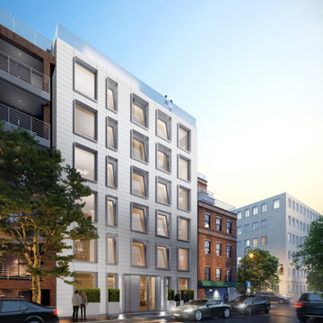
Located in the heart of Manhattan’s Lower East Side, the building was erected on a shallow commercial lot between two 120 year old masonry buildings and a new residential rental building. 330 Grand Street is a mix of 725 SF 1BRs and 1050 SF 2BR apartments. It also contains a 1100 SF two story duplex as well as private and public rooftop space, large private balconies for most units and two large private terraces for the ground floor units.
330 Grand Street was originally designed and approved at the NYC DOB as a prefabricated modular building. During the pandemic, as shipping costs skyrocketed putting the project at risk, we suggested redesigning the building as a reinforced cast-in-place concrete structure. Concrete was readily available and prices had not been affected by the demand increase that many other materials suffered in the pandemic. We took this opportunity to raise floor to ceiling heights, enlarge high performance windows and redistribute the buildings MEPFS and Structural Systems to create very open floor plans.
The challenge was to create a luxurious sensorial living experience with very limited means. In a city with very high construction costs, low cost residential buildings in the area are usually devoid of good quality, design and character. Our approach was to aim high for the end user, prioritizing natural light, open space with long visual perspectives, high ceilings and as always, rejecting the use of predefined building templates.
Our biggest challenge was to ensure that the small spaces feel as clean cut, large and bright as possible. Several unique design decisions were made to ensure low cost and high quality;
Floor plans were laid out so that spaces were wide open and free of clutter from mechanical or structural interruptions. Therefore all infrastructure was placed in lateral demising walls, which in turn act as the unit’s storage and kitchen. The apartments feel wide open, are super quiet and have more storage space than any other comparable apartment in the city.
To solve the problem of the site’s shallow commercial lot which is typically prone to dark interior spaces we focused our attention on the building’s envelope. Instead of the usual small punched window openings, oversized high performance windows were designed to ensure that light penetrated as far as possible into the units. In the smaller 1BR units, the full 50’ depth of the lot is perceived by partitioning spaces with sliding pocket doors that can be retracted to allow deep visual perspectives, making the sight lines in the space feel longer, larger, more ample than normal. In addition to the full height glazing, each unit above the 2nd floor receives a 7 foot covered balcony, adding 120 to 240 sf to each apartment, something unusual in New York City buildings. The space is large enough for a full size dining table, when the weather permits being outside.
We also worked hard to ensure modularity. For example, all kitchen units are all identical throughout the building. The idea of modularity and the economy of the repetitive unit is exercised to the maximum through the building.
Hardware, appliances, flooring, wall coverings and material finishes are all carefully selected to feel bespoke, high quality and unique.
It was important to KURV that the result of this work manifest into something that would deeply connect with the end user and sustain relationships with the consumers of this space.
All images by KURV Architecture ©
 Drury Design
THE SETUP
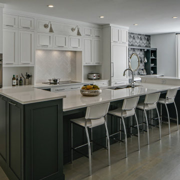
Sam’s client had lived in her downtown townhome home for less than a year when she decided to remodel the spacious second level. This open area consisted of three sections: a TV and fireplace zone, a sparsely furnished dining area, and a dominant central kitchen. The kitchen featured a long back wall with three segmented sections and a massive island housing the cooktop. She found the kitchen’s functionality lacking and its presence overwhelming – it dominated the entire floor, regardless of where you stood.
Design objectives:
- Reconfigure key kitchen elements (sink, cooktop, oven) while minimizing the kitchen’s visual impact
- Optimize the kitchen’s back wall, eliminating existing dead space
- Create a purposeful, well-defined dining area
- Establish a distinct, comfortable living area
- Reuse existing appliances and flooring
- Maintain an overall modern design aesthetic
THE REMODEL
Design challenges to be solved:
- Redesign the island to reduce its overwhelming presence
- Create a comfortable, dedicated living room within the available space
- Establish a distinct, inviting dining area within spatial constraints
- Enhance kitchen functionality and style without dominating the entire floor
THE RENEWED SPACE
Design solutions:
- Sam created raised end caps for the island. This separated the kitchen from adjacent living and dining areas while focusing the kitchen’s functionality. The new sink location offers ample workspace, allowing the cook to interact with guests seated at the island. The redesigned island also provides additional storage.
- For the living area, Sam opted for a functional-yet-minimalist approach. Large-format tile creates a natural stone look for the fireplace and TV wall. The recessed TV and extended fireplace shelf maintain a sleek profile. - Artistic wallpaper adds depth and texture, while the intentional lack of extensive shelving keeps the space open and distinct.
- Sam transformed the dining area’s blank wall into a feature, adding a unique dry bar with counter space, open shelves, cabinet storage and a beverage fridge. - - - Wallpaper behind and above the bar contributes to the area’s personality. A mirror adds depth while pendant lights add style and visual interest.
Relocating the cooktop to the back wall facilitates hidden ventilation, reducing visual clutter. Sam balanced transitional and modern elements for a contemporary yet comfortable feel. The digital control panel on the convection cooktop maintains a sleek look, while the wall oven is now at an easy-to-use height. ----- Mirrored base cabinet fronts and a paneled fridge prevent cabinetry monotony.
The redesign has delighted Sam’s client, achieving her main goal of creating a more inviting and visually appealing space. Each section now has its own visual personality and functionality while harmonizing within a monochromatic palette. The entire floor offers wow-factor pop upon first glance, with each area maintaining its distinct character while contributing to a cohesive, modern aesthetic.
206