
Search results for "Wellness approach" in Home Design Ideas
 Abda Custom Window Fashions
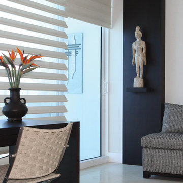
Hunter Douglas Pirouette provides an elegant look with sophisticated functionality.
The Hunter Douglas Pirouette gives the look of a roman shade with the functionality of a silhouette sheer shade. The Pirouette’s fabric vanes open to a sheer fabric to provide a view through area and allowing light into the room. The sheer fabric provides protection from the harsh UV rays. The shade also closes completely for privacy. The Pirouette has the look of roman shades with the functionality of blinds. The Pirouette also comes in specialty shades that can fit many types of windows such as, arches or angles.
The structure of the Pirouette is clean and elegant because the lifting system for the vanes have the patented Invisi-Lift system. This system allows the floating vanes to operate without having the unsightly cords or tapes. The vanes of the Hunter Douglas Pirouette can be flattened or contoured for complete privacy or opened for wide view-through.
Protect your wood flooring, furniture or artwork from the damaging ultraviolet rays. The Pirouette Roman Shades block up to 81% of the harmful UV rays with vanes open and 99% with the vanes closed. There is a large selection of fabrics to choose from and two vane sizes.
The Pirouette can also be operated manually or by remote control. Hunter Douglas has an app that can control the Pirouette on your iPhone or iPad.
At Abda, we make the draperies, curtains, valances, cornices, pillow shams, accent throw pillows, duvet covers, comforters, coverlets and bed skirts…even custom fabric headboards in a variety of styles, sizes and shapes. We also make draperies, roman shades, valances or cornices to coordinate. If you have an existing piece of furniture, we also do upholstery. The possibilities are endless when you go custom. If you’re not sure where to start, no worries because we have design specialists that can help you create the home you’ve always dreamed of!
We’re known for our attention to detail, great quality and outstanding service. We not only work with Indiana clients but also across the nation.
HOW DO WE HAVE QUALITY PRODUCTS WITHOUT BREAKING THE BUDGET?
At Abda, we believe in providing quality products, great customer service without breaking the pocket book for our customers! We’ve been in business since 1998 and have learned a few things over the years. Customers want excellent, reliable products without spending more than necessary. We decided to not have a large flashy retail store and focus on referrals rather than traditional advertising. In doing so, we’re able to provide the same great quality products as our competitors at a better price. And the amazing thing is, we do all of this while putting our focus on excellent customer service for our clients. Don’t take our word for it, check out what some of our customers are saying about us. www.abdawindowfashions.com
LIVE OUT OF STATE OR TOO BUSY?
Talk with our professional design specialists and let them help you transform your home! It’s simple and easy. This is a great solution for persons who live out of state or are too busy for a traditional home consultation. We have a “virtual interior designer” that will work with you each step of the way. With our great reviews, solid company and company values- you know that your home is in great hands!
For more information, contact Talitha at 317-273-8343 or email: talitha@abdawindowfashions.com or check out our houzz.com store!
LIVE IN CENTRAL INDIANA?
For our local customers we offer, FREE In-home consultation or showroom appointment to meet your lifestyle and design needs. At Abda, we have the perfect blend of high-end and affordable solutions for every style and budget. Affordable doesn’t mean cheap! We pride ourselves on quality products with excellent service. We’re so confident of our products that we give our customers more than the manufacturers guarantee!
At Abda, you will find knowledgeable staff that will turn your visions into a reality. Stop in our showroom or schedule a Free In-home consultation today! We know you will be happy with the results but don’t take our word for it, check out what some of our customers say about us on Houzz and Angie’s List!
http://www.angieslist.com/companylist/us/in/indianapolis/abda-inc-custom-window-fashions-reviews-60394.htm?cid=ssabadge
WHY CHOOSE US?
We have been in business since November 1998 and started in the window covering business by cleaning & repairing blinds. This gave us a unique perspective from most window covering dealers. We have always considered how well products hold up and which manufacturers stand behind their products the best. We let our clients know the benefits of more expensive products and give honest feedback. We take pride in showing alternative products to fit all budgets. We also give our customers an additional 2 year warranty on top of the manufacturers guarantee!
Our great testimonials on Angie’s List, Houzz.com and referrals have helped our company grow without the need for “conventional” advertising. Abda means ‘servant’. At Abda, we approach every customer with a servant’s attitude. This philosophy has helped our customers feel confident in their purchases and well-taken care of. Our number one focus is customer service and we believe in putting the customer’s needs first. We offer our clients an additional 2 year warranty on top of the manufacturer’s warranty and want each and every client to be completely happy with their purchase. We’ve been awarded the prestigious 2014 Angie’s List Super Service Award, an honor bestowed annually on approximately 5 percent of all the businesses rated on the nation’s leading provider of consumer reviews. We’ve grown over the years and have added more team members to our company and we’re very excited at the direction our company is going.
Contact us today to get started on your project.
Abda, Inc
1159 Country Club Road
Indianapolis, In 46234
317-273-8343 (Ext. 103)
Other Common Names For Pirouette:
Roman Shades
Roman Blinds
Blinds
Pirouette Blinds
Vertical Blinds
Venetian Blinds
Shades
Fabric Shades
Hunter Douglas Blinds
Hunter Douglas Shades
Hunter Douglas Pirouette
Energy Efficient Blinds
Sun Protection Shades
Sun Protection Blinds
Child Safety Blinds
Child Safety Window Treatments
Indianapolis Blinds
Indianapolis Shades
Indianapolis Fabric Roman Shades
Custom Blinds
www.abdawindowfashions.com
 Abda Custom Window Fashions
Hunter Douglas Pirouette provides an elegant look with sophisticated functionality.
This dining room has draperies layered with the pirouettes. This softens the space while adding visual interest. The pirouettes add UV protection for the hardwood flooring.
The Hunter Douglas Pirouette gives the look of a roman shade with the functionality of a silhouette sheer shade. The Pirouette’s fabric vanes open to a sheer fabric to provide a view through area and allowing light into the room. The sheer fabric provides protection from the harsh UV rays. The shade also closes completely for privacy. The Pirouette has the look of roman shades with the functionality of blinds. The Pirouette also comes in specialty shades that can fit many types of windows such as, arches or angles.
The structure of the Pirouette is clean and elegant because the lifting system for the vanes have the patented Invisi-Lift system. This system allows the floating vanes to operate without having the unsightly cords or tapes. The vanes of the Hunter Douglas Pirouette can be flattened or contoured for complete privacy or opened for wide view-through.
Protect your wood flooring, furniture or artwork from the damaging ultraviolet rays. The Pirouette Roman Shades block up to 81% of the harmful UV rays with vanes open and 99% with the vanes closed. There is a large selection of fabrics to choose from and two vane sizes.
The Pirouette can also be operated manually or by remote control. Hunter Douglas has an app that can control the Pirouette on your iPhone or iPad.
At Abda, we make the draperies, curtains, valances, cornices, pillow shams, accent throw pillows, duvet covers, comforters, coverlets and bed skirts…even custom fabric headboards in a variety of styles, sizes and shapes. We also make draperies, roman shades, valances or cornices to coordinate. If you have an existing piece of furniture, we also do upholstery. The possibilities are endless when you go custom. If you’re not sure where to start, no worries because we have design specialists that can help you create the home you’ve always dreamed of!
We’re known for our attention to detail, great quality and outstanding service. We not only work with Indiana clients but also across the nation.
HOW DO WE HAVE QUALITY PRODUCTS WITHOUT BREAKING THE BUDGET?
At Abda, we believe in providing quality products, great customer service without breaking the pocket book for our customers! We’ve been in business since 1998 and have learned a few things over the years. Customers want excellent, reliable products without spending more than necessary. We decided to not have a large flashy retail store and focus on referrals rather than traditional advertising. In doing so, we’re able to provide the same great quality products as our competitors at a better price. And the amazing thing is, we do all of this while putting our focus on excellent customer service for our clients. Don’t take our word for it, check out what some of our customers are saying about us. www.abdawindowfashions.com
LIVE OUT OF STATE OR TOO BUSY?
Talk with our professional design specialists and let them help you transform your home! It’s simple and easy. This is a great solution for persons who live out of state or are too busy for a traditional home consultation. We have a “virtual interior designer” that will work with you each step of the way. With our great reviews, solid company and company values- you know that your home is in great hands!
For more information, contact Talitha at 317-273-8343 or email: talitha@abdawindowfashions.com or check out our houzz.com store!
LIVE IN CENTRAL INDIANA?
For our local customers we offer, FREE In-home consultation or showroom appointment to meet your lifestyle and design needs. At Abda, we have the perfect blend of high-end and affordable solutions for every style and budget. Affordable doesn’t mean cheap! We pride ourselves on quality products with excellent service. We’re so confident of our products that we give our customers more than the manufacturers guarantee!
At Abda, you will find knowledgeable staff that will turn your visions into a reality. Stop in our showroom or schedule a Free In-home consultation today! We know you will be happy with the results but don’t take our word for it, check out what some of our customers say about us on Houzz and Angie’s List!
http://www.angieslist.com/companylist/us/in/indianapolis/abda-inc-custom-window-fashions-reviews-60394.htm?cid=ssabadge
WHY CHOOSE US?
We have been in business since November 1998 and started in the window covering business by cleaning & repairing blinds. This gave us a unique perspective from most window covering dealers. We have always considered how well products hold up and which manufacturers stand behind their products the best. We let our clients know the benefits of more expensive products and give honest feedback. We take pride in showing alternative products to fit all budgets. We also give our customers an additional 2 year warranty on top of the manufacturers guarantee!
Our great testimonials on Angie’s List, Houzz.com and referrals have helped our company grow without the need for “conventional” advertising. Abda means ‘servant’. At Abda, we approach every customer with a servant’s attitude. This philosophy has helped our customers feel confident in their purchases and well-taken care of. Our number one focus is customer service and we believe in putting the customer’s needs first. We offer our clients an additional 2 year warranty on top of the manufacturer’s warranty and want each and every client to be completely happy with their purchase. We’ve been awarded the prestigious 2014 Angie’s List Super Service Award, an honor bestowed annually on approximately 5 percent of all the businesses rated on the nation’s leading provider of consumer reviews. We’ve grown over the years and have added more team members to our company and we’re very excited at the direction our company is going.
Contact us today to get started on your project.
Abda, Inc
1159 Country Club Road
Indianapolis, In 46234
317-273-8343 (Ext. 103)
Other Common Names For Pirouette:
Roman Shades
Roman Blinds
Blinds
Pirouette Blinds
Vertical Blinds
Venetian Blinds
Shades
Fabric Shades
Hunter Douglas Blinds
Hunter Douglas Shades
Hunter Douglas Pirouette
Energy Efficient Blinds
Sun Protection Shades
Sun Protection Blinds
Child Safety Blinds
Child Safety Window Treatments
Indianapolis Blinds
Indianapolis Shades
Indianapolis Fabric Roman Shades
Custom Blinds
www.abdawindowfashions.com
 Almesedoors
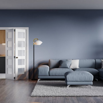
FINISH: PRIMED
The advantages of this approach – of this type of interior door finish – are fairly obvious. Pick a color, any color that suits your projects best. Mix and apply. Re- coat whenever you feel it is necessary to do so. Touch it up. It gives you, the proud owner of these interior doors, complete freedom of choice, and the significant savings, especially where it comes to bulk orders, can be a true source of joy.
As Kurt Vonnegut mentions in one of his novels (Bluebeard, unless I’m mistaken … check it out when you get a chance), the thrill of laying on colors is a large part of the artist’s professional satisfaction. In other words, a keen pleasure.
When back in the remote past visual arts became a field dominated by professionals rather than hobbyists, the main problem of “just laying on paint” became obvious: you can’t.
The medium of choice back then was egg tempera, a permanent, fast-drying substance consisting of colored pigments mixed with a water-soluble binder medium, usually glutinous material such as egg yolk. Portraits and ornaments were executed in this medium, and the wood panel was the surface of choice. One of tempera’s interesting features is that it is not as easily absorbed by wood as other mediums. Some sort of primer was necessary, of course, but pretty much any substance that dried evenly could be used.
The drawbacks of tempera, or pintura al temple, as the Spanish call it, only became obvious with the advent of the Renaissance, when the leading representatives of the trade turned to oil (and interior doors suddenly became a great deal less crude, but that’s a story for another day).
Oil painting is the process of “painting with pigments with a medium of drying oil as the binder.” Commonly used types include linseed (highly preferable in art, though not necessarily in interior doors, mind you), poppy seed, walnut, and safflower.
Today, five hundred years later, it is safe to say that oil is more versatile than pintura al temple – by orders of magnitude. Specifically, the contrasts achieved through the former are much greater, the darks are far deeper, and three- dimensional, highly realistic images are much easier to achieve. Next time you visit a museum, take a closer look at pintura al temple portraits. All of them, without exception, come off as a bit “flat” as opposed to their latter-day counterparts.
Also, where glazing is concerned …
Glazing: a painting technique in which a transparent layer, with just a touch of pigment, is laid over a previously painted surface, allowing light to travel through the glaze and be reflected back off of the opaque layer below. Gentle shadows, subtle changes of color, smooth transitions – all these can be achieved through glazing, which was used by all artists up until the middle of the Nineteenth Century, when artist tubes were invented, revolutionizing the field, and other techniques began to be explored.
Tempera enthusiasts (it takes all kinds to make a world) will assure you that glazing is not just possible in pintura al temple but is actually the basis of the whole enterprise. Well, what are you going to do? They’re enthusiasts.
Anyway, la peinture à l'huile, as the French call it, re-introduced the ancient problem of most surface’s propensity to absorb dipingere, as the Italians call the stuff. Wood or canvas, it is all the same: you’re not going to get very far without a good primer.
Experiments were conducted, and soon rabbit skin glue emerged as the least expensive and most effective solution. It was easy to apply. It dried evenly. It made the application of the l’huile stuff on top of it a walk in the park.
There were drawbacks. Today, rabbit skin glue is considered to be a major cause of cracking by most modern conservators. (Remember, when you visited the Metropolitan Museum of Art – and did you see those interior doors? … some of them are quite something … - most “old masters” pictures are completely covered with a cobweb of cracks? There you go). Because the glue is hygroscopic, it continually absorbs moisture from the atmosphere, causing the glue to swell and shrink as ambient humidity levels change. Over many humidity cycles, this repeated flexing causes the brittle oily layers to crack.
To combat this problem, modern primers are made of acrylic materials which are guaranteed not to cause any damage to the dipingere. No bubbling, no cracks. Your interior doors are safe.
Find the right local pro for your project

 Apartment 46 for the Home
The Buddha sits on a bed of stones and is honored by fallen blossoms, pieces of pottery, shells and any other beautiful thing that deserves a pride of place for a moment.
 TKS Design Group
Download our free ebook, Creating the Ideal Kitchen. DOWNLOAD NOW
As with most projects, it all started with the kitchen layout. The home owners came to us wanting to upgrade their kitchen and overall aesthetic in their suburban home, with a combination of fresh paint, updated finishes, and improved flow for more ease when doing everyday activities.
A monochromatic, earth-toned palette left the kitchen feeling uninspired. It lacked the brightness they wanted from their space. An eat-in table underutilized the available square footage. The butler’s pantry was out of the way and hard to access, and the dining room felt detached from the kitchen.
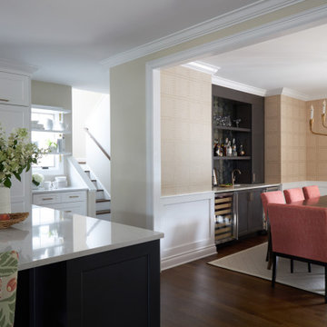
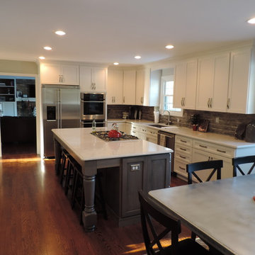
Lead Designer, Stephanie Cole, saw an improved layout for the spaces that were no longer working for this family. By eliminating an existing wall between the kitchen and dining room, and relocating the bar area to the dining room, we opened up the kitchen, providing all the space we needed to create a dreamy and functional layout. A new perimeter configuration promoted circulation while also making space for a large and functional island loaded with seating – a must for any family. Because an island that isn’t big enough for everyone (and a few more) is a recipe for disaster. The light white cabinetry is fresh and contrasts with the deeper tones in the wood flooring, creating a modern aesthetic that is elevated, yet approachable for everyday living.
With better flow as the overarching goal, we made some structural changes too. To remove a bottleneck in the entryway, we angled one of the dining room walls to create more natural separation between rooms and facilitate ease of movement throughout the large space.
At The Kitchen Studio, we believe a well-designed kitchen uses every square inch to the fullest. By starting from scratch, it was possible to rethink the entire kitchen layout and design the space according to how it is used, because the kitchen shouldn’t make it harder to feed the family. A new location for the existing range, flanked by a new column refrigerator and freezer on each side, worked to anchor the space. The very large and very spacious island (a dream island if we do say so ourselves) now houses the primary sink and provides ample space for food prep and family gathering.
The new kitchen table and coordinating banquette seating provide a cozy nook for quick breakfasts before school or work, and evening homework sessions. Elegant gold details catch the natural light, elevating the aesthetic.
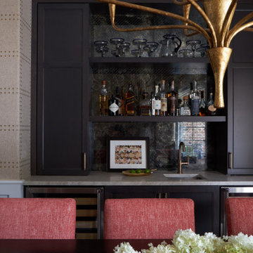
The dining room was transformed into one of this client’s favorite spaces and we couldn’t agree more. We saw an opportunity to give the dining room a more distinguished identity by closing off the entrance from the foyer. The relocated wet bar enhances the sophisticated vibe of this gathering space, complete with beautiful antique mirror tiles and open shelving encased by moody built-in cabinets.
Updated furnishings add warmth. A rich walnut table is paired with custom chairs in a muted coral fabric. The large, transitional chandelier grounds the room, pairing beautifully with the gold finishes prevalent in the faucet and cabinet hardware. Linen-inspired wallpaper and cream-toned window treatments add to the glamorous feel of this entertainment space.
There is no way around it. The laundry room was cramped. The large washer and dryer blocked access to the sink and left little room for the space to serve its other essential function – as a mudroom. Because we reworked the kitchen layout to create more space overall, we could rethink the mudroom too – an essential for any busy family. The first step was moving the washer and dryer to an existing area on the second floor, where most of the family’s laundry lives (no one wants to carry laundry up and down the stairs if they don’t have to anyway). This is a more functional solution and opened up the space for all the mudroom necessities – including the existing kitchen refrigerator, loads of built-in cubbies, and a bench.
It’s hard to not fall in love with every detail of a new space, especially when it serves your day-to-day life. But that doesn’t mean the clients didn’t have their favorite features they use on the daily. This remodel was focused largely on function with a new kitchen layout. And it’s the functional features that have the biggest impact. The large island provides much needed workspace in the kitchen and is a spot where everyone gathers together – it grounds the space and the family. And the custom counter stools are the icing on the cake. The nearby mudroom has everything their previous space was lacking – ample storage, space for everyone’s essentials, and the beloved cement floor tiles that are both durable and artistic.
 D2 Architects
"We often rush to divide everything as white and black and store them separately in a separate place. But seemingly opposing things that are inseparable - that is the world - are a mixture of different things." _Matisyahu_
The contrast between black and white is not only a choice but also a way to make it special. When stepping into an all-white or all-black living space, it is easy to feel purity or luxury, but it can also suggest a little skepticism about the monotony or oppressiveness it brings. So using black and white is therefore not difficult but definitely not easy.
In the apartment project at Vinhomes Symphony apartment that we implemented this time, white and black are no longer just two opposing colors, but they are combined and mixed, intertwined creatively to create a unity. As an expression of day and night, brilliance and mystery, white and black have adopted tricks and materials, arrays of blocks and light, blending together with the goal of creating living spaces with comfort, convenience and luxury.
"This is probably a very special and interesting project for me and my colleagues, right from the first approach, the investor is also a sister, a person with a young, dynamic way of thinking with a very special and very own taste. After each actual project, we keep a diary of the conceptualization, design and execution process. Join us to look back on the process of project formation as well as better understand the philosophy, ideas and functions that have been sent in the project" - Kts. Dang Duong - Founder of D2Architects.
The current status of the project is 2 apartments located at location A-20 and A-21 in S6A building of Vinhomes Symphony apartment. With an east-facing façade, the apartment is endowed with the advantage of natural light as well as excellent panoramic views. The highlight of this apartment is the view opening to the Phuc Loi lotus lagoon with a large area, more than 10 hectares and airy landscape by the Duong River.
These are not merely apartments, but they are also places to express creativity and make harmonious use of natural light and surrounding nature. Every view from these apartments not only opens up amazing scenery but also a lifestyle full of relaxation and tranquility amidst the noisy city.
With the special importance of location and unique views, making perfect use of space and light here is not only an advantage but also a great potential to create a sophisticated and classy living space. The sophistication in design and handling of space has been put on top by us, in order to make the most of these extremely special advantages.
In order for a living space to truly become a place called "Home" – a place where we want to return and feel peaceful while there, we have carefully researched the preferences and desires of the owner. Sharing with me about her hobby, Ms. Yen expressed that she loves a modern space with minimalist style and cool tones, creating a sense of tranquility and elegance. This is clearly reflected in the original idea for the apartment.
What's even more interesting is his teenage son's hobby of playing Lego. This is not only a personal preference but also a special source of inspiration for the design process. From these data, we built a preliminary idea for the comprehensive living space of the apartment.
The combination of the requirement of modern, minimalist space and cool tones along with creative elements from his son's personal hobby of playing Lego has created a unique living space, both reflecting the owner's own personality and meeting the needs of living and personal preferences. This is the foundation for creating a real home, where each member of the family feels content and peaceful every time they return.
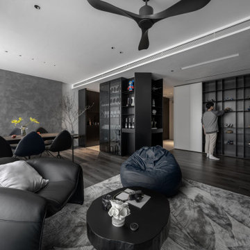
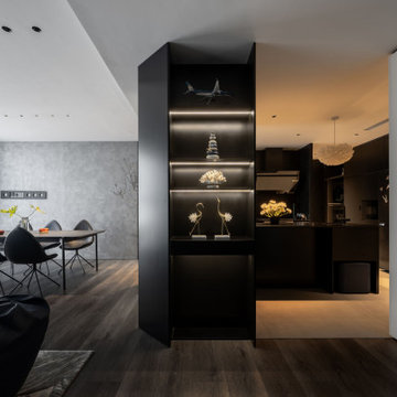
The project uses the main tone of industrial wood painted in dark gray, white and dark veneer. Versatile combination with other modern materials such as smoke glass and artificial stone,... Create a work of architectural art where everything intersects harmoniously with natural light like a great symphony.
The contrast between the bass of the cool tone and the warm, gentle touch of the light creates an impressive picture of a delicate blend of opposing elements. The soft, beautiful touch of this space is hidden in the strength and modernity of the materials used. This is not only a house, but also a mirror that clearly reflects the personality and philosophy of life of the owner.
The modern, youthful spirit is clearly shown from the moment you cross the threshold to enter the house. Flexibility, creativity and the harmonious intersection of materials and light have created a colorful and sophisticated living space, while celebrating the beauty of modernity and youthful vitality.
LIVING ROOM:
The living room is not merely a living area or common living space of the family, but according to feng shui concept, this is the place where the best energy of the house is concentrated. Therefore, creating a special living room space is extremely important.
Neutral gray-white tones are made in the background, creating the foundation for sophistication and elegance. Color accents are subtly applied, creating a unique touch for the house, increasing the creativity and style of the owner.
Maintaining the spirit of LEGO - unlimited creativity - through every corner, every architectural line has created an interesting space experience right in the living room. It stimulates the imagination of all ages, opening up space for each person to freely create, build and connect with each other through the common language of LEGO.
KITCHEN & DINNING ROOM:
The kitchen is an indispensable piece in every family, this place is likened to the heart of the whole house. All one needs to create great taste is love and creativity in the kitchen. Because the kitchen with family meals is the emotional bond between members. Therefore, designing a beautiful and functional kitchen requires a delicate combination of colors, shapes and meticulousness in choosing the right materials.
Today's kitchen is invested by many people in both form and quality, so a beautiful, luxurious, modern, comfortable kitchen that fully meets the needs of each family is the design criterion D2 Architects aims for.
The Lego House project is not just a project anymore but it is really the result of sending all our core values and creative spirit to create a living space that symbolizes the interconnectedness of design, art and soul.
D2Architects
A : Khuat Duy Tien -Thanh Xuan Bac - Ha Noi – Viet Nam
M: d2architects.vn@gmail.com
W: d2architects.vn
P: 0965551101 - 0965554792
 Simply Home Decorating
There are not many things better than a room full of your favourite people. As you gather you smell dinner cooking in the kitchen and music playing in the background, as joyful conversation and laughter fill the room. I feel so grateful that we are inching our way back to these days. How about you?
The project I’m sharing with you today has beautiful moments like these at its heart. Spaces that invite people in, foster connection, and make everyday living so simple that it’s impossible not to enjoy...
Meet our Delightful Clients:
The family behind this 1950s North Vancouver home transformation enjoy entertaining friends just as much as cosying up to watch a movie together. A professional couple (I'll call them Jon and Anna) with two elementary school-aged sons, Anna and Jon approached us with the task of furnishing the main floor living spaces and the basement of their family home.
Anna is a busy lawyer who is now working almost full time from home, and Jon works in the film industry. With full careers, two active boys, and a love of gathering, they craved a home that could support their everyday lifestyle.
Design and Lifestyle Goals:
Our central goal for this project was simple: to uncover the hidden potential in their home and create a family-friendly space that functioned well and flowed seamlessly.
On the main floor, our clients tasked us with creating an area for the family to relax and entertain, along with crafting a work and play space for the boys. They also dreamed of a more functional and bright basement, which they envisioned as a dual purpose family room and home office for Anna.
Reveal: Comfortable and Welcoming Entryway & Living Room:
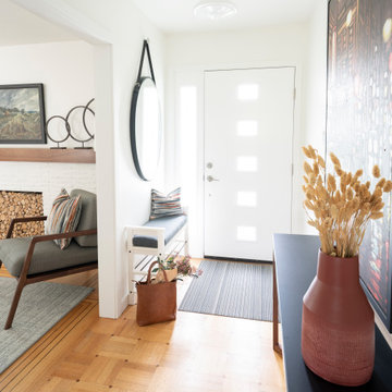
Imagine you are coming home, and you walk through a bright, sunny front door like this one. You are met by this entryway of calming earth and sea tones, paired with warm, natural wood flooring. You feel instantly welcomed and eager to venture further inside... The same is now true for our clients!
The simple details in their entryway are thoughtfully arranged with clean lines and colourful art as the focal point, achieving a timeless and friendly aesthetic. Dried wheat brings movement into the space and plays up the beauty of nature, while the vibrant yet warm colours and textures evoke feelings of comfort and homecoming.
The entry flows seamlessly into this connected living area, which is adorned with ample seating strategically arranged to host and accommodate joyful conversations. With the fireplace and wood mantel as the focal point, these natural elements and hues warm up the room to make it feel beautifully lived-in (not like an untouchable museum).
Another colourful work of art graces the space above Jon’s and Anna’s sofa, and we used decorative pillows and a throw blanket to tempt those colours into the rest of the room. A simply styled coffee table keeps the space feeling open and engaged. Reading material, anyone?
Just beyond this living area, you get a glimpse of the second space our clients requested on their main floor...
A Collected Space for Children to Work + Play:
When Jon and Anna realised that their formal dining area wasn’t being used to its full potential, they imagined creating a work and play space for their boys instead. We came up with a plan to create a shared desk area with plentiful storage.
This timeless natural wood desk was the perfect way to maximise surface area and give the boys plenty of space to do homework during the school year, or spend time crafting or building LEGOs during the summers. The drawers provide storage for all the wonderful items that fuel their productivity or creativity. Or both.
I also love how the white floating shelves display a collection of nostalgic toys, providing just the right amount of childhood endearment to this sophisticated and functional space. This workspace now has endless possibilities for the boys, and it helps Jon and Anna keep their minds and spaces clear, too. Which brings us to...
Basement Family Room & Home Office:
In general, we knew we had to maximise surface area in this ‘50s home, and this was especially true for our clients’ basement. I’m happy to say that we designed an effortlessly comfortable space that focuses on family and makes it simple to settle in and work… or leave the workday behind.
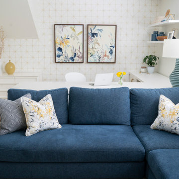
Welcome to this dual-function office and family room. Toward the back of the room, we strategically positioned Anna’s wraparound desk facing out into the room and gave her a wallpaper-and-art backdrop for stunning Zoom calls (she has already received glowing compliments). There is plenty of storage for easy organization including a space to store the family’s shared printer near the door… so they don’t have to interrupt “Mom” to get to it.
Anna also wanted the freedom to be able to relax in this space with her family and turn her back on the work day — quite literally! The sofa is perfectly positioned backing onto the desk allowing her to do just that.
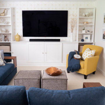
We relocated an existing mustard yellow chair and used pops of the same colour to integrate it into the overall scheme. The wood armrests on this modular sectional provide surfaces for snacks and drinks where there was no room for an end table. The walnut finish carries the theme of natural comfort from the upstairs spaces down into the family room.
The view from the sectional is less business and more pleasure, featuring cosy seating and throw pillows in cheerful colours and patterns.
The highlight of this space? A wallpapered accent wall where we were able to achieve the high-end feel of custom built-in shelving with a simple IKEA hack. The shelves and cabinetry around the television offer plenty of much needed storage space to house family games and movies at a budget price point.
This fun room is the perfect balance of work and play, accommodating and supporting our clients’ daily family adventures.
What Our Clients Had to Say...
Our clients could not be happier with their warm yet functional new rooms. With thoughtful consideration and a plan of action, we were able to transform two areas of their home into spaces that function well and feel good. In fact, they had this to say:
“Lori and her team were everything we were looking for: great listeners, wonderfully creative and highly professional. We couldn't be happier with our interior makeover.” — Clients
That is why we do what we do. If you're ready to start your redesign project, we would love to help. Reach out to us here, and let's get to know more about each other.

Sponsored
Sunbury, OH

J.Holderby - Renovations
Franklin County's Leading General Contractors - 2X Best of Houzz!
 D2 Architects
"We often rush to divide everything as white and black and store them separately in a separate place. But seemingly opposing things that are inseparable - that is the world - are a mixture of different things." _Matisyahu_
The contrast between black and white is not only a choice but also a way to make it special. When stepping into an all-white or all-black living space, it is easy to feel purity or luxury, but it can also suggest a little skepticism about the monotony or oppressiveness it brings. So using black and white is therefore not difficult but definitely not easy.
In the apartment project at Vinhomes Symphony apartment that we implemented this time, white and black are no longer just two opposing colors, but they are combined and mixed, intertwined creatively to create a unity. As an expression of day and night, brilliance and mystery, white and black have adopted tricks and materials, arrays of blocks and light, blending together with the goal of creating living spaces with comfort, convenience and luxury.
"This is probably a very special and interesting project for me and my colleagues, right from the first approach, the investor is also a sister, a person with a young, dynamic way of thinking with a very special and very own taste. After each actual project, we keep a diary of the conceptualization, design and execution process. Join us to look back on the process of project formation as well as better understand the philosophy, ideas and functions that have been sent in the project" - Kts. Dang Duong - Founder of D2Architects.
The current status of the project is 2 apartments located at location A-20 and A-21 in S6A building of Vinhomes Symphony apartment. With an east-facing façade, the apartment is endowed with the advantage of natural light as well as excellent panoramic views. The highlight of this apartment is the view opening to the Phuc Loi lotus lagoon with a large area, more than 10 hectares and airy landscape by the Duong River.
These are not merely apartments, but they are also places to express creativity and make harmonious use of natural light and surrounding nature. Every view from these apartments not only opens up amazing scenery but also a lifestyle full of relaxation and tranquility amidst the noisy city.
With the special importance of location and unique views, making perfect use of space and light here is not only an advantage but also a great potential to create a sophisticated and classy living space. The sophistication in design and handling of space has been put on top by us, in order to make the most of these extremely special advantages.
In order for a living space to truly become a place called "Home" – a place where we want to return and feel peaceful while there, we have carefully researched the preferences and desires of the owner. Sharing with me about her hobby, Ms. Yen expressed that she loves a modern space with minimalist style and cool tones, creating a sense of tranquility and elegance. This is clearly reflected in the original idea for the apartment.
What's even more interesting is his teenage son's hobby of playing Lego. This is not only a personal preference but also a special source of inspiration for the design process. From these data, we built a preliminary idea for the comprehensive living space of the apartment.
The combination of the requirement of modern, minimalist space and cool tones along with creative elements from his son's personal hobby of playing Lego has created a unique living space, both reflecting the owner's own personality and meeting the needs of living and personal preferences. This is the foundation for creating a real home, where each member of the family feels content and peaceful every time they return.
The project uses the main tone of industrial wood painted in dark gray, white and dark veneer. Versatile combination with other modern materials such as smoke glass and artificial stone,... Create a work of architectural art where everything intersects harmoniously with natural light like a great symphony.
The contrast between the bass of the cool tone and the warm, gentle touch of the light creates an impressive picture of a delicate blend of opposing elements. The soft, beautiful touch of this space is hidden in the strength and modernity of the materials used. This is not only a house, but also a mirror that clearly reflects the personality and philosophy of life of the owner.
The modern, youthful spirit is clearly shown from the moment you cross the threshold to enter the house. Flexibility, creativity and the harmonious intersection of materials and light have created a colorful and sophisticated living space, while celebrating the beauty of modernity and youthful vitality.
LIVING ROOM:
The living room is not merely a living area or common living space of the family, but according to feng shui concept, this is the place where the best energy of the house is concentrated. Therefore, creating a special living room space is extremely important.
Neutral gray-white tones are made in the background, creating the foundation for sophistication and elegance. Color accents are subtly applied, creating a unique touch for the house, increasing the creativity and style of the owner.
Maintaining the spirit of LEGO - unlimited creativity - through every corner, every architectural line has created an interesting space experience right in the living room. It stimulates the imagination of all ages, opening up space for each person to freely create, build and connect with each other through the common language of LEGO.
KITCHEN & DINNING ROOM:
The kitchen is an indispensable piece in every family, this place is likened to the heart of the whole house. All one needs to create great taste is love and creativity in the kitchen. Because the kitchen with family meals is the emotional bond between members. Therefore, designing a beautiful and functional kitchen requires a delicate combination of colors, shapes and meticulousness in choosing the right materials.
Today's kitchen is invested by many people in both form and quality, so a beautiful, luxurious, modern, comfortable kitchen that fully meets the needs of each family is the design criterion D2 Architects aims for.
The Lego House project is not just a project anymore but it is really the result of sending all our core values and creative spirit to create a living space that symbolizes the interconnectedness of design, art and soul.
D2Architects
A : Khuat Duy Tien -Thanh Xuan Bac - Ha Noi – Viet Nam
M: d2architects.vn@gmail.com
W: d2architects.vn
P: 0965551101 - 0965554792

 Gallery KBNY
The owner of this historic and landmarked town-home renovation in Hudson Square, originally built in 1826, hired Gallery Kitchen and Bath to fully gut-renovate this 3-unit row-home. The scope of work included a full-scale renovation of the owners unit, including the renovation of the kitchen, one 4-piece master ensuite bathroom, one 3-piece bathroom with a walk-in steam shower, and a beautiful powder room. Additional work in the owners unit also included flooring, electrical upgrade, major plumbing work, new HVAC system, restoration of a fireplace, installation of a fully integrated smart home system and landmarked approved windows.
CELLAR RENOVATION IN NYC LANDMARKED TOWN-HOME
Rounding out the owners unit we renovated the cellar, which was converted into an entertainment space and featured a custom glass curtain wall, along with a custom staircase with an exposed brick wall. During the demolition phase of the cellar, our team discovered 56 wine jugs filled with wine from the prohibition era, leading us to name this project the prohibition house. For the two tenant units, Gallery Kitchen and Bath undertook the renovation of 2 kitchens, 4 bathrooms, new hardwood flooring throughout, along with detailed carpentry work in the entire home.
WHY GALLERY KITCHEN AND BATH
After interviewing multiple contractors, our client decided on Gallery Kitchen and Bath primarily because of our turnkey design, selection, and build process. In a renovation of this magnitude it is crucial to have a centralized full service contractor under one roof to handle all of the aspects and simultaneous moving parts of the project. Decentralizing the entire process by having multiple unaffiliated vendors handle various parts of the process can easily become chaotic, time consuming, and costly.
Because Gallery Kitchen and Bath undertook the entire process, from the design of the entire space to the selection and procurement of all finishes and fixtures, down to the procurement of all permits and LPC filings, it made a seemingly chaotic project a’lot more manageable.
PHASE 1: DESIGN, SELECTION, PROCUREMENT
Our client wanted the renovation to incorporate a fully modern design into his Hudson Square town-house. Being that this is a landmarked property, the exterior facade had to be restored and kept with the original aesthetic, the interior of the home however was a whole different story.
In keeping up with the modern aesthetic, our designers went to work to design a custom kitchen that included fully custom flat panel base cabinets in a white high gloss finish and an absolute matte black appliance/pantry wall. The kitchen design also included a white quartz countertop and backsplash with a waterfall edge island. To bring warmth to the modern kitchen, our designers incorporated a rifted and quartered select oak wood floor in a herringbone pattern, and custom blended stain with matte polyurethane finish. For continuity, the wood floor was also extended throughout the entire owners unit.
In the ensuite bathroom we created a “wet area” which houses a standalone soaking tub as well as a beautiful rainfall shower, completely leveled with the rest of the floor in the bathroom. Some highlights within this space include a tiled square drain, large niche cutouts with a carrera marble accents. Once again, to bring warmth to this modern bathroom, our designers incorporated a floating rustic oak vanity and carrera marble mosaic floor tile.
Last on the list on the owners unit floor was the cellar, which our client wanted to utilize as an entertainment space for his friends and family. During the design phase, we incorporated an open concept layout, wedding the indoor and outdoor space with a custom glass curtain wall. The design also included custom walnut built-ins that serve as a custom wet bar and storage piece.
With the design approved and selections made our office liaisons moved to procure all of the material selections and finishes.
PHASE 2: DEMO
Because this home is almost two centuries old, we had to take extra precaution during the interior demolition phase of the project. One specific area that we had to pay special attention to was the existing brick. Over time the mortar in old brick homes deteriorates and turns into dust – for this reason it was extremely important that a thorough and ongoing inspection of the exteriors and interior walls took place during the demolition of the space.
After 14 30-yard debris containers and 56 wine filled jugs from the prohibition era later , the demolition of this historic Hudson Square town-home came to an end. If you are wondering whether we tried the wine? After notifying the owner we agreed to open one of the jugs and try them together – nothing but vinegar.
PHASE 3: BUILD
One of the challenges in a renovation project of this scope is nailing down the logistics and delivery of fixtures and finish material. Adding to this challenge was a narrow entry door that required us to use a boom truck in order to deliver some of the larger materials on site. To ensure a succinct time schedule, we boomed all of the materials through the 3rd floor for the entire project and worked our renovation work from top floor to cellar. This technique also insured that any unexpected water issues during the renovation process would not damage a finished floor.
With all roughing and framing complete, the Gallery KBNY team proceeded to execute on the design plan.
THE REVEAL
From what was once a dilapidated town-home with nothing but potential, to a glamorous and luxurious modern interior space – the prohibition house was complete. Ready to speak with us about your renovation project? Contact us to schedule your free consultation and let Gallery KBNY show you why our all-inclusive approach to your renovation is the smartest way to renovating in NYC.
 TKS Design Group
Download our free ebook, Creating the Ideal Kitchen. DOWNLOAD NOW
As with most projects, it all started with the kitchen layout. The home owners came to us wanting to upgrade their kitchen and overall aesthetic in their suburban home, with a combination of fresh paint, updated finishes, and improved flow for more ease when doing everyday activities.
A monochromatic, earth-toned palette left the kitchen feeling uninspired. It lacked the brightness they wanted from their space. An eat-in table underutilized the available square footage. The butler’s pantry was out of the way and hard to access, and the dining room felt detached from the kitchen.
Lead Designer, Stephanie Cole, saw an improved layout for the spaces that were no longer working for this family. By eliminating an existing wall between the kitchen and dining room, and relocating the bar area to the dining room, we opened up the kitchen, providing all the space we needed to create a dreamy and functional layout. A new perimeter configuration promoted circulation while also making space for a large and functional island loaded with seating – a must for any family. Because an island that isn’t big enough for everyone (and a few more) is a recipe for disaster. The light white cabinetry is fresh and contrasts with the deeper tones in the wood flooring, creating a modern aesthetic that is elevated, yet approachable for everyday living.
With better flow as the overarching goal, we made some structural changes too. To remove a bottleneck in the entryway, we angled one of the dining room walls to create more natural separation between rooms and facilitate ease of movement throughout the large space.
At The Kitchen Studio, we believe a well-designed kitchen uses every square inch to the fullest. By starting from scratch, it was possible to rethink the entire kitchen layout and design the space according to how it is used, because the kitchen shouldn’t make it harder to feed the family. A new location for the existing range, flanked by a new column refrigerator and freezer on each side, worked to anchor the space. The very large and very spacious island (a dream island if we do say so ourselves) now houses the primary sink and provides ample space for food prep and family gathering.
The new kitchen table and coordinating banquette seating provide a cozy nook for quick breakfasts before school or work, and evening homework sessions. Elegant gold details catch the natural light, elevating the aesthetic.
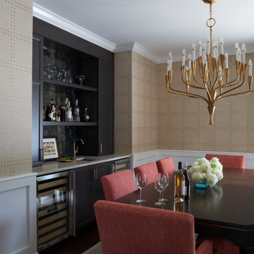
The dining room was transformed into one of this client’s favorite spaces and we couldn’t agree more. We saw an opportunity to give the dining room a more distinguished identity by closing off the entrance from the foyer. The relocated wet bar enhances the sophisticated vibe of this gathering space, complete with beautiful antique mirror tiles and open shelving encased by moody built-in cabinets.
Updated furnishings add warmth. A rich walnut table is paired with custom chairs in a muted coral fabric. The large, transitional chandelier grounds the room, pairing beautifully with the gold finishes prevalent in the faucet and cabinet hardware. Linen-inspired wallpaper and cream-toned window treatments add to the glamorous feel of this entertainment space.
There is no way around it. The laundry room was cramped. The large washer and dryer blocked access to the sink and left little room for the space to serve its other essential function – as a mudroom. Because we reworked the kitchen layout to create more space overall, we could rethink the mudroom too – an essential for any busy family. The first step was moving the washer and dryer to an existing area on the second floor, where most of the family’s laundry lives (no one wants to carry laundry up and down the stairs if they don’t have to anyway). This is a more functional solution and opened up the space for all the mudroom necessities – including the existing kitchen refrigerator, loads of built-in cubbies, and a bench.
It’s hard to not fall in love with every detail of a new space, especially when it serves your day-to-day life. But that doesn’t mean the clients didn’t have their favorite features they use on the daily. This remodel was focused largely on function with a new kitchen layout. And it’s the functional features that have the biggest impact. The large island provides much needed workspace in the kitchen and is a spot where everyone gathers together – it grounds the space and the family. And the custom counter stools are the icing on the cake. The nearby mudroom has everything their previous space was lacking – ample storage, space for everyone’s essentials, and the beloved cement floor tiles that are both durable and artistic.

 Advance Design Studio, Ltd.
Mike and Michelle of Lake Barrington knew they needed extra space. Their home was becoming too crowded for their family with blossoming teenagers, so a basement renovation offered the perfect solution for more space for the kids and more room to entertain for the adults.
“Our project consisted of expanding our laundry room, putting in a first floor wet bar so we had adult space upstairs, while also renovating our basement for a family-friendly and teen-functional area as well,” Michelle says.
They found Advance Design Studio through a neighbor who gave a glowing recommendation, giving Michelle and Mike the confidence they needed to move forward with a major home renovation. They felt like they knew Advance Design before they even worked together. When they met with the owner Todd Jurs and designer Nicole Ryan, Mike and Michelle knew they were getting a trustworthy, dependable team that could create the project they had been dreaming about for 7 years.
Having virtually no natural light to work with, one of the biggest design challenges was creating a basement that did not feel dark and depressing. The Advance team got to work creating architectural archways and custom detailed dry-stack stone columns artfully designed into the space, adding a dramatic element that made the space feel less like a basement or more like a relaxing family room. Color 3D renderings were created to portray what the space would look like so Mike and Michelle could visualize the space in advance.
Detailed trim and crown moldings grace the built in buffet and wet bar making for an amazingly functional space that lacks nothing in style and visual interest. Cherry wood cabinetry by Dura Supreme is featured in the space with a “Cocoa Brown” finish and includes beautiful mirrored glass doors embellished with unique elliptical mullion details. A built-in microwave, dishwasher and mini fridge add practicality to the ample entertainment mecca. An under mounted sink finishes the space joined with a intricate mosaic tile backsplash and “Ventisca Polished” quartz countertops.
The basement is absolutely perfect for hosting friends and family with expertly designed key areas such as a game space for the kids, a movie area for the family, an ample workout room with luxurious full bath, and even built in wine storage. The family absolutely loves the new basement living space, and has already enjoyed numerous family movie nights and sleep-overs with friends.
While custom cabinets made by Dura Supreme were used to create unique spaces that lived up to Mike and Michelle’s expectations., heated flooring under the 16”x16” “Mongolian Spring” tile was installed giving all tiled areas of the basement a much cozier feel, eliminating that cold hard surface most of us hate in our basements!
The new basement must-have requirement list included a new bath space, which was incorporated adjacent to the work out room. The sleek shower door and cabinets in the new bathroom make guests and family feel like they are in an elegant hotel. The new guest bath features 4”x36” “Silver Screen” honed marble tile in a brick pattern on the shower walls and 2”x2” “Chenille” limestone tile in a hexagon mosaic pattern on the shower floor.
“I came in with very specific requirements for our three project areas,” Michelle says. “There was not one time that I felt like I was asking for something that was not going to turn out how I anticipated.”
Tying in multiple rooms during a renovation if you have can do it makes a lot of sense and saves money in the long run. A fully functional laundry room as well was a must on this family’s wish list. Michelle wanted to add space to the existing cramped and awkward laundry room, and Mike wanted to make sure they could still park a car in the garage. Reconfiguring interior walls required borrowing unused space cleverly from the garage in order to enlarge the laundry room space.
Drawers under the stairs added beautiful hidden storage created almost magically out of dead space. White painted Dura Supreme cabinets bring additional light into the small space; while the 16”x16” cleft slate tile flooring provides excellent contrast and the naturally earthy feel Michelle wanted. Quartz countertops with a 3”x12” “Debut Dew” subway tile backsplash add elegance to the now upliftingly bright laundry room.
The extra space makes doing laundry much more pleasurable and the added storage is a great for all those little things like winter hats and gloves, umbrellas and the like. “The Advance Design project team was phenomenal to work with,” Michelle says. “They came in, shared the plans with us and walked us through the expectations. We always knew what was coming next.”
Converting an existing closet space, the wet bar upstairs was challenging because they wanted a functional area that didn’t look or feel like cabinets just sticking out of a closet. So the Advance team transformed this ordinary closet space into a stunning wet bar that architecturally appears as if it’s always been there. Traditional, elegant hand carved custom molding matching the adjacent fireplace ties the new entertainment bar area in nicely with the existing family room and kitchen area.
Featuring a built in wine refrigerator, Dura Supreme cabinetry in deep cherry wood elegantly displays wine bottles and etched glass mullion doors that fill with soft light in the evening hours. Cambria “Windermere” quartz countertops with a sophisticated hammered copper sink and a glimmering backsplash round out the stunning wet bar. Hosting parties and family functions has become much more enjoyable now that they have a dedicated beverage serving area large enough to include hors devours.
All three projects were designed and constructed together at the same time, making for a cohesive project that was administered smoothly and easily both for the design team and for the family. Disruption to the home was minimal as each phase was completed in each project conclusively, and design and meeting time for the homeowner was efficient and organized making for an enjoyable process.
“Advance Design was great to work with,” Michelle says. “I would highly recommend them to anyone considering a home improvement project. They took the time at the beginning to understand our needs, our budget, and our vision for our home. The field team was great, attentive, on time, cleaned up each day and made the overall experience very positive. We couldn't be happier with the finished product.”
With the help of our talented, award winning design team you can create the basement, laundry room, or any other home renovation that you have been dreaming of. With our “Common Sense Remodeling” approach, the process of renovating you home has never been easier. Contact us today at 847-836-2600 or schedule an appointment to talk with us about that kitchen remodeling project.
Joe Nowak
 Simply Home Decorating
There are not many things better than a room full of your favourite people. As you gather you smell dinner cooking in the kitchen and music playing in the background, as joyful conversation and laughter fill the room. I feel so grateful that we are inching our way back to these days. How about you?
The project I’m sharing with you today has beautiful moments like these at its heart. Spaces that invite people in, foster connection, and make everyday living so simple that it’s impossible not to enjoy...
Meet our Delightful Clients:
The family behind this 1950s North Vancouver home transformation enjoy entertaining friends just as much as cosying up to watch a movie together. A professional couple (I'll call them Jon and Anna) with two elementary school-aged sons, Anna and Jon approached us with the task of furnishing the main floor living spaces and the basement of their family home.
Anna is a busy lawyer who is now working almost full time from home, and Jon works in the film industry. With full careers, two active boys, and a love of gathering, they craved a home that could support their everyday lifestyle.
Design and Lifestyle Goals:
Our central goal for this project was simple: to uncover the hidden potential in their home and create a family-friendly space that functioned well and flowed seamlessly.
On the main floor, our clients tasked us with creating an area for the family to relax and entertain, along with crafting a work and play space for the boys. They also dreamed of a more functional and bright basement, which they envisioned as a dual purpose family room and home office for Anna.
Reveal: Comfortable and Welcoming Entryway & Living Room:
Imagine you are coming home, and you walk through a bright, sunny front door like this one. You are met by this entryway of calming earth and sea tones, paired with warm, natural wood flooring. You feel instantly welcomed and eager to venture further inside... The same is now true for our clients!
The simple details in their entryway are thoughtfully arranged with clean lines and colourful art as the focal point, achieving a timeless and friendly aesthetic. Dried wheat brings movement into the space and plays up the beauty of nature, while the vibrant yet warm colours and textures evoke feelings of comfort and homecoming.
The entry flows seamlessly into this connected living area, which is adorned with ample seating strategically arranged to host and accommodate joyful conversations. With the fireplace and wood mantel as the focal point, these natural elements and hues warm up the room to make it feel beautifully lived-in (not like an untouchable museum).
Another colourful work of art graces the space above Jon’s and Anna’s sofa, and we used decorative pillows and a throw blanket to tempt those colours into the rest of the room. A simply styled coffee table keeps the space feeling open and engaged. Reading material, anyone?
Just beyond this living area, you get a glimpse of the second space our clients requested on their main floor...
A Collected Space for Children to Work + Play:
When Jon and Anna realised that their formal dining area wasn’t being used to its full potential, they imagined creating a work and play space for their boys instead. We came up with a plan to create a shared desk area with plentiful storage.
This timeless natural wood desk was the perfect way to maximise surface area and give the boys plenty of space to do homework during the school year, or spend time crafting or building LEGOs during the summers. The drawers provide storage for all the wonderful items that fuel their productivity or creativity. Or both.
I also love how the white floating shelves display a collection of nostalgic toys, providing just the right amount of childhood endearment to this sophisticated and functional space. This workspace now has endless possibilities for the boys, and it helps Jon and Anna keep their minds and spaces clear, too. Which brings us to...
Basement Family Room & Home Office:
In general, we knew we had to maximise surface area in this ‘50s home, and this was especially true for our clients’ basement. I’m happy to say that we designed an effortlessly comfortable space that focuses on family and makes it simple to settle in and work… or leave the workday behind.
Welcome to this dual-function office and family room. Toward the back of the room, we strategically positioned Anna’s wraparound desk facing out into the room and gave her a wallpaper-and-art backdrop for stunning Zoom calls (she has already received glowing compliments). There is plenty of storage for easy organization including a space to store the family’s shared printer near the door… so they don’t have to interrupt “Mom” to get to it.
Anna also wanted the freedom to be able to relax in this space with her family and turn her back on the work day — quite literally! The sofa is perfectly positioned backing onto the desk allowing her to do just that.
We relocated an existing mustard yellow chair and used pops of the same colour to integrate it into the overall scheme. The wood armrests on this modular sectional provide surfaces for snacks and drinks where there was no room for an end table. The walnut finish carries the theme of natural comfort from the upstairs spaces down into the family room.
The view from the sectional is less business and more pleasure, featuring cosy seating and throw pillows in cheerful colours and patterns.
The highlight of this space? A wallpapered accent wall where we were able to achieve the high-end feel of custom built-in shelving with a simple IKEA hack. The shelves and cabinetry around the television offer plenty of much needed storage space to house family games and movies at a budget price point.
This fun room is the perfect balance of work and play, accommodating and supporting our clients’ daily family adventures.
What Our Clients Had to Say...
Our clients could not be happier with their warm yet functional new rooms. With thoughtful consideration and a plan of action, we were able to transform two areas of their home into spaces that function well and feel good. In fact, they had this to say:
“Lori and her team were everything we were looking for: great listeners, wonderfully creative and highly professional. We couldn't be happier with our interior makeover.” — Clients
That is why we do what we do. If you're ready to start your redesign project, we would love to help. Reach out to us here, and let's get to know more about each other.
 TKS Design Group
Download our free ebook, Creating the Ideal Kitchen. DOWNLOAD NOW
As with most projects, it all started with the kitchen layout. The home owners came to us wanting to upgrade their kitchen and overall aesthetic in their suburban home, with a combination of fresh paint, updated finishes, and improved flow for more ease when doing everyday activities.
A monochromatic, earth-toned palette left the kitchen feeling uninspired. It lacked the brightness they wanted from their space. An eat-in table underutilized the available square footage. The butler’s pantry was out of the way and hard to access, and the dining room felt detached from the kitchen.
Lead Designer, Stephanie Cole, saw an improved layout for the spaces that were no longer working for this family. By eliminating an existing wall between the kitchen and dining room, and relocating the bar area to the dining room, we opened up the kitchen, providing all the space we needed to create a dreamy and functional layout. A new perimeter configuration promoted circulation while also making space for a large and functional island loaded with seating – a must for any family. Because an island that isn’t big enough for everyone (and a few more) is a recipe for disaster. The light white cabinetry is fresh and contrasts with the deeper tones in the wood flooring, creating a modern aesthetic that is elevated, yet approachable for everyday living.
With better flow as the overarching goal, we made some structural changes too. To remove a bottleneck in the entryway, we angled one of the dining room walls to create more natural separation between rooms and facilitate ease of movement throughout the large space.
At The Kitchen Studio, we believe a well-designed kitchen uses every square inch to the fullest. By starting from scratch, it was possible to rethink the entire kitchen layout and design the space according to how it is used, because the kitchen shouldn’t make it harder to feed the family. A new location for the existing range, flanked by a new column refrigerator and freezer on each side, worked to anchor the space. The very large and very spacious island (a dream island if we do say so ourselves) now houses the primary sink and provides ample space for food prep and family gathering.
The new kitchen table and coordinating banquette seating provide a cozy nook for quick breakfasts before school or work, and evening homework sessions. Elegant gold details catch the natural light, elevating the aesthetic.
The dining room was transformed into one of this client’s favorite spaces and we couldn’t agree more. We saw an opportunity to give the dining room a more distinguished identity by closing off the entrance from the foyer. The relocated wet bar enhances the sophisticated vibe of this gathering space, complete with beautiful antique mirror tiles and open shelving encased by moody built-in cabinets.
Updated furnishings add warmth. A rich walnut table is paired with custom chairs in a muted coral fabric. The large, transitional chandelier grounds the room, pairing beautifully with the gold finishes prevalent in the faucet and cabinet hardware. Linen-inspired wallpaper and cream-toned window treatments add to the glamorous feel of this entertainment space.
There is no way around it. The laundry room was cramped. The large washer and dryer blocked access to the sink and left little room for the space to serve its other essential function – as a mudroom. Because we reworked the kitchen layout to create more space overall, we could rethink the mudroom too – an essential for any busy family. The first step was moving the washer and dryer to an existing area on the second floor, where most of the family’s laundry lives (no one wants to carry laundry up and down the stairs if they don’t have to anyway). This is a more functional solution and opened up the space for all the mudroom necessities – including the existing kitchen refrigerator, loads of built-in cubbies, and a bench.
It’s hard to not fall in love with every detail of a new space, especially when it serves your day-to-day life. But that doesn’t mean the clients didn’t have their favorite features they use on the daily. This remodel was focused largely on function with a new kitchen layout. And it’s the functional features that have the biggest impact. The large island provides much needed workspace in the kitchen and is a spot where everyone gathers together – it grounds the space and the family. And the custom counter stools are the icing on the cake. The nearby mudroom has everything their previous space was lacking – ample storage, space for everyone’s essentials, and the beloved cement floor tiles that are both durable and artistic.

 Simply Home Decorating
There are not many things better than a room full of your favourite people. As you gather you smell dinner cooking in the kitchen and music playing in the background, as joyful conversation and laughter fill the room. I feel so grateful that we are inching our way back to these days. How about you?
The project I’m sharing with you today has beautiful moments like these at its heart. Spaces that invite people in, foster connection, and make everyday living so simple that it’s impossible not to enjoy...
Meet our Delightful Clients:
The family behind this 1950s North Vancouver home transformation enjoy entertaining friends just as much as cosying up to watch a movie together. A professional couple (I'll call them Jon and Anna) with two elementary school-aged sons, Anna and Jon approached us with the task of furnishing the main floor living spaces and the basement of their family home.
Anna is a busy lawyer who is now working almost full time from home, and Jon works in the film industry. With full careers, two active boys, and a love of gathering, they craved a home that could support their everyday lifestyle.
Design and Lifestyle Goals:
Our central goal for this project was simple: to uncover the hidden potential in their home and create a family-friendly space that functioned well and flowed seamlessly.
On the main floor, our clients tasked us with creating an area for the family to relax and entertain, along with crafting a work and play space for the boys. They also dreamed of a more functional and bright basement, which they envisioned as a dual purpose family room and home office for Anna.
Reveal: Comfortable and Welcoming Entryway & Living Room:
Imagine you are coming home, and you walk through a bright, sunny front door like this one. You are met by this entryway of calming earth and sea tones, paired with warm, natural wood flooring. You feel instantly welcomed and eager to venture further inside... The same is now true for our clients!
The simple details in their entryway are thoughtfully arranged with clean lines and colourful art as the focal point, achieving a timeless and friendly aesthetic. Dried wheat brings movement into the space and plays up the beauty of nature, while the vibrant yet warm colours and textures evoke feelings of comfort and homecoming.
The entry flows seamlessly into this connected living area, which is adorned with ample seating strategically arranged to host and accommodate joyful conversations. With the fireplace and wood mantel as the focal point, these natural elements and hues warm up the room to make it feel beautifully lived-in (not like an untouchable museum).
Another colourful work of art graces the space above Jon’s and Anna’s sofa, and we used decorative pillows and a throw blanket to tempt those colours into the rest of the room. A simply styled coffee table keeps the space feeling open and engaged. Reading material, anyone?
Just beyond this living area, you get a glimpse of the second space our clients requested on their main floor...
A Collected Space for Children to Work + Play:
When Jon and Anna realised that their formal dining area wasn’t being used to its full potential, they imagined creating a work and play space for their boys instead. We came up with a plan to create a shared desk area with plentiful storage.
This timeless natural wood desk was the perfect way to maximise surface area and give the boys plenty of space to do homework during the school year, or spend time crafting or building LEGOs during the summers. The drawers provide storage for all the wonderful items that fuel their productivity or creativity. Or both.
I also love how the white floating shelves display a collection of nostalgic toys, providing just the right amount of childhood endearment to this sophisticated and functional space. This workspace now has endless possibilities for the boys, and it helps Jon and Anna keep their minds and spaces clear, too. Which brings us to...
Basement Family Room & Home Office:
In general, we knew we had to maximise surface area in this ‘50s home, and this was especially true for our clients’ basement. I’m happy to say that we designed an effortlessly comfortable space that focuses on family and makes it simple to settle in and work… or leave the workday behind.
Welcome to this dual-function office and family room. Toward the back of the room, we strategically positioned Anna’s wraparound desk facing out into the room and gave her a wallpaper-and-art backdrop for stunning Zoom calls (she has already received glowing compliments). There is plenty of storage for easy organization including a space to store the family’s shared printer near the door… so they don’t have to interrupt “Mom” to get to it.
Anna also wanted the freedom to be able to relax in this space with her family and turn her back on the work day — quite literally! The sofa is perfectly positioned backing onto the desk allowing her to do just that.
We relocated an existing mustard yellow chair and used pops of the same colour to integrate it into the overall scheme. The wood armrests on this modular sectional provide surfaces for snacks and drinks where there was no room for an end table. The walnut finish carries the theme of natural comfort from the upstairs spaces down into the family room.
The view from the sectional is less business and more pleasure, featuring cosy seating and throw pillows in cheerful colours and patterns.
The highlight of this space? A wallpapered accent wall where we were able to achieve the high-end feel of custom built-in shelving with a simple IKEA hack. The shelves and cabinetry around the television offer plenty of much needed storage space to house family games and movies at a budget price point.
This fun room is the perfect balance of work and play, accommodating and supporting our clients’ daily family adventures.
What Our Clients Had to Say...
Our clients could not be happier with their warm yet functional new rooms. With thoughtful consideration and a plan of action, we were able to transform two areas of their home into spaces that function well and feel good. In fact, they had this to say:
“Lori and her team were everything we were looking for: great listeners, wonderfully creative and highly professional. We couldn't be happier with our interior makeover.” — Clients
That is why we do what we do. If you're ready to start your redesign project, we would love to help. Reach out to us here, and let's get to know more about each other.
 Crystal Kitchen + Bath
The goal for this 1939 Tudor-style story-and-a-half home was to create a kitchen that offered the conveniences, storage, and performance of a modern workspace while preserving the warmth, craftsmanship, and vintage charm that made the home special. The client, an avid home cook, wanted the room to feel as though it had always belonged to the house, with thoughtful upgrades that respected the original architecture rather than competing with it. Just as important, she needed a more efficient layout with enough storage for small appliances, so everyday cooking would no longer require carrying items up from the lower level.
Several existing conditions shaped the design approach. The kitchen retained original, amber-stained birch woodwork that the client wished to keep, and the compact footprint was interrupted by six doorways and two windows, none of which were to be moved, altered, or replaced. A previous flooring update had left the door casings undercut too short, creating visible gaps where the casing met the floor. The existing vintage 40-inch range also lacked proper ventilation, yet the client wished to accommodate a refrigerator, dishwasher, cooktop, double ovens, built-in microwave, and effective venting above the cooktop into the new kitchen layout.
To honor the original millwork, beaded inset-style cherry cabinetry was selected in a soft, hand-rubbed finish that will deepen over time and develop a natural patina. Charcoal-gray soapstone countertops complement the cabinetry while reinforcing the historic character of the home with an organic, timeworn texture. The former breakfast nook was transformed into a butler’s pantry, adding valuable base cabinet storage and expanded work surfaces for frequently used small appliances. Also in the butler’s pantry, a single upper cabinet was paired with open shelves to give an open, airy feeling while adding character and practical storage. A classic single-bowl apron-front workstation sink contributes both period-appropriate character and practical prep and cleanup function.
Because the home’s openings were such a defining feature, the design worked within the existing architecture instead of altering it. Custom plinth blocks were created for each doorway to extend the original casing gracefully down to the new natural red oak flooring, resolving the earlier construction issue while adding a detail that feels authentic to the age of the house. Despite the number of door and window openings, the new layout provides a significantly more functional, built-in kitchen with an improved work triangle for serious cooking.
Appliance placement was carefully planned to deliver the requested performance without overwhelming the small room. Three cooking functions (double ovens & microwave) were consolidated into one location with a GE Café double oven featuring Advantium Technology, while the client’s compact 31-inch refrigerator was reused to preserve space. A sleek 30-inch induction cooktop provides efficient cooking, and a Vent-A-Hood ARS ductless vent hood supplies needed ventilation without requiring a duct run to the exterior.
The finish palette balances richness, texture, and historical sensitivity. A deeply textured navy backsplash tile adds depth and dramatic shadow play against the soapstone, while wallpaper in the back entry echoes the tile’s geometric pattern to visually connect the adjoining spaces. Oil-rubbed bronze cabinet hardware and light fixtures enhance the warmth of the cherry cabinetry and complete the antique-inspired feel.
Lighting was layered to make the compact kitchen brighter, more useful, and more inviting. Vintage-style semi-flush ceiling fixtures establish the overall tone, while dimmable puck lights highlight select areas and undercabinet task lighting keeps work surfaces well illuminated.
The completed kitchen now feels both highly functional and deeply rooted in the home’s history. Rich cherry cabinetry, velvety soapstone, natural red oak flooring, navy tile, bronze accents, and carefully preserved birch trim work together to create a warm, cohesive space that celebrates timeless craftsmanship. By increasing storage, improving workflow, integrating modern appliances, and respecting the Tudor home’s original character, the design achieves the client’s vision: a kitchen that feels personal, practical, historically appropriate, and as though it has always been there.
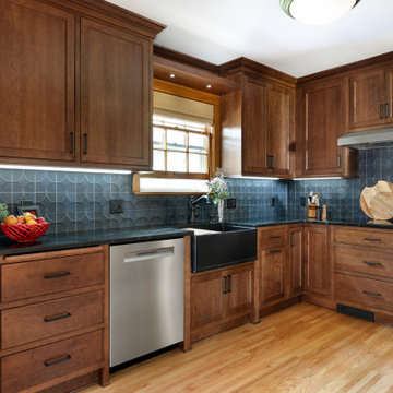 Crystal Kitchen + Bath
The goal for this 1939 Tudor-style story-and-a-half home was to create a kitchen that offered the conveniences, storage, and performance of a modern workspace while preserving the warmth, craftsmanship, and vintage charm that made the home special. The client, an avid home cook, wanted the room to feel as though it had always belonged to the house, with thoughtful upgrades that respected the original architecture rather than competing with it. Just as important, she needed a more efficient layout with enough storage for small appliances, so everyday cooking would no longer require carrying items up from the lower level.
Several existing conditions shaped the design approach. The kitchen retained original, amber-stained birch woodwork that the client wished to keep, and the compact footprint was interrupted by six doorways and two windows, none of which were to be moved, altered, or replaced. A previous flooring update had left the door casings undercut too short, creating visible gaps where the casing met the floor. The existing vintage 40-inch range also lacked proper ventilation, yet the client wished to accommodate a refrigerator, dishwasher, cooktop, double ovens, built-in microwave, and effective venting above the cooktop into the new kitchen layout.
To honor the original millwork, beaded inset-style cherry cabinetry was selected in a soft, hand-rubbed finish that will deepen over time and develop a natural patina. Charcoal-gray soapstone countertops complement the cabinetry while reinforcing the historic character of the home with an organic, timeworn texture. The former breakfast nook was transformed into a butler’s pantry, adding valuable base cabinet storage and expanded work surfaces for frequently used small appliances. Also in the butler’s pantry, a single upper cabinet was paired with open shelves to give an open, airy feeling while adding character and practical storage. A classic single-bowl apron-front workstation sink contributes both period-appropriate character and practical prep and cleanup function.
Because the home’s openings were such a defining feature, the design worked within the existing architecture instead of altering it. Custom plinth blocks were created for each doorway to extend the original casing gracefully down to the new natural red oak flooring, resolving the earlier construction issue while adding a detail that feels authentic to the age of the house. Despite the number of door and window openings, the new layout provides a significantly more functional, built-in kitchen with an improved work triangle for serious cooking.
Appliance placement was carefully planned to deliver the requested performance without overwhelming the small room. Three cooking functions (double ovens & microwave) were consolidated into one location with a GE Café double oven featuring Advantium Technology, while the client’s compact 31-inch refrigerator was reused to preserve space. A sleek 30-inch induction cooktop provides efficient cooking, and a Vent-A-Hood ARS ductless vent hood supplies needed ventilation without requiring a duct run to the exterior.
The finish palette balances richness, texture, and historical sensitivity. A deeply textured navy backsplash tile adds depth and dramatic shadow play against the soapstone, while wallpaper in the back entry echoes the tile’s geometric pattern to visually connect the adjoining spaces. Oil-rubbed bronze cabinet hardware and light fixtures enhance the warmth of the cherry cabinetry and complete the antique-inspired feel.
Lighting was layered to make the compact kitchen brighter, more useful, and more inviting. Vintage-style semi-flush ceiling fixtures establish the overall tone, while dimmable puck lights highlight select areas and undercabinet task lighting keeps work surfaces well illuminated.
The completed kitchen now feels both highly functional and deeply rooted in the home’s history. Rich cherry cabinetry, velvety soapstone, natural red oak flooring, navy tile, bronze accents, and carefully preserved birch trim work together to create a warm, cohesive space that celebrates timeless craftsmanship. By increasing storage, improving workflow, integrating modern appliances, and respecting the Tudor home’s original character, the design achieves the client’s vision: a kitchen that feels personal, practical, historically appropriate, and as though it has always been there.
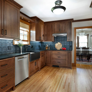 Crystal Kitchen + Bath
The goal for this 1939 Tudor-style story-and-a-half home was to create a kitchen that offered the conveniences, storage, and performance of a modern workspace while preserving the warmth, craftsmanship, and vintage charm that made the home special. The client, an avid home cook, wanted the room to feel as though it had always belonged to the house, with thoughtful upgrades that respected the original architecture rather than competing with it. Just as important, she needed a more efficient layout with enough storage for small appliances, so everyday cooking would no longer require carrying items up from the lower level.
Several existing conditions shaped the design approach. The kitchen retained original, amber-stained birch woodwork that the client wished to keep, and the compact footprint was interrupted by six doorways and two windows, none of which were to be moved, altered, or replaced. A previous flooring update had left the door casings undercut too short, creating visible gaps where the casing met the floor. The existing vintage 40-inch range also lacked proper ventilation, yet the client wished to accommodate a refrigerator, dishwasher, cooktop, double ovens, built-in microwave, and effective venting above the cooktop into the new kitchen layout.
To honor the original millwork, beaded inset-style cherry cabinetry was selected in a soft, hand-rubbed finish that will deepen over time and develop a natural patina. Charcoal-gray soapstone countertops complement the cabinetry while reinforcing the historic character of the home with an organic, timeworn texture. The former breakfast nook was transformed into a butler’s pantry, adding valuable base cabinet storage and expanded work surfaces for frequently used small appliances. Also in the butler’s pantry, a single upper cabinet was paired with open shelves to give an open, airy feeling while adding character and practical storage. A classic single-bowl apron-front workstation sink contributes both period-appropriate character and practical prep and cleanup function.
Because the home’s openings were such a defining feature, the design worked within the existing architecture instead of altering it. Custom plinth blocks were created for each doorway to extend the original casing gracefully down to the new natural red oak flooring, resolving the earlier construction issue while adding a detail that feels authentic to the age of the house. Despite the number of door and window openings, the new layout provides a significantly more functional, built-in kitchen with an improved work triangle for serious cooking.
Appliance placement was carefully planned to deliver the requested performance without overwhelming the small room. Three cooking functions (double ovens & microwave) were consolidated into one location with a GE Café double oven featuring Advantium Technology, while the client’s compact 31-inch refrigerator was reused to preserve space. A sleek 30-inch induction cooktop provides efficient cooking, and a Vent-A-Hood ARS ductless vent hood supplies needed ventilation without requiring a duct run to the exterior.
The finish palette balances richness, texture, and historical sensitivity. A deeply textured navy backsplash tile adds depth and dramatic shadow play against the soapstone, while wallpaper in the back entry echoes the tile’s geometric pattern to visually connect the adjoining spaces. Oil-rubbed bronze cabinet hardware and light fixtures enhance the warmth of the cherry cabinetry and complete the antique-inspired feel.
Lighting was layered to make the compact kitchen brighter, more useful, and more inviting. Vintage-style semi-flush ceiling fixtures establish the overall tone, while dimmable puck lights highlight select areas and undercabinet task lighting keeps work surfaces well illuminated.
The completed kitchen now feels both highly functional and deeply rooted in the home’s history. Rich cherry cabinetry, velvety soapstone, natural red oak flooring, navy tile, bronze accents, and carefully preserved birch trim work together to create a warm, cohesive space that celebrates timeless craftsmanship. By increasing storage, improving workflow, integrating modern appliances, and respecting the Tudor home’s original character, the design achieves the client’s vision: a kitchen that feels personal, practical, historically appropriate, and as though it has always been there.
Sponsored
Sunbury, OH
J.Holderby - Renovations
Franklin County's Leading General Contractors - 2X Best of Houzz!
 Crystal Kitchen + Bath
The goal for this 1939 Tudor-style story-and-a-half home was to create a kitchen that offered the conveniences, storage, and performance of a modern workspace while preserving the warmth, craftsmanship, and vintage charm that made the home special. The client, an avid home cook, wanted the room to feel as though it had always belonged to the house, with thoughtful upgrades that respected the original architecture rather than competing with it. Just as important, she needed a more efficient layout with enough storage for small appliances, so everyday cooking would no longer require carrying items up from the lower level.
Several existing conditions shaped the design approach. The kitchen retained original, amber-stained birch woodwork that the client wished to keep, and the compact footprint was interrupted by six doorways and two windows, none of which were to be moved, altered, or replaced. A previous flooring update had left the door casings undercut too short, creating visible gaps where the casing met the floor. The existing vintage 40-inch range also lacked proper ventilation, yet the client wished to accommodate a refrigerator, dishwasher, cooktop, double ovens, built-in microwave, and effective venting above the cooktop into the new kitchen layout.
To honor the original millwork, beaded inset-style cherry cabinetry was selected in a soft, hand-rubbed finish that will deepen over time and develop a natural patina. Charcoal-gray soapstone countertops complement the cabinetry while reinforcing the historic character of the home with an organic, timeworn texture. The former breakfast nook was transformed into a butler’s pantry, adding valuable base cabinet storage and expanded work surfaces for frequently used small appliances. Also in the butler’s pantry, a single upper cabinet was paired with open shelves to give an open, airy feeling while adding character and practical storage. A classic single-bowl apron-front workstation sink contributes both period-appropriate character and practical prep and cleanup function.
Because the home’s openings were such a defining feature, the design worked within the existing architecture instead of altering it. Custom plinth blocks were created for each doorway to extend the original casing gracefully down to the new natural red oak flooring, resolving the earlier construction issue while adding a detail that feels authentic to the age of the house. Despite the number of door and window openings, the new layout provides a significantly more functional, built-in kitchen with an improved work triangle for serious cooking.
Appliance placement was carefully planned to deliver the requested performance without overwhelming the small room. Three cooking functions (double ovens & microwave) were consolidated into one location with a GE Café double oven featuring Advantium Technology, while the client’s compact 31-inch refrigerator was reused to preserve space. A sleek 30-inch induction cooktop provides efficient cooking, and a Vent-A-Hood ARS ductless vent hood supplies needed ventilation without requiring a duct run to the exterior.
The finish palette balances richness, texture, and historical sensitivity. A deeply textured navy backsplash tile adds depth and dramatic shadow play against the soapstone, while wallpaper in the back entry echoes the tile’s geometric pattern to visually connect the adjoining spaces. Oil-rubbed bronze cabinet hardware and light fixtures enhance the warmth of the cherry cabinetry and complete the antique-inspired feel.
Lighting was layered to make the compact kitchen brighter, more useful, and more inviting. Vintage-style semi-flush ceiling fixtures establish the overall tone, while dimmable puck lights highlight select areas and undercabinet task lighting keeps work surfaces well illuminated.
The completed kitchen now feels both highly functional and deeply rooted in the home’s history. Rich cherry cabinetry, velvety soapstone, natural red oak flooring, navy tile, bronze accents, and carefully preserved birch trim work together to create a warm, cohesive space that celebrates timeless craftsmanship. By increasing storage, improving workflow, integrating modern appliances, and respecting the Tudor home’s original character, the design achieves the client’s vision: a kitchen that feels personal, practical, historically appropriate, and as though it has always been there.
 Crystal Kitchen + Bath
The goal for this 1939 Tudor-style story-and-a-half home was to create a kitchen that offered the conveniences, storage, and performance of a modern workspace while preserving the warmth, craftsmanship, and vintage charm that made the home special. The client, an avid home cook, wanted the room to feel as though it had always belonged to the house, with thoughtful upgrades that respected the original architecture rather than competing with it. Just as important, she needed a more efficient layout with enough storage for small appliances, so everyday cooking would no longer require carrying items up from the lower level.
Several existing conditions shaped the design approach. The kitchen retained original, amber-stained birch woodwork that the client wished to keep, and the compact footprint was interrupted by six doorways and two windows, none of which were to be moved, altered, or replaced. A previous flooring update had left the door casings undercut too short, creating visible gaps where the casing met the floor. The existing vintage 40-inch range also lacked proper ventilation, yet the client wished to accommodate a refrigerator, dishwasher, cooktop, double ovens, built-in microwave, and effective venting above the cooktop into the new kitchen layout.
To honor the original millwork, beaded inset-style cherry cabinetry was selected in a soft, hand-rubbed finish that will deepen over time and develop a natural patina. Charcoal-gray soapstone countertops complement the cabinetry while reinforcing the historic character of the home with an organic, timeworn texture. The former breakfast nook was transformed into a butler’s pantry, adding valuable base cabinet storage and expanded work surfaces for frequently used small appliances. Also in the butler’s pantry, a single upper cabinet was paired with open shelves to give an open, airy feeling while adding character and practical storage. A classic single-bowl apron-front workstation sink contributes both period-appropriate character and practical prep and cleanup function.
Because the home’s openings were such a defining feature, the design worked within the existing architecture instead of altering it. Custom plinth blocks were created for each doorway to extend the original casing gracefully down to the new natural red oak flooring, resolving the earlier construction issue while adding a detail that feels authentic to the age of the house. Despite the number of door and window openings, the new layout provides a significantly more functional, built-in kitchen with an improved work triangle for serious cooking.
Appliance placement was carefully planned to deliver the requested performance without overwhelming the small room. Three cooking functions (double ovens & microwave) were consolidated into one location with a GE Café double oven featuring Advantium Technology, while the client’s compact 31-inch refrigerator was reused to preserve space. A sleek 30-inch induction cooktop provides efficient cooking, and a Vent-A-Hood ARS ductless vent hood supplies needed ventilation without requiring a duct run to the exterior.
The finish palette balances richness, texture, and historical sensitivity. A deeply textured navy backsplash tile adds depth and dramatic shadow play against the soapstone, while wallpaper in the back entry echoes the tile’s geometric pattern to visually connect the adjoining spaces. Oil-rubbed bronze cabinet hardware and light fixtures enhance the warmth of the cherry cabinetry and complete the antique-inspired feel.
Lighting was layered to make the compact kitchen brighter, more useful, and more inviting. Vintage-style semi-flush ceiling fixtures establish the overall tone, while dimmable puck lights highlight select areas and undercabinet task lighting keeps work surfaces well illuminated.
The completed kitchen now feels both highly functional and deeply rooted in the home’s history. Rich cherry cabinetry, velvety soapstone, natural red oak flooring, navy tile, bronze accents, and carefully preserved birch trim work together to create a warm, cohesive space that celebrates timeless craftsmanship. By increasing storage, improving workflow, integrating modern appliances, and respecting the Tudor home’s original character, the design achieves the client’s vision: a kitchen that feels personal, practical, historically appropriate, and as though it has always been there.
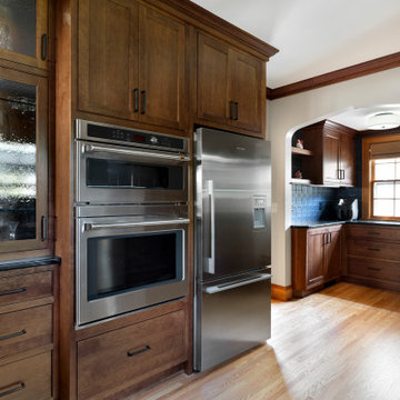 Crystal Kitchen + Bath
The goal for this 1939 Tudor-style story-and-a-half home was to create a kitchen that offered the conveniences, storage, and performance of a modern workspace while preserving the warmth, craftsmanship, and vintage charm that made the home special. The client, an avid home cook, wanted the room to feel as though it had always belonged to the house, with thoughtful upgrades that respected the original architecture rather than competing with it. Just as important, she needed a more efficient layout with enough storage for small appliances, so everyday cooking would no longer require carrying items up from the lower level.
Several existing conditions shaped the design approach. The kitchen retained original, amber-stained birch woodwork that the client wished to keep, and the compact footprint was interrupted by six doorways and two windows, none of which were to be moved, altered, or replaced. A previous flooring update had left the door casings undercut too short, creating visible gaps where the casing met the floor. The existing vintage 40-inch range also lacked proper ventilation, yet the client wished to accommodate a refrigerator, dishwasher, cooktop, double ovens, built-in microwave, and effective venting above the cooktop into the new kitchen layout.
To honor the original millwork, beaded inset-style cherry cabinetry was selected in a soft, hand-rubbed finish that will deepen over time and develop a natural patina. Charcoal-gray soapstone countertops complement the cabinetry while reinforcing the historic character of the home with an organic, timeworn texture. The former breakfast nook was transformed into a butler’s pantry, adding valuable base cabinet storage and expanded work surfaces for frequently used small appliances. Also in the butler’s pantry, a single upper cabinet was paired with open shelves to give an open, airy feeling while adding character and practical storage. A classic single-bowl apron-front workstation sink contributes both period-appropriate character and practical prep and cleanup function.
Because the home’s openings were such a defining feature, the design worked within the existing architecture instead of altering it. Custom plinth blocks were created for each doorway to extend the original casing gracefully down to the new natural red oak flooring, resolving the earlier construction issue while adding a detail that feels authentic to the age of the house. Despite the number of door and window openings, the new layout provides a significantly more functional, built-in kitchen with an improved work triangle for serious cooking.
Appliance placement was carefully planned to deliver the requested performance without overwhelming the small room. Three cooking functions (double ovens & microwave) were consolidated into one location with a GE Café double oven featuring Advantium Technology, while the client’s compact 31-inch refrigerator was reused to preserve space. A sleek 30-inch induction cooktop provides efficient cooking, and a Vent-A-Hood ARS ductless vent hood supplies needed ventilation without requiring a duct run to the exterior.
The finish palette balances richness, texture, and historical sensitivity. A deeply textured navy backsplash tile adds depth and dramatic shadow play against the soapstone, while wallpaper in the back entry echoes the tile’s geometric pattern to visually connect the adjoining spaces. Oil-rubbed bronze cabinet hardware and light fixtures enhance the warmth of the cherry cabinetry and complete the antique-inspired feel.
Lighting was layered to make the compact kitchen brighter, more useful, and more inviting. Vintage-style semi-flush ceiling fixtures establish the overall tone, while dimmable puck lights highlight select areas and undercabinet task lighting keeps work surfaces well illuminated.
The completed kitchen now feels both highly functional and deeply rooted in the home’s history. Rich cherry cabinetry, velvety soapstone, natural red oak flooring, navy tile, bronze accents, and carefully preserved birch trim work together to create a warm, cohesive space that celebrates timeless craftsmanship. By increasing storage, improving workflow, integrating modern appliances, and respecting the Tudor home’s original character, the design achieves the client’s vision: a kitchen that feels personal, practical, historically appropriate, and as though it has always been there.
213