
Search results for "Wrong person" in Home Design Ideas
 TVL Creative Ltd.
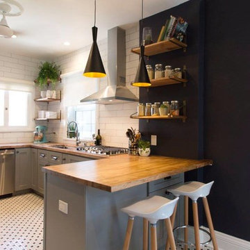
Our wonderful Baker clients were ready to remodel the kitchen in their c.1900 home shortly after moving in. They were looking to undo the 90s remodel that existed, and make the kitchen feel like it belonged in their historic home. We were able to design a balance that incorporated the vintage charm of their home and the modern pops that really give the kitchen its personality. We started by removing the mirrored wall that had separated their kitchen from the breakfast area. This allowed us the opportunity to open up their space dramatically and create a cohesive design that brings the two rooms together. To further our goal of making their kitchen appear more open we removed the wall cabinets along their exterior wall and replaced them with open shelves. We then incorporated a pantry cabinet into their refrigerator wall to balance out their storage needs. This new layout also provided us with the space to include a peninsula with counter seating so that guests can keep the cook company. We struck a fun balance of materials starting with the black & white hexagon tile on the floor to give us a pop of pattern. We then layered on simple grey shaker cabinets and used a butcher block counter top to add warmth to their kitchen. We kept the backsplash clean by utilizing an elongated white subway tile, and painted the walls a rich blue to add a touch of sophistication to the space.
 User
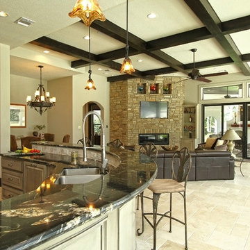
UserLarge tuscan open concept travertine floor family room photo in Houston with beige walls, a corner fireplace and a wall-mounted tv
 Ferriss - Architectural Renderings
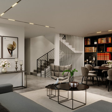
Top 10 house planning mistakes
Mistake # 1: placing wet areas away from communications.
Architects always foresee in advance the placement of wet areas in the immediate vicinity of communications, so you should not move the kitchen or bathrooms to more distant distances.
Mistake # 2: arrangement of living rooms and kitchens in rooms without natural light.
A person needs natural light when he is reading, studying or preparing food. Therefore, you should not plan living spaces, including the kitchen, in rooms without windows. Premises without natural light are mainly dressing rooms, storage rooms and bathrooms.
Mistake # 3: exit the bathroom to the living room or dining room.
Doors to bathrooms and utility rooms cannot open into public areas - living room or dining room. With such a planning decision, you will inconvenience guests and households, because no one will be able to enter or leave the premises unnoticed.
Mistake # 4: having one entrance to the house.
Plan 2-3 entrances to your home with each one serving a specific role. For example, through the front door you will meet guests, the entrance from the courtyard facade - to exit to the site in order to go around the house. The third entrance should lead from the street to the boiler room. Technicians enter through it and the equipment is replaced.
Mistake # 5: neglecting entrance hallways.
Do not plan grand halls and lounges when entering a house. Be sure to organize hallways with dressing rooms or spacious wardrobes.
Mistake # 6: placing a guest bathroom far from the entrance.
The concept of "guest bathroom" speaks for itself. To get into it, your friends do not need to go through all the rooms on the ground floor. Therefore, do not place it far from the front door.
Mistake # 7: Insufficient number of bathrooms on the floor.
One bathroom is not enough for a floor, especially if it is a bedroom. For the convenience of households and guests, each bedroom should be equipped with a separate bathroom.
Mistake #8: lack of an economic block.
In houses of any number of stores on the first or basement floor, a pantry with a sink should be provided for storing cleaning equipment, for storing vegetables or solid fuel. In this case, the exit from the storeroom to the floor must be isolated from the living rooms.
Mistake # 9: arrangement of walk-through living rooms.
Do not make the living room a walk-through, even if you plan to equip an office or living room in it. You and your guests will feel uncomfortable because the multiple doors leading to other rooms make the room look like a reception.
Mistake # 10: the wrong size of the corridors.
The width of the passage corridors should be at least 120 cm. First of all, the rule should be observed for the safety of residents and according to the rules of fire safety measures. An important role is played by ensuring sufficient ventilation of the premises: if the corridor is narrow and long, then there will be either a constant draft or stale air.
Also, in a narrow aisle, it will be extremely difficult to bring in and take out large-sized furniture or equipment. And the doors that open into the corridor should not block the passage, as a traumatic situation may arise.
If you have any polls that are not covered by this topic - write to us, we will be happy to advise you.
https://www.ferriss.co/
Find the right local pro for your project
 LMB Interiors
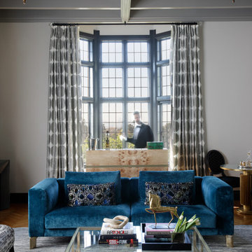
Our clients wanted their home to be host to charity functions, community events, and their family and friends, as well as a showcase for their eclectic and colorful art collection featuring works by local Oakland artists.
Oh, and when they moved in, they did the work to register the house as an Oakland Historical Landmark.
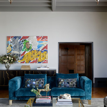
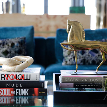
The fact that the couple was looking to upgrade their living room in the Hollywood Regency style (which is known for bold colors, shiny metallics, luxe fabrics, and an eye to mixing opulence with comfort while holding true to the glamor of 1930s Hollywood) made this project all the more inspiring and fun for me and my team.
John recalls, “We wanted a place that was glamorous, and compelling, so that people who visit would be excited and inspired by it!”
Our mission was to bring the very grand living room with its high ceilings and leaded glass bay windows to the next level for the family (including grown children Tom and Mandela) and their guests — ranging in number from 6 to 60 or more, on any given day or night.
The Hollywood Regency aesthetic was a perfect canvas for mixing and matching with the couple’s significant and hyper-local pop art collection, including pieces by famed Oakland artists Mel Ramos and K-Dub.
Kim and John’s personal views and aesthetics, together with their vibrant art collection, called for a bold design that is more funky and eclectic overall than many owners of historic homes like this tend to prefer.
I mean, don’t get me wrong; many of our clients like to do something a little daring, and often they opt for elements of glam. However, John and Kim agreeing to our specification of a pair of peacock blue sofas — that is no small commitment to audacious color!
Another furnishing element I love from this project is the custom-designed birds-eye-maple and antique glass inset bar — on wheels, which allows flexibility: a bartender can serve a large party from behind it or it can be turned around for use as self-service for a more intimate gathering.
My team and I couldn’t be more proud to have created a design that inspires and supports this family so that they may continue to make significant contributions to their causes and community.
 LMB Interiors
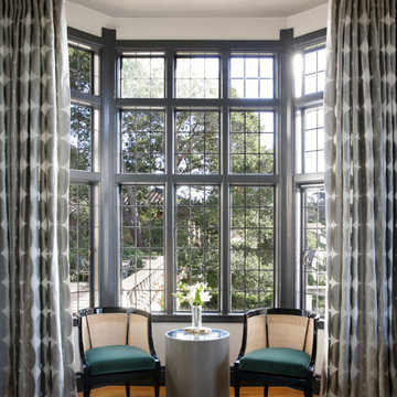
Our clients wanted their home to be host to charity functions, community events, and their family and friends, as well as a showcase for their eclectic and colorful art collection featuring works by local Oakland artists.
Oh, and when they moved in, they did the work to register the house as an Oakland Historical Landmark.
The fact that the couple was looking to upgrade their living room in the Hollywood Regency style (which is known for bold colors, shiny metallics, luxe fabrics, and an eye to mixing opulence with comfort while holding true to the glamor of 1930s Hollywood) made this project all the more inspiring and fun for me and my team.
John recalls, “We wanted a place that was glamorous, and compelling, so that people who visit would be excited and inspired by it!”
Our mission was to bring the very grand living room with its high ceilings and leaded glass bay windows to the next level for the family (including grown children Tom and Mandela) and their guests — ranging in number from 6 to 60 or more, on any given day or night.
The Hollywood Regency aesthetic was a perfect canvas for mixing and matching with the couple’s significant and hyper-local pop art collection, including pieces by famed Oakland artists Mel Ramos and K-Dub.
Kim and John’s personal views and aesthetics, together with their vibrant art collection, called for a bold design that is more funky and eclectic overall than many owners of historic homes like this tend to prefer.
I mean, don’t get me wrong; many of our clients like to do something a little daring, and often they opt for elements of glam. However, John and Kim agreeing to our specification of a pair of peacock blue sofas — that is no small commitment to audacious color!
Another furnishing element I love from this project is the custom-designed birds-eye-maple and antique glass inset bar — on wheels, which allows flexibility: a bartender can serve a large party from behind it or it can be turned around for use as self-service for a more intimate gathering.
My team and I couldn’t be more proud to have created a design that inspires and supports this family so that they may continue to make significant contributions to their causes and community.
 LMB Interiors
Our clients wanted their home to be host to charity functions, community events, and their family and friends, as well as a showcase for their eclectic and colorful art collection featuring works by local Oakland artists.
Oh, and when they moved in, they did the work to register the house as an Oakland Historical Landmark.
The fact that the couple was looking to upgrade their living room in the Hollywood Regency style (which is known for bold colors, shiny metallics, luxe fabrics, and an eye to mixing opulence with comfort while holding true to the glamor of 1930s Hollywood) made this project all the more inspiring and fun for me and my team.
John recalls, “We wanted a place that was glamorous, and compelling, so that people who visit would be excited and inspired by it!”
Our mission was to bring the very grand living room with its high ceilings and leaded glass bay windows to the next level for the family (including grown children Tom and Mandela) and their guests — ranging in number from 6 to 60 or more, on any given day or night.
The Hollywood Regency aesthetic was a perfect canvas for mixing and matching with the couple’s significant and hyper-local pop art collection, including pieces by famed Oakland artists Mel Ramos and K-Dub.
Kim and John’s personal views and aesthetics, together with their vibrant art collection, called for a bold design that is more funky and eclectic overall than many owners of historic homes like this tend to prefer.
I mean, don’t get me wrong; many of our clients like to do something a little daring, and often they opt for elements of glam. However, John and Kim agreeing to our specification of a pair of peacock blue sofas — that is no small commitment to audacious color!
Another furnishing element I love from this project is the custom-designed birds-eye-maple and antique glass inset bar — on wheels, which allows flexibility: a bartender can serve a large party from behind it or it can be turned around for use as self-service for a more intimate gathering.
My team and I couldn’t be more proud to have created a design that inspires and supports this family so that they may continue to make significant contributions to their causes and community.
 Genay Bell Interior Design
Jesse L Young Photography
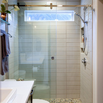
Inspiration for a transitional gray tile and pebble tile porcelain tile bathroom remodel in Seattle with shaker cabinets, dark wood cabinets, gray walls and quartz countertops
Inspiration for a transitional gray tile and pebble tile porcelain tile bathroom remodel in Seattle with shaker cabinets, dark wood cabinets, gray walls and quartz countertops

Sponsored
Delaware, OH

Buckeye Basements, Inc.
Central Ohio's Basement Finishing ExpertsBest Of Houzz '13-'21
 InnovationLand
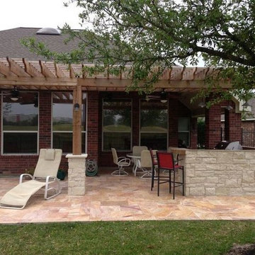
We love this rustic-modern Houston patio addition with an outdoor kitchen and double pergola!
It not only made the most of a long, narrow space while satisfying strict homeowners association rules, but did so affordably in a warm, timeless style.
“The client really enjoys outdoor living, but had a specific budget they wanted to meet,” explains Outdoor Homescapes owner Wayne Franks. “They also live on a golf course and had to meet particular HOA requirements.”
The HOA requirements restricted how far back the new 450-square-foot patio and pergola could extend back into the yard. The HOA also wanted to make sure the patio’s colors and materials matched the existing home and others around it.
“We chose colors and materials that offered texture and character, but that would go with just about anything around it,” says Wayne. “We found what we were looking for in the Fantastico travertine and Austin limestone – two materials clients love and just can’t go wrong with.”
The Austin limestone facing the 8-foot-square, L-shaped kitchen island is dry-stacked in a castle pattern for a naturalistic, rustic look. Yet its light, neutral color keeps the style fresh and modern.
Adding to the modern look are the stainless steel appliances: an RCS 30-inch stainless steel grill, double burner and outdoor fridge. Even though the finishes on the sink and light fixtures (Hunter pendant lamps and Hampton Bay light/fan combos) have a different finish – oil-rubbed-bronze – this actually follows the recent trend of mixing different metals, materials and finishes.
“The look’s not so matchy-matchy anymore,” explains Wayne. “Mixing it up makes it look more authentic and personalized.”
That’s why backsplashes like the one in this project – done in glass and metal mosaic – are also becoming more popular than traditional ceramic tile.
Another recent trend can be seen here, too – an amping up of color variation and texture.
“In addition to the split-face texture of the rock, you can definitely see the bold color variation in the travertine,” says Wayne.
The flooring is a Fantastico travertine, laid out in a Versailles pattern. “The Fantastico tile is killer,” says Wayne. “The warm reds go great with red brick, which we have a lot of around here.”
The countertop with the rounded, raised bar at the end is English walnut travertine.
The red bar stools also add a pop of exciting color that contrasts nicely with the greenery around the patio.
The double pergola, continues Wayne, is No. 2 pine stained a Minwax honey-gold. One side of the pergola – the side over the seating area – is covered with Lexan, a clear material that keeps out rain, heat and UV rays.
The pergola also juts further into the yard on that side. “It’s called a scallop, and it just lends some visual interest,” explains Wayne. “It prevents the pergola from just looking like one big rectangular hunk of wood.”
Wayne particularly likes how everything blended so well with the brick – which was a big concern – yet didn’t come off as too neutral or boring.
“The Fantastico travertine and red chairs do an excellent job of pulling the red from the brick and working with the warmth of that color to make a super-inviting space,” says Wayne. “We’re really pleased with how it all ties together so well.”
 Amy Krane Color Consulting
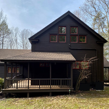
Adirondack color of brown with red trim on a post and beam house
Home design - farmhouse home design idea in New York
Home design - farmhouse home design idea in New York
 LMB Interiors
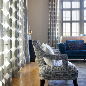
Our clients wanted their home to be host to charity functions, community events, and their family and friends, as well as a showcase for their eclectic and colorful art collection featuring works by local Oakland artists.
Oh, and when they moved in, they did the work to register the house as an Oakland Historical Landmark.
The fact that the couple was looking to upgrade their living room in the Hollywood Regency style (which is known for bold colors, shiny metallics, luxe fabrics, and an eye to mixing opulence with comfort while holding true to the glamor of 1930s Hollywood) made this project all the more inspiring and fun for me and my team.
John recalls, “We wanted a place that was glamorous, and compelling, so that people who visit would be excited and inspired by it!”
Our mission was to bring the very grand living room with its high ceilings and leaded glass bay windows to the next level for the family (including grown children Tom and Mandela) and their guests — ranging in number from 6 to 60 or more, on any given day or night.
The Hollywood Regency aesthetic was a perfect canvas for mixing and matching with the couple’s significant and hyper-local pop art collection, including pieces by famed Oakland artists Mel Ramos and K-Dub.
Kim and John’s personal views and aesthetics, together with their vibrant art collection, called for a bold design that is more funky and eclectic overall than many owners of historic homes like this tend to prefer.
I mean, don’t get me wrong; many of our clients like to do something a little daring, and often they opt for elements of glam. However, John and Kim agreeing to our specification of a pair of peacock blue sofas — that is no small commitment to audacious color!
Another furnishing element I love from this project is the custom-designed birds-eye-maple and antique glass inset bar — on wheels, which allows flexibility: a bartender can serve a large party from behind it or it can be turned around for use as self-service for a more intimate gathering.
My team and I couldn’t be more proud to have created a design that inspires and supports this family so that they may continue to make significant contributions to their causes and community.
 Closet Factory (Richmond, VA)
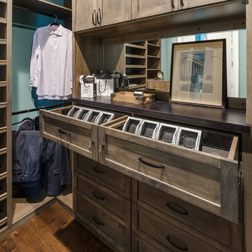
Locked drawers keep valuable collections, wardrobe accessories & other personal belongings from falling into the wrong hands.
Inspiration for a walk-in closet remodel in Richmond with shaker cabinets and medium tone wood cabinets
Inspiration for a walk-in closet remodel in Richmond with shaker cabinets and medium tone wood cabinets
 LMB Interiors
Our clients wanted their home to be host to charity functions, community events, and their family and friends, as well as a showcase for their eclectic and colorful art collection featuring works by local Oakland artists.
Oh, and when they moved in, they did the work to register the house as an Oakland Historical Landmark.
The fact that the couple was looking to upgrade their living room in the Hollywood Regency style (which is known for bold colors, shiny metallics, luxe fabrics, and an eye to mixing opulence with comfort while holding true to the glamor of 1930s Hollywood) made this project all the more inspiring and fun for me and my team.
John recalls, “We wanted a place that was glamorous, and compelling, so that people who visit would be excited and inspired by it!”
Our mission was to bring the very grand living room with its high ceilings and leaded glass bay windows to the next level for the family (including grown children Tom and Mandela) and their guests — ranging in number from 6 to 60 or more, on any given day or night.
The Hollywood Regency aesthetic was a perfect canvas for mixing and matching with the couple’s significant and hyper-local pop art collection, including pieces by famed Oakland artists Mel Ramos and K-Dub.
Kim and John’s personal views and aesthetics, together with their vibrant art collection, called for a bold design that is more funky and eclectic overall than many owners of historic homes like this tend to prefer.
I mean, don’t get me wrong; many of our clients like to do something a little daring, and often they opt for elements of glam. However, John and Kim agreeing to our specification of a pair of peacock blue sofas — that is no small commitment to audacious color!
Another furnishing element I love from this project is the custom-designed birds-eye-maple and antique glass inset bar — on wheels, which allows flexibility: a bartender can serve a large party from behind it or it can be turned around for use as self-service for a more intimate gathering.
My team and I couldn’t be more proud to have created a design that inspires and supports this family so that they may continue to make significant contributions to their causes and community.

 Dynamic Garage Door
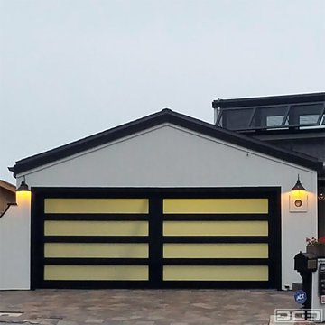
Orange County, CA - So you've just redone your landscape but there's something terribly wrong with your home's curb appeal. What? You might ask,is the problem? Actually, you might have overseen your garage door! Upgrading your luster-lack garage door can do wonders to your landscaping project. Your garage door plays an enormous role on what the overall outcome of your landscaping remodel will look like in the end. Our descerningly designed fullview glass garage doors can do just the trick. Not only will your landscaping look great but the entire curb appeal of your home will get a radical face-lift you didn't think possible for the entry level investment budget. We are the only garage door company in Orange County specializing in true custom-designed full-view glass garage doors which means you can get an glass pane size, frame color and/or configuration. Many custom home builders, homeowners, designers and contractors have commissioned Dynamic Garage Door to create amazing glass overhead doors that are uniquely designed for each home project. As a result, no other home in your area will have a cookie cutter version of your door and/or personal taste. Let one of our garage door designers create an outstanding glass garage door that will give your home the distinction it deserves. Talk to one of our designers by calling (855) 343-DOOR
 Closet Factory (Richmond, VA)
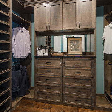
Locked drawers keep valuable collections, wardrobe accessories & other personal belongings from falling into the wrong hands.
Walk-in closet photo in Richmond with shaker cabinets and medium tone wood cabinets
Walk-in closet photo in Richmond with shaker cabinets and medium tone wood cabinets
 User
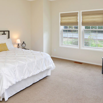
UserYou can't go wrong with a classic black and white color scheme with a pop color such as yellow to add warmth and personality.

 Betz Pools Limited
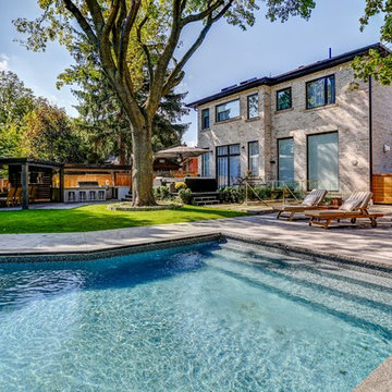
Adding a contemporary feel, the pool features elegant custom full-width vinyl over steel walk-in steps. The pool’s attractive liner of miniature blue-grey mosaic tiles is a perfect complement to the black stone coping. The nearby garden storage shed houses the controls for night lighting, sheer descent waterfall, etc.
 Scene Stealers
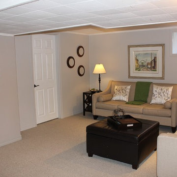
AFTER: The first thing we did was repositioned key furniture pieces. The homeowner had placed them to face the cable box hook up but their furniture looked out of place and the wrong size for the space. In staging, a TV is not a focal point!
We rearranged pictures, pillows and blankets that the client already had to make the room more homey, but less personal by removing family photos.
Paint: Benjamin Moore Abalone 2108-60
9