
Search results for "Your own which" in Home Design Ideas

 Change Your Bathroom©
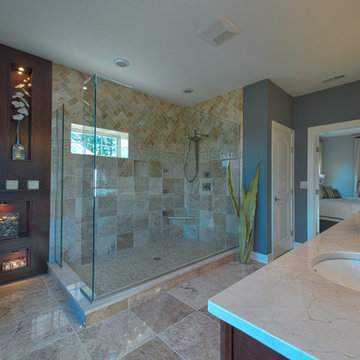
The goal of this project was to upgrade the builder grade finishes and create an ergonomic space that had a contemporary feel. This bathroom transformed from a standard, builder grade bathroom to a contemporary urban oasis. This was one of my favorite projects, I know I say that about most of my projects but this one really took an amazing transformation. By removing the walls surrounding the shower and relocating the toilet it visually opened up the space. Creating a deeper shower allowed for the tub to be incorporated into the wet area. Adding a LED panel in the back of the shower gave the illusion of a depth and created a unique storage ledge. A custom vanity keeps a clean front with different storage options and linear limestone draws the eye towards the stacked stone accent wall.
Houzz Write Up: https://www.houzz.com/magazine/inside-houzz-a-chopped-up-bathroom-goes-streamlined-and-swank-stsetivw-vs~27263720
The layout of this bathroom was opened up to get rid of the hallway effect, being only 7 foot wide, this bathroom needed all the width it could muster. Using light flooring in the form of natural lime stone 12x24 tiles with a linear pattern, it really draws the eye down the length of the room which is what we needed. Then, breaking up the space a little with the stone pebble flooring in the shower, this client enjoyed his time living in Japan and wanted to incorporate some of the elements that he appreciated while living there. The dark stacked stone feature wall behind the tub is the perfect backdrop for the LED panel, giving the illusion of a window and also creates a cool storage shelf for the tub. A narrow, but tasteful, oval freestanding tub fit effortlessly in the back of the shower. With a sloped floor, ensuring no standing water either in the shower floor or behind the tub, every thought went into engineering this Atlanta bathroom to last the test of time. With now adequate space in the shower, there was space for adjacent shower heads controlled by Kohler digital valves. A hand wand was added for use and convenience of cleaning as well. On the vanity are semi-vessel sinks which give the appearance of vessel sinks, but with the added benefit of a deeper, rounded basin to avoid splashing. Wall mounted faucets add sophistication as well as less cleaning maintenance over time. The custom vanity is streamlined with drawers, doors and a pull out for a can or hamper.
A wonderful project and equally wonderful client. I really enjoyed working with this client and the creative direction of this project.
Brushed nickel shower head with digital shower valve, freestanding bathtub, curbless shower with hidden shower drain, flat pebble shower floor, shelf over tub with LED lighting, gray vanity with drawer fronts, white square ceramic sinks, wall mount faucets and lighting under vanity. Hidden Drain shower system. Atlanta Bathroom.

 Alno Miami - Kitchens and Custom Cabinetry
Eat-in kitchen - mid-sized contemporary u-shaped concrete floor eat-in kitchen idea in Miami with an undermount sink, flat-panel cabinets, white cabinets, wood countertops, stainless steel appliances and a peninsula

 Sigmar
Petr Krejci
Example of a transitional l-shaped kitchen design in London with shaker cabinets and gray backsplash
Example of a transitional l-shaped kitchen design in London with shaker cabinets and gray backsplash
Find the right local pro for your project


 KA DesignWorks
Eat-in kitchen - large contemporary u-shaped light wood floor and beige floor eat-in kitchen idea in Denver with a double-bowl sink, flat-panel cabinets, black cabinets, white backsplash, an island, soapstone countertops, stone slab backsplash, paneled appliances and black countertops

 Studio Revolution
Designed by: Studio Revolution Photography by: Thomas Kuoh
Elegant living room photo in San Francisco with beige walls
Elegant living room photo in San Francisco with beige walls


Sponsored
Columbus, OH

Hope Restoration & General Contracting
Columbus Design-Build, Kitchen & Bath Remodeling, Historic Renovations

 MSI
Our stacked stone will make your home the envy of the neighborhood! Use it for any number of hardscaping projects, including water features and outdoor kitchens. Let it stand on its own as an accent wall, like it does here.

Staircase - huge mediterranean limestone curved metal railing staircase idea in Dallas with limestone risers

 O’Hara Interiors
Martha O’Hara Interiors, Interior Design & Photo Styling | John Kraemer & Sons, Builder | Troy Thies, Photography | Ben Nelson, Designer | Please Note: All “related,” “similar,” and “sponsored” products tagged or listed by Houzz are not actual products pictured. They have not been approved by Martha O’Hara Interiors nor any of the professionals credited. For info about our work: design@oharainteriors.com


 Growsgreen Landscape Design
, photo by Caitlin Atkinson.
Example of a danish deck design in San Francisco
Example of a danish deck design in San Francisco

 Susan Yeley Homes
This gem of a house was built in the 1950s, when its neighborhood undoubtedly felt remote. The university footprint has expanded in the 70 years since, however, and today this home sits on prime real estate—easy biking and reasonable walking distance to campus.
When it went up for sale in 2017, it was largely unaltered. Our clients purchased it to renovate and resell, and while we all knew we'd need to add square footage to make it profitable, we also wanted to respect the neighborhood and the house’s own history. Swedes have a word that means “just the right amount”: lagom. It is a guiding philosophy for us at SYH, and especially applied in this renovation. Part of the soul of this house was about living in just the right amount of space. Super sizing wasn’t a thing in 1950s America. So, the solution emerged: keep the original rectangle, but add an L off the back.
With no owner to design with and for, SYH created a layout to appeal to the masses. All public spaces are the back of the home--the new addition that extends into the property’s expansive backyard. A den and four smallish bedrooms are atypically located in the front of the house, in the original 1500 square feet. Lagom is behind that choice: conserve space in the rooms where you spend most of your time with your eyes shut. Put money and square footage toward the spaces in which you mostly have your eyes open.
In the studio, we started calling this project the Mullet Ranch—business up front, party in the back. The front has a sleek but quiet effect, mimicking its original low-profile architecture street-side. It’s very Hoosier of us to keep appearances modest, we think. But get around to the back, and surprise! lofted ceilings and walls of windows. Gorgeous.


 Haven Design and Construction
This beautiful study was part of a whole house design and renovation by Haven Design and Construction. For this room, our objective was to create a feminine and sophisticated study for our client. She requested a design that was unique and fresh, but still warm and inviting. We wallpapered the back of the bookcases in an eye catching metallic vine pattern to add a feminine touch. Then, we selected a deep gray tone from the wallpaper and painted the bookcases and wainscoting in this striking color. We replaced the carpet with a light wood flooring that compliments the gray woodwork. Our client preferred a petite desk, just large enough for paying bills or working on her laptop, so our first furniture selection was a lovely black desk with feminine curved detailing and delicate star hardware. The room still needed a focal point, so we selected a striking lucite and gold chandelier to set the tone. The design was completed by a pair of gray velvet guest chairs. The gold twig pattern on the back of the chairs compliments the metallic wallpaper pattern perfectly. Finally the room was carefully detailed with unique accessories and custom bound books to fill the bookcases.

 Main Line Kitchen Design
The best kitchen showroom in your area is closer than you think. The four designers there are some of the most experienced award winning kitchen designers in the Delaware Valley. They design in and sell 6 national cabinet lines. And their pricing for cabinetry is slightly less than at home centers in apples to apples comparisons. Where is this kitchen showroom and how come you don’t remember seeing it when it is so close by? It’s in your own home!
Main Line Kitchen Design brings all the same samples you select from when you travel to other showrooms to your home. We make design changes on our laptops in 20-20 CAD with you present usually in the very kitchen being renovated. Understanding what designs will look like and how sample kitchen cabinets, doors, and finishes will look in your home is easy when you are standing in the very room being renovated. Design changes can be emailed to you to print out and discuss with friends and family if you choose. Best of all our design time is free since it is incorporated into the very competitive pricing of your cabinetry when you purchase a kitchen from Main Line Kitchen Design.
Finally there is a kitchen business model and design team that carries the highest quality cabinetry, is experienced, convenient, and reasonably priced. Call us today and find out why we get the best reviews on the internet or Google us and check. We look forward to working with you.
As our company tag line says:
“The world of kitchen design is changing…”

 Creative Design Landscapes
Outdoor Living Orient. Pool landscaping by Creative Design Landscapes in the Hamptons.
Patio - coastal backyard brick patio idea in New York with a fire pit and no cover
Patio - coastal backyard brick patio idea in New York with a fire pit and no cover
Sponsored
Fredericksburg, OH

High Point Cabinets
Columbus' Experienced Custom Cabinet Builder | 4x Best of Houzz Winner

 Bungalow 56
Kristen Vincent Photography
Small tuscan master beige tile and stone tile travertine floor corner shower photo in San Diego with medium tone wood cabinets, white walls, an undermount sink, quartz countertops and recessed-panel cabinets
Small tuscan master beige tile and stone tile travertine floor corner shower photo in San Diego with medium tone wood cabinets, white walls, an undermount sink, quartz countertops and recessed-panel cabinets


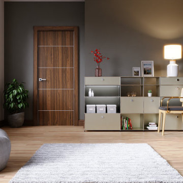
 Almesedoors
THE DOOR NAME ORIGIN - "ALLUMINIO ELIVIA VERTICAL WOOD GRAIN 4HS"
Of all the interior door models in the Elivia collection, this one is perhaps the most unapologetically elegant. Why? Hmm … That which is self-evident can be the most difficult to explain.
Is it because it is built using the latest breakthroughs in interior door making technology? Look at the finish: the process of applying it utilizes something called “stretching” by professionals, which is to say that instead of simply slapping the finish on top of the interior door’s surface, our company fuses (for lack of a better word) the materials (on molecular level, no less), the result being that the finished product is more warp-resistant, scratch-resistant, and fade-proof than any interior door put together in the past. This is especially important in climates known for their high humidity levels. Yes, but this has more to do with engineering than aesthetics, right?
Okay, so, is this interior door super-elegant because it features all the wonderful state-of-the-art hardware, specifically, the 3D adjustable, self-lubricating concealed hinges (made in Italy, by the way – a country which is, arguably, the birthplace of elegance as a concept)? Self-lubricating means your interior door will never creak. 3D-adjustable means that the installation is quick and precise (far more so than what you’d expect from ordinary hinges). Concealed means, of course, that the pin will not be visible from either side of the interior door when it’s closed. Actually, there is no pin. Neat, isn’t it? Would that be it?
Perhaps. Elegance in interior doors is a tricky concept. It combines (well, at least in the case of this particular interior door model it does) the “wow!” effect with the long-term agreeability. How so, you might ask. Well. It gets your favorable attention the first time you set eyes on it (the “wow” part); after which, you’ll never get tired of looking at it. For as long as you own it, it’ll always be easy on the eyes.
That must be it.
Maybe. Maybe not. There’s more.
This interior door is almost certainly Italian in spirit. Italian culture is rooted in Greco-Roman (Italian designers are very proud of that fact). Look at the vertical latitudinal orientation (which is to say the direction) of the wood grain. Pointing upward means creating additional visual space, pushing the ceiling higher (because your ceilings can never be too high). This is a time-proven architectural trick which ancient Greeks, with their characteristic tongue-in-cheek humor, referred to as “optical correction.” (By the way, if you’d sooner increase, the visual horizontal space of your room, you should look into this interior door’s sister – with the appropriate direction of the wood grain).
And then there’s the 4HS part, which stands for four horizontal stripes – resembling the four strings on the violin: the ultimate elegant musical instrument if there ever was one.
In its present form, the violin appeared in early Sixteenth Century in (guess …) northern Italy. Of course. To be fair, it quickly gained popularity throughout Europe, and the rest of the world soon after.
It’s elegance (the appearance as well as the sound) agreed with both street musicians and the nobility. The French king Charles IX ordered an Italian master to construct twenty-four violins for him in the year 1560.
Was the violin the source of inspiration for our designers?
Let’s move on to the finish.
215