
Search results for "Your own wondering" in Home Design Ideas
 Rudloff Custom Builders
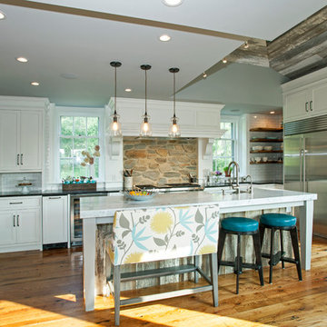
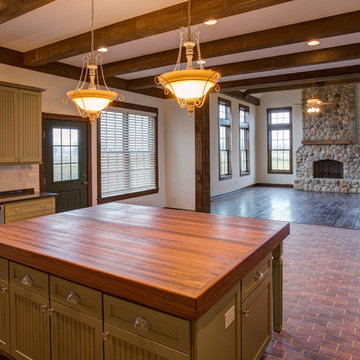
This kitchen has many interesting elements that set it apart.
The sense of openness is created by the raised ceiling and multiple ceiling levels, lighting and light colored cabinets.
A custom hood over the stone back splash creates a wonderful focal point with it's traditional style architectural mill work complimenting the islands use of reclaimed wood (as seen on the ceiling as well) transitional tapered legs, and the use of Carrara marble on the island top.
This kitchen was featured in a Houzz Kitchen of the Week article!
Photography by Alicia's Art, LLC
RUDLOFF Custom Builders, is a residential construction company that connects with clients early in the design phase to ensure every detail of your project is captured just as you imagined. RUDLOFF Custom Builders will create the project of your dreams that is executed by on-site project managers and skilled craftsman, while creating lifetime client relationships that are build on trust and integrity.
We are a full service, certified remodeling company that covers all of the Philadelphia suburban area including West Chester, Gladwynne, Malvern, Wayne, Haverford and more.
As a 6 time Best of Houzz winner, we look forward to working with you on your next project.
 Advance Design Studio, Ltd.
Jennifer and Dan have lived in their Deer Park Illinois home for 15 years, slowly making minor fixes like painting and decorating; but they had a new plan for their kitchen the entire time. An awkwardly placed garage door, and an island cooktop with a terrible downdraft made a full-scale kitchen remodel an absolute must. Jennifer had many ideas in mind and wanted to work with a company that could provide high-end work, while partnering with a designer that would tailor the kitchen to her ideas.
She was intrigued by the phrase “Common Sense Remodeling” in Advance Design’s feature she discovered while perusing an issue of the community’s Quintessential Barrington Magazine. Doing further research on the company’s website, as she looked through project profiles and read about Advance Design’s “Common Sense Remodeling” philosophy, she promptly scheduled an appointment to see if the people and ideas she read about were truly who they said they were. The more she read, the more she knew that the “Common Sense” approach to remodeling they described was exactly the type of company she was looking for.
The partnership was sealed after an initial consultation with Owner Todd Jurs and Project Designer Michelle Lecinski. They displayed a combination of friendliness, professionalism and respect that was unmatched by any of the other companies Jennifer talked to. She knew that with Advance Design, she would be able to retain the vision that she had in mind with high-quality craftsmanship.
“I reached out to Advance Design because of the ‘Common Sense Remodeling’ tagline,” Jennifer said. “That’s what lingered for me”. “Advance Design was the most respectful- of the house and of my design ideas, and the most professional of the handful of companies that looked at my project”.
Soon after the meeting Jennifer began working with Michelle on the project design. They quickly developed chemistry. Jennifer loved how Michelle researched and located every detail that Jennifer wanted for the kitchen. Between the two of them, every concept and idea was worked through and perfected. “Jennifer had definite ideas about what she wanted the new kitchen to look like, she just didn’t know how to bring it all together. We worked together really well to make her ideas into the practical reality necessary for a well-functioning kitchen, with the look and feel that she had envisioned”, says Michelle.
“Michelle was wonderful in using the CAD system she would show me new drawings every time we changed the layout while working through the design,” Jennifer said. “She was a really wonderful partner in execution, she made sure everything happened quickly and easily.”
The finished design drew out elements of Jennifer’s style and personality. The pair call the look “sophisticated farmhouse” to describe the kitchen renovation to family and friends. The result was a beautifully crafted, authentic-feeling space that satisfied Jennifer’s dreams 15 years in the making. The whole project consisted of a kitchen remodel, mudroom upgrade with powder room, and garage entry relocation. “The projects I personally like the best, are the ones that put the client’s dreams on display,” Project Designer Michelle said. “And this is one of those projects.”
The main focal point of the kitchen is custom zinc and brass ventilation hood with a vintage sheen, which was hand made to order by a small company in Indiana named Vogler Metalworking. “It’s like sculpture, a true work of art”, says Jennifer. Your eye is immediately drawn towards this elegant yet practical hood that eliminated the home’s downdraft problem and added a striking conversation piece at the same time. The carpenters had to use special gloves when transporting and installing it, so they didn’t smudge it with fingerprints. The beautiful hood centers proudly over the stunning black enamel and brass LaCornue Range. “I had a friend who had a LaCornue range and after learning how easy it was to cook perfect meals, I was convinced I wanted to have one”, says Jennifer. This unique, breathtaking combination anchors the entire kitchen and is apparent immediately as you walk into the great room the surrounds the space.
DuraSupreme Crestwood cabinets with a Kendall Panel add function and sophistication. A custom gray paint color paired with a storm blue was developed so that the new kitchen looked like it belonged to the existing space. Unlacquered brass faucets and hardware were important to Jennifer because she wanted the living finishes to age over time. Remarkable brass diamond mesh cabinet door inserts imported from the UK continue to add this one-of-a-kind kitchen renovation; giving it a “you won’t see this everywhere” quality. The use of old railcar flooring for the coffee bar countertop and reclaimed oak for the open shelving gives an authenticity to the space uncommon in kitchens today.
Jennifer and Michelle fell in love with the Limestone Grey Stone while they were investigating unique island countertop ideas. They liked the fact that the limestone as a living finish will age and change over time. Calcutta Miel Quartz countertops made for an excellent pairing around the perimeter, as it’s durable and perfect for cooking preparations. A textured white subway tile backsplash that runs to the ceiling keeps your eye moving towards the open shelving, and to the main focal point of the stunning range hood combination.
“The kitchen functions beautifully, and it’s gorgeous,” beams Jennifer as she gestures with both hands while smiling ear to ear. “The most important thing was I wanted a kitchen that had a wonderful flow, cooked beautiful meals and was a great gathering place for family and friends, and this space does that perfectly! Beauty wise, it turned out exactly how I had envisioned. I felt the function part was the hardest part, and that was nailed”!
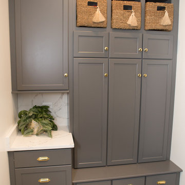
Relocating the garage entry to the new mudroom was a huge priority and has finally separated the family’s arriving home functions from their kitchen. Now coats and shoes and bags have their own area for dropping once members arrive home. Matching gray DuraSupreme cabinetry helped create gorgeous, purposeful lockers for the family. A reclaimed vintage sink and custom wall paper were added to the tiny powder room to beautify the once previously only functional space. Advance Design was even able to create a custom space for their dog to sleep while the family is away.
“It was unbelievable that a project of this size was completed in such a short time, and I think that’s because of the large amount of planning and preparation that went into it,” Jennifer marveled, “When we started, we were ready, and everything was prepared”.
When it came to execution, Project Manager Justin Davis and his crew were quick, accessible, and organized. Projects like this kitchen are typically completed in as little as 8-10 weeks. Jennifer’s kitchen however despite the relocation of some challenging HVAC in a soffit and moving of an exterior door was completed remarkably fast in part because the team was working with an existing tile floor that ran throughout the first floor that the client really loved.
“You get to know these people really well because they’re living in your house while you’re living in your house. They were so fast and really good, it didn’t take as long as even planned” reported Jennifer. “I would text Justin and he always responded almost immediately. I got to know all the guys who were working in our house and they were all wonderful people”.
Details in a customized kitchen like this one require skill and care from the people who install it. “All the guys on the job were skilled at what the did. I wanted small details like little feet to look like furniture, that is where their carpentry skill came in to make these all perfect”, said Jennifer. “The tile guys were wonderful. They even let me determine how I wanted the texture with the grout to appear for a salt and pepper look; now that is a very skilled trade person making it custom”.
In Jennifer’s interview, she continued to reference Advance Design’s “Common Sense Remodeling”, so I took a minute to ask her exactly what that phrase meant to her and how it played out in her experience with her project and the Advance Design team. Here is what she said: “I was intrigued about Common Sense Remodeling and in my head that there would be clear costs and prices, great communication between the design team, the execution team and me”, said Jennifer. They did deliver on that, it was so clear about the cost breakdown, what I could expect from everyone who came to my house, and everything that we had ordered. That to me is the Common Sense”!
It’s great to see a client take literally our assertion that a well-planned remodeling project is simply “Common Sense”! She anticipated each step of the way would be clear, concise, and predictable, all the while protecting the outcome due to the careful upfront planning. “Advance Design delivered on their ‘Common Sense Remodeling’ promise,” Jennifer said. “From the design team, to the execution team - everything was straight forward like I imagined. The project turned out exactly how I envisioned, I enjoyed this process and absolutely would recommend Advance Design Studio to anyone.”
 FineLine Kitchens, Inc.
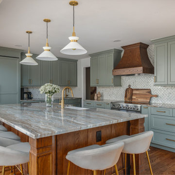
Hi everyone, I'm Sarah and Ogun we are here with fine line kitchens. So we are a couple working together. I do the interior design and remodeling of the space material selection meeting with the clients. And I handled operations outside, you know meaning all the construction work that is taking place the inside. The houses that we work in. I handle all the aspects of the construction, so today's project is very special. We're in Vienna and the client had a very big family. It's a family of seven that lives here. So we had a few aspects that we needed to keep in mind while designing this one. Having everybody be able to sit on the island. So we wanted plenty of seating all the way around. We didn't want anybody standing or anything like that. So what we did is we maximize the space. The center island is the biggest part of the kitchen. We use a natural stone to kind of give it a beautiful texture versus quartz. It's kind of standard white or kind of fabricated, so I wanted something very natural. We did this because I took my inspiration from the outside, so the inspiration if you look at the view right in front of me is there are so many greens there's a lot of brass accents and I wanted to bring this. Into this kitchen while designing it for my clients. She is very warm very. She wanted a very homey, comfy kind of look for the kitchen. So that's what we did today. As you can see, the cabinets are sage green, very light, so I still think it's a neutral, but it's a lighter color that again brings the outside in and we combine that with the oak right behind me so it's a slightly warm oak. It's not very dark. It's not very light. It's a medium brown and the same color went on the island. To kind of tie these two in and the backsplash, my favorite part is where you can see a little bit of design. It is, in my opinion still classic, but includes a pattern so the outside part is as we said in the beginning, is handled by my husband. I'd like him to speak a little bit about that. Thanks, Sarah, I want to talk to you guys a little bit about the construction part of this project. Originally this kitchen was located mostly in this area. They had their stove there sing. It was more of a peninsula layout in Sarah's and the customer vision they wanted. They wanted to get rid of the peninsula and they want to be able to have a huge island that can at least sit seven people because they're familiar with seven. So we wanted to make sure that we can achieve this design and bring it to life so that they can be happy with this layout. Some of the challenges we had, the house, the home being, you know, old home. There were a lot of you know the older electrical and plumbing that had to be replaced. We had to relocate the stove from here to this area. Over here we had put a nice foot fan that we had to relocate all the ductwork and the plumbing. Was being on the peninsula area. We had to relocate it to the center islands. So we achieved all this and kind of like bring it to bring in this kitchen up to date it looks beautiful. That's true, so yes, the old layout did not function for my clients because everything was kind of gathered on one side of the kitchen. So there was like a peninsula right there. So the end of this island kind of continued straight. And that was just the L shape. Kind of where everything was and there used to be another big table here, so they were using only kind of half of the space. So like I said at the beginning, our vision was to kind of feed everybody at the island, create some symmetry. 'cause I love that. So as you can see behind me, this is kind of the focal point symmetrical. Everything is kind of even we wanted to also panel the fridge here so it mimics the pantry and another size. So when you're looking at it, it is bringing again that symmetry back again. I hope you enjoyed this kitchen and this video and I'll see you soon. So how do you think this project turned out? It's nice. I like the color. I think it turned out nice. It's kind of like a little bit different color than what we always do. So I realize. Are you giving me a little bit of credit here that I did something different? Are you proud? I'm so proud of you. Other than that I like it. That they have kind of like a two sink. So if this was our kitchen, if we ever like you can have your own. I can have mine if we ever get into a fight then this can be like my own kitchen. Why are we gonna bring in a fight right now? So I'm cooking anyway. You're grilling most of the time, So what are you even talking about? My kitchen? That's my kitchen. You can just take the small sink. That's fine. It's always good to have your own space right there, so anyways. Thank you guys for watching. We hope to see you soon and if you have any questions please click the link below. It'll lead you to our website, house, YouTube and all of the social media is so nice to have you guys. We'll see you soon. Thanks bye bye-bye.
Find the right local pro for your project

 Live your home - Interior Design
First own apartment
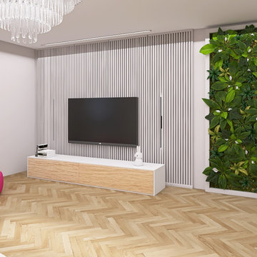
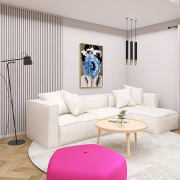
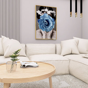
In this interior design project, we focused on a 2-bedroom apartment. It was the client's first own apartment as she recently moved to Vienna. She desired a feminine and minimalist interior design that was far from boring. Since it was a rental apartment, certain elements were predetermined, and we aimed to create a design that could easily be taken along in case of a move. For example, we incorporated natural white acoustic panels as accents behind the sofa and TV, providing texture without introducing color into the space.
We drew inspiration from the Pantone Color of the Year 2023, "Viva Magenta," for the accent color. Thus, we chose dining chairs and a pouf in shades from this color palette.
The kitchenette remained unchanged, but we added a beautiful floral wallpaper as an accent to the backsplash. However, the highlight of the design is undoubtedly the living plant wall. It creates a green focal point in the middle of the room. We decided against adding more plants since our client is often away for days, and regular care couldn't be guaranteed. The living wall requires less maintenance and is more manageable in this regard.
----
Erste eigene Wohnung in Wien
In diesem Einrichtungsprojekte ging es um eine 2-Zimmer-Wohnung. Es ist die erste eigene Wohnung der Kundin, die eben nach Wien gezogen ist. Sie wünschte sich ein feminines, schlichtes, jedoch nicht langweiliges Interiordesign. Da es sich um eine Mietwohnung handelt, waren einige Dinge gegeben und wir haben uns bemüht, alles so zu gestalten, dass es bei einem Umzug leicht mitgenommen werden kann. Wie z.B. die naturweißen Akustikpaneele, die als Akzent hinter dem Sofa sowie hinter dem TV angebracht wurden. Diese bieten Struktur, ohne Farbe in den Raum zu bringen.
Bei der Akzentfarbe wollten wir uns nämlich von der Pantone-Farbe 2023 “Viva Magenta” inspirieren lassen und haben somit die Esszimmer-Stühle sowie den Pouf farblich aus dieser Palette gewählt.
Die Küchenzeile blieb unverändert, jedoch haben wir der Rückwand mit einer hübschen Blüten-Tapete einen Akzent verliehen. Wahrscheinlich aber DAS Highlight ist die lebende Pflanzenwand. Diese bietet einen grünen Blickpunkt mitten im Raum. Auf weitere Pflanzen wurde verzichtet, da unsere Kunden oft tagelang nicht zuhause ist und die Pflege daher nicht garantiert wäre. Diese “Living wall” ist da weniger anspruchsvoll.
 Fernando Wong Outdoor Living Design
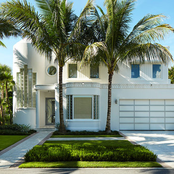
Example of a trendy white two-story stucco flat roof design in Miami


Sponsored
Sunbury, OH

J.Holderby - Renovations
Franklin County's Leading General Contractors - 2X Best of Houzz!
 Studio Dearborn
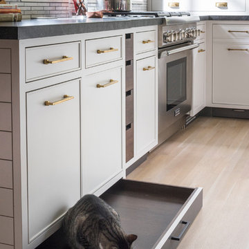
INTERNATIONAL AWARD WINNER. 2018 NKBA Design Competition Best Overall Kitchen. 2018 TIDA International USA Kitchen of the Year. 2018 Best Traditional Kitchen - Westchester Home Magazine design awards. The designer's own kitchen was gutted and renovated in 2017, with a focus on classic materials and thoughtful storage. The 1920s craftsman home has been in the family since 1940, and every effort was made to keep finishes and details true to the original construction. For sources, please see the website at www.studiodearborn.com. Photography, Adam Kane Macchia
 Live your home - Interior Design
First own apartment
In this interior design project, we focused on a 2-bedroom apartment. It was the client's first own apartment as she recently moved to Vienna. She desired a feminine and minimalist interior design that was far from boring. Since it was a rental apartment, certain elements were predetermined, and we aimed to create a design that could easily be taken along in case of a move. For example, we incorporated natural white acoustic panels as accents behind the sofa and TV, providing texture without introducing color into the space.
We drew inspiration from the Pantone Color of the Year 2023, "Viva Magenta," for the accent color. Thus, we chose dining chairs and a pouf in shades from this color palette.
The kitchenette remained unchanged, but we added a beautiful floral wallpaper as an accent to the backsplash. However, the highlight of the design is undoubtedly the living plant wall. It creates a green focal point in the middle of the room. We decided against adding more plants since our client is often away for days, and regular care couldn't be guaranteed. The living wall requires less maintenance and is more manageable in this regard.
----
Erste eigene Wohnung in Wien
In diesem Einrichtungsprojekte ging es um eine 2-Zimmer-Wohnung. Es ist die erste eigene Wohnung der Kundin, die eben nach Wien gezogen ist. Sie wünschte sich ein feminines, schlichtes, jedoch nicht langweiliges Interiordesign. Da es sich um eine Mietwohnung handelt, waren einige Dinge gegeben und wir haben uns bemüht, alles so zu gestalten, dass es bei einem Umzug leicht mitgenommen werden kann. Wie z.B. die naturweißen Akustikpaneele, die als Akzent hinter dem Sofa sowie hinter dem TV angebracht wurden. Diese bieten Struktur, ohne Farbe in den Raum zu bringen.
Bei der Akzentfarbe wollten wir uns nämlich von der Pantone-Farbe 2023 “Viva Magenta” inspirieren lassen und haben somit die Esszimmer-Stühle sowie den Pouf farblich aus dieser Palette gewählt.
Die Küchenzeile blieb unverändert, jedoch haben wir der Rückwand mit einer hübschen Blüten-Tapete einen Akzent verliehen. Wahrscheinlich aber DAS Highlight ist die lebende Pflanzenwand. Diese bietet einen grünen Blickpunkt mitten im Raum. Auf weitere Pflanzen wurde verzichtet, da unsere Kunden oft tagelang nicht zuhause ist und die Pflege daher nicht garantiert wäre. Diese “Living wall” ist da weniger anspruchsvoll.
 User
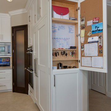
UserTraditional but unusually shaped kitchen with a white painted cabinets, seapearl quartzite countertops, tradewinds tint mosaic backsplash, paneled appliances, dark wood island with hidden outlets. Featuring a flat panel TV in the backsplash for your viewing pleasure while cooking for your family. This great kitchen is adjacent to an amazing outdoor living space with multiple living spaces and an outdoor pool.
Traditional but unusually shaped kitchen with a white painted cabinets, seapearl quartzite countertops, tradewinds tint mosaic backsplash, paneled appliances, dark wood island with hidden outlets. Featuring a flat panel TV in the backsplash for your viewing pleasure while cooking for your family. This great kitchen is adjacent to an amazing outdoor living space with multiple living spaces and an outdoor pool.
Photos by Jon Upson

 Live your home - Interior Design
First own apartment
In this interior design project, we focused on a 2-bedroom apartment. It was the client's first own apartment as she recently moved to Vienna. She desired a feminine and minimalist interior design that was far from boring. Since it was a rental apartment, certain elements were predetermined, and we aimed to create a design that could easily be taken along in case of a move. For example, we incorporated natural white acoustic panels as accents behind the sofa and TV, providing texture without introducing color into the space.
We drew inspiration from the Pantone Color of the Year 2023, "Viva Magenta," for the accent color. Thus, we chose dining chairs and a pouf in shades from this color palette.
The kitchenette remained unchanged, but we added a beautiful floral wallpaper as an accent to the backsplash. However, the highlight of the design is undoubtedly the living plant wall. It creates a green focal point in the middle of the room. We decided against adding more plants since our client is often away for days, and regular care couldn't be guaranteed. The living wall requires less maintenance and is more manageable in this regard.
----
Erste eigene Wohnung in Wien
In diesem Einrichtungsprojekte ging es um eine 2-Zimmer-Wohnung. Es ist die erste eigene Wohnung der Kundin, die eben nach Wien gezogen ist. Sie wünschte sich ein feminines, schlichtes, jedoch nicht langweiliges Interiordesign. Da es sich um eine Mietwohnung handelt, waren einige Dinge gegeben und wir haben uns bemüht, alles so zu gestalten, dass es bei einem Umzug leicht mitgenommen werden kann. Wie z.B. die naturweißen Akustikpaneele, die als Akzent hinter dem Sofa sowie hinter dem TV angebracht wurden. Diese bieten Struktur, ohne Farbe in den Raum zu bringen.
Bei der Akzentfarbe wollten wir uns nämlich von der Pantone-Farbe 2023 “Viva Magenta” inspirieren lassen und haben somit die Esszimmer-Stühle sowie den Pouf farblich aus dieser Palette gewählt.
Die Küchenzeile blieb unverändert, jedoch haben wir der Rückwand mit einer hübschen Blüten-Tapete einen Akzent verliehen. Wahrscheinlich aber DAS Highlight ist die lebende Pflanzenwand. Diese bietet einen grünen Blickpunkt mitten im Raum. Auf weitere Pflanzen wurde verzichtet, da unsere Kunden oft tagelang nicht zuhause ist und die Pflege daher nicht garantiert wäre. Diese “Living wall” ist da weniger anspruchsvoll.
 Design Studio West
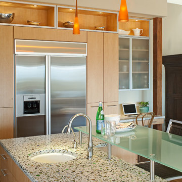
 It took some time, but our clients saved enough of their wine and beverage bottles to create a truly unique countertop. It's not only beautiful, but it's full of memories, and a wonderful way to conserve to environment.
By Design Studio West

Sponsored
Sunbury, OH
J.Holderby - Renovations
Franklin County's Leading General Contractors - 2X Best of Houzz!
 Live your home - Interior Design
First own apartment
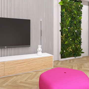
In this interior design project, we focused on a 2-bedroom apartment. It was the client's first own apartment as she recently moved to Vienna. She desired a feminine and minimalist interior design that was far from boring. Since it was a rental apartment, certain elements were predetermined, and we aimed to create a design that could easily be taken along in case of a move. For example, we incorporated natural white acoustic panels as accents behind the sofa and TV, providing texture without introducing color into the space.
We drew inspiration from the Pantone Color of the Year 2023, "Viva Magenta," for the accent color. Thus, we chose dining chairs and a pouf in shades from this color palette.
The kitchenette remained unchanged, but we added a beautiful floral wallpaper as an accent to the backsplash. However, the highlight of the design is undoubtedly the living plant wall. It creates a green focal point in the middle of the room. We decided against adding more plants since our client is often away for days, and regular care couldn't be guaranteed. The living wall requires less maintenance and is more manageable in this regard.
----
Erste eigene Wohnung in Wien
In diesem Einrichtungsprojekte ging es um eine 2-Zimmer-Wohnung. Es ist die erste eigene Wohnung der Kundin, die eben nach Wien gezogen ist. Sie wünschte sich ein feminines, schlichtes, jedoch nicht langweiliges Interiordesign. Da es sich um eine Mietwohnung handelt, waren einige Dinge gegeben und wir haben uns bemüht, alles so zu gestalten, dass es bei einem Umzug leicht mitgenommen werden kann. Wie z.B. die naturweißen Akustikpaneele, die als Akzent hinter dem Sofa sowie hinter dem TV angebracht wurden. Diese bieten Struktur, ohne Farbe in den Raum zu bringen.
Bei der Akzentfarbe wollten wir uns nämlich von der Pantone-Farbe 2023 “Viva Magenta” inspirieren lassen und haben somit die Esszimmer-Stühle sowie den Pouf farblich aus dieser Palette gewählt.
Die Küchenzeile blieb unverändert, jedoch haben wir der Rückwand mit einer hübschen Blüten-Tapete einen Akzent verliehen. Wahrscheinlich aber DAS Highlight ist die lebende Pflanzenwand. Diese bietet einen grünen Blickpunkt mitten im Raum. Auf weitere Pflanzen wurde verzichtet, da unsere Kunden oft tagelang nicht zuhause ist und die Pflege daher nicht garantiert wäre. Diese “Living wall” ist da weniger anspruchsvoll.





14