
Search results for "Traffic flow" in Home Design Ideas
 User
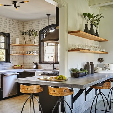
UserInspiration for a mid-sized industrial u-shaped light wood floor and beige floor enclosed kitchen remodel in New York with a farmhouse sink, black cabinets, concrete countertops, white backsplash, subway tile backsplash, stainless steel appliances, no island and flat-panel cabinets
 Moss Design
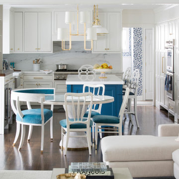
Example of a mid-sized transitional brown floor great room design in New York with white walls
 Bevan + Associates
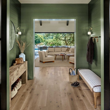
Entryway - cottage light wood floor and beige floor entryway idea in San Francisco with green walls and a black front door
Find the right local pro for your project

 Block Brothers Custom Cabinets
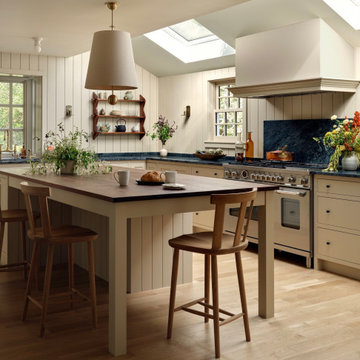
Inspiration for a timeless l-shaped light wood floor and beige floor kitchen remodel in Portland Maine with flat-panel cabinets, beige cabinets, stainless steel appliances, an island and black countertops

 Alana Spears Home, LLC
This modern organic kitchen blends rift white oak cabinetry with warm white uppers and a spacious island topped in quartz. Woven rattan counter stools introduce natural texture, while black dome pendants add bold contrast. A vertical picket marble backsplash and brass fixtures complete the light-filled, inviting space.
 Landis Architects | Builders
Greg Hadley Photography
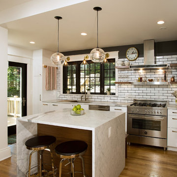
The clients opted to use Ikea glossy white cabinets. Our crew assembled and installed the cabinetry on site. To provide an organic accent, we included walnut doors and open shelves. These pieces were purchased from a company that builds real wood veneer doors that fit over Ikea cabinet boxes. The island is sized to fit the space and provide adequate clearances around it for good traffic flow. The client requested the waterfall feature. The stone tops in the kitchen are Calacatta. Brass lamps above the sink (the original trim around the window was narrower, but once the client found these fixtures, we widened the trim to accommodate the lights.) Glass globe pendants. Brass lamp over built-in table. Glazed white brick subway backsplash tile.
Black painted Pella window and door.


 Bridgewater
The new owners were looking forward to living in their new home with an open floor plan, tall vaulted ceilings, and great views. It featured a large Great Room with two big French Doors separating the Dining Room from the Master Bedroom.
But after only a few months they identified a major design flaw: Each of the French Doors had ten glass windows with two large windows above each door. (Check out our before and after designs, traffic flow diagrams and photos of this project.) Glass windows and doors allowed sound and light from guests or the TV in the great room to easily sneak into the bedroom. With unique work and sleep schedules (he’s a pilot, she’s a registered nurse) this design wasn’t working.
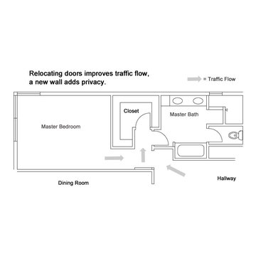
Then there was a traffic flow design flaw: The Master Bedroom had a second entrance from a hallway. To get into the bedroom from the hallway you needed to walk down another claustrophobic hallway.
To get from the Master Bedroom to the Master Bath begin at the most remote corner of the bedroom and down a hallway between two closets. Once inside the bath, a huge triangular Jacuzzi dominating the space.
So, from a privacy and traffic flow perspective, this home had some major design issues.
When Craig Weber first met with the owners, he listened to their ideas and concerns. The owners trusted Craig to come up with the most efficient and most effective solution to this design dilemma. He offered a solution that resolved the bed-bath traffic flow problem, offered some bedroom room privacy, and updated the bath.
First, the two French Doors and windows were removed. A new wall was built with sound-absorbing materials, making the Great Room and Dining Room more comfortable spaces for entertaining while creating the bedroom privacy the owners craved.
Solving the Bedroom/Bath traffic flow problem began with removing the two existing closets. The bath door was relocated next to the hall entrance, and then a new walk-in closet was added adjacent to the hallway entrance. The solution offered easy access to and from the bath, closet and hallway without a hint of claustrophobia.
The Master Bath underwent a major transformation designed for convenience and comfort – especially during long, cold Minnesota winters.
Most everything from the former bath was torn out, beginning with the giant Jacuzzi.
A new bathtub that is wider and deeper than the standard size was installed with brushed Nickel fixtures. It’s the perfect place to relax with a glass of wine and candles.
Warm floors are a Minnesota “must have.” The bath’s new ceramic floor features in-floor electric heat. Getting in and out of the tub is easy and comfortable.
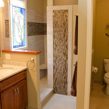
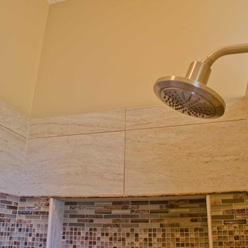
The new walk-in shower again features in-floor heating and a place to sit. The most interesting feature of this shower may the custom ceramic tile installed with unique patterns.
A new vanity Cambria Bradshaw countertops features two under-hung ceramic sinks with matching brushed Nickel fixtures.
Tall ceilings and three glass windows near the ceiling flood the room with natural light. A new energy-efficient window frames an ornamental stained glass window created by the owner’s father – a great personal touch.
A quiet place to sleep. A private dining room for entertaining. A Master Bath to die for. And easy traffic flow. The owners couldn’t have been more delighted with the outcome. And Lilly, their cat, loves it too.
 O'Neil Builders
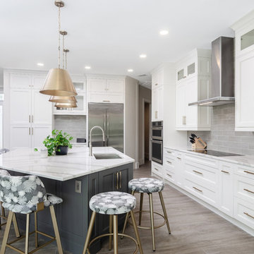
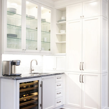
Kitchen - transitional l-shaped gray floor kitchen idea in Miami with an undermount sink, recessed-panel cabinets, white cabinets, gray backsplash, subway tile backsplash, stainless steel appliances, an island and white countertops
 Anderson Nikolich Design Initiative
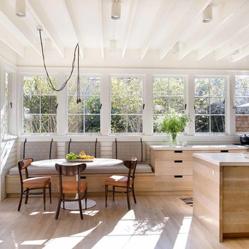
Inspiration for a scandinavian light wood floor and beige floor eat-in kitchen remodel in Birmingham with flat-panel cabinets, light wood cabinets, stainless steel appliances, an island and white countertops
 Northland Design & Build
Portland Metro's Design and Build Firm | Photo Credit: Shawn St. Peter
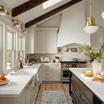
Example of a large classic l-shaped medium tone wood floor eat-in kitchen design in Portland with an undermount sink, white cabinets, granite countertops, gray backsplash, stainless steel appliances, glass-front cabinets, an island and stone tile backsplash
Example of a large classic l-shaped medium tone wood floor eat-in kitchen design in Portland with an undermount sink, white cabinets, granite countertops, gray backsplash, stainless steel appliances, glass-front cabinets, an island and stone tile backsplash

 H2D Architecture + Design
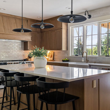
The kitchen in this custom home designed by H2D Architecture + Design blends refined detailing with everyday functionality. A large central island anchors the space, offering generous room for meal preparation, casual dining, and gathering. White stainless appliances provide a sleek, contemporary touch, complemented by a built-in, panel-ready refrigerator that maintains the kitchen’s seamless aesthetic. The hood, wrapped in matching cabinetry material, creates a cohesive focal point while subtle detailing in the pendants above the island adds warmth and visual interest. Expansive windows overlook the private wooded yard, filling the kitchen with natural light and connecting the heart of the home to its serene surroundings.
+ Architecture: H2D Architecture + Design
+ Interior Design: H2D Architecture + Design
www.h2darchitects.com
+ Built by: Rainier Custom Homes
+ Photography: Anastasiya Homes
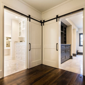


 Twelve Stones Designs, LLC
The owners of this kitchen had spent the money to upgrade the finishes in their kitchen upon building the home 12 years ago, but after living in the space for several years they realized how nonfunctional the layout really was. The (then) two preschool aged children had grown into busy, hungry teenagers with many friends who also liked to hang out at the house. So the family needed a more functional kitchen with better traffic flow, space for daily activities revolving around the kitchen at different times of day, and a kitchen that could accommodate cooking for and serving large groups. Furthermore, the dark, traditional finishes no longer reflected the homeowners’ style. They requested a brighter, more relaxed, coastal style that reflected their love of the seaside cities they like to visit.
Originally, the kitchen was U-shaped with a narrow island in the middle. The island created narrow aisles that bottle-necked at the dishwasher, refrigerator, and cooktop areas. There was a pass-through from the foyer into the kitchen, but the owners never liked that the pass-through was also located so close to the powder room. The awkward proximity was unappealing and made guests feel uncomfortable.
The kitchen’s storage was made up of lots of narrow cabinets, apothecary drawers, clipped corner units, and very few drawers. It lacked useful storage for the larger items the family used on a daily basis. And the kitchen’s only pantry was small closet that had only builder-grade, narrow shelving with no illumination to be able to see the contents inside.
Overall, the kitchen’s lighting plan was poorly executed. Only six recessed cans illuminated the entire kitchen and nook areas. The under cabinet lighting was not evenly distributed either. In fact, the builder had mis-placed the under cabinet lighting around the decorative pilasters which made for choppy, dark cubbies. Further, the builder didn’t include any lighting over the sink or the bar area, which meant whoever was doing the dishes was always in their own shadow. That, coupled with the steep overhang of the game room above made the bar area feel like a dim, cavernous space that wasn’t inviting or task oriented. The kitchen looked out into the main living space, but the raised bar and a narrow wall (which held the only large cabinet in the kitchen) created more of a barrier than a relationship to the living room or breakfast nook. In fact, one couldn’t even see the breakfast nook from the cooktop or sink areas due to its orientation. The raised bar top was too narrow to comfortably sit to either dine at or chat from due to the lack of knee space. The the homeowners confided that the kitchen felt more like a dark, dirty prison than place where the family, or their guests, wanted to gather and commune.
The clients' needs and desires were:
➢ to create a kitchen that would be a space the family loved to be in; to relate to the adjacent spaces all around, and to have better flow for entertaining large groups
➢ to remove the walls between the breakfast nook and living area and to be able to utilize the natural light from the windows in both those areas
➢ to incorporate a functional chopping block for prepping fresh food for home cooked meals, an island with a large sink and drain board, 2 pull out trash cans, and seating for at least the 2 teens to eat or do homework
➢ to design a kitchen and breakfast nook with an airy, coastal, relaxed vibe that blended with the rest of the house's coastal theme
➢ to integrate a layered lighting plan which would include ample general illumination, specific task lighting, decorative lighting, and lots of illuminated storage
➢ to design a kitchen with not only more storage for all the husband’s kitchen gadgets and collection of oils and spices, but smart storage, including a coffee/breakfast bar and a place to store and conceal the toaster oven and microwave
➢ to find a way to utilize the large open space between the kitchen, pantry area, and breakfast nook
Twelve Stones Designs achieved the owner's goals by:
➢ removing the walls between the kitchen and living room to allow the natural light to filter in from the adjacent rooms and to create a connection between the kitchen, nook, and living spaces for a sense of unity and communion
➢ removing the existing pantry and designing 3 large pantry style cabinets with LED tape lights and rollout drawers to house lots of kitchen appliances, gadgets, and tons of groceries. We also took the cabinets all the way up to the 9’ ceiling for additional storage for seasonal items and bulk storage.
➢ designing 2 islands - 1 with a gorgeous black walnut chopping block that houses a drawer for chopping and carving knives and a custom double pull out trash unit for point of use utilization - and 1 that houses the dishwasher, a large Blanco Gourmet sink with integrated drain board, woven baskets for fresh root vegetables and kitchen towels, plenty of drawer storage for kitchen items, and bar seating for up to 4 diners.
➢ closing off the space between the kitchen and the powder room to create a beautiful new private alcove for the powder room as well as adding some decorative storage. This also gave us space to include more tall storage near the new range for precision placement of the husband’s extensive oil and spice collection as well as a location for a combo-steam oven the wife wanted for baking and cooking healthy meals.
The project is enhanced functionally by:
➢ incorporated USB and standard receptacles for the kids’ laptops and phone charging in the large island
➢ designing the small island to include additional open shelving for items used on a daily basis such as a variety of bowls, plates, and colanders. This set up also works well for the husband who prefers to “plate” his dinners in restaurant-style fashion before presenting them to the table.
➢ the integration of specific storage units, such as double stacked cutlery drawers, a custom spice pull-out, a Kuerig coffee and tea pod drawer, and custom double stacked utensil drawers
➢ moving the refrigerator to the old oven location - this eliminated the bottle neck as well as created a better relationship to the eating table. It also utilizes the floor space between the pantry, nook, and kitchen
➢ creating a banquet style breakfast nook - this banquette seating not only doubles the amount of seating for large gatherings but it better utilizes the odd space between the kitchen and the previous nook area. It also helps to create a distinct pathway from the mudroom room through the pantry area, kitchen, nook, and living room.
➢ the coffee/breakfast bar area which includes the perfect location for the concealed microwave and toaster oven, convenient storage for the coffee pods and tea accoutrements. Roll-out drawers below also house the smoothie maker, hot water kettle, and a plethora of smoothie-making ingredients such as protein powders, smoothie additives, etc. Furthermore, the drawers below the Keurig house measuring utensil, cutlery, baking supplies and tupperware storage.
➢ incorporating lots of wide drawers and pullouts to accommodate large cookware.
➢ utilizing as much vertical space as possible by building storage to the ceiling which accommodates the family’s abundant amount of serving platters, baking sheets, bakeware, casserole dishes, and additional cutting boards.
The project is enhanced aesthetically by:
➢ new 5-piece Versailles pattern porcelain tile that now seamlessly joins the entire down stairs area together creating a bright, cohesiveness feeling instead of choppy separated spaces - it also adds a coastal feeling
➢ designing a cabinet to conceal the microwave and toaster oven
➢ the coastal influenced light fixtures over the nook table and island
➢ the sandy colors of the Langdon Cambria countertops. The swirling pattern and sparkling quartz pieces remind the homeowner of black-and-tan sandy beaches
➢ the striped banquet seating whose creamy white background and blue-green stripes were the inspiration for the cabinet and wall colors.
➢ All the interior doors were painted black to coordinate with the blacks and grays in the backsplash tile and countertop. This also adds a hint of tailored formality to an otherwise casual space.
➢ the use of WAC's Oculux small aperture LED units for the overhead lighting complimented with Diode LED strips for task lighting under the cabinets and inside the pantry and glass wall cabinets. All of the lighting applications are on separate dimmer switches.
Innovative uses of materials or construction methods by Realty Restoration LLC:
➢ Each 1-1/2” x 3” block of reclaimed end-grain black walnut that makes up the center island chopping block was hand milled and built in the shop. It was designed to look substantial and proportional to the surrounding elements, executed by creating the 4 inch tall top with a solid wood chamfered edge band.
➢ The metal doors on either side of the vent hood were also custom designed for this project and built in the Realty Restoration LLC shop. They are made 1x2, 11-gauge mild steel with ribbed glass. Weighing 60 lbs a piece, heavy duty cabinet hinges were added to support the weight of the door and keep them from sagging.
➢ Under-cabinet receptacles were added along the range wall in order to have a clean, uninterrupted backsplash.
Design obstacles to overcome:
➢ Because we were removing the demising walls between the kitchen and living room, we had to find a way to plumb and vent the new island. We did this by tunneling through the slab (the slab had post tension cables which prevented us from just trenching) to run a new wet vent through a nearby structural wall. We pulled the existing hot and cold lines between upper floor joists and ran them down the structural wall as well and up through a conduit in the tunnel.
➢ Since we were converting from wall overs to a gas range it allowed us to utilize the 220 feed for the wall ovens to provide a new sub panel for all the new kitchen circuits
➢ Due to framing deficiencies inherited from the original build there was a 1-1/2” differential in the floor-to-ceiling height over a 20 foot span; by utilizing the process of cutting and furring coupled with the crown moulding details on the cabinet elevations we were able to mask the problem and provide seamless transitions between the cabinet components.
Evidence of superior craftsmanship:
➢ uniquely designed, one-of-a-kind metal “X” end panels on the large island. The end panels were custom made in the Realty Restoration LLC shop and fitted to the exact dimensions of the island. The welding seams are completely indistinguishable - the posts look like they are cut from a single sheet of metal
➢ square metal posts on the small island were also custom made and designed to compliment and carry through the metal element s throughout the kitchen
➢ the beautiful, oversized end panels on the pantry cabinets which give the breakfast nook a tailored look
➢ integrating a large format 5 piece Versailles tile pattern to seamlessly flow from the existing spaces into the new kitchen space
➢ By constructing a custom cabinet that jogged around a corner we could not remodel (housing the entry way coat closet) we were able to camouflage the adjacent wall offset within the upper and lower cabinets. By designing around the existing jog in the structural walls we accomplished a few things: we were able to find the space to house, and hide, the microwave and toaster oven yet still have a clean cohesive appearance from the kitchen side. Additionally, the owners were able to keep their much needed coat closet and we didn’t have to increase the budget with unnecessary structural work.
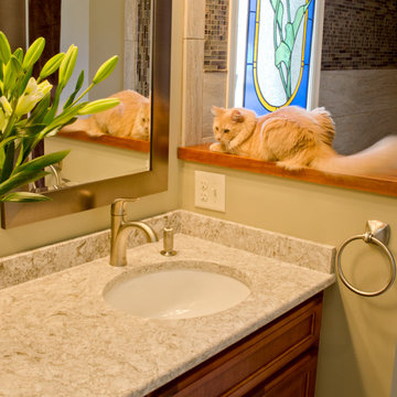 Bridgewater
The new owners were looking forward to living in their new home with an open floor plan, tall vaulted ceilings, and great views. It featured a large Great Room with two big French Doors separating the Dining Room from the Master Bedroom.
But after only a few months they identified a major design flaw: Each of the French Doors had ten glass windows with two large windows above each door. (Check out our before and after designs, traffic flow diagrams and photos of this project.) Glass windows and doors allowed sound and light from guests or the TV in the great room to easily sneak into the bedroom. With unique work and sleep schedules (he’s a pilot, she’s a registered nurse) this design wasn’t working.
Then there was a traffic flow design flaw: The Master Bedroom had a second entrance from a hallway. To get into the bedroom from the hallway you needed to walk down another claustrophobic hallway.
To get from the Master Bedroom to the Master Bath begin at the most remote corner of the bedroom and down a hallway between two closets. Once inside the bath, a huge triangular Jacuzzi dominating the space.
So, from a privacy and traffic flow perspective, this home had some major design issues.
When Craig Weber first met with the owners, he listened to their ideas and concerns. The owners trusted Craig to come up with the most efficient and most effective solution to this design dilemma. He offered a solution that resolved the bed-bath traffic flow problem, offered some bedroom room privacy, and updated the bath.
First, the two French Doors and windows were removed. A new wall was built with sound-absorbing materials, making the Great Room and Dining Room more comfortable spaces for entertaining while creating the bedroom privacy the owners craved.
Solving the Bedroom/Bath traffic flow problem began with removing the two existing closets. The bath door was relocated next to the hall entrance, and then a new walk-in closet was added adjacent to the hallway entrance. The solution offered easy access to and from the bath, closet and hallway without a hint of claustrophobia.
The Master Bath underwent a major transformation designed for convenience and comfort – especially during long, cold Minnesota winters.
Most everything from the former bath was torn out, beginning with the giant Jacuzzi.
A new bathtub that is wider and deeper than the standard size was installed with brushed Nickel fixtures. It’s the perfect place to relax with a glass of wine and candles.
Warm floors are a Minnesota “must have.” The bath’s new ceramic floor features in-floor electric heat. Getting in and out of the tub is easy and comfortable.
The new walk-in shower again features in-floor heating and a place to sit. The most interesting feature of this shower may the custom ceramic tile installed with unique patterns.
A new vanity Cambria Bradshaw countertops features two under-hung ceramic sinks with matching brushed Nickel fixtures.
Tall ceilings and three glass windows near the ceiling flood the room with natural light. A new energy-efficient window frames an ornamental stained glass window created by the owner’s father – a great personal touch.
A quiet place to sleep. A private dining room for entertaining. A Master Bath to die for. And easy traffic flow. The owners couldn’t have been more delighted with the outcome. And Lilly, their cat, loves it too.
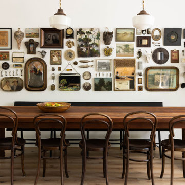
 Stripe Design Services
The front elevation of this house consists of the original 1910 farmhouse. The rest of the house had been augmented incrementally over time and the roofline beyond the original structure had become convoluted and the flanking elevations nonsensical. The current owners preserved the original 1910 farmhouse portion of the home and took the rest of the structure down to the foundation. A simple modern black barn was designed to run perpendicular with the old farmhouse structure and painted black in stark contrast to its old, white counterpart. Siding runs vertically on the new section as opposed to the horizontal shiplapped siding on the old. The new structure houses the kitchen with 12’ cathedral ceilings, a pantry / mudroom and a study.
The kitchen boasts a 1930’s island reclaimed from a commercial bakery and pendant lights from an old schoolhouse in Ohio as its nucleus, against a quiet backdrop of black stained oak cabinetry. Gently veined quartzite slabs serve as countertop, backsplash and wrap the stove hood to accentuate the ceiling height.
The interior design of this home is a carefully balanced alchemy of antiquity and modernity. It has an overriding monochromatic theme with layers of pattern and texture for depth. The color interest is derived from the lush outside landscape, with the exception of their daughter’s bedroom which is a tasteful symphony of pink, landed by a hand painted mural.
The theme of the home is framed around comfortable family living against curated backdrops of beloved collected items. The living room boasts no less than nineteen vintage crystal
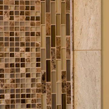 Bridgewater
The new owners were looking forward to living in their new home with an open floor plan, tall vaulted ceilings, and great views. It featured a large Great Room with two big French Doors separating the Dining Room from the Master Bedroom.
But after only a few months they identified a major design flaw: Each of the French Doors had ten glass windows with two large windows above each door. (Check out our before and after designs, traffic flow diagrams and photos of this project.) Glass windows and doors allowed sound and light from guests or the TV in the great room to easily sneak into the bedroom. With unique work and sleep schedules (he’s a pilot, she’s a registered nurse) this design wasn’t working.
Then there was a traffic flow design flaw: The Master Bedroom had a second entrance from a hallway. To get into the bedroom from the hallway you needed to walk down another claustrophobic hallway.
To get from the Master Bedroom to the Master Bath begin at the most remote corner of the bedroom and down a hallway between two closets. Once inside the bath, a huge triangular Jacuzzi dominating the space.
So, from a privacy and traffic flow perspective, this home had some major design issues.
When Craig Weber first met with the owners, he listened to their ideas and concerns. The owners trusted Craig to come up with the most efficient and most effective solution to this design dilemma. He offered a solution that resolved the bed-bath traffic flow problem, offered some bedroom room privacy, and updated the bath.
First, the two French Doors and windows were removed. A new wall was built with sound-absorbing materials, making the Great Room and Dining Room more comfortable spaces for entertaining while creating the bedroom privacy the owners craved.
Solving the Bedroom/Bath traffic flow problem began with removing the two existing closets. The bath door was relocated next to the hall entrance, and then a new walk-in closet was added adjacent to the hallway entrance. The solution offered easy access to and from the bath, closet and hallway without a hint of claustrophobia.
The Master Bath underwent a major transformation designed for convenience and comfort – especially during long, cold Minnesota winters.
Most everything from the former bath was torn out, beginning with the giant Jacuzzi.
A new bathtub that is wider and deeper than the standard size was installed with brushed Nickel fixtures. It’s the perfect place to relax with a glass of wine and candles.
Warm floors are a Minnesota “must have.” The bath’s new ceramic floor features in-floor electric heat. Getting in and out of the tub is easy and comfortable.
The new walk-in shower again features in-floor heating and a place to sit. The most interesting feature of this shower may the custom ceramic tile installed with unique patterns.
A new vanity Cambria Bradshaw countertops features two under-hung ceramic sinks with matching brushed Nickel fixtures.
Tall ceilings and three glass windows near the ceiling flood the room with natural light. A new energy-efficient window frames an ornamental stained glass window created by the owner’s father – a great personal touch.
A quiet place to sleep. A private dining room for entertaining. A Master Bath to die for. And easy traffic flow. The owners couldn’t have been more delighted with the outcome. And Lilly, their cat, loves it too.
 Bridgewater
The new owners were looking forward to living in their new home with an open floor plan, tall vaulted ceilings, and great views. It featured a large Great Room with two big French Doors separating the Dining Room from the Master Bedroom.
But after only a few months they identified a major design flaw: Each of the French Doors had ten glass windows with two large windows above each door. (Check out our before and after designs, traffic flow diagrams and photos of this project.) Glass windows and doors allowed sound and light from guests or the TV in the great room to easily sneak into the bedroom. With unique work and sleep schedules (he’s a pilot, she’s a registered nurse) this design wasn’t working.
Then there was a traffic flow design flaw: The Master Bedroom had a second entrance from a hallway. To get into the bedroom from the hallway you needed to walk down another claustrophobic hallway.
To get from the Master Bedroom to the Master Bath begin at the most remote corner of the bedroom and down a hallway between two closets. Once inside the bath, a huge triangular Jacuzzi dominating the space.
So, from a privacy and traffic flow perspective, this home had some major design issues.
When Craig Weber first met with the owners, he listened to their ideas and concerns. The owners trusted Craig to come up with the most efficient and most effective solution to this design dilemma. He offered a solution that resolved the bed-bath traffic flow problem, offered some bedroom room privacy, and updated the bath.
First, the two French Doors and windows were removed. A new wall was built with sound-absorbing materials, making the Great Room and Dining Room more comfortable spaces for entertaining while creating the bedroom privacy the owners craved.
Solving the Bedroom/Bath traffic flow problem began with removing the two existing closets. The bath door was relocated next to the hall entrance, and then a new walk-in closet was added adjacent to the hallway entrance. The solution offered easy access to and from the bath, closet and hallway without a hint of claustrophobia.
The Master Bath underwent a major transformation designed for convenience and comfort – especially during long, cold Minnesota winters.
Most everything from the former bath was torn out, beginning with the giant Jacuzzi.
A new bathtub that is wider and deeper than the standard size was installed with brushed Nickel fixtures. It’s the perfect place to relax with a glass of wine and candles.
Warm floors are a Minnesota “must have.” The bath’s new ceramic floor features in-floor electric heat. Getting in and out of the tub is easy and comfortable.
The new walk-in shower again features in-floor heating and a place to sit. The most interesting feature of this shower may the custom ceramic tile installed with unique patterns.
A new vanity Cambria Bradshaw countertops features two under-hung ceramic sinks with matching brushed Nickel fixtures.
Tall ceilings and three glass windows near the ceiling flood the room with natural light. A new energy-efficient window frames an ornamental stained glass window created by the owner’s father – a great personal touch.
A quiet place to sleep. A private dining room for entertaining. A Master Bath to die for. And easy traffic flow. The owners couldn’t have been more delighted with the outcome. And Lilly, their cat, loves it too.
 Luxe Remodel
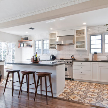
Mid-sized transitional galley cement tile floor and multicolored floor open concept kitchen photo in Los Angeles with an undermount sink, shaker cabinets, white cabinets, quartzite countertops, white backsplash, ceramic backsplash, stainless steel appliances and an island
 Bridgewater
The new owners were looking forward to living in their new home with an open floor plan, tall vaulted ceilings, and great views. It featured a large Great Room with two big French Doors separating the Dining Room from the Master Bedroom.
But after only a few months they identified a major design flaw: Each of the French Doors had ten glass windows with two large windows above each door. (Check out our before and after designs, traffic flow diagrams and photos of this project.) Glass windows and doors allowed sound and light from guests or the TV in the great room to easily sneak into the bedroom. With unique work and sleep schedules (he’s a pilot, she’s a registered nurse) this design wasn’t working.
Then there was a traffic flow design flaw: The Master Bedroom had a second entrance from a hallway. To get into the bedroom from the hallway you needed to walk down another claustrophobic hallway.
To get from the Master Bedroom to the Master Bath begin at the most remote corner of the bedroom and down a hallway between two closets. Once inside the bath, a huge triangular Jacuzzi dominating the space.
So, from a privacy and traffic flow perspective, this home had some major design issues.
When Craig Weber first met with the owners, he listened to their ideas and concerns. The owners trusted Craig to come up with the most efficient and most effective solution to this design dilemma. He offered a solution that resolved the bed-bath traffic flow problem, offered some bedroom room privacy, and updated the bath.
First, the two French Doors and windows were removed. A new wall was built with sound-absorbing materials, making the Great Room and Dining Room more comfortable spaces for entertaining while creating the bedroom privacy the owners craved.
Solving the Bedroom/Bath traffic flow problem began with removing the two existing closets. The bath door was relocated next to the hall entrance, and then a new walk-in closet was added adjacent to the hallway entrance. The solution offered easy access to and from the bath, closet and hallway without a hint of claustrophobia.
The Master Bath underwent a major transformation designed for convenience and comfort – especially during long, cold Minnesota winters.
Most everything from the former bath was torn out, beginning with the giant Jacuzzi.
A new bathtub that is wider and deeper than the standard size was installed with brushed Nickel fixtures. It’s the perfect place to relax with a glass of wine and candles.
Warm floors are a Minnesota “must have.” The bath’s new ceramic floor features in-floor electric heat. Getting in and out of the tub is easy and comfortable.
The new walk-in shower again features in-floor heating and a place to sit. The most interesting feature of this shower may the custom ceramic tile installed with unique patterns.
A new vanity Cambria Bradshaw countertops features two under-hung ceramic sinks with matching brushed Nickel fixtures.
Tall ceilings and three glass windows near the ceiling flood the room with natural light. A new energy-efficient window frames an ornamental stained glass window created by the owner’s father – a great personal touch.
A quiet place to sleep. A private dining room for entertaining. A Master Bath to die for. And easy traffic flow. The owners couldn’t have been more delighted with the outcome. And Lilly, their cat, loves it too.
1