
Search results for "Two different couches" in Home Design Ideas
 Kaplan Thompson Architects
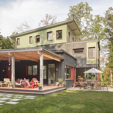
A young family with a wooded, triangular lot in Ipswich, Massachusetts wanted to take on a highly creative, organic, and unrushed process in designing their new home. The parents of three boys had contemporary ideas for living, including phasing the construction of different structures over time as the kids grew so they could maximize the options for use on their land.
They hoped to build a net zero energy home that would be cozy on the very coldest days of winter, using cost-efficient methods of home building. The house needed to be sited to minimize impact on the land and trees, and it was critical to respect a conservation easement on the south border of the lot.
Finally, the design would be contemporary in form and feel, but it would also need to fit into a classic New England context, both in terms of materials used and durability. We were asked to honor the notions of “surprise and delight,” and that inspired everything we designed for the family.
The highly unique home consists of a three-story form, composed mostly of bedrooms and baths on the top two floors and a cross axis of shared living spaces on the first level. This axis extends out to an oversized covered porch, open to the south and west. The porch connects to a two-story garage with flex space above, used as a guest house, play room, and yoga studio depending on the day.
A floor-to-ceiling ribbon of glass wraps the south and west walls of the lower level, bringing in an abundance of natural light and linking the entire open plan to the yard beyond. The master suite takes up the entire top floor, and includes an outdoor deck with a shower. The middle floor has extra height to accommodate a variety of multi-level play scenarios in the kids’ rooms.
Many of the materials used in this house are made from recycled or environmentally friendly content, or they come from local sources. The high performance home has triple glazed windows and all materials, adhesives, and sealants are low toxicity and safe for growing kids.
Photographer credit: Irvin Serrano
 Breathe Design Studio
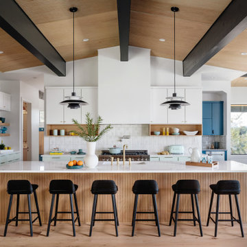
Our Austin studio decided to go bold with this project by ensuring that each space had a unique identity in the Mid-Century Modern style bathroom, butler's pantry, and mudroom. We covered the bathroom walls and flooring with stylish beige and yellow tile that was cleverly installed to look like two different patterns. The mint cabinet and pink vanity reflect the mid-century color palette. The stylish knobs and fittings add an extra splash of fun to the bathroom.
The butler's pantry is located right behind the kitchen and serves multiple functions like storage, a study area, and a bar. We went with a moody blue color for the cabinets and included a raw wood open shelf to give depth and warmth to the space. We went with some gorgeous artistic tiles that create a bold, intriguing look in the space.
In the mudroom, we used siding materials to create a shiplap effect to create warmth and texture – a homage to the classic Mid-Century Modern design. We used the same blue from the butler's pantry to create a cohesive effect. The large mint cabinets add a lighter touch to the space.
 Breathe Design Studio
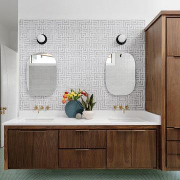
Our Austin studio decided to go bold with this project by ensuring that each space had a unique identity in the Mid-Century Modern style bathroom, butler's pantry, and mudroom. We covered the bathroom walls and flooring with stylish beige and yellow tile that was cleverly installed to look like two different patterns. The mint cabinet and pink vanity reflect the mid-century color palette. The stylish knobs and fittings add an extra splash of fun to the bathroom.
The butler's pantry is located right behind the kitchen and serves multiple functions like storage, a study area, and a bar. We went with a moody blue color for the cabinets and included a raw wood open shelf to give depth and warmth to the space. We went with some gorgeous artistic tiles that create a bold, intriguing look in the space.
In the mudroom, we used siding materials to create a shiplap effect to create warmth and texture – a homage to the classic Mid-Century Modern design. We used the same blue from the butler's pantry to create a cohesive effect. The large mint cabinets add a lighter touch to the space.
Find the right local pro for your project
 BUILD
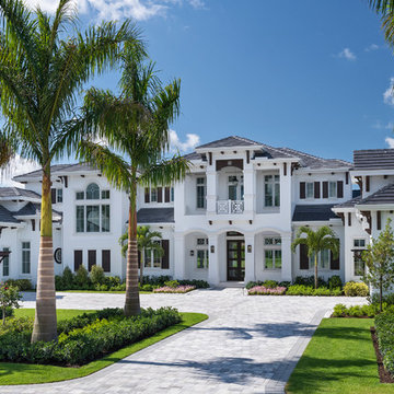
BUILDA custom-made expansive two-story home providing views of the spacious kitchen, breakfast nook, dining, great room and outdoor amenities upon entry.
Featuring 11,000 square feet of open area lavish living this residence does not
disappoint with the attention to detail throughout. Elegant features embellish this home with the intricate woodworking and exposed wood beams, ceiling details, gorgeous stonework, European Oak flooring throughout, and unique lighting.
This residence offers seven bedrooms including a mother-in-law suite, nine bathrooms, a bonus room, his and her offices, wet bar adjacent to dining area, wine room, laundry room featuring a dog wash area and a game room located above one of the two garages. The open-air kitchen is the perfect space for entertaining family and friends with the two islands, custom panel Sub-Zero appliances and easy access to the dining areas.
Outdoor amenities include a pool with sun shelf and spa, fire bowls spilling water into the pool, firepit, large covered lanai with summer kitchen and fireplace surrounded by roll down screens to protect guests from inclement weather, and two additional covered lanais. This is luxury at its finest!
 Progressive Design Build
Challenge
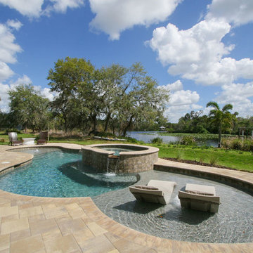
This 2001 riverfront home was purchased by the owners in 2015 and immediately renovated. Progressive Design Build was hired at that time to remodel the interior, with tentative plans to remodel their outdoor living space as a second phase design/build remodel. True to their word, after completing the interior remodel, this young family turned to Progressive Design Build in 2017 to address known zoning regulations and restrictions in their backyard and build an outdoor living space that was fit for entertaining and everyday use.
The homeowners wanted a pool and spa, outdoor living room, kitchen, fireplace and covered patio. They also wanted to stay true to their home’s Old Florida style architecture while also adding a Jamaican influence to the ceiling detail, which held sentimental value to the homeowners who honeymooned in Jamaica.
Solution
To tackle the known zoning regulations and restrictions in the backyard, the homeowners researched and applied for a variance. With the variance in hand, Progressive Design Build sat down with the homeowners to review several design options. These options included:
Option 1) Modifications to the original pool design, changing it to be longer and narrower and comply with an existing drainage easement
Option 2) Two different layouts of the outdoor living area
Option 3) Two different height elevations and options for the fire pit area
Option 4) A proposed breezeway connecting the new area with the existing home
After reviewing the options, the homeowners chose the design that placed the pool on the backside of the house and the outdoor living area on the west side of the home (Option 1).
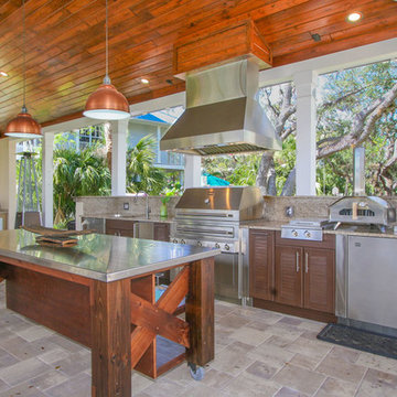
It was important to build a patio structure that could sustain a hurricane (a Southwest Florida necessity), and provide substantial sun protection. The new covered area was supported by structural columns and designed as an open-air porch (with no screens) to allow for an unimpeded view of the Caloosahatchee River. The open porch design also made the area feel larger, and the roof extension was built with substantial strength to survive severe weather conditions.
The pool and spa were connected to the adjoining patio area, designed to flow seamlessly into the next. The pool deck was designed intentionally in a 3-color blend of concrete brick with freeform edge detail to mimic the natural river setting. Bringing the outdoors inside, the pool and fire pit were slightly elevated to create a small separation of space.
Result
All of the desirable amenities of a screened porch were built into an open porch, including electrical outlets, a ceiling fan/light kit, TV, audio speakers, and a fireplace. The outdoor living area was finished off with additional storage for cushions, ample lighting, an outdoor dining area, a smoker, a grill, a double-side burner, an under cabinet refrigerator, a major ventilation system, and water supply plumbing that delivers hot and cold water to the sinks.
Because the porch is under a roof, we had the option to use classy woods that would give the structure a natural look and feel. We chose a dark cypress ceiling with a gloss finish, replicating the same detail that the homeowners experienced in Jamaica. This created a deep visceral and emotional reaction from the homeowners to their new backyard.
The family now spends more time outdoors enjoying the sights, sounds and smells of nature. Their professional lives allow them to take a trip to paradise right in their backyard—stealing moments that reflect on the past, but are also enjoyed in the present.
 Mike Schaap Builders
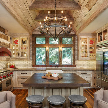
The most notable design component is the exceptional use of reclaimed wood throughout nearly every application. Sourced from not only one, but two different Indiana barns, this hand hewn and rough sawn wood is used in a variety of applications including custom cabinetry with a white glaze finish, dark stained window casing, butcher block island countertop and handsome woodwork on the fireplace mantel, range hood, and ceiling. Underfoot, Oak wood flooring is salvaged from a tobacco barn, giving it its unique tone and rich shine that comes only from the unique process of drying and curing tobacco.
Photo Credit: Ashley Avila
 Progressive Design Build
Challenge
This 2001 riverfront home was purchased by the owners in 2015 and immediately renovated. Progressive Design Build was hired at that time to remodel the interior, with tentative plans to remodel their outdoor living space as a second phase design/build remodel. True to their word, after completing the interior remodel, this young family turned to Progressive Design Build in 2017 to address known zoning regulations and restrictions in their backyard and build an outdoor living space that was fit for entertaining and everyday use.
The homeowners wanted a pool and spa, outdoor living room, kitchen, fireplace and covered patio. They also wanted to stay true to their home’s Old Florida style architecture while also adding a Jamaican influence to the ceiling detail, which held sentimental value to the homeowners who honeymooned in Jamaica.
Solution
To tackle the known zoning regulations and restrictions in the backyard, the homeowners researched and applied for a variance. With the variance in hand, Progressive Design Build sat down with the homeowners to review several design options. These options included:
Option 1) Modifications to the original pool design, changing it to be longer and narrower and comply with an existing drainage easement
Option 2) Two different layouts of the outdoor living area
Option 3) Two different height elevations and options for the fire pit area
Option 4) A proposed breezeway connecting the new area with the existing home
After reviewing the options, the homeowners chose the design that placed the pool on the backside of the house and the outdoor living area on the west side of the home (Option 1).
It was important to build a patio structure that could sustain a hurricane (a Southwest Florida necessity), and provide substantial sun protection. The new covered area was supported by structural columns and designed as an open-air porch (with no screens) to allow for an unimpeded view of the Caloosahatchee River. The open porch design also made the area feel larger, and the roof extension was built with substantial strength to survive severe weather conditions.
The pool and spa were connected to the adjoining patio area, designed to flow seamlessly into the next. The pool deck was designed intentionally in a 3-color blend of concrete brick with freeform edge detail to mimic the natural river setting. Bringing the outdoors inside, the pool and fire pit were slightly elevated to create a small separation of space.
Result
All of the desirable amenities of a screened porch were built into an open porch, including electrical outlets, a ceiling fan/light kit, TV, audio speakers, and a fireplace. The outdoor living area was finished off with additional storage for cushions, ample lighting, an outdoor dining area, a smoker, a grill, a double-side burner, an under cabinet refrigerator, a major ventilation system, and water supply plumbing that delivers hot and cold water to the sinks.
Because the porch is under a roof, we had the option to use classy woods that would give the structure a natural look and feel. We chose a dark cypress ceiling with a gloss finish, replicating the same detail that the homeowners experienced in Jamaica. This created a deep visceral and emotional reaction from the homeowners to their new backyard.
The family now spends more time outdoors enjoying the sights, sounds and smells of nature. Their professional lives allow them to take a trip to paradise right in their backyard—stealing moments that reflect on the past, but are also enjoyed in the present.
Sponsored
Sunbury, OH

J.Holderby - Renovations
Franklin County's Leading General Contractors - 2X Best of Houzz!
 Birchwood Construction Company
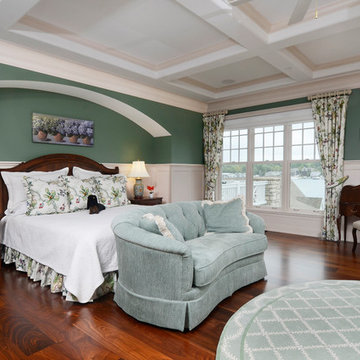
Camp Wobegon is a nostalgic waterfront retreat for a multi-generational family. The home's name pays homage to a radio show the homeowner listened to when he was a child in Minnesota. Throughout the home, there are nods to the sentimental past paired with modern features of today.
The five-story home sits on Round Lake in Charlevoix with a beautiful view of the yacht basin and historic downtown area. Each story of the home is devoted to a theme, such as family, grandkids, and wellness. The different stories boast standout features from an in-home fitness center complete with his and her locker rooms to a movie theater and a grandkids' getaway with murphy beds. The kids' library highlights an upper dome with a hand-painted welcome to the home's visitors.
Throughout Camp Wobegon, the custom finishes are apparent. The entire home features radius drywall, eliminating any harsh corners. Masons carefully crafted two fireplaces for an authentic touch. In the great room, there are hand constructed dark walnut beams that intrigue and awe anyone who enters the space. Birchwood artisans and select Allenboss carpenters built and assembled the grand beams in the home.
Perhaps the most unique room in the home is the exceptional dark walnut study. It exudes craftsmanship through the intricate woodwork. The floor, cabinetry, and ceiling were crafted with care by Birchwood carpenters. When you enter the study, you can smell the rich walnut. The room is a nod to the homeowner's father, who was a carpenter himself.
The custom details don't stop on the interior. As you walk through 26-foot NanoLock doors, you're greeted by an endless pool and a showstopping view of Round Lake. Moving to the front of the home, it's easy to admire the two copper domes that sit atop the roof. Yellow cedar siding and painted cedar railing complement the eye-catching domes.
 MacCracken Robinson Architects
Our introduction to the Tahoe site was in late winter, on a clear sunny day with filtered light and long shadows through snow-laden fir and pine bows. It made a strong impression, stored for future consideration but the impetus for the design came soon after the spring snow melt. A powerful sense of horizontal layering of vegetation and various stages of decomposing downed timber on the two-acre site, juxtaposed with pine and fir trees and the dense canopy of the surrounding forest. The site is located near the historic 1960 Olympic Nordic track, situated on the edge of wetlands and seasonal streams.
The homeowners were previous clients and dreamt of having a retreat in the Sierras away from their home base in Berkeley, CA. Among skiers, bike riders, hikers, and boaters, they found the ideal central location for their home base near Lake Tahoe.
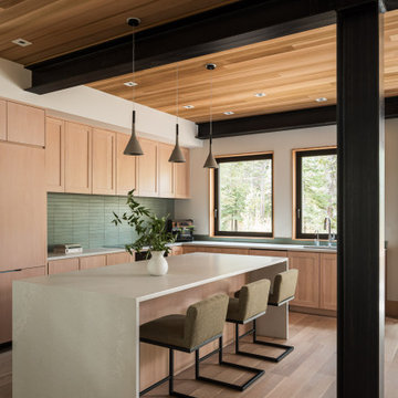
The home is organized as a series of linked spaces, each providing a unique sensory experience and connection to different parts of the site, both vertically and horizontally. The design includes extensive use of glass to create a true indoor/outdoor connection and maximize natural light. At the center of the site are two large fir trees, which the building respectfully wraps around in an L shape to create a focal point in the landscaped courtyard.
A refined, context-driven palette of natural materials including cedar, oak, fir, and steel is used to harmoniously blend in among the surroundings. The construction includes advanced details such as thermally broken steel beams supporting layered roof planes engineered to hold snow rather than shed it. Designed to resist significant load, we exposed the steel structure as a recurring element in the interior spaces. The resulting columns and support beams contribute to the familiar design aspects of each room and provide a better understanding of how the building was constructed. The second floor features cantilevered volumes that reach out into the nearby evergreen limbs, likening the experience to being in a tree house. The house incorporates features such as radiant heating, solar panels, and operable windows for passive cooling. Fire safety measures include the use of naturally fire-resistant materials, a Class A roof construction, sprinklers, and drought-tolerant landscaping beyond the defensible space.
 Progressive Design Build
Challenge
This 2001 riverfront home was purchased by the owners in 2015 and immediately renovated. Progressive Design Build was hired at that time to remodel the interior, with tentative plans to remodel their outdoor living space as a second phase design/build remodel. True to their word, after completing the interior remodel, this young family turned to Progressive Design Build in 2017 to address known zoning regulations and restrictions in their backyard and build an outdoor living space that was fit for entertaining and everyday use.
The homeowners wanted a pool and spa, outdoor living room, kitchen, fireplace and covered patio. They also wanted to stay true to their home’s Old Florida style architecture while also adding a Jamaican influence to the ceiling detail, which held sentimental value to the homeowners who honeymooned in Jamaica.
Solution
To tackle the known zoning regulations and restrictions in the backyard, the homeowners researched and applied for a variance. With the variance in hand, Progressive Design Build sat down with the homeowners to review several design options. These options included:
Option 1) Modifications to the original pool design, changing it to be longer and narrower and comply with an existing drainage easement
Option 2) Two different layouts of the outdoor living area
Option 3) Two different height elevations and options for the fire pit area
Option 4) A proposed breezeway connecting the new area with the existing home
After reviewing the options, the homeowners chose the design that placed the pool on the backside of the house and the outdoor living area on the west side of the home (Option 1).
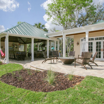
It was important to build a patio structure that could sustain a hurricane (a Southwest Florida necessity), and provide substantial sun protection. The new covered area was supported by structural columns and designed as an open-air porch (with no screens) to allow for an unimpeded view of the Caloosahatchee River. The open porch design also made the area feel larger, and the roof extension was built with substantial strength to survive severe weather conditions.
The pool and spa were connected to the adjoining patio area, designed to flow seamlessly into the next. The pool deck was designed intentionally in a 3-color blend of concrete brick with freeform edge detail to mimic the natural river setting. Bringing the outdoors inside, the pool and fire pit were slightly elevated to create a small separation of space.
Result
All of the desirable amenities of a screened porch were built into an open porch, including electrical outlets, a ceiling fan/light kit, TV, audio speakers, and a fireplace. The outdoor living area was finished off with additional storage for cushions, ample lighting, an outdoor dining area, a smoker, a grill, a double-side burner, an under cabinet refrigerator, a major ventilation system, and water supply plumbing that delivers hot and cold water to the sinks.
Because the porch is under a roof, we had the option to use classy woods that would give the structure a natural look and feel. We chose a dark cypress ceiling with a gloss finish, replicating the same detail that the homeowners experienced in Jamaica. This created a deep visceral and emotional reaction from the homeowners to their new backyard.
The family now spends more time outdoors enjoying the sights, sounds and smells of nature. Their professional lives allow them to take a trip to paradise right in their backyard—stealing moments that reflect on the past, but are also enjoyed in the present.
 Design Connection, Inc.
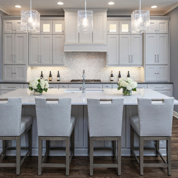
The homeowner of this new build came to us for help with the design of their new home. They wanted a more contemporary look than what they're used to.
The large island is a great gathering point with in the open concept of the dining/kitchen/living space. Using two different colors of quartz countertops added contrast that highlights the marble backsplash. The backsplash adds texture and richness to the space. Shaker style cabinets help modernize the space with the clean lines. Function was key to this kitchen working with utensil pullouts, spice racks, rollouts, hidden storage and a knife block.
Design Connection, Inc. Kansas City interior designer provided space planning, architectural drawings, barstools, tile, plumbing fixtures, countertops, cabinets and hardware, lighting, paint colors, coordination with the builder and project management to ensure that the high standards of Design Connection, Inc. were maintained.
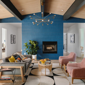 Breathe Design Studio
Our Austin studio decided to go bold with this project by ensuring that each space had a unique identity in the Mid-Century Modern style bathroom, butler's pantry, and mudroom. We covered the bathroom walls and flooring with stylish beige and yellow tile that was cleverly installed to look like two different patterns. The mint cabinet and pink vanity reflect the mid-century color palette. The stylish knobs and fittings add an extra splash of fun to the bathroom.
The butler's pantry is located right behind the kitchen and serves multiple functions like storage, a study area, and a bar. We went with a moody blue color for the cabinets and included a raw wood open shelf to give depth and warmth to the space. We went with some gorgeous artistic tiles that create a bold, intriguing look in the space.
In the mudroom, we used siding materials to create a shiplap effect to create warmth and texture – a homage to the classic Mid-Century Modern design. We used the same blue from the butler's pantry to create a cohesive effect. The large mint cabinets add a lighter touch to the space.
---
Project designed by the Atomic Ranch featured modern designers at Breathe Design Studio. From their Austin design studio, they serve an eclectic and accomplished nationwide clientele including in Palm Springs, LA, and the San Francisco Bay Area.
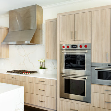
 Kitchen Design Concepts
These clients had recently moved to Texas and really needed to remodel a few spaces in the home - the kitchen was number 1 priority! Wanting a clean and modern update, while keeping the room warm and inviting, we think we hit the mark.
Cabinets are from Ultracraft. The perimeter is their Metropolis Door in Melamine - Silver Elm vertical grain. The island we contrasted with the Acrilux II Lux door in Pure White (gloss). Cabinet hardware from from Atlas Homewares, the IT pull in brushed nickel.
Counters we were able to pull two different materials together. The perimeter counter material was Pure White from Caesarstone - very simple. Brought in some pattern with Quartzmaster Calcutta Borghini on the backsplash, and on the island. The mitered waterfall edge gives it an extra "oomph" that we just love.
For fixtures, we kept things fairly simple. A Blanco super single bowl sink, and California Faucets Corsano Pull down at the island. We paired with a matching soap dispenser and air switch.
The appliances were also important, so we took some time mixing and matching what was needed and what worked well within the budget. From Wolf we have a gas cooktop, Double oven and Microwave. We opted for a Best Vent Hood and blower, Electrolux Refrigerator ad Bosch Dishwasher to round out the selections.
Sponsored
Westerville, OH

Custom Home Works
Franklin County's Award-Winning Design, Build and Remodeling Expert
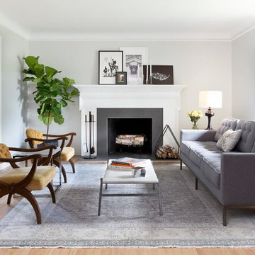
 Scavolini Store Detroit
This house is nestled in the suburbs of Detroit. It is a 1950s two story brick colonial that was in major need of some updates. We kept all of the existing architectural features of this home including cove ceilings, wood floors moldings. I didn't want to take away the style of the home, I just wanted to update it. When I started, the floors were stained almost red, every room had a different color on the walls, and the kitchen and bathrooms hadn't been touched in decades. It was all out of date and out of style.
The formal living room is adjacent to the front door and foyer area. The picture window lets in a ton of natural light. The coves, frames and moldings are all painted a bright white with light gray paint on the walls. I kept and repainted the wood mantel, laid new gray ceramic tile in the hearth from Ann Sacks. Photo by Martin Vecchio.
 Progressive Design Build
Challenge
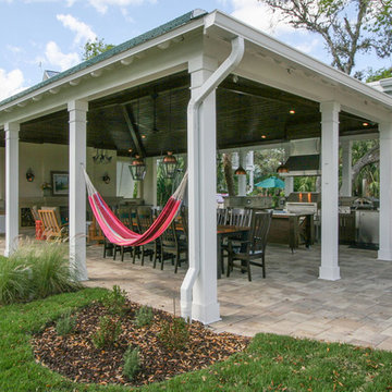
This 2001 riverfront home was purchased by the owners in 2015 and immediately renovated. Progressive Design Build was hired at that time to remodel the interior, with tentative plans to remodel their outdoor living space as a second phase design/build remodel. True to their word, after completing the interior remodel, this young family turned to Progressive Design Build in 2017 to address known zoning regulations and restrictions in their backyard and build an outdoor living space that was fit for entertaining and everyday use.
The homeowners wanted a pool and spa, outdoor living room, kitchen, fireplace and covered patio. They also wanted to stay true to their home’s Old Florida style architecture while also adding a Jamaican influence to the ceiling detail, which held sentimental value to the homeowners who honeymooned in Jamaica.
Solution
To tackle the known zoning regulations and restrictions in the backyard, the homeowners researched and applied for a variance. With the variance in hand, Progressive Design Build sat down with the homeowners to review several design options. These options included:
Option 1) Modifications to the original pool design, changing it to be longer and narrower and comply with an existing drainage easement
Option 2) Two different layouts of the outdoor living area
Option 3) Two different height elevations and options for the fire pit area
Option 4) A proposed breezeway connecting the new area with the existing home
After reviewing the options, the homeowners chose the design that placed the pool on the backside of the house and the outdoor living area on the west side of the home (Option 1).
It was important to build a patio structure that could sustain a hurricane (a Southwest Florida necessity), and provide substantial sun protection. The new covered area was supported by structural columns and designed as an open-air porch (with no screens) to allow for an unimpeded view of the Caloosahatchee River. The open porch design also made the area feel larger, and the roof extension was built with substantial strength to survive severe weather conditions.
The pool and spa were connected to the adjoining patio area, designed to flow seamlessly into the next. The pool deck was designed intentionally in a 3-color blend of concrete brick with freeform edge detail to mimic the natural river setting. Bringing the outdoors inside, the pool and fire pit were slightly elevated to create a small separation of space.
Result
All of the desirable amenities of a screened porch were built into an open porch, including electrical outlets, a ceiling fan/light kit, TV, audio speakers, and a fireplace. The outdoor living area was finished off with additional storage for cushions, ample lighting, an outdoor dining area, a smoker, a grill, a double-side burner, an under cabinet refrigerator, a major ventilation system, and water supply plumbing that delivers hot and cold water to the sinks.
Because the porch is under a roof, we had the option to use classy woods that would give the structure a natural look and feel. We chose a dark cypress ceiling with a gloss finish, replicating the same detail that the homeowners experienced in Jamaica. This created a deep visceral and emotional reaction from the homeowners to their new backyard.
The family now spends more time outdoors enjoying the sights, sounds and smells of nature. Their professional lives allow them to take a trip to paradise right in their backyard—stealing moments that reflect on the past, but are also enjoyed in the present.
 Singleton Interiors, Allied ASID
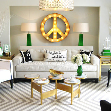
Living room - mid-sized contemporary formal and enclosed living room idea in Charleston with gray walls, no fireplace and no tv
 BK Interior Design
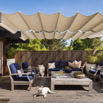
This space is perfect for entertaining! When the owners originally moved in, this deck was not here. There were several steps down from the kitchen door, and the stone slabs were a toe-stubbing minefield.
We added the deck and designed it perfectly for entertaining. Since we had several large pine trees removed from the property, we increased sun exposure creating a need for more shade. We had this awning custom made by PJ Canvas in Santa Rosa, CA. The awning tucks neatly under the roof of the house during the rainy months.

 Mike Schaap Builders
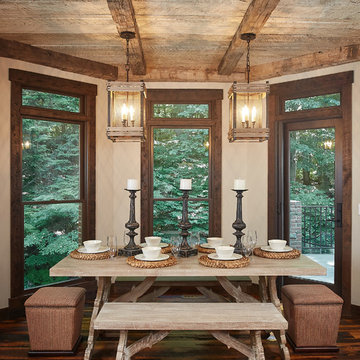
The most notable design component is the exceptional use of reclaimed wood throughout nearly every application. Sourced from not only one, but two different Indiana barns, this hand hewn and rough sawn wood is used in a variety of applications including custom cabinetry with a white glaze finish, dark stained window casing, butcher block island countertop and handsome woodwork on the fireplace mantel, range hood, and ceiling. Underfoot, Oak wood flooring is salvaged from a tobacco barn, giving it its unique tone and rich shine that comes only from the unique process of drying and curing tobacco.
Photo Credit: Ashley Avila
 KraftMaster Renovations
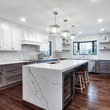
Transitional style U-shaped kitchen has all the counter space you could ever want with two-toned cabinet colors. This kitchen has two dishwashers and two full size sinks for all your food prep and clean-up needs.
Photos by Chris Veith
 Mastercraft NW
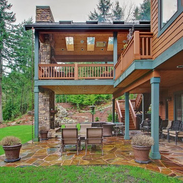
Two level deck with upper and lower wood-burning fireplaces, built-in ceiling heaters and numerous skylights for lots of sun.
Mountain style patio photo in Seattle with a fire pit
Mountain style patio photo in Seattle with a fire pit
1