
Search results for "Wrap around cabinets" in Home Design Ideas
 Advance Design Studio, Ltd.
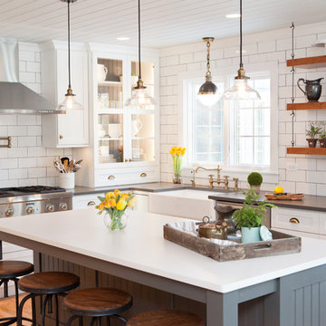
When this suburban family decided to renovate their kitchen, they knew that they wanted a little more space. Advance Design worked together with the homeowner to design a kitchen that would work for a large family who loved to gather regularly and always ended up in the kitchen! So the project began with extending out an exterior wall to accommodate a larger island and more moving-around space between the island and the perimeter cabinetry.
Style was important to the cook, who began collecting accessories and photos of the look she loved for months prior to the project design. She was drawn to the brightness of whites and grays, and the design accentuated this color palette brilliantly with the incorporation of a warm shade of brown woods that originated from a dining room table that was a family favorite. Classic gray and white cabinetry from Dura Supreme hits the mark creating a perfect balance between bright and subdued. Hints of gray appear in the bead board detail peeking just behind glass doors, and in the application of the handsome floating wood shelves between cabinets. White subway tile is made extra interesting with the application of dark gray grout lines causing it to be a subtle but noticeable detail worthy of attention.
Suede quartz Silestone graces the countertops with a soft matte hint of color that contrasts nicely with the presence of white painted cabinetry finished smartly with the brightness of a milky white farm sink. Old melds nicely with new, as antique bronze accents are sprinkled throughout hardware and fixtures, and work together unassumingly with the sleekness of stainless steel appliances.
The grace and timelessness of this sparkling new kitchen maintains the charm and character of a space that has seen generations past. And now this family will enjoy this new space for many more generations to come in the future with the help of the team at Advance Design Studio.
Photographer: Joe Nowak
Dura Supreme Cabinetry
 Haven Design and Construction
Matthew Niemann Photography
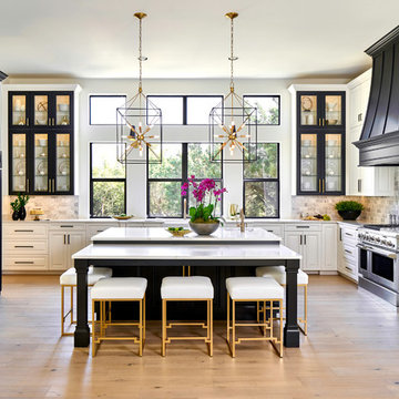
Example of a transitional u-shaped light wood floor and beige floor kitchen design in Austin with a farmhouse sink, raised-panel cabinets, gray backsplash, paneled appliances, an island, white countertops, quartz countertops, white cabinets and stone tile backsplash
Example of a transitional u-shaped light wood floor and beige floor kitchen design in Austin with a farmhouse sink, raised-panel cabinets, gray backsplash, paneled appliances, an island, white countertops, quartz countertops, white cabinets and stone tile backsplash
 Siena Custom Builders, Inc.
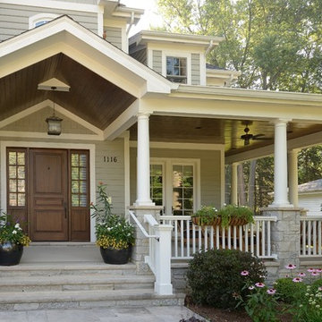
Wrap around front porch - relax, read or socialize here - plenty of space for furniture and seating
Inspiration for a timeless one-story single front door remodel in Chicago with a dark wood front door
Inspiration for a timeless one-story single front door remodel in Chicago with a dark wood front door
Find the right local pro for your project
 emma delon
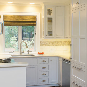
Maximizing the functionality of this space, and coordinating the new kitchen with the beautiful remodel completed previously by the client were the two most important aspects of this project. The existing spaces are elegantly decorated with an open plan, dark hardwood floors, and natural stone accents. The new, lighter, more open kitchen flows beautifully into the client’s existing dining room space. Satin nickel hardware blends with the stainless steel appliances and matches the satin nickel details throughout the home. The fully integrated refrigerator next to the narrow pull-out pantry cabinet, take up less visual weight than a traditional stainless steel appliance and the two combine to provide fantastic storage. The glass cabinet doors and decorative lighting beautifully highlight the client’s glassware and dishes. Finished with white subway tile, Dreamy Marfil quartz countertops, and a warm natural wood blind; the space warm, inviting, elegant, and extremely functional.
copyright 2013 marilyn peryer photography
 Nar Design Group
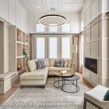
This cozy gathering space in the heart of Davis, CA takes cues from traditional millwork concepts done in a contemporary way.
Accented with light taupe, the grid panel design on the walls adds dimension to the otherwise flat surfaces. A brighter white above celebrates the room’s high ceilings, offering a sense of expanded vertical space and deeper relaxation.
Along the adjacent wall, bench seating wraps around to the front entry, where drawers provide shoe-storage by the front door. A built-in bookcase complements the overall design. A sectional with chaise hides a sleeper sofa. Multiple tables of different sizes and shapes support a variety of activities, whether catching up over coffee, playing a game of chess, or simply enjoying a good book by the fire. Custom drapery wraps around the room, and the curtains between the living room and dining room can be closed for privacy. Petite framed arm-chairs visually divide the living room from the dining room.
In the dining room, a similar arch can be found to the one in the kitchen. A built-in buffet and china cabinet have been finished in a combination of walnut and anegre woods, enriching the space with earthly color. Inspired by the client’s artwork, vibrant hues of teal, emerald, and cobalt were selected for the accessories, uniting the entire gathering space.
 Kraft Custom Construction
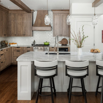
After a not-so-great experience with a previous contractor, this homeowner came to Kraft Custom Construction in search of a better outcome. Not only was she wanting a more functional kitchen to enjoy cooking in, she also sought out a team with a clear process and great communication.
Two elements of the original floorplan shaped the design of the new kitchen: a protruding pantry that blocked the flow from the front door into the main living space, and two large columns in the middle of the living room.
Using a refined French-Country design aesthetic, we completed structural modifications to reframe the pantry, and integrated a new custom buffet cabinet to tie in the old columns with new wood ceiling beams. Other design solutions include more usable countertop space, a recessed spice cabinet, numerous drawer organizers, and updated appliances and finishes all around.
This bright new kitchen is both comfortable yet elegant, and the perfect place to cook for the family or entertain a group of guests.
 Drury Design
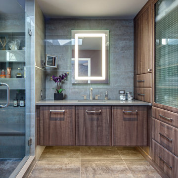
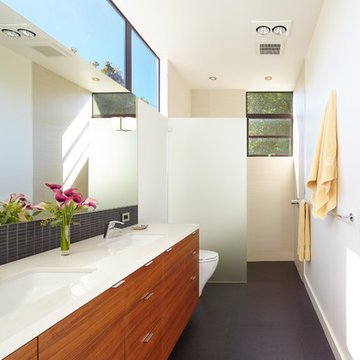
The homeowner was looking for a lot more space in a very small bathroom. In order to overcome the room’s lack of any kind of storage the oversized tub was replaced with a shower bench and multiple niches for shampoos.
Additional cabinetry storage was created by wrapping the vanity cabinets around a wall and creating tall linen cabinets in an area that had not been used before. Floating vanity under cabinet lights and a special wall lit mirror helped to open up the small space.
Large format Porcelenosa Ston-ker Ferroker floor tiles and field tiles in the color Aluminio were used on the floors and vanity wall. Special attention was paid to the geometric layout of the horizontal lines of the entire layout – walnut vertical grained cabinetry, wall and floor tiles to create visual space to the room. A Nu-heat heated floor added to the comfort of the room.

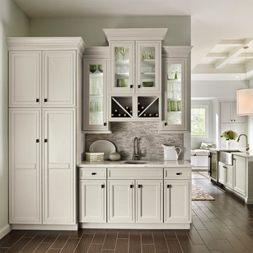
 MasterBrand Cabinets
Small elegant single-wall porcelain tile and brown floor wet bar photo with an undermount sink, recessed-panel cabinets, beige cabinets, gray backsplash, mosaic tile backsplash and white countertops
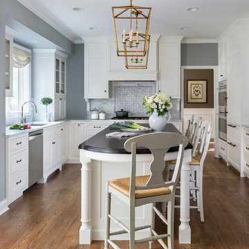
 Liz Schupanitz Designs
A PLACE TO GATHER
Location: Eagan, MN, USA
This family of five wanted an inviting space to gather with family and friends. Mom, the primary cook, wanted a large island with more organized storage – everything in its place – and a crisp white kitchen with the character of an older home.
Challenges:
Design an island that could accommodate this family of five for casual weeknight dinners.
Create more usable storage within the existing kitchen footprint.
Design a better transition between the upper cabinets on the 8-foot sink wall and the adjoining 9-foot cooktop wall.
Make room for more counter space around the cooktop. It was poorly lit, cluttered with small appliances and confined by the tall oven cabinet.
Solutions:
A large island, that seats 5 comfortably, replaced the small island and kitchen table. This allowed for more storage including cookbook shelves, a heavy-duty roll out shelf for the mixer, a 2-bin recycling center and a bread drawer.
Tall pantries with decorative grilles were placed between the kitchen and family room. These created ample storage and helped define each room, making each one feel larger, yet more intimate.
A space intentionally separates the upper cabinets on the sink wall from those on the cooktop wall. This created symmetry on the sink wall and made room for an appliance garage, which keeps the countertops uncluttered.
Moving the double ovens to the former pantry location made way for more usable counter space around the cooktop and a dramatic focal point with the hood, cabinets and marble backsplash.
Special Features:
Custom designed corbels and island legs lend character.
Gilt open lanterns, antiqued nickel grilles on the pantries, and the soft linen shade at the kitchen sink add personality and charm.
The unique bronze hardware with a living finish creates the patina of an older home.
A walnut island countertop adds the warmth and feel of a kitchen table.
This homeowner truly understood the idea of living with the patina of marble. Her grandmother’s marble-topped antique table inspired the Carrara countertops.
The result is a highly organized kitchen with a light, open feel that invites you to stay a while.
Liz Schupanitz Designs
Photographed by: Andrea Rugg
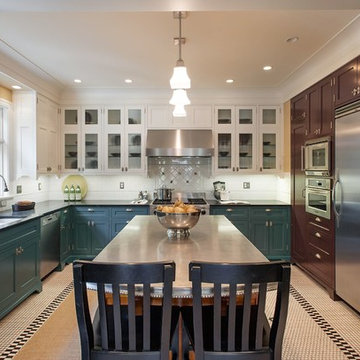
 Karen Ellentuck. ASID
This kitchen was in a home dating from the early 20th century and located in the Mt. Baker neighborhood of Seattle. It is u-shaped with an island in the center topped with a zinc counter. Black and white tile was used on the floor in a tradition pattern with hexagon as the inset and a black and white border with a square mosaic around the perimeter framing the island. Cabinetry is inset traditional style with the hardware on the exterior. the base of each cabinet is framed with a footed detail. Base cabinet were painted with teal, upper cabinets are white and the full height cabinets are mahogany which is used throughout the residence. A tradition style faucet was used with the pull out attached. Cup pulls are used on the drawers and knobs have a back plate.
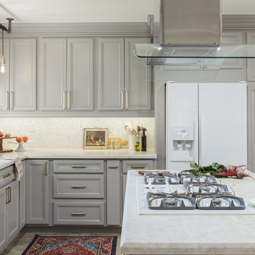
 DANIELLE Interior Design & Decor
Embark on a culinary crave with this classic gray and white family kitchen. We chose a warm neutral color for the cabinetry and enhanced this warmth with champagne gold cabinet hardware. These warm gray cabinets can be found at your neighborhood Lowes while the champagne hardware are designed by Atlas. Add another accent of shine to your kitchen and check out the mother of pearl diamond mosaic tile backsplash by Jeffrey Court, as seen here. Adding this hint of sparkle to your small space will allow your kitchen to stay bright and chic. Don't be afraid to mix metals or color. This island houses the glass cook top with a stainless steel hood above the island, and we added a matte black as our finish for the Edison lighting as well as black bar stool seating to tie it all together. The Taj Mahal white Quartzite counter tops are a beauty. The contrast in color creates dimension to your small kitchen layout and will continually catch your eye.
Designed by Dani Perkins @ DANIELLE Interior Design & Decor
Taylor Abeel Photography
 Nar Design Group
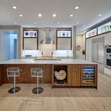
Having designed the kitchen in their previous home (see Davis Rockwell Kitchen) - which they loved for many years – this couple came back to us with one main request, to design a similar but more upscale interpretation for their new home.
As with the previous kitchen, the clients wanted an open space for entertaining and dedicated areas to showcase their large collection of art pieces. The existing builder grade kitchen didn’t fit their personal style or wish list.
Knowing that the client’s intention was for this house to be their forever home, it was vital to give them a design that worked well now as well as for future needs. Knowing they love to entertain, we recommended a 5’ Galley Workstation for its flexibility to serve a variety of tasks from everyday wash station to party central with just a quick change of accessories. Located in the heart of the home, the kitchen is visible from all angles and needed to present a clean, flush look with the cabinets and appliances.
Special features include LED strip lighting in the upper niche cabinets to highlight special art pieces. Beautiful walnut panels wrap the cabinetry and serve a dual purpose around the fold-up wall cabinets by the cooktop; they provide just enough depth for custom spice shelves. Mitered edges on counter tops and continuous vertical wood grain drawer fronts are upscale details.
Photo credit: Fred Donham of Photographerlink
 Drury Design
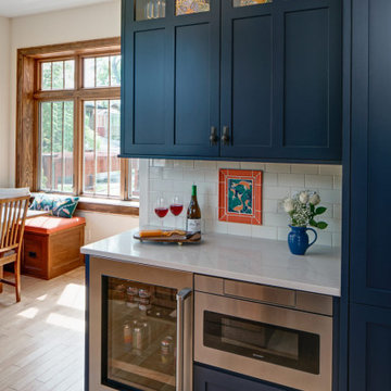
The 100-year old home’s kitchen was old and just didn’t function well. A peninsula in the middle of the main part of the kitchen blocked the path from the back door. This forced the homeowners to mostly use an odd, U-shaped corner of the kitchen.
Design objectives:
-Add an island
-Wow-factor design
-Incorporate arts and crafts with a touch of Mid-century modern style
-Allow for a better work triangle when cooking
-Create a seamless path coming into the home from the backdoor
-Make all the countertops in the space 36” high (the old kitchen had different base cabinet heights)
Design challenges to be solved:
-Island design
-Where to place the sink and dishwasher
-The family’s main entrance into the home is a back door located within the kitchen space. Samantha needed to find a way to make an unobstructed path through the kitchen to the outside
-A large eating area connected to the kitchen felt slightly misplaced – Samantha wanted to bring the kitchen and materials more into this area
-The client does not like appliance garages/cabinets to the counter. The more countertop space, the better!
Design solutions:
-Adding the right island made all the difference! Now the family has a couple of seats within the kitchen space. -Multiple walkways facilitate traffic flow.
-Multiple pantry cabinets (both shallow and deep) are placed throughout the space. A couple of pantry cabinets were even added to the back door wall and wrap around into the breakfast nook to give the kitchen a feel of extending into the adjoining eating area.
-Upper wall cabinets with clear glass offer extra lighting and the opportunity for the client to display her beautiful vases and plates. They add and an airy feel to the space.
-The kitchen had two large existing windows that were ideal for a sink placement. The window closest to the back door made the most sense due to the fact that the other window was in the corner. Now that the sink had a place, we needed to worry about the dishwasher. Samantha didn’t want the dishwasher to be in the way of people coming in the back door – it’s now in the island right across from the sink.
-The homeowners love Motawi Tile. Some fantastic pieces are placed within the backsplash throughout the kitchen. -Larger tiles with borders make for nice accent pieces over the rangetop and by the bar/beverage area.
-The adjacent area for eating is a gorgeous nook with massive windows. We added a built-in furniture-style banquette with additional lower storage cabinets in the same finish. It’s a great way to connect and blend the two areas into what now feels like one big space!
Sponsored
Fredericksburg, OH

High Point Cabinets
Columbus' Experienced Custom Cabinet Builder | 4x Best of Houzz Winner

 Five Star Interiors
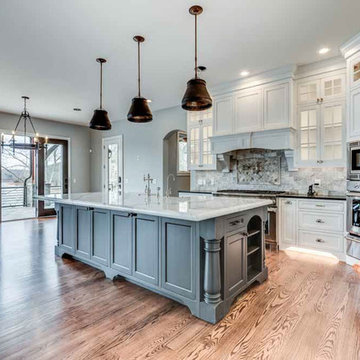
Cabinets: Dove Gray- Slab Drawers / floating shelves
Countertop: Caesarstone Moorland Fog 6046- 6” front face- miter edge
Ceiling wood floor: Shaw SW547 Yukon Maple 5”- 5002 Timberwolf
Photographer: Steve Chenn
 Morning Star Builders LTD
Kolanowski Studio
Inspiration for a large timeless u-shaped porcelain tile utility room remodel in Houston with a single-bowl sink, recessed-panel cabinets, white cabinets, limestone countertops, a side-by-side washer/dryer, beige walls and beige countertops
Inspiration for a large timeless u-shaped porcelain tile utility room remodel in Houston with a single-bowl sink, recessed-panel cabinets, white cabinets, limestone countertops, a side-by-side washer/dryer, beige walls and beige countertops
 Mosby Building Arts
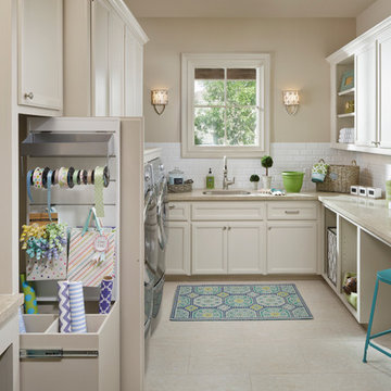
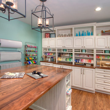
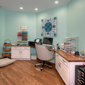
A couple wished to turn the unfinished half of their Creve Coeur, MO basement into special spaces for themselves and the grandchildren. Four functions were turned into 3 separate rooms: an arts and crafts room for the grandkids, a gift wrapping room for the wife, with office space for both of them, and a work room for the husband (not pictured).
The 3 rooms are accessed by a large hall, which houses a deep, stainless steel sink operated by foot pedals, which comes in handy for greasy, sticky or paint-smeared hands of all ages.
The gift wrapping room is adult art projects plus an office work space. Grandparents can leave their projects out and undisturbed by little ones by simply closing the French doors. Custom Wellborn cabinetry becomes work tables with the addition of wood tops. The impressive floor-to-ceiling hutch cabinet that holds gift wrapping supplies is custom-designed and built by Mosby to fit exact crafting needs.
Photo by Toby Weiss
 ODS Architecture
Originally a nearly three-story tall 1920’s European-styled home was turned into a modern villa for work and home. A series of low concrete retaining wall planters and steps gradually takes you up to the second level entry, grounding or anchoring the house into the site, as does a new wrap around veranda and trellis. Large eave overhangs on the upper roof were designed to give the home presence and were accented with a Mid-century orange color. The new master bedroom addition white box creates a better sense of entry and opens to the wrap around veranda at the opposite side. Inside the owners live on the lower floor and work on the upper floor with the garage basement for storage, archives and a ceramics studio. New windows and open spaces were created for the graphic designer owners; displaying their mid-century modern furnishings collection.
A lot of effort went into attempting to lower the house visually by bringing the ground plane higher with the concrete retaining wall planters, steps, wrap around veranda and trellis, and the prominent roof with exaggerated overhangs. That the eaves were painted orange is a cool reflection of the owner’s Dutch heritage. Budget was a driver for the project and it was determined that the footprint of the home should have minimal extensions and that the new windows remain in the same relative locations as the old ones. Wall removal was utilized versus moving and building new walls where possible.
Photo Credit: John Sutton Photography.

 Joy Street Design
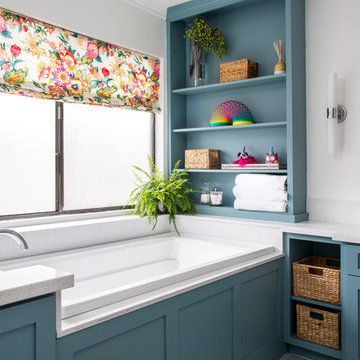
A colorful makeover for a little girl’s bathroom. The goal was to make bathtime more fun and enjoyable, so we opted for striking teal accents on the vanity and built-in. Balanced out by soft whites, grays, and woods, the space is bright and cheery yet still feels clean, spacious, and calming. Unique cabinets wrap around the room to maximize storage and save space for the tub and shower.
Cabinet color is Hemlock by Benjamin Moore.
Designed by Joy Street Design serving Oakland, Berkeley, San Francisco, and the whole of the East Bay.
For more about Joy Street Design, click here: https://www.joystreetdesign.com/
 Mosby Building Arts
The home office portion of the gift wrapping room uses the same white maple Wellborn cabinets connected by walnut countertops. The office space was originally set up so the lady of the house had a computer and printer for her craft projects, but the man of the house finds himself (and their dog!) spending a lot of time at this station because it's inviting and inspiring.
Photo by Toby Weiss
 Denise Quade Design
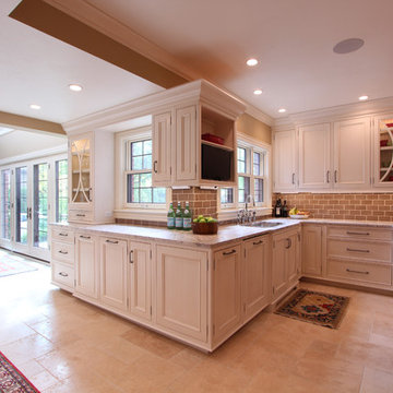
Cabinets were wrapped around this wall intersection to continue the flow of the space. A bookshelf cabinet was incorporated to hold a flat screen tv. Decorative cabinet door ends were incorporated onto the sides of the cabinets for a seamless transition. Two, double trash pullouts were incorporated for a recycling center. At the end of the cabinet run, the cabinet runs to the countertop. The glass door and traditional mullions allows for display space. The white glazed cabinets add warmth and depth to the space to fit the style of this tudor home.
1