Software
Houzz Logo Print
valistone

Dining room wall

12 years ago
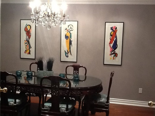
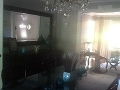
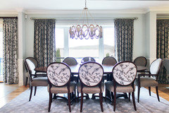
This wall is still not right..what do you think of the art work here? Is there something that might be better? It's a 17 foot wall. Thank you

Comments (36)

  • 12 years ago
    I chose those colours because of the seat covers. What might be a better choice?
  • 12 years ago
    I think bringing in some of the reds, yellows and blues in the art would look good on the table, in small doses or how about just white on the table?
    valistone thanked Melissa E
  • PRO
    12 years ago
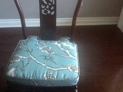
    I agree that the artwork isn't working for this wall. Can you put them on another wall if you like them in this room instead? What about a large interesting mirror instead? Or one large framed painting. Can you post a photo of the seat cushions?
    valistone thanked Rebecca Mitchell Interiors
  • 12 years ago
    last modified: 12 years ago
    I agree with the suggestion to just move the art closer together. Do not let it extend beyond the length of the table.
    valistone thanked abbyjean
  • 12 years ago
    Move the pictures closer together I agree that they are too far apart .
    valistone thanked Geneviève
  • 12 years ago
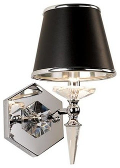
    Add scones on the sides
    Vienna Full Spectrum Manhattan Wall Sconce · More Info
    valistone thanked Geneviève
  • 12 years ago
    Great Wall color to highlight the art! I agree with howellmsue, and others. Move the art a little closer together. Would you consider cushions that bring more of the colors of the art together?
    valistone thanked laurakdesigns
  • PRO
    12 years ago
    Sconces - Genevieve - not scones! My favourite French-Canadian mistake which I encounter all the time in my line of work;)
    valistone thanked Rebecca Mitchell Interiors
  • 12 years ago
    Could you consider using trim work to match your baseboard and frame the artwork, either together or separately? Just to make them more substantial. The arrangement on the table does seem a little too "studied". Some of the color from the artwork should be incorporated into the arrangement, while still keeping the teal to match your seat cushions.
    valistone thanked Moxiemom
  • PRO
    12 years ago
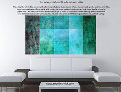
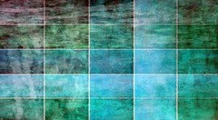
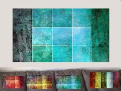
    A few ideas for that wall.

    http://angelina-vick.artistwebsites.com/
    valistone thanked Angelina Vick
  • 12 years ago
    Try putting the art like everyone is saying, 2-3 inches apart. I would put a solid color table runner on the table that picks up a painting color and has a silky finish, nothing cottony which would look country. The maybe an opaque black glass vase with a couple of silk flowers, and a short pillar candle on a simple dish.
    valistone thanked mmowbray
  • valistone thanked mmowbray
  • PRO
    12 years ago
    http://www.infoaffreschi.com/en look at this panels...you can also costumize sizes and images...
    valistone thanked Affreschi & Affreschi
  • 12 years ago
    last modified: 12 years ago
    The room looks somewhat empty, especially that very long wall. A long, shallow console or buffet type table placed along that wall would help to divide the 17 feet into 3 distinct areas and break the vertical plane into more manageable sized spaces. You would then have something to help 'ground' and provide 'boundaries' for your 'floating' art works and a horizontal plane upon which you could arrange some other select items that pick up your art colors, somewhat like the "Asian Tablescape" that mmowbray offered above, but this would also function as a server when needed. Arrange that central space like you would a fireplace mantel and allow the two side areas to serve as more open areas for extra chairs against the wall, a porcelain garden seat, tall plant, etc. I also like the idea of sconces on the wall to highlight that specific area and provide a variety of depths in your arrangement of pieces.
    valistone thanked bprince300
  • PRO
    12 years ago
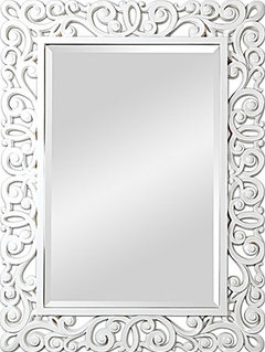
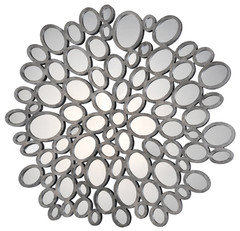
    Here are a couple of mirrors that could really make that wall interesting. The rectangular one could be hung horizontally and is 48 x 36" and the round one is 47" in diameter.
    valistone thanked Rebecca Mitchell Interiors
  • 12 years ago
    Thanks everyone, I see now that I should have taken a picture of the full room as the buffet table is on the other side with a large mirror over it and cannot be moved because the electrician put the chandelier in where it currently is. The sconces are on the wall into the living room. I love so many of your ideas!! Thank you!!
  • PRO
    12 years ago
    Yes that would have helped! However, now that I see the the fabric on the chairs (which I have used in another colour!) - I definitely do not think the artwork belongs in the dining room. I would look for something else that ties in better with the fabric and the wall colour as well as the formal feel of the room you have created. Hope this helps.
  • 12 years ago
    What do you think of a fresco?
  • PRO
    12 years ago
    What do you mean? I think of a ceiling when you say fresco?!
  • 12 years ago
    A fresco can be anywhere. It just means a pattern stained into wet plaster
  • 12 years ago
    I like the blue in the cushions, but as I mentioned, I think either change the cushions to coordinate with the art, or as someone else said, change the art. Interesting art is always great for a dining room as it adds a vibrant energy to the space and is conducive to great conversation!
  • 12 years ago
    I think a fresco could be beautiful...do you have artist?
  • PRO
    12 years ago
    last modified: 12 years ago
    A fresco could definitely work. Make sure you can see examples of other paintings the artist has done, to be sure you like their style. =)
  • 12 years ago
    Do you mean a mural or a fresco?
  • PRO
    12 years ago
    Instead of a fresco, I think you should find something for the main wall that ties in the chair fabric - which is a traditional fabric but with an unexpected colour (turquoise). I would look for artwork with branches or birds that has some of the same colours.
  • PRO
    12 years ago
    I think a fresco would fit. have a look to this catalogs
    http://www.infoaffreschi.com/en/download
  • PRO
    12 years ago
    We used the same fabric in one of our projects but in another colour!
    valistone thanked Rebecca Mitchell Interiors
  • 12 years ago
    I would move the art closer together as in previous suggestions and I would recover the chairs with colors that coordinate with the art. Also have a dramatic arrangement made for the table with same color theme as the art. You might also consider a couple of large tall plants on either side of the art.
    valistone thanked Allison Hanner
  • 12 years ago
    Possible alternative framed art bringing in chair seat color and bird motif

    http://houzz.com/photos/8542080
    valistone thanked orchardsgal
  • PRO
    12 years ago
    You need a larger piece overall, the three pieces are spread too far apart and are too small.
  • PRO
    12 years ago
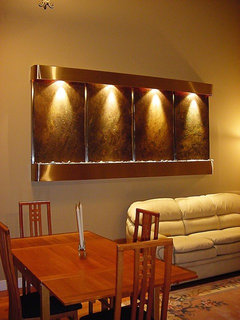
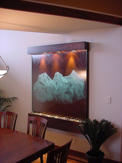
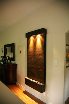
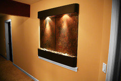
    A great idea for that wall could be a water feature: http://www.LuxeWaterWalls.com
  • PRO
    12 years ago
    last modified: 12 years ago
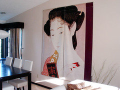
    We at BetterWall represent 30+ major art museums, selling their authentic street banners to people to put in their homes as spectacular wall art. Because sometimes banners are meant to hang front to back on a street pole to create a larger image, you might want to create a diptych or a triptych using several images. Several of our clients do this with beautiful results. http://betterwall.com/blog/japanese-print-woman-installation/
    valistone thanked BetterWall
  • PRO
    12 years ago
    Here's a photo of a client who faced the same challenge as you.
    valistone thanked BetterWall
  • 11 years ago

    Thanks for your comments everyone, they really helped!!. I do have a server on the other side with a large mirror and the sconces are placed on the either side of the door into the living room. I did change the table decorations as suggested. I don't really want to continue the Asian theme on the wall but have found a really large piece of original artwork that would work and it is the same colours as in the tables and wall. There will be a large corner to the left of the artwork. What would you suggest I put in that corner?