

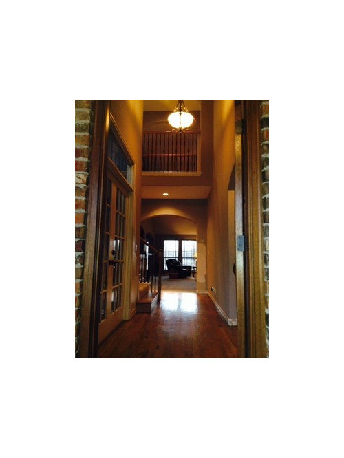
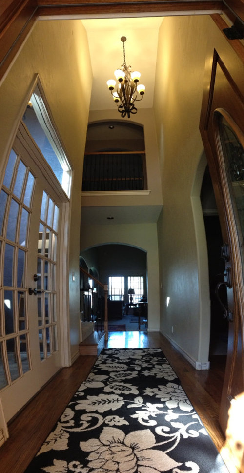
Let There Be Light!! (in our foyer)
12 years ago
last modified: 12 years ago
Featured Answer
Sort by:Oldest
Comments (35)
 12 years ago
- 12 years ago
 PRO12 years ago
 12 years ago
- 12 years ago
 12 years ago
- 12 years ago
- 12 years ago
 12 years ago
 12 years ago
 12 years ago
 12 years ago
- 12 years ago
 12 years ago
- 12 years ago
 12 years agolast modified: 12 years ago
 12 years ago
- 12 years ago
- 12 years ago
 12 years ago
- 12 years ago
- 12 years ago
- 12 years ago
 12 years ago
- PRO12 years ago
- 12 years ago
 12 years ago
 PRO12 years ago
 10 years ago
 PRO10 years ago
 PRO10 years ago
 PRO10 years ago
 PRO10 years ago
 10 years ago
Related Stories

REMODELING GUIDESMagical Materials: Luminous Kalwall Lets the Sunshine In
Translucent, pliable material lights up your home and adds privacy, too
Full Story
COLORLet Purple Passion Infuse Your Home
We take the mystery out of using this most spiritual of colors to create a deeply beautiful interior design
Full Story
MOST POPULARHouzz TV: Let’s Go Island Hopping
Sit back and enjoy a little design daydreaming: 89 kitchen islands, with at least one for every style
Full Story
GREEN BUILDINGLet’s Clear Up Some Confusion About Solar Panels
Different panel types do different things. If you want solar energy for your home, get the basics here first
Full Story
DECORATING GUIDESBudget Decorator: Let’s Go Thrifting
Dip into the treasure trove of secondhand pieces for decor that shows your resourcefulness as much as your personality
Full Story
WINDOWSThese Windows Let In Light at Floor Height
Low-set windows may look unusual, but they can be a great way to protect your privacy while letting in daylight
Full Story
REMODELING GUIDESInnovative Details: Letting in the Light
Modern Design Lights Up the Lobby in Historic New York Apartment Building
Full Story
ARCHITECTUREHouzz Tour: Easy, Breezy Home Lets the Light Shine In
Despite its narrow site, a serene new family home is flooded with natural light, thanks to a glass-lined internal courtyard
Full Story
Sponsored

Leading Interior Designers in Columbus, Ohio & Ponte Vedra, Florida




Luxe Water Walls